 | |
| |
|
|
view titles only (low bandwidth) |
| |
| LEGOs threaten ISS, Big Electric Cat, Mirrors | Feb 29, 2012 6:11 AM PST | url |
| | |
Added 1 new A* page:Watch JAXA flight engineer Satoshi Furukawa build a LEGO International Space Station...while aboard the International Space Station:
video on Youtube
Looks like microgravity really helps when assembling delicate models--although in this case it was offset by having to construct it in separate sections in a smallish plastic bag; and apparently this was necessary because, aside from the possibility of losing pieces and having them floating all over the station, "exposing the LEGO bricks to the open cabin air was a flammability hazard." HUH. Sounds to me like the other astronauts were just jealous of Satoshi's mad LEGO skillz. Anyway there is more about this mystical feat over here.
~~~~~~~
While launching my dear and ancient Photoshop 4.0 to start getting today's page into the computer, I accidentally pressed "Alt," and much to my surprise, this caused an alternate "About" box to appear (it was only there momentarily during startup, so it took me a while to figure out what the heck it was and what caused it):
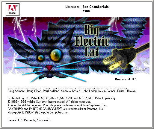
Big...Electric...Cat? Well, according to this page, that was the code name for Photoshop 4.0 during development, the cat's actual name is "Udo," Udo is Photoshop's "unofficial" mascot, and "her nickname is Becky (shorthand for Big Electric Cat), and shes present in the easter egg about boxes for all the following versions." So maybe you can find her in your version, I dunno!
"Big Electric Cat" has also been the name of a sort of fan or employee or something band who have played at Photoshop get-togethers, but this is not to be confused with the real Australian "gothic" rock group by the same name, who were "inspired by Philip K. Dick's sci-fi novel Do Androids Dream of Electric Sheep? and the future noir movie Blade Runner." (Tenuous) Sci-fi connection, yay!
~~~~~~~~~
I find that sometimes--especially if I'm trying to draw a person head-on so they should in theory be pretty much perfectly symmetrical, like say here--my drawings will secretly be kinda slanted funny, only for some weird brain-tricky reason, I can't tell unless I view them in a mirror, where the off-kilterness is immediately obvious. I do wonder if this would only really be noticeable to people who are used to reading from right to left--thus I imagine my comic looks truly comical to Japanese readers. :/ Anyhoo I don't mean for the drawings to be slanted like that generally, so sometimes when I'm not sure, it helps to check 'em in a mirror before I'm done. Today's page wasn't a perfectly straight-on view, but I thought I'd check anyway; for that one I just linked above I was running back and forth between my drawing table and the bathroom mirror--I guess because I wanted the exercise or something--but the more convenient thing to do is to hold the drawing facing outward on my chest, and then hold my little hand-mirror (also useful for modeling expressions!) in front of that, which is basically what I tried to take a photo of here:
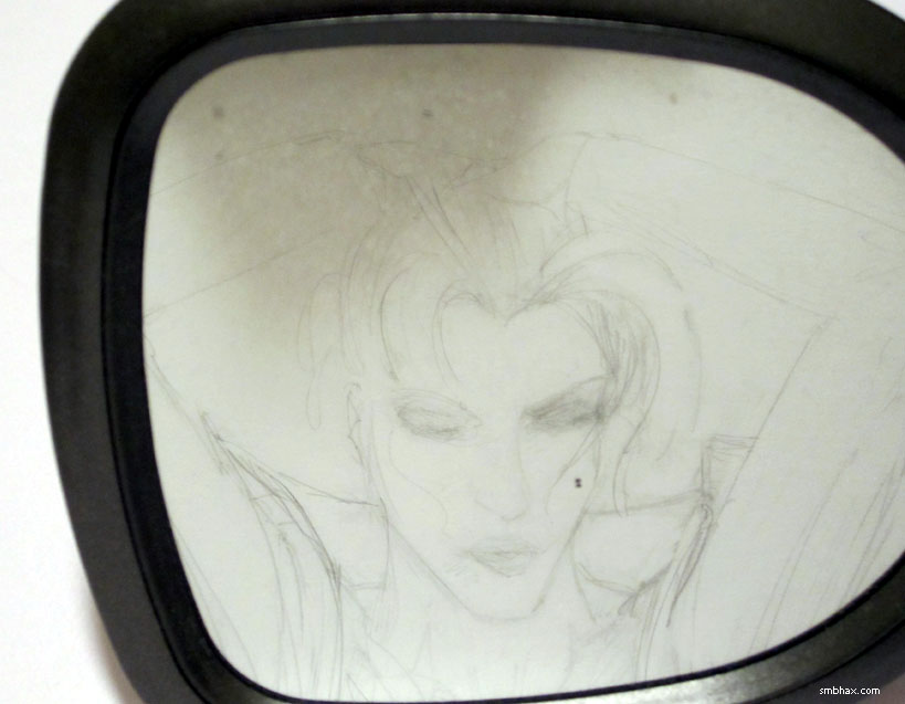
No slanting problem there, whew!
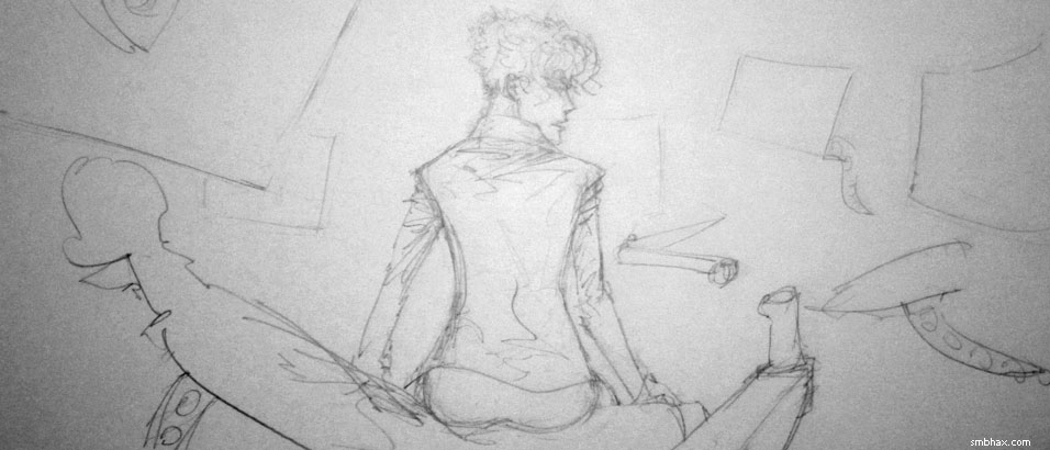
^ Aside from being backwards, that's also a preliminary version of the pencils for this page. Oh the excitement!
|
·····
|
| |
| Pencils, Pens, and the last Princess | Feb 28, 2012 5:07 AM PST | url |
| | |
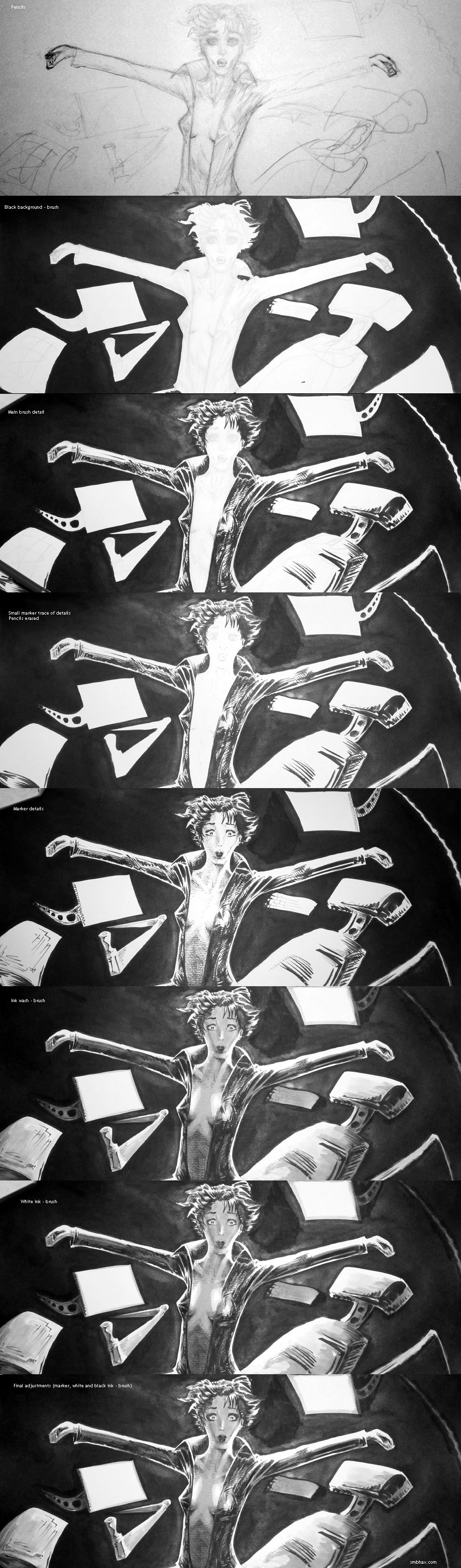
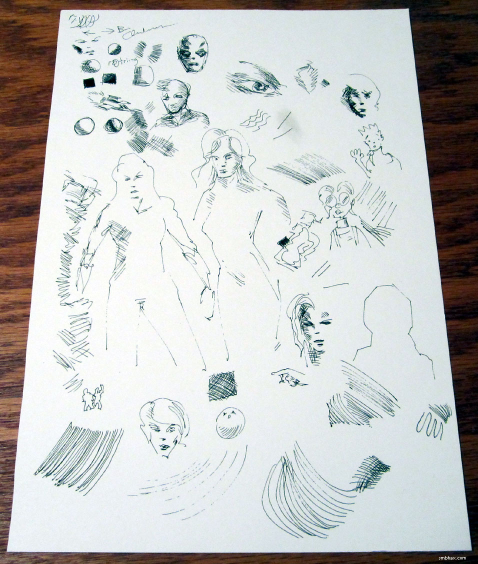
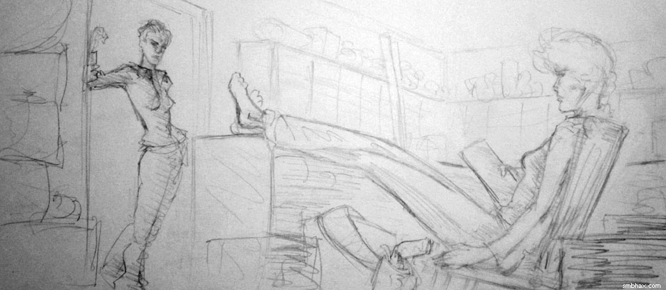
Added 1 new A* page:Boy, these medium-range shots are really showing up my lack of a solid method for translating small detail from the pencil into ink. This time I stuck with the brush for the transfer, but again I just let it be loose and brushy, and again this did not preserve the facial detail correctly and I had to spend extra hours getting an approximation back in there. So anyhoo for a slightly alternate face, here are the pencils:
I can *probably* do it with the brush if I just concentrate, although a pen might be easier--only the pens I have, Copic Multiliner Markers, don't hold up to the eraser all that well. But I also wasted more time--I was doing this a lot last week :P--on the internet today looking into a solution, and I did find something I hadn't expected. We shall see if it helps the process when it arrives here next week!
On a somewhat related note, The Pen Addict linked to my blog article on The Rapidograph pen and the Crown Jewels from a week or so ago. Thanks, Pen Addict! I'd actually been perusing a number of his pen reviews over the past week or so--they come up in Google quite a bit if you're looking for eh well good pens for drawing, I guess, although his angle is mostly hand writing--so it was both neat and surreal to find myself linked there. Yay, internet! (Also, I tried several different varieties of pens over the weekend, so there's another set of scribbles I gotta scan in to show you some time--the result was a bit surprising, actually--but then, I don't know much about pens. :p)
I do know one thing, though: a pen like this could potentially be the perfect thing--an inkjet pen! Man! Too bad it isn't actually a retail product I guess (the prototype also looks relatively unwieldy but I betcha they could work that out in production).
~~~~~~
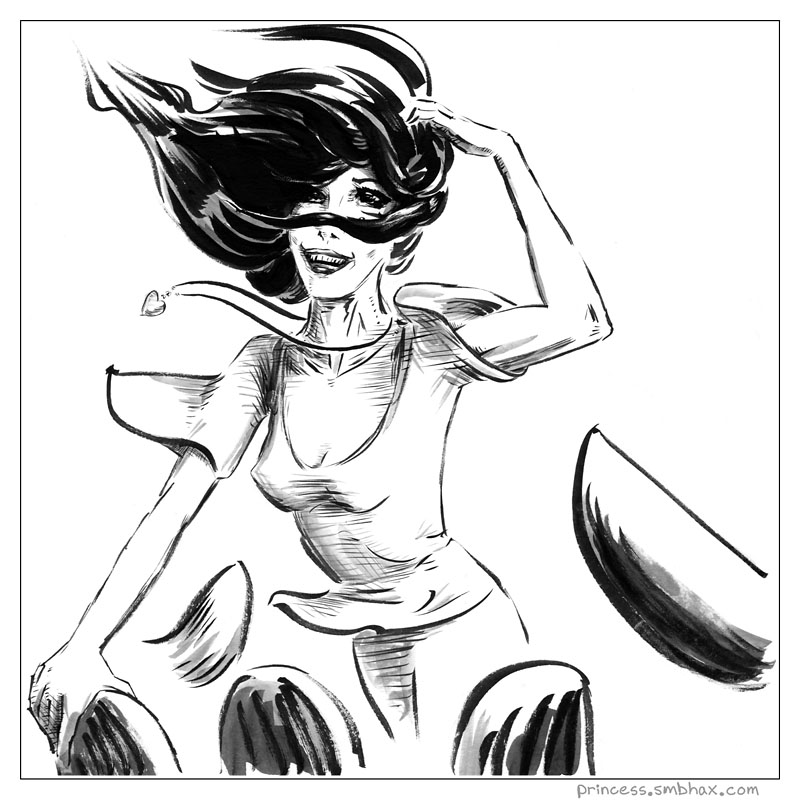
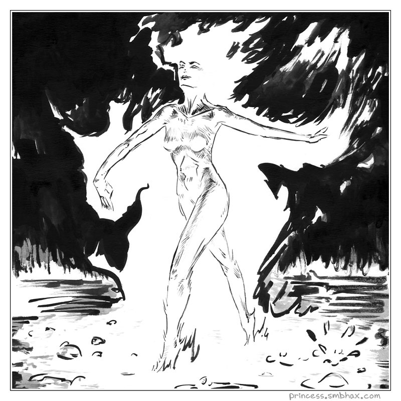
This weekend was my very last Princess and the Giant comic; I hadn't exactly been planning to end the series, but it *was* meandering a bit after having completed the first major story arc, and in retrospect I think that was probably because I simply didn't have time to do a proper job of it anymore; and I knew I was going to have to take the next week off from it because I'm going to have jury duty Monday and Tuesday of next week (argh--I have been dreading this for over a year ;P) so I'll need this coming weekend to work ahead on A* so that hopefully I can go do my patriotic duty and still get A* pages going out uninterrupted. Thinking that over made me realize that I have been in a time crunch with it for the past oh however many months, I dunno...and I could really use that weekend time to work on things I need to work on and have been putting off for A*, like writing, managing advertising, site updates like the long-promised subscription system and original art buying system, and eh things like laundry and sleep.
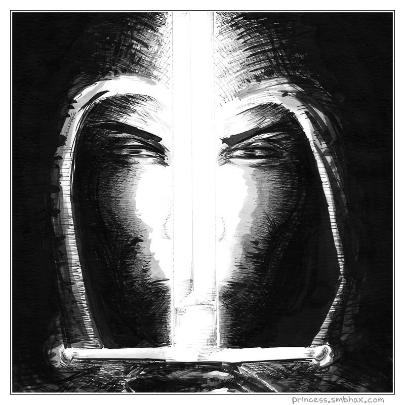
So something had to go and I guess it had to be the Princess. :| Well, it was a fun and educational nearly three years of weekly fantasy comics. I'm down to just A* as a regular comic series now! Gosh. Here's the final Princess page, which like most of the recent ones was really just a sketch, since that was all I could squeeze out of the weekend:
And dang if I couldn't even get those rushed eyes straight--trying to draw while exhausted and propped up on caffeine is *sometimes* not all that productive. Wait, what am I saying? 'Tis blasphemy, arr!
|
·····
|
| |
| Pencil Progress & Death of a Multiliner | Feb 25, 2012 10:54 AM PST | url |
| | |
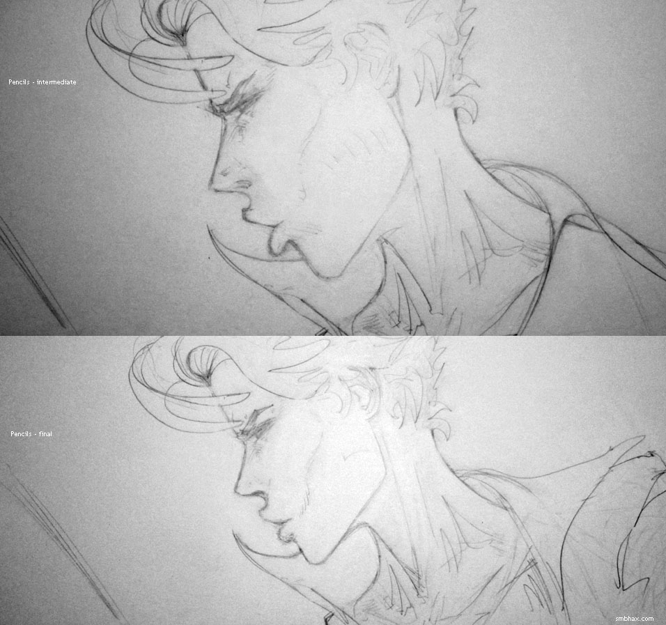
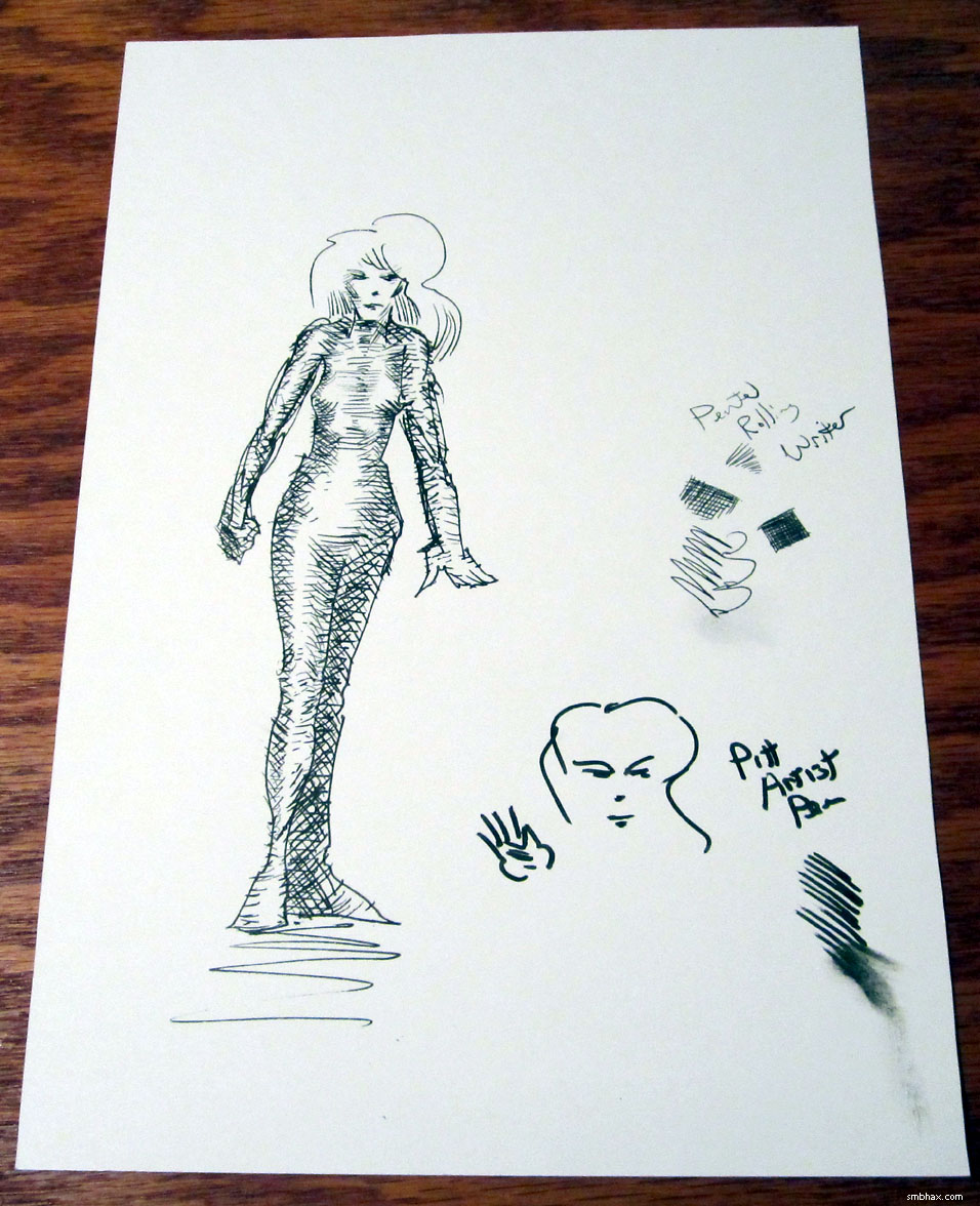
Added 1 new A* page:A couple photos of the pencils for today's page--some intermediate step in which I wasn't satisfied with well mainly the size of that big mouth and jaw, and then the final pencils (and the hours in between the two--I don't even wanna think about how many times I tried to get a good look at a side view of my puckered lips in the mirror ;Ppp):
One of my new Copic Multiliner markers went caput today! The 0.8 mm size wasn't putting out much ink when I held it in certain ways, and then it wasn't putting out much ink even from the top of the tip; then I tried some warm water and a gentle hand rub (I have no idea if those would help or not :P), but it was no good, the thing is totally dead now. Hadn't even had it a week--barely used! Hopefully this is some sort of fluke...or maybe the cap just wasn't fastened on all the way for the past few days or something? Egh. I've ordered another set, so I guess I'll have backups for the other sizes, and I guess really I'm only out about $2 for that one marker, but still, I hope the others tend to last a good deal longer! :o
|
·····
|
| |
| Crumb-y Rapidograph | Feb 24, 2012 9:56 AM PST | url |
| | |
Added 1 new A* page:Painting space backgrounds is a whole lot easier now that I'm off the computer; all those fancy Photoshop brushes and tutorials they're giving kids these days don't hold a candle to a little jar of white ink and fingertips, I tell ya.
Speaking of little jars of white ink, know who carries one of those around New York City to assist in sketching with his Rapidograph? Famed "underground" (that term isn't really used anymore but he's grandfathered in, I figure) comic creator R. Crumb, as probably everyone else already knew because you've seen that documentary about him that came out some years back, called "Crumb." Well I've never seen it, but here for instance in the trailer you can see him--for a split second, anyway--out there with Rapidograph and white ink. And in this collection of excerpts from the movie (I think?), you can see him using a brush, Rapidograph, and dip pen--the dude can draw with anything! (And his sketching style of short, slow, evenly weighted strokes certainly fits the Rapidograph to a T--I wonder if he developed that style before or after he got one of the things...probably before, I suppose.)
video on Youtube
What's more impressive is that he's doing all that sketching (although most of his final comic work is done with brush and pen, I gather) with the American-made "Koh-I-Noor" Rapidographs, which unlike the German "Rotring"-brand one I got recently have to be cleaned every day and always clog and stuff, apparently; but he seems to enjoy complaining about it and telling stories about how he got ink all over himself cleaning it at first, like in this guardian.co.uk interview.
I used mine a bit in today's page--part of that blackish liney area on the right side of the ship--because I thought it might be handy in spots where I've got some white ink I want to blacken back over; you can't really do that with a brush because the inks will mix to a gray muddle, and yesterday when doing it with markers I kept screwing up the marker tips (temporarily--the white ink washes right off, even after it's dried) by getting white ink crusted over them. So the Rapidograph *sort* of worked there, although the ink doesn't really flow well on the uneven dried white ink surface, and in the end I had to finish the job with markers anyway.
|
·····
|
| |
| Good inking is not bad tracing :| | Feb 23, 2012 9:06 AM PST | url |
| | |
Added 1 new A* page:Armed with my markers I decided on a rather elaborate approach to today's page, which was eh well a learning process. Here's the stage-by-stage:
Where I ran into trouble that took a while to sort out in the end was in doing a light trace of pencil details with a small marker--this was basically one (loose) trace too many, and some of the details, particularly the mouth, were not preserved well, and lost their original emphasis.
I did the light tracing before erasing and then doing a full rendering because while these Copic Multiliner markers hold onto the paper under the pressure of erasing much better than, say, Faber Castell's "Pitt" markers--although not quite as well as the India ink I use with the brush--if you've been working the markers into the paper fairly heavily, while that won't tend to have torn into the surface in a visible way, it will have softened it to the point that going over it with an eraser can tear up little bits of it, resulting in a jagged or stippled appearance, which I wanted to avoid (I ran into that yesterday around the ringed planet in the middle distance).
What I'll have to do in the future though is make sure that, while keeping my hand light, if I make a pre-erasing trace with a marker, it's got to be an accurate and full-fledged one, not just a rough approximation; either that, or I just get used to working out major details at the marker stage, which...I don't think I'm good enough for yet. :P
|
·····
|
| |
| Episode 16; line discipline | Feb 22, 2012 4:46 AM PST | url |
| | |
Added 2 new A* pages:Hopefully the markers look a little more integrated in this kick-off of episode 16, rather than jumping out and saying "hey look, marker lines!" Like, this weekend's page for my Sunday fairy tale The Princess and the Giant was the first actual comic I drew after I got them, and I was all like "man everything is going to have cross-hatching TO t3h MAXZ!"
Which, in retrospect, maybe have been a bit much (also all that hatching kind of killed my arm 8P). But I think I got a little of it out of my system. =p
|
·····
|
| |
| Art store rampage -> Copic Multiliners | Feb 21, 2012 3:18 AM PST | url |
| | |
Added 1 new A* page:^ That by the way is the end of episode 15! Episode 16 starts tomorrow, whee!
So I did bombard the local art supply superstore with my pen-testing presence over the weekend, and man there was this dude there just like on a regular patrol route through the marker section, and EVERY TIME he came through he asked me if I was finding everything okay. Yes. YES STOP BOTHERING ME I'm trying to spit-test your markers, okay? :PP Finally on his last pass (his fourth or fifth) I said "yes, almost done" and he gave me kind of a funny look while not stopping on his ceaseless patrol.
I hadn't thought they had Copic Multiliners, which I'd read good things about, because they don't have them on their web site, but they do in fact sell a set of them. So I tested those alongside Faber Castell "Pitt" markers, a four-piece Staedtler marker set (German company; the lead holder, leads and eraser I use are made by them), and a bunch of Sakura Pigma Microns; basically I took a couple comparable sizes of each, drew short and long lines on what I guess were price tags but were also handy paper surfaces, and wet my finger and smudged them to see how waterproof they actually were.
And guess what, they all did about the same! At least in terms of line quality, ink flow, and water resistance. But the winning set had two important differences: the smallest marker size, and a slightly darker ink. And the winner was...
Copic Multiliners! Here's the set I got--these are the disposable ones, not the more expensive "SP" aluminum ones with replaceable nibs and ink:
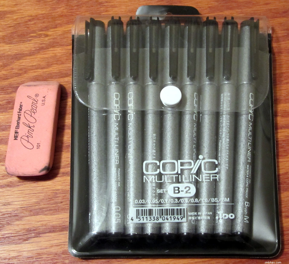
(Eraser not included--that's just there to show scale. :P)
The set includes nine markers: 0.03, 0.05, 0.1, 0.3, 0.5, 0.8, and 1.0 mm markers, plus small and medium "brush" tips; here's a close-up of the tips, alongside the 0.25 mm Rotring Rapidograph on the right, above a regular ball point pen:
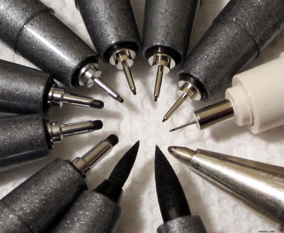
From that, the "0.03 mm" size claim seems a little suspicious, hm? Well, it does make quite a thin line, and the 0.03, 0.05, and 0.1 are all thinner than the Rapidograph, so I guess it's at least accurate in that respect! The Pitts and maybe the Staedtlers "only" went down to I think a 0.1 mm size, and the Microns maybe 0.05, I don't remember exactly--definitely not 0.03 though.
I also did a bunch of doodling with them on the weekend, but it's already later than I wanted it to be, so I'll just have to get those scanned and uploaded eh well hopefully tomorrow but tomorrow is the kick-off of a new episode which is always a bit of extra work so we'll see!
At any rate, I'd for some reason been a bit shy of using "markers," maybe because I hadn't been too thrilled with the Pitt "brush" markers I got a while back; and they do have a bit of that sort of stodgy felt resistance moving over paper, but not much since their tips are super dense; and they can make quite solid black lines if you're holding them right and exerting the correct pressure, so in fact I'm having quite a bit of fun with them; they finally let me do hard lines to complement the brushy lines of the brush, and they also let me kind of do sketchy work too, which is nice. And loads of cross-hatching potential, woo! And I think all of that is going to let me get back to a bit more of a hard black and white style; the brush-only ink wash was getting a bit gray and washy, really. I suppose it will take me a while to figure out exactly how I want to use them, but hopefully today's page is a positive step. :D
|
·····
|
| |
| Rapidograph and other pen doodles | Feb 18, 2012 8:39 AM PST | url |
| | |
Added 1 new A* page:Okay here's the chicken scratch I made when testing out the 0.25 mm Rotring Rapidograph:
I had a couple problems with it! While the line quality is very good, if I tried moving it quickly, it would skip a bit; this paper is pretty smooth, and I tried it on some smoother Bristol, too, and it still did it there, so I guess maybe it's just that the ink doesn't flow fast enough to keep up if you try a sufficiently fast line.
And second, like the pointed dip pen nibs, if I crossed my own line three or so times, the little metal tube tip would tend to start chewing up the surface of the paper a bit.
I do like the liney effect of that face I managed sort of in the lower middle right. I could use the Rapidograph for light detail like that, but not as a drawing mainstay, since I like to make fast, criss-crossing lines.
While I was at it, I doodled with a few other pens I have laying around:
The first was a medium-tipped Pentel Rolling Writer; I have decade(s?) old boxes of these by the dozens sitting around--always liked them for doodling in my notes in school since they have those soft but not too soft "roller ball" tips, and put out a lot of ink; haven't used them all that heavily since though. Their ink isn't quite as dark as the Rapidograph, which was actually about as dark as the "Sumi" India ink I use. I'm not sure what kind of ink it is, and their line quality isn't all that great.
The other is the smaller brush-tip type of Faber-Castell PITT artist pen--pretty thick with the felt tip, and totally failed my lick-your-finger-and-smudge-it-over-the-lines waterproof test--even though it claims to be waterproof. HM. (The Rapidograph, on the other hand, was even more resistant to smearing in that test than the Sumi ink.)
I got some good reader suggestion for pens to try :D, which I'm gonna do! One is a ball point nib for dip pens, which will probably be the best option for me if they're sufficiently small. And then a few people suggested Sakura Pigma Microns, which are very fine tipped disposable markers; my local art store has buckets of the things, so I think I'll shoot down there tomorrow and play with them; they've got little pads of paper you can try the pens out on, so it's pretty much going to be my playground tomorrow afternoon, whee--I'll doodle enough Selenis clones for a full-on invasion fleet! (I generally don't like the feel of marker tips I guess, but these are really really small so maybe they'll feel different.) I don't think they have Copic Multiliners, which is a shame, but they've got some other brands I can't remember right now that I'll try out as well.
|
·····
|
| |
| Rapidograph pens and the Crown Jewels | Feb 17, 2012 8:05 AM PST | url |
| | |
Added 1 new A* page:I got some good inking tool tips from people on the A* forum and on Google+. Thanks guys!
Today's new tool that I just retrieved from the post office is a Rotring Rapidograph, which is what they call a "technical pen"--it can draw a very fine, fixed-width line. Rotring is a German company--the name means "red ring" in German--although probably a general downturn in technical pen sales over the past decade or so of increasing computer dominance led to their being bought by what I think is an American company somewhat recently, who apparently discontinued some of their products. They still make their flagship Rapidographs, though! Here's the one I got, in its sections:
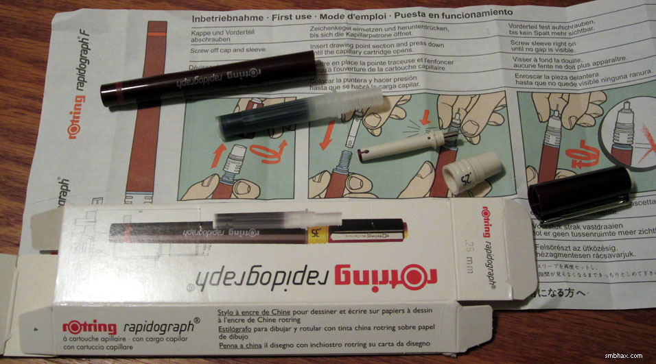
I included the box at bottom because in French and a few other languages it calls the ink used "India ink" ("encre de Chine" or "China ink" as the French call it :P), which is nice to know because that's what I use on A* with my brushes--I hadn't seen the ink type mentioned in online documentation.
As you may be able to tell from that darkish photo, the Rotring Rapidograph uses ink cartridges; this is different from the American-made "Koh-i-Noor" Rapidographs, which are more common (and cheaper) here: Koh-i-Noor is a Czech company that Rotring licensed to make and distribute their own brand of Rapidographs in the US; their Rapidographs use entirely different mechanisms, such as a refillable ink reservoir. Even though theirs are cheaper to buy here, I went with the Rotring Rapidograph because whereas the Koh-i-Noor pens are said to be finicky, hard to clean, and prone to clogging, users seem to have nothing but good to say about the German ones.
The Rotring site says their tips get as tiny as 0.1 mm! I went with a more modest 0.25 mm tip, which is still shockingly tiny--it looks and feels like a thin needle. Here it is next to a standard ball point pen tip:
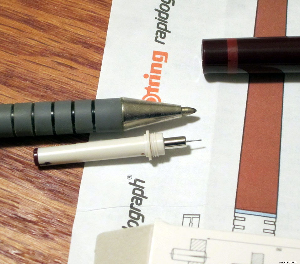
Tiny! I find it hard to imagine how small the 0.1 mm tip must be. :o
As you can see, aside from the tip and the pocket clip, the rest of the pen is plastic, but screws together easily and tightly. It's pretty light weight.
I will leave you guessing for now as to whether or not I liked it, because it's getting late! Doodles tomorrow!
~~~~~~
Still I can't resist a word or two more about Koh-i-Noor, because the name got me wondering. They're named after the massive Koh-i-Noor diamond, a rock discovered in India in the 1200s. Since then it passed from ruler to ruler as a spoil of war, primarily; it was in Afghanistan in 1790, when the Koh-i-Noor company was founded--the ruler there had gotten it after the Persian shah who had captured it (and named it Koh-i-Noor, which means "Mountain of Light" in Persian) from the Indian shah was assassinated.
No wonder with this bloody history that the jewel is said to be cursed, and will bring misfortune upon whoever possesses it--unless the possessor is a woman! Well that was a handy technicality when the British more or less conquered India, and handed the Koh-i-Noor to Queen Victoria in 1850, who made it one of the British crown jewels; it is currently in the crown of Queen Elizabeth ("the late Queen Mother").
I like this valuation of the Koh-i-Noor in the memoirs of Babur (circa 1530), the first Mughal emperor (their line descended from Genghis Khan!), and a possessor of the stone: "Babur held the stone's value to be such as to feed the whole world for two and a half days."
Here's a photo of a copy of the Koh-i-Noor (apparently the British royalty aren't big on photographing their jewels) from a Munich museum; this reflects its "new cut," a redesign from its earlier cut that had proven unpopular at the Great Exhibition in 1851; so the next year the Queen's mineralogist drastically cut the stone "from 186 1/16 carats (37.21 g) to its current 105.602 carats (21.61 g)":
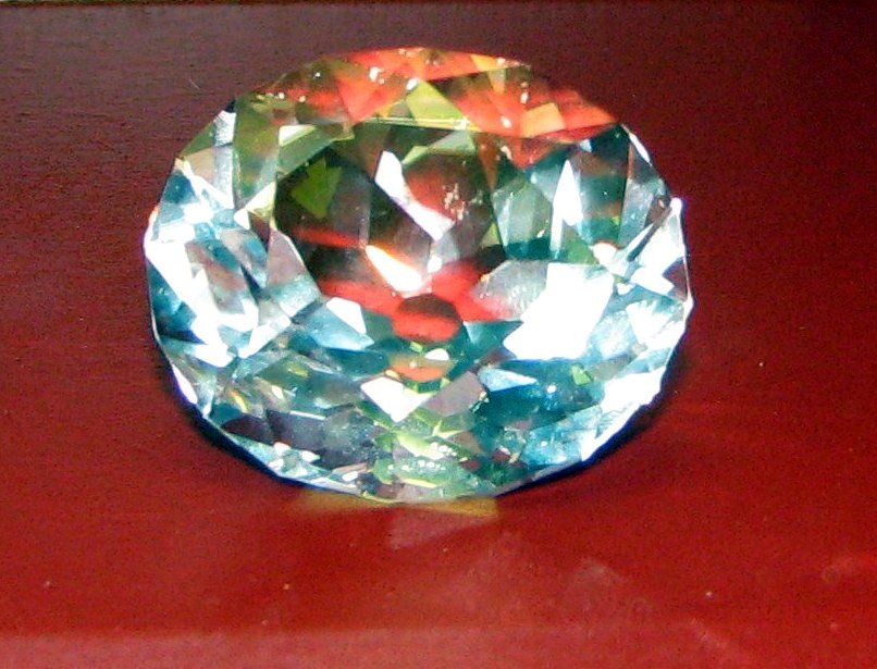
image by Chris 73 (source)
|
·····
|
| |
| Dip Pen Adventures, Part 2 | Feb 16, 2012 7:07 AM PST | url |
| | |
Added 1 new A* page:The art supplies I got that have not been so successful have been parts for dip pens. I got some from the local art supply mega-store recently, but the ones I could use (I was missing a handle for a few of them) weren't quite the type most comic inkers use, as it turned out; so I ordered the right ones and the right handles. (The helper lady at the art supply store was nearly as clueless about them as I was, unfortunately; here's an example that will show experienced dip pen users just how ignorant we were: I asked "Do you have Hunt nibs?" and she replied "No, we just have Speedball"; those who know their stuff will know that those two are one and the same, at least since 1997 when they were all put under the "Speedball" brand, which also covers other things like inks and so forth--the confusing thing though is that the packaging says only "Speedball," and the nibs themselves have only "Hunt" engraved on them (which is hard to read through the packaging). Pretty feeble rebranding effort there if ya ask me, and one that leaves noobs such as myself confused.)
So the doodles I showed in that recent post were made with a "22" nib, which is too big and too rigid for proper comic work; it was also chewing into even the heavy paper and Bristol I tried it on if I tried inking over the same spot a few times, as you would want to do to get a solid black area, or for crosshatching. Not cool! So I was hoping the smaller nibs comic artists use would be more forgiving on the paper, and also easier to move around and use for a variety of line widths and styles.
Well, here's the result of my attempts with the little nib collection I now have--I've placed the nibs themselves next to their identifying number, and the doodles around that area of the paper were done with that same nib:
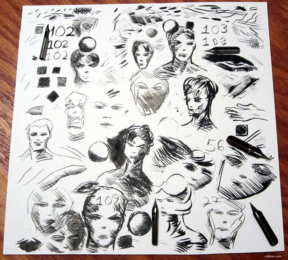
Blech! Anyway... The "102" in the upper left is the "crow quill" you may see some inkers talking about--it's probably the most commonly recommended for comic inking, at least that I've seen on the internet. It's small but pretty darn stiff, and with two or three cross-hatches would start chewing into the paper with its needle-like point.
"103" (upper right) was recommended in that book on inking by Klaus Jansen, and it's nice and flexible, but the ink just doesn't seem to want to come down from that cross-shaped reservoir (when you dip these into ink, a drop of ink collects at the hole above the tip, and is supposed to flow down the nib when you apply pressure to spread the two halves of the nib apart slightly)--I spent a *long* time trying to get it to flow consistently, and tried three different 103s, but just couldn't get them working reliably; plus, the tip is *so* flexible that I bent two of them (the halves of the nib wouldn't snap back together without a gap), and in testing the third one just to see what would happen if I applied just a *little* more pressure than one would think to do, **PANG!** half of the nib snapped off and darn well could have put my eye out. And anyway even though it was really flexible, it would still chew into the paper a bit on repeated crossings.
"109" (lower left) was probably the most successful--somewhat flexible, without ink flow problems--but yep would still chew up inked paper; you can kind of see it in the darker blotches in the heavy black areas I tried to make.
"22" is a big, fairly inflexible nib that I had before and used to make the doodles shown under the first link in this post; I kind of like the loose, thin lines you can get when moving it with very little pressure, but its big size makes it even more paper-chewy--although it is topped in that department by the even bigger "56."
Well, I'm probably doing this wrong. It isn't coming intuitively like the brush and pencil do--although I've used those extensively before, so it's just as likely simply a matter of familiarity and practice, or lack thereof--and the way you can only move the tip in certain directions due to how its knife-like tip moves on the paper feels uncomfortable and restrictive. I want to be able to make the type of hard lines these nibs can do that a brush can't really, but I don't think I'm gonna be able to jump in and do that with them; and anyway I suspect the chance of chewing up the paper with the tip will always remain, especially since what I really want to do with them is loads of overlapping cross-hatching and hard, dark, blocky areas; I wonder if this happens to the pros (and I don't see how it can't, at least once in a while)--I suppose it doesn't really show up in their scanned linework anyway, since (I think?) the usual method of getting linework ready seems to include using 50% Threshold in Photoshop to simplify it to pure black and white, which would make the chewed-up areas just as black as the non-chewed-up areas. But you can't do that with ink wash, and anyway I want my originals to look nice, since I plan to sell them and don't want people to be disappointed with how they look in person!
So this is probably the end of my flirtation with dip pens for the time being. I tried doing some semi-"hard" lines around the figures with this new brush of mine on today's A* page, and was surprised how successful it was at doing a thin, fairly steady line. It still isn't quite nib-sharp, but I've got another tool waiting for me at the post office that should be, so maybe I'll get a chance to play with that tomorrow.
|
·····
|
| |
| Raphaël is a nice brush (and big! :o) | Feb 15, 2012 4:22 AM PST | url |
| | |
Added 1 new A* page:The successful part of that package of art supplies that arrived yesterday was a new type of brush: a Raphaël 8404, size 3--I picked a size 3 since that's the same size number as the brushes I'd been using, Winsor & Newton Series 7s, but the Raphaël sizes are actually about one size larger; you can see the "size 3" Raphaël sorta dwarfing the "size 3" W&N here:
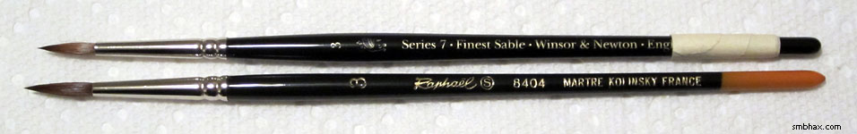
(The tape on the end of the W&N's handle signifies that it's my old W&N, the one I'm just using for white paint (which is kinda gloppy and rough on bristles) now--not that the handle broke or anything.)
I've done these past two A* pages with the Raphaël, and I have to say I'm exceedingly pleased with its performance. Yay French brush (the company, which is named something else that is rather boring, was founded in the late 1700s, which they say makes them the longest-running brush manufacturer around today)! And you might not have suspected it but it is actually cheaper than the W&N, or perhaps I should put that the other way around and say the W&N is more expensive, about twice as much for a similar physical size.
Now, my original A* brush was a German one (a Da Vinci "Maestro") that was also half the price of the British Winsor & Newtons, but that one was about the same size, had some small bristle problems from the beginning, and only lasted about half as long before it lost what useful point (the sharp tip the bristles are supposed to form when wet so you can paint tiny lines) it had started with. So far, the bristles of the Raphaël feel at least as nice as the W&N, and there are, well, a lot more of them. Also, I dunno if it's the increased size, or some difference in the bristles, but I've found I can do some really long delicate feathering with the Raphaël--like with the shading on Selenis' pants today, and on her hand yesterday--that I simply never found the W&N really wanting to do.
It's nice to have a bigger brush, too, since it can do bigger lines in a single stroke; and particularly with ink wash, it comes in handy in its greater capacity for carrying water and ink--this means I have to go back to the well less frequently, and since I'm currently mixing ink wash grays "on the fly" in the brush itself, rather than pre-mixing them in tidy separate jars, this means I can do larger areas of the same tone, so in general the work should be less patchy and dabby (that isn't really a word) looking.
In his book on inking that a kindly reader got for me recently from my Amazon Wish List (<3), professional inker Klaus Jansen says he does most of his work with a Raphaël size *4*--which would be a W&N size 5, approximately. :o I suppose it takes more control to handle larger and larger brushes, especially if you still want to be able to do small lines with them, which I do, but I think I'm going to get myself a size 4 and see how that goes, because if I can still do small lines with it, then in theory it will be even more useful than the size 3 I'm using now.
|
·····
|
| |
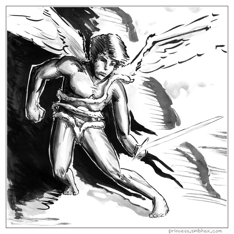
| I draw some mostly naked guy with wings | Feb 14, 2012 2:59 AM PST | url |
| | |
Added 1 new A* page:Spent a good bit of time playing with new drawing tools that arrived from the internet today. Some were successful (and used for this latest A* page!), some were not--a learning experience, shall we say! I'll go into that more tomorrow; for now, I give you this strange winged man-boy I drew for my Sunday fairy tale comic, The Princess and the Giant, currently going through a dream phase that seems to be getting increasingly weird:
|
·····
|
| |
| Here comes trouble | Feb 11, 2012 5:05 AM PST | url |
| | |
Added 1 new A* page:Hope you've enjoyed the A* makeover week! =P It's possible I enjoy my costume changes a bit too much... But heck with it, they're my characters, I'll play dress-up with 'em if I wanna.
There's more than just a change of clothes in that box from Mother, though. Just what else will be revealed...next week! And we'll come very close to wrapping up this episode next week, even. And then it will be off to new worlds...of adventure!
|
·····
|
| |
| What's cooler than gangsters? | Feb 10, 2012 4:45 AM PST | url |
| | |
Added 1 new A* page:Dah too late for full-on blogging. Gotta stop spending part of the day scrutinizing the methods of painstakingly photo-realistic comic artists who averaged (not making this up!) three months PER PAGE. :o But they are ink wash and they look so nice; I will go into this more when time allows 'cause it's an interesting story, there is some amazing sci-fi comic art that came out of it, and I'm also going to be adopting at least one of the main tools used.
But for this evening I'll settle for relating that in the shower yesterday I came up with details for some of the meaty scenes we'll be having here in A*'s next episode (episode 16, I mean, which isn't far off now). It ended up being a pretty long shower and I was probably close to chortling to myself at some points just thinking of the fun we'll have; all well and good although this was in the members shower at the gym and I suppose I probably got some weird looks but HEY writing isn't supposed to be easy.
Anyway I don't want to spoil anything but I will say this: space gangsters. Oh yeah. A* episode 16, don't miss it!
And because loads of text is boring here's a combo photo of two stages of penciling the main figure in today's page--the sad part is getting from one to the other probably took like an hour or something, gar:
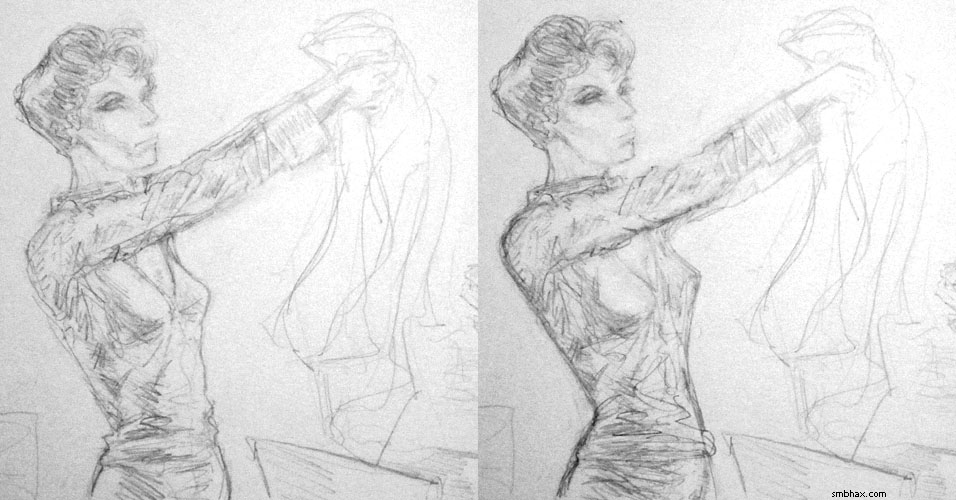
Hm I made a few more changes after that (to the way the shirt draped over the slacks, for instance), but I had already taken what I thought were the final stage photos like three times over the past few hours so I had to stop shooting SOMEtime.
|
·····
|
| |
| All nuclear detonations since 1945 | Feb 09, 2012 5:33 AM PST | url |
| | |
Added 1 new A* page:I threatened to tell you more about my dip pen adventures today but I spent way too long dabbing away at this latest page, so I've gotta put that off and do something quick instead... Ah, here's a spooky schematic animation of nuclear detonations from 1945 to 1998 (thanks to my brother for sharing this on Facebook :D); it starts off a bit slow but it's definitely looking a bit like global thermonuclear war by the time it gets into the '60's:
video on Youtube
:o
|
·····
|
| |
| Dip Pen Doogles! | Feb 08, 2012 3:07 AM PST | url |
| | |
Added 1 new A* page:I'm not sure what happy stars aligned but for some reason I got a lot of nice feedback and support from readers in the last day or so, which was really enjoyable and encouraging. :) In fact I think it was pretty definitely the largest spontaneous outbreak of support A* has had ever. Gosh! Thanks to everyone who wrote in -- and to all those lovely readers who have written me at some point over the past several years!
Okay I have something else I did this weekend to show you! With that hot lava painting I showed yesterday I mentioned I'd got a new brush--but I also picked up a few other items (Christmas gift certificate! <3 :)) when I was at the mega local art supply store this weekend! A few of them assemble into something called a "dip pen," which is pretty much like a fountain pen, with a split sort of spade-shaped metal tip, only it came before the "fountain" part, so you have to dip it into an ink well every few lines or so. It sounds crazy but apparently lots of comics have been made with such things, and I wanted to try one out, and they're pretty cheap, so I did! This first bunch of doogles (haha that's an interesting typo for "doodles," I think I'll just leave it :D (probably Google's fault :p)) are pretty awful, but I was mostly just trying to see what kinds of marks the crazy pen would make:
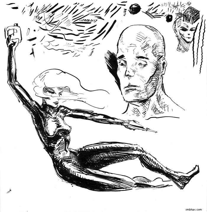
Lots of fairly even lines! That drawing's about 7" per side. I tried another quicky on Sunday, partly to see if I could do large black areas with the pen, but I couldn't really for technical reasons I'll go into tomorrow (I know, I know, you can't wait! :P), so eventually I settled for finishing it, as it were, with just a lot of cross hatching:
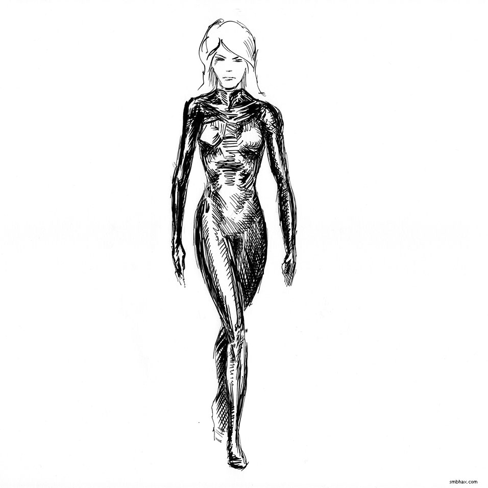
Aside from the sloppy rushed anatomy, which wasn't the pen's fault, I rather like how that came out (the part you see there is about 10.5" per side)! You can definitely get a nice sharp look with the pen, and now I think I understand a lot more of why a lot of comics look the way they do. I'm thinking that I'll incorporate the dip pen into my work alongside the brush, at least for certain textures and effects. I can't start on that quite yet though because I...got the wrong parts. Yeah I'll explain that foolishness tomorrow--or try, anyway. :P
|
·····
|
| |
| New brush & hot feet | Feb 07, 2012 12:30 AM PST | url |
| | |
Added 1 new A* page:So apparently I have a thing for drawing women's feet--it is nice to learn such things about oneself! Huh. Anyway here are some more feet I drew over the weekend, these are for my Sunday fantasy comic The Princess and the Giant--but they're in hot lava so that's totally different and stuff, right?
Oh yeah and I got a new brush! Painting with a new brush is fun, they're so frisky and subtle! So things should be a bit sharper for a while, until I wear this one down too. Actually I read somewhere that the real thing that prevents them from forming a proper point after a while is ink getting dried up in the ferrule--the metal tube clasping the bristles onto the handle. I'm kind of tempted to try leaving the old one in some really strong soap solution overnight to see if it can get that stuff out and rejuvenate the brush, but something tells me it can't be that easy to resurrect them. Hm, well, worth a try I suppose, then at least I'll know!
EDIT: Ah and I forgot I'd snapped a photo of the pencil stage of today's page:
And on second thought I'm not sure I should try that strong soap bath to resurrect the old brush, since it could just as well take out the glue holding the bristles on, and then I've got no brush at all (currently it's handy for secondary stuff like white ink--which is too thick to use with a thin point anyway--or just adding water). So maybe I'd better wait until I have *two* old brushes, then try it on one of them. :P
|
·····
|
| |
| A new do & weird(er) art warning | Feb 04, 2012 1:48 AM PST | url |
| | |
Added 1 new A* page:If today's page looks familiar, you may recall one of the first A* ink and brush practice pieces I did back in October:

I always did like how kind of loose and wild that one was, especially in the hair region. I can't use that old acidy paper for the real A* pages ;_;, but maybe I can try to get back to more of the way I did that one, having to do a lot of the design work in ink because the pencils were very sketchy. And anyway I've found I tend to be happiest with the pages in which I kind of let the ink do its own thing (or rather, it does its own thing on its own), like
and
and I don't think I remembered to mention it at the time, but this one was done without any preliminary pencil work--just straight ink on paper:
I can't usually get away with that, but still I want to try developing the images more with the ink. So we'll see! (Huh those ^ were all straight-on eye shots...) Something that ought to help is getting some a fresh brush to paint with, since this nice Winsor & Newton Series 7 I've been using can't quite keep a point anymore; it kept its point for about two months (40-some pages?) I think, which was about twice as long as the Da Vinci "Maestro" brush I was using before it, which was half the price--go figure!
I think I'll also pick up a dip pen (sometimes called a "crow quill") too, since they're pretty affordable, especially compared to the nicer brushes, and I realize now that a lot of the artists whose ink work I like used them--those old black and white pulp adventure strips, for instance. I do find it interesting though that all the stuff I've read from people comparing pens vs brush for inking says that the brush is a lot harder to get used to--whereas I feel perfectly comfortable with it for some reason. So I should probably just stick with it, but I'm curious about the pens so I at least wanna see what it's like to mess around with one. And I would think I could find some sort of use for it alongside brushes.
So starting next week the art might be getting a bit (more) experimental and weird for a bit while I try out some different techniques and approaches. I'll try to keep it mostly legible... Thanks for sticking with me as I figure out how I want to ink stuff! :)
|
·····
|
| |
| Ur is the best ancient supercontinent | Feb 03, 2012 6:42 AM PST | url |
| | |
Added 1 new A* page:I don't remember quite how this happened but anyway I recently came across the supercontinent cycle page on Wikipedia. Now we've probably all heard of Pangaea and all, but that was only the most *recent* supercontinent--there were loads of others before Pangaea! And the first supercontinent might've been one called Ur that formed about 3 billion years ago (although some might say Vaalbara preceded it by about 600,000,000 years, but Vaalbara was a tiny little thing maybe about the size of South Africa, whereas Ur was maybe close to the size of Australia, and, I dunno, you gotta draw the line somewhere, ya know?
And Ur lasted right up until Pangaea broke up, leading to the modern continents--what was Ur is now in bits of Africa, Australia, and India. Here's the play-by-play from Wikipedia:
~3 billion years ago, Ur formed as the only continent on Earth.
~2.8 billion years ago, Ur was a part of the major supercontinent Kenorland.
~2 billion years ago, Ur was a part of the major supercontinent Columbia.
~1 billion years ago, Ur was a part of the major supercontinent Rodinia.
~550 million years ago, Ur was a part of the major supercontinent Pannotia.
~300 million years ago, Ur was a part of the major supercontinent Pangaea.
~208 million years ago, Ur was torn apart into parts of Laurasia and Gondwana.
~65 million years ago, the African part of Ur was torn apart as part of India.
~Present, Ur is part of Australia and Madagascar. |
Or, in a more general perspective given by this article (which also has a nice illustration showing these continental shifts):
Rogers says Ur was the first continent, formed three billion years ago, followed by Arctica half a billion years later. Another half a billion years passed before Baltica and Atlantica emerged. The four continents roamed separately until, about one-and-a-half billion years ago, Arctica and Baltica collided with what is now eastern Antarctica to form Nena.
When Nena, Atlantica, and Ur came together one billion years ago, the supercontinent Rodinia was born. After 300 million years, the three landmasses separated for about 400 million years, then came back together in a new configuration, Pangea. |
Ur was more or less invented by University of North Carolina geologist John Rogers in 1996, when he pieced it together in a paper called "A History of Continents in the Past Three Billion Years," in which he noted that those bits of three current continents all dated back to about 3 billion years, and had been together in Pangaea--so that meant they were probably a continent that had existed by itself before the younger rocks around it.
I mostly just like the names some of these old continents have. "Ur" is nice, and I suppose Rogers just got that from the ancient Sumerian city-state of the same name. "Arctica" as named above is pretty nice, and there's also Atlantica. And all right, I guess Vaalbara is a pretty cool name, too.
~~~~
Just a couple other interesting articles I saw linked from one of those sites: Alzheimers spreads like a virus from neuron to neuron is an interesting one from the A* neuroscience perspective, and then are you ready for Russians about to breach 20-million-year-old lake in Antarctica? Man there could be some crazy stuff in there.
|
·····
|
| |
| Enterprise, the engine-free Space Shuttle | Feb 02, 2012 5:20 AM PST | url |
| | |
Added 1 new A* page:Space Shuttle Discovery, which I was talking about yesterday, was the first Space Shuttle to be retired (final landing March 9th, 2011), and once all the dangerous bits I suppose are taken out, it's due to replace Space Shuttle Enterprise at the Smithsonian.
Enterprise is an interesting case, as it wasn't a fully functional shuttle, but rather a prototype built without engines or heat shield. What could it do without those? Gliding landing tests! Here's are links to the two parts of the contemporary newscast (dig the old TV commercials in there) from its first free flight and landing, on August 12th, 1977, after it was taken up to gliding altitude on the back of a modified 747: part 1, mated takeoff and climb, and part 2, separation and landing.
In that video you can see Enterprise sporting a jaunty white cone over where a shuttle's engine thrusters would normally be:
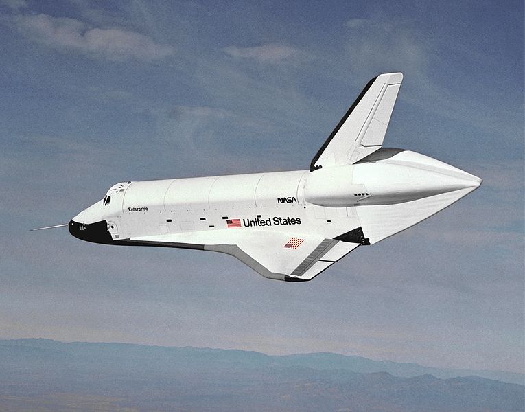
image by NASA (source)
Enterprise was retired in 1984, took a tour of Europe and North America, and then went to the Smithsonian, where it has been ever since:
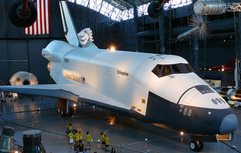
image by Ad Meskens (source)
|
·····
|
| |
| Selenis = September?; Discovery's cockpit | Feb 01, 2012 4:31 AM PST | url |
| | |
Added 1 new A* page:I've heard this song plenty of times but I'd never seen the singer:
video on Youtube
Troops of black body-suited clones... Hm! Well apparently I've been using Swedish singer/songwriter September as Selenis all this time and never knew it! And her dad is an astrophysicist, go figure. Anyway she or her stylists have some pretty A*-ish tastes:
     
We do have one more hairstyle change coming up in this episode. Oh the possibilities!
~~~~~~~
A thoughtful reader on Google+ tipped me off to this G+ post which links to (Flash required) this "360VR" view of the Space Shuttle Discovery's cockpit during decommissioning (on June 22, 2011, if that's what the caption means).
So many switches! :o I wonder if there'd be less if they redesigned it now with a multitasking OS, so you didn't, like, need a separate physical control panel and screen for everything—that's kind of how I design ship cockpits in A*, although I'll throw in a few extra buttons or screens for looks now and then. >_>
Now I could take it several steps further and have controls handled entirely by eh holographic input screens or thought control or something like that, I suppose, but I dunno, there's something about switches and buttons and joysticks that's more satisfying than those fancy intangible things.
|
·····
|
|
|