 | |
| |
|
|
view titles only (low bandwidth) |
| |
| The Rusty X-Acto and the Bionic Eye | Aug 31, 2012 8:08 AM PDT | url |
| | |
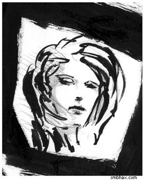
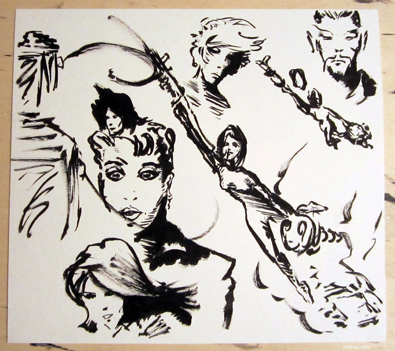
Added 2 new A* pages:Starting to get back into the swing of this pencils-before-ink thing, I think. Had to dig up my ancient X-Acto knife to cut the masks for protecting foreground objects when I spray stars on the backgrounds with white ink--I'd been using just regular scissors for that up to this point, but today's had little enclosed spots in them and so forth that weren't really scissor-accessible. The X-Acto has probably been sitting in my drawer for over a decade and actually has rust on the blade. Hm. Should probably get a new one. Still it cut through the transparencies I'm using for the masks pretty well--didn't do so good on the waxed tracing paper, which sometimes would try to pull and tear; I like the transparencies much better for making masks though since they're way easier than tracing paper to see through...when tracing! Their only down side I suppose is that the marker will smudge off them (even though I was using a waterproof Kuretake Disposable Brush Pen) and get all over my hands as I'm cutting the mask, but I don't mind that if you don't.
I smeared the spattered stars with my finger to get a sort of exaggerated motion effect; need practice at that though 'cause you'll see some of them are going slightly different directions. In theory it works well, though!
~~~~~~~~~
Australians implant 'world first' bionic eye (warning: auto-playing video with sound) was the eye-catching title of an AFP article I spotted today; apparently it only gives the woman who got it a "little flash" of light as a hint of what she's looking at, but that seems like a good place to start.
~~~~~~~~~
The Twitter account of Pentel of America--the pen company--retweeted the Pentel Pocket Brush sketch I posted yesterday. :o Thanks, @PentelofAmerica! Your brush pens are pretty fun to sketch with.
|
·····
|
| |
| Supermassive news post 1000! | Aug 30, 2012 7:44 AM PDT | url |
| | |
Added 2 new A* pages:A*'s 1000th news post! Gosh! To think it all started with a very short post back on March 18th, 2009. And here we are, 999 posts later!
NASA celebrated this supermassive milestone (*cough*) by announcing the discovery of millions of supermassive black holes (the article also mentions the A* comic's namesake, Sagittarius A*, the supermassive black hole at the center of our own galaxy!) in a new all-sky survey by their Wide-field Infrared Survey Explorer ("WISE"). Light gets stretched out into the long infrared wavelengths as it travels across the universe, AND lower-energy light--infrared light--goes through gas and dust more easily than higher energy light, because it vibrates less and is thus less likely to hit something as it moves along, or something like that. AND energy escaping from a black hole tends to be shifted to infrared as well due to...hm well I forget, something to do with the gravity, obviously. So WISE is a good tool for seeing things that might be very far away, obscured by gas and dust, and maybe black-holey--like say the supermassive black holes sitting at the center of galaxies. More specifically, these supermassive black holes are quasars, which means they're actively sucking down material, and in the process creating an energy buildup around themselves, which can be seen from far off by instruments like WISE.
This image shows the overview of WISE's survey, and a zoomed-in view of just one tiny section, showing just how many supermassive black holes, for instance, it found in that one section--"an area about three times larger than the moon":
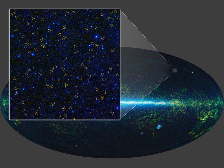
image by NASA/JPL-Caltech/UCLA (source)
WISE found about three times as many quasars (or, properly speaking, quasar candidates) as a previous survey, the Sloan Digital Sky Survey. This even-more-zoomed-in view shows how the additional quasars WISE spotted were sometimes messy, dust-obscured objects, whereas the smaller subset the visible-light SDSS was able to see (blue-green circles) were quasars that weren't obscured:
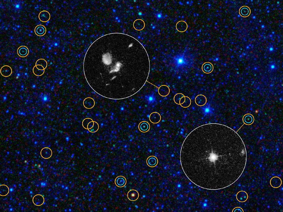
image by NASA/JPL-Caltech/UCLA/STScI (source)
WISE also found about "1,000 even dustier objects thought to be among the brightest galaxies ever found"; called by the rather awful name "hot DOGs" ("Dust-Obscured Galaxies" :P), these rare objects are emitting twice as much energy as normal quasars--more than 100 trillion times the energy emitted by the Sun. They are thought to be creating stars very rapidly, and there are some theories that they're an important, heretofore unknown step in the galactic evolution, and might even indicate that in galactic formation, the central supermassive black hole forms first, then powers star growth around itself with its intense gravitational vortex. Go, supermassive black holes!
~~~~~~~~~~~
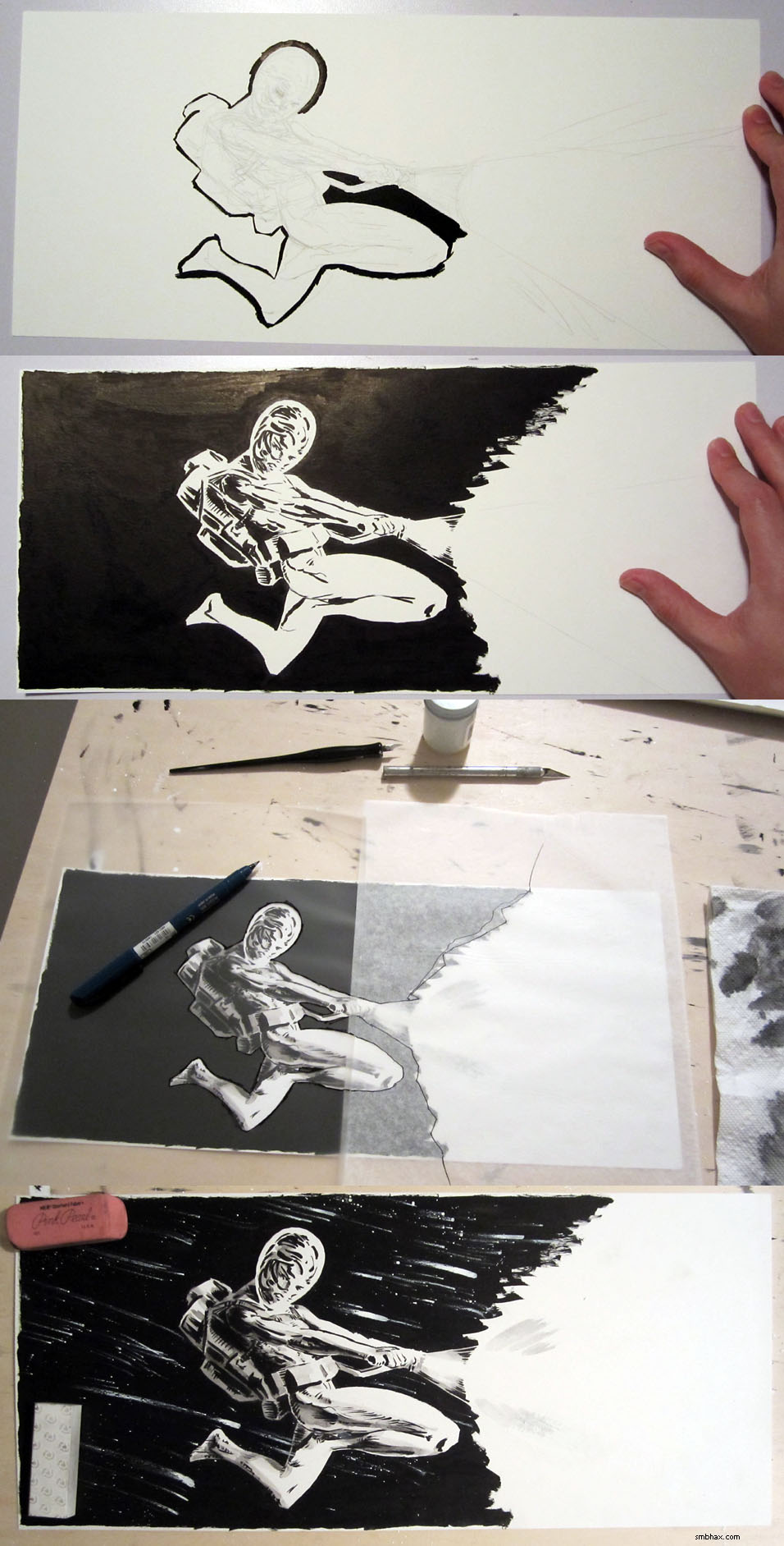
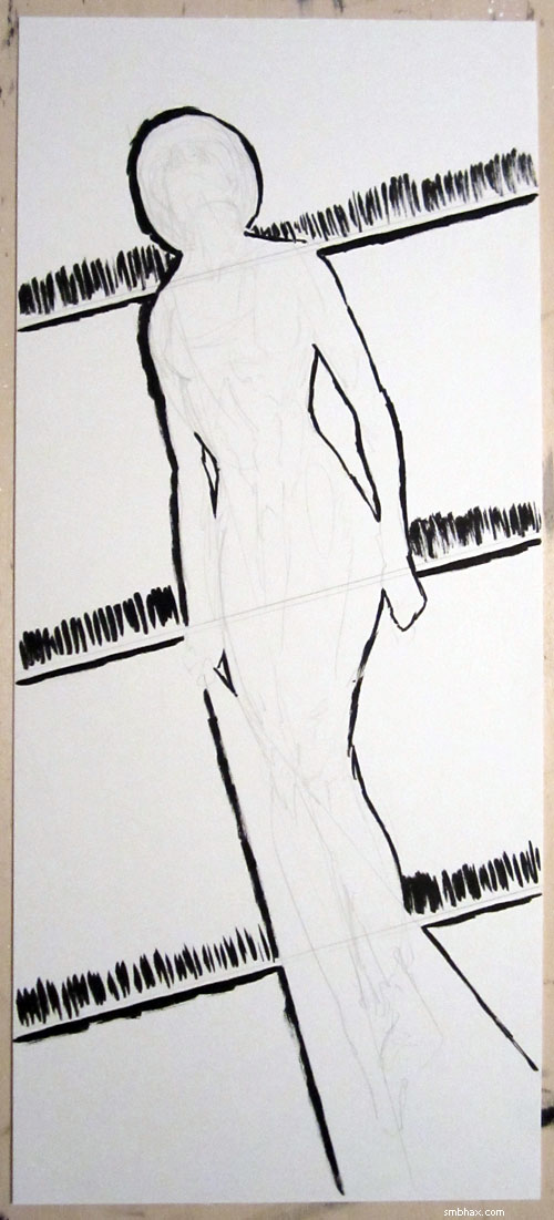
Another big milestone for me today: I caved in and have gone back the crutch of doing a layout of an A* page in pencil before starting in with ink. I stopped using pencil layouts around page 29 of episode 16, and I've had a lot of fun working only in ink, and it definitely made me learn a lot about ink handling and just how to create images out of whole cloth, as it were--I think it's helped my brush control and planning immensely--but I've also come to realize that there are things that I just won't be able to do *without* pencils--cool things like a white figure outlined in gray, as I did with Selenis' feet behind her flashlight beam in today's page 71. It's also very hard to do complex poses and angles when you can't lay them out in pencil first. So gradually I started to feel like I was getting to the point where not using pencil was holding the art back more than it was helping, and it was time to bite the lead and pick up the ol' mechanical pencil and eraser and get back to filling my old shag carpet with eraser shavings.
A test sketch I did earlier in the day pretty much cinched it: just a quick, very loose 0.5 mm pencil layout, then inked in with a Pentel Pocket Brush brush pen, and finally a bit of graphite shading added with a 2 mm lead holder. It resulted in a very nice, airy look that I realized I've been missing in the all-ink pages; working only in ink, it's hard to skip and leave gaps in your structures, so things tend--at least for me--to feel a bit too heavy and solid all the time.
I even thought maybe I could start doing shading with pencils, you know do a sort of hip multimedia approach :P, but it turned out that the pencils didn't scan very well--kind of all speckly. You can't see it too much at the size at which the A* comics appear (relative to this tiny little test sketch):
but at subscriber HD size the graphite speckliness starts to become apparent
and at larger sizes it's pretty bad--this is about 300 dpi (I scan at 1200 dpi):
which is a shame because it looks pretty good in person! But maybe it's just as well, since the pencil might smear at some point. I'll just have to stick to ink wash shading, which is fine. Anyway the ink part of the test worked well, and was of a quality I haven't been able to get working just in ink, so at that point I knew I needed to dig my old pencil out.
Thinking about that, though, reminded me that the thick handle on these big brushes I've been using lately has completely banished any of the wrist stiffness I used to get from drawing all day, and I wouldn't want to go back to my old mechanical pencil and have that problem come back. It's an old plastic one--so old any brand name it used to have has long since rubbed off, but I think maybe it's a Pentel, since it advances the lead with a nifty side button, and googling that resulted almost exclusively in Pentel models showing up, although they don't look quite like mine--which is one that I think I've had since high school, and maybe even since middle school, which would make it 20-25 years old. =o
And still going strong! But not as far as the wrist thing goes, and it seems like the like triangular grip things they used to make to stick around pencils and pens for an easier grip aren't very easy to find anymore, so I got to looking into what else I could do. As far as mechanical pencils with thick grips go, there's Paper Mate's "PhD" line, which I've seen in my local stores, but...well, I haven't used Paper Mate stuff since the old "erasable" blue pens back...uh 25 years ago, and those left kind of a bad taste in my youthful mouth. ;P And then I found out that there are things called "drafting" pencils, which are like mechanical pencils, only with longer tubes at the tip--for drawing along thick rulers, if necessary, and I think also for better visibility of what you're drawing, or at least that's a side benefit--and generally of much higher quality construction. And as it turns out, one of drafting pencils held in the very highest regard is the Japanese Platinum Pro-Use II 05 Drafting Pencil, which has a thick grip section! Sweet. So I impulsively ordered one of those and am anxiously awaiting it. There doesn't seem to be a whole lot of coverage of it on the internet--an exciting mystery! You can bet I'll go on way too long about it once I get my mitts on it.
And if it turns out not to fit my silly little hands and wrist well, I guess it'll just join all the many pens I've tried in my embarrassingly large cupboard of art supply shame. :P I can't afford a drafting pencil addiction, though, so I guess I don't need to worry about getting quite as carried away on the pencil front. Not as much as this guy, anyway--now that's an impressive mechanical pencil collection! ==ooo
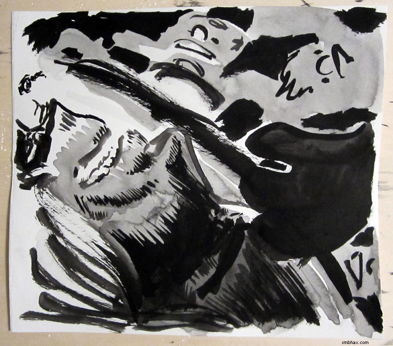
Oh yeah and here are the pencils and beginnings of inking of page 71; I'm still a bit rusty getting back into this pencil process, but I think you can definitely expect the art to pick up in terms of precision and clarity over what I was able to do with the fun and expressive but sometimes messy ink-only approach:
But I certainly don't regret trying the ink-only route; like I said, it taught me a lot, and if I can remember to keep that sense of freedom and inky expression, just guided a bit by light and loose pencil layouts, I think the art will be on a pretty good course.
~~~~~~~~
Oh yeah, I also spent way too much time this morning posting some of my favorite art by other people, and some of my own more successful efforts, on my new A* Tumblr. Some you may have seen before but some you almost certainly haven't!
|
·····
|
| |
| A*'s on Tumblr! | Aug 29, 2012 5:26 AM PDT | url |
| | |
Added 2 new A* pages:Got a lot of non-art A* stuff done over the weekend. For one thing, you can now follow A* right from the comfort of your Tumblr dashboard, because A* is on Tumblr! Or click this embiggified version of the button I squished into the social networking bar below the comic and ads:

I'm already have a lot of fun exploring and reblogging some great art posted by a few folks I've found to follow there so far. It's just nonstop stuff to stick in your eyeballs. 8o
I also worked out how to communicate with PayPal's "Instant Payment Notification" system/protocol. I needed to figure that out as the first stage of selling my original A* art through the site, because since there's only one of each, I need to be able to have PayPal tell my site when one sells, so my site can take down the For Sale sign on it. I was a little worried about it because PayPal's back end stuff is sometimes kind of kludgy, and always poorly documented, but it turns out they actually have a (poorly documented) test site for having their system bounce simulated IPN messages off your script, so that was a huge help.
And once I figured that out, I was able to make buying A* e-books and subscriptions a little snazzier: now when you buy an e-book, in addition to PayPal taking you--or sort of maybe trying to take you--to the download page in your browser, my site will automatically send you an email with the download page link in it, just in case; and when you buy a subscription, instead of having to wait a bit for me to activate it manually, it is now activated automatically! So that's fun.
|
·····
|
| |
| Neil Armstrong passes into legend | Aug 28, 2012 5:59 AM PDT | url |
| | |
Added 2 new A* pages:
image by USAF (source)
Neil Armstrong passed away over the weekend at age 82. I had difficulty getting through the article about it because I found my eyes unexpectedly welling up with tears; I hadn't realized the man and his achievement meant that much to me.
A lot of very dedicated, very talented people helped make possible the"one small step" that Armstrong took onto the surface of the Moon on July 20, 1969. But it was Armstrong--the quiet, self-described "nerdy engineer"--to whom the chance fell--whose dedication, skill, and unshakable nerve had got him there--and it was Armstrong who knew how to crystallize that unbelievably awesome moment, how to make it at once human and immortal. In the history of the human race, how many individuals have stood on the edge of eternity, knowing that their next action would forever define a point in the life of the species?
Few, I think. Very, very few. Neil Armstrong had the chance and he hit it out of the park, and that's why we remember him--why people will go on remembering him long after most other things we remember today have long since been forgotten. And even when, perhaps, his nerve finally shook a bit under the pressure of the eyes of a fifth of the human race riveted on him across the largest gulf of space our eyes had ever crossed, and he didn't quite get out all the words he meant to get out--he meant to say "one small step for A man"--it still worked out for the best.
| "Honor his example of service, accomplishment and modesty, and the next time you walk outside on a clear night and see the moon smiling down at you, think of Neil Armstrong and give him a wink." - The Armstrong family |
|
·····
|
| |
| Clarifying art, & a view of the "studio" | Aug 25, 2012 6:40 AM PDT | url |
| | |
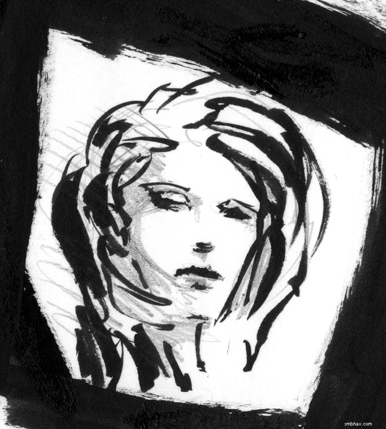
Added 1 new A* page:Well the "blocking out" of the pages in a light ink wash before going in with black ink, which I started and talked about yesterday, is leading to some interesting benefits I hadn't anticipated.
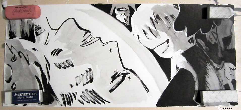
I used the usual warmup sketch to try to work out the lighting for today's page; I did block in the big shapes in a light wash beforehand, but then I did a lot of feathering and washing to try to get some kind of lighting going, which ended up like this:
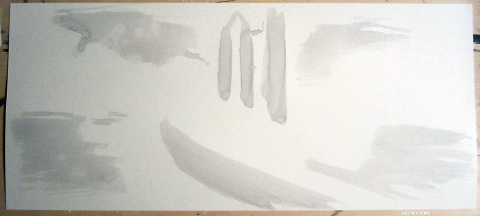
Pretty icky, in other words. Like, in a way that heavy shading could be dramatic, but even cleaned up and done carefully I think it would be hard to "read." So I thought I'd better try something different; I flipped the warmup page over and tried again:
(I had also checked out a few tricky facial features in the mirror in between to get the anatomy a little straightened out. :P And yes, I drew the faces mostly rotated upside-down from what you see here.) This simpler approach seemed to communicate the idea a lot more easily, while still giving a sense of relative lighting. Looked like a winner!
Part of what had inspired me to try that, I think, was looking up some Rip Kirby strips by Alex Raymond earlier in the evening. For instance, in this page of strips, although there's a lot of different, fairly complex locations, and a lot of characters, it's all pretty easy to take in quickly, even without any gray tones. He uses bold black masses very effectively to make sense of what might otherwise be a confusion of graceful lines. It also helps, of course, that his anatomy--minus, perhaps, the last face in the last panel--is exquisite; just look how effortlessly he appears to have done the above and behind perspectives on the men in the middle strip, for instance.
But it's also interesting to see how his Rip style progressed over the years. That strip is dated 1948; taking a look at a strip from 1954, six years later, we can see that he's gotten into even larger, bolder black masses, and reduced the backgrounds to very thin, almost sketchy lines, with a light brush of gray tone here and there. The camera seems pulled back a little more, allowing for more body language from the characters, who in their big black shapes, with intricate modeling on the side where the light is striking, really seem to pop forward.
The clarity of that '54 strip struck me, and I think some of that was behind today's second warmup drawing. But it wouldn't have been possible, really, without the "blocking out" approach I started trying yesterday--you can see where the light gray fills the face there, and that was all down on the page before I went in and delineated the edges and details of the face with black lines; just having that mass there to start with almost made the lines feel like they were drawing themselves for me. It isn't penciling, which I used to do (up through page 28 of the last episode) but dropped because, besides being messy and tedious, it was really killing the energy of my inking; I never seem to have much inspiration when I'm just going over lines I've already drawn. So with the light wash I'm just very loosely separating the page into light and dark areas, and, besides giving my inking a general frame of reference, this seems to be helping me to boil my thinking of the page down to the essentials, and to avoid, perhaps, overworking the page with too much feathering or washing, or, worse, whiteouts and revisions of badly misguided lines and shapes.
Or something. Maybe I've just been lucky on the last couple pages. ;)
~~~~~~
When I was unplugging my digital camera to photograph today's page, I noticed I was at a vantage to just about fit my tiny working space into a single frame, so I took a photo:
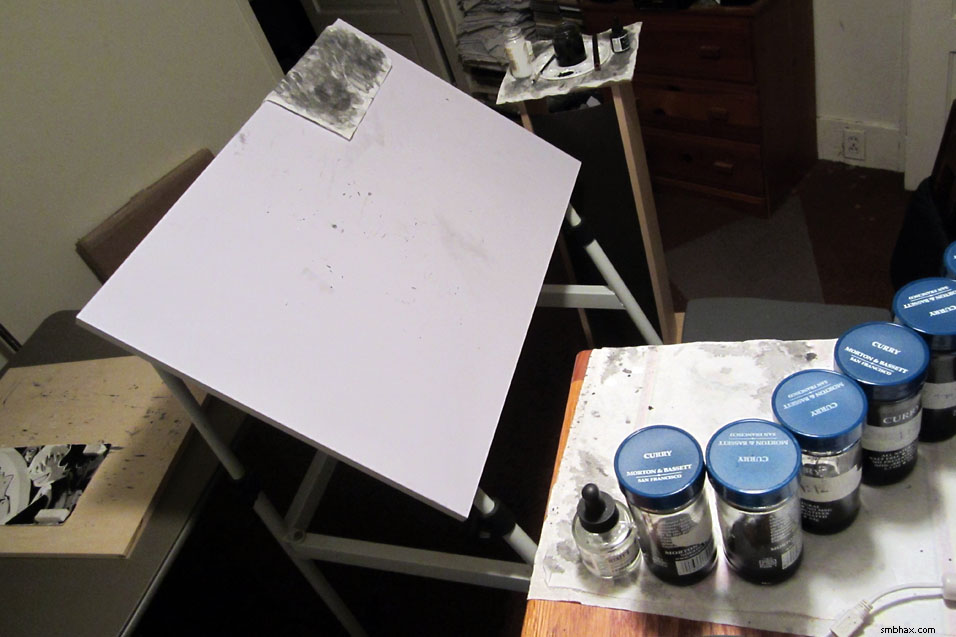
Yes, ink washes of different shades *do* come from curry. >_> The little stand on the far side of my drawing table, which is supporting my brushes and little ink palette thingy, is a wooden CD stand that I've repurposed in these days of not needing physical CDs anymore. :P The gray thingy to the left (there actually *are* a few colorful things elsewhere in my room, I swear!) is a little folding table I was fortunate to find at a good discount recently (they appear to have been discontinuing it for the same table in slightly fancier packaging, which cost twice as much :PP), and which has proven handy for all sorts of things you'd need a table for, like putting your original art on for photographing.
I've been slavishly photographing every traditionally created page I've done, in fact, because I want to include the photo of the full, actual, uncropped page for when I get a mechanism for selling my original artwork, which it's looking like I may be able to get started on this weekend. Currently there's about a half inch of space around the edges that gets cropped off for the final online page--this gives me a little leeway in deciding how to frame the image for the final version, while leaving plenty of space to avoid getting in those ragged border areas where you don't want to paint right to the edge because then you'll get ink all over your drawing table. And I've been photographing them against the backdrop of my wooden drawing board, because I think it looks kind of nice. :) Here's the one of the latest page, for instance:
So that gives an idea of the page as an actual physical object that you can't quite get from the digitally scanned, cropped, and tidied-up version--and you can see that, without the edges digitally cropped off, there's a fair deal more to each drawing than you see in the online strip. You can pull up the photo of any page by substituting "/o/" for "/d/" in the page's regular-size image URL; once I get the original-selling thing going, of course, clicking a "buy original art" link or whatever will bring the photo right up for you along with assorted information about it.
The Pink Pearl eraser is always there to illustrate scale (I would certainly never use the scratchy thing for erasing!), although it often comes in handy for holding down a rebellious page corner, too. Oh, and everything in my studio (apartment :p) is at a slightly funny angle to go with the flow of the floor, which is sloping down slightly toward one end as this old house slowly sinks into the ground. ;)
|
·····
|
| |
| Art talk: blocky lighting | Aug 24, 2012 5:57 AM PDT | url |
| | |
Added 2 new A* pages:Time once again for a self-indulgent A* art talk!
I was frustrated with the drawing of the monorail approaching the base yesterday (page 63), and after thinking about it for a while I realized that a good part of its dullness came from my not having a clear handle on the lighting for the scene; like, I had a hazy idea about this gleaming rocket lit up in the otherwise mostly dark spaceport, but I didn't really work out where the light would be coming from, how illuminated the surroundings should be, and so forth. And when I don't have a sharp idea of lighting for a drawing, that's pretty much proven to be a guarantee of generating an immensely mediocre image.
So once I remembered/realized that, I swore a bitter oath to myself that never again would I let myself go into a drawing without *some* solid idea of what the light should be doing. And I had a brainwave this morning that maybe it would help, at the start of a drawing, to block out the light and dark portions with a very rough, very light wash--in theory, this could help me go in with a better handle on the overall layout and proportion, and on the lighting.
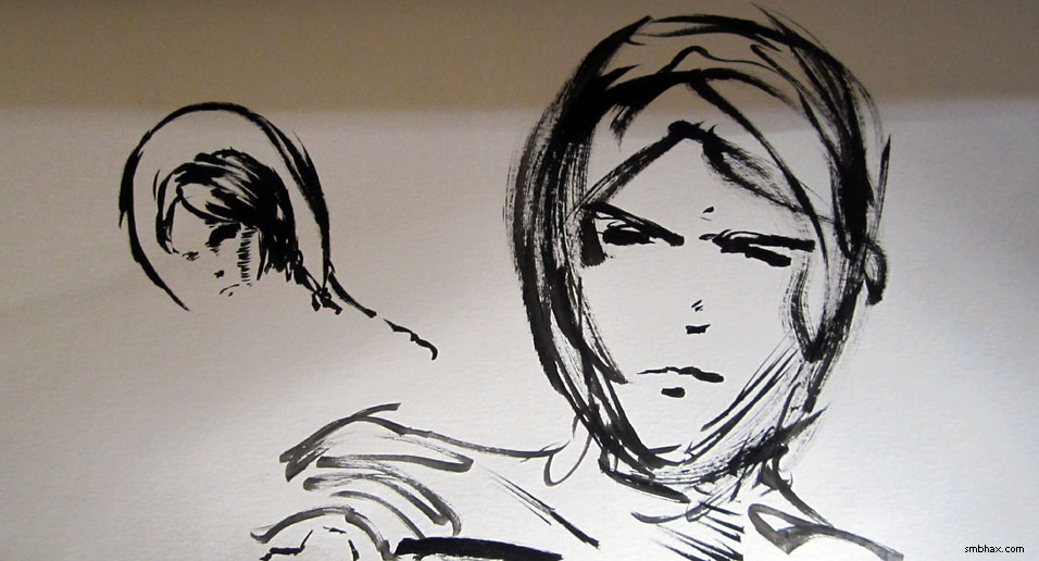
I tried it in the warmup drawing of the face on the left, and quick and blocky as it was (you can see it very faintly in a light gray on the right side of the nose and cheek, and I think under the eyebrow), it definitely seemed to help solidify the proportions:
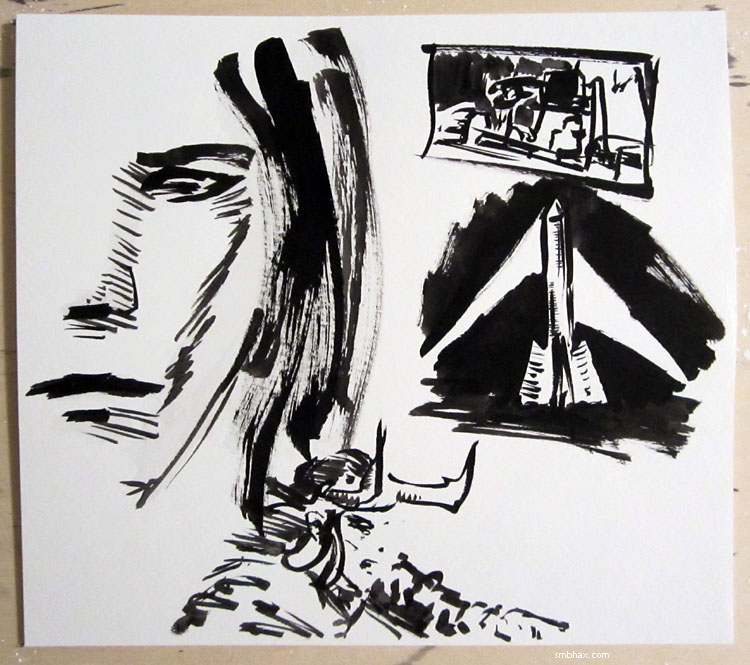
You'll notice I was also trying to work on ideas for lighting the rocket. How to lay out the page was preying even more on my mind, though: how to show the train being unloaded, and the cargo loaded into a huge rocketship, all in one panel so it's all easy to decipher at a glance. So the thumbnail in the upper right is actually the rough of the layout I ended up going with. Also, Loki seems to have slipped in there somehow. >_>
But I had the idea for the layout, so I tried blocking it in with a light wash:
I realized midway through doing that that I was making it too detailed at that stage--I should have left the crane, for instance, as simpler, stronger shapes. And I got so obsessed with the layout or something that once again I didn't really get a grip on the lighting throughout--I knew I wanted the monorail and crane-thing lit from the rocket on the far side, so they'd be mostly in shadow on our side--but once again I didn't work out how the lighting on the rocket actually worked. So it just kind of...glows? Argh. The result being another profoundly dull drawing. UGH.
Thankfully, for the next page there was a rocket launch to draw--can't really miss with a nice single-point lighting scene like that. The blocking-in was probably a little too organic and curvy, but at least I mostly remembered to keep it simple:
I would like to be able to get to the point where I can have areas of the pages that are angular, sharp, and semi-abstract, yet still communicating a clear sense of depth and lighting--rather than being sort of a bendy muddle. I think this blocking-in approach could help get me there--just gotta concentrate on keeping it clean and crisp, and definite on the lighting.
|
·····
|
| |
| Light in slo-mo: 1 trillion simulated fps | Aug 23, 2012 7:55 AM PDT | url |
| | |
Added 2 new A* pages:Was passed an interesting video on G+ today:
video on Youtube
So that's basically high-volume laser imaging, with the results being correlated together by fancy computer stuff to create a simulated video of light moving over/through objects at about 1 trillion frames per second, which is slow (fast) enough to show light pulses "moving" from one end of a soda bottle to another, for instance. Pretty neat idea. And because the computer keeps track of the time each bit of light takes to come back to the camera, it knows how far it traveled, which lets it do 3D reconstructions, even (blurrily) using light reflecting around a corner, as shown in the video.
~~~~~~~
The author of the webcomic Athra, a black and white Conan-ish adventure drawn in a neat digital scribbly style that I linked yesterday, saw that people were visiting the comic from my comic, and wrote up a nice link back. Gosh! Isn't it nice how the internet works sometimes. :) Thanks to them and of course to you lovely readers for actually following the silly links I put in this here news blog thingy.
~~~~~~~~
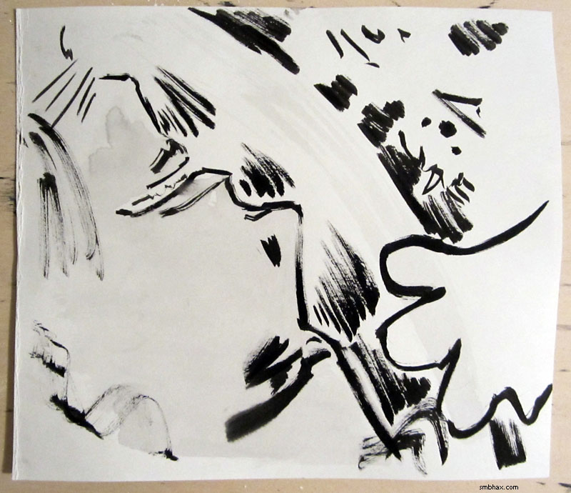
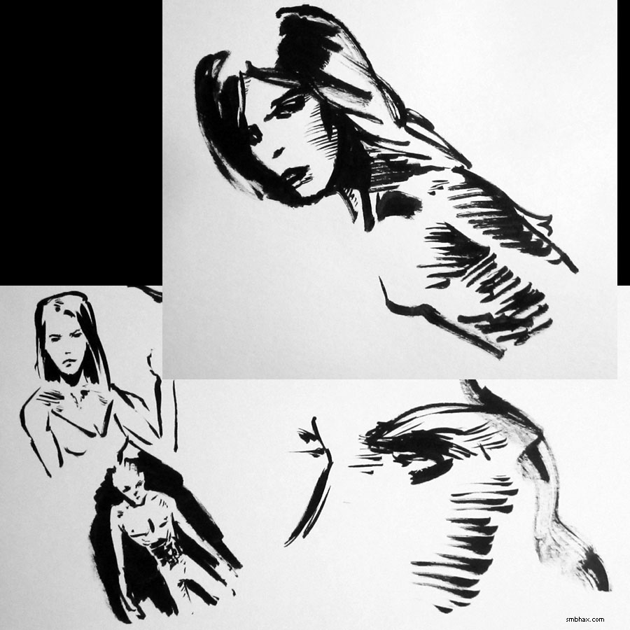
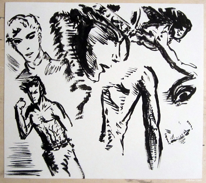
Various sketches from today--the big top one is from the back of page 63, because I screwed up the first attempt I made at it, and had some blank space left over on the page before I flipped it over to try the page again :p:
|
·····
|
| |
| Athra and affiliated art | Aug 22, 2012 7:03 AM PDT | url |
| | |
Added 2 new A* pages:Made myself banish some evil spirits with warm up drawing today:
I came across an adventure comic with interesting black and white scribbley computer art that kinda reminds me of what I was doing when I did A* in Photoshop with the Lasso Tool; the webcomic is Athra, self-described as "The Thinking Man's Conan." I'm not sure if it--or the other links I'm about to post--are entirely "work safe" all the way through, so proceed with that in mind.
Athra's author also posts quite a bit of art from other artists in each of his blog updates, and through one of those I spotted another scribbley computer artist whose stuff I rather like: Richard Anderson, whose site is flaptraps art. Actually the stuff I like most there is the distinctly not-safe-for-work black and white series in the "personal" gallery. I wish I wish I could keep that kind of liquidity and looseness in these A* pages but I only seem to get a bit of it here and there. Still trying to work out how to do that in ink I guess.
And also through Athra (eyyy) I came across the perhaps discontinued "blaxploitation" webcomic World of Hurt, which has an inky black and white style that is very reminiscent of the great adventure strips of the past. Lots of nice brushiness there.
|
·····
|
| |
| Haircuts and other practical space concerns | Aug 21, 2012 6:51 AM PDT | url |
| | |
Added 2 new A* pages:There was an excellent point made on the forum about long loose hair and sealed space helmets not mixing. So yes, please do not let your hair roam wild when donning a space suit! Also you probably don't want to wear a transparent helmet in deep space, either--unless, like Selenis, multiple lifetimes of cloning have made you somewhat careless of long-term (or even medium-term) health concerns.
I'm glad to have people point these things out because they're interesting (for me, anyway!) to discuss, and because at some point I'm sure I'm going to make boo-boos that I don't realize that I will really want to know about--after a healthy amount of self-flagellation and hair-pulling, of course. :D
Some things though I will confess are semi-conscious "aesthetic" decisions, which is to say that it's just more fun to draw things that way. Like crazy space hair. Actually I'd forgotten, but one of the more successful A* drawings I've done, I think, was a space hair one from early in episode 14:
A non-A* reader actually bought the framed original of that page at my art show this summer! So you see, it must be in my economic self-interest to draw more crazy space hair. Yes. >_>
Oh yeah, and do you remember where we saw "Earth Boy" before? Maybe (semi-answer-spoiler-->) at the beginning of this episode? And now we've got a whole train-load of 'em, dear me.
|
·····
|
| |
| Flight of the Mighty Eagle! | Aug 18, 2012 8:03 AM PDT | url |
| | |
Added 1 new A* page:Last update in which I'll spam you with these--thanks to everyone who's tried one or both of A*'s new subscription and e-book features out so far this week! :)


~~~~~~
NASA's experimental Morpheus lander may have crashed and burned spectacularly a week ago, but NASA has just released footage showing a successful rather than catastrophic first untethered test of another experimental lander, the Mighty Eagle, which actually took place a few days before. It's a short and quite unspectacular test flight--or test hover, perhaps I should say--but that's probably exactly what they were hoping for.
~~~~~~~
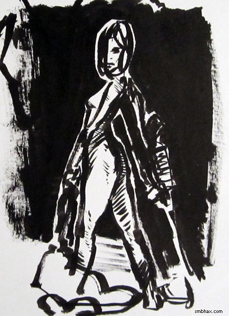
Warmup sketch--mouth got away from me a bit:
And I probably should'a tried experimenting with the upcoming page layout a bit in the warmup, because my first tries at the actual page showed I had no idea of how to execute the thought I'd had in my head. I flailed around with it multiple times until for some reason one of the sketches twisted around like this
and I finally felt like I was onto something. Although after finishing the page and having some trouble with the final touch ups, I'm now finally convinced the tip of this latest Haboku brush is already toast--that'd be about thirteen pages it go through; it was going great, actually, but then there were two days in which it lost a bristle each day, and I guess those two bristles must have been fairly crucial tip bristles, because since then it just hasn't held a point at all. Sooo yeah these things are fun but not so well put together!
|
·····
|
| |
| The new massivest supermassive: Phoenix | Aug 17, 2012 6:49 AM PDT | url |
| | |
Added 1 new A* page:Yeah I had to stop at one page today to stop sunlight from completely lapping me. :P Darn Sun!
~~~~~~~~
I've been bugging people about A*'s brand new subscription and e-book features all week, and I'm not about to quit here on the home stretch! :D
~~~~~~~~
It was just announced that scientists at the Chandra, South Pole, and other observatories have discovered one of the largest galactic clusters known: the Phoenix Cluster weighs in at maybe somewhere around 2 quadrillion (that's the one above "trillion"--10^15) solar masses.
The announcement article is pretty interesting for its discussion of the structure and theorized processes powering galactic clusters. The Phoenix Cluster has thrown a wrench in the works of an existing theory of how galactic clusters work, because while the huge cloud of hot gas inside it--which like in most galactic clusters contains more mass than the galaxies themselves--is cooling, the center of the cluster is also undergoing a very heavy starburst event, with loads of new stars being created.
It *had* been thought that for major star growth, a galactic cluster was powered by energy from jets shooting out of its central supermassive black hole; this is the case in the Perseus Cluster. But the Phoenix doesn't show signs of active jets--and yet it birthed an estimated 740 solar masses worth of new stars in the past year, which is 20 times the current estimated growth rate of Perseus. So Phoenix, whose central supermassive black hole isn't shooting out jets or huge bubbles of relativistic plasma like Perseus is, and is actually undergoing cooling of its gas at a record rate, is still putting out more X-rays than any of what would normally be considered more "active" clusters, and is growing more stars.
AND its central supermassive black hole, which is already a record 20 billion solar masses (that's about 5,000 times as massive as our own galaxy's supermassive black hole Sgr A*, and 2 billion more than the previous estimated record holder, OJ 287), is growing at the rate of about 60 solar masses per year.
Pretty exciting stuff on the supermassive black hole scene! Scientists will have to come up with some new theories to explain what exactly is going on there.
There doesn't seem to be a great photo of the Phoenix Cluster (just a tiny and quite nondescript one in the announcement article--not too impressive for a cluster that's supposed to be 7.3 million light years across, but then again it is about 5.7 billion light years away), but there are some pretty good ones from the merely 237 million light-years distant Perseus Cluster, whose X-ray emission, the strongest we receive from any galactic cluster, was first detected back in 1970. You can see its central "bubbles" of plasma blown outwards by jets from its supermassive black hole because the superheated molecules in them shine brightly in X-rays picked up by Chandra:
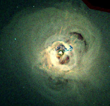
image by NASA/CXC/IoA/A.Fabian et al. (source)
The galaxy at Perseus' center is NGC 1275, also known as Perseus A, which is being spun out into incredibly long filaments of gas by the supermassive black hole's jets: "The amount of gas contained in a typical thread is approximately one million times the mass of our own Sun. They are only 200 light-years wide, are often very straight, and extend for up to 20,000 light-years." The threads are "much cooler" than the hot gas cloud around them, which is something of a puzzle: why haven't they heated up, or collapsed to form stars?
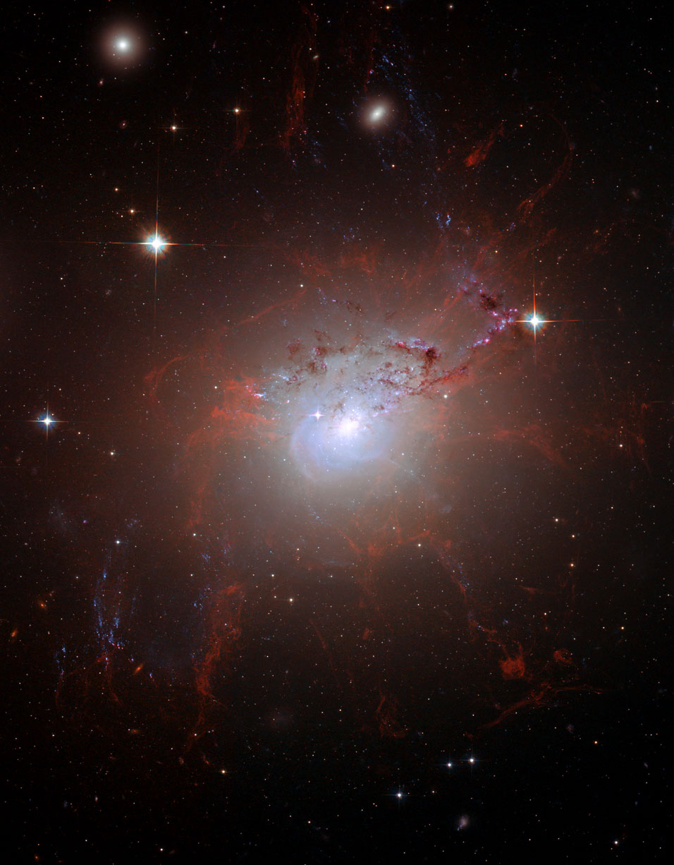
image by NASA, ESA, and the Hubble Heritage (STScI/AURA)-ESA/Hubble Collaboration (source)
~~~~~~~~
Hey if you wanted to make a graphic that's as big as the radius of the solar system, at say 72 dpi, your image would only have to be about 60,207,906,528,000,000 pixels high!
~~~~~~~~
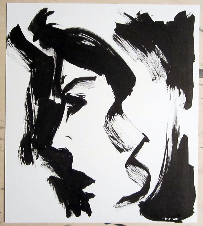
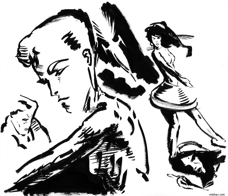
And you can't escape without seeing today's hideous bunch of warmup sketches!
|
·····
|
| |
| Subscriptions, e-books, doodles | Aug 16, 2012 8:37 AM PDT | url |
| | |
Added 2 new A* pages:
Yep A* now has subscriptions and e-books, check 'em out if you haven't already! :)
Ugh late/early again. :P I spent some warmup drawing time figuring out the design for that little gun thingy she pulled out today
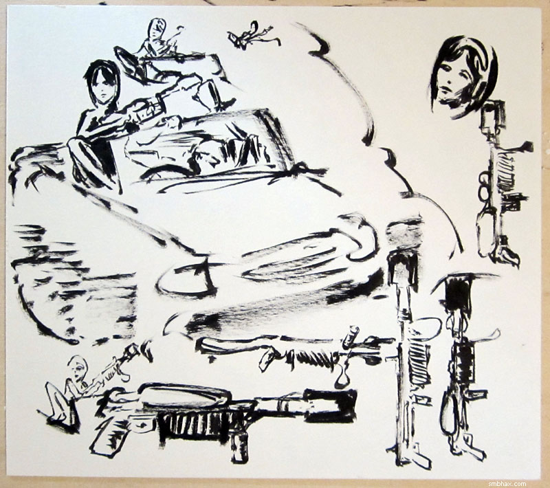
The first ideas there were to have it be gas-powered, but then I realized that was silly; explosion-powered is always better! Then the other tricky part was where to fit in the second handle--eventually had to go with it sticking out the side.
The first try at page 55 (this is on the back of the final page 55) was coming out pretty fuzzy:
I *sort* of liked the angle of the upper body, which was kind of close to what I'd been picturing in my head, but it's one of those cases where when you try to work it all out you realize the picture in your head didn't quite take some things into account, like how to fit the rest of the stuff in so it's readable. :P Oh and like how I'd already had to turn her around because she fires with the right hand, not the left.
|
·····
|
| |
| 1,681 pages of A*: the SUPER EXPRESS PACK! | Aug 15, 2012 8:17 AM PDT | url |
| | |
Added 2 new A* pages:
Check out the new A* subscriptions and e-books if you haven't already! :)
And there's a new e-book download option: right at the top of the episode list you'll see the A* SUPER EXPRESS PACK! This was after the request of a subscriber who was asking if there was a way to download all the episodes at once--well, now there is! The SEP is at a fixed price, rather than donationware like the individual episodes--because if I'm gonna let people pull a 100+ MB file off my site that easily, I guess I'd better make sure my bandwidth costs are at least covered; at $20 it's $3 less than the suggested donations for the individual episodes put together. For that bread you get a .zip file with all the .pdf episode e-books in it: 1,681 pages of A* in a single download!
~~~~~~~
Someone put together a pretty cool 360-degree panning panorama (is that redundant?) of the view from the Curiosity rover on Mars. It's a little chuggy on my aging computer, but still pretty neat.
~~~~~~~
I didn't have time to do proper warmup sketches today, but maybe these aborted attempts at starting page 51 will serve--photographed in the bluish rays of the sun rising through my kitchen window...hm maybe I should go to bed! :P
|
·····
|
| |
| A* subscriptions & e-books are here! | Aug 14, 2012 7:38 AM PDT | url |
| | |
Added 2 new A* pages:
Yep, A* subscriptions and e-books are now here! You'll notice the prices are lower than the ones I'd mentioned during earlier planning phases, too:- An annual A* subscription is just $10. Yep, for just ten clams you can read the site's comics ad-free, and in high-definition if you want, for a whole year. Plus, during that year, you'll always be able to download the latest completed episode e-book for free.
- The e-books for each episode, instead of having fixed prices, are donationware, which means you can pay whatever you want to download them!
So check those out. :) And whether or not you decide they're up your alley, thanks for reading and supporting the comic!
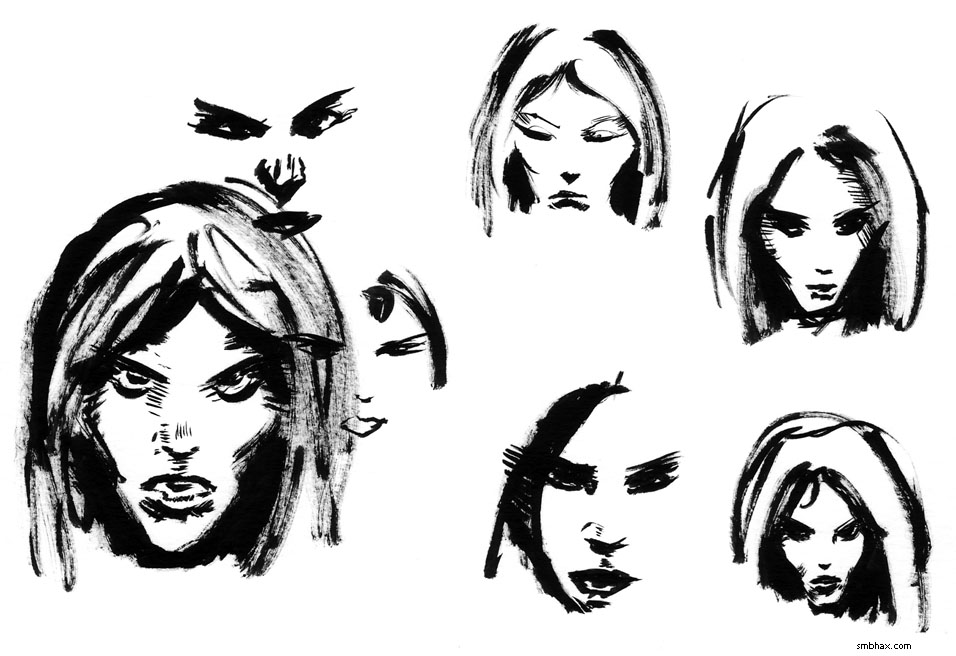
I'm gonna leave that painted, clickable title thing ^ at the top of my news articles for a few days, I think--can you tell I'd really like everyone to give those new site features a look? :D Here's the rest of the warmup sketchery I did today:
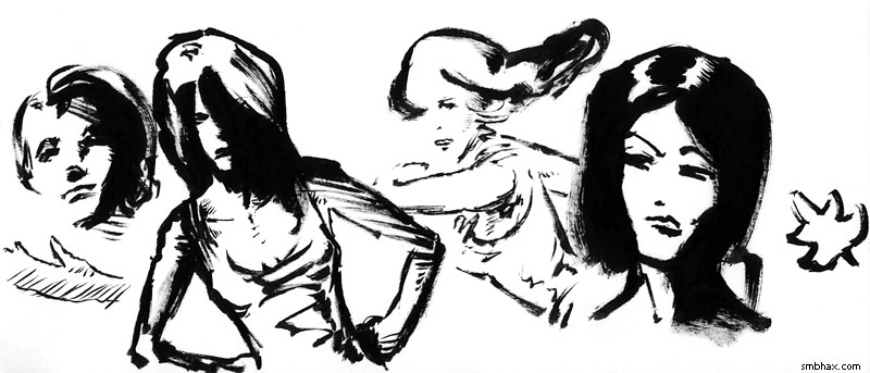
The first page still came out kinda stiff (I need to watch my urge to do all these straight-on face close-ups--that pose doesn't allow for much wiggle room!), but I seem to have loosened up a bit by the second page. I kinda like the breezy look of the third figure in the sketches, too.
Oh and who wants less talk and more action for a while? 'Cause that's what's happening starting tomorrow!
|
·····
|
| |
| The Comics Journal's 1994 Frazetta interview | Aug 11, 2012 6:30 AM PDT | url |
| | |
Added 1 new A* page:Remember that I'm rolling out the A* subscription and e-book stuff this weekend, which involves quite a few changes to the sorta back-endish stuff on the site, so if you stop by Saturday or Sunday and things are a little weird, that's just...the magic happening. >_> I'll definitely have it all sorted out and running smoothly by Monday! Check out the new stuff once it's up--there will be "episodes & e-books" and "subscriber" links in the site's top menu. I hope you'll like it!
~~~~~~~
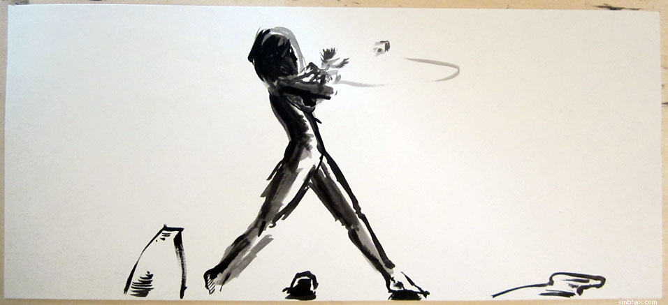
I had a purpose with today's warmup drawings, which was figuring out if I wanted to have the doctor facing us for page 49, or turned somehow; and, if facing, whether she should be kind of enthused or gloating a bit, or not:
The left one with her having her head turned to the left, and we're seeing her from behind mostly in shadow, seemed like the way to go, although I kept trying a few more front-facing options just to make sure.
When I started drawing the full-size page, starting with the border of the top of her head, I realized I'd drawn it way too zoomed-in to fit in her chin, to say nothing of her shoulders, but...that seemed to work out anyway. It wasn't until the page was all done and I was going to clean off my brushes and jars that I realized I hadn't even used any white ink (to fix stuff, generally ;)--first time that's happened in a while!
~~~~~~~~
The Comics Journal printed a very long interview with illustrator Frank Frazetta in 1994; they've reproduced it online right here, and if you're at all interested in Frazetta as an artist, or even just the art of illustration in the period in which he worked, which started in the '40s and went right up to his death in 2010--although health problems did slow his output significantly in recent decades--then I think you'll find it an interesting read; I realize now I've seen passages of it quoted in a lot of things, like the Frazetta art books I have, but I'd never seen the whole (huge) thing, and it sure covers a lot of ground: his early days as a staff cartoonist on Li'l Abner, his street tough days in Brooklyn, his admiration of the work of Jack Kirby and Richard Nixon, and...just about everything else. Frazetta certainly drinks his own Kool-Aid to an extent, but the guy was a deserving rock star of illustration, and his uncompromising views certainly make for an interesting interview.
There's the famous story (told by him, I mean) of how he was told to learn anatomy, and given two books on the subject to study, and he brought them back the next day, saying he didn't need them anymore--he'd copied every drawing in them overnight. That sounds like a stretch but there's no doubting that he learned his anatomy, so who's to say he *didn't* copy them completely in one evening? One of the books was George Bridgeman's Constructive Anatomy, which seems to have been copied all over the internet--there's a pretty good .pdf version you can download here, for instance. I like it! You can certainly see where some of Frazetta's craggy physicality came from in the rugged drawings of arm and leg muscles, in particular.
Bridgeman isn't big on some areas in that volume, like faces, but the other one, Victor Perard's Anatomy and Drawing, covers a lot of areas Bridgeman doesn't. That book doesn't seem to be quite as public domain-y as Bridgeman's, so it's a bit harder to find, but here's one online version. I'm not as keen on the less dynamic style, but it is clearer on things like the skeleton, and a more moderate type of figure.
Around page 3 of the interview, Frazetta gets to talking about his favorite illustrators, and Hal Foster of Prince Valiant is high on his list. Now, I saw plenty of Prince Valiant in the Sunday funnies as a kid, and was never really impressed, but that wasn't Foster's work--he stopped drawing it in 1975 due to arthritis (he'd started it in '37!!). So I had to look up some of his work, of course, and it really is beautiful--such elegant linework and detail. There's a gallery with some pretty detailed scans of his work (aside from the silly artificial paper texture under them; click on the thumbnails to zoom in) over here.
Oh and I found some great photos of Foster at work. He worked huge! It's a *single strip* he's working over here. :O Man I wish I had a scanner or whatever that large so I would work that big. Here's a closer view of him drawing, using a model ship as reference, and here's a nice (almost certainly staged :D) shot of an older Foster kicking back, another huge strip complete on his drawing board.
I did find it interesting though that Frazetta rated Foster's work as more dynamic than Alex Raymond of Flash Gordon fame--I wonder how much Frazetta was thinking of Raymond's Flash artwork--which did focus more on pretty curving lines than really strong impact action--vs Raymond's later Rip Kirby strip, which for my money exhibits some of the most stylish and powerful strip artwork ever created; check out the Rip panel reproduced a few paragraphs down this page, for instance. Stupendous! (And coincidentally, the head isn't all that dissimilar to the layout I needed for today's A* page! I came across it after I'd done the warmups, but before I did the final page.)
As for Frazetta's own work, there's a nice gallery here that shows a lot of the stuff he did, not just his later Conan paintings; personally I much prefer his earlier ink and watercolor work; just check out the rendering of the women's knees under the table in the top middle illustration for "The Night They Raided Minsky's" on that page, for instance--now that's the stuff! Frazetta was really, really good as an inker; it's interesting, for instance, to see him ink someone else's work, as he did over Al Williamson's pencils in this "Space Heroes" plate, for instance; note the big brushy passage under the guy's arm, and the inky splashes on the right and left sides of the drawing. Neat! In the interview, Frazetta even says that he did let his inking deteriorate a bit through disuse in later years, as he focused more on higher-pay painting; he mentions this 1955 Buck Rogers cover for Weird Science magazine, issue 29, as the pinnacle of his inking technique--it isn't really my favorite of his stuff by a long shot, but it's certainly a tour-de-force of inking.
At another point in the interview he's talking about drawing muscles, and what makes a figure look powerful--how it's more triceps than biceps, for instance, and keeping the muscles tight and compact, rather than blown out like body builders. His A Fighting Man of Mars ink wash is certainly a prime example of those ideas in action! I've linked that one before, but I just like it. :)
|
·····
|
| |
| The fiery death of Morpheus; more warmups | Aug 10, 2012 6:27 AM PDT | url |
| | |
Added 2 new A* pages:NASA nailed their big Mars rover landing at the beginning of the week, but as if to show that things don't always go so swimmingly, today their unmanned Morpheus test lander crashed and burned (and exploded) in its first attempt at free flight:
video on Youtube
Now it's easy to say this in hindsight, but maybe a single thin central thruster on a wide platform--while no doubt efficient--is kind of inherently unstable? Might be back to the drawing board for that one.
~~~~~~
More awful warmup doodling:
|
·····
|
| |
| Subscriptions & e-books next week; doodle+ | Aug 09, 2012 7:15 AM PDT | url |
| | |
Added 2 new A* pages:Over this past weekend, somewhat to my surprise, I got A*'s subscription mode AND the digital download e-book thing all done, so I'll be trying to roll both of those out over this coming weekend--so if you're watching then, you may see some weirdness for a bit. But never fear! I'll probably get it all sorted out before Monday. >_>
What this means is that starting next week you'll be able to purchase a one-year subscription to A* that gives you the comic ad-free, and automatically at the size of your choosing: regular or HD. Oh and subscribers also get to download the most recent episode e-book (episode 16, currently) for free, so subscribers will get that, too. And all completed A* episodes will be available for purchase as downloadable, .pdf e-books; the ones of recent episodes--the hand-painted ink stuff--will be in high-definition. (Like episode 14, which I'm giving out for free! Well so I guess technically that one won't be available for purchase. ;) But you can download it directly from this link (.pdf, 2.31 MB), which I've been passing around for the past week or so.)
The site's top menu will change slightly, and there will be a few small things rearranged in the widget bar beneath the comics. The site's front page will actually be dynamic, rather than a pre-generated static .html file--which doesn't really mean much in practical reader terms, but excites me because I've never done that before. :D Oh, also the addresses of all the comic pages will change to a new, shorter format--if you happen to find an old address laying around somewhere, it should redirect to the same page in the new URL scheme pretty much transparently.
Since I managed a halfway decent page today with page 46, I'm ending the "subscription preview mode" with that page (it started way back with episode 13, page 136!); from here on out, new HD-sized pages will go to cryptic pathways that only the subscribers' version of the comic browser will take them to. I'm such a meanie! D: But I certainly hope some of you will be inspired to support the comic by getting the subscription and its goodies, and/or some of the episodes as e-books that you can read offline on just about any remotely smart device. (I don't have any smart devices myself--except this computer--but all my friends--who are cooler and more "with it" than I--seem to. Hm maybe I'll be able to get one of them to let me see what one of these A* e-book thingies actually looks like on their smarty things!)
All the high-def comics in the "preview" section--episode 13, page 136 through episode 17, page 46--will remain accessible in their ad-free, giant form, so if you've got a 1080p or larger screen, go to one of those and click the "subscription mode preview" link at the lower-right corner of the regular-size comic page to see what the super-sized (and ad-free) pages look like, if you haven't given that a shot yet.
~~~~~~~~~~
I've talked about how I should do it, but today I finally did--did some warmup sketching before starting in on an actual A* page. It was handy for page 45 there--I used it to work out the pose/perspective of that Selenis close-up. The close-ups still aren't coming out quite as I'd like, usually, but I'm hoping that if I can get into this warmup loose sketching, I'll be able to start transferring more of that style into the larger-format drawings. Anyway here are the pre-page 45 sketches in all their uncensored roughness:
Hm now I notice that the ones where I didn't sketch the hole head shape first didn't do very well! I actually *did* do the whole head shape first for the full size page, which I think helped.
I didn't intend to do practice sketches for page 46--this paper doesn't grow on trees, after all! or eh well money for it doesn't :P--but the first attempt at the figure didn't go too well, the second had some possibilities but also some rough parts, and the third and fourth were pretty tragic; I'd ended up just doing these side-by-side on the full-size piece of paper originally intended for the A* comic, and a fifth on the flip side was no better, so I came back and ended up polishing up the second attempt, and turning the first, third, and fourth into trees. Yay recycling!
|
·····
|
| |
| Some brush tips! | Aug 08, 2012 6:33 AM PDT | url |
| | |
Added 1 new A* page:One of these days I'll remember to stop making myself do tricky close-up facial perspectives. ... One of these days. :P
~~~~~~~
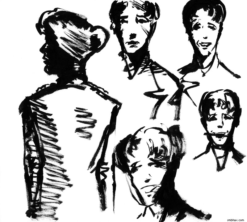
Got a three replacement brushes today although I'm not sure the tip on this first one I opened is much good to start with. Then again it didn't lose any bristles on this first day as far as I saw, whereas the last one lost a good half-dozen. Hm. Maybe I should just stop worrying about it. :P Not likely!
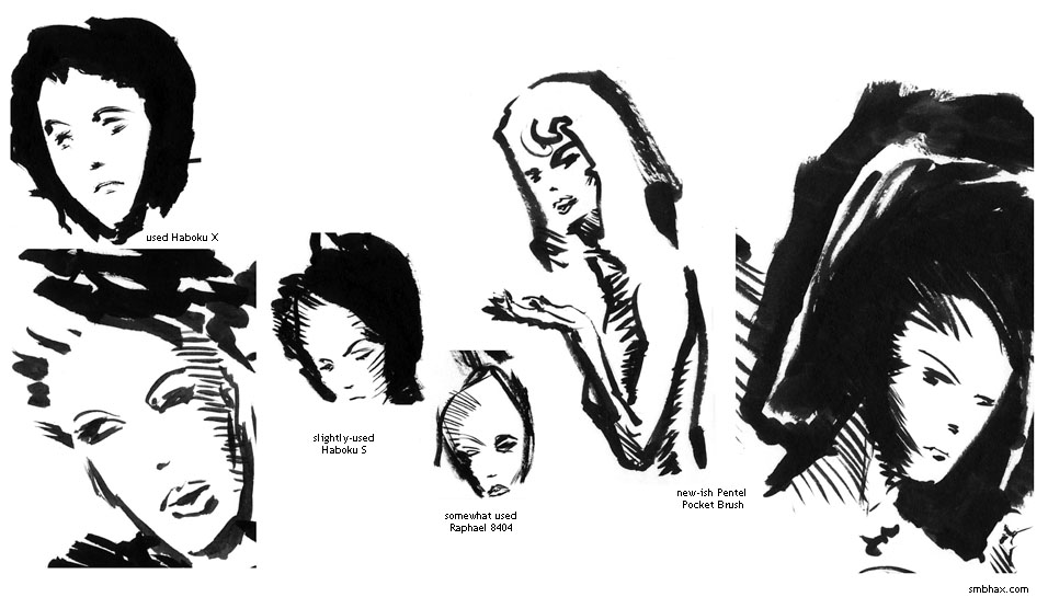
Below are some of the least disastrous doodles I did yesterday while comparing brush tips: it's old Haboku X on the left two, slightly used Haboku S to the right of those, somewhat used sable brush (Raphael 8404 size 4) next, and seldom-used and still minty Pentel Pocket Brush from there on out; these are all shown at their correct relative sizes, so you can see for instance how the inward-pointing nylon tip of the PPB can do surprisingly fine lines for a synthetic, but it can't beat the sable brush for sheer needle-like point--and how the beat-up Haboku X couldn't do fine lines at all, except where it split and gave a fine split-line. :P
Oh yeah, one other thing I was trying to experiment with on most of those heads was with drawing the head shape first, then filling in the features--instead of the habit I've gotten into with the full-size A* pages, where I've been drawing the facial features individually--almost always starting with the eyes--then gradually filling in the head around them; that's great and all but it's hard to keep the head proportion and angle right that way, so I should really stop doing it...although I totally forgot and did it anyway with today's page, which could probably really have used the other approach. But I think its scarier to think about starting with the whole head shape when working at like full page size, or something. Still, I think I'd better knuckle down and start doing it.
|
·····
|
| |
| Curiosity...is alive! And on Mars. | Aug 07, 2012 6:21 AM PDT | url |
| | |
Added 2 new A* pages:NASA's big Curiosity rover just landed safely on Mars—and I'll admit their big sort of anti-PR campaign about the landing being "7 minutes of terror," and making signs showing bad track record of human missions to Mars (although the Soviet Union kind of brought the average down :P) did manage to make me a bit worried that their $2.5 billion science project might end up spread across a Martian mountain range or something—so easily manipulated am I!—but nope, apparently a pretty much perfect landing, and now...a few weeks of testing to make sure everything is working right. HUM. Then it begins its two-year trek up the 3-mile-high mountain—"Mount Sharp"—looming over its landing position
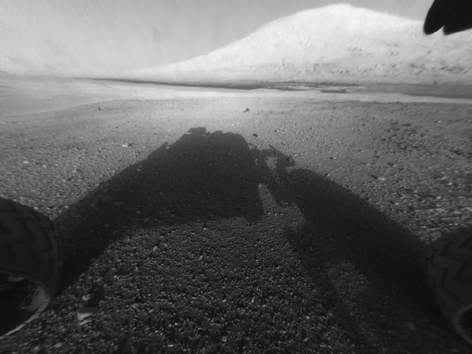
image by NASA/JPL-Caltech (source)
to look for the possibility of ancient Martians. NASA managed to get a glimpse of the parachute stage of the rover's descent to the surface from their Mars Reconnaissance Orbiter, which was overhead:
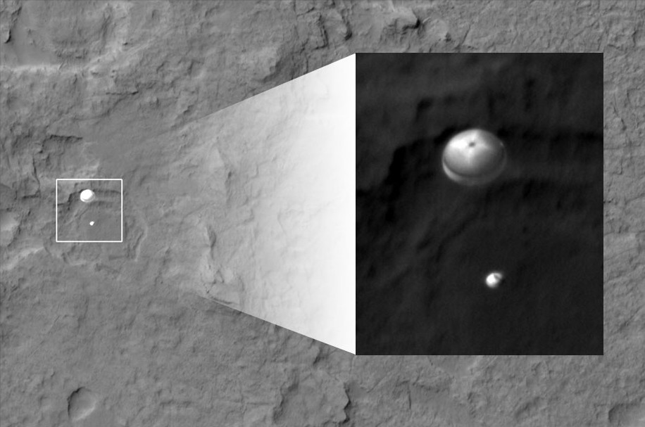
image by NASA/JPL-Caltech/Univ. of Arizona (source)
(Later they also spotted a tiny dot that they think was the rover's ejected, falling heat shield in a distant, cropped part of this photo.)
The rover took a series of photos during its decent, some of which have been stitched together into a really grainy video of the landing. All of the rover's early images have been low-resolution things; supposedly some were compressed before sending due to the bandwidth limitation it has of getting info back to Earth, and higher-resolution versions will be trickling in later, especially once the rover breaks out its more powerful cameras—I read somewhere earlier today that it has...eh...I think it was something like a total of 22 cameras on it. Or was it 16? Oh wait, Wikipedia says it's 17. See if you can sort them all out from this NASA article/diagram!
One diagram I thought was kinda nifty was this:
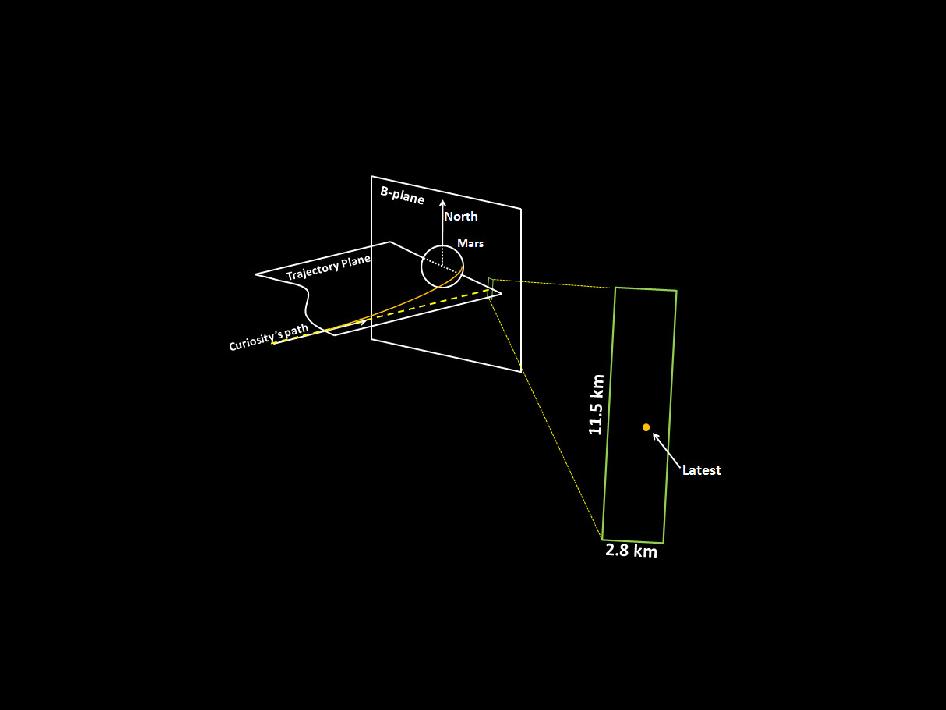
image by NASA/JPL-Caltech (source)
I'm sure it's highly simplified from what the navigators are actually looking at, but it kinda shows how, since they've calculated the pull the planet's gravity will have on the craft very precisely, while getting there they just have to make sure it's aimed at the right "window" in space before the gravity hooks it and starts pulling it down. Or maybe I'm totally misinterpreting that. :P
And finally, this artist's concept of the rover using its laser for spectrometry (the laser is actually invisible, and just creates a tiny light flash on the target that's read by sensors, which can tell from the specific wavelengths of light released what elements were in the object struck)
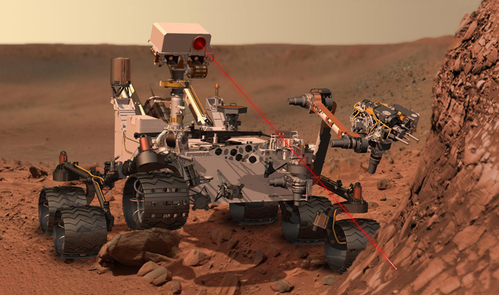
image by NASA/JPL (source)
looked awfully familiar. Hmmmm.... Oh yeah, it's because we saw it in 1986!
:o (And oh man, of course even that movie is in the works for a remake/reboot, according to that Wikipedia page. ;P Maybe they can get Curiosity to star!)
~~~~~~
Boy the tip of my big Haboku X brush is really aced—that probably wasn't helping the struggles I was having with the last two close-ups of Selenis' face. I guess it lasted about 15 pages before starting to get ragged, which isn't great as far as brush longevity goes—I was getting at least 20 out of my dinky sable brushes, although those were a good deal more expensive. Hopefully the local art supply store keeps up a good stock of these Habokus, and at the same discount price! I dunno if I can even go back to smaller style brushes anyway, because it turns out that the nice thick handle of the Haboku (especially the X size) is great in terms of grip ergonomics—the occasional wrist soreness I would get after a day of drawing quietly vanished once I started using it. :D And I would get that and/or forearm aches if I wasn't *exactly* positioned with my elbow and wrist flat on the drawing table with other brushes, which was a real chore both for my back and because it's harder for me to draw when I'm hunkered down over the paper like that—I can't really see the whole composition as a single unit when I'm forced that close to it. But the Haboku X has been perfectly comfy to use from any angle and position!
|
·····
|
| |
| O man it's the weekend; also download this | Aug 04, 2012 8:08 AM PDT | url |
| | |
Added 1 new A* page:Whew this was one of those evenings where I'm up all night working on the page, I think I've got it, and then it turns into mush, the sun came up hours ago, and I still need a page, so I rip through a ton of ink and paper trying to find something that works. I dunno if this worked out for the better or not, but it's what I got!
~~~~~
I'll be working away on wrapping up the digital downloads and subscriptions systems over the weekend; should just be a few more solid weekends of work to get those ready to go, I think. If you missed it earlier in the week, you can download the "e-book" version of A* episode 14 right here (.pdf, 2.31 MB) for free. That's just to get you hooked, of course. :D The other (much longer) episodes will cost a little something to download, and then I'll be able to make my getaway to Mexico, yay! >_> :D
|
·····
|
| |
| Float like a pen, sting like a robo-bee | Aug 03, 2012 6:03 AM PDT | url |
| | |
Added 2 new A* pages:I came across a fan-made trailer for the movie version of 2001: A Space Odyssey--the trailer wasn't very good, but it had a clip in it that makes me wonder if my subconscious got the floating pen scene at the beginning of A* episode 3 (actually you can really only see it in the original animated version) from 2001; I don't remember that movie very well, and I don't remember this scene at all--not consciously, anyway, but:
video on Youtube
And huzzah for Strauss' The Blue Danube playing in the background! I always liked that tune, ever since it was the docking music in the old space trading game "Elite." :)
~~~~~~~~~
I was poking around comixology.com, a site where I'd heard you can buy and read digital versions of current print comic books or something, and I noticed that they offer some of their collection for free. Not the cream of the crop, I suppose (most comic issues there seem to cost a couple bucks), but if you look through their most popular free digital comic books you might find something that interests you; for me it was Detective Comics #27, featuring a Batman story (or rather, a "The Bat-Man" story) from 1939! His costume's bat ears are really wide! Anyway I thought that was neat. You don't actually get to download the digital comics you "buy"--you have to read them online through comiXology's reader--but still it's a pretty slick operation, and I have to say I'm kind of floored that they have complete back-issue collections of comic series going all the way back to at least the Golden Age.
~~~~~~~~~
Right up until today I'd planned to have this little robo-bee of Selenis' land on the back of the bioarchivist's neck, rather than in her ear; I noticed that a practice sketch I did of it (I was having some trouble getting it to come out :P) did make it look like the flight path terminated in her ear, and I told myself to watch that when trying the final version...and yet it still happened. I left it, figuring it was close enough to neck area that I could get away with showing it on the back of her neck later, but then a couple readers asked me if it went into her ear...and when I got to thinking about it, it does work better that way anyway, since she's supposed to be hearing Selenis talking to her through a tiny speaker on the bee. So in the ear it is!
|
·····
|
| |
| The Tarantula Hawks and the Bees | Aug 02, 2012 3:56 AM PDT | url |
| | |
Added 2 new A* pages:In looking for reference photos of bees (apis mellifera, the "European honey bee," specifically), I found some pretty neat ones on Wikipedia:
Who knew bees were this fuzzy?
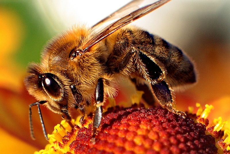
image by Maciek mono (source)
Carrying pollen back to the hive!
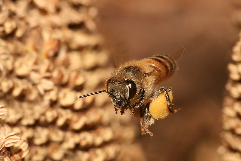
image by Muhammad Mahdi Karim (source)
I got to wondering about stings, and ended up at the Schmidt Sting Pain Index, a sorta subjective scale of pain of different insect bites/stings compiled by painful personal experience of American entomologist Schmidt--he rates a honey bee sting about middle of the road, "like a matchhead that flips off and burns on your skin." Well of course we want to know what the most painful one is, and he considers that to be the venomous bite of the bullet ant, so-called because the pain of its bite is said to be as painful as a bullet shot. :o In Central America, where it lives, it is called (in the vernacular), the "24 hour ant," referring to the 24 hours of pain you're in for if one bites you. Yikes!
The one that really gets me, though, is #2 on Schmidt's index, the tarantula hawk. The female tarantula hawk, a two-inch-long black wasp with rust-colored wings, swoops down on a tarantula, paralyzes it with its excruciatingly painful sting, drags it
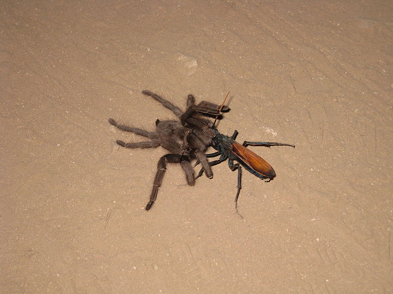
image by Astrobradley (source)
back to her nest, lays an egg on it, and then covers the entrance of the burrow. The wasp larva hatches and drills into the tarantula's abdomen where it proceeds to devour the still-living spider's juicy innards, "avoiding vital organs for as long as possible to keep the spider alive."
:O
The adult wasps eat nectar and sometimes get drunk from fermented fruit. :P
I'm kind of surprised that there are enough tarantulas around for another species to use them as their vehicle for childbirth! I suppose this is because I don't live in the tarantula part of the world. I always thought they were neat though when I'd see one in a display as a kid, except sometimes they'd look a little bald and ragged where they'd scraped off all their hairs to fling at enemies or prey or whatever they supposedly do with them. I assume tarantula hawks just laugh off such feeble countermeasures. :P
|
·····
|
| |
| Apparently I have lots of streaming to do | Aug 01, 2012 6:30 AM PDT | url |
| | | |
Added 2 new A* pages:Whoops, I meant to get to writing up some stuff about bees and other stinging insects that I found while looking up bee reference photos for this sequence, but eh I got distracted by looking up old streaming movies. There are old Flash Gordon serials on archive.org and Netflix streaming! This bears further investigation, methinks. Also I saw that Hitchcock's "The Lady Vanishes" is on Netflix streaming, so if you have that (I'm in my eh initial evaluation month thing, yeah I know I'm late on this :P), make sure you catch what is probably my favorite movie ever. Oh and "Starcrash" is on there! It's that cheesy 70's Star Wars rip-off that I talked about way back in November...so now I have no excuse not to watch it. :o
|
·····
|
|
|