 | |
| |
|
|
view titles only (low bandwidth) |
| |
| Sale of original A* art approaching | Sep 29, 2012 9:12 AM PDT | url |
| | |
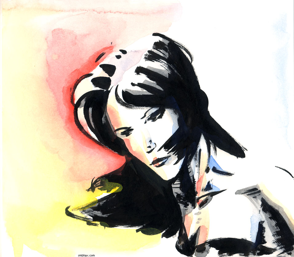
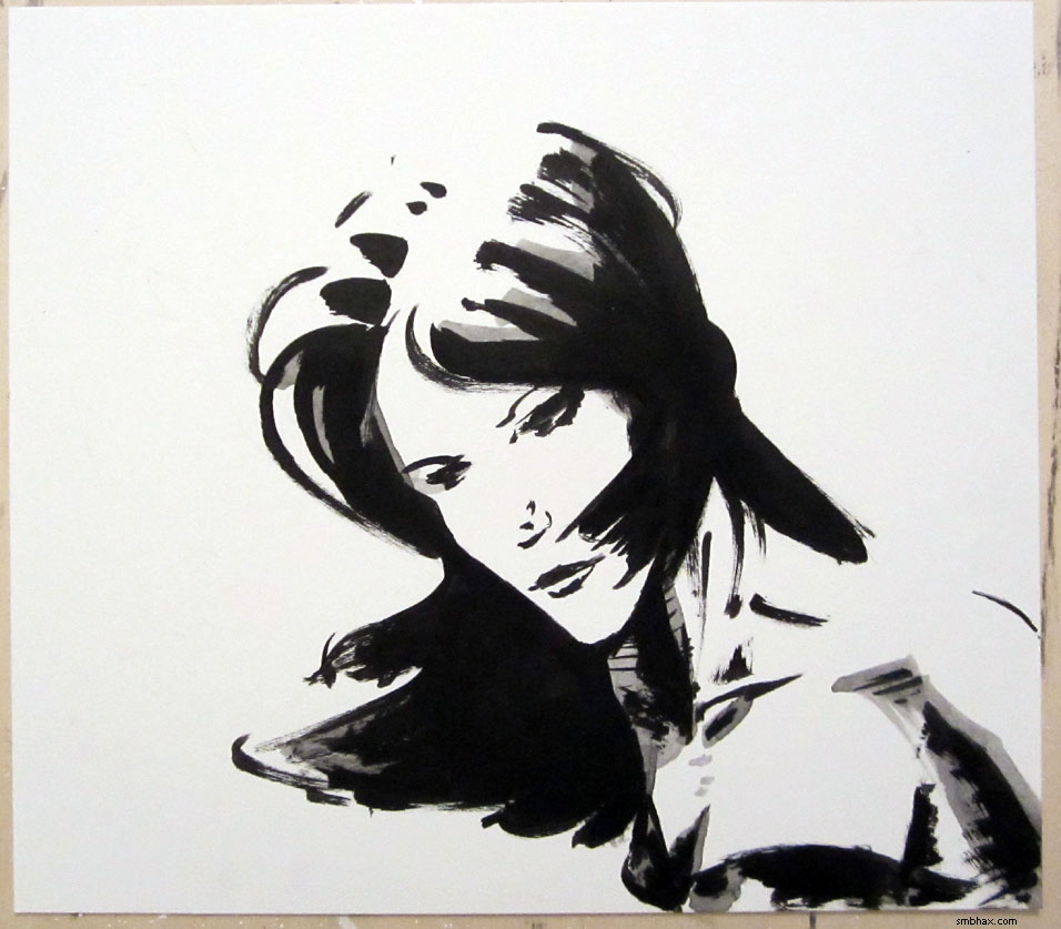
Added 1 new A* page:Going to see if I can make the final push of getting my original-art-selling system for the web site finished this weekend. Might go up overnight Sunday/Monday, we'll see how the weekend work gods treat me!
~~~~~~
A while back I linked to this page of "rare Bill Watterson art"; well, I found a similar page with other unpublished artwork by Watterson, known of course for his newspaper comic strip Calvin and Hobbes. The page is Bill Watterson's Rarest, and includes a strip from a rejected pre-Calvin series he tried, Critters, as well as a Calvin strip that only ran in about half the usual newspapers, and was never republished--for reasons unknown!
~~~~~~
That space junk I mentioned was menacing the International Space Station a day or so back--or more specifically menacing the station's designated "safe" zone--was in fact far enough away that the station didn't have to dodge, according to this article.
~~~~~~
The Curiosity rover just came across what looks like an ancient streambed on Mars; the " rocky outcrops containing large and rounded stones cemented in a conglomerate matrix" suggest that water that hip-deep water may have flowed swiftly through the area billions of years ago.
~~~~~~
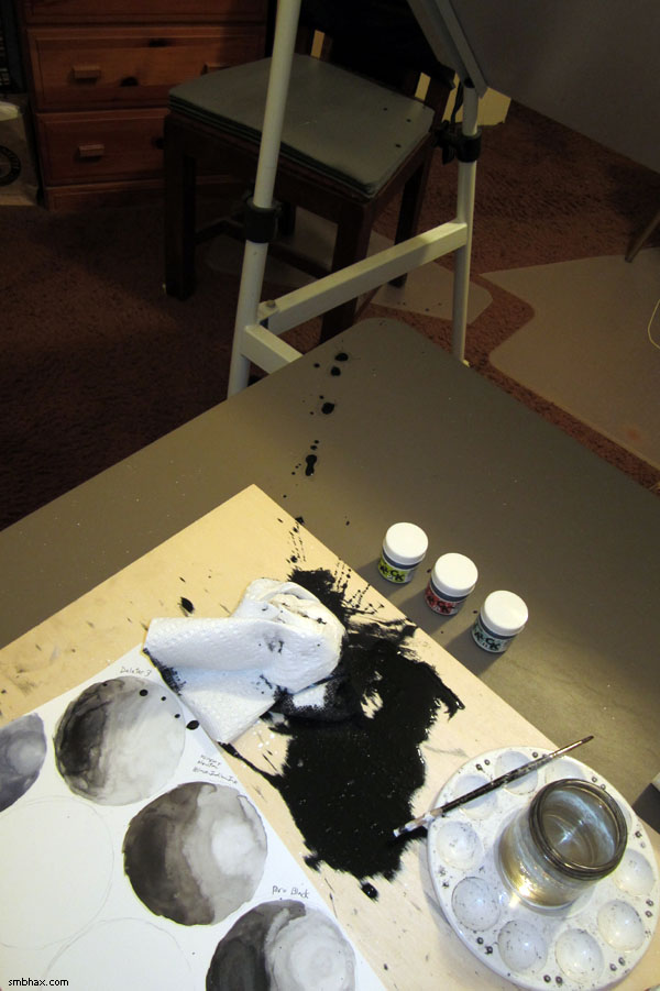
I tried something slightly different with today's A* page; earlier in this episode, for adding some noise/dust to the galactic core nebula, if you can call it that, I got an interesting effect by stroking black ink over non-waterproof white ink. For the base operator's hair in today's page I thought I'd try the same technique; it didn't come out quite the same--darned if I can remember quite what the difference in the approach was--but it still did something interesting, I think.
|
·····
|
| |
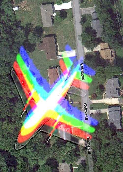
| Finding the source of rainbows on Google Maps | Sep 28, 2012 9:39 AM PDT | url |
| | |
Added 1 new A* page:All kinds of funny things sometimes get in the way of the cameras Google uses for their Google Maps project—ever wonder what happens when an aircraft happens to fly past just as the satellite is taking a photo? IT TURNS INTO A RAINBOW. Or more specifically, an airplane-shaped rainbow. Like here over the Novatec facility near Baltimore, or here outside of Charlotte, or even over Brooklyn, NY.
~~~~
Update 3/22/16: Those maps have all been updated to non-rainbow versions; here's a shot of an old example:
~~~~
According to this page, the colors come from the camera shooting the different color filters in quick succession, rather than all at once. On Twitter this was referred to as a "sequential color frame camera," and there was some speculation on whether the rainbow effect might also show up on particularly fast-moving cars or high-flying unicorns.
|
·····
|
| |
| A* vs baby planets & ISS vs Kosmos | Sep 27, 2012 7:30 AM PDT | url |
| | |
Added 1 new A* page:Today's first news item comes from Twitter, where I was linked to a slashdotted article describing the findings of a new research paper, which says that a protoplanetary disk has been discovered around a red dwarf star that is being sucked rapidly toward the supermassive black hole at the center of our galaxy, Sgr A*. While even the ESO's Very Large Telescope can't directly image the star's disk, its presence has been inferred from "a telltale 100 billion-mile diameter cloud of glowing gas created by the disintegration of the disk" as it is torn apart by A*'s gravitational pull.
The dwarf star has been calculated to hail from a "3 million-year-old ring of young stars" orbiting A*; a close encounter with another star or stars in the ring could have thrown this star into the pull of the supermassive black hole. It is projected to avoid being sucked in, though: calculations show that in 2013 it will make its closest approach to the hole, within 270 billion miles miles--that's about 100 times as far as Pluto is from the Sun--in the middle distance of Pluto's elliptical orbit, anyway. The star may survive that revolution, but it looks likely that its planetary nursery won't.
The article also points out that the Hubble Space Telescope found a ring of stars orbiting the black hole center of our neighboring Andromeda galaxy in the 1990s, and goes on to get excited about the suggestion this troubled red dwarf in our galaxy presents: if it was forming planets, then could life evolve on a star orbiting a supermassive black hole? I guess anything's possible, but I'll take our position in this nice peaceful galactic backwater over that precarious position any day, thanks!
~~~~~~
I also noticed an article saying that NASA is tracking two pieces of space debris that may get into the 30-mile-wide, one-mile-high "safety zone" around the International Space Station Thursday and Friday, which would mean that the station would have to fire its thrusters as a "debris avoidance maneuver" to get back in the clear--they don't actually think the pieces will hit the station anyway, but they like to be on the safe side. The pieces are "the remains of a Russian Cosmos satellite and a leftover chunk of an old Indian rocket."
The Kosmos satellites, as they're spelled in their home country I guess, aren't a single satellite program, but more of a blanket term for all Soviet and Russian government satellites, counting all the way back to Kosmos 1 in 1962--they were up to 2,468 Kosmos-designated craft as of 2010. Hopefully most of them will behave themselves.
~~~~~~
In fighting with today's page--which gradually got darker and darker as I found it just looked too hm bright and plain I guess in the airlock's before-seen super-white state :?P--I came across something that actually worked pretty well. I finally decided I had to make the background of the airlock, behind the spacemen, very dark, but I didn't want to do full black, because I wanted the full black on them to stand out from it a bit, so I filled it with a very dark gray wash. That wasn't quite spooky enough, though, so I took my big brush and drybrushed some pure black ink into the middles of those dark gray areas, and it actually made a pretty nice effect I think: a very dark area that could pass for black, but has dark auras and other magical things that seem to be living in it. An easy and lively alternative to a flat black fill, perhaps!
|
·····
|
| |
| The USAF set the skydiving record 50+ yrs ago | Sep 26, 2012 7:47 AM PDT | url |
| | |
Added 1 new A* page:August 16th, 1960: USAF pilot Joseph Kittinger steps off his gondola at an altitude of over 100,000 feet (19 miles / 31 km) to begin what is still the longest, fastest skydive in human history:
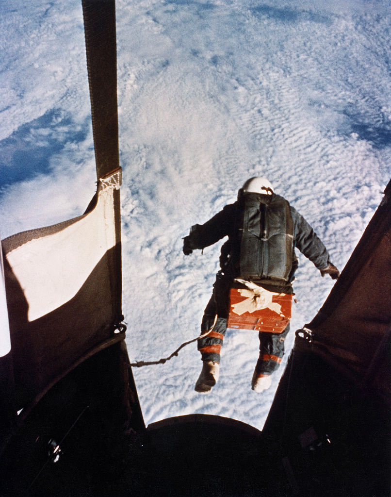
image by US Air Force (source)
This was Kittinger's third, final, and highest extreme altitude jump as part of the Air Force's Project Excelsior. He made the first two jumps--after floating up in a helium balloon gondola--from about 75,000 feet; in the first, the stabilizer parachute deployed prematurely, leaving Kittinger helpless to stop himself from going into a 120 rpm spin; he experienced forces up to 22 G at his extremities, and blacked out--he was saved by the automatic deployment device on his main parachute, which kicked in when he'd fallen to an altitude of 10,000 feet.
In his record-setting third jump, in temperatures as low as -94 F (-70 C), the thin atmosphere at that higher altitude allowed him to accelerate to 614 mph (988 km/h) in free fall--about 9/10ths the speed of sound in those conditions. The pressurization in his right glove had failed as he ascended, and his hand swelled up to twice its normal size. Fortunately, his speedy fall got him safely back to the ground in just four minutes and 36 seconds.
To put the 19 mile / 31 km altitude in perspective, the next year, cosmonaut Gagarin reached an altitude of 327 km during his orbit of the Earth in Vostok 1, which is considered the first human spaceflight.
Kittinger, who is still living, would go on to three tours of duty as a combat pilot in Vietnam; after being shot down near the end of his third tour, he survived torture and 11 months of captivity in the "Hanoi Hilton" prison, taking command among the prisoners, as he was the senior ranking officer of those captured in the past three years; he was promoted to colonel upon his release. Retiring from the Air Force in '78, he went into civilian ballooning, setting distance records in two balloon class sizes--one still stands, and it also happens to have been the first solo crossing of the Atlantic by balloon. Now living in the Orlando area, he is still active as an aviation consultant "and touring barnstormer"!
In the Tumblr post where I first found out about his skydiving exploits, there's a link to a Discovery channel segment showing actual footage from his 100,000 foot leap.
And although Kittinger's 1960 dive still holds the records for highest, longest, and fastest skydive, it isn't as though nobody's been trying to beat it: these guys have been trying in recent years, for instance.
~~~~~~
Two other interesting items that drifted across my screen today:
- A computer glitch delayed the departure of an unmanned cargo ship from the International Space Station; the thing I thought was interesting here was that the computer controlling the deployment was a laptop (the glitch was that it was apparently not properly connected to the station's jack or whatever, so the commands didn't go through)--I guess in just about every space station interior photo you see there are laptops everywhere, but it hadn't quite connected in my head that they'd even use them for stuff like controlling space vessels.
- Net Index by Ookla shows the accumulated results of "millions" of internet speed tests from around the globe, and compiles them into a bunch of charts showing which countries have the best internet speeds, prices, and so forth. The US has been dropping like a rock in these categories; we're 34th in download speed, for instance, right behind Mongolia, Estonia, and Liechtenstein; the (warning: auto-playing video with sound) article where I first found out about this goes into how instead of competing and improving out national internet structure, the major service providers in the States have basically conspired to keep raising prices, without significantly improving performance. ... Maybe we'll be saved by a predatory provider from France or Hong Kong or something.
|
·····
|
| |
| Saturn's chaotic moon: Hyperion | Sep 25, 2012 4:13 AM PDT | url |
| | |
Added 1 new A* page:Saturn's moon Hyperion (the Titan of "watchfulness and observation" in Greek mythology) was the first known non-round moon when it was discovered in 1848--which was some feat, considering that this irregularly shaped, dark, and highly pockmarked moon only averages about 270 km in diameter (it's about 360 km from tip to tip along its longest axis). It kinda looks like a potato in photos taken by the Cassini probe (this one's from 2005):
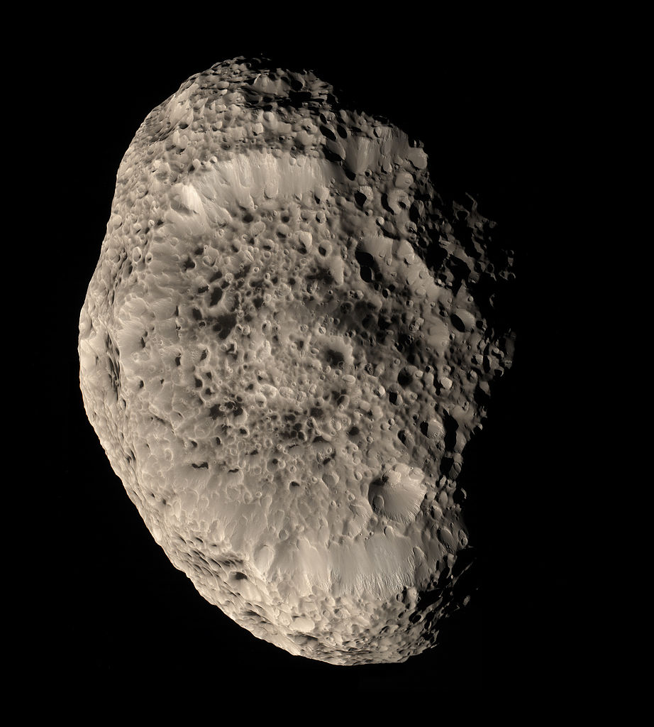
image by NASA (source)
It is the largest irregular moon of which we have good pictures--Neptune's faceted Proteus is larger, but hasn't been seen clearly yet. Hyperion has a very low density: calculations based on its size, orbit, and so forth estimate it to be composed mostly of water ice rather than rock--the dark color is thought to come from a thin coating of dust--and to be as much as 46% empty space, what with all those honeycombs of craters and so on, which have caused the moon to be likened in appearance to a giant sponge.
This strange potato sponge moon is also the only moon in our solar system known to rotate chaotically: likely because of its irregular shape, eccentric orbit, and proximity to Saturn's largest moon, Titan, Hyperion's axis of rotation wobbles so much that its orientation at any particular time is hard to predict.
Unique as it is, Hyperion is just one of 61 confirmed moons of Saturn! About half of them are distant, tiny things under 10 km across, but still!
|
·····
|
| |
| HG Wells' Things to Come; Inflatable Helmets | Sep 22, 2012 9:35 AM PDT | url |
| | |
Added 1 new A* page:Here's a sci-fi movie you can watch online that you may not have seen! It's H.G. Wells' 1936 film Things to Come (Wikipedia link), and you can watch it for free on YouTube right here.
Coming out pre-WWII, Things to Come starts off with a dramatic presentation of the London Blitz--four years before it happened! Wells' prophetic and quite impressively destructive version doesn't take place in London, actually, but an English town, which we then follow through the war--which lasts for decades!
That's when things get pretty weird (and this is only maybe fifteen minutes into the film :P). Devastated by decades of war, disease, and privation, the town's surviving pocket society reverts to a kind of primitive, anti-technology state. The same actors who began the film in near-contemporary England play their own generations of descendents, who play out Wells' ideas of what challenges the presence of technology will pose for us--will we find technology in opposition to our own needs and inclinations? What will happen when technology becomes incredibly destructive?
It's a far-ranging film, and pretty far out--make that VERY far out--by the end. It's quite a good looking film, and some of the effects are even quite good looking by modern standards--there are some really massive super-science bombers ("peace bombs" =p), for instance, that look pretty darn awesome, and later some huge, floating, partially transparent tele-screen things that are quite convincing. Not all of the effects are that successful, and a few of the actors are a bit clunky, but this is indubitably classic sci-fi, and raises some big questions in the bold, straightforward way that sci-fi movies don't really attempt anymore.
~~~~~~
An in-progress snapshot of today's page, right after I'd repainted the face:
This was one of those ones where I thought I had a perfectly good face drawn, but it was in fact two faces--or more specifically, the face from two different angles: the eye and upper part was one way, the mouth and lower part was just enough of a different way to make a difference, and the nose couldn't quite hold them together--so there was nothing to do except repaint it--except the nose. :P
The redraw got a little wild--and I left some of the pencil line around the eye 'cause it seemed to kind of work; now I can call myself a "multimedia" artist, woo!
~~~~~
Oh, yeah--bet you thought Selenis' helmet was a solid dome, eh? The old version she had in previous episodes, with that big collar thingy, was, but this ultralite travel version is inflatable! Maybe I'll regret this move, I dunno, but I've debated it with myself for so long that I wasn't getting any further with it one way or the other and finally just figured I might as well throw it out there. Aside from solving the story/layout technical issue of what she does with her darn helmet when the takes it off (now it can just fold up into her suit's neck or something! ie disappear so I don't have to worry about it :)), there had been the long-troubling question in my head of how exactly does she get it on/off if it closes under her chin? It was either make it flexible, or have it be like folding sections that lock together--but that seemed a little clunky. I suppose a flexible helmet, even made of eh you know super-advanced whatever it is, probably can't be as resistant to piercing damage as a solid helmet--but man, the convenience! Heck, you could take along a second--third, forth? however many you need!--as a spare just in case!
|
·····
|
| |
| When Galactus Had No Pants | Sep 21, 2012 8:53 AM PDT | url |
| | |
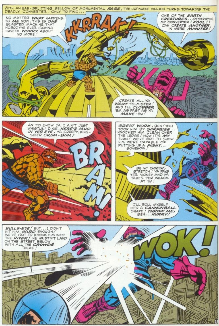
Added 1 new A* page:A friend of mine pointed out that in the inked and colored version of that Galactus page from Kirby's Fantastic Four #49 that I posted on my Tumblr, the colorist had rendered the world-eater without any pants. He also doesn't have sleeves.
Now, I thought this was clearly a mistake rather than a radical costume decision, since elsewhere in that issue the Big G (is that cartoony "G" on his chest to die for, or what? Kirby would remove it within a few years (maybe sooner, I haven't searched that hard :P), leaving just a blank round plate on this chest) appears to have his customary armored blue long johns, as you can see for instance on this page (although his helmet's antennae have mysteriously gone missing in the last panel, but never mind).
But the pantsless Galactus keeps popping up--post-Kirby, he's dressed for summer throughout the appropriately named "Galactus Unleashed" story in Fantastic Four #122, for instance--except for on the cover.
I suppose though that we should just be glad he didn't stick with the coloring scheme he had in his very first panel appearance, at the end of Fantastic Four #48, in which he shocks the FF with a festive combination of dark green / red helmet and chest piece, and maroon leggings.
~~~~
But what's this? A careful reading of the text in that last linked page digs up a surprising statement: "In this reprint, the colorist has given Galactus pants." This puts a whole new twist on things! If what this suggests is true, Galactus readers since oh perhaps some time in the 70's have had the pants pulled over their Galactus legs in a mighty Marvel cover-up! Were the planet-devourer's legs deemed too powerful, too sexy, too dangerous for the hapless inhabitants of Earth? Did some editing schlub at Marvel really go to all the trouble of making sure they were changed from flesh to blue...stuff in every reprint? Will anyone ever get to the bottom of this time-shrouded mystery??
|
·····
|
| |
| Enjoying the Ice Age and other Facts | Sep 20, 2012 6:59 AM PDT | url |
| | |
Added 1 new A* page:I've got a ridiculous backlog of blog topics! My bookmark list is over two screens high now and I have to wait for it to scroll up and down to find stuff, that's how ridiculous it is--and I'm not even trying to think about the whole other pile of topics I accumulated a year or two ago and just had to mothball because I was falling farther and farther behind in talking about stuff in the daily A* news. Oy!
Obviously I've got to face the fact that the increased time I've been putting into the artwork has been sucking up my old A* blogging time, and I won't be able to do the hugely verbose, bandwidth-heavy blog posts I did in the carefree ol' days--not if I want to get a decent page drawn, anyway. So you know what time I think it is? Blogdozin' time! Yeah, instead of writing a whole photo essay about them--alas, time, etc--I'm just gonna start throwing mad news topic blurbs and links at you, and it's up to you if you wanna go check 'em out! *I* think they're all pretty interesting, and I'm not able to do them real justice myself, which is awful, but I think it's better to get them to you some way than no way. And I NEED to be able to start paring down my bookmark list, ugh. :P So let's start!
Did you know we're in an ice age? It's true! You can tell because there are still year-round ice sheets in Greenland and Antarctica--the current ice age started about 2.6 million years ago, at the start of the Pleistocene epoch, with a series of glacial periods that killed off megafauna like mastadons, sabre-toothed tigers, and neanderthals; at their maximum extent, ice sheets up to four or so kilometers thick covered 30% of the Earth's surface, and global sea level dropped by as much as 100 meters. Fortunately for us there are warmer and cooler cycles in the midst of an ice age; the last glacial--or cool--period ended about 10,000 years ago, and we're currently in an inter-glacial period in this ice age, during which temperatures are relatively warm. According to some scientists who study the complex cycles of glacial and interglacial periods, we're just about due for this interglacial period to end, and some even posit that man-made global warming is helping prevent the onset of the next glacial period--which would probably be a good thing for us in the medium-long term, you know (probably not in the short term :P). Of course, that's just a theory.
The Event Horizon Telescope is a project coordinating radio telescopes worldwide into a cooperative network targeted toward one very special subject of study: the supermassive black hole at the center of our galaxy, Sgr A*--their ultimate goal being to capture an image of A*'s event horizon! They perhaps optimistically think that this can be achieved in this decade with refinement and increasing resolving power and coordination of radio telescopes. Well, that would certainly be cool to see!
One of the telescopes involved in that project is the South Pole Telescope--a 10-meter radio telescope located at the Amundsen-Scott South Pole Station, which is precisely at Earth's south pole. It's the best place on Earth for radio observations, because the atmosphere is very thin, and the air, thanks to the freezing temperatures and distance from the ocean, is very dry, which means there's less water moisture to interfere with incoming radio waves from space; also, you've got months and months where the Sun never rises, making the atmospheric conditions very stable. You can't view the northern sky from there, admittedly, but fortunately for our purposes, A* is in the southern sky, so the South Pole is perfect! In an interesting coincidence, the telescope, which began making observations in 2007, is run by my alma mater! (Not that I can take any credit whatsoever--I was an art major :P.)
The Findings section of the Large Hadron Collider Wikipedia page is an interesting spot to watch, what with all the excitement about CERN's gigantic Swiss-based particle accelerator looking for the Higgs boson (supposed to explain gravity) and all that. You'll find the "quark-gluon plasma" I mentioned yesterday in there, but the one I thought was really funny was bottomonium, a new particle or particle state observed at the LHC in December. Bottomonium is an example of "quarkonium," which Wikipedia defines as "a flavorless meson whose constituents are a quark and its own antiquark." Yes I have no idea what that means really, my brain just can't take these names seriously. Tragically, "toponium" does not exist, "since the top quark decays through the electroweak interaction before a bound state can form." Well, dang.
|
·····
|
| |
| Warp drives, Soviet Moon water & hidden Kirby | Sep 19, 2012 8:50 AM PDT | url |
| | |
Added 1 new A* page:I saw a funny article today about a warp drive being more feasible than initially thought--the point the article doesn't really make is that more feasible than impossibly unfeasible is still pretty much impossibly unfeasible! The "warp drive" in question is the physics concept for what would be in effect faster-than-light travel made by theoretical physicist Miguel Alcubierre in 1994; the Alcubierre drive is, in principle, a ring of "exotic matter" around a space ship, of such energy/mass that it compresses space/time in the desired direction of travel, and expands it behind--and this would supposedly allow the ship to move much faster than normal, relative to the unwarped idea of space--up to 10 times the speed of light.
Well that's a fun concept to think about, maybe, and supposedly fits some mathematical models of physics and so forth--we do know that mass/energy can stretch spacetime; or at least, Einstein's equations say it can, and various things like the measured apparent expansion of the universe, measurements of time dilation due to velocity and gravity (time slows down for those moving faster, or closer to a larger mass), and so forth, seem to back the notion up--but there is no actual way to construct such a "drive."
That first article, for instance, was saying that a breakthrough idea has been made for the concept: by altering the shape of the warping ring, instead of requiring the equivalent of all the energy in a mass the size of Jupiter to warp space, the thing would only require an energy equivalent of a mass the size of the Voyager 1 probe. And gosh, that's just a tiny thing!
But the energy even in a tiny thing is vast, as Einstein and nuclear bombs have taught us--and nukes are even relatively inefficient in terms of matter to energy conversion, as opposed to something like the pure conversion of a matter/antimatter collision, which is something like 1000 times more efficient. So let's do some E=mc^2 on this Voyager 1 mass and see just how much energy that is:
Voyager 1 is 721.9 kg--that's our mass, "m." Now we multiply that by the square of the speed of light ("c") in meters per second: 300,000,000 squared is 90,000,000,000,000,000, times our mass 721.9, gives us 64,971,000,000,000,000,000, and the unit for that is Joules. So all the energy they say we need now to power this "warp drive" is about 65 quintillion Joules.
That sounds like a lot of energy. Is it? Oh yes. It's about 16 gigatons of TNT--ie, the equivalent of the combined explosive force of 16 billion tons of TNT; that's over three times the combined destructive power of all the world's nuclear arsenals (which clock in at about 5 gigatons altogether).
So that would be a tough amount of energy for puny humans to come up with. But that's the most feasible part of the idea, really.
Don't forget that the ring has to be composed of exotic matter, which is a fancy way of saying that it has to be made of extremely powerful magical stuff that we don't really understand or are even sure exists. The closest we come to knowing about something that would qualify as "exotic matter," maybe, is theoretical, unconfirmed quark-gluon plasma that may be generated in trace amounts in the 4 trillion degree C quantum conditions seen for split seconds at the center of particle collisions in really powerful particle accelerators like CERN's Large Hadron Collider in Switzerland. Good luck coming up with enough of that stuff for a ring big enough to surround a spacecraft--much less being able to hold it together, or keep it from spontaneously decaying, for that matter. Or zapping it with 65 quintillion Joules. Or having a spacecraft survive in the middle of all of that. Or of somehow causing that to warp space-time in the direction you want.
But those kinds of petty considerations needn't bother theoretical physicists much, thank goodness!
~~~~~
I saw something about a US scientific group making a deal with China to get some experiment time with the robotic lander that China plans to land on the Moon next year as part of their Chang'e 3 mission. They already got an unmanned orbiter around the Moon a few years ago; if they can get this robot on the Moon, it'll be the first "soft landing" on the Moon in 37 years, since the Soviet Union's Luna 24 touched down there in 1976.
A "soft landing" means not a crash--we've crashed loads of things into the Moon for various experimental reasons, like the rocket piece smacked into the poor Moon a few years ago to kick up lunar dust for studying how much water ice was in it. In an interesting coincidence, one of the experiments conducted by the Luna 24 probe in '76 returned data that Soviet scientists used, two years later, to conclude that the lunar soil they studied was 0.1% water by weight--the first real measurement of water on the Moon, but it was ignored and forgotten somehow; today, measuring water on the Moon, as something that would considerably enhance the feasibility of a manned lunar base, is a pretty hot topic!
~~~~~
Thanks to Checkpoint Interviews for posting a notice about A*'s new-ish subscriptions and e-books! I was interviewed by them before, and they've also got interviews with other comics folk--most way better known than me!
~~~~~
Brian Bendis, who as far as I can tell writes at least half of Marvel Comics these days :P, is pretty active on tumblr, and I piggy-backed on a post of his of some Jack Kirby pencil art from Fantastic Four #49 (the classic series, you have to say in these latter days of reboots argh), to compare it against the same artwork once it had been inked and colored by the rest of the team of artists working on FF at the time. That combined photo post is here on my Tumblr, and I did it because I wanted to show just how little we really got to see of Kirby's art, which was far more subtle and refined than the inked pages we see ever showed. Because if you look at that post you'll see in his pencil work that he had all kinds of intricate, subtle variation of tone--the rocky faces on the back of the Thing's carapace, for instance, fade beautifully through a range of grays as they curve away from the light source, and the folds of the Watcher's cloak are rendered in a delicate selection of cross-hatched gray patterning, not to mention the delicate feathering of reflected lines on Galactus' armored body. Yet all of that marvelous detail was completely obliterated under the care of the inker--in this case Joe Sinnott, but they all did this--all of Kirby's tones, feathering, crosshatching and so forth were simply turned to flat black.
Even the fairly isolated, incredibly hard-working Kirby must have caught at least glimpses of the finished Marvel products from time to time, so I'm sure he knew of the massacre that was being inflicted on his art; and pencils I've seen from later in his career have seemed to streamline most of that detail, so perhaps he got used to it and stopped bothering to do the lovely touches that would always be totally blacked out by the inkers. But it makes me wonder what he thought of it, and why it was done, and what his art might have looked like under the hands of an inker who was actually interested in capturing the true range of his pencil work; Kirby's mystique was such that, at least today, all the inking talk I've seen about him is obsessed with this idea of his art's "power"--this was based at least in part on low-quality copies of his pencils that did not preserve the intricacies--and nobody even thinks about inking him with anything more refined than the inking equivalent of a sledgehammer. Sheesh.
~~~~~
Speaking of inking with sledgehammers, today's page was an interesting one for me because I ended up more or less re-drawing it piece by piece. I knew it was a scene of Selenis rushing down a hall, and my sort of default take on this was, apparently, to put her in the typical cartoonish, super-actiony running stance drilled into my impressionable youth by Marvel comics; you know the one: arms cranked up and down in opposite directions, body leaning almost horizontally forward, one knee cocked up almost as high as the chest, with its foot bent all the way back up under the hindquarters, the other leg shooting straight out behind and down into the floor, foot fully extended, knee not bent at all, exaggerated foreshortening everywhere, and so on.
It came out all right as far as those things go, but it was bothering me, and as I started to fiddle with parts here and there, it eventually dawned on me that the problem I was having with it was that nobody actually runs that way--or could run that way. Not even in the relatively low gravity of Nena's moon! So I started re-drawing the sections of the body that seemed the most egregious violators of kinetics, and eventually I had redone all of them. In comparison to The Marvel Run, a more realistic running position looks almost like at most a fast walk--especially here, where the gradual straightening up of the body resulted in the legs eventually trailing off the bottom of the page, so I couldn't get in one of those typical "this is a run" tricks of like making both feet slightly off the ground--which is somewhat unrealistic in its own way. But all in all I think it's a better way to go for A*, and hopefully I'll get used to it and start to do it right from the initial sketch so things fit on the page and flow a little better. :P Anyway I find it kind of funny that now my main concern with an action scene is controlling it enough to make it actually believable--and that the one that's given me the most tricky time in that respect in recent memory has been something as seemingly commonplace as a running pose...but I suppose I really haven't had one of those come along in quite some time, now that I think about it.
|
·····
|
| |
| What caused dinosaurs; dry ice snow on Mars | Sep 18, 2012 10:57 AM PDT | url |
| | |
Added 1 new A* page:Science news that grabbed me!
- This article has various theories about origin of the mass extinction marking the divide between the Triassic and Jurassic 200 million years ago--what caused half the species on Earth to die over the course of 100,000 years?--and how this might have led to the rise of the dinosaurs; dinosaurs had evolved about 25 million years earlier, but were, up to that point, dominated by other creatures, including "extinct relatives of modern crocodilians, such as the large and carnivorous land-based rauisuchians and semiaquatic phytosaurs as well as plant-eating aetosaurs and revueltosaurs."
One theory about the extinction cause is that the rifting of the supercontinent Pangaea at that time triggered 20,000 years of tremendous volcanic eruptions, which "coated what was to become Africa and the Americas with a million cubic kilometers of lava and doubled the level of carbon dioxide in the air causing massive global warming, 'about a 3- degree Celsius increase on average in temperature, if the climate system was as sensitive as models suggest.'" But then sulfur blasted into the atmosphere in the eruptions could also cause significant cooling by reflecting sunlight. And this could all have caused plants to start dying off, then the species who lived on them, and the species who lived on those species, etc.
But another theory is that it was yet another disastrous meteor strike that cause this extinction--for evidence of which various craters have been examined, such as the Manicouagan Crater in what is now Quebec (that was a million years too early), and "a hole about 40 kilometers wide discovered in France at Rochechouart."
- This article says that analysis of data collected by the Mars Reconnaissance Orbiter between 2006 and 2007 has revealed carbon dioxide snow clouds over the Martian south pole--which could very likely explain how there comes to be a year-round carbon dioxide--"dry ice"--polar cap there.
That would be the first-ever detection of natural dry ice snowfall--and that isn't even the only kind of snow that's been seen on Mars! "In 2008, NASA's Phoenix lander observed water-ice snow the stuff we're familiar with here on Earth falling near the Red Planet's north pole."
The carbon dioxide snow, of course, requires conditions that fortunately for us do not exist here on Earth: "Dry ice requires temperatures of about minus 193 degrees Fahrenheit (minus 125 Celsius) to fall." (The lowest temperature ever recorded on Earth "was −89.2 °C (−128.6 °F; 184.0 K) at the Soviet Vostok Station in Antarctica, on July 21, 1983"--that's cool enough to freeze dry ice, but apparently not nearly cold enough for it to condense and fall as snow from the atmosphere.
~~~~~
Boy I dunno if I'll try inking a page like I inked today's again any time soon! I've been using my old non-waterproof white ink--which I've always used for stars--for general white-overing again lately, since it spreads easier than the waterproof white ink, and since I don't have to worry too much about having to disturb it later due to a correction mistake, since I'm now back to working from pencil sketches again. Well, that breaks down when you change your mind midway through inking a page, as happened today, when I realized that a start-with-grays approach had run into trouble. So that triggered a lot of inking over and then re-inking over, because by then of course I'd lost my original lines--eventually had to repaint both eyes, even. Eeg! I dunno why I thought the gray-in approach would work, since it hasn't before, but hope springs eternal in my subconscious, I guess. :P
I suppose it was partly because the pencils had gone so well--which is often troublesome since then I get nervous about screwing them up with ink, so I told myself well, just face the fact you're going to screw them up, and put some effort into it and really go to town and screw up royally, at least. So I tried the different approach, what the heck. And it didn't work, but such is life, and I did get to experiment a bit with blending (or trying to blend) the white ink into black ink. I don't think the results are as attractive as a straightforward black ink then black washes approach could have attained, and they certainly took more time--and I should try to remember this so I don't fall into this again. :PP
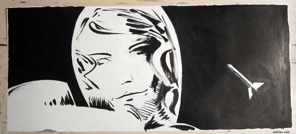
Anyway I kinda knew something weird would happen so I thought ahead and preserved the nice pencils in a photo:
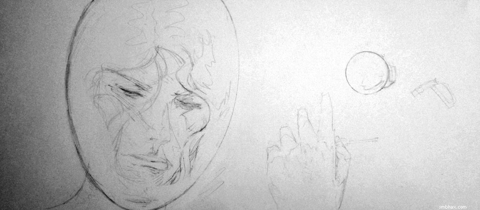
^ I actually like how the lighting happened to work out in that photo, especially with the resulting digital camera grain being accentuated when I contrast-adjusted the (fairly poorly lit) photo in Photoshop to make the pencil lines visible. Kinda tempting to get some really dark pencils and try working all in photographed pencil drawings...almost. :P
So I tried starting out with middle-gray lines to replace the pencils
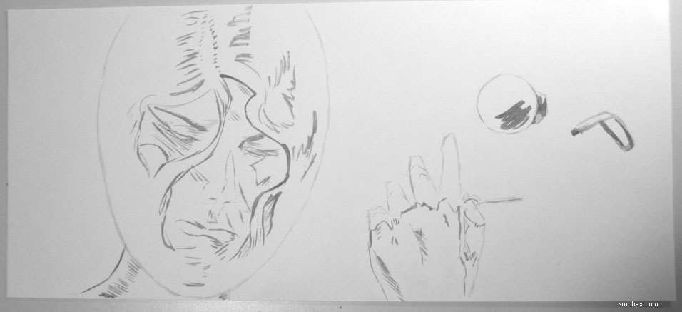
which *seemed* to be working, but then as I started to fill in things like the face, again with light to medium grays, which also *seemed* to work okay
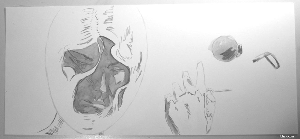
I eventually realized that the washes weren't solid enough to keep the lines/shapes preserved tightly, and that I'd now effectively lost the ability to ink in important original details like the eyes--and that areas that had been somewhat vague in the pencils, such as the cheek/hair on the right, were now pretty darn confusing. I kept on for a while, filling things in more with darker and darker washes, then tried black, then white, contemplated chucking the whole thing and starting over, but it was quite late by that time and besides I'd probably be haunted by the success of the first drawing and just struggle to try to recapture it in any further drawing, so I set out to salvage what I could via liberal application and mingling of black and white inks. Which worked better than I'd thought it would at the worst point, I guess, but hm yeah probably aren't the way I'd want to try going again.
~~~~~
Lots of progress made over the weekend on making A*'s original artwork available for sale through the web site--in fact I got really ambitious and just went to town on it, and the stuff for selling the original artwork behind the daily comic pages is ready to roll. I'm not rolling it out to the site yet, though--I had to fight myself over this repeatedly :P because I hate sitting on stuff--because I'm still accumulating my arsenal of secure art shipping supplies--my skinny boxes arrived today! :D--and because at some point I want to be able to sell select items from the episode art galleries as well, and those will run through the same scripts that selling the comic pages does, so I might as well get that all done at once before inflicting it on the public, since going back to work on adding the gallery-sale stuff will probably make a temporary mess of comic-selling stuff while I'm working at it. :P Mmm so yah, might be able to get it all worked out next weekend, we'll see.
|
·····
|
| |
| Selling art and Reading Frank Miller | Sep 15, 2012 8:43 AM PDT | url |
| | |
Added 1 new A* page:I gotta go easy on all this microscopic cross-hatching before I kill my wrist. :P Or at least learn to rotate the paper so I'm hatching in a natural direction, gosh.
I won't be drawing this weekend, though--I'll be putting in some more work on getting the system for selling A* original art online. Here's what a sample "buy" page looks like so far:
So mostly I just have to get the comic displaying script to show a "buy" link for the current comic page if the original art for it hasn't been sold yet, and then I gotta have my little script that listens to PayPal's feedback messages take a page off the market once its original art has been sold. Shouldn't be too tough.
You'll notice the price in that sample page display says $50! I've mentioned $100 as the price for original art before, and I still think that's what the price will be eventually, but I think--I suppose my thinking on this could change before I roll this out, but this is what it is currently--initially I'm going to offer them at the murderously low introductory price of $50 to stimulate sales and cut into the eh going on 300 pages or so pile of original art I've accumulated here in my little apartment since I started drawing them by hand almost a year ago. So if you were considering buying a page before, well now you'll be able to get two! Anyway I think I'll have that ready to roll out within a month or so.
~~~~~~~
Speaking of A* original art, at my latest art show opening this evening, before anyone showed up I wormed my way into the "graphic novel" aisle of the shop, and what did a find but a cheap copy of Frank Miller's "Sin City: A Dame to Kill For." I've read it before, of course, but never had my own copy--so now I do! Which is handy because sometimes I'm sitting around thinking "gosh how would Miller have tackled this drawing dilemma" and there really isn't that much that turns up in Google image searches for his art, rather surprisingly. Not that I want to draw like him, exactly, but you have to admit he had some good ideas of how to handle black and white artwork. And overall (I keep telling myself this from time to time but then I forget) I think I should be doing more black and white, and less gray, so a dose of Miller tonight was a good reminder of that. This episode will be getting progressively darker, anyhow, I think.
Oh, and I got the urge to look up Miller on Wikipedia to see if it says what he's been up to since his last movie crashed and burned; it doesn't, but it did have a link to this extremely extensive article analyzing his work on what is probably still my favorite graphic novel: Reading Frank Miller's Batman: The Dark Knight Returns. The middle section is a little slow--an almost frame-by-frame analysis of each of the TDKR's four chapters--although it does have quite a bit of his art to look at--but the beginning and end sections, which look at Miller's career up to that point, and the techniques he and colorist Lynn Varley (I don't think I realized they'd married--and then divorced in 2005, an event which some speculate helped precipitate Miller's rather public flameout :P, although...well, enough on that topic :PP) pioneered in order to achieve a print quality that just hadn't been used for American comics before that point--using high quality paper and printers that could capture the delicate line variation of his German inker Klaus Janson, and a color process that could reproduce the subtle hues of Varley's gouache paints--are quite interesting.
|
·····
|
| |
| A* and I at Couth Buzzard Friday night! | Sep 14, 2012 6:00 AM PDT | url |
| | |
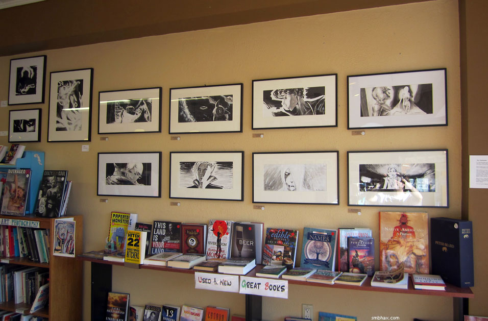
Added 1 new A* page:My dad and I got my artwork hung on a prominently placed, coffee-hued wall at Couth Buzzard Books at 83rd and Greenwood in Seattle today—the art will be on display (and sale!) there through October. It's mostly some of what I think are the nicer A* original pages, all framed and matted:
The local "art walk" thingy is tomorrow (Friday, anyway) evening, and I'll be hanging out at the Buzzard from about 7 to 7:30 pm. I hope they have snacks. >_> You could come and help me find them! Or you may find me with my nose buried in a book, because there's both a Philip K. Dick and a Heinlein book on top of the bookshelf directly below my artwork. :) Oh so yeah that's Couth Buzzard Books, they also have a little espresso/pizza shop in there, and I believe they said they'd probably have live music of some kind as well.
~~~~~~~~~
You've probably noticed that I haven't managed more than a page a day since I went back to using pencils and a small brush and all that about a week ago. It just takes more time to do pages this way, so I think we'll be stuck at this rate for a while; I wouldn't do it except that I think the improvement in art quality makes it worth the slower pace—hopefully my readers agree! =o
Anyway, the one thing I've actually been able to sell in with A* has been art, so currently my hope of achieving vast fortune and eventual galactic domination hinges on my getting the art to improve to the point where I can make some decent dough doing commissions and freelance work on the side—in addition to selling the original A* art, of course. So improving the artwork is a top priority! Hopefully in another year or so I'll be ready for the commercial market. :o Once I get the original-art-ordering system done—it's coming along pretty well, in fact—I intend to start getting in some regular freewheeling arting on weekends; I'd like to do some paintings/sketches/illustrations in different formats in terms of size, dimension, color, etc, just to practice and I suppose work up a varied portfolio. Although I imagine I'll mostly end up drawing (or trying to draw, I mean) pretty women. >_> I hope that's okay with everyone.
~~~~~~
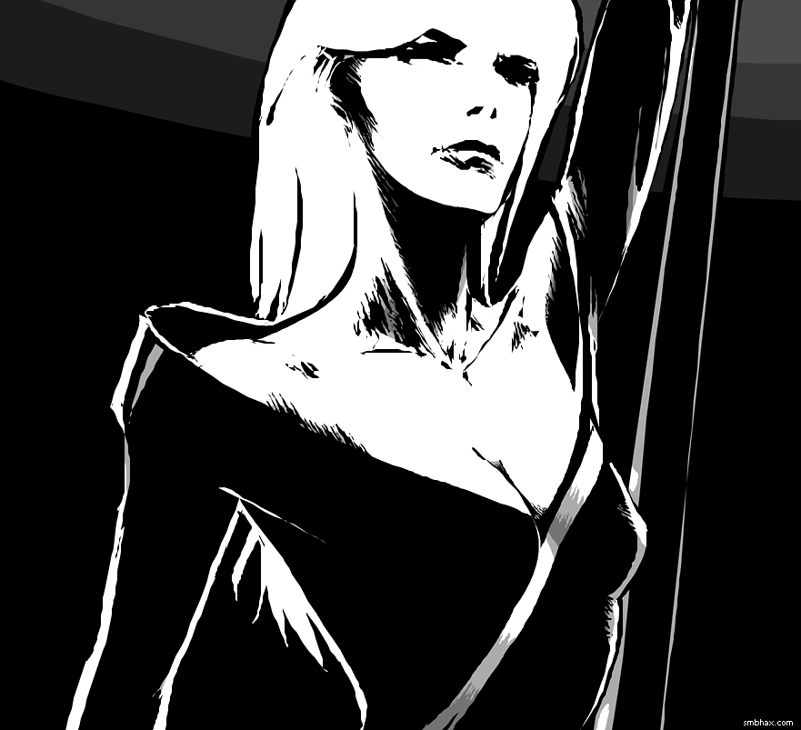
Oh man art stuff! You may have noticed that the art style has varied slightly over the past week... I'm trying to hit the right balance between clearly delineating everything—the usual black outlines around everything that other comics use do that quite well—and rendering things in more of an expressive, impressionist manner where there *aren't* lines around everything. I've kind of been bouncing back and forth; also I could stand to improve in each type, from a technical standpoint. I think maybe the figure of Caines on page 82 is the closest I've come to success so far—there's actually kind of a mix of delineation and impressionism going on with him there, and it's proving a tricky balance to strike consistently I guess. In today's page, for instance, I wish I'd been able to capture the gray tones of the face more boldly—like, on the first stroke, rather than having to build them up in a few layers and getting a bit smudgy. Ah well, plenty to work on!
|
·····
|
| |
| Definitive Flash Gordon and Jungle Jim, Vol 1 | Sep 13, 2012 8:36 AM PDT | url |
| | |
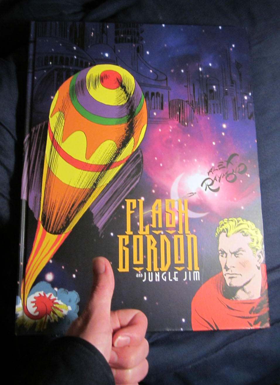
Added 1 new A* page:A large flat package waiting on my porch today pretty much made my day because it turned out to be an item from A*'s Amazon Wish List that a very kind reader had sent to me—they even had it gift-wrapped! =o I've learned that not everyone wants their name given to the internet at large, so I'll just say thank you very much, lovely reader. :)
And I'll share! Because this isn't just any book, but the very large and colorful Definitive Flash Gordon and Jungle Jim Volume 1, which begins the task of collecting all of Alex Raymond's Flash Gordon and Jungle Jim newspaper strips; volume 1 starts with the very first strips for each series, which debuted in 1934, and gets as far as 1936 with them.
It's a large book—16 inches high! (Amazon appears to have the dimensions all wrong. And did you know that 16" is the width of a cropped-for-the-web A* illustration? Hm!) And hardcover, but not sporting one of those annoying dust jacket things over blank cardboard covers; no, this has some wacky and highly colorful graphics on it, unhelpfully blocked here by some photo-bombing doofus' hand:
Jungle Jim was a "topper" for Flash Gordon, meaning it ran above it on the comics page when the strips came out every Sunday. Jim was meant to ape (har) the success of the Hal Foster-illustrated Tarzan, based on Edgar Rice Burroughs' immensely popular pulp adventure series, and already incredibly popular in its own right. Flash, meanwhile, was meant to compete with the immensely popular sci-fi strip Buck Rogers; interestingly, both Tarzan and Buck had begun on the same day: January 7, 1929.
Well, Raymond's Jungle Jim and Flash Gordon hit the funny pages exactly five years later, on January 7th, 1934. Here's the first strips, and you can see their "topper" layout:
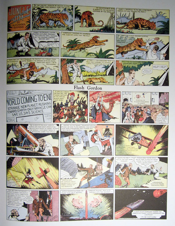
The intro to the book has a lot of interesting info about the strips; that first Flash comic, for instance, was Raymond's third try; the first two, rejected by the syndicate, had Flash as part of a four-man crew whose ship, designed to be the first to orbit the Earth, had malfunctioned, leaving them stranded in space. It was more sciencey and less fantasy, apparently; but the editor finally went for this third try, which included such crowd-pleasers as an impending apocalypse, a mad scientist, and a beautiful young woman in distress—all in one Sunday page!
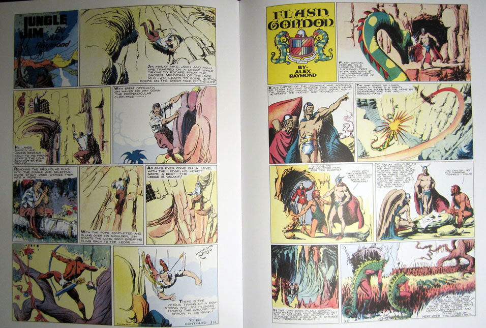
For a period in '35, it was decided to run the funnies in a "tabloid-style" insert, and both Jim and Flash got their own full page; you can see that already, just one year later, Raymond's art has become much more polished, graceful, and dynamic, and he's moved to working in fewer, larger panels; Jim, though, is noticeably lower detail than Flash—you can even see some quicky dry brush work in Jim's shading:
Raymond, incidentally, did not usually handle the coloring of the strip. He was no newcomer to comic drawing, however: the book's introduction tells how he got his break in 1931, when at the age of 22 he began assisting neighbor Russell Westover on Westover's Tillie the Toiler comic strip; and it really was a break for the newly married Raymond, whose job at a Wall Street brokerage firm—he'd turned down a Notre Dame football scholarship after the death of his father in 1922 to work on Wall Street and help support the rest of his family, which included six other siblings—had dissolved shortly after the stock market crash in '29. Westover's syndication connection got the otherwise self-taught Raymond a job at the King Features syndicate's art department, from which he was eventually hired as assistant by Chic Young, creator of the fledgling strip Blondie. Chic's brother Lyman also had a strip—Tim Tyler's Luck—which by '33 Raymond was ghost-illustrating in eye-catching fashion, a fact that hardly escaped the eyes of the ambitious King Features editors.
Anyway, skipping back ahead to Flash, by March 1936 it was back to its initial configuration with Jim as the topper, and you can see also that Raymond's style was well on its way to the intricate patterns of curving, space-and-light-defining lines for which his Flash work would be most known:
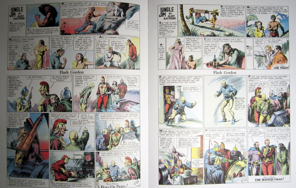
So as a comparison, here are a couple panels from the bottom left of a Flash strip from May 20th, 1934
vs a couple from the bottom left of the last strip in Volume 1, from just over two years later—May 31st, 1936:
Just look at that print quality, too. This is a really lovely book!
Bonus factoids! Raymond had also been given a THIRD strip: Secret Agent X-9 was to be the big one; written by Dashiell Hammett, famed hard-boiled crime story writer of The Maltese Falcon (Sam Spade and all that, you know), X-9 was set to steal some of the thunder (so creative they were at King Features back then :P) of the very popular Dick Tracy comic strip, which had begun on October 4th, 1931. Raymond stopped working on it in '35, and Hammett didn't stay long, either; X-9 went on under various creators and names, though—it was renamed "Secret Agent Corrigan" in later decades—and didn't stop until 1996! I wonder if I ever saw it in a paper... Can't say I remember it! Another interesting factoid: Al Williamson illustrated Corrigan in the '70's; Williamson had also been an assistant on the strip Raymond started after WWII, Rip Kirby, AND had done later Flash Gordon illustration work—you can see some nice examples of both his Corrigan and Flash work on that Wikipedia page I've linked there. And incidentally, Williamson had also collaborated on comic work with another inspiring artist I've happened to mention more than a few times, Frank Frazetta.
UPDATE: I talk about volume 2 of this Flash compilation series here.
|
·····
|
| |
| A* on show at Couth Buzzard in Seattle | Sep 12, 2012 6:51 AM PDT | url |
| | |
Added 1 new A* page:Well it's official: A* artwork, mostly framed original art, will be showing at Couth Buzzard at 83rd and Greenwood in Seattle from this Friday through the end of October. It's a combo used bookstore / espresso joint! This is something of a surprise show—my dad just found out they had a spot for me yesterday—so I won't have any originals there that you wouldn't have seen if you came to my show earlier in the summer, but if you *didn't* make it to that one, well now you've got a couple months to catch them at the Buzzard.
~~~~~~~
A couple science things happened!
- Explosion on Jupiter - An amateur astronomer spotted a several-second-long flash on Jupiter, which he guesses was an impact, possibly from a small, unknown comet. This is the fourth impact observed on Jupiter since 2009; they haven't been nearly as spectacular as the massive Shoemaker-Levy comet impact of 1994, which hit Jupiter with an energy equivalent to the output of about 11 million thermonuclear warheads—I calculated that for an A* thing a few years ago—leaving huge black spots on top cloud layers of the gas giant.
- A new theory points out that the geologic formations seen on Mars that have long been thought to show traces of erosion by ancient waterways or seas could actually have been formed by cooling magma rather than water—there's a region of French Polynesia with clays similar in composition to Martian ones, and these Polynesian ones were shown four years ago to have been formed by rapidly cooling magma, rather than by slow erosion by water. Still, scientists are pretty confident that water has played a role in the geology and chemistry of Mars, so this apparently doesn't shoot down the possibility of past Martian water-dependent life, which people are always hopeful of finding for some reason.
|
·····
|
| |
| Surprise art x3 | Sep 11, 2012 9:02 AM PDT | url |
| | |
Added 1 new A* page:Believe it or not, in what is nearly a year now of working with ink on a daily basis--in my ancient brown shag carpeted apartment--I hadn't had a single ink spill...until today, when I had two. I don't know if it was excitement/perturbation caused by getting a call from my dad to say that a place he'd scouted months and month ago for showing my art had suddenly gotten back to him with a surprise vacancy in their schedule, and could we get some art over there and hung up before this Friday or what, but man, the carpet got it good today.
On the plus side, the sections of carpet that I scrubbed the ink out of probably haven't been this clean in a decade. And while I thought at first my drawing board was irreparably warped--having absorbed about 2/3rds of an ink bottle from a direct hit in the first spill, it had so much pigment on it that I felt I had to scrub it off, even though I suspected that wetting would risk warping the thin, light wood--it seems to be straightening out all right under some boards and books. So huzzah!
Here's the almost immediate aftermath of the first spill--got a good long splash going right over the table, drawing table, chair, and carpet:
Pencils for today's page--if I was better at inking I wouldn't have had to re-try Selenis' face over and over, and spend hours puzzling over how much black coverage to give to her space suit:
Another good side of the first spill: the ink I spilled was experimental ink, I guess the last of the current wave of art supply experiments I've been running. Maybe I'll be able to show you the results in the next day or two. Anyway it wasn't great ink for my purposes so no loss there. :P
|
·····
|
| |
| It's alive! The revenge of Frankenbrush | Sep 08, 2012 8:08 AM PDT | url |
| | |
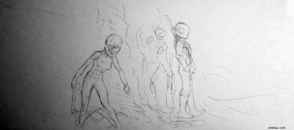
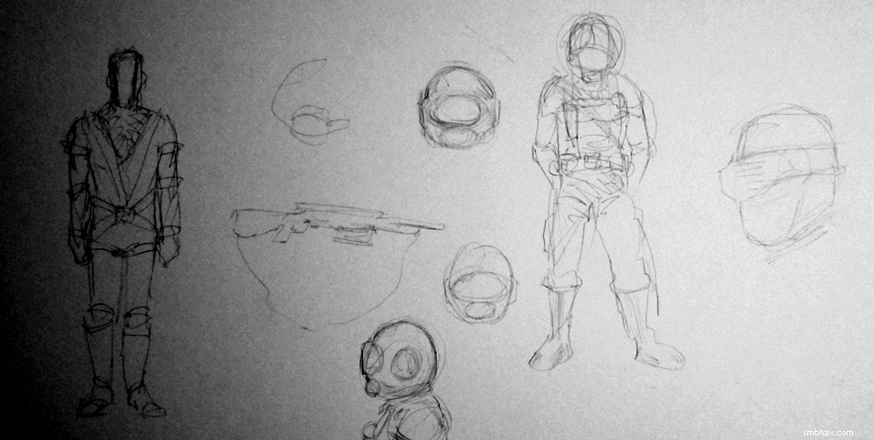
Added 1 new A* page:Some sketchy design sketches for the space suits of these guys--decided to go with the more retro fishbowl-style helmets ;):
~~~~~~~~~
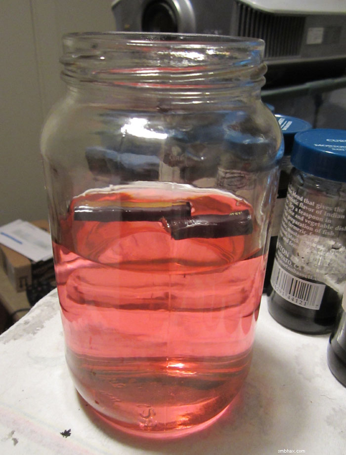
Hm I think I *may* have ruined a brush in my art supply experiments after all. ;) See a few pages back I went back to using relatively small sable brushes for detail work, instead of the big synthetic/horsehair brush I'd been using for everything for most of this episode. The handle on the sable brush is a lot thinner, and I was afraid I'd start to get wrist stiffness / forearm soreness like I used to get before I switched to the larger brush. But then I happened to notice that the handle of the sable brush can just about fit through the hollow bamboo handle of the big brush; the first bamboo handle section I tried was just a *little* too narrow, but I found that soaking it in water--which I had to do anyway to get the red dye covering the inside to go away (that's what was going on in that photo I posted a couple days ago with that jar of red water)--caused the bamboo to expand enough that the sable brush's handle fit through the bamboo handle with room to spare. So I squirted some Elmer's "Wood Glue MAX" down one of the bamboo handle sections I cut off to balance the big brushes out anyway, stuck the small sable brush through it end-first, let it set for 24 hours, and I had me a Frankenbrush--a small-tipped brush with a nice thick handle:
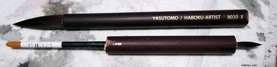
I used it for the details in today's page, aaaand it seemed to irritate my wrist--way more than it had been irritated using a normal thin-handled sable brush yesterday. Now, it seems to take my arms two or three days to adjust to new tools anyway, so maybe it'll get better, but I'm starting to think that it's more to do with my wrist and arm position as I hold the brush than it is with the girth of the brush handle--with the big handle on, I think I just started to hold it differently. But with the big bamboo brushes, I unconsciously tend to hold those more sideways, because the brushy tip tends to bend to one side a little anyway, and plus to do bigger dry-brush effects you'd want hold it further sideways.
Anyway I guess I'll try Frankenbrush more next week and see if it gets better. It does at least seem to be bonded together pretty solidly. :P
~~~~~~~~
I stuck a "Top Webcomics" voting link widget in the left end of the social networking bar found under the ad section on the comic pages; I've had A*'s TWC links solely as text links on the site's "about" page for years because I felt that TWC is more of an ad for TWC than it really is for the webcomics striving to raise their rank and theoretical visibility in its list, and also I didn't want readers to feel like they need to be doing anything more than reading the comic. And in fact even just with the text links tucked away on the "about" page, some kindly folks have made a habit of voting for A* on TWC, and often get A* hovering somewhere in the mid-200's in TWC's ranking (which resets every month), and that actually has brought in a decent amount of additional traffic to the site. So, while I don't like to shill for TWC or whoever, if putting their widget on my front page helps get me a few new readers, I guess it's silly not to do it. I guess I'll try it there for a few months, and if it doesn't get A* up into the more visible part of the ranking (like into the 100's), I can just remove it. :P
~~~~~~~~
I've been playing around on A*'s Tumblr since I recently created it, having a surprising amount of fun browsing around and posting neat art and science things that I find--in addition to A* stuff of course! For instance, near the top just now you'll several interesting supernova articles and photos, a space adventure comic story by Al Williamson, inked by Frank Frazetta, and an old Radio Shack ad in which Isaac Asimov and his huge bushy white sideburns extoll the merits of the new TRS-80 Color Computer--along with a bunch of other fun stuff! So check that out, follow it if you like it, tell your friends, and here's that huge link button to it again, just to be gratuitous:

In any case, thanks to everyone who's gone out of their way to give me some feedback on the comic, whether it's been by emailing me, tweeting me, adding a message when buying something from the store, getting in touch on deviantART, Liking my A* posts on Facebook, giving a +1 on Google+ or a <3 on Tumblr, voting for A* in some poll thing, dropping a thoughtful comment here or there, or whatever--it means a lot to me to get each and every one of those... I guess it seems a little silly but they really do encourage me quite a bit! So thank you. :)
|
·····
|
| |
| Space Toothbrush & The Boundless Solar System | Sep 07, 2012 7:55 AM PDT | url |
| | |
Added 1 new A* page:More art materials experimentation today. May not have killed a brush; and I ended up using a bottle of Elmers "Wood Glue MAX" rather than a caulking gun, anyway, because apparently everything that goes in a caulking gun is toxic, and I'm trying to cut back. May have some conclusive result with that one that I can show you buy tomorrow.
Meanwhile, in space, some news happened!
- At the International Space Station, astronauts on a long spacewalk finally got a replacement "electrical switching unit" into place by jury-rigging an emergency cleaning solution--a gummed-up bolt socket was preventing the unit from fitting in place--out of a toothbrush attached to the end of a pole. And THAT'S why you should always remember to take your toothbrush with you when you go on a trip.
- At the edge of our solar system, Voyager 1...still has not found the edge of the solar system. Eight years ago there was excitement when it entered the "heliosheath," which is the area in the outer solar system where the solar wind "begins to slow due to pushback from interstellar plasma." Two years ago, it entered a region where the solar wind "dropped to zero"; this was a bit of a surprise, but scientists thought maybe it was due to hit the edge of the solar system at any time. And one year ago, it entered an unexpected "frothy" zone in the Sun's magnetic field--but scientists still thought at any time it would hit the edge of the solar system. Well, now, almost 17 light-hours (18.2 billion kilometers) from Earth, it *still* hasn't entered the area of interstellar medium that science says should exist outside the influence of our star. So scientists have had to revise their ideas of where the edge is, and a new paper says that the boundary may be another four billion kilometers (seven years of Voyager 1 travel time) farther out. So our idea of the size of the solar system is getting bigger all the time!
|
·····
|
| |
| Wacky experiments, shady deals, and Apollo 15 | Sep 06, 2012 7:38 AM PDT | url |
| | |
Added 1 new A* page:I borrowed the name "Hadley" from the name of the lunar landing site for Apollo 15. It appears to have been an interesting mission!
image by NASA/David Scott (source)
The crew, for instance, got up to not just one but *two* unauthorized deals. For one, a German stamp dealer paid each of the three astronauts a tidy sum for agreeing to have one of the crew carry "unauthorized commemorative postal covers" inside his space suit, in addition to the officially NASA-authorized ones for the U.S. Postal Service. For the other, one of the astronauts "told mission control he was doing some clean up activities around the rover so they wouldn't know what he was doing" while he planted an unauthorized plaque--made by a Belgian sculptor who later tried to sell replicas (although the "deal" he'd made with the astronauts had said he wouldn't)--on the lunar surface, bearing the names of 14 dead American and Soviet astronauts and cosmonauts:
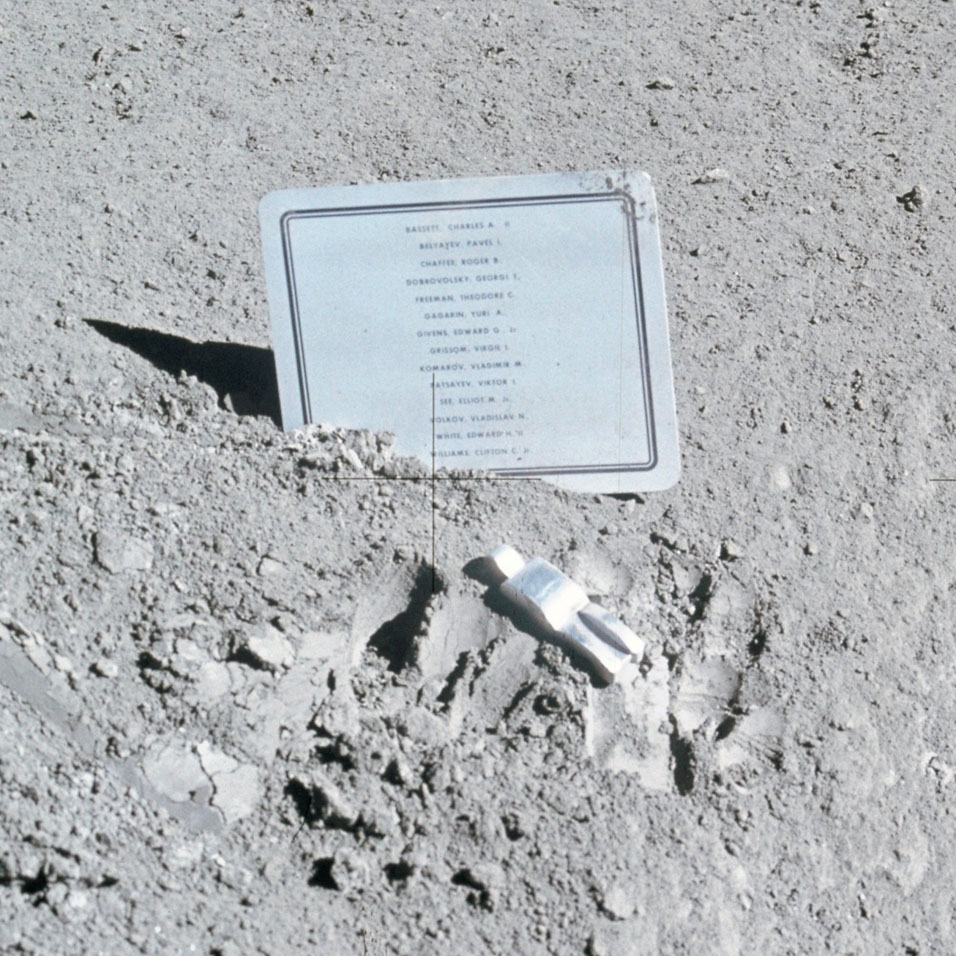
image by NASA (source)
The ~3" figure in front of the plaque is known as the "Fallen Astronaut," and was meant to represent the deceased spacemen.
Another surprise event surprised even the crew, when during their first sleep period after the lander reached the Moon, Houston Mission Control detected a slow, steady oxygen leak--turned out to be "an open valve on the urine transfer device."
Also, they conducted an experiment to show that Galileo was correct: two objects should fall at the same speed regardless of their mass. The Moon, not having an atmosphere to provide air resistance, is a pretty good place to test that, so one astronaut dropped a hammer from one hand and a feather from the other at the same time, and wouldn't you know it, they hit the ground at the same time as well! You can watch the video of that here. (I wonder if he did a test run first juuuust to make sure there were no surprises. ;)
~~~~~~~~~~
Only one page again today; I've somehow found myself in the middle of three separate art supply experiments. Dug out the ol' small sable brush as part of one, to do the smallish figure in today's page--the big synthetic/horsehair brush I've been using for most of this episode is fun, but sometimes I do get a bit frustrated when trying to do detail with it. Here's another thing related to these experiments:
I'll be pretty surprised if anyone can guess what that is! ... Uh. It actually looks worse than it is.
First thing tomorrow, I'll probably be destroying an old sable brush in an experiment involving a caulking gun. ... Yeahhh I'd say the brush has a low chance of survival. :p
~~~~~~
Ohh yeah and I came across a webcomic with very nice sketchy art, called Shiver Bureau. Looks like another superhero comic book pro has crossed over into webcomics--I expect just about all of 'em'll do that at some point, just you wait.
|
·····
|
| |
| Surprise Tikky sketches, same ol' face | Sep 05, 2012 7:31 AM PDT | url |
| | |
Added 1 new A* page:Only got the one page done today. Been working on a couple new/modified drawing tools, but I need some more time with them before I can say anything definitive about them, so perhaps I'll plague you with that information in another day or two.
It is *not* Selenis with a sudden haircut / bleach job in today's page... I just can't seem to want to draw a different facial type. :P After having to draw the more elderly bioarchivist earlier in this episode for what seemed like a LOT of pages in that conversation, I swore a bitter oath that I wouldn't draw any more non-beautiful women...and apparently I have a very narrow definition of facial beauty, blargh. Or what's more likely, a very narrow variety of "beautiful" faces that I think I can actually draw. But I'm hardly the first artist to get stuck on a facial type--there was Frazetta and his moon-faced girls, for instance, and innumerable comic book artists over the decades, etc. Not that I shouldn't try to bust out of this rut. But I like the rut. HM.
I *did* draw her lower lip and chin *slightly* more recessed than I would have drawn Selenis'...but I was fooling myself if I thought that was a meaningful difference. :"P
Anyway anyway I do have another bunch of drawings--oh those familiar faces though...--that I did over the weekend. Speaking of Frazetta, I'd just been going through a whole bunch of Frazetta material, and I'd had the urge to do some free sketching all weekend, so I sat down and did some, which was fun--although I think the Frazetta stuff had an influence on some of the subjects my hand decided to draw:
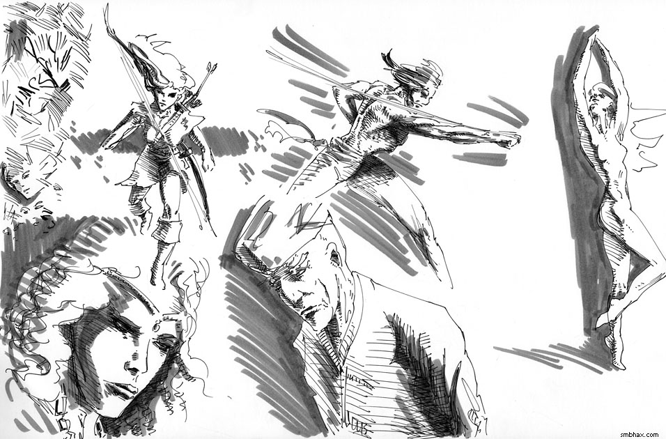
Couldn't quite fit that knee in my scanner. :p Close-up of the two rather more successful figures:
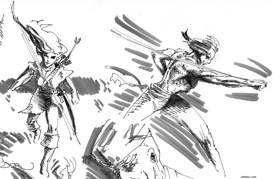
That was pencil (poorly erased in some spots I see, but I was working on a sheet of old Strathmore Bristol I have laying around, rather than my usual Canson Illustrator paper, and the spongier bristol is definitely harder to erase from, urgh), inked with a Rotring Tikky Graphic 0.3 mm marker, and then sorta shaded with Faber-Castell "big brush" artist series "cold grey IV 233" marker. I'd thought I was going to use a different inking marker--maybe a Kuretake Disposable, or a Copic Multiliner--but the Tikky turned out to be the only one whose ink flow could keep up when doing rapid sketching. I was pretty hard on the Tikky in my Supermassive Black Pen Round-Up back in May, and it's true that it is too "wet" for slow, fine detail work, or feathering, but darned if it isn't the only micro-tip art marker I know of that'll maintain a real solid line when working quickly.
|
·····
|
| |
| Perilous adventures in cheap color | Sep 04, 2012 7:59 AM PDT | url |
| | |
Added 2 new A* pages:Boy, black paint applied with big horsehair bristles over wettish non-waterproof white ink (that's the Dr. Ph. Martin's Bleed Proof White that I've only been using for stars lately) produces some pretty cool nebular dust cloud effects! Gonna hafta practice that more.
When I was at the art supply store getting some replacement brushes and a new X-Acto knife and other fun stuff over the weekend I picked up what I thought was a cheap six-color watercolor kit by Pelikan (ah, like this) turned out to be a cheap gouache (aka "opaque" watercolors) kit by Pelikan with very nebulous labeling. Gouache is kinda like thicker, slightly creamy watercolor, I suppose; since it's thicker you can get brighter colors kind of but it will also cover up black ink somewhat, which isn't what I wanted because I was looking for something I could throw as a splash of color over an inked piece, that would just color the non-inked areas. So anyway as you can see in this little test I did, the yellow gouache for instance covers the black ink of her hair a bit where it overlaps:
Pretty bright, at least! One other problem with that set is the red is more of an orange, and looking through the single pans you can buy separately (which is nice and I wish more watercolor pan sets did that), I'm not convinced they really have a good red in there. Also the colors lost a lot of saturation when I tried mixing them, so I guess if I was going to use these for something I'd have to bump up to a larger set so I wouldn't have to do as much color mixing to get other colors.
I went back to find a *transparent* watercolor set, but apparently these are like over twice as expensive. :| As a last attempt I popped into the art aisle of the local anything store, and didn't see much there, BUT in the back-to-school aisle, what did I find but a 99 cent kit of 16 watercolor pans. The brand name ("Debbie Lynn" or something) did not fill one with confidence, but hey, even if it was junk, as was likely, I'd only be out 99 cents. So I tried it:
Man, the chalky residue! Ew. Also pretty weak/dull colors.
So I'm not sure what I accomplished but I guess I learned a couple very basic things about what not to do. :P I think I probably mostly just muddled up two fairly decent ink sketches; oh yeah, here's what the first one looked like before smearing cheap gouache all over it:
And a pretty nearly matched photo with the color on, for comparison:
Hum. Well some people who know more than me have pointed me to an actual quality transparent watercolor set that isn't too expensive, so maybe I'll pick one of those up the next time I order supplies from the place that carries it.
Am I thinking of doing color in A*? Well...I guess it's a possibility. I don't think I'd want to do full color, ever, because man, who wants to spend all their time mixing flesh tones? :P And I don't want to dilute the stark power of black and white. But it might be fun to keep you guys on your toes by being able to pop some non-representational color in now and then for effect, like for instance the red Mar back when I was working digitally.
~~~~~
That second sketch, the one with the unfortunate green face, was all wrong at first and I despaired of using it for anything, until the next day I realized the problem was just that the eye was a bit too high, and I could fix it by drawing a lower eye and just covering the original one in deep shadow of the eye socket. This worked dandy, and in fact reminded me that I should do deep eye socket shadows more.
|
·····
|
| |
| What the heck is up with drawing | Sep 01, 2012 7:52 AM PDT | url |
| | |
Added 1 new A* page:There's a drawing I did back when I was working digitally that is still one of the best things I've drawn, I think--and this was way back in episode 12, page 22:
Just how I managed to create the realistic but hard shading of the face and the overall graceful proportions of the figure have remained something of a mystery to me. It's certainly something I'd like to be able to do more, but it's been something I haven't really managed to replicate, either digitally or traditionally.
Fortunately I stored previous working versions of my digital stuff, so I could dig up the original Photoshop file and make this process animation out of it:
It started with my usual (back then) quick thumbnail sketch with the Brush tool, then went--or tried to go--into doing the final art with the Lasso tool. You'll see though that there are three false Lasso starts on this one, then I finally gave up and just traced the thumbnail sketch with the Lasso, and then started refining that--because the original sketch had a life and angle and lighting to it that I just wasn't able to recapture. Hmph. So I'm not sure how much looking at this helps me, except that it tells me that I should start from something loose and energetic that really captures something true about the scene I'm trying to create.
In fact I had some trouble along those lines in today's page. My initial pencil sketch was--I thought--pretty good; I stayed loose, didn't get too detailed, but the proportions and so forth were there and there was something interesting about it. So I dutifully started inking it in...and then got bogged down in trying to reproduce the pencils. This is the very thing that led me to giving up penciling for a long time! Argh. Well I struggled with it for a while but parts started going all pear-shaped and eventually half the face had been obliterated and repainted--only I wanted to do a trick with ink wash shading over the face, so this wouldn't work at all because you can't do ink wash over white ink. So I had to give it up and start over--here's where I left that first try:
There are some aspects of it I like, like the eye on the left, some of the hair, the ship...and the mouth was interesting, but I think maybe the smile was too ambivalent. And there was the question of was she going owl on us and twisting her neck around a little more than should be possible to look over her shoulder. Anyway none of that mattered because I couldn't shade the face so it had to go. Flip the page over and try again.
The second try--the one that became the final page 75--got a little weird. But I got the main parts down, which is the important thing, I guess. It's supposed to hint at what we'll see in the next panel, and you can probably guess what it is anyway! But the struggle with this page got me thinking, and I think I should keep in mind that I'm not really an inker, I'm more of a painter. I have to work briskly and with that original inspiration--the image I see in my head--or else I lose it and I'm just trying to follow pencil lines and the whole thing ends up looking dead, at best (or probably incomprehensible because I'm trying to keep the pencils loose to avoid that very line-following temptation...but I forgot about that in today's first attempt).
Well that's more than enough from me on art process for one week. Another brush is past worn out, so I think I'll go to the art supply store tomorrow and play with things--like ooh their extensive mechanical pencil collection! And a fresh X-Acto knife. Oh and I should see if they sell transparent sheets I can use for tracing masks to shield from star spraying. But whee art supply shopping! That'll get my mind off these process conundrums for a bit.
|
·····
|
|
|