 | |
| |
|
|
view titles only (low bandwidth) |
| |
| Insult to injury: an asteroid and its moon | May 31, 2013 11:14 PM PDT | url |
| | |
Added 1 new A* page:The 1.7-mile-wide (2.7 kilometers) asteroid 1998 QE2 made its 3.6 million mile closest approach to Earth today, which isn't that exciting because it's like ten or eleven times as far away as the Moon and anyway seven or so times smaller than the asteroid theorized to have wiped out the dinosaurs, BUT the nifty thing about it is that it has its own moon, as seen here in these recent NASA radar images:
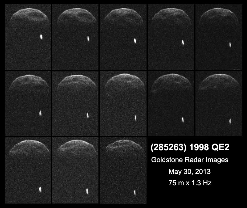
image by NASA/JPL-Caltech/GSSR (source)
Neat! I wonder if the dinosaur-killing one had a moon or two--after all, it was a lot bigger. "In the near-Earth population, about 16 percent of asteroids that are about 655 feet (200 meters) or larger are binary or triple systems," says NASA.
Excited as anyone about the prospect of global catastrophe by asteroid impact, and perhaps hoping to get some significant funding bucks out of the fear generated by such a prospect, NASA, at the request of Congress in 2005, came up with a study of the possibility of deflecting an incoming asteroid--complete with complicated graphs trying to show to what degree objects of various sizes/speeds would be deflected by a variety of man-made devices--which concluded, as any fool / Hollywood producer could have told you, that the best way to do it would be with a nuke, aside from the political caveat that nuclear explosions in outer space were banned under the U.N.'s 1967 space treaty (okay the Hollywood producer might have had to look that one up). But you bet your ass we'd do it anyway if we had to! And its little moon, too! U S A! U S A!
~~~~~~
Saturday addendum : p
Trying something a little different with how I process A* pages: I'm going straight bitmap, so they're sharper, faster, and maybe have more of a pulp feel. And I think any digital grays I need to include with the pencil blend more seamlessly this way. I've replaced some of the recent pages with reprocessed versions: 27, 38, 42, 46, and 49. (Only the latter 3 have had the large versions replaced, oh and you might need to tell your browser to refresh the page (F5) to see the new versions.)
Let me know what you think!
~~~~~~
Monday:
I've switched 'em back--too many dots after a while. : P I think what I got out of all this though is that I just need to add a tiny bit of sharpening after shrinking down the original to web size, then we should be good.
|
·····
|
| |
| Hatching plans | May 31, 2013 5:46 AM PDT | url |
| | |
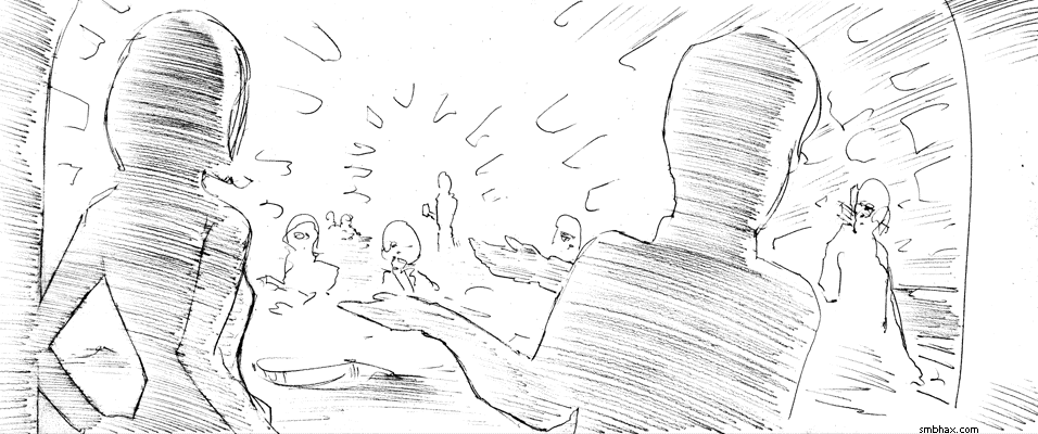
Added 2 new A* pages:I may just give in to digital gray stuff because certain kinds of hatching with the pencil just don't seem to be coming naturally to me, or at any rate I can't get the results to look as nice as I would like. I made a couple tries at using hatching to get the shading I wanted on the backs of the two main figures in page 48
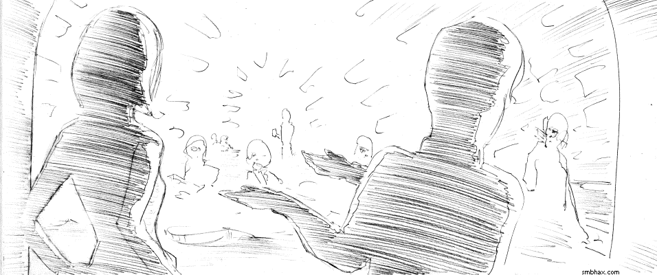
and they were just too speckly or uneven or...really just too distracting, I suppose. Anyway I'm trying to resolve not to get too bent out of shape about having to use a digital gray here or there to get an image to hold together.
I've also been a little worried that the hatching work seems to have been troublesome since I switched from the mechanical drafting pencil to regular wooden pencils, and certainly in some ways it's a little trickier to get even lines with a regular pencil's potentially more variable tip, but really I was having hatching difficulties in the plst pages I did with the drafting pencil too, and then as I switched pencils we also changed scene to much more complicated interiors, so I don't think I can blame it all on the wooden pencil, tempting as that may be. ;)
I did take a break to go on an online shopping spree for Japanese erasers, though--these big wooden pencil points throw way more graphite around, and it would be nice if I could find an eraser out there that could clean things up even better than the Staedtler Mars Plastic erasers that have been my standby; I'm a bit skeptical that I'll find something better, but you don't know until you try, so I've got I think about 15 different Japanese erasers that should be incoming from several parts of Asia, although I think three will take some weeks to get here...if they pass Customs at all, since I could have sworn one of them, which has become legend as a great eraser--such things are usually blown way out of proportion in rose-tinted hindsight by old users, was banned for import due to it containing something some government decided was unhealthy. Well. I guess we'll see. : o
~~~~~~
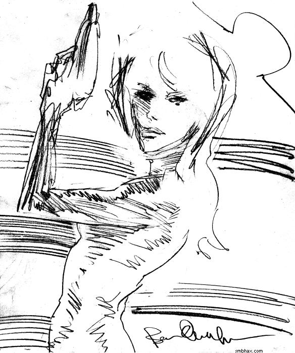
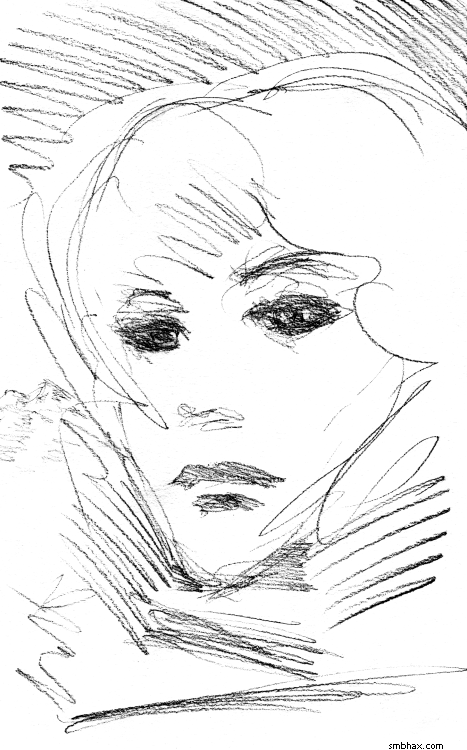
Here's a sketch I sketched yesterday when I was frustrated with how yesterday's page 46 had come out:
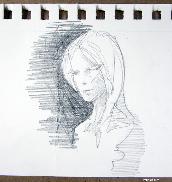
Frustration sketch, yay! Like the last one this is really more how i would like to draw the regular A* pages, only I can't quite seem to stay this free and easy when it's "for real." Or maybe it's just that these sketches are tiny and the layouts and poses are very simple. Hum maybe I should draw the A* pages on tinier pieces of paper!
|
·····
|
| |
| Help me digital gray, you're my only hope | May 30, 2013 5:08 AM PDT | url |
| | | |
Added 2 new A* pages:Hm, page 46's medium-range general view seems to be a type my brain has trouble handling with pencil alone--difficult to abstract it enough to handle in stylish outlines, especially when one character has gotten themselves wedged into the background. Maybe next time I'll remember this and plan out something better. : P Also wondering if maybe I should get one of those big graphite stick things for some better way of applying shading over large areas. I'll be in the vicinity of the tiny neighborhood-ish overpriced art supply store tomorrow, maybe I'll see what they have.
|
·····
|
| |
| Or I could just get a land line | May 29, 2013 1:19 AM PDT | url |
| | |
Added 1 new A* page:Only one page today, because I spent most of the day trying to configure my phone; see since I moved into this swanky new apartment and at about the same time activated a hand-me-down smartphone a friend gave me, which unfortunately is tied to a single cell phone service provider, I've had pretty bad reception, and this came to a head this past weekend when I finally took my turn hosting a revolving pot-luck dinner party of some old grade-school chums--I never did it before because my old apartment was too small and icky :p--and as it turned out I didn't know a couple of the guests had arrived--well one was re-arriving because he'd gone to rescue the other whose car battery had suspiciously died--because the hefty bricks in this old 1920s apartment building were blocking the call from the call box out in front of the building to my apartment in the back of the building. Fortunately the rescued guest was the person most familiar with my reception problem so he knew to email me when calling didn't work. : P
So anyway I can't have people coming over and starving to death on my front porch because their call doesn't get through, and I decided to take the rescued guest's earlier advice and get set up to take calls over the internet, and after porting my phone number and signing up with my cell service plan for a second time and then twiddling back and forth and back with phone settings and apps oh and my wireless access point, in *theory* I should be able to receive calls again. Nobody has actually called me yet. >_>
It's a simple setup that goes like this: a phone call comes through to the servers tied in to application 1, who now own my phone number, and their servers try to send it to their app on my phone and to my phone itself, except that application 2 and application 2's application-1-specific plugin, which detects if I am on WiFi or not, has gone into application 1's web settings and set it to ring just the app or the phone, depending on my WiFi connection status, so that actually if I am not on WiFi it rings my phone with an otherwise regular voice call, whereas if I am on WiFi it instead goes to application 1 which integrates with application 3 which handles the call as internet data which even after tweaking it and setting it to heavy bandwidth use and switching to a different wireless channel that may be the least busy in the vicinity of my apartment at certain times of the day, and so forth, sounds a bit skippy now and then but is hopefully more reliable than trying to take calls on my one-ish bar of reception while hunched down by the open window that isn't the one right next to my computer or refrigerator, although there was also the tantalizing possibility of a three-bars-of-reception spot at floor level in the corner and once I got a pretty good connection there for a few minutes by calling while lying down on the floor.
Boy, I dunno if telephoning has been this much of an adventure for 135 years or so!
|
·····
|
| |
| Maybe if I tried some eyeliner... | May 28, 2013 3:26 AM PDT | url |
| | | |
Added 2 new A* pages:Sheesh it's taking me longer and longer to draw these, I swear. One thing I ran into on the second page was something I've run into just a few times before, but it's a tricky one; see, generally if you're having trouble with some facial feature you can look in a mirror and be reminded that oh yeah that's what a nostril does at the bottom, or ah okay so that's what eyes look like when seen from a low angle; this sounds good and all and it's very tempted to use it when confronted with something tricky like the low angle view of Selenis' face there, but the problem comes when a specific feature you're trying to get--eyes, in this case--specifically do not look like the corresponding feature on your own face; which is to say, my eyes do not look like Selenis' eyes, especially--apparently--at a low angle, and so I was having trouble getting them drawn right when using the mirror as a reference point, which made me think I had to use the mirror more attentively, which just made things worse. : P So finally you realize you don't have a good reference and just have to draw the darn things without reference, and viola things start to get better. Strange stuff, this drawing business.
|
·····
|
| |
| Art therapy ain't rocket science | May 25, 2013 3:23 AM PDT | url |
| | |
Added 1 new A* page:Was sorta annoyed with the way I drew the last few pages so I drew this to feel better:
And it worked a little! Because who doesn't like silly pin-ups I guess.
Have a super-nice weekend!
|
·····
|
| |
| Pencils!!! The Mitsubishi Hi-Uni | May 24, 2013 3:01 AM PDT | url |
| | |
Added 2 new A* pages:In which I continue the fascinating tale of my journey for the ideal pencil! Yesterday I got to talking about Japanese pencils, and how I found, at a local store, the US market version of one, the Tombow Mono, and it was pretty sweet. I also mentioned the Mono's rival in Japan, the Mistubishi Hi-Uni. (Note that the Mitsubishi Pencil Company is not related to Mitsubishi Group, the automobile manufacturer.) Well, shipping from importer JetPens.com is fast enough that I got my hands on a Hi-Uni—well, a dozen, since that's the smallest amount in which they sell them :P—a few days ago, and ran it in a HEAD TO HEAD BATTLE against the US Mono, a pencil almost 1/3rd the Uni's price.
I liked the Mono better. The Hi-Uni, pictured below
(sharpened with my new imported Uni sharpener, which was a bit expensive ;_; but hey, I suck with a pocket knife, wood shavings, and besides, chances are good a standard sharpener won't fit these slightly wider than normal pencils) was significantly scratchier than the Mono, and lighter, almost as if the "H"-grade Hi-Uni is more like a "2H"-grade Mono or something: harder and not as dark. They both seem about equally smeary, though, which would definitely give the Mono the edge. In any case, the Mono H felt more like the H-grade 0.5 mm Pentel leads I've been using in my mechanical pencils—ie, more like what I'm used to. It was smoother than the Hi-Uni, and, well, I just couldn't find any up-side to the Hi-Uni; not that it's a bad pencil, it just isn't quite as good as the Mono, at least according to my peculiar tastes.
So the Mono it was; the handsome box of a dozen imported Hi-Unis was relegated to my bankruptcy-inducing art supply cupboard of shame. However, one nagging thought remained: what if the Japanese Mono 100 *is* better than the plain Mono (or "Mono Professional," strictly speaking) they put out State-side, as some would-be hard-core pencil importers maintain? Why, I'd be using a sub-standard instrument!
Perhaps you can guess what will happen in the next installment of the pencil saga...which won't be along until a certain package arrives, probably first thing next week.
~~~~~~
Danger with these Monos is overloading on graphite. Kinda did that on page 40 here. Gotta be clearer with decisions when it comes to shading so I don't end up muddling around. Well I suppose that'll come with practice.
EDIT: Over a year later, I've actually switched over from a Mono to a Hi-Uni after some consideration and re-testing!
|
·····
|
| |
| Pencils!! Caran d'Ache 777, Tombow Mono | May 23, 2013 12:22 AM PDT | url |
| | |
Added 2 new A* pages:So to continue the pencil saga from yesterday, I was using a 0.5 mm pencil to draw the comic, but kept wondering if maybe I should be trying a more expressive option, more like a regular pencil where you can have more variation of broad and thin strokes and so on. You may remember I got some of those fancy-looking Cretacolor Monolith woodless pencils some time back to try out, where it's just a big pencil-shaped stick of graphite or whatever, which is pretty darn slick, only they don't come in the harder grades of lead; I use H leads with my 0.5 mm pencils, which is on the low end of the hard side of the lead scale, and seems to be about my ideal balance between darkness (leads get lighter as they get harder) and smeariness (leads smear more as they get softer). Well, woodless pencils only seem to go to "HB," which is two grades softer than "H." I tried an HB woodless pencil, but it was just too soft. So I kind of gave up on the idea and just went back to doing the best I could with the 0.5 mm drafting pencil.
Recently though I came across the pencil work of anghorkheng on deviantART, and while his subject matter--big buff dudes with knifes and demons and so on--isn't what I'm into, his pencil work is amazingly expressive--almost brush-like in the way he builds up form with swished parallel pencil lines. And I knew he could do stuff with whatever pencil he uses that is just not possible with a 0.5 mm mechanical--I mean, purely mechanically, aside from him being way better with a pencil than me. And fortunately for me he's one of the nice folks who goes out of their way to thank you when you follow them (you know, I don't do that... I probably should), and so I struck up a small conversation with him via dA comments, and found that he *used* to be a dedicated 0.5 mm user, but eventually broke out of that into more serious pencil hardware.
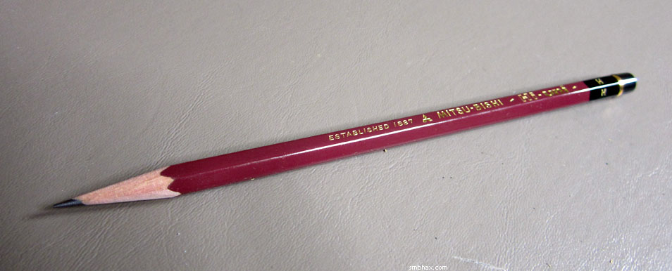
From that I finally realized I really need to try branching out and not just huddle inside the nice neat protective radius of the mechanical pencils. No, it was time--time to get into wood shavings. I remembered I had an actual wooden pencil somewhere in my art supply cupboard of shame, and dug it out; I had bought it after an extremely enthusiastic clerk at a large local art supply store had snatched it up and regaled me with stories of how great it was as I was looking around the pencil section for the right grade of lead for the 2 mm lead holder I was using for A* layouts oh somewhere over a year ago. I hadn't paid much attention to it at the time, but I found it, and it turned out to be a Caran d'Ache "Technograph" 777, grade F. F is the grade right between "HB" and "H," so a grade softer than I wanted, but I tried the 777 a bit anyhow, and wasn't blown away by it; kinda just felt like a regular old pencil. Nonetheless I looked into Caran d'Ache, and the Swiss manufacturer doesn't seem to make the 777 anymore, at least not for the US, but now they have this "Grafwood" line that comes in fancy cascading painted gray colors and is quite expensive as far as pencils go--but it had good reviews, kinda as the top-of-the-line Western pencil or something.
But the 777 had been underwhelming, so, not convinced, I went looking for something else. Turns out, as no real surprise I suppose, that there are some highly regarded pencil lines from Japan, with most of the English buzz surrounding Mitsubishi's Hi-Uni (what we know as "Uni-Ball" over here is in fact a Mitsubishi brand), and Tombow's revered old Mono 100. Both had about equally great reviews and equally high cost on the JetPens import site. I ran out to my most local art supply store, a tiny thing with high prices close to my favorite grocery store, and of course they didn't have imported Japanese pencils, BUT they did have the Mono pencil brand that Tombow makes for the States, in fact the Tombow MONO "Professional" seems quite easy to find around here. I got an H and an F Mono and trotted home to give them a whirl vs the 777 and my 0.5 mm.
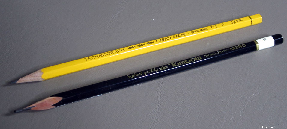
Unlike most other civilized pencil-making countries, Japan seems to have stayed old-school, and their pencils do not come to you pre-sharpened--perhaps this is a samurai thing. I thought I had this covered with a tiny little manual sharpener I had and had never used, but the Mono is actually a millimeter or two thicker than a regular pencil--and marginally thicker than the 777, I think--and did not fit in the sharpener. Um. But then I remembered DocDave's story of how Frank Frazetta offered to draw Dave a self-portrait for Dave's camera, dug up a pencil, and, not having a sharpener, just flicked open his trusty Tarzan pocket knife and whittled the pencil to some sort of point. Thus inspired, I chopped away at the Monos with my childhood Swiss Army knife, wasting a good deal of lead and ending up with a large protrusion of not-very-sharp lead. Still, it would do for simple pencil testing:
How did it go? Well, I had read a person or two on the internet who was of the opinion that the US version of the Mono was inferior to the import-only Mono 100; but domestic though it was, this Mono (the H one--the F was a bit too soft) felt good--darn good. In fact, to my own surprise, even though I was in a hurry and was supposed to be meeting a friend shortly and was in fact already late although I hadn't realized it yet, I just could not stop doodling with the thing, it was so fun to draw with. The hardness/smeariness seemed about identical to the ubiquitous Pentel Super Hi-Polymer 0.5 mm leads I'd been using in the mechanicals, while also being a shade or two darker, which would greatly help some of the difficulty I've had scanning my lighter pencil drawings.
If the cheap American version is this good, I thought, the made-for-Japan stuff must be amazing! So I ordered some--but that'll have to wait until next time. :o
Oh and today's pages were drawn with the US-market Tombow Mono. :) Properly sharpened, though--I got an imported rather fancy Mitsubishi Uni sharpener, the kind that clamps onto the pencil and then pulls it in by springs as you turn the crank to spin the sharpening blade thingy, and stops sharpening automatically once you've got the tip perfectly shaped. Frazetta would probably consider me a sissy, and I'll own up to that, but man this'll save me a lot of pencil lead, finger gashes, and stray shavings in the long run! :"P
|
·····
|
| |
| Pencils! Platinum Pro-Use II, Pentel PD345 | May 21, 2013 11:22 PM PDT | url |
| | |
Added 1 new A* page:Like the good ship Aurelia (shouldn't be too hard to figure out where that name came from :), I'm behind schedule too, so just the one page today. Part of the reason I got behind was because I spent some time criss-crossing town the past few days to manage a sale of a couple pieces of the A* original art in my current art show in town (at Spin's Barbershop in Wallingford, through June :). Exciting! The other part was getting a filling at the dentist's yesterday, which was eh exciting in a different way, I guess (always fun when they tell you it's such a small one, they won't need to numb you up--don't worry, it'll be painless! :o And then he keeps going back in with the drilllllllll).
Since I lead such an exciting life, I think I'm going to be sharing some of it with you over the next few days--that's right, it's more posts about pencils! Yes, hold onto your shorts, we're talkin' graphite! :ooo
I know I've excited you before by telling you that I'm doing the pencil work in A* with a Platinum Pro-Use II 05 drafting pencil, a fine machined aluminum Japanese drawing instrument I got over here, but I never thrilled you with a picture of it, so
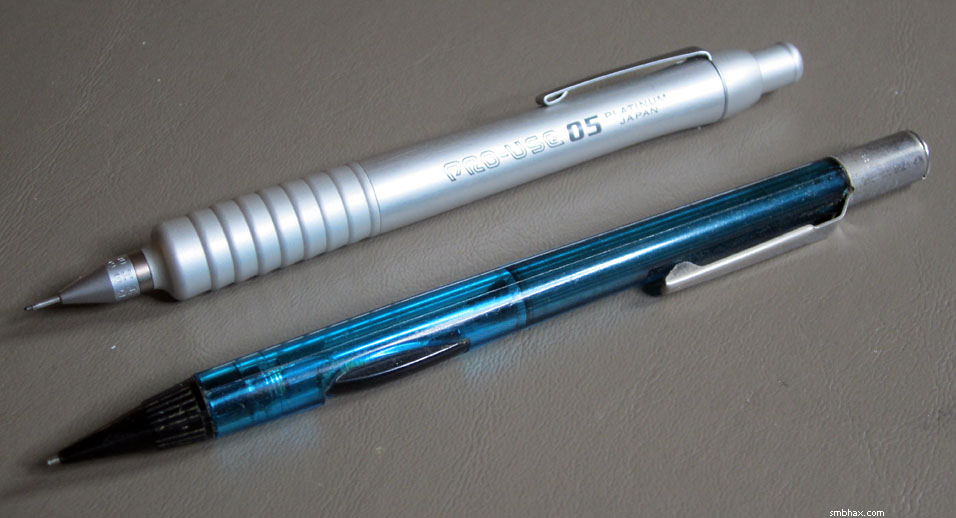
The long metal pipe for the drawing lead in front is the main way to tell the difference between a drafting pencil like the Pro-Use II--it's so you can draw along rulers better and stuff I guess--and a regular everyday mechanical pencil like that blue beauty in front there, my trusty Pentel PD345. Both use 0.5 mm leads, although there are models in other lead sizes. Wikipedia says the PD345 has been around since the 80's, and...that is probably about how long I've had that one. :) Still going strong! At some point Pentel came out with a new model that has a sorta bigger lead-advance button and other garishness, but fortunately they also still make and sell the original model, although I guess not in this nice blue color, which is too bad. That's the pencil I was doing the layouts with when I first started doing A* traditionally.
The Pro-Use II is definitely nicer to draw with, though--far better balance and weighting, finer tip, beefier feed mechanism, and MAN I swear it must have the best grip in the pencil world, just look at those lovely wavey curves; they snuggle right up against your fingertips for a wonderfully solid grip, without grating or slipping like the spikey grid grips on just about every other drafting pencil. Nice and thick, too! The Pro-Use II is awesome.
And I'm going to be moving to something else. Or trying to. :P Gasp! The carbon-tipped saga continues tomorrow, probably.
|
·····
|
| |
| Quantum annealing I almost get | May 20, 2013 11:40 PM PDT | url |
| | |
Added 2 new A* pages:An A* reader who actually knows stuff (unlike me who just reads stuff in articles that he thinks sounds cool) wrote me to clear up some of my confusion over that quantum annealing stuff that the new D-Wave computer NASA is getting is going to be doing with its qubits:
...quantum annealing is a variant of a regular computer optimization technique called simulated annealing.
Basically you start with a "landscape" (though it's multi-dimensional) with hills and valleys in it. In this you have the equivalent of a little ball that rolls downhill. The trick is a bit like one of those little puzzles with a ball in it where you shake it around and try to get the ball into a particular hole, except that the holes are different depths and you want to get the ball into the deepest one (which is your solution).
In regular simulated annealing, the algorithm "shakes" the box hard to start with, and less and less as it goes on, which *usually* results in the ball falling into the deepest valley, or at least one of the deeper ones. (In real metal annealing, the "shaking" is done by raising the temperature and slowly decreasing it (causing the atoms to settle into neat regular arrays, so in simulated annealing they refer to this as a temperature as well.)
In the quantum version, they don't make the ball travel *over* the hills in the landscape, it just tunnels through them, and they gradually reduce the area over which it tries to tunnel. But they're still looking to see which valley the ball landed in.
Okay, that's an oversimplification, but is roughly what's happening.
The main thing is that the D-Wave computer isn't a *real* quantum computer, exactly, it's only useful for solving this specific type of optimization problem, as far as I understand it. |
And I had seen a chart of that over on Wikipedia. So I said all right but what is this fancy equationing actually doing, and the knowledgeable reader wrote back:
Oh, that's pretty simple. It's common optimization problems, with the X and Y (and other dimensions) representing the values of the parameters (e.g. airspeed and control surface position for a plane) that can be varied in the optimization process, and the Z dimension being the measure of how good the result is for a particular set of parameter values (for a plane design, that might be drag, or lift, or the size of vortices produced by a wing, or some combination of those).
I would guess NASA is interested in using the computer to optimize airflow over vehicles, or rocket engine thrust, or complex-but-efficient "slingshot" orbits, or similar problems. Since it's Ames that's getting the machine, I'd guess it's most likely for aerodynamics stuff, since that's been their specialty. Orbital mechanics would mostly likely be JPL, and engines would be Hunstsville, I think. Maybe they're trying to figure out a better scramjet design
.
I don't really understand how the D-Wave machine works; my (limited) knowledge of quantum computing is of the kind of quantum computer that's a bit more like a general purpose computer, only it works by running all possible values through a computation at once, and then tries to pick out the "right" inputs that give the desired result. In other words, kinda like magic
. "Normal" quantum computers have devices that are sort of recognizably similar to logic gates in normal computers, I don't think the D-Wave machine does. Instead, I think it sets up a quantum physical simulation of the "landscape" somehow, and tries to measure where the "ball" comes to rest in it. Basically it's more like an old-style analog computer, I think. |
Huzzah for putting it in layman's terms, I can almost wrap my head around that! I'm fortunate to have super-smart readers. : )
~~~~~~~~
Original version of this page--kinda like the shading of the face but the facial features and body language were off:
|
·····
|
| |
| The gray of shame | May 18, 2013 12:45 AM PDT | url |
| | | |
Added 1 new A* page:Forgot the lesson I tried to teach myself a week or so ago about not drawing too lightly; drew this one so lightly I can actually barely see it on the page itself in real life (although it looks nice when you look really, really close in good light--honest! :P), so the lighting effect such as it was totally falls apart when trying to scan it and put it into a visible graphic, so finally I've been reduced to salvaging it with an extremely crudely applied digital gray--crudely applied with my finger on my tiny keyboard touchpad, because I don't want to do a nice smooth job with the ol' drawing tablet and get sucked back into working digitally again; what I *want* to do is to be able to produce the "grays" I want with correctly applied linework from the get-go, like maybe I've managed best so far on page 27 and page 28. Oh the digital shame of it all! Blah anyway huzzah it's the weekend.
|
·····
|
| |
| NASA getting computer that does quantum stuff | May 16, 2013 11:10 PM PDT | url |
| | | |
Added 2 new A* pages:I happened to spot some interesting science news on the BBC's site today, where they report that NASA will be getting a new supercomputer built by D-Wave Systems that uses quantum annealing, a quantum calculation method that takes advantage of the quantum mechanical behavior known as "quantum tunneling," which describes how quanta can just pop right through barriers. I can't make heads nor tails of the Wiki-science/math speak in Wikipedia's quantum annealing article, but annealing has something to do with finding the "lowest energy" solution to a problem very efficiently; anyway the BBC article says this new quantum computer "in one case" performed a certain operation 3,600 times faster than a conventional system, and it's got already Google and university researchers lining up to share time on the computer, so it must be pretty spiffy. Its quantum 512 qubit processor thingy *does* have to be cooled down to near absolute zero in a tool-shed sized housing in order to function, and it reportedly costs "up to" $15 million, so you probably won't be playing really awesome games on one of your own any time too soon...but if you can get into NASA's Ames Research Center starting this autumn, maybe you can sneak in a quantum game of video solitaire or something.
|
·····
|
| |
| Two lights are better'n one | May 16, 2013 12:58 AM PDT | url |
| | |
Added 2 new A* pages:Two pages! Still wasted time, although now I think I've finally got everything I need for adequate studio lighting in my new apartment--which has been tricky since it's from ye olden dayes when apparently they didn't have overhead ceiling lights! Sheesh.
Here's the version right before the final version of page 29:
I have photos of some earlier versions but those are too ugly. : P
|
·····
|
| |
| Altman, Star Wars & Arnie in The Long Goodbye | May 14, 2013 10:14 PM PDT | url |
| | |
Added 1 new A* page:Blah, I dunno where the time went today, which is probably exactly the problem; I know I spent ages drawing layouts and erasing, just trying to find something that clicked; in any case, it looks like the one page will have to be it. Will do better tomorrow, I hope!
On a completely unrelated note >_>, Altman's 1973 film "The Long Goodbye" on Netflix streaming is a darn fine movie: his reinvention of Raymond Chandler's classic noir private eye Philip Marlowe 20 years later, for a jaded '70s. One production note I found particularly interesting was that "The Long Goodbye's" screenwriter, Leigh Brackett, also wrote, nearly 30 years earlier, the screenplay for Howard Hawks' adaptation of Chandler's "The Big Sleep," in which Marlowe was played by Bogart, and which is a darn fine film itself. Elliot Gould in "The Long Goodbye" is no Bogart, which is probably exactly the point.
Brackett had also written a lot of her own science fiction, along with other screenplays, in between, and would later deliver "a finished first draft" of the script for "The Empire Strikes Back" shortly before her death from cancer in 1978. AND in "The Long Goodbye," the guy who also happened to go on to write the score for "Empire" and the other Star Wars movies, John Williams, took the eponymous Johnny Mercer theme song and recast it over and over in other musical styles heard throughout the film, so that all the music you hear throughout is simply radically different versions of "The Long Goodbye."
AND if creatively punishing gangster Marty Augustine's super-buff henchman looks kinda familiar once he strips down later in the film--which I should mention does include nudity, language, and a bit of violence--that's because he's the future governor of California (Altman's Marlowe references another governor of California, Ronald Reagan), Arnold Schwarzenegger, in an uncredited role, just his second movie appearance (after starring in the 1970 "Hercules in New York").
|
·····
|
| |
| Woodless pencils are kinda like gray crayons | May 13, 2013 11:23 PM PDT | url |
| | |
Added 2 new A* pages:Here is this sketch I sketched late one night over the weekend:
It was basically an excuse to get an image out of my head and to play with those Cretacolor "Monolith" woodless pencils again. This was with the 2B, and on my sketch book's rougher paper it really showed a lot of texture. Almost crayon-like, really. Too messy for regular A* pages, I suppose....... .... Hm.
|
·····
|
| |
| Forcing Facebook to make a decent thumbnail | May 11, 2013 4:27 AM PDT | url |
| | |
Added 1 new A* page:Like a lot of people, I post my latest pages on Facebook so people who follow my work there will be notified of an update; Facebook is supposed to scan the URL you paste into its "Share..." text box and convert that into a nice handy link with your page's title and even a little thumbnail image of a graphic from the linked page; this is particularly handy for comics because it shows readers that there's some new artwork they can check out by clicking the link.
Facebook, however, is a fitful beast, and when left to its own devices does not always accomplish its thumbnail conjuring correctly: sometimes it won't come up with any thumbnail, and sometimes it will come up with a thumbnail of nearly every graphic on the page *except* the comic image itself.
It was on a particularly persistent tear of doing that to me lately, so I finally got fed up and looked around to see if there was a way to put Facebook's thumbnails to the screw. Fortunately, there are several ways, all, as it turns out, invented by Facebook themselves.
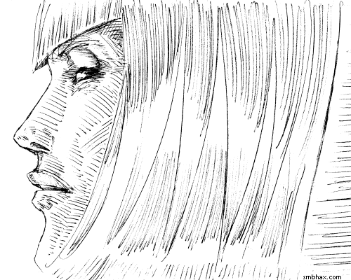
The theoretically nearly ideal one is the Open Graph protocol, a system of HTML header tags for specifying stuff, including thumbnail parameters; Facebook came up with this and then made it public domain, so it is now also used by other social networking sites, such as Google+ and tumblr. It's a pretty straightforward syntax, and you can find out all you need to know about it in clear and surprisingly concise detail on the Open Graph page. Technically, all you need to do is add one line to the HTML header of the web page you want thumbnailed, and that is the "og:image" meta property. For instance, if I wanted a particular comic graphic (https://smbhax.com/ep/0019/d/0025.png)
from a particular page (https://smbhax.com/?e=0019&d=0025) thumbnailed when I pasted the page URL into Facebook's "Share..." box, I'd just need to add this to my page's header
<meta property="og:image" content="https://smbhax.com/ep/0019/d/0025.png">
and Facebook should make a nice little thumbnail out of the comic image.
Well, it doesn't always work. If you go to Facebook's Debugger (which used to be called by the very odd name of "Linter") and punch your page URL in there, it may give you some funny error message like "Provided og:image is not big enough. Please use an image that's at least 200x200 px" when you know darn well your image is bigger than 200x200 pixels.
This seems to be some kind of caching problem on Facebook's end--it hasn't loaded the image correctly, or something. Fortunately, when you plug a page URL into their Debugger, it forces Facebook to re-cache the page; so, if you now go back to your Facebook status page and plug the URL into the "Share..." box, it just might make the correct thumbnail for you! Voila, mission complete. That might even help you out without having to use an "og:image" header tag at all--worth a shot, anyway!
Now, the Open Graph protocol has some additional parameters you can use that may make Facebook's caching a little more reliable so you don't have to bop their Debugger over the head--or perhaps I'm just imagining it. Anyway, you can give the dimensions of the image you want thumbnailed (the one you used for "og:image") with a few additional header lines: "og:image:width" and "og:image:height," like this (being sure to use the actual correct pixel sizes for your image):
<meta property="og:image:width" content="956">
<meta property="og:image:height" content="475">
That might help; then again, it may not; I've come across various arcane theories about this, such as that you should make your image's dimensions over 1500 pixels, that they should be rounded to multiples of 100, and that they should be perfectly square; I don't know about all that; I DO know that I'm not going to resize my thumbnails just to try to hack around weird Facebook problems, and that giving Facebook fake rounded dimension numbers has no discernible effect one way or another.
Now, if you want to get a little fancy, note that you can use any online image for your "og:image" thumbnail--it doesn't necessarily have to be one that appears on the page you're generating the thumbnail for. For instance, I have high-definition versions of all my comic pages, so I could use the URL for the high-res version of the comic page as "og:image"--and set the "width" and "height" lines to match--if those matter--and then Facebook would generate an imperceptibly higher quality thumbnail for the page because it would have more sample image data to work from.
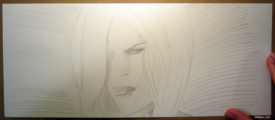
A little more usefully, you can specify an image that is, say, zoomed in on some particularly interesting part of the comic page image to which you're linking; not only will a detail be much more legible at thumbnail size, but this way you can focus on the most eye-catching part to grab people skimming through their Facebook feed, and you can avoid spoiling some part of the page in miniscule thumbnail size. I've actually been generating thumbnails along those lines for tumblr (since making a "Photo" post on tumblr and then adding a link to the custom thumbnail image you've made in effect lets you post a giant thumbnail, rather than a small one with their ugly auto-formatted text link that their "Link" post type makes), so I figured since I have them, I might as well use them for Facebook and Google Plus as well by specifying them with the og:image header tags. So for this example page, I have this giant custom thumbnail I made in Photoshop
and to get Facebook and the other services to use it as the thumbnail when linking to the page, I use these lines in my page header:
<meta property="og:image" content="https://smbhax.com/ep/0019/t/0025.png">
<meta property="og:image:width" content="500">
<meta property="og:image:height" content="400">
which tells the sites to use that customized giant thumbnail image as the source for the small thumbnails they'll generate when linking to the page, like so from Facebook:
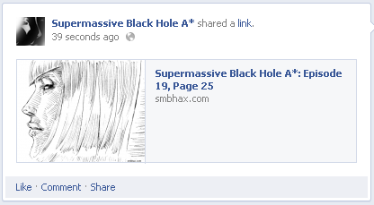
Super fancy! But don't lose that link to Facebook's Debugger because you will probably still need it once in a while to get Facebook to double-check your page for the correct thumbnail to use.
|
·····
|
| |
| Pencil vs Pen, round X | May 09, 2013 11:37 PM PDT | url |
| | |
Added 2 new A* pages:Sorry about the uckiness of page 23; well I mean it isn't my best drawing, but then the contrast got kinda blown out because I had to compensate for the pencil having been sketched in too lightly, which has been a problem now and then so far in this episode's pencil-only odyssey. I tried to pay more attention to using sufficiently bold pressure in the next page, 24, for it to come through with more of a tonal range and less grunge, and I think that did work better, anyway.
Also comparing these two pages reminded me that with pencil I've really got to take an angle on the drawing in order for it to work out--I can't just sort of muddle into it and hope for the best, because without a direction--if you don't mind me mixing metaphors in a confusing fashion--the pencil is just way too aimless on its own, unlike, say, the brush, where even fairly random brush strokes still have some character of their own. On the other hand, given direction, it seems to me--for me, anyway--that the pencil can be steered to a wider variety of results than the brush; maybe this is due to the very anonymity of its mechanical line: it's easier to lose track of it in an overall design, so in a really composed pencil image you're less distracted by the pencil itself.
Or maybe that's all just silly talk, I dunno. I did try a few experiments today in going over the pencil versions with pen, primarily a Rotring Tikky Graphic 0.5, which is pretty much the only technical pen I've found that can keep up with a brisk drawing pace. Since I already screwed up the original version of page 16 of this episode with a failed pencil redraw, I tried converting that to pen; here's the actual page 16, the photo of the failed pencil redraw of it that I showed before, and the pen conversion:
That just about ends my pen curiosity, because although it scans a lot more cleanly, it can't do the subtle variations in width, texture, and tone that the pencil can do--and besides, I don't think I like the perfect cleanness of it; art shouldn't be completely clean and robotic-looking. : P
Not to mention that the redraw was just a bad drawing to begin with, so that wasn't quite fair to the pen, I suppose--but I don't want to ruin my good drawings. ;) So I tried one last pen-speriment with today's page 23, since I'm not too fond of that one, and...that one came out hideously, we're talking like the walking dead ugly here. Didn't really help that I thought I'd try using a much thicker pen--a Faber-Castell Artist Series Big Brush marker--for the hair, but really it was the awful uniformity of the shading lines I made with the Tikky across the face that just gave it a ghastly, spectral appearance, which I won't blight your eyes with.
So yeah, still stickin' with the pencil, still learning how to use it.
|
·····
|
| |
| Dithering and the Golden Nostril | May 09, 2013 1:35 AM PDT | url |
| | |
Added 1 new A* page:Back to my old ways of falling behind schedule as the week goes on, so I've only got one page in today—and I thought this would put me back on track for two tomorrow, but it took me a long time to do because I ended up redoing it. Well I'm just going to cut out the gym tomorrow, so there, I'll still get two done, hah. : P Anyway here was the pre-redo version:
Can you tell what's wrong with it? The eyes and the nose/mouth are facing different directions: the eyes to the left, the nose/mouth straight ahead. This kind of angle shift happens when I spend too much time fussing over individual features; it used to happen to me a lot more than it does now, but now it's more sneaky and subtle and awful. : P So I ended up redrawing just about all of the face except the tip of the nose and the nostril on the right. That nostril was gold!
~~~~~~
I keep feeling like I'm always wasting a lot of time during the day, flipping around the internet or whatever, but I dunno, maybe that's necessary; I mean, when I intentionally shut off the time-wasting things I've been doing, I then find myself just inventing new ones instead. So maybe my subconscious is just really resistant to turning each day into a pure drawing grind, and maybe that's for good reason; I do think that you need time to reflect and inspire yourself when working on a primarily creative endeavor; if I didn't take time to look around at other things then maybe I'd just be crunching along with pretty much the same drawing style with which I began A* years ago—then again some might say that would be a good thing!
Ah well. Anyway one thing I've been looking around for is other art drawn in a sort of similar way to how I've ended up drawing a lot of these pencil pages. I can't say I've found anything online that has really struck me in that way, hm wait aside from this Mucha sketch and this illustration from Punch—tried to track down the "EH" artist for that, but the only E.H. I could find listed as an artist in the Punch Magazine wikipedia page didn't look to have that style—but I keep thinking of the linear shading Alex Raymond did in his Flash Gordon, particularly later on. I don't have a great example of it in the book I have to take a photo of, but he also did it from time to time for effect in his later Rip Kirby strip, for instance in the strips in this photo I posted back in December:
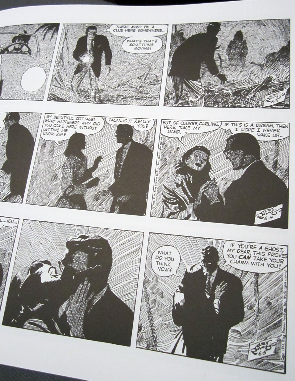
I didn't consciously set out to ape that type of shading, but it just seems to come out more attractively for me than cross hatching.
~~~~~~~~
Oh another thing I dithered around with today: dithering! See with all these shading lines, the comic image file sizes can start to creep up higher than I'd like—don't want them to take too long to load for readers to read briskly. I'd been switching some to lossy jpg format instead of lossless 256-color png, but even those jpgs were getting big, plus I noticed in a jpg version of today's page that individual little dots can turn into big blurry blogs in jpg. So for today's page I converted it to a 16-color png instead, which is much smaller in file size than even those blobby jpgs, and quite a bit sharper—very slightly sharper than the 256-color version, but about half the file size.
|
·····
|
| |
| Threshold for erasing | May 08, 2013 1:58 AM PDT | url |
| | | |
Added 2 new A* pages:Ugh, I got nothin' today; that second page took me way too long--that is, scribbling and erasing the I dunno six or seven attempts before it, and then however many attempts it took to finalize the features of Massimilia's face, took way too long. Son of a gun, it was like art block or something for a while there, yuck. Glad I kept trying though I guess, since it came out all right in the end. I used a max Threshold layer over the original high res scan this time, that did a good job of preventing the scanned pencil lines from breaking up or looking too pixelated when shrunk down to web size.
|
·····
|
| |
| Mucha's "The Slav Epic" | May 06, 2013 11:21 PM PDT | url |
| | | |
Added 2 new A* pages:Recently I linked to a collection of turn-of-the-century (do people say that about the 2000s yet? 'cause I mean the 1900s :P) Czech artist Alfons Mucha's visual interpretation of the Lord's Prayer in a set of seven stunning black and white lithographs, first printed in Paris in 1900. Well, later in life Mucha became very interested in portraying the history of the Slavic people, and spent a decade and a half painting 20 huge (we're talking 20 foot high, 25 foot wide) canvases depicting what Mucha felt were key points in the history of the Slavs. Painted in tempura, they are brilliantly colored and masterfully composed, fully of intricate detail of dozens of figures in all sorts of impressive scenes; last night I finally got the bug to collect the best images I could find of them on the 'net into a complete set of his full Slav Epic, and duly posted it on my tumblr, although I had to break it into two parts because tumblr limits you to 10 images per post. : P So here's Mucha's Slav Epic, cycles 1 through 10 and cycles 10 through 20.
|
·····
|
| |
| Etsy, Etsy, Etsy! | May 04, 2013 3:26 AM PDT | url |
| | |
Added 1 new A* page:A*'s got a shop on Etsy now, with this A*-y little banner:

You'll find five of my original ink drawings there as exclusives! Well at least for the four months or so that Etsy listings last. You can buy pretty much all the original A* art and prints I have right through the A* web site itself, and without my having to notch the price up slightly to compensate for the fees of an external shop, so this Etsy thing is really more for getting art buyers from Etsy to find A* stuff than it is for A* readers to find my stuff on Etsy, but, anyway, there it is! I've never tried Etsy before so we'll see how this goes.
|
·····
|
| |
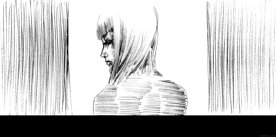
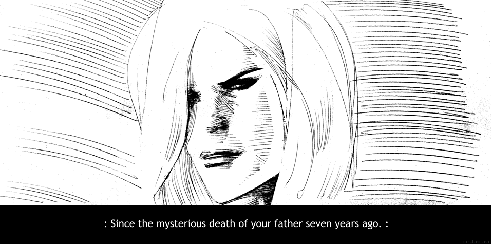
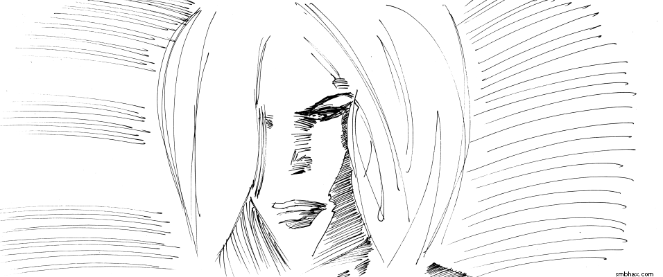
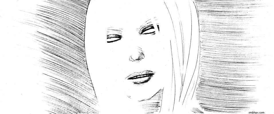
| The Treban Affair | May 03, 2013 3:59 AM PDT | url |
| | |
Added 2 new A* pages:We've heard the name "Treban" three times before this episode. Do you remember? Well here's a triple hint--okay it's blatant links to the exact pages: from Mar in episode 1, from Proctor in episode 9, and from the Major in episode 18. I will also mention that, figuring in travel time, clone generation time, undercover time, etc, episode one took place just a bit less than seven years prior to where we are here in episode 19. I think. I generally don't like to give time frames but sometimes it's useful for adding up to something.
~~~~~~
I think I made some progress in pencil style today, apparently the key is to stay up all night obsessively trying to beat a ridiculously high video pinball score (finished at 7:00 am! Take that, Big Shot! : P). ... I don't think I'll do that again, though, so I'll just have to muddle on somehow.
Although I did have trouble processing page 16, because I sketched the eye way darker than the other lines of the head, so when I tried my usual way of just raising the black levels some, the eye was way too dark relative to the lines:
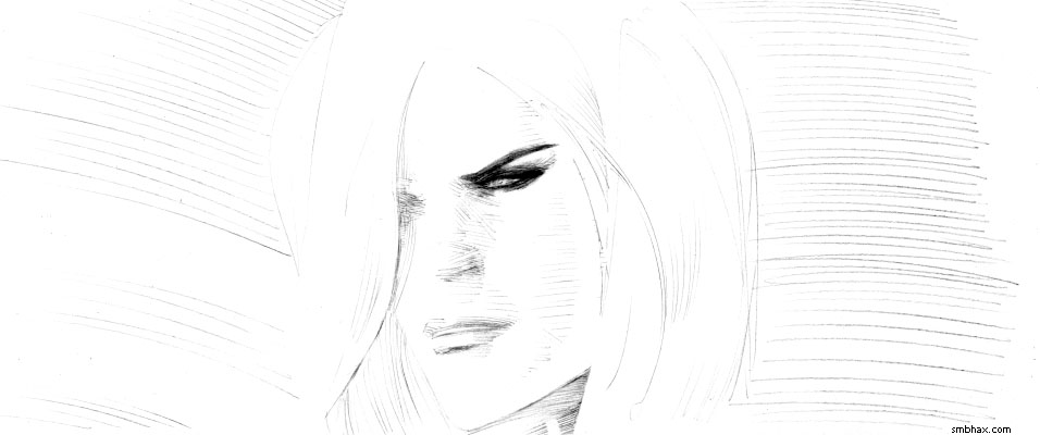
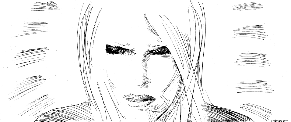
Oops. I tried some things but wasn't happy with them so then I figured I'd just redraw all the other lines. ... This did not work, it's basically like inking, with most of the drawbacks therein, primarily that I can't redraw things without losing something significant of the original. This was the result:
That was getting bad so I went back to my original scan and this time adjusted the eye separately from the rest of the lines, tinkered with gamma and white levels too, and, well, at least the end result looks like the eye more or less belongs in that face, even if the overall black/white contrast is more severe than I would have liked. This was distressing because the previous page, 15, of Massimilia, came out about as perfectly as I could hope for, black/white processing-wise I mean; but I think that was because I'm exaggerating "realistic" features slightly for her face, so it's ever so slightly cartoonish which means I don't worry nearly as much about making it look perfectly real, and I guess that makes me feel free to lay down more forceful lines, rather than sketching things out and feeling my way along toward a more realistic result.
~~~~~~~~
Did you know there's a 1916 D.W. Griffith (and others) short film in which Douglas Fairbanks plays a coked-out Sherlock Holmes parody named "Coke Ennyday"? Yes. It's freely available online but I'm not going to point you directly to it because I'm still not sure what to make of it all. They made some pretty crazy movies back then.
|
·····
|
| |
| Douglas Fairbanks on Happiness | May 02, 2013 12:03 AM PDT | url |
| | | |
Added 2 new A* pages:Didn't do the best on time management today--got two pages done, though!--so this'll be a skimpy blog post, mostly I wanted to direct you to what I think is a nifty screenshot (actually a photo I took off of Netflix : P) of a keen color tinted, special effects shot in the opening of Douglas Fairbanks' (mostly) black and white 1924 film, The Thief of Baghdad--the image has a nice little truism written in stars sparkling over the duney desert sands, and you can see it here on my tumblr (which is a good place to put stuff that is probably otherwise copywritten :p).
|
·····
|
|
|