 | |
| |
|
|
view titles only (low bandwidth) |
| |
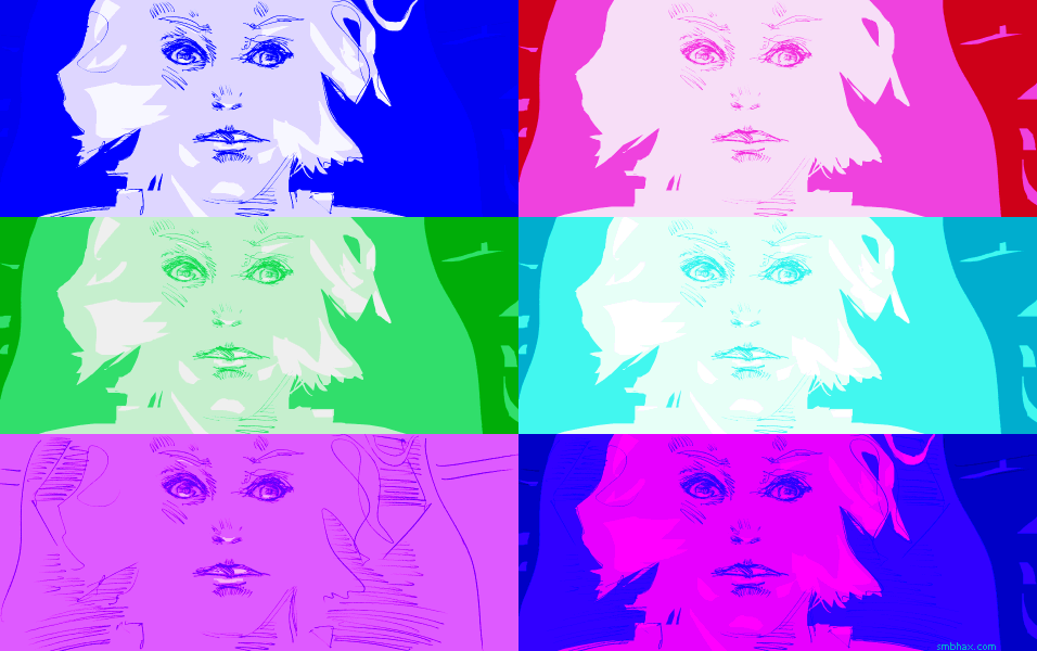
| Where the colors came from! | Aug 31, 2013 4:57 AM PDT | url |
| | |
Added 1 new A* page:Some coloring steps : P:
I've got a new art feature I want to get done for the site, haven't seemed to manage to fit it in over the past few weekends, hoping for better squeezing this weekend.
|
·····
|
| |
| Fusion power in France! ...In 10 years, maybe | Aug 29, 2013 11:18 PM PDT | url |
| | |
Added 1 new A* page:'Critical phase' for Iter fusion dream is a recent BBC article about the internationally funded "ITER" ('International Thermonuclear Experimental Reactor and Latin for "the way" or "the road",' according to Wikipedia) experimental fusion reactor under construction in southern France, "receiving the first of about one million components for its experimental reactor." The creation of the components by various agencies around the world has been more troublesome than initially anticipated, and the operating target date of 2020 is looking pretty shaky at this point. ITER's "rough overall budget" is supposed to be about 15 billion euros (just under 20 billion USD)--although I guess that might have to go up considering the delays.
Still, fusion power! In southern France! Might happen some day! ITER's reactor is a "tokomak" design; "tokomak" is "the Russian word for a ring-shaped magnetic chamber." 28 incredibly powerful magnets will be tasked with creating a magnetic field of sufficient strength to contain plasma reaching over 200 million degrees Celsius, "conditions hot enough to force deuterium and tritium atoms to fuse together and release energy." Previous experiments with a tokomak at the JET ("Joint European Torus") (<- there's a really cool photo of the reactor's interior there) reactor in the UK have achieved fusion, but took more energy to produce than they generated; ITER, on the other hand, is supposed to be able to create ten times more energy than it takes to operate--up to 500 megawatts, quite a bit more than JET's 16 megawatt fusion record set in 1997 (which took 24 megawatts to generate); for the sake of comparison with fission reactors, the world's largest nuclear fission reactor plant, Kashiwazaki-Kariwa Nuclear Power Plant in Japan, can produce 7,965 megawatts from its seven reactors combined. (A 6.6 magnitude offshore earthquake, the second largest to hit a nuclear plant, took Kashiwazaki-Kariwa offline for 21 months starting in 2007, but the radiation leakage was insignificant (the 2011 offshore quake that caused a tsunami and extremely significant radiation leaks at the Fukushima Daiichi plant in Japan was magnitude 9.0).)
~~~~~~~~~~
I just noticed that there are a bunch of James Bond movies on Netflix's streaming service. And that they're being removed on September 2nd. >_< Guess I'll just try to squeeze in as many of the Sean Connery ones as I can before then...although maybe I'll do that Lazenby one first, I think I've only seen that once before.
|
·····
|
| |
| Thierry Legault and Astrophotography | Aug 29, 2013 12:03 AM PDT | url |
| | |
Added 1 new A* page:A friend sent me a link to the astrophotography web site of Thierry Legault, who takes some pretty spectacular space-related pictures. For instance, some amazing shots of polar aurorae over Norway (make sure you get down to the landscape shots at the bottom too, those are quite nice), and photos and even video--from Earth--of the International Space Station docking with the Space Shuttle Endeavour in 2011, and then the two of them crossing in front of the Sun, looking a bit like little bees on a gigantic honeycomb.
Also he's prrrrrrobably no relation to the Thierry in A*, which is good considering what will go on next episode. >_>
By the way, Wikipedia's astrophotography page will fill you in a bit on the field's history and techniques, along with a lot of other cool photos, including oldies like the first photo of a solar eclipse (Berkowski, Prussia, 1851):
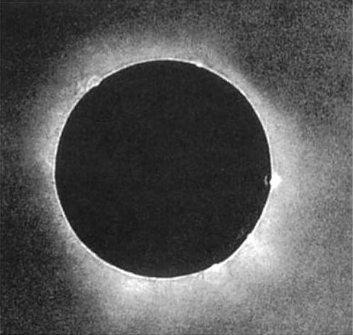
image by Berkowski (first name unknown) (source)
That was a photo using the original photographic daguerreotype process--a copper plate with a silver face, made light sensitive by iodine fumes, exposed via a camera obscura, then developed with mercury fumes and fixed in a salt solution. Its inventor, Louis-Jacques-Mandé Daguerre, had made the first attempt at an astronomical photo in 1839, shooting at the Moon, but the telescope he was using didn't track accurately enough and it just came out as "a fuzzy spot."
|
·····
|
| |
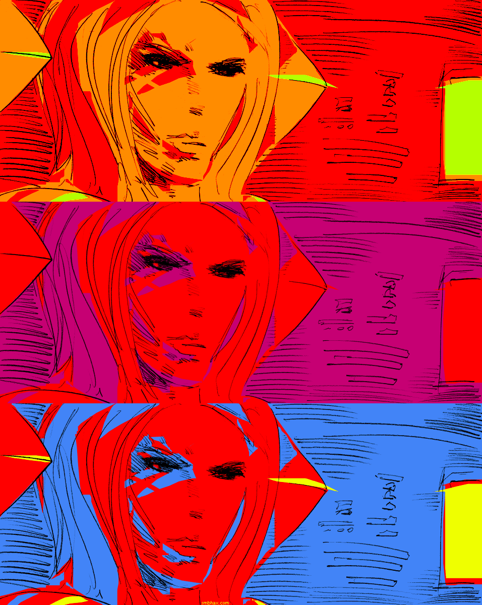
| One more point of value? No... Two? No... | Aug 28, 2013 12:21 AM PDT | url |
| | |
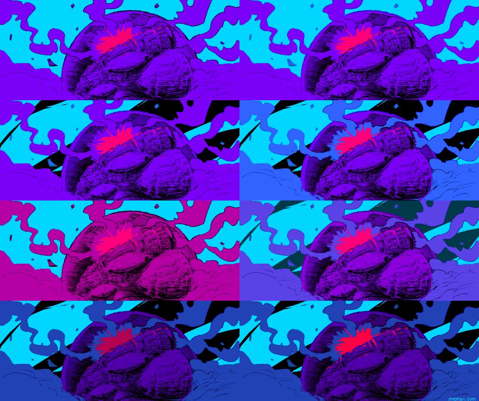
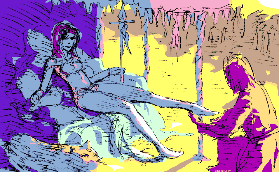
Added 1 new A* page:Oh man. Way too much time finicking with the color on this one and I've probably just ended up with a big dark blob for a lot of people, cutting it too fine with the gamma. Well hey, suspense! >_> Rejects:
|
·····
|
| |
| Wakin' up to Mickey since the '80s | Aug 26, 2013 9:23 PM PDT | url |
| | |
Added 1 new A* page:I've been talking about Disney cartoons lately (Did you know Walt started out as a comic strip artist? (Did not go well.) And had two failed companies before things started working out on the animation front? And his first film was himself taking a smoke break? And sold his camera for a one-way trip to California? And started off his eventually successful Disney Bros. Cartoon Studio by ripping off Felix the Cat? Well that's what Wikipedia says, anyway.) and it occurred to me that Disney's been getting me out of bed in the morning for the last quarter century. I mean with this little guy:
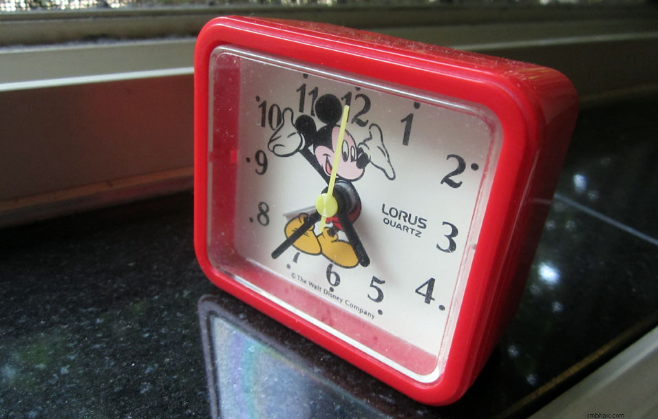
^ Oops and it got all pollen-y or something when I put it on the windowsill. Oh well. I believe I got it at a gift ship in Disneyland on a trip there as a kid with my family--my brother and I had both won a coloring contest at the local grocery store--yeah it was weird, we were on TV and stuff. Anyway I picked up the alarm clock while I was there, and it has served me without fail since then...hm I guess it might be closer to thirty years now. Keeps good time, runs practically forever on a single AA battery, and it's still piercingly loud! The back says "MOV'T JAPAN / ASM. IN CHINA" and the front says Disney, so good job all around, international partnership!
A Google image search failed to turn up anything on this durable clock, but there's a similar model on eBay, and you can see a different similar model (although with a ticker much louder than mine) sort of in action on YouTube, although I really wish they had done less fumbling around with the alarm switch and more letting the alarm go off so you could hear it. Ah well.
|
·····
|
| |
| Disney does Dalí | Aug 24, 2013 8:03 AM PDT | url |
| | |
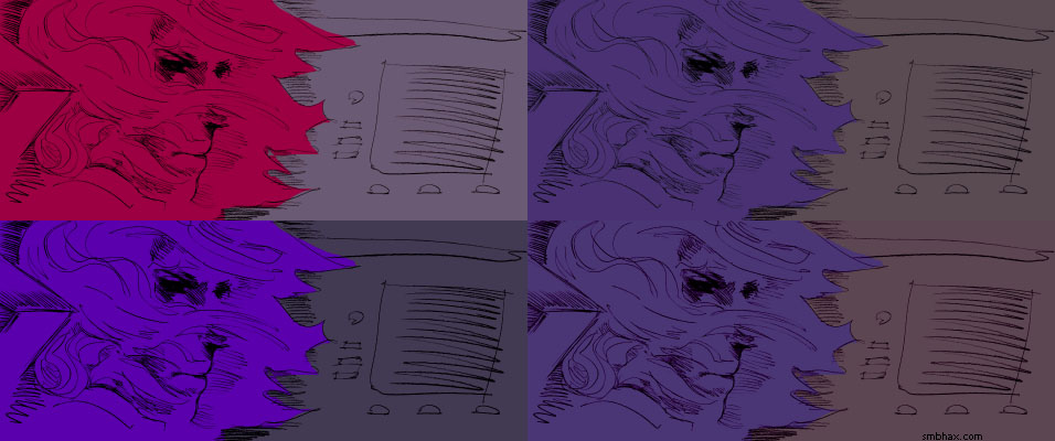
Added 1 new A* page:Color variants:
Spent a long time pursuing that more complicated coloring approach with the outlined hair and chair and so forth, eventually realized that I was overpowering the lines instead of accentuating them--it was particularly futile to try to capture penciled whisps of hair in hard lasso shapes (and I'd gotten the upper shape wrong anyway so it didn't look micro-gravity enough : p).
~~~~~~~
Re: the Disney inking and coloring stuff I was blathering on about yesterday, I managed to forget that Titan A.E. was also a Don Bluth film. : P I'm about ten or so minutes into it, and boy, it is kind of a mess. Especially in the would-be-dramatic opening scene, a combination of a bunch of animation techniques--including way too much ugly 3D CGI, and somewhat awkward 2D animation of mostly forgettable generically khaki-clad soldiers--just isn't meshed together well at all, and comes out as a horrible mish-mash. Not a good way to start! It calms down a little after that, and you start to see how Bluth again is a bit sharper and grittier than Disney, but it also sounds like Matt Damon recorded his lead audio in his bedroom or something and emailed it to the studio--it just sounds low quality and almost a bit echo-y. I stopped for now just as his character was complaining about having to live in the "dull, grimy present" or something like that, and unfortunately that's really what it looks like with the drag CGI sets on display so far. Yeesh! Oh well the story at least hasn't really gotten started enough to get bad, so I'll stick it out for now.
Before that, also on Netflix of course, I finished quite an odd duck and a bit of an insight into pre-war Disney, or at least their marketing machine: 1941's The Reluctant Dragon has a middle-aged guy badgered by his wife into taking a fantasy storybook to Disney to pitch as a movie--it doesn't really seem like they have the rights to it, but maybe I missed that part--and for some reason he gets admitted and set up with a meeting with Walt, but then keeps ditching his oddly militant, frighteningly ramrod young tour guide, and stumbling into various Disney studios, where they inexplicably know his name and indulge him in showing him how they do stuff--or at least, the creepily "we're all happy here" version of it. Halfway through, in the midst of some really awful sexist remarks he persists in making to a young woman who's trying to show him sound work and cel painting, as he gets to the FX department and then to the coloring department, the movie switches from black and white to Technicolor (the main character remarks upon it), and we get to see more stuff, including some quite good cartoons, and yes eventually we do get to Walt, holding court in his viewing room, feet tucked up beneath him and his green and tan leisure suit.
Warped PR though it is, it does give a look at the mind of Disney at its/his peak, before the war took away a big chunk of his manpower, much of it permanently. This is the era when the studio was whipping out amazing animated shorts like nobody's business, and, combined with some of the earlier shorts I'd been watching in other compilations on Netflix, it got me thinking of the theater-going experience at the time--well, starting in 1932 when color cartoons came along, at least: if you were lucky, I guess you'd get to the theater, find your seat, and get blasted with an intense carnival of cartoon color and sound on the big screen--and then that would end fairly shortly and you'd sit back and watch what was almost certainly a black and white feature presentation. Imagine how much more amazing the color cartoons would have been in that context! Man. No wonder animation studios like Disney and Warner were raking it in back then.
~~~~~~
In The Reluctant Dragon, a caricature of Salvador Dalí is seen briefly in the "Baby Weems" storyboard sequence, and in fact, four years later, Dali worked with an animator at Disney on what was apparently intended as a Fantasia-esque musical animated short, dubbed "Destino"--but work stopped shortly after the storyboard stage, and all that got done in terms of animation was a 17-second test. Skip ahead to 1999, when "Walt Disneys nephew Roy E. Disney, while working on Fantasia 2000, unearthed the dormant project"--he gave it to Disney Studios France, and, following the "cryptic" storyboards, they produced an animated feature--and it is definitely about as Dalí as you could want, with numerous melting clocks, bizarre morphing creatures, and inventive, space-inverting scene transitions, among weirder things. You can watch it and read more about it where I found it in this Collective History tumblr post.
|
·····
|
| |
| There used to be this animation stuff | Aug 23, 2013 6:02 AM PDT | url |
| | |
Added 1 new A* page:Hoy the color. I don't know if it's related but I've found myself on a Disney binge on Netflix this week--it started last week with The Secret of NIMH, which I've always had a soft spot for despite its story not making a whole lot of sense (dark, giant, genius rats! multicolored electrical arcs! subterranean skullduggery!), which is not, of course, Disney, although Bluth came from Disney...anyway that got me going on Disney stuff, and Disney doesn't really have their A material on Netflix for the most part, and I'm finding some things I was okay with as a kid I can't sit through now (Rescuers and Aristocats, for instance--in fact I suspect most of that sketchy period from Walt tuning out / dying up until The Little Mermaid is going to be a bit rough--the pedestrian themes, the lackluster action, and oh goodness the awful pacing--and I'm really starting to wish they had Sleeping Beauty on there, because I've been paging through my old Disney Animation: The Illusion of Life book and man that Beauty stuff just had a gorgeous graphic quality that most of the other Disney stuff, even the good stuff, doesn't--not in that way, at least.
Beauty, which came out in 1959, was also the last feature they hand-inked; the production as a whole was long and lavish, twice as expensive as they previous films, and when it didn't make a ton of money right away, financial crisis loomed and the studio switched to a xerographic process of transferring the animators' pencil drawings directly to the animation cels, skipping the time-consuming hand-inking step--and allowing them to trim staff from 500 to 100 people, or something like that is what I think I read somewhere on Wikipedia. And it's ironic and a little worrying to me because *I'm* taking pencils straight to final art and skipping inking with A* these days, but gosh if the Disney films didn't lose a huge amount of their beauty and charm when the inking went away--and it didn't come back until digital inking came along with The Great Mouse Detective (which *is* on Netflix, but isn't that great) 27 years later, in 1986.
So that's been an interesting process to watch unfolding as I skip around through their stuff. The other interesting thing for me is catching up on movies they've done since, oh, I guess Pocahontas (1995) was the end of my steady Disney viewing, although I also caught Mulan three years later. And I suppose they haven't really done all that many hand-drawn animated movies since, but still, there are a few I can catch up with on Netflix, and although Atlantis and Treasure Planet, for instance, have their cringe-worthy aspects, they are--3D-rendered bits notwithstanding--superbly animated, and mostly pretty watchable. Although now I'm enjoying the collections of classic Disney shorts Netflix has, and I've also been hoarding Dumbo and Alice in Wonderland, so I can end my little tour on a high note (except that now I've found more Don Bluth stuff, and some of that might be a bit iffy... and also Titan A.E., which, eh, I'm curious about, at least from the point of view of it being the movie that sealed the fate, for a while, of Fox's animation studio).
|
·····
|
| |
| Good Vibe-rations | Aug 22, 2013 4:26 AM PDT | url |
| | | |
Added 1 new A* page:I have to thank Scott Bieser of (*mature language warning*) Quantum Vibe for putting A* in his reading list links--Quantum Vibe is one of the most popular sci-fi webcomics out there, and most weeks the largest contingent of new visitors to A* come trooping through that link. It's been that way for a while now, but I've been assuming all along that my sorta random ad campaigns were popping up on QV, and *that* was what was getting traffic from the site, but I really hadn't thought that through very well because his site is popular enough that it's kinda outta my price range for advertising. ; ) So the link is all the more appreciated! And if you're one of the few people here who somehow hasn't seen Quantum Vibe yet, well, it's a science fiction comic with big, full color multi-panel page updates every weekday (don't ask me how that is possible because I have no idea! : o), so you just might find it worth your while to give it a look-see.
|
·····
|
| |
| Gamma isn't just for Bruce Banner | Aug 21, 2013 2:38 AM PDT | url |
| | |
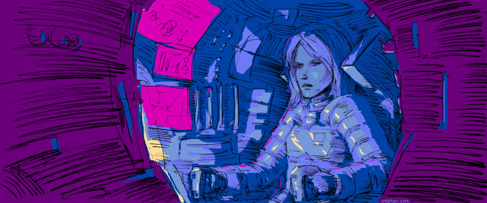
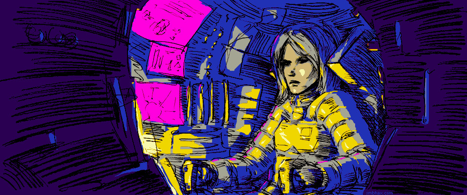
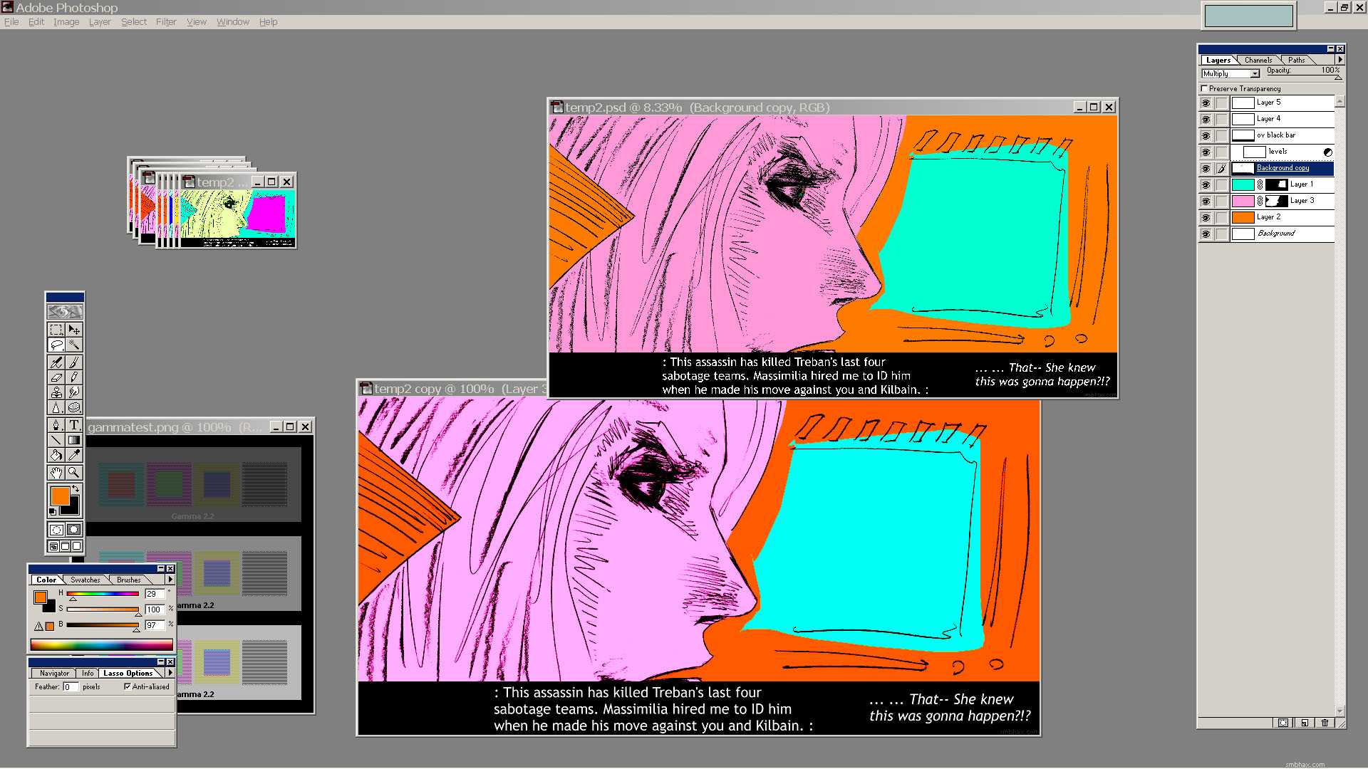
Added 1 new A* page:Coloring this one was fairly straightforward--tried twisting the hues after I was done, but nothing struck me as better than the colors I'd already picked out. Here's a Photoshop screenshot, because who doesn't like those? (click it for the full-size version)

That "gammatest.png" image is from The Monitor calibration and Gamma assessment page, and it gives me a way to make sure I'm seeing the colors correctly on my screen, which is a bit of an older model LCD I guess where the tone shifts depending on your vertical viewing angle, which can make getting colors and shades right pretty tough if you're just trying to eyeball them--but your eye somehow adds up the differently colored horizontal lines in the test image to the correct gray when you're viewing it at the correct angle (this only works in the full-size version of the screenshot, since the shrunk-down one is based on Photoshop blending the lines as it scaled them down, and I guess Photoshop doesn't do it quite like your eye does, so the colors pop out instead of going gray), so if I keep the image I'm working on at the same level on my screen, I can be reasonably sure I'm seeing it for what it actually is. : P (I'm using the 2.2 gamma test image.)
|
·····
|
| |
| An amazing gallery of zero pixel images | Aug 20, 2013 2:07 AM PDT | url |
| | |
Added 1 new A* page:Oof boy I need to get to bed. Got...*shudder*...social things to do the next couple of evenings, gonna have to manage to squeeze in A* pages around those, could be rough going. This is sort of an extraordinary collision of two periodic (roughly quarterly, and annually) hanging out things I've somehow failed to manage to avoid in my usual antisocial way, thus precipitating this crisis... Another such semblance of a life should not come along for quite some time though, probably! Whew.
Over the weekend I made a little hack to the comic viewer that makes your browser download the comic image for the *next* page (if there is one yet) while you're still reading the previous page, so when you advance to the next page, that comic image has probably already loaded up. Less waiting for pages to appear!
(^ This "precaching" is done by hiding the next comic image somewhere on the page, shrunk down to 1 pixel by 1 pixel. In theory you can hide it entirely using CSS ("display: none," or something), or by shrinking it to zero pixels by zero pixels, but I'm not sure either of those methods is foolproof--web searching reveals discussions saying some mobile browsers don't load images hidden with display:none, which would defeat the whole purpose of this "precaching," and although the zero x zero scaling idea that popped into my head *seemed* to work in the desktop and mobile browsers I tried, I couldn't find *any* discussion of such a hack anywhere on the internet, so I didn't feel I could trust it. There's also a fairly widely used Javascript method of precaching images, but eh that's Javascript. So anyway if you look closely you'll see a single pixel somewhere on the page (as long as it isn't the very last page, since in that case there's no next page to precache) that in these color pages at least alternates between various bright colors as you flip through the pages. Can you find it? Don't look at the page source code, that's cheating. : P)
|
·····
|
| |
| Conté might be good for drawing a black hole | Aug 17, 2013 4:36 AM PDT | url |
| | |
Added 1 new A* page:A couple sketches from a little while ago in the sketchbook:
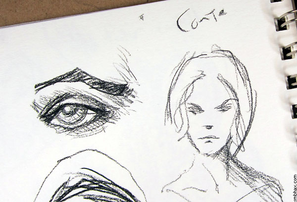
I was trying out a Conté pencil that I'd spotted at the local art supply store:
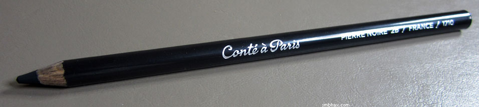
I had no idea what it was, really, only that it was black and something to draw with; turns out that Conté is a clay-based medium, embedded with graphite or charcoal for the black color--this French dude, Conté, came up with it in 1795 as a cheap alternative to pure graphite pencils, which had to be imported from the world's only graphite mine in England, and at the time the English had a naval blockade around France. I got it in wood-encased pencil form, but you usually hear about it in non-encased "crayon" (which may have wax rather than clay, possibly) form.
This black Conté pencil is incredibly dark! Puts any graphite pencil to shame by a good ways in terms of how dark a mark it makes. It helps that the Conté stuff isn't reflective like graphite is; it's totally matte and just looks like...well, like a black hole I guess. So black! It is also very soft--it *does* almost feel clay-like--so it doesn't really do small detail, really picks up the texture of the paper or whatever you're drawing on, and it doesn't erase very well. But if you wanted to have a pencil-type thing that made as dark a mark as possible, you could do worse.
|
·····
|
| |
| Sacrifice your eye orbs | Aug 16, 2013 12:58 AM PDT | url |
| | |
Added 1 new A* page:The auction for my latest big ink painting wrapped up pretty successfully this evening, and once again I'd like to thank everyone who placed a bid on it--your support really means a lot to me, so thank you very much indeed. Of course, only one person could actually win it, but fear not, I think I'll be able to get another big painting painted and put up for auction in the not *too* distant future--possibly in a month-ish from now, we'll see.
~~~~~~
Spent more time making the colors weirder...almost went with the first of these in the end, but then I realized my eyes were sore : P
EDIT: Ah to heck with it. Messed with it a few more times. : P
~~~~~~~
I've found myself doing a bunch of sketching lately, so I'm kinda behind on posting photos of stuff from my notebook! So here's one from way back when I was thinking of what to draw for that big ink painting that just went at auction; because the drawing is kinda sketchy and some pointy-haired boss seeing it from a distance might mistake it for nudity (there's actually nothing there you wouldn't see in one of my usual drawings of Selenis in her form-fitting space suit), I'll stick it here under an **almost NSFW** warning link.
That pose is kinda similar to one I used for a life-sized plaster sculpture as a senior in college ages ago; that figure though was fairly abstract--it was just put together from plastered-over rolls of chicken wire--vaguely male, and had a hollow tubular head, which, while the sculpture stood in the courtyard in the middle of the art department complex, my brother and I, around graduation time, eventually filled with kindling and set on fire as a sort of primitive sacrifice to the animal spirits of higher education.
|
·····
|
| |
| "Charged" A* art auction ends today! | Aug 15, 2013 2:26 AM PDT | url |
| | |
Added 1 new A* page: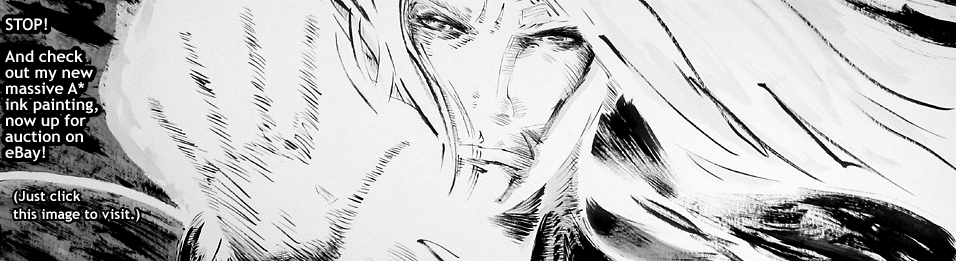
^ Last chance to get in on the action! The auction for this big A* ink painting ENDS TODAY, Thursday the 15th, at 6:33 PM Pacific time! Thanks to everyone who's been bidding, I really appreciate the support!
~~~~~~~~~~~
Color...process?
|
·····
|
| |
| Free Buck Rogers Sunday strips, plus science | Aug 13, 2013 11:26 PM PDT | url |
| | |
Added 1 new A* page:
^ Just a day and a half left in the auction for this big A* ink painting! Auction ends this Thursday (the 15th) at 6:33 PM Pacific time!
~~~~~~~~
If you've signed up for a free account at comic book buying/reading site comixology.com, you can get the free downloadable comic book Buck Rogers: 25th Century A.D.: FCBD 2013, with two collected stories from the Sunday comics version of the Buck Rogers strip, both of which ran in papers in 1937. They did really elaborate stuff with color in Sunday strips back then! And in the back there's a collection of the very first Buck Rogers daily strips, from 1929.
~~~~~~~
Came across a couple interesting new science articles on the BBC's site this morning:
Near-death experiences 'explained' talks about a new study of dying rats that found (rather morbidly) "high levels of brainwaves at the point of the animals' demise," and they think that, if the brain also goes hyperactive like that right before death in humans, it that might explain the bright tunnel, life-flashing-before-your-eyes and other weird stuff related by people who've been on the brink of death and come back to tell about it.
Musk unveils 'Hyperloop' idea is about latest idea from the guy who invented PayPal, SpaceX, and Tesla automobiles: namely, super-high-speed trains suspended on air in solar-powered tubes, zipping between cities like little memo-laden pods used to zip through air tubes between departments in old business buildings; to hear him tell it, the train version totally doable, although he says he doesn't have time to work on it himself. If you watch the video at the top, though, it sounds like another group has already been working on such a concept, and are even more upbeat about it.
|
·····
|
| |
| "Out of this World" '80s digital art | Aug 12, 2013 10:46 PM PDT | url |
| | |
Added 1 new A* page:
^ Two and a half days left on the auction for this big original A* ink painting!
~~~~~~~
I mentioned last week how three people had said to me separately that the A* color I was doing reminded them of the '80s, and I talked about how I was probably influenced by comic book coloring in the '80s, since that's when I started reading comics. But thinking about this more over the weekend, it struck me that at least two of those people were probably thinking of '80s color use in general, not just in comics. This slow train of thought was aided by a reader, who posted a couple nifty, definitely '80s palette illustrations on the forum.
It further occurred to me that color use in video games back then would probably have seeped into my brain too, to come out now in this 5-bit A* stuff I've just started doing; most of the games I was playing on my Amiga computers back then, for instance, were either 16 or 32 color affairs. The one that sprang right to mind when I got down this track was a slightly later, 16-color game, French designer Eric Chahi's Another World, started in 1989 and released in 1991, which I knew as Out of this World--the name had been changed in the US to avoid conflict with the Another World soap opera. : p Another World the video game proved quite popular, "selling around 1 million copies during the 1990s," and, as its platformer gameplay was on the brief and frustrating side, that was likely due to the style of its presentation, which was spare, smooth, atmospheric, and extremely stylish, accomplishing this with an innovative blend of vector animation and low-color bitmap backdrops accompanied by subtle sound effects and music that effectively brought an alien world to life in a dark, dangerous, sophisticated way that no other game to that point had.
Here's a screenshot from the opening cinematic
and one from the brief cinematic sequence at the end of the first level
Those big, flat, carefully toned colors were really striking, and their sharp-edged look is kinda reminiscent of the shapes cut by the Lasso Tool I use for delineating A*'s colored areas in Photoshop. Oh and those screenshots are from the PC demo of the game's 15th Anniversary Edition, which you can download from this page of Chahi's web site. The full 15th Anniversary version seems to have been pulled from its online digital vendors in favor of the more recent 20th Anniversary edition, currently available on Steam and mobile platforms.
~~~~~~~
I got a bunch of visitors from the Something Awful forum today! : ) Thanks to the old hacker who linked to me over there. ; )
|
·····
|
| |
| A* original pencil art price cut! Also colors | Aug 10, 2013 7:01 AM PDT | url |
| | |
Added 1 new A* page:
~~~~~~
I've cut the price for the original pencil art for these daily A* pages in half, from $50 to $25! Yep, the inked pages from earlier episodes are still $50 each, but now it's just 25 beans for each of the actual, one-of-a-kind pencil drawings I made for this latest episode. They're pretty big, too--16" wide, in fact. And especially now that I'm adding digital color afterwards, sometimes the original pencils by themselves have a different, cool look all their own, like say the pencil drawing for page 120 the other day (you can click these to go to their store page):
And throughout this whole episode (19) I've been generating pencil art for the pages. Here's page 81's, which I think may be the most successful one overall so far:
And of course there are all the others! Just look for the "original art" link at the lower left-hand corner of the each page's comic image. (A few I screwed up later on don't have the link, like page 2 which I disastrously tried to ink. : PP)
~~~~~~~~
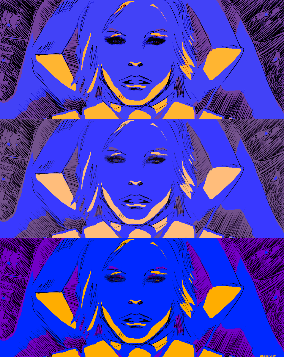
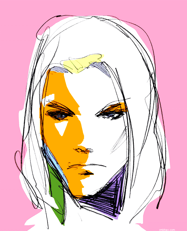
O color! I gotta stop agonizing over this stuff. More palettes that might have been--from the accident-laden coloring process
to later variants (the Hue layer adjustment slider is kinda fun : P)
I *almost* went with that first one of the second batch there, the pink one, because I think it looks pretty keen, but flicking through the pages in sequence showed that its inversion of the color values would make it way too confusing as part of a read-through. So it gets the blog. : P
|
·····
|
| |
| Do I really color like the '80s? : o | Aug 09, 2013 5:47 AM PDT | url |
| | |
Added 1 new A* page:Man this color stuff is getting way too detailed. : P
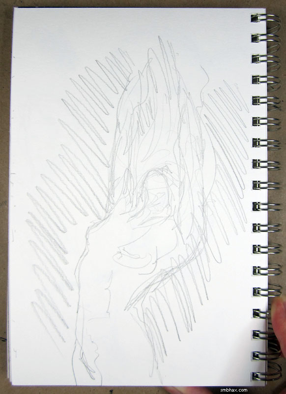
I did some color practice over the weekend, using a quick little fantasy sketch in my notebook:
^ That was before I was doing quite as much color filter processing as I am now, so the colors aren't as intense. Even so, it was tricky to work that many multicolored objects into a single 32-color scene and have it hold together; one thing that helped was turning the distant jungle brown rather than green--I was stuck on that until I took a break to drive and pick up some dinner, and noticed that the sun setting behind some trees was turning them more of a brown shade than green anyway. Another discovery that helped was that I didn't have to color the objects, like the woman's skin, separately under the shadow of the awning--I could just leave them as one shadow color, for the most part, and it still read okay; I'd been thinking I might have to use a semi-transparent layer to pull off the shadow, but that didn't go so well; in fact, every time I've tried to use semi-transparent layers rather than 100% opaque layers to get color, it just hasn't come out right at all in this wacky method.
Speaking of which, here's how the colors in today's A* page looked before the color processing (Hard Light x2 and then 0.75 Levels gamma adjustment)--these are the colors I selected and laid down manually in Photoshop, I mean:
Weird how the colors shift, huh? And here's a quicky alternate palette I tried after I was done, when I was worrying that today's palette didn't match the one in yesterday's view of the same location sufficiently:
But that didn't look so hot, and anyway I kinda knew palettes were going to shift from day to day, that's actually part of the fun for me, if I don't worry about them.
Also over the weekend, I was looking up comic coloring wisdom on the internet. I found the web site of Matt Hollingsworth, who is currently doing some pretty neat flat color work on Marvel's "Hawkeye" series (and I realized he's also coloring a comic called "The Wake," drawn by Sean Murphy, who does some pretty great stuff with ink); on his site, right here, Hollingsworth has a detailed article on how comic coloring used to work, when you did it with chemicals and color chart codes--he mentions something I didn't know, which was that DC comics only allowed the artists to work from a 64-color chart, whereas Marvel used a 125-color set, so their color could be a lot more subtle and detailed. Maybe that was subconsciously why I was way more into Marvel stuff back then?
If you scroll down to the bottom of that page and hit the link to the previous page, he's got a detailed breakdown of how he does his digital colors, and reading that made me realize that I really am not into the usual comic method of coloring, with its "flatting" (a set-up for coloring neatly inside the lines, basically : P), "trapping," shading, blurring, intensely detailed "rendering," and texturing. It all just looks too...sterile and artificial for my tastes, like it's done by a robot--the flat coloring method Hollingsworth has since developed for "Hawkeye" is much more creative. I'm really not into the digital style spelled out on his older page there, though; its so careful and methodical--can't we encourage professional colorists to go outside the lines sometimes? Man. Anyway if you *are* into that sort of highly precise and technical inside-the-line coloring, the another print comic pro, Dave McCaig, started a forum for colorists some time back, gutterzombie.com, and they go all into that stuff in microscopic Photoshop detail; the forum doesn't seem to be quite as busy as it was in its heyday, and it looks like the circle of pro (or soon to be pro) colorists like McCaig who started it don't pop in much these days, but there are still people posting and also really elaborate tutorials, and handy tips and so forth.
Anyhoosle that's the professional coloring stuff I found, and it more or less satisfied me that I am not gonna worry about how the pros do it because it looks boring. Oh yeah I also listened to a podcast um where was it...ah yes: in episode 19 of his "Decompressed" podcast, print comic author Kieron Gillen interviews professional comic colorists Bettie Breitweiser and Matt Wilson--these are more folks who do work for the big comic publishers, and they talk in detail about why they colored specific panels or pages of comics they've worked on in their various ways, which is interesting to hear, although again, looking at the results told me that I'm not so into that style.
By the weekend I'd had three people, separately, liken my coloring to the old, pre-Photoshop coloring of the '80s--the chemicals and chart days, I mean. That surprised me, and then worried me, because a lot of the coloring back then was not so great--like, they used a lot of bright pink and orange in inappropriate places...eh whereas when I do it, it's totally tasteful and pizzazzy. Ehm. Well, the fact is that the '80s was when I started reading comics, so I'm not gonna pretend like I can escape its influence when it comes to comic coloring--I mean, I had no idea that the coloring I was doing was '80s-esque until it was pointed out to me, but now that I look at it, I can definitely see what the 80s comics have done to me, and...hey, what can ya do. : P Not that I'm consciously going to embrace retro coloring or anything either, I just think it's interesting how some of those old colors have dyed my propensities.
And if you don't know what I mean by '80s comic coloring, the gotham city by way of riverdale tumbl blog is absolutely packed with examples (not safe for color or dot-pattern-sensitive eyeballs, perhaps!).
|
·····
|
| |
| Contains artificial colors and flavors | Aug 08, 2013 5:32 AM PDT | url |
| | |
Added 1 new A* page:
The US Census Bureau called me today to ask me about my time management in the last 24-hour period. Well I think I probably broke their curve. : P Actually they've been calling me all week but didn't leave a message identifying themselves until this afternoon. : PPP But they seem to like me for some odd reason, 'cause they got me for another phone survey--of like income and stuff, which was another rather borderline sampling I should think--just a few months ago.
Anyhoo the time management didn't improve much today because I was fighting my own inclinations once again--see, yesterday I started getting nagging feelings of shame that I've been using a Photoshop filter like Hard Light (actually I've been doing two on top of each other lately, plus a little Levels gamma adjustment afterwards for good measure) to come up with my final colors for these pages, rather than inventing those crazy colors myself; they're all just combinations of three 0 to 255 values, right? I should be able to come up with those just as well as a filter! And then the filter was also doing something to the black lines today that I didn't like, although I think in the end that was just my fault for not having set the lines dark enough, and I still had the original lines so I could remedy it.
Well I learned some tricks with the lines but try as I might I couldn't come up with colors all my own that satisfied me; really I think it's just that because I don't fully understand the Hard Light filter, its results always surprise me a little, so it helps me discover color combinations that wouldn't have occurred to me on my own--like today's rather Swedish palette. Of course then I go back and try to tweak the base colors and then run them through the filter again to see what pops out this time, but anyway I don't have the process fully under control, so accident can play a part, and I suspect I like that. Maybe I should worry then that eventually even I *will* figure out how Hard Light works and I'll know just what will happen with the colors before I process them and the result will no longer be a surprising adventure, and maybe at that point this coloring method will no longer work for me and all the colors will become boring and predictable. I dunno! Fortunately I'm sometimes bad at learning things, so we'll see. ; )
Here are a few of the other color and line results from experiments this evening--these are more manual, before I finally decided to stick with the double Hard Light processing; there are nice things about them I think but in the end they just didn't have that certain zing:
|
·····
|
| |
| It's a rocket! It's a plane! It's...Skylon! | Aug 07, 2013 2:10 AM PDT | url |
| | |
Added 1 new A* page:
^ The auction for my big new A* ink painting is off to a pretty good start! That clickable banner there is my slightly less spammy way of bothering you about it. ; )
Futzed with the color for too long on today's page! Dang. Well, hopefully I'm going to learn not to waste a lot of time worrying about minute variations in saturation and value. : P
Anyway there was an interesting BBC article today about the European Space Agency funding research for a reusable rocket ship to deliver communications satellites and so forth into orbit; called "Skylon," it would consist of a rocket/plane part that would take off and land on runways, and a cargo carrier booster ship that would launch from the rocket plane thing, about 300 km up, to take the cargo to its orbital altitude, which would be more like 36,000 km up. In the concept art shown at the top of the article, Skylon has a really cool, sleek tapered look--don't let that fool you, though: Skylon would be a big thing to land on a runway: at 273 feet (83.3 meters) it would dwarf, say, a Boeing 767 airliner (200 feet long). Sure, NASA's huge Saturn V launch vehicles for the Apollo Moon program during the space race stood 363 feet tall, but they didn't have to come in for a landing.
The other big deal about the Skylon, according to the article, would be its "Sabre" engines, which would operate like regular air-breathing turbine jet engines at low altitudes, then switch to rocket power as the air got thinner higher up. Pretty keen--if they can get it to work! This study is due to run for a year, at which point they'll hopefully have a better idea of whether or not they can actually pull something like this off.
|
·····
|
| |
| New A* ink painting "Charged" up for auction | Aug 06, 2013 2:05 AM PDT | url |
| | |
Added 1 new A* page:I have a new ink painting up for auction on eBay! It's called "Charged," and the auction is live right here.
This one is even bigger than the last one (24" x 18"), and I didn't plan to but ended up going kind of nuts with it and threw in not just black ink but also ink wash, plus two different white inks. So I hope you like it and maybe even are inspired to bid, 'cause I could really use the dough to support doing A*! Oh and here's a picture of the thing if you haven't already gone and looked at the higher-resolution one on eBay:
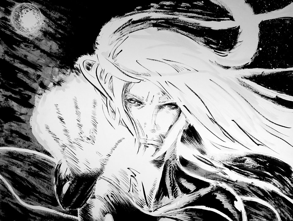
I don't know if Selenis will ever have an electrically charged gauntlet in the comic, but she sure does here--and winning it in this auction (or getting it from whoever does : p) is the only way you'll be able to enjoy it in fine natural detail (24" x 18" is pretty darn big in front of your face), because I'm not going to sell it as prints or anything. So anyway there's my pitch, I'll no doubt be bothering you about it slightly less but still a bit from time to time as the auction goes along over the next ten days.
~~~~~~
At the risk of breaking that time/space thing, I was fooling around today and also back over the weekend and found ways to pump up the color intensity of the daily comics even more (the two from last week have been updated 8 o). Also, I do think I'll get back to hitting two per day even with color (this simple color takes a little time I guess, but I also have to spend less time worrying over the pencil shading, so once I get the hang of the color thing it should end up taking about the same time as doing just the pencil), it's just that I haven't been managing my time so well for the past few working days, and uh also I'm still working out the coloring technique. Also the lines are super-sharp now, probably too sharp, but I kinda like how the thing comes out looking more computery this way...and anyway when I tried less sharp lines it made less visual impact and the effect on the lines from the light was reduced (currently lines in light color areas get kind of thinned and eaten away by the color, which helps with contrast in an unusual way) so I guess I'll stick with it unless I find some way to keep that while possibly smoothing them out just a tad.
|
·····
|
| |
| Saturn squeezes Enceladus; Photoshop follies | Aug 03, 2013 12:13 AM PDT | url |
| | |
Added 1 new A* page:There was an interesting article on the BBC News site the other day about scientists discovering that the ice spewing out of gashes in the surface of Saturn's little moon Enceladus is squeezed out by Saturn's gravitational pull: they found that Enceladus' ice geysers are more active when the moon is furthest from Saturn, at the point where Saturn's gravity is heaving it back around. There are some nice (old) photos of the ice geysers in that article, and I have a whole forum thread with photos and info about Enceladus--from a while back--over here. It's a pretty neat moon, and pretty likely to have a liquid water ocean under that surface ice!
~~~~~~
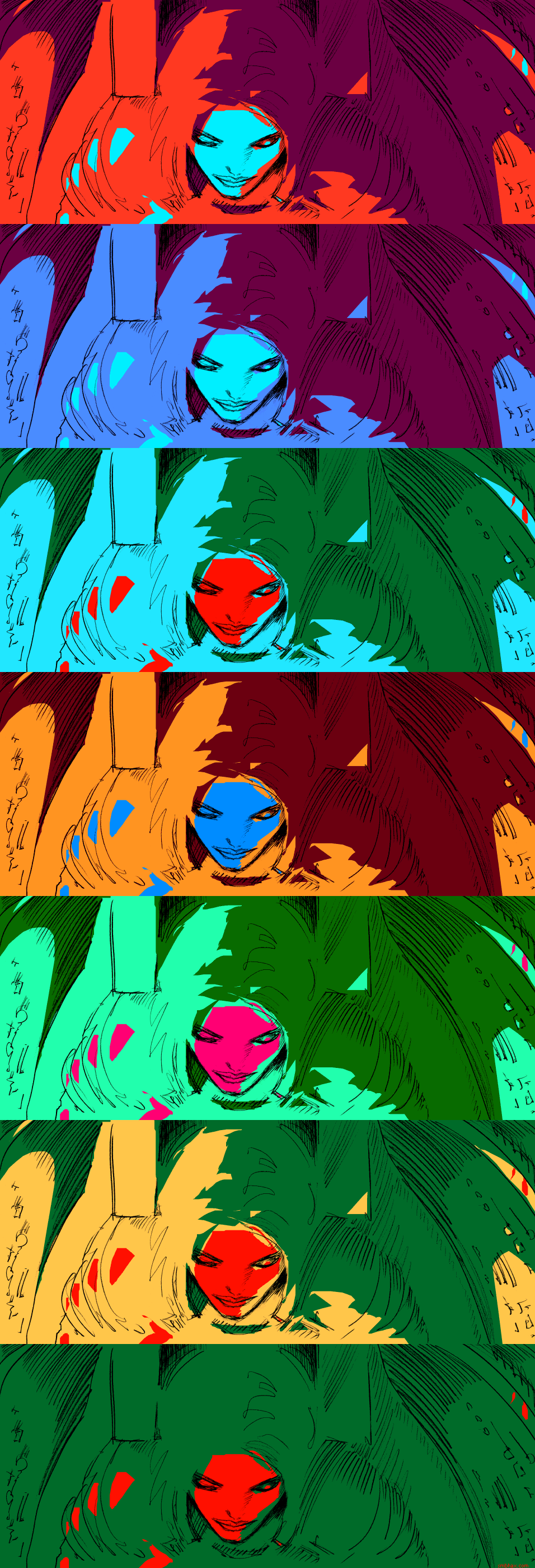
I got a lot of feedback about the first crazy flat color page yesterday (well strictly speaking I suppose that one of Mar in red way back in episode 11 was the first, but that was always just a one-off)--most of it positive, besides a few popped retinas. : o Today's is a little rough but I was so excited about yesterday's that I didn't get myself much sleep, so I'll blame it on that. : p Playing with these colors is fun and I really never knew I loved orange so much. (I don't think the people will always be orange, though. My brother suggested I make Selenis blue.) It's also shown me that I didn't need to be worried about color cutting down on my freedom to put abstract elements into the drawing, because playing fast and loose with the shapes and hues of the color just lets me add yet another layer of abstraction, if I want to use it that way. It's also nice to be able to make the eye jump between patches of warm and cool, and to suggest relationships between different areas of an image that it wouldn't have been possible to point out otherwise.
Oh right I had a couple more technical points to make about this stuff that I forgot to say yesterday. The first is that although I like the dithered black and white look, and how, for instance, it lets you create gray tones that stay at their proper tone even when viewed at an angle on LCD monitors, one possible lump in those mashed potatoes is that when you look at a dot pattern like that on a screen that's scaling the image down, like say on a non-super-duper-high-def cell phone, the pattern can come out all wiggly and squirrely. So that's just something for me to keep in mind if I ever think about using it.
The other thing was that although I said I punch the colors up by putting a copy of the image on a new layer and setting it to the "Hard Light" blend mode, that isn't *actually* the exact steps I follow in the macros I have set up that spit out the pages at the correct size, sharpness, and color depth for the web site. It would have been, but it turns out that my ancient Photoshop 4, which was the first one to have macros ("Actions"), was a little spotty on their implementation, so some operations, for whatever reason, cannot be recorded in a macro--and setting a layer's blending mode is one of those that don't record (they do in any modern version of Photoshop, of course). So actually what I have the macro do is take a "Snapshot" of the image, then Fill it with the Snapshot in the "Hard Light" blending mode--Snapshot and Fill macro just fine in Photoshop 4, so voila. If they didn't, theoretically I could also achieve the same result by using "Define Pattern" instead of "Snapshot," or maybe even somewhat more complicatedly through "Apply Image" or "Calculations"--although come to think of it I think those last two didn't turn out to record in macros in Photoshop 4 either. Silly! And mind you, Photoshop 4's "Snapshot" is not the same as "Snapshot" in more recent Photoshops, where it's a different function, and in the "History" panel (which Photoshop 4 doesn't have)--and I guess they removed its original function, since it was pretty redundant.
~~~~~~
OOh and over the weekend I hope to get that big super-sized A* drawing I did a few weeks ago all nice and inked up, so I can put it up for auction next week. It's gonna take a lot of ink again...
|
·····
|
| |
| Five bits of eye-filling fun | Aug 02, 2013 3:47 AM PDT | url |
| | |
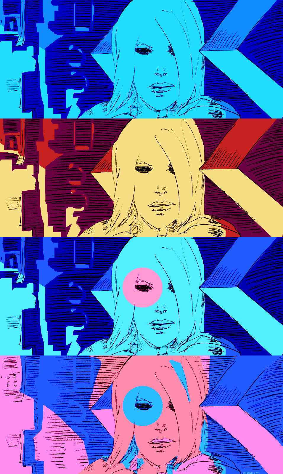
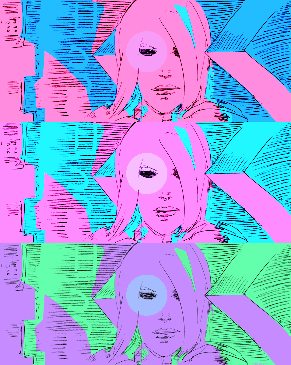
Added 1 new A* page:>_>
Excuse me while I go a little crazy.
The thought that got me out of bed this morning was something along the lines of "maybe I could try throwing some planes of flat digital color over the drawings I did yesterday." After an hour or two of mulling it over over breakfast and various toiletries, the next pertinent thought was "what an awful idea that was, phew." Then I was fairly satisfied and was able to get on with some things, only a few hours later I got to thinking maybe I'd just play with it and have some fun. Hours later that resulted in this:
Then I thought hm maybe color's a bit much, but how about taking it grayscale or even dithered black and white? And that got me to through a rather bland gray one to a rather grand black and white one
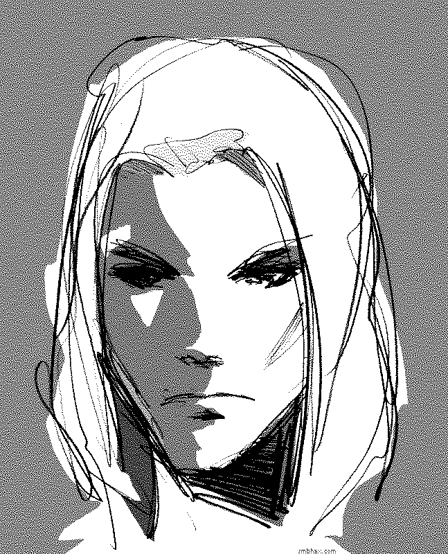
but the problem with that is that the dithering breaks things up too much at smaller scales
and it kind of falls apart. Besides which, my retinas couldn't deny, despite my ingrained habit of the past x years of wanting to be in black and white, that the color one was the one that was smiting them most mightily. They were smitten.
So I gave it a shot on an actual A* page. It worked out better than I'd thought it would--I've liked sort of flat, bright, abstract color like that for a while now--some nice examples that spring to mind are Kit Roebuck's completed sci-fi webcomic Nine Planets Without Intelligent Life and Matt Hollingsworth's colors in the current print comic Hawkeye (click the cover in the upper left corner to see some interior pages--these are all I've seen too, I can't afford comics : P). And of course if you're an old crab like me and remember working with GIFs in ye olde dialup days and having to optimize your limited colors so people could actually download them, you know that flat colors and sharp edges do quite well in technical terms on the web. So it kind of seems natural somehow even to this hardline black and white comic, I guess.
I'm not sure how I'm going to handle sequencing color palettes from page to page, my guess is I'll just wing it and it will be an awful fruit-loopy browsing experience for a while until I gradually learn to fit colors together across multiple pages. : P
~~~~~~
Oh yeah I was going to talk about how I did it--technical Photoshop details of the foolishness, I mean. The colors are all on separate layers, with the scanned pencil lines on a Multiply layer above them: I go down, make a new layer, pick a color that seems about right for the space I want to tackle, and fill in the whole layer with it (Alt+Backspace). I give the layer a layer mask, and usually swap it from white to black (CTRL+A, CTRL+X to select it all and cut it to the background color, X to swap foreground/background (white/black) if necessary) to make the layer invisible--alternatively, as I did in this one with that orangey color, I'll leave the full thing visible. Then with the Lasso Tool I clumsily (I'm just using my keyboard's tiny touch pad for this, I'd rather it be weird and snaggley and semi-abstract than nice and smooth with my tablet) select an area I want to fill or clear with current layer's color, and either cut to white in the mask to fill that area with the color, or cut to black to remove color from that area. Keep adding new colors on new layers and cutting into their masks until I've got sufficient color overload.
Ah but then there's the secret ingredient that makes it sing! Later versions of Photoshop are probably better at this, but anyway my ancient Photoshop 4's default color picker thingy is kind of weird and is good for exploring colors you might not have expected, but bad at making them vibrant. Or well probably I'm just bad at picking vibrant colors. So after all the colors are placed, one of the final steps, before converting it all to a 32-color image for exporting to a nice compact web file, is to create a copy of the image on a layer above the image, and set that layer to Hard Light blending mode. Suddenly the colors POP! Also it clears away weak lines and spots, sort of emphasizing the strong black areas, which is a plus. So yeah, Hard Light. Pew pew lasers!
There are probably tons of better ways to do this but whatever. : P
~~~~~~~
I suppose I will probably get sick of it all and go back to black and white after a week or so and then all the readers who survived the switch to freaky color will never forgive me. >_>
|
·····
|
| |
| I wish I could draw as well as I sketch | Aug 01, 2013 1:15 AM PDT | url |
| | |
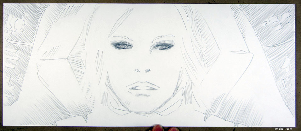
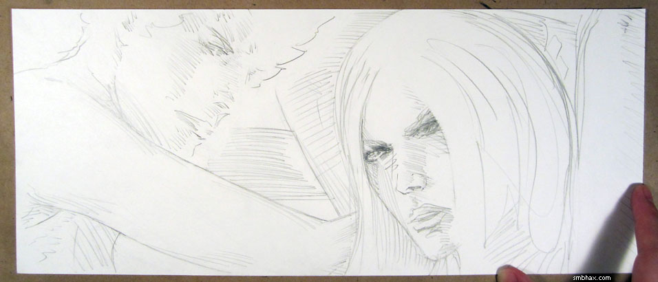
Added 2 new A* pages:A sketch I did late the other day--wait I think it was yesterday. I was trying to see if I was better with a wooden pencil (the Tombow Mono 4Bs I've been using for the daily pages) or a 0.5mm mechanical drafting pencil; this was one of the wooden pencil efforts and the clear winner:
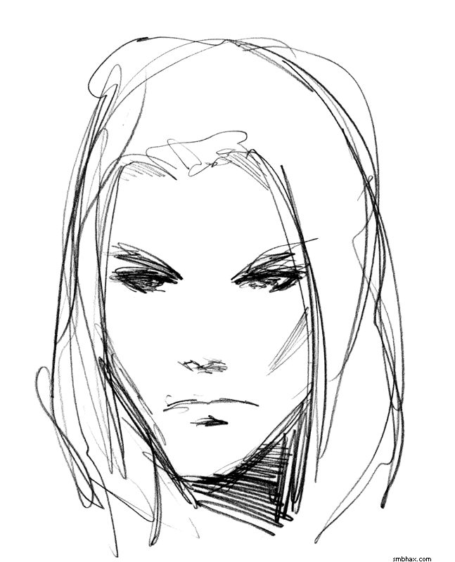
It's also the reason today's pages are on the sketchy side, because I really want to be able to bring this sketch's freedom and verve to the daily pages--but I still tightened up a little and the lines--particularly the shading--in the pages are lighter and less vigorous than in the sketch. Gotta keep working on that. I tried a warm-up sketch to get that flowing, but I haven't really seemed to find a rhythm with warmup sketches, and today's attempt was no exception. Seem to do better in warm-down sketches. : P
|
·····
|
|
|