 | |
| |
|
|
view titles only (low bandwidth) |
| |
| Patreon rewards, art show wrap, shark jumping | Mar 31, 2014 11:06 PM PDT | url |
| | |
Added 1 new A* page:Well there's no real news today except that if I hustle here I can just about get to bed on time to be bright-eyed and bushy-tailed for tomorrow morning, for once, so I can be all rested up and on time for another page of A*. : oo
Oh well also tomorrow being the first day of the first month since the start of A*'s Patreon campaign, in theory that is when I get to start sending out rewards to my backers! Yay! So everyone who's got e-books coming should be getting an email with a free download link, and then I gotta get working away on the sketches to start mailing out to people. : )
Oh yeah and also the little A* art show that started a few weeks ago up at Leilani on Greenwood, 10215 Greenwood Ave. N, Seattle, will be ending Thursday at about 3:00 pm (my parents and I trucking up there to take all the framed artwork down and cart it away), so if you wanna see/buy anything there, that'll be your last chance! At least until my next local art show, which umm I should know this but it we don't have one in April, anyway, but mmmaybe May? Or June or something. I'll figure that out at some point.
Also, jet skis! : D I promised a reader on some network or other months and month ago that we'd have them—I'm not sure they believed me : o—and we're finally here at the big jet ski chase sequence, yah! Let's see how many sharks we can jump!
|
·····
|
| |
| Light Time Wasting | Mar 29, 2014 10:27 AM PDT | url |
| | |
Added 1 new A* page:I came across a really nice watercolor by fashion artist Alexander Roshchin on tumblr—what great handling of the paint! Gee whiz. Meanwhile I've put brighter bulbs in the lamps on my drawing table (40 watts! : o), and I'm going to blame those for the fact that I went a little darker than I'd realized with the blue watercolor on today's page and it got a little chunky; like, the blue on pages 76 and 80 is smoother and less distracting because it is painted lighter on the paper. Subtle, subtle...gotta remember that. : P The main thing I was trying to focus on today was keeping a sense of the light sourcing, which I had definitely gotten pretty far away from in yesterday's page, which I think is why I ended up getting frustrated and throwing paint on it (very non-subtle, but fun ; ).
I figured out a way to waste less time during non-A* parts of my day today, so maybe if I can stay disciplined then I can keep my comicking schedule a little less crazy, that would be nice. : )
Hm but to do that I probably shouldn't waste time watching semi-random YouTube videos like We Play Doom With John Romero, which might be interesting if you're a PC game dinosaur like me. : P
|
·····
|
| |
| When in doubt, throw things at your painting | Mar 28, 2014 6:45 AM PDT | url |
| | |
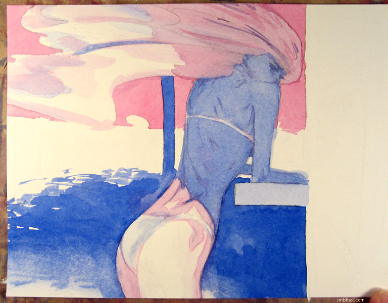
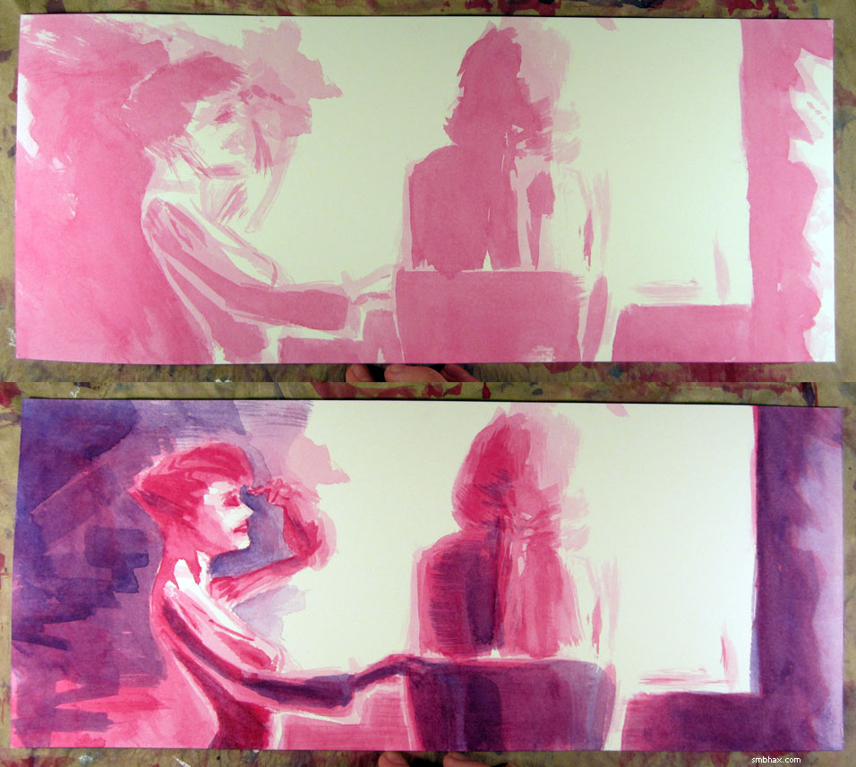
Added 1 new A* page:It might have been a bout of horror vacui that spurred me into trying to do some more shading on Selenis here with alternating strokes of color—which is something I've been wanting to try out, I guess. I'm not sure it was going all that well, and the overall effect was frustratingly muddled, and doing various awful things to the background to try to isolate and highlight her more didn't quite solve that, so at about 2:35 a.m. I just went and dumped the contents of my palette on it
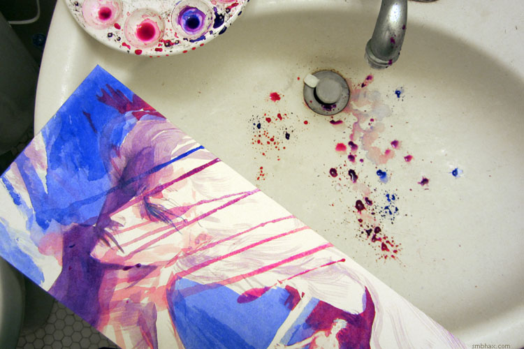
which actually worked out surprisingly well. I don't know if it's a process I want to go through regularly... Well okay, splashing watercolor around like that actually *is* pretty fun. But I feel like ideally I shouldn't have to resort to nutty waterworks in order to distract from bleh shading jobs. ; ) Anyway, splish splash, take THAT, painting!
|
·····
|
| |
| Pencils and Markers | Mar 27, 2014 3:25 AM PDT | url |
| | |
Added 1 new A* page:This one was pretty straightforward from the pencils, as you can see (notwithstanding that the pencils are crooked : p):
Here's a marker sketch I did uh probably nearly a month ago now:
I did it to test watercolors over markers...again... (oh wait I hadn't tried it on watercolor paper before, that's what this was for) and again they turned out pretty icky. I think it's more a mental block on my part than a chemical thing...but maybe there's a bit of chemistry working against it, too. Anyway that attempt was too ugly to show, it pretty much just spoiled a decent-ish black and white sketch. : P
|
·····
|
| |
| Thanks for helping A* on Facebook & Patreon! | Mar 26, 2014 1:53 AM PDT | url |
| | |
Added 1 new A* page:Shoot, my days are still lasting 26 hours. Gotta figure out a way to go back in time just a little. : P
I mentioned A*'s Facebook page was close to 300 likes yesterday, and whaddaya know, suddenly it's over 300. Yay! Many thanks to all the A*s over there. : )
And although I didn't mention it yesterday, in fact while I was posting yesterday's blog entry, A*'s Patreon just hit—and then today thundered past—$200 per month of funding for the comic. That. Is. Pretty. Darn. Rad. I didn't have a milestone set up in Patreon for $200, because I've had a hard time thinking of more things I could do that wouldn't make my days last even longer than 26 hours : o (I've got one at $800, to remove the banner ad at the bottom of the site), but it's a significant amount for me nonetheless! I haven't managed to make anything you could call a living doing A* these past 5 years, but my living expenses are relatively modest, so $200 a month through Patreon is definitely a big deal, and makes making a living at this thing seem not quite so impossible. : o Still, don't quite your day jobs, kids! Like I did... >_>
~~~~~
I got a nice, terse email from my site host this morning saying that the server "encountered an error" and had to be rebooted. That sort of thing *generally* doesn't happen around here, so if you encountered a bit of slow access or down time this past morning, I hope it didn't put you off coming back, in which case...you wouldn't be reading this. So it didn't! Yay! : D
|
·····
|
| |
| tumblr, Facebook, and Twitter, oh gosh | Mar 24, 2014 11:28 PM PDT | url |
| | |
Added 1 new A* page:I want to thank people on tumblr for being nice to A* lately! I hit my record ever "Notes" (Likes & Reblogs) for an A* page over there a few pages back, breaking into double digits. Yeah that's small potatoes but hey, it's better than no potatoes. : D I'm not big on tumblr yet but I will be some day, by golly! I guess most of the nearly 200 people who follow me there found me more for the other stuff I post—Golden Age illustration stuff, space stuff, vintage Hollywood stuff, paintings, whatever else catches my interest—and they at least tolerate the weird little cropped watercolor paintings I insist on showing them every day ; ). Anyway tumblr is a lot of fun and if you like the idea of having tons and tons of cool images posted for you every day then I'd say check it out! Well at least check out my tumblr with A* and other stuff I like, and you might end up finding other tumblrs you like too but that's really beside the point for our purposes here. ; )
Also, Facebook! A*'s Facebook page is about to hit 300 followers, yay. : ) I've been trying a new strategy in the past week or so, basically posting links for my new pages to social media sites like Facebook during daylight hours, rather than in the middle of the night; I'm not sure that's mattering much as far as Facebook is concerned though, thanks to that weird algorithm they put in a few years back that makes it so that you don't actually get to see all the posts by pages you're following—just a certain percentage of them, and next to none, in fact, if you haven't interacted with that page recently. But how will you know to interact with it if you don't see its posts? Silly! So I think maybe people who check Facebook during these daylight hours aren't used to catching my posts anyway so they don't get shown them now? Well anyway if you do want to see them, supposedly it would help your odds if you say something or Like something on A*'s Facebook page once in a while. It would also make my day! : )
And A*'s Twitter is the thing I post to if just strange thoughts that need an outlet pop into my head as I'm working or whatever—as well as all the A* updates and news, of course.
~~~~~~~
Super-early heads up! I think I'm going to end the current Supermassive Original Art Sale at the end of April—so that means if you want to get any of the original illustrations behind the daily A* comics that are still available through this site (check the link in the lower left corner of each comic page—if it's gold, the art for that page is still available!), or in the episode galleries, for the super sale price of just $10, don't dither too much longer, because once the sale ends they'll go back to their regular price of $50, for the most part. Buy now to get your 80% discount! : D Once we get into April I'll probably do some posts highlighting any I think are particularly nifty that haven't been boughten yet.
|
·····
|
| |
| Double r̶a̶i̶n̶b̶o̶w̶s Levels layers! | Mar 22, 2014 1:33 PM PDT | url |
| | |
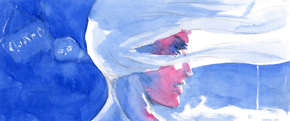
Added 1 new A* page:MAN was today's page ever a learning experience. You aren't going to read this, because it is way too long a session of art nerdery. : P I'm just making notes and thinking aloud for myself so I can work all this out and not forget it. : )
First of all, after many, many, many failed attempts at drawing the scene from the angle I'd been planning, I finally realized that something about that view just wasn't working for me, and sort of gave up and let my pencil draw the view it wanted to draw. This has actually happened on the last four pages now, which coincides exactly with when I decided to force myself to draw in a less rounded and cartoony manner. So I guess my brain's camera man is still trying to film in cartoon mode : p—either that or to get this look I want it simply *is* necessary to let the drawing have the reins a lot more.
Second—the drawing! Aside from a bit too much jut in the jaw—which was easy enough to work out in the watercolor stage—or would have been, if I'd gone about it logically >_>—I feel like this one really *did* hit the mark I've been trying for in terms of drawing style—a sleek, angular, expressive look:
Bam! How about that? Well it isn't perfect but I'm excited. It took so much erasing that the paper got pretty messy from all the ground-in graphite, and my pencil was completely blunt by the time I finished...but again I think maybe those were necessary, forcing me to adopt a looser, brushier stroke with the pencil. Intermediately, I had gone through a phase where I was trying to draw shading directly, without drawing the thing the shading was on first...which didn't really work, I think at least in part because it gets super messy and I want to leave the shading more up to the watercolors, but it did get me (desperately, perhaps) out of my usual drawing mode.
Of course, after hours and hours of watercoloring over those pencils, I thought I had more or less ruined them by overworking it—a not uncommon feeling for me at the end of a day's work—but this actually turned out pretty well because I learned a new Photoshop trick to salvage the nearly lost lines, AND in all that overworking I also got in about three times as much watercolor experimentation as usual, and figured some stuff out there as well. : )
Let's do the Photoshop trick, since it has pictures. This is probably an awful way of doing things—or everyone knows about it already—but anyway, I start my nightly comic processing with the freshly scanned image, which always comes in from my scanner looking very light:
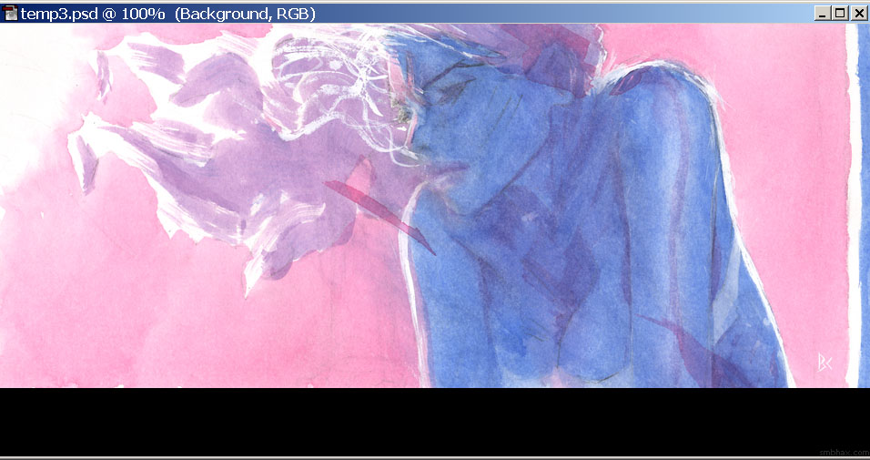
Normally I just drag the left slider in enough to make the dark end of the image near enough to black—or full color saturation—that it doesn't look washed out against the black background of the A* site. But the ridiculous amount of washes and scrubbing I'd done over the course of battering away at the shading of Selenis on this page had left the surviving pigments all jumbled around and piled up on the watercolor paper's textured surface, so just bringing out the most intense dark parts just brought the resulting speckled patterning to the fore in a very distracting way:
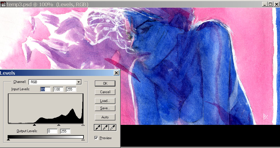
Bleh! What to do? Well in the past I've used the middle slider—gamma—instead of the left slider; gamma adjusts the midtones, leaving the dark tones alone so that dark patterning isn't as obvious, but relying primarily on the gamma results in a slightly muddier look than I would like, since you can't get the same degree of contrast that way. But suddenly a crazy scheme popped into my head: TWO Levels operations! Not that multiple adjustment layers is anything out of the ordinary in Photoshop, of course—far from it!— but normally I don't want to pile up multiple lossy adjustments of the same kind if I can help it because the data losses from pinching and pulling those pixels around will start to magnify each other. However, desperate times... So for the first of the two Levels adjustment layers, I went way overboard on bringing up the dark values
which "crushes" the darker colors down to their darkest possible state—this is a huge loss of colors, so I normally try to avoid it, but in this case it would force the areas around the dark speckles to be just as dark as the speckles themselves, thus eradicating the worst of the speckles! The remaining flat black and dark blue areas are way too dark to read, but you can lighten them, and restore some of the apparently lost image detail to visibility, by taking that crushing Levels adjustment layer you just made and reducing its opacity, say to 64% in this case:
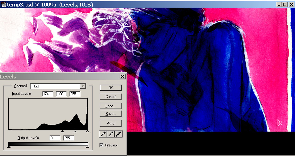
Great, but now it's back to looking washed out like it was when we started out, only darker overall. Right—so it's time for another Levels adjustment layer, on top of that first one! In this second one, I set the left slider to the new end point of the darkest tones, to restore their contrast, while also raising the gamma way up, to separate the midtones back out from the darkest parts of the image, and voila, I've got my lines back, and all nice and dark, but without all the surface texture noise that was there originally:
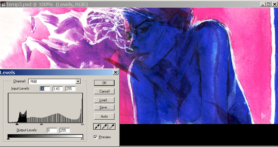
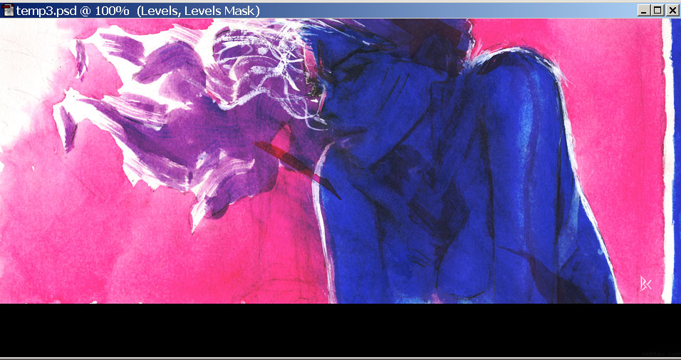
Saved! (I did end up lightening the final version's gamma just a tad more; and I had left most of the dark tones a bit gray, so the image looks just ever so slightly washed out, to give the feel of how your eyeball or a camera gets washed out when pointed toward a bright light source, like the implied sun at the left side of the drawing.) The resulting look is somewhat unnatural, and not the sort of digital mauling I want to give the watercolors normally, but in this case they were mauled to begin with in real life, and fortunately Photoshop could un-maul them a bit. : )
~~~~~~
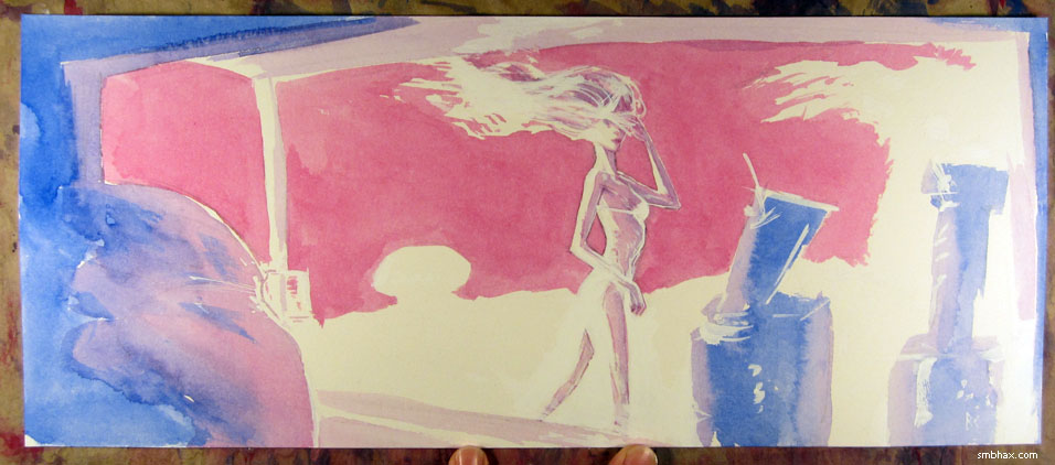
Oh yeah other things I learned from this watercoloring ordeal that I want to remember:
- The pure magenta flashes splashed on here and there, like across the shoulders and the ear, are fun and pretty effective in adding some abstract spice and focus (or distraction ; ); I first did one of those two days ago, over Selenis' eye, because the face there was just...too blank and bland, and the resulting weird patch of color turned out to be just the thing to add interest—that whole page had felt flat before I finally did that.
- The gradated background worked pretty well. I started off with a little pool of pure water on my palette, then after laying down some background area with it, going from upper left to lower right, I would dip in just a little bit of concentrated magenta, gradually adding more and more pigment that way as I progressed across the page—made for a pretty smooth transition. : ) I did run out a *bit* of the added magenta toward the far right side, so, still need more practice to figure out the pacing better. ; )
- If I want to keep my pencil lines...which I thought I really should have for a while here, until I rescued this page in Photoshop...now I'm not so sure. But anyway it would probably at least be better to leave myself the option, so, the important thing is not to go too dark over areas of pencil detail I want to be able to read, like Selenis' face on this page—where I in fact *did* go in too dark, which meant that I would have to "ink" the pencil lines with very dark watercolor in order for them to be visible, which I may not really always want to do, especially with this this type of long, lively line, because they always lose energy when inked (especially by me : P). And in fact the blue around them was *so* dark that it was hard even seeing the lines in order to ink them, and it took a messy few attempts to get anywhere at it.
- And I think maybe the reason I *did* go in darker with the blue fill on Selenis' body than I had intended was because it was the darkest area in the page, and on the previous page I'd been able to go as dark as I'd wanted for the darkest end of the drawing, because it was just a dark blue shadow area behind Selenis, with no pencil line detail in it to worry about obscuring; so I think I was thinking subconsciously that I could go as dark as that over Selenis' face on this latest page. So I guess the lesson would be just to go lighter overall with the watercolor if my darkest area also has line detail in it. ... Or maybe not, because weird things can come out of the alternative catastrophe! : P Hm.
|
·····
|
| |
| Heydilly hodilly | Mar 21, 2014 10:06 AM PDT | url |
| | |
Added 1 new A* page:More shenanigans.
Before the white stuff goes on:
Sleepy time!
|
·····
|
| |
| It was such a simple plan... | Mar 20, 2014 6:35 AM PDT | url |
| | |
Added 1 new A* page:Whenever I think I have a nice simple drawing worked out
it goes and gets messy and complicated. ; )
Not doing so well on the time management this week! And I still have to go fold laundry tonight, dang. :" P
|
·····
|
| |
| Make Mistakes. Fix. Repeat. | Mar 19, 2014 4:29 AM PDT | url |
| | |
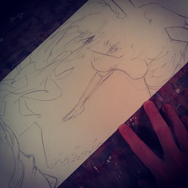
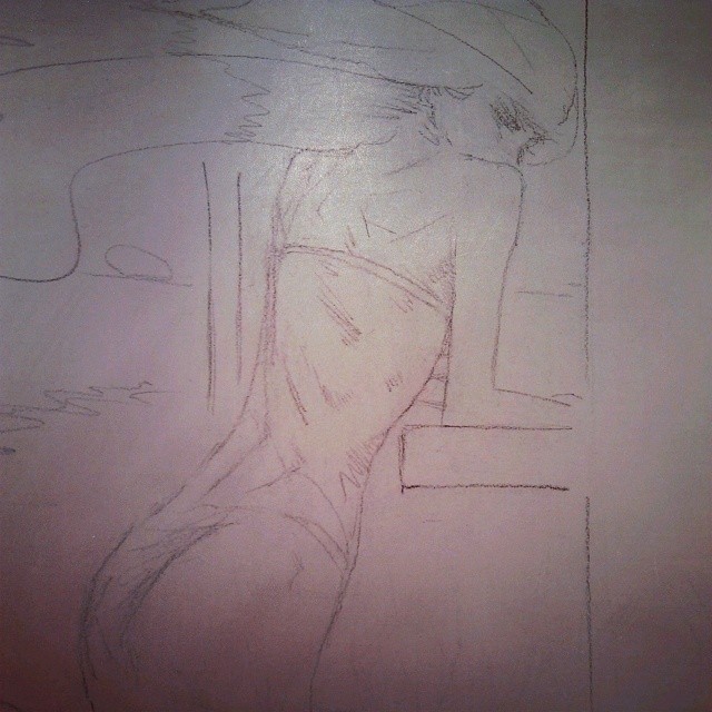
Added 1 new A* page:Okay so, think I did a bit better today than yesterday's disaster, and maybe moved slightly closer to what I would like to do. I realized after talking about loosening up the drawing yesterday that this *wasn't* just a matter of how to apply the watercolor, it has to start with the pencil work itself, so I tried to work a bit more linearly and dynamically with the pencil, holding it sideways more, getting some wrist action going, letting the pencil feel its way around a bit, make multiple lines, and so forth. Wasn't quite seeing things clearly today because now that I look back at the photo I took of the pencils
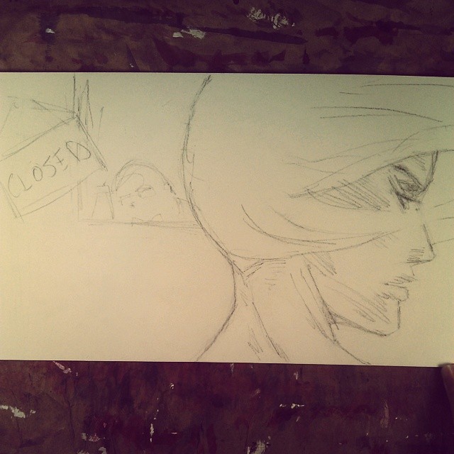
it's obvious that almost-profile had some issues, like some of the features were facing a slightly different angle than others. : P I guess I got some of that straightened out by the time I got to what I thought maybe was the point of being done with the thing
but once again little things starting bugging me, like the edge of the nose and forehead, and the sort of non-committal eye: is it open? Closed? Lit? In shadow? And I *almost* mucked the thing up trying to tweak it, but somehow the glob of white ink that built up over the eye socket from a set of misguided correction attempts just pulled off pretty nearly cleanly, which...I actually didn't think was possible—and it opened up this nice clean gradient space for a lowered eyelid. So that was a bit lucky. : o
Still too uptight with most of the watercolor application though; got to stop worrying about filling in the lines (semi-) neatly, try to get some big dynamic overlapping slabs of transparent color going. I suppose in order to be able to get started with that I should get comfortable with the idea of leaving the pencil lines mostly intact. Hm. And then I keep spending hours fiddling with the colors in Photoshop, trying to get the scanned colors to look like what my brain thinks the actual thing looks like, yet also nice and dark for the dark web page. And that doesn't really work. So I finally let them stay a little on the lighter side here, hopefully when I look at this tomorrow morning they won't strike me as washed out. : P Oh yeah and also I'm now fairly sure that my scanner scans the magenta in darker than it should be relative to the ultramarine, which is technically easy to correct, but, geez.
Trivial Photoshop discovery while fighting with the colors: setting a Levels adjustment layer to Multiply blending mode has the same effect as setting its gamma (middle slider below the histogram) to 0.50. Amaze your friends!
|
·····
|
| |
| Random halves of drawings | Mar 18, 2014 12:43 AM PDT | url |
| | |
Added 1 new A* page:You know, things can get weird in a hurry when you remove the lines
It was looking like this, but a thing or two were bothering me, so I decided to make some white ink alterations. Well one thing led to another and in the end I had applied about half a bottle of white ink and blotted out about half the page. But I decided to go with it because I dunno, maybe a remarkable ruin is better than a so-so drawing. Well I'm not sure about that yet...but I think I'm going to try to use this to make myself loosen up and, hopefully, stop drawing cartoonishly. So please excuse me while I go a little bughouse on this next batch of pages. : o
|
·····
|
| |
| Pencil, Shmencil | Mar 15, 2014 10:29 AM PDT | url |
| | |
Added 1 new A* page:Thanks to everyone who came to my art show opening reception! With all the friends and family who showed up it turned into a pretty fun hangout. : ) Thanks also to the management of Leilani on Greenwood (102nd & Greenwood Avenue North in Seattle—my hypercolorful A* prints and other things will be there through the end of the month) for providing security and some tasty calorie-packed refreshments! : d
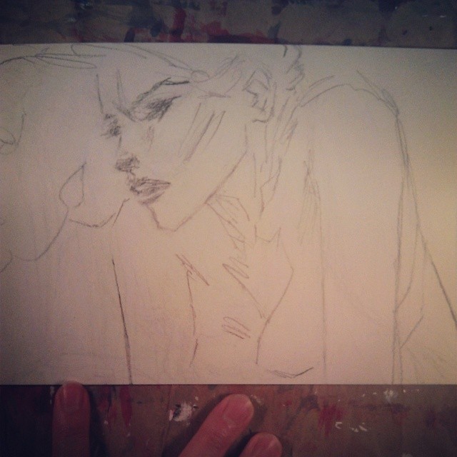
And it was actually almost a total coincidence that refreshments are a visible theme in today's A* page! (Just how much *did* I have brownies on the brain while I was painting this? : o) In pencil it looked kinda like this Instagram shot
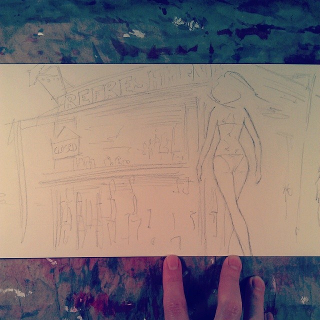
and I decided to try painting without a big wet-on-wet "underpainting" phase to start with, so I could just do mostly -on-dry painting to keep some sharp white areas and so forth. That went all right and I was all set to upload it looking like this
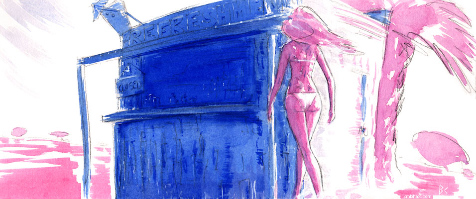
when for some reason (I guess one thing was that I was flipping through the recent pages to compare the color balance and I'm kinda starting to like the fully-painted look I had in page 71, where I didn't leave much pencil behind) I decided to see what would happen if I got rid of the lines. So after much tidying up with an eraser and white ink and a dab of watercolor here and there, we ended up with the final version of today's page. Slightly messier than it would have been if I'd had the idea from the start, but I think maybe it was a good way to go. Also I was kind of happy to see—perhaps I'm just optimistically imagining this : oo—that there are some of those overlapping, almost polygonal layers of transparent colors coming together to build up the figure in interesting ways between the shoulder blades there and in the hair above them, like the similar but much more extensive and nicer structures I pointed out a while back in Bill Sienkiewicz's inspiring "Kelby" watercolor painting. So! I gotta figure out where those came from and try to do more of them. I think maybe it came from just kind of going at it freely with multiple colors and not worrying about keeping them segregated or something silly.
~~~~~~~
Thanks to everyone who voted for A* in Comic Mix's March Madness webcomic tournament seeding round a few days back! I only gave you guys one day's notice—or half a day's notice, probably—and we still *nearly* made it into the tournament with our last-minute voting burst! So that was pretty cool. : ) (And now we don't have to worry about stressful "vs" matchups and more vote-offs, which is probably just as well. ; )
|
·····
|
| |
| A* art show opening at Leilani tonight! | Mar 14, 2014 7:23 AM PDT | url |
| | |
Added 1 new A* page:Art show opening at 6-9 pm today (Friday the 14th)! It's in the front showroom at Leilani on Greenwood (10215 Greenwood Ave. N, Seattle - map), and I'll be there scarfing down the free refreshments. Mom, dad and I got all the artwork set up yesterday; here's an icky cell phone preview shot of just one bit of it:
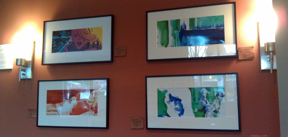
And there's lots more! Plenty more recent A* color stuff, particularly. If you're stuck in Seattle on this Friday night with nothing better to do, well, here's something! (Plus free snacks! :d)
And if you can't make it tonight, the artwork will stay on display there, between 9 am and 6 pm daily, through the end of the month, just in case you happen to be passing through north-ish Seattle.
|
·····
|
| |
| Seed me! Seed me! | Mar 13, 2014 5:50 AM PDT | url |
| | |
Added 1 new A* page:I just noticed that A* is in Comix Mix's "Mix March Madness Webcomics Tournament" Seeding Round, which means that that until their poll "ends Thursday, March 13 at 11:59 PM EDT," you can vote for A* instead of, uh, a ton of other webcomics! Or you can vote for other comics too, I guess. Fame and glory surely await! I'm a bit late finding out about it but there's no time like the present for a roaring comeback!
~~~~~~~
Instagrammy of the pencils for today's page:
Tried a couple things with the watercoloring that, to my surprise, didn't translate as well as I would have liked once the thing was scanned into Photoshop. Hm! Guess I won't do those again. : P
|
·····
|
| |
| Patreon Pen Practice | Mar 12, 2014 12:32 AM PDT | url |
| | |
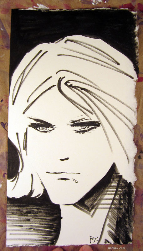
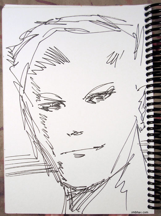
Added 1 new A* page:Here is a pen sketch I did yesterday:
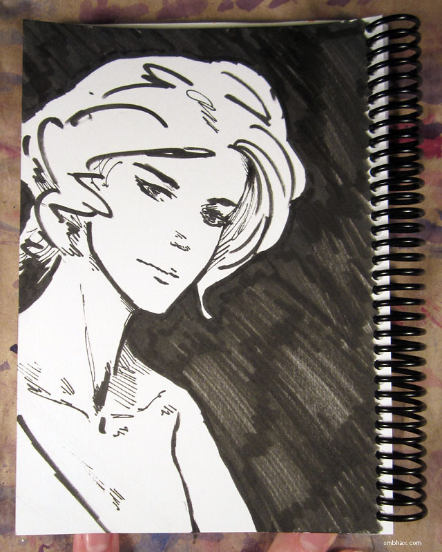
Kind of a practice run for the type of sketches I'll be doing as rewards for people who've pledged their support for A* on Patreon. : ) Reasonably happy with how this one turned out!
|
·····
|
| |
| A* art show this Friday @Leilani on Greenwood | Mar 10, 2014 11:38 PM PDT | url |
| | |
Added 1 new A* page:A* original art, and hyper-colorful prints of my most recent watercolor work, all nicely framed, will be on display in the front showroom of Leilani on Greenwood (10215 Greenwood Ave. N, Seattle - map) starting this Friday, March 14th! I'll be there Friday evening from about 6-9 for the opening receptionwell okay, really for the free refreshments. :d There will probably be some left over for you, too! If you can't make it Friday, the art will still be there at least through the end of the month (but it might not be there long after that, I think we have another show starting in April : oo), where you can visit it daily between 9 am and 6 pm.
There will be nice big framed color prints of these recent A* pages, for instance:
as well as many others! Come see!
|
·····
|
| |
| Pencils, Pens, and Pratt vs Moebius | Mar 08, 2014 7:28 AM PST | url |
| | |
Added 1 new A* page:Right back to the pencil today. ; ) I also got out some pens and did a pen sketch (over pencils, which I then erased) as a sort of practice run for the end of the month, when I'll have to do some reward sketches for my first A* supporters on Patreon :). It came out like this:
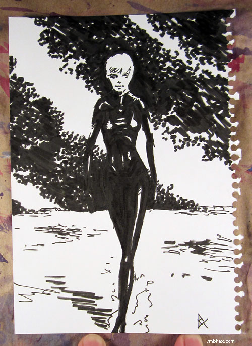
Which I thought was not too badin fact I thought it was all right, so I put it up for auction on eBay in case any reader should want to buy it (starts at 99 cents, with free shipping!). Maybe I should do A* pages this way? I *did* do some in (small) pen at the beginning of this episode (and the last page of the previous episode), and they kind of got out of control with the attempted cross-hatching and sketchy/jagged outlines; if I could stick to using the pens to define shapes rather than lines, more like what I was doing in today's sketch, that would probably come out better for me.
It wasn't 'til after I finished drawing it that it occurred to me that the big pen / little pen combo I was using was sort of similar to Hugo Pratt's thick/thin line approach for Corto Maltese, which I was just talking about the other dayalthough I think he used a lot of brush in that. But in fact you can see Pratt, and Jean Giraud (aka "Moebius") drawing freehand with big markers in an impromptu comic mashup for the 1970s French show Tac au Tac (which might translate as "Tit for Tat") on YouTube. (Update 7/17/22: That version taken down by the French government's Institut National de l'Audiovisuel. : P Here's one on Vimeo.) It's pretty neat! Moebius is the skinny guy with glasses, and Pratt is the big guy in the sweater. You can see how he just kind of lets fly with these crazy winding lines that somehow end up turning into a complicated figure in motion. (The same uploader put up a lot of other episodes of Tac au Tac, with a really impressive array of famous illustrators from back in the day, from all over the world!) Pratt inserts Corto into the collaborative comic strip they're doing (I think they're given sound effects, and they're supposed to draw the panels based on those?), while Moebius uses his beloved "Mike Blueberry" cowboy character. Oh the wacky 1970s comic hi-jinks!
|
·····
|
| |
| To Pencil or Not to Pencil | Mar 07, 2014 12:51 AM PST | url |
| | |
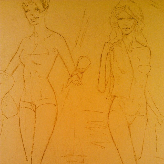
Added 1 new A* page:Thought I'd try doing a page without using the pencil; I was looking at yesterday's page and noticing the little things off with the pencil lines here and there and thinking that maybe the inertia working against me when it comes to altering drawn lines, especially on this watercolor paper where they don't always erase completely, was kind of holding me back in terms of drawing; like, on the page before that, I'd gone outside the lines with some really dark watercolor to adjust the hairline and mouth on the figure on the right, and both those changes had been for the better.
Then I thought no, you can't do the pages without penciling them first, that would be a disaster. And indeed I had gone without the pencil from mid-episode 16 to mid-episode 17, back when I was working in ink and ink wash, and I'd felt in the end that those pages weren't my best work (I was also trying to do two a day). But I also remembered that for a brief streak there in episode 16 I'd sort of sketched or blocked things out first in a very light ink wash, then gradually refined from there, going darker and darker, and that had produced some rather successful partial results: Selenis' face in episode 16, page 69, the foreground ship on page 71, and the background dudes in pages 72 and 73. But I'd dropped it soon after that because it took longer, sometimes didn't work out well at all, and led to some warping and runny ink seams—because the materials I was using back then weren't intended for that sort of thing, really.
Well now I'm using watercolor stuff that *is* designed for that sort of thing, and not so much for pencil, so maybe it makes sense to give that approach another try. I feel like it can definitely help me get toward a more expressive, painterly mode, which I've found myself unable to get into when using pencil lines—but it will also be a challenge to do complicated layouts and sharp features without them.
Today's layout, for instance, was pretty basic—too basic? It didn't come out quite as disastrously as I'd feared it might, though. Here are some intermediate steps (another tricky thing about this approach is that it can look like an absolute disaster most of the way through, until you put in the final light/dark details—especially the white ink!—right at the end):
So...I dunno. I think I can get better at it, but I don't think I'll ever be able to match the crispness and the subtle dynamism of layout I got with through the pencil in, say, page 66; really what I should just get better at is a) erasing and redrawing when necessary and b) ignoring the pencil lines in watercolor when necessary. Maybe I'll give this no-pencil thing another page or two to see if I can stumble upon some kind of breakthrough with it.
|
·····
|
| |
| Sketches and Cepheids | Mar 06, 2014 12:49 AM PST | url |
| | |
Added 1 new A* page:More generosity! My brother's belated X-mas present turned out to be a super-bright 27" LED monitor. So big! So bright! 8o And I'll have to move it back I guess because I'm getting cramps craning my neck to look at it all. ; ) But it doesn't have the tiny-viewing-angle problem my old one did that made me have to try to gamma-calibrate each image separately, so now in theory I can be a lot more assured that the colors I'm seeing are the same ones most of you are seeing, which means I can be a bit bolder with them.
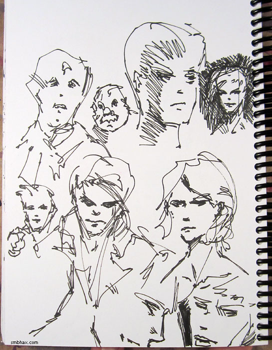
Here are some quick loose pen frustration sketches I did late last night before I could sleep; they aren't great but what the heck:
~~~~~~
Hey let's cover some science news! My backlog's backlog is already getting backed up in my inbox, yeesh—so these are fairly recent (Feb 6th):
Gaia 'billion-star surveyor' returns test image (bbc.co.uk) - Europe's newly launched Gaia satellite is gearing up to start studying the motion of a billion stars, particularly those in the Large Magellanic Cloud galaxy, a satellite galaxy of our own Milky Way. "By repeatedly viewing its targets, it should get to know the brightest stars' coordinates down to an error of just seven micro-arcseconds - an angle equivalent to a euro coin on the Moon being observed from Earth." This will let scientists determine the distances to neighboring Cepheid variable stars using parallax—and because "the strong direct relationship between a Cepheid variable's luminosity and pulsation period" allows scientists to determine their distance just by observing the frequency at which they pulse "between a larger, brighter state and a smaller, denser one," Cepheids are an important measuring stick we can use to know how far away other star clusters are. But currently "we have precision distances - i.e. to 1% accuracy - to only one Cepheid star, which is Polaris (the North Star). So the whole distance scale to the Magellanic clouds depends on very shaky foundations." So Gaia's measurements should help us nail down these distances!
Here's a nifty Hubble photo of the Cepheid variable RS Puppis, about 6500 light years away (give or take 90, they think) (check that link for a really cool animation of its light echoes pulsing through the surrounding nebula!):
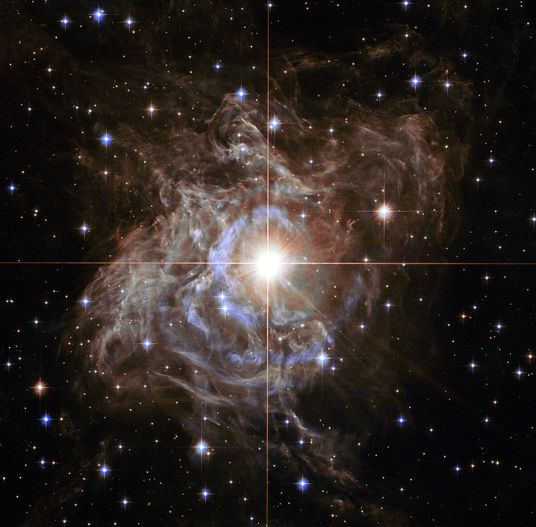
image by NASA (source)
Fresh impact crater spied on Mars (bbc.co.uk) - "The hole is about 30m (100ft) in diameter"; "The explosion that generated this crater tossed out debris as far as 15km (9.3 mi)." "These studies indicate that impacts producing holes at least 3.9m (12.8ft) in diameter occur at a rate exceeding 200 per year across the planet."
|
·····
|
| |
| Hugo Pratt's "Corto Maltese" | Mar 05, 2014 12:14 AM PST | url |
| | |
Added 1 new A* page:Besides all the people who continue to jump in and support A* through Patreon, I have to thank the further generosity of Russia's #1 A* fan, who sent me yet another book off A*'s Amazon Wish List! And I'm a little behind on going through these neat books I get, but I'm going to make sure I do this one because I find it really amazing in a unique way. It is Corto Maltese: The Ballad of the Salt Sea by Italian comic book creator Hugo Pratt; the roguish sailor Corto Maltese was Pratt's most famous creation, and this, the first Corto book, came out from '67 through '69 in French and Italian.
Pratt was a teenager in Africa during WWII, and later spent time in South America before moving back to Italy, and then finally going to France where he did the bulk of his comic work. In his travels he absorbed details of many cultures, and you can see this paying off unmistakably in the scrappy South Seas situations in which Corto finds himself. There's a surprising amount of dialogue in what you might have assumed was a straight-up adventure story, but Corto and his world are both surprisingly complex.
But I've only read the first chunk of Ballad so far, so I can't say all that much about the writing I suppose, except that the English translation by Hall Powell in this Universe-published edition is a little awkward. This edition also adds color—by Patrizia Zanotti—and although I'd have liked to have seen Pratt's original black and white, the color, done in a broad, watercolor style, really does fit Pratt's ink pretty well. But enough talk, let me *show* you:
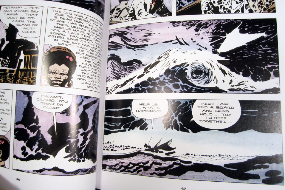
^ Pratt gets *really* abstract with the ink when the sea acts up : o
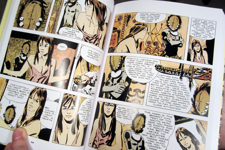
^ As I said, lots of dialogue—but somehow it doesn't seem like too much as you're actually reading it, even when one of the speakers' faces it totally obscured by a nifty mask (the font they used for the translation *is* a little funky)
^ Action! Notice how abstract Pratt's individual ink marks are—but they almost always add up to something you understand right away
^ More action, and Pratt having fun with poses; notice too how his use of shadows is both heavy yet subtle; oh by the way that's the main character squeezed in on the right
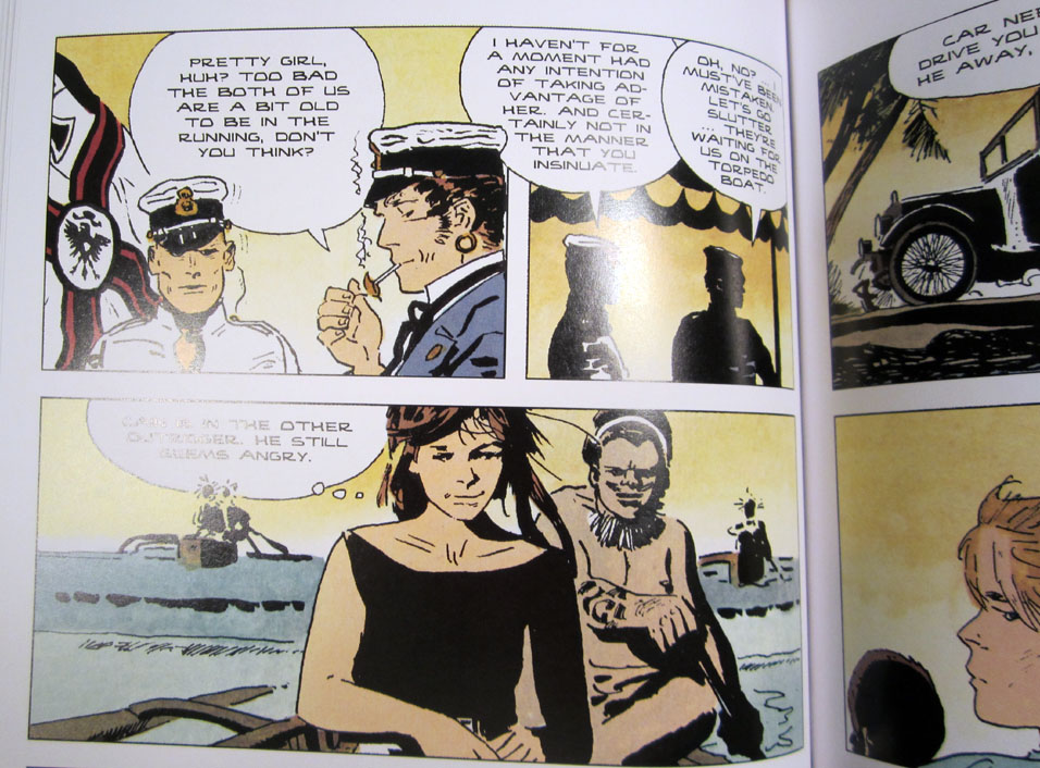
^ Corto being sassy to a German soldier conducting an off-the-record war in the WWI era
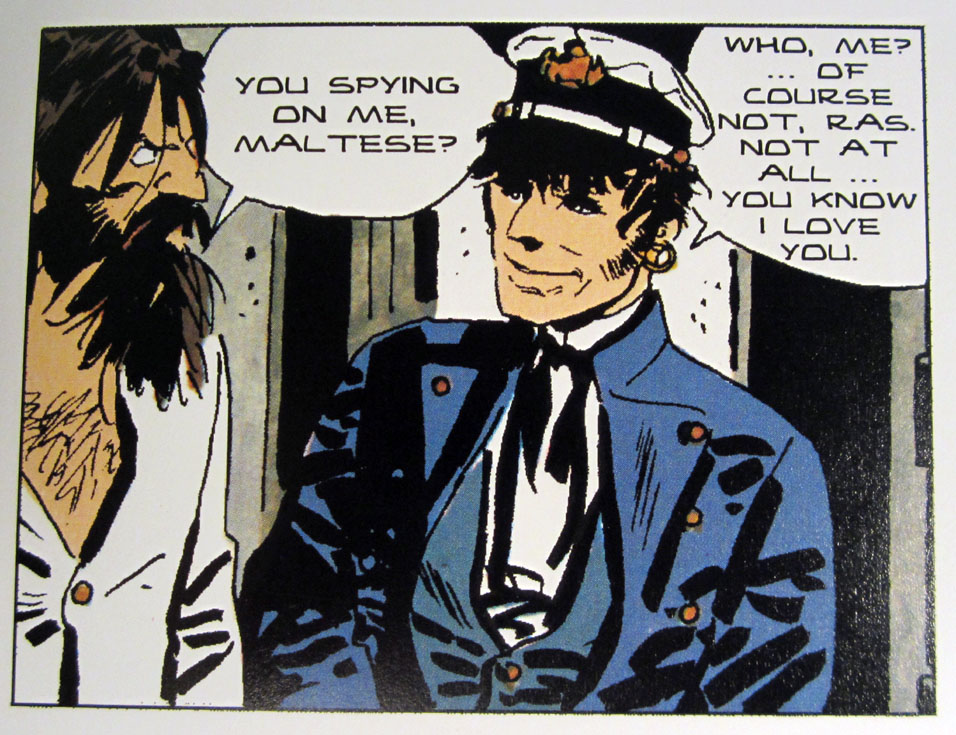
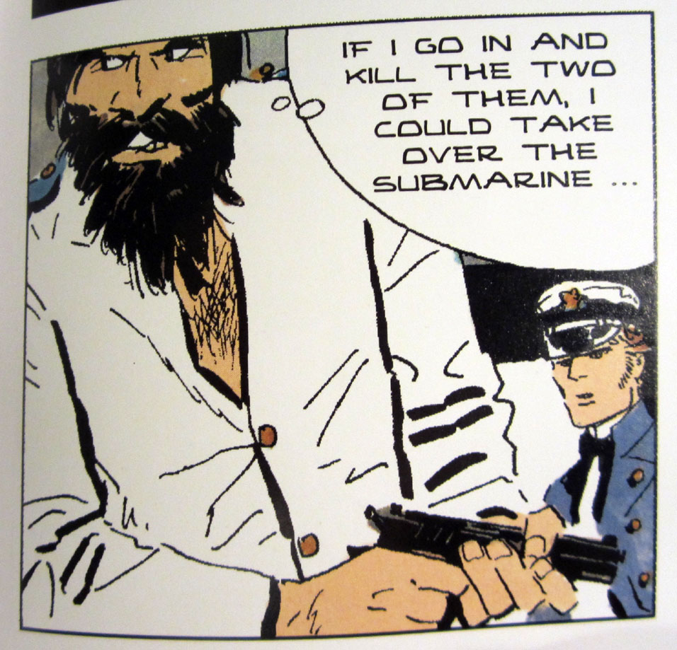
^ Corto being sassy to his usual nemesis, his rival rogue captain, Rasputin
^ I didn't really notice until I got close-up like this, but the line art they used in this edition is a little low-res
^ A good view of Pratt's favorite thick and thin lines there on Ras' shirt; they remind me of some of the work Frank Miller did decades later—and Miller contributed a quote on the back of the book
^ Diagonal lines on noses are always fun
^ Corto is extra saucy when he's been adrift at sea and hasn't shaved in a while
^ The diabolical Rasputin tries to hurt Corto's feelings
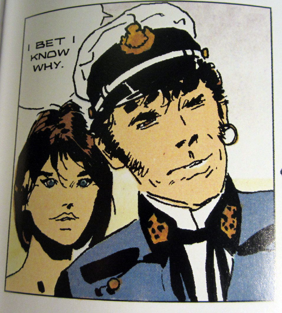
Well, that's it for now—I've got about 2/3rds of the thing left to go, and I will probably be sucking up your bandwidth with more photos of them at some point. I really like how Pratt's artwork has this devil-may-care attitude about it with the loose linework; once in a while there's a panel that really *does* look like a disaster, but he never goes completely off the rails and away from an essential realism, and the expressive way he goes about it has a genuine rough charm and assurance, just like Corto himself.
Ballad seems to be the only Corto book Amazon carry themselves, which is too bad. I'd really like to get these books in the original French, too—would be a good excuse to get back to trying to improve my pretty poor abilities in that language. Oh speaking of which, there are a few animated Corto films on YouTube; The Ballad film is a bit sketchy, but La Cour Secrète des Arcanes is absolutely gorgeous—and in French; nonetheless, I will watch it some day when I feel like just sitting for 90 minutes and seeing something really neat.
|
·····
|
| |
| A* readers are paying half my rent! : oo | Mar 03, 2014 11:12 PM PST | url |
| | |
Added 1 new A* page:Since I put A* on the Patreon crowdfunding service on Saturday, readers have already pledged enough support to cover about half my rent! : oo
Needless to say that is just stupendous, and I'm really awed by the generosity of folks out there. Mostly I just sit in my apartment alone working away at these strange drawings, and yet people out there in the wide world connect with them enough to pitch in like that--it's pretty amazing!
I did get around to replacing that hulking link banner with a simple text bit, too--which is now on the "about" page, and there's a link on the "store" page too:
| Many thanks to my readers, who keep A* going with a buck or two a month via Patreon! |
So yeah! I do have pretty low rent, so every little bit really *does* make a big difference!
Tomorrow I'll have some more reader generosity-related news, but this one will have actual comic stuff in it--if I get my work done early enough, anyway!
|
·····
|
| |
| Gimme yer dough! I mean, A* is on Patreon! | Mar 01, 2014 12:18 AM PST | url |
| | |
Added 1 new A* page:I've just signed up with Patreon, a crowdfunding service that makes it easy to support content creators--such as webcomic authors--by automatically kicking them a buck or two on a regular basis; Patreon is still fairly new, but a lot of well-known webcomics, and even smaller webcomics, are already getting a not-insignificant income through it, thanks to their readers, so, after a reader mentioned to me that they'd like to use something like that to help support the comic, I figured I should give it a shot. A*'s Patreon page is here--or just click on this remarkably garish banner I made and will probably have to tone down a bit...or even a lot : o (and it won't be on the front page permanently, goodness no--I'll be migrating it over to the "about" and/or "store" pages):

You really can set your support up to be as small as $1 a month--every bit helps! I've configured little rewards by way of thank yous for some of the higher support levels, giving away things like e-books, sketches, and all the way up to big original A* watercolor paintings for truly insane levels of funding. And I've set a few funding goals, like, should we somehow reach $800 in funding : o, I'll happily remove the ad banner currently running at the bottom of this site's comic and news pages.
Here's my pithy Patreon pitch blurb, which you guys actually helped me write, although you didn't realize it at the time : D:
| Hi there! I'm Ben Chamberlain, and I've been producing the daily webcomic Supermassive Black Hole A* full-time since 2009. My readers have called the comic things like "dark," "mysterious," "sexy," and "noir," which has been awfully nice of them. With your help, I'll be able to keep bringing this science fiction adventure to them--and to you! |
If you aren't into the whole Patreon thing, I totally understand; it isn't as though I have extra dough to splash around on the internet either! As always, I am glad just to have you as a reader, and I hope we can continue having fun with A* for a long, long while. : )
~~~~~~~~~~
Oh yeah, just in case you were still going to visit Patreon, I posted an actual undoctored (though heavily shadowed : p) photo of myself in my Patreon user profile-it's a little way down the left-hand column of A*'s Patreon page, below the funding goals. Fair warning! : o
Oh yeah #2, I will post photos in the blog here on smbhax.com of the sketches/paintings I do as rewards for Patreon supporters before I mail them off--so this is also a way to get myself back into making sketches to show you, which I've totally been slacking on for the past month+.
|
·····
|
|
|