 | |
| |
|
|
view titles only (low bandwidth) |
| |
| Whew Monday is almost over = P | Jun 30, 2014 11:46 PM PDT | url |
| | |
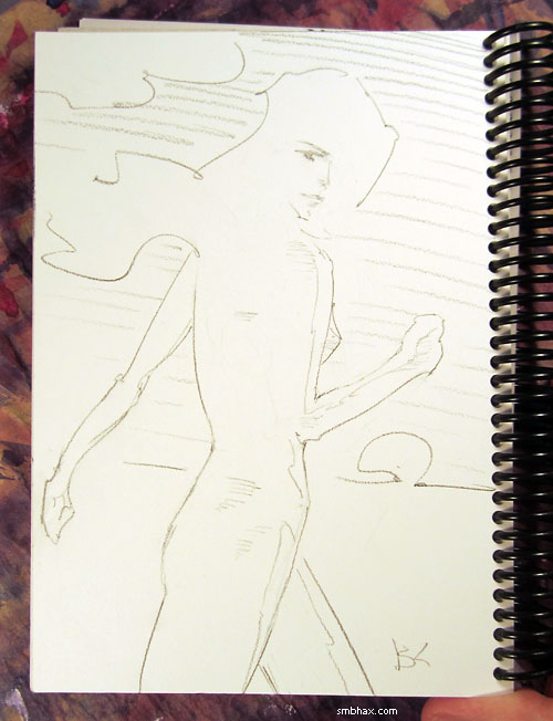
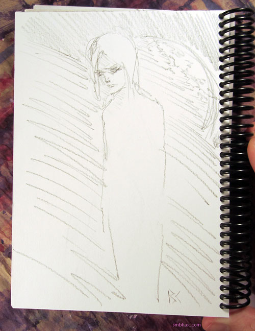
Added 1 new A* page:Here's a sketch I drew and sent off to a munificent A* reader a few weeks back as the reward for their support of the comic in May through Patreon:
<3<3<3
|
·····
|
| |
| Coloring inside lots of lines | Jun 28, 2014 11:33 AM PDT | url |
| | |
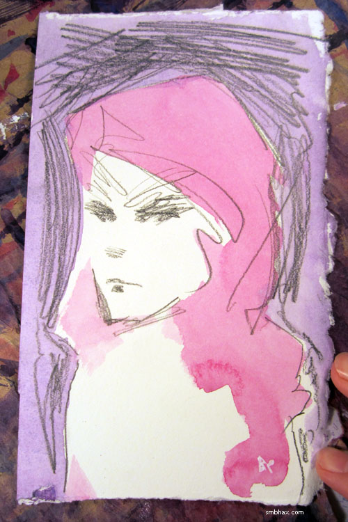
Added 1 new A* page:So day two here of adventuring in A* with the new pencil; the drawing for today's page came out super-detailed by my standards
but then comes the tricky part—how to color it? I opted for a sorta standard kind of fill in the lines approach, but now that it's done I'm not sure if that's the approach I want to be going with. Like, maybe I should have come up with something more abstracted and particular to do with the watercolor, so the colors are doing their own thing without just kind of taking over what the lines were doing? I think the final thing came out okay; I guess it's just that inevitably there are going to be things I liked in the pencils that will get lost in that type of conversion, and I'll always regret losing whatever it was, even if (maybe?) the finished piece works better that way as a whole. Huhhh hard to tell, I guess I'll just have to keep feeling out each drawing and keeping an open mind as to how to approach it with the colors. Here's a photo I took of coloring this one, after having done the red and before adding the blue—at this point I hadn't had to touch any of the important details on the figure yet, and thus had no regrets so far—I guess that's why I took the photo then : P:
Hmmm. I suppose the most obvious answer to this is that maybe I just need to go lighter (and a little neater) on the color, so I can darken the lines up more digitally at the end, and then I won't feel like I've lost parts of them. Maybe. On the other hand, maybe sometimes I can go with more of an Art Nouveau type look where you've got intricate linework kind of left to itself, with more like abstract color shapes arranged alongside. Much less of a by-the-numbers approach there and I'm not sure how I would go into it, exactly...which I suppose is why I keep chickening out of my promise to myself to go more abstract with the color application some day.
Maybe a change of scene will help give me some new coloring ideas. That's happening (ideas or no) on Monday! Have a cool weekend.
|
·····
|
| |
| A new pencil! The high-falutin' Hi-Uni H | Jun 27, 2014 6:00 AM PDT | url |
| | |
Added 1 new A* page:I got a new pencil! : o
This is going to be a long post.
See I've been thinking for a while that I wished I could figure out a way to make the pages look a little sharper—I'm constantly thinking oh what about going back to ink or trying pens or something, for instance. Yesterday's page particularly struck me in a could-have-used-sharpening-up way, once I saw how it came out digitally, and that got me thinking about how some of the pencil-only pages I was doing a few episodes back had come out pretty sharp—this one, particularly.
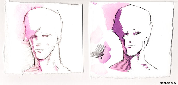
That was done with a mechanical 0.5 mm drafting pencil, before I switched to woodcase pencils, soon settling on the 4B Tombow Mono that I've been using more or less ever since. So I thought hm, maybe I should take a look at how the drafting pencil does on this relatively rough watercolor paper I'm using these days—the soft 4B Mono breaks up and scatters a bit on it, you see. I did a quick side-by-side sketch of the drafting pencil and its narrow H-grade-lead line next to a sketch done with the 4B Mono, as a proof-of-concept (this is closer-up than the standard A* comic drawing size):
Yeahhh, the drafting pencil and its H-grade lead came out much finer—just think of the increased detail I could get in! I would have way less of an excuse not to draw noses properly! But then I had a further thought, namely that woodcase pencils come in H-grade too, silly—and that I even had some in my shame-filled art supply cabinet: a fancy box of imported (back before I realized they were available much cheaper domestically : p) Monos, and differently designed yet similarly fancy box of imported (these are not sold here in the States, alas) H-grade Mitsu-Bishi Hi-Uni pencils, which I got when I was first investigating woodcase pencils. So I pulled one of each of those pencils out, and did a bunch of series of comparison sketches with them, the 4B Mono, and my (yes, another import : p—these things all come from that amazing source of Japanese and some German art/office supplies, jetpens.com) Platinum Pro-Use II mechanical drafting pencil loaded with (non-imported : p) Pentel H-grade leads. Here are a couple of those sets; the top row goes (l-r) H mechanical pencil, H Hi-Uni, H Mono, 4B Mono; the bottom row l-r is 4B Mono, H Hi-Uni, H Mono, and H mechanical:
(Drat, I forgot to sharpen that scan after shrinking it in Photoshop; just pretend the slight blurriness isn't there. : P) I found that the mechanical pencil, though a high quality one, had just a tiny little bit of play in the lead, which I suppose is inevitable when you're dealing with moving parts, vs the woodcase pencils, which have zero moving parts; this leads to just a hair less control when drawing; for instance, you can't be sure that the lead won't rotate slightly on you when you press down on its leading edge, which will displace the line you're trying to draw ever so slightly; or, the slight flex in the metal clamps or whatnot inside may cushion things ever so slightly when you try a quick application of pressure; I'd never noticed these things before, but now that I've been used to drawing with woodcase pencils every day, it really jumped out at me.
The other drawback of the mechanical is that the Pentel leads had a slightly waxy consistency; this allowed them to leave a very smooth, unbroken line on the rough paper, but that line was slightly, well, blurry compared to the crisp lines made by the woodcase pencils. It drew really zippy, but, coupled with the slightly lesser control, I found that I was mostly making quick, dashed lines, rather than carefully drawn ones; this had a stylish kind of polygonal effect, since it was hard to brake with the thing (another factor in this may have been the mechanical pencil's greater weight), but wasn't really helping me draw in great detail; same with my trusty 4B Mono, even though I was having the highest success rate of decent sketches with it, probably because it's been my daily drawing tool for oh nearly forever now.
So the drafting pencil and the 4B Mono were out, leaving me with the H-grade Tombow Mono and Mitsu-Bishi Hi-Uni: a showdown of Japanese titans! Most of the sets of sketches I did last night
were battles in that titanic and closely-matched struggle; I was having a hard time deciding! I seemed to have a higher success rate of decent sketches with the smoother, softer, darker Mono, but there was something about some of the ones I managed with the Hi-Uni, even though it didn't draw quite as darkly, and the harder point made it feel much scratchier than the Mono... It was too close to call! I drew set after set, scrutinizing them intently, but couldn't pick a clear winner. The night was almost gone! Finally, I tore up the strips and narrowed it down to a comparison of the three best representative sketches done with each of the two pencils (this is to scale with standard A* comic size; click it for the larger 1080p size):

The three H Mono sketches are on the left, and the H Hi-Uni sketches are on the right. You can see the Mono is darker (note that I darken all of these scans relatively in Photoshop for greater legibility), and there's more of a liveliness or style about its drawings, I think because the smoother, softer lead moved more easily across the paper, so I could just let my hand have fun zipping off crazy lines—relative to the harder, scratchier Hi-Uni, where I had to put more conscious effort into moving the pencil tip across the paper—but that seems to have given me more control, or maybe it was just the process of having to fight and struggle and re-draw... Anyway, in the end I couldn't deny that the Hi-Uni sketches, although fewer of them had come out well, were better drawings—something more life-like and true had come out of fighting that hard lead point across the rough paper.
Oh yeah, the other thing in the Hi-Uni's favor was that the slightly harder lead broke up less easily on the paper, so the lines were a little more solid than the ones made with the more easily scattered, softer lead in the Mono (yes these are still both rated "H" grade by their manufacturers—but pencil grades aren't made to be consistent between manufacturers), which was the whole reason for trying a different pencil (than the very soft 4B Mono I had been using) in the first place.
Which reminds me, I had done one other pencil test last night; when still thinking the mechanical pencil would be the way to go, I did a quick to-A*-comic-scale (width, anyway) test, with a dash of watercolor, to make sure its lighter lines could come out okay (and I would have to go correspondingly lighter with the watercolor, so that when I applied the necessarily greater darkening to the lines in Photoshop, the watercolors wouldn't come out too dark/saturated):
When scanned and scaled to that size, it broke up where I'd gone lighter, but mostly worked pretty well, and the Hi-Uni lead would be darker anyway—in any case, the jump in sharpness over the 4B Mono was obvious.
~~~~~~
I got up this morning today thinking that I'd better make sure the Hi-Uni H, which had seemed to be the winner of the evening's battery of tests, could work with watercolor and digitally prepped for the comic; also, I'd gotten to thinking that if I just needed dark lines, what about inking Hi-Uni drawings with my trusty, waterproof Rotring Tikky Graphic 0.3 pen? So I gave those things a shot:
It wasn't a great sketch with the Hi-Uni H (this is why I don't usually try drawing before breakfast : p), and I hadn't drawn as heavily (and thus darkly) with it as I had in the previous evening's sketches, but it came close to darkening up reasonably well in Photoshop; as for the pen test, the pen and watercolor combo still wasn't quite clicking with me—I guess I still haven't quite wrapped my head around how to a) translate pencils well into a water-colorable pen drawing, and b) how to paint over the pen lines in a meaningful way. And the Tikky's normally dependable ink flow was breaking up a bit across the watercolor paper's toothy surface, even in these relatively short lines. On the plus side, its ink at least didn't run in any really perceptible way when painted over, which I'd been wondering about for a while.
Still, it looked like I was going to go with just watercolor plus Hi-Uni H, but I wanted to try more brands (it would be nice to find one sold domestically, for instance, which would be way cheaper than importing the Hi-Unis from Japan), and more grades: particularly, grades harder than H. I knew I wouldn't really be able to convert lead lines much lighter than those made by the Hi-Uni H to legible watercolored comics, but I suspected that a 2H Mono, for instance, might be just as dark as an H Hi-Uni. So while out running some errands I popped into the small neighborhood art supply store; they don't have a wide selection, and in fact at this point had just two pencil lines: the Tombow USA Monos, and Faber-Castell's German-made "Castell 9000" series; these get pretty high marks on the internet, and also I wanted to see if European leads really were, as I'd read online, harder than Japanese leads, which are reputed to be softer than the rest of the world's, generally.
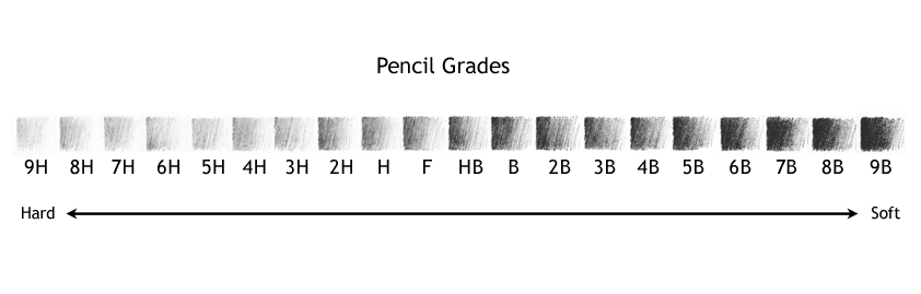
This was indeed the case; the best match for the feel of the H-grade Hi-Uni was a 2H Mono, and an HB Castell 9000: so, at least at this part of the range, the Mono is one grade softer than the Hi-Uni, and the Castell 9000 is two grades harder! (The pencil grading name convention is kinda weird; here's a refresher of the schematic I've posted before:
modified from the original image by Untitledmind72 (source))
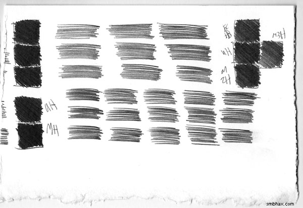
Between those three, then, the Hi-Uni was just a shade darker than Castell and the Mono, although the lines they made were really hard to tell apart, as you can probably (not-ish) tell from this test matrix I made with them (and one sanity comparison test of the Hi-Uni H vs the Mono H in the lower left corner—the significantly softer Mono H was still darker, phew):
So the Hi-Uni, the expensive import, was still the one that seemed like the best balance of hardness and darkness for my A* watercoloring purposes. : P
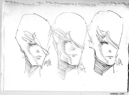
I did find that I liked certain different hard grades of the Mono and Castell, for whatever reason: just sketching sets with all of them (I had H through 6H in Monos, and HB through 4H in Castells), I just pure liked best the 3H in both the Monos and the relatively much harder Faber-Castells; higher than that in both ranges became uncomfortably scratchy, and they were already too light for using in scanned watercolors, but just for sketching I liked their feel, particularly the Castell 3H, where you can scratch together so much very light, fine detail, it's just neat to play around with and see what it can do; here's a little set of sketches using those two and then the Hi-Uni H at the end:
And that, thankfully, brings us just about to the end of this horrifically long article. I used the Hi-Uni H in today's A* page, and I think it did help me get into a more ambitious layout than my usual. I knew I'd have to mentally recalibrate my sense of how saturated to go with the watercolors—I'd have to go lighter to match the lighter pencil lead—but I still managed to slather them on a bit too heavily in a few spots, resulting in some spottiness and the inability to reach quite the darkness of line I would have liked in my Photoshop adjustments. But! It kinda came close. I think this'll work out well with a bit of practice.
|
·····
|
| |
| Now with more watts! | Jun 25, 2014 10:47 PM PDT | url |
| | |
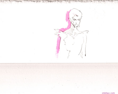
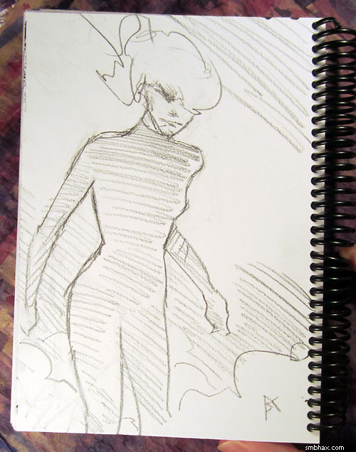
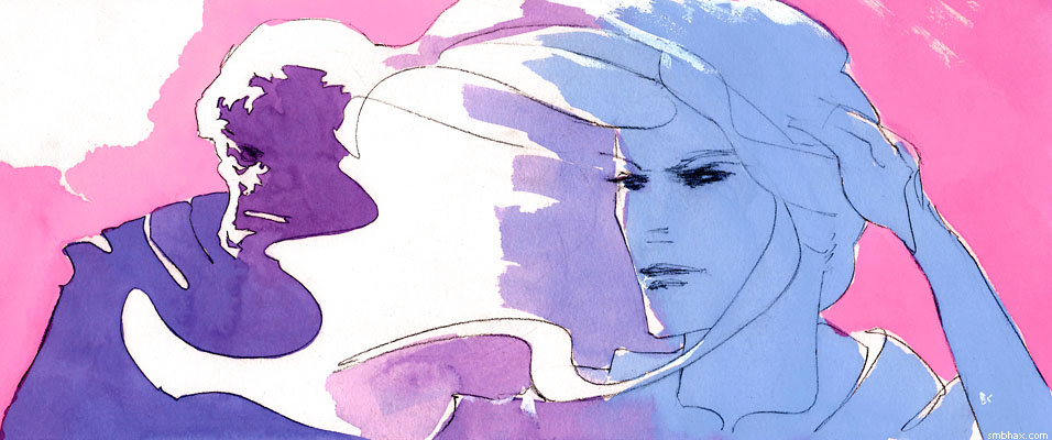
Added 1 new A* page:Here's yet another sketch reward I sent to a wonderful reader who supported A* for the month of May through Patreon:
Emo style! : oo
~~~~~~
New brush and new lighting at my drawing table today (note to self: 25 watts was probably not enough to draw by and was probably what was causing your eyes to ache after drawing for a while : P; hopefully 60 is closer to the right number of watts >_<); maybe it's just a coincidence, but today's A* page seemed to come out a bit sharper, so yay. Also been looking at Sara Pichelli's art in Marvel Comics' latest "Guardians of the Galaxy" comic series. So precise! So sharp! She can draw noses and ears! Jeez!
|
·····
|
| |
| Blingin'! | Jun 24, 2014 10:48 PM PDT | url |
| | |
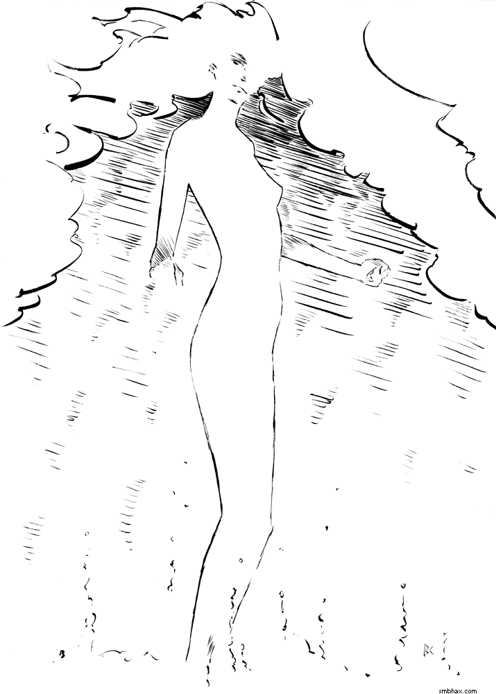
Added 1 new A* page:Here's another reward sketch I sent to another wonderful A* reader for supporting the comic through Patreon in May:
: D
~~~~~
Speaking of raising funds for working on the comic, I should mention that I've bumped up the starting bid price of the daily original art that I sell on eBay, starting with the original art behind today's A* page (its auction is here)—bumping the action up to $9.99, woo! Not that I like raising prices on people, but the old $4.99 barely covered the material costs involved in producing a page, and, sadly, I have other expenses as well. What kind of world are we living in?!? Maybe I should move to Europe, I hear artists get some pretty good breaks over there. >_> Anyway so yeah, price gouge. I was selling nearly all of the halfway-decent pages I put up at the old minimum bid price anyway (even ones that had someone else in them besides just Selenis! I never used to be able to sell any of those : o), so I suppose it was time to try raising it. We're still pretty far off from the I dunno $50 or $100 or whatever I really need to be averaging per page to, like, make a sustainable living, whatever that is, but eh baby steps, baby steps. Just gotta, like, keep learning to draw better and stuff, yah. I think.
|
·····
|
| |
| Sketchin' on rough paper | Jun 23, 2014 11:59 PM PDT | url |
| | |
Added 1 new A* page:Here's a sketch I sent out to a lovely reader as a reward for their very generous support of A* in the month of May through Patreon:
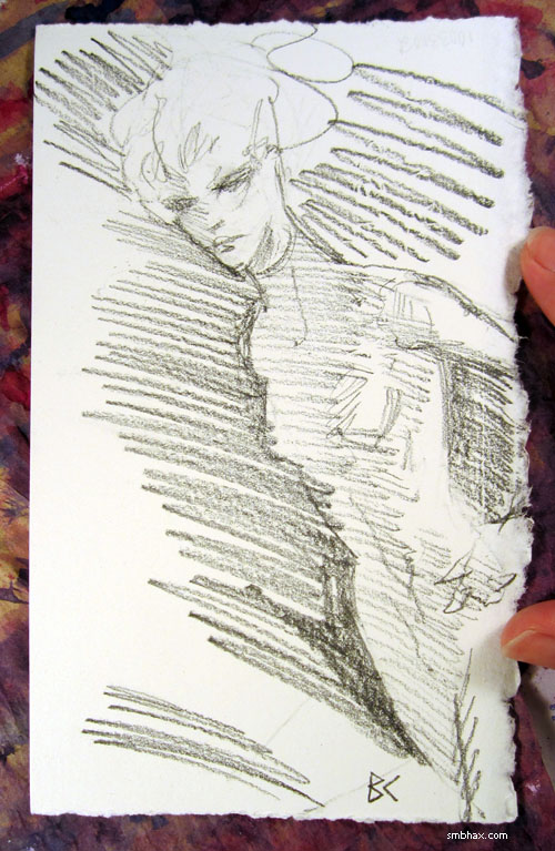
: )
|
·····
|
| |
| A* auction extravaganza! Bonanza. | Jun 21, 2014 4:45 AM PDT | url |
| | |
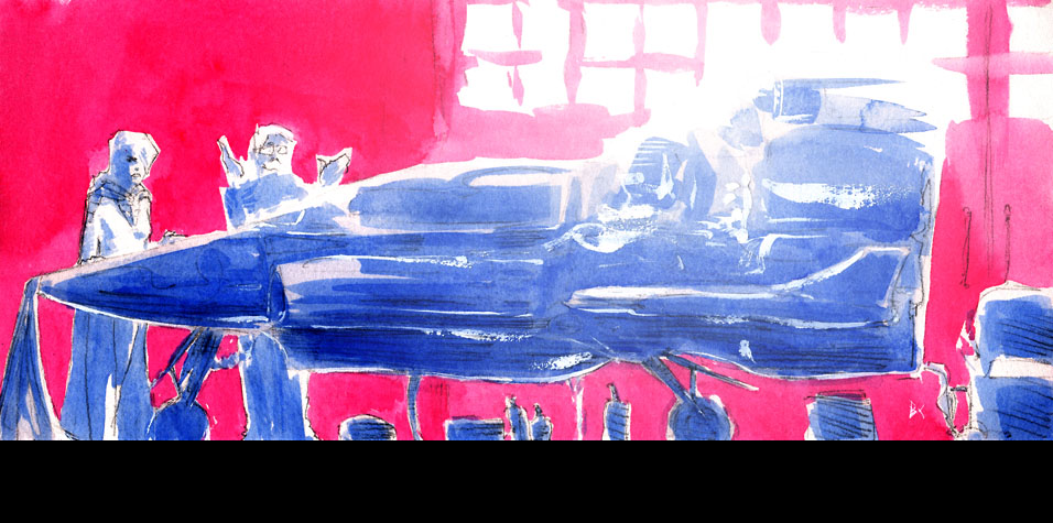
Added 1 new A* page:Well it's my last good chance to remind you of the auction of my special big ink piece before the auction ends Monday night, soooo while there's time left you can still go to the auction and bid on this illustration if you want:
~~~~~
Hey while I'm at it I may as well put in that if you prefer watercolor stuff, just like with all my pages you can bid on the original painting behind today's A* page too, using that little gold and baby blue eBay text link at the lower left corner of the comic (or just click here to go to the auction if you don't want to scroll up); I think today's is one of my better-executed watercolor attempts of late, and hmm well I don't think we'll be having *too* many more dramatic shots of Selenis piloting a ship as it's going down in flames in front of a puffy pink sky in the foreseeable future, so if that's your thing—and who doesn't like that, I ask you—then this is your hour! Or week, since that's how long the auctions run.
And in any case, huzzah! We made it to the weekend. Together. <33
|
·····
|
| |
| Explosions fix everything! | Jun 20, 2014 1:14 AM PDT | url |
| | | |
Added 1 new A* page:Hmm I often feel a little uneasy about a page when it doesn't have a person in it; maybe without that emotional focus I just fuss over the color balance or something, I dunno. But hey how long has it been since we had an explosion?? TOO long!
|
·····
|
| |
| Through a Glass, Blurry | Jun 18, 2014 10:51 PM PDT | url |
| | |
Added 1 new A* page:Just in case you missed me blathering about it two days ago: I've got a special large (10" x 14") A* illustration currently up for bid on eBay—probably five days or so left:
~~~~~~
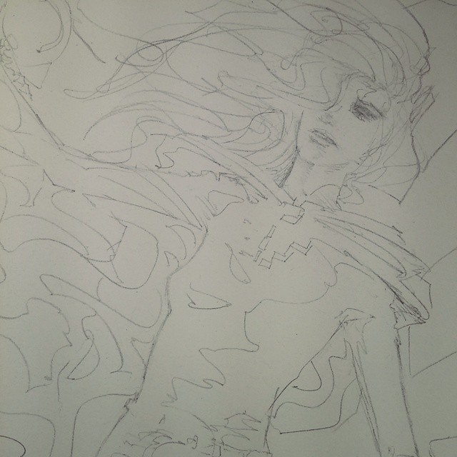
Here's another sketch I sent to another supporter of A*'s Patreon campaign for their support in the month of April—unfortunately all three photos I took before bundling it off turned out blurry, dannnng:
I thought it was one of my better ones, too! : P
|
·····
|
| |
| What big...brows you have, grandpa! | Jun 17, 2014 11:02 PM PDT | url |
| | |
Added 1 new A* page:Here's a sketch I sent to a supporter of A*'s Patreon campaign as the reward for their generous support in the month of April:
Little Red Riding Selenis? Anyway, thanks to everyone who's been helping out, it means a lot! : D
|
·····
|
| |
| A* ink illustration #1 - "Cherenkov" | Jun 16, 2014 10:30 PM PDT | url |
| | |
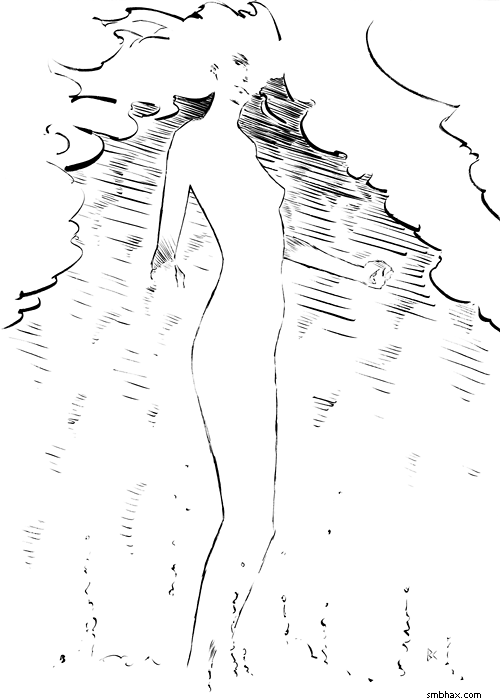
Added 1 new A* page:I got that big A* ink illustration I've been threatening to do done finally! So it is up for auction on eBay right now and I hope you will check it out but here's a preview just in case:
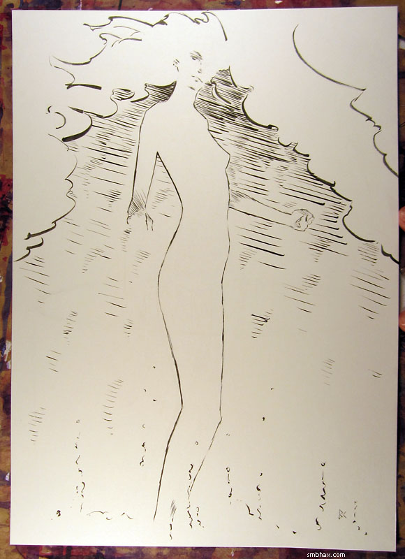
It's 10"x14" and I inked it with a "size 0" brush, which is way tinier than the size 4 brush I've been used to using for ink work—the smaller brush helped me do all the thin little lines there, especially the longer, sinuous ones; I'd been pretty worried that I just wouldn't be able to pull those off in ink—I've never really inked anything like them before—but I was surprised to find myself unconsciously falling into doing them with a series of medium-length strokes, just kind of carefully going along them bit by bit. It was actually a lot of fun, if a little nerve/hand-muscle-wracking.
So I hope everyone bids on it and then I will be pumped up to do more and also able to pay some rent and buy some groceries! (Mmm, groceries : d) I'm hoping this will be kind of a little I dunno pin-up series or whatever I guess, so I optimistically labelled this one #1. : D At most I'll only be able to manage one or maaaaaybe two a month, though, so they're always gonna be LQQK R@R3 and all that. : p Anyway yeah, ink! It's kind of been a while (but this one actually went waaaay better than I'd expected—didn't even hafta use any white ink to cover up boo-boos! : o).
(By the way, if you missed it in an earlier article, you can see what the original pencil sketch looked like right here.)
|
·····
|
| |
| The Pen I am Least Awful at Inking With, Pt 2 | Jun 14, 2014 8:44 AM PDT | url |
| | |
Added 1 new A* page:Man, who knew painting outdoor scenes in watercolor was so fun? : o
Okay about time I finish my bloggy thing about which pen I am least bad at inking with—part one is here, in which I narrowed the field considerably; in fact, I narrowed it down to two pens, my trusty Rotring Tikky Graphic 0.3 technical pen, and the Copic Multiliner SP BS "brush" pen.
So I did a head-to-head with them of sight sketches off of the pencils I need to ink, plus just a bunch of little doodles. It was looking like the SP BS just wasn't quite flexible enough to do the delicate linework I wanted, and anyway it wears down too much under an eraser—so I was going to be trying to ink this piece with the ol' Tikky 0.3, BUT then a twist happened. Namely, a friendly user over at the A* mirror on Drunk Duck commented that they prefer a small brush for this type of work. And as soon as I read that I had to admit to myself that I could certainly get better line quality with a brush, and I'd just kind of been trying to avoid going to a brush because well it's a little more mess and fuss, and more frustrating when things don't quite go right.
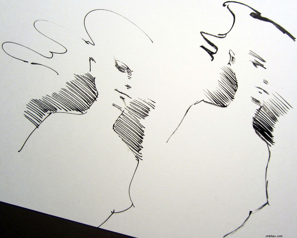
Well just to prove things to myself I dug out one of the little "size 0" brushes that were coming free in complementary two-packs with my preferred brush size, 4, of Raphael's 8404 brush; I'd tried one of the 0's once, just to test, but it hadn't been able to carry an unbroken line—but I had a sneaking suspicion that that, along with some of the frustrations that eventually had me abandon even the size 4 brush, was because I was using ink that was just too darn thick. So I diluted the old dregs of ink that have been sitting here unused in my little ink bottle for ages now, adding a surprising amount of water actually without making the ink noticeably less black on paper, but that got it flowing pretty good, and gosh I could do unbroken lines with the little size 0 brush, wouldn't you know. I did these tests—and some with my somewhat used size 4 brush, too—on the same piece of paper on which I had done the final round of pen testing, so it got a little cluttered (you can click this photo for a larger version):
^ Generally, the SP BS was used on the left, the Tikky 0.3 is the thin, fixed-width lines on the right, and the organic lines on the right, including the right-most sight sketch from the pencils, and the doodle in the lower-right corner, were done with the 8404 size 0 brush—except for the slightly heavier-inked Selenis half-faces in the upper right and middle, which were done with the 8404 size 4 (half with the 0 and half with the 4; you have to look pretty closely to see the difference, and to be fair to the 4, in steady hands you shouldn't really see any difference between the two for drawings of that small scale—but I probably *do* have slightly better control with the shorter brush (your hand is closer to the paper when holding it), and also my current size 4 is a little used, so the tip isn't quite perfectly sharp anymore).
Also worth noting are the two black squares in the middle, where I tested the the SP BS, on the left square, and the Tikky 0.3, on the right, against eraser wear by erasing the top right half of each square: while the untouched SP BS ink was darker, running the eraser over it really faded it badly, while the Tikky ink emerged nearly unscathed; as far as I'm concerned, this shows that the SP BS's ink is just unsuitable for pieces where you'd have to use an eraser to clean up underlying pencil lines after doing the inking.
But that was sort of a moot point, because, although, it's a bit hard to tell in looking at that cluttered page now, it was clear pretty immediately as I was drawing that I wasn't going to match this fluid ink brushwork with a pen. Buuut, just to be sure, I did a few more trials. I went back to the test page from part 1 and threw down some long S-curves with the size 0 brush, next to the curve I'd inked (I have to use that term loosely for my attempts here : p) with the Tikky 0.3; in this photo,
in which I've edited out some extraneous older lines, the 0.3 S-curve is on the left, and the rest are 8404 size 0 brush lines that I executed with a single flowing stroke each—well except for the third S-curve, which I think I built up from lots of little size 0 brush strokes; to me, the brush lines are obviously more attractive (and the ink is darker than the pen ink, which doesn't hurt), but you'll notice that the three on the right are slightly wavy or jerky: that's what happened when I was trying to follow an underlying pencil line carefully with the brush, whereas the two single-stroke brush S-curves to their left, which are smoother, I did freehand, not following pencil lines. This is why I'm a bad inker. : P
And finally, a more specific test: sight sketches from the pencils I'm going to be trying to ink, pitting the Tikky 0.3, on the left, directly against the 8404 size 0 brush, on the right:
While I like the smooth quick curves I can do with the pen, in pretty much every other respect, the brush lines, even when they are slightly off, are easier on the eyes than the pen lines—and I still had my ink a little too thick here (I was really surprised by how much I was able to water down this Deleter 3 ink without losing its darkness), so in theory I should be able to execute pretty smooth curves with the brush—although I still tend to bear down a little too much with it on curves, making thicker lines than I might like.
So anyway, if I want this piece I'm going to try to ink to have at least a chance of looking kind of professional, I think I'd better knuckle down and do it with the brush. It will probably take me a while to get into the swing of things with the brush again, and especially doing tight linework, which was never really my thing even back when I using brush and ink on A* every day, and probably never will be...but anyway with practice I should be able to recapture some of the crispness I'll lose initially in going from pen to brush.
Yep, the least awful pen for me to ink with turned out to be a brush, what a shock. : P Back to inky fingers for me! At least on some weekends; hopefully this weekend, for starters, and then I could put the finished piece up for auction Monday evening. If you do like my old black and white brushwork and would like to see me do more of it, well, I hope you'll be checking out the auction, because if I can make a little extra money doing ink pieces, I will definitely have to endeavor to do more of them.
~~~~~~~~
Speaking of inking, it just so happens that today I came across a really good video interview with "Joltin'" Joe Sinnott, an artist who began working in comics in the late Golden Age, 1950, and at age 87 is still going strong today: he inks the Spider-Man Sunday comic strip every week, which you can see on his web site (scroll about halfway down the front page there). Pretty darn amazing! He is most famous for the hundreds of comics, particularly in the boom of Marvel Comics in the early '60s, in which he inked the penciled artwork of Jack Kirby. Anyway in that interview he talks a lot about his tools of the inking trade, which is the type of stuff I'm always very interested to hear; he talks more about them in this other video interview, and that one's in his home office so you get to see his drawing table and work set-up, which is another thing I love to see of other artists.
In both videos, he complains about being unable to find a decent white ink these days; he used to use one called "Poster White," but that has been discontinued; in the slightly older second video, from four years ago, he was using a white ink called "Pro White"; I've tried that one, and really didn't like it. I thought he might like to know about the white ink I use, a Japanese import called "Deleter White 2," which can be ordered directly from Deleter here, or imported through jetpens.com here (more expensive per bottle, but shipping is much faster and cheaper), so I emailed him about it. I don't expect to hear back, but anyway I hope he finds or already has found a good white ink! It took me a while, that's for sure, and I was really glad when I did.
~~~~~~
Oh right I almost forgot (man this is a long one): I'd been meaning to show a close-up comparing the tip of Copic's Multiliner SP BS ("brush small") pen with the tip of the non-SP, disposable Copic Multiliner BS—in this photo it's the regular, disposable Multiliner BS in sparkly grey plastic on the top, and the aluminum-bodied Multiliner SP BS on the bottom:
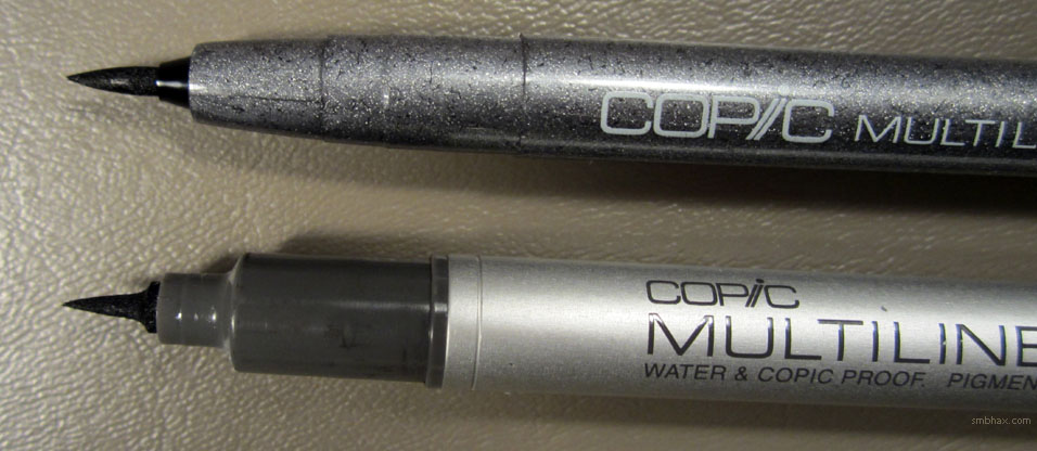
Really different tips! The more slender and tapering (and replaceable) SP BS nib is much softer and more flexible; I found the regular BS's thicker tip unpleasantly stiff.
~~~~~~
Oh man this is never going to end. Just remembered something about brushes for inking! The Raphael "Kolinsky Sable" brushes, like the 8404, and indeed pretty much all the other Kolinsky hair brushes from other European manufacturers, are currently very hard to come by; you'll notice that on the page at dickblick.com where I usually order mine, almost all of them are on indefinite backorder. : oo Turns out this is due to an import ban on Kolinsky sable hair put in place by the U.S. Fish & Wildlife Service after they noticed that some of the hair put into European-made brushes had been improperly imported from China—illegally, in fact, is what China told them when they checked up on it. So they went and added new paperwork requirements to importing Kolinsky sable hairs, and although all this started last summer, apparently no imported shipments of Kolinsky sable hairs meeting the new paperwork requirements have yet made their way from Chinese Siberia, where the animals have to be raised, through the European brush manufacturers, and thence to our shores. In theory the supply will start to flow once the paperwork gets sorted out all along the line; until then, the good brushes are in shorter and shorter supply! (Waterproof ink in particular really chews through these brushes something fierce: it gets down into the metal ferrule holding the base of the hairs, and starts to spread them apart as it dries in there, essentially ruining the sharp tip the brushes are otherwise able to form; I think I generally got a few dozen A* pages out of a single 8404 size 4 brush before the tip was too separated and I had to go to a new one; watercolor on the other hand, which washes out easily, hardly wears them down at all...and in theory I could make them last longer if I switched to a non-waterproof ink, although those are harder to white-ink over... I've still got a few extra brushes of both size 0 and size 4, but I'll have to switch to weaker ink if the supply chain on these brushes doesn't kick back in eventually!)
The Fish & Wildlife Service, by the way, likes to call the animal these amazingly useful for painting hairs come from the "Kolinsky weasel," undoing decades if not centuries of careful marketing by brush manufacturers attempting to disguise the fact that the animal is not, in fact, a fancy-sounding sable, but is rather a dirty-sounding weasel. Pretty silly! And oh my gosh there is just the cutest weasel photo at the top of Wikipedia's weasel page. (And yes there are even cuter weasel photos out on the internet in droves as I have since found—who knew weasels were so darn photogenic? Well, just me, apparently. : o)
Okay now I am weaseling out and finally going to bed, yay!
|
·····
|
| |
| Why Mind Over Matter Matters | Jun 13, 2014 4:42 AM PDT | url |
| | |
Added 1 new A* page:This was the second attempt at this page, done in a frenzy of super-late drawing and erasing and drawing—which I think is a mode I should try to get into more, except that I have to figure out how to do that while also getting decent amounts of sleep. : P But there's a certain mindset in that crunch mode that sometimes helps, because I know I need something better than the last try, and I know I don't have much time to do it, so I know I need something very pure and clear yet also interesting, and I give up trying to think out and construct a scene carefully in my head, and just start letting figures arrange themselves on the page, and keep erasing them and starting over until they start to fit themselves into a dynamic layout; sort of giving up a level of conscious control over the composition, I guess. I've been flirting with that mindset a bit in the previous scene, in the spacial relationship between Selenis and the Margrave—the previous page was probably the most abstract I let it get, and I think that design was probably the best of that bunch, although it could have been executed more vigorously—but the yardstick for it so far for me has been a couple consecutive pages way back in episode 18, when Selenis was in the General's office: the two pages starting here; I'd been struggling with how to arrange the two around his desk in his tiny office, when I realized that I didn't have to limit myself to straight lines and fixed scales and distances and perspectives: I could bend and pull space a little to get a more interesting composition. At the time I worried a little that the figures in those two pages came out a little too cartoonish, I suppose as part of the response to realizing I could stretch things a little, but still they've endured in my mind as some of my most successful A* compositions. I wonder if I was low on sleep when I did those, too. : o
So anyway I'm going to put off part two of the pen inking article again because that requires photos and analysis and a little thinking. : P I will though drop a news link for you: Paraplegic in robotic suit kicks off World Cup (BBC), which is a follow-up to another BBC article I mentioned a month or so back that was talking about how they were going to have a paralyzed person walk out in an exosuit and kick a ball to start this World Cup—it seems to have come off okay, although the footage I was able to find doesn't show as much as one might have liked. This other video has even less of the actual kick (why??) but does show training sessions, with a paralyzed person walking, with some additional support, using the exosuit; it may not look that impressive to see a person walking unsteadily with clunky armatures strapped to their legs, but when you remember that said person actually cannot move their legs on their own, and is doing it here with the help of a mechanical suit that is reading their mind, it becomes a little mind-boggling to think about.
The BBC article goes into some detail on the set-up: how the suit has sensory skin against the soles of the pilot's feet, and that, combined with readings from their brainwaves picked up by the special helmet they're wearing, tells it what action is wanted by the pilot; and how it provides sensory feedback to the arms of the pilot, which they will learn to "feel" as their legs. Man!
The guy leading the project is Brazilian neuroscientist Miguel Nicolelis, of Duke University, and in fact his pioneering work with teaching monkeys to move mechanical arms (via joysticks) is an important part of Wikipedia's "brain-computer interface" article that I referenced a while back in a blog entry about neural interfaces and how they relate to A*.
I don't think Selenis has an implant for playing soccer, though.
Uh and if you want to see the first attempt at today's page, well, I'll link you to it, but be warned: it is extremely weak. : P *That's* the kind of drawing that happens when don't keep making myself erase and redraw until something dynamic starts to happen—I get just a "well here is this scene." : pp
|
·····
|
| |
| The Moebius Filter I Shouldn't Use | Jun 12, 2014 7:04 AM PDT | url |
| | |
Added 1 new A* page:Well I did not get the second part of my inking pen evaluation written up (there's going to be a twist ending though, I've discovered) because once again I stayed up all night twiddling with colors in Photoshop, only, in the sobering light of the rising sun, to chuck it all and go back to basics.
I was worried that watercolor over the faces in today's page had gotten too mottled, so I ended up devising a way to cure mottling, which I didn't really expect to manage to do: you just lay on a lot of Selective Color adjustment layers, and set the colors to a big negative Black, which reduces the black (aka the mottling) in the colors, but leaves the black in the black lines intact. Taken to an extreme of 8 identical adjustment layers, the page came out like this:
Nice and smooth and pastel—almost Moebius-ized, come to think of it. It is kind of a neat effect, but although it smoothed things out, or crisped them up, it lost whatever atmosphere and depth the painting had had, and—well, really I just need to handle the paint better, rather than coming up with elaborate digital crutches to fix things that didn't quite carry over when scanned and darkened for the web site. Although I may end up regretting the decision for this page... Anyway, I think it got off to the wrong start when I went in with colors that were just a little too dark and saturated; got to remember to keep the colors very light, those seem to convert to the computer better.
|
·····
|
| |
| The Pen I am Least Awful at Inking With, Pt 1 | Jun 11, 2014 3:52 AM PDT | url |
| | |
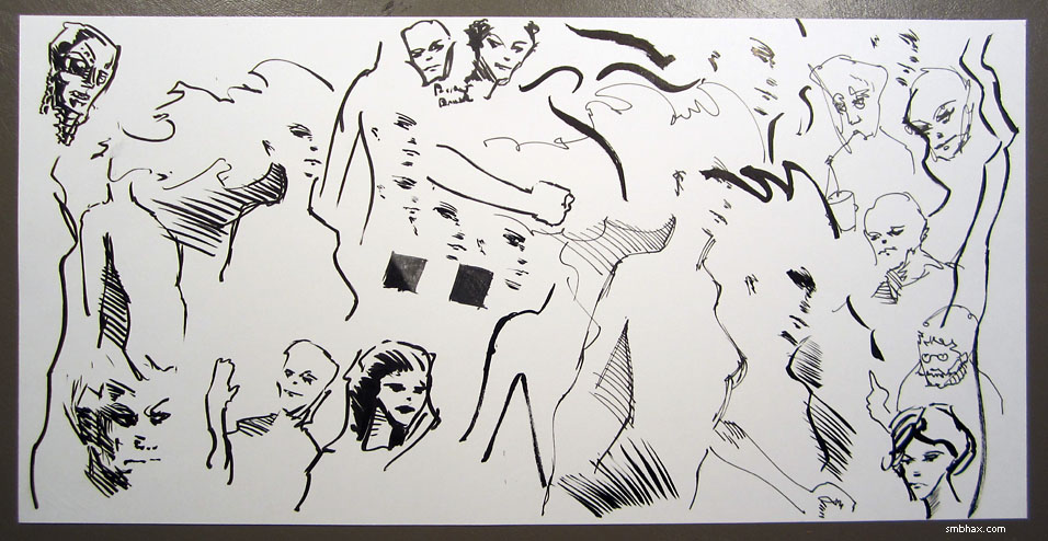
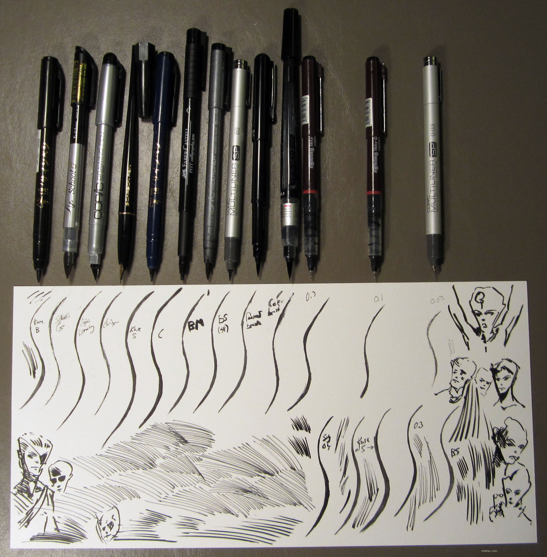
Added 1 new A* page:Okay, so, yesterday I mentioned that I got out a bunch of pens to see which one I could ink a long S-curve with best, in preparation for trying to ink the sinuous pencil lines in that large drawing I'd done over the weekend. I'm gonna have to break this up into two parts because it's already pretty late here tonight : P, and this will be long. Anyway, to start, here's the lineup of pens and the main test results of me trying to ink a nice curving line with themthe pens are pointing at the line I inked with them (click the photo for a larger version):

About half of these pens are available in the States, and the other half you'd have to import from somewhere like jetpens.com (which is a great store, by the way, and their prices are also better on some of the stuff that's available domestically, like the Copic SPs): the five pens on the left were imported from Japan through Jetpens, and the second and third from the right, the dark-red "Rotring" pens, are of German manufacture, also obtained through jetpens.com; the rest you can get from somewhere local-ish like dickblick.com. Also, all except the School-G and the Pocket Color have waterproof ink, although that isn't important for this job.
From left to right, the pens are:- Kuretake Disposable Pocket Brush Pen, Medium
- Tachikawa School-G, Fine
- Copic Drawing Pen
- Platinum Carbon Pen
- Kuretake Disposable Pocket Brush Pen, Fine
- Faber-Castell PITT Calligraphy Pen
- Copic Multiliner BM
- Copic Multiliner SP BS
- Pentel Pocket Brush
- Pentel Pocket Color
- Rotring Tikky Graphic 0.3
- Rotring Tikky Graphic 0.1
- Copic Multiliner SP 0.03
Okay, so the first thing is that obviously I am bad at trying to ink a nice curving line. It is pretty embarrassing! But which pens helped me look the least awful? I covered some of these pens, along with others, a while back in my Supermassive Black Pen Round-Up, sort of a general review. Here, I'm only concerned with what's going to help me ink that darn pencil drawing shown in the previous blog entry. So:
Kuretake Disposable Pocket Brush Pen, Medium
Although it's the fattest of the Kuretake Disposable Pockets, it has a pretty hard point, so still works for fine lines. Not bad but it loses a lot of its blackness once you go over it with the eraser. In addition to the Medium and Fine, I also have a Very Fine that I used to use for some small drawing tasks, but its felt tip has fuzzed upsomething which I have no doubt would also happen to the other Kuretakes if I used them more. To be fair, it has also happened to every felt-tip marker pen I have used, EXCEPT for the Rotring Tikky Graphics. This and the Fine don't draw bold straight lines very well: the tip squishes/dries and you get a thin double line instead of a single bold line.
Tachikawa School-G, Fine
I know of an illustrator who has gotten great results with this pen, but I am absolutely useless with itit wasn't flowing for me well at all and everything I tried looked like chicken scratch.
Copic Drawing Pen
Metal nib like the School-G but I was at least able to get solid lines out of it. Still not really great at using this type of pen, it just feels too hard to move in all directions I guess; I also worry about the paper getting chewed up by the hard tip. Resisted the eraser pretty well.
Platinum Carbon Pen
The Carbon Pen has an ultrafine metal nib tip, and was super-scratchy when trying to do a thick curve. Not gonna work.
Kuretake Disposable Pocket Brush Pen, Fine
I had some trouble handling this one, I dunno if it was because the tip tapers so much that I couldn't see what I was doing, or whatoh well, the felt tip does have a bit of a styrofoam-on-chalkboard feel. Like the Medium, takes a lot of damage from the eraser.
Faber-Castell PITT Calligraphy Pen
Back when I was drawing A* with pens, I used the Calligraphy Pen for some of that work; I like the variable width lines you can get with the broad chisel tip; unfortunately, the corners of the tip wear down really quickly. Trying to draw a thick curve with just the corners was hard, too, and it tended to come out a rather angular. Faber-Castell's waterproof ink holds up pretty well under erasers.
Copic Multiliner BM
Too darn thick for this! These are fun pens for bold work, with decent ink flow at first, but the tip wears down fast.
Copic Multiliner SP BS
This was interesting. I hadn't used it much before this, because I'd done some tests previously with the non-SP, disposable small brush ("BS" : p) Copics, and didn't like the stiff feel of their tips. But here I finally noticed that the replaceable nib in the aluminum-bodied "SP" models has more of a slender, tapering shape, giving it greater flexibility, sensitivity, and brush-like feel. Pretty fun! Although, it took some getting used to, because the tip is actually so thin and flexible that, compared to other brush pens, you almost can't even feel it touching the paper. The ink in the Multiliners (and these SPs can be refilled) is pretty fast-drying, but the SP BS runs so wet (and that's how I like my pens) that I did get a bit of smearing now and then when I was using it for quick doodling. Unfortunately, the ink takes a pretty big hit when you run an eraser over it.
Pentel Pocket Brush
Although a bit expensive, these things are kind of fun to mess with, what with them having brush-like tips composed of separate plastic hairs, and pretty good automatic ink flow: easy to do big dark areas. Their tips don't hold up nearly as well as a real sable brush, mind you, and they don't have the snap of real sable, either, so even at their best they tend to be a bit mushy. Had some trouble holding a solid edge to the curve. The ink wears somewhat under the eraser.
Pentel Pocket Color
Slightly larger than the Pocket Brush, non-waterproof, and you sorta have to squeeze the barrel for ink flow sometimes; the flow was problematic for me here, and just turned my attempted curve into a mess.
Rotring Tikky Graphic 0.3
This has been my standby, and it's looking like I haven't found much that I'm better with. These thingsthis size in particularhave great ink flow, allowing you to lay down solid, unbroken lines very quickly. You don't get any real width variability out of their hard felt (or whatever) tips, but the tips also hold up extremely well, unlike all the other tips of this type that I've tried. Come with a huge ink reservoir, with a window so you can see how much is left. I still haven't come close to exhausting one. Their ink dries quickly and holds up well under the eraser. It's questionable how well I can hang in there to put a thick curve together with multiple strokes, impatient as I am, but my handling of this pen is probably better than the others, if only because I've used it morewell, plus they have nice long needle tips so you can see what you're doing.
Rotring Tikky Graphic 0.1
The smaller Tikky Graphics don't have nearly as nice an ink flow as the 0.3, and I was too impatient to be able to mold anything approaching a smooth curve out of it.
Copic Multiliner SP 0.03
The ultra-thin 0.03 runs pretty dry, and there was no way that I would have the patience or the dexterity to construct a thick line with it.
~~~~~
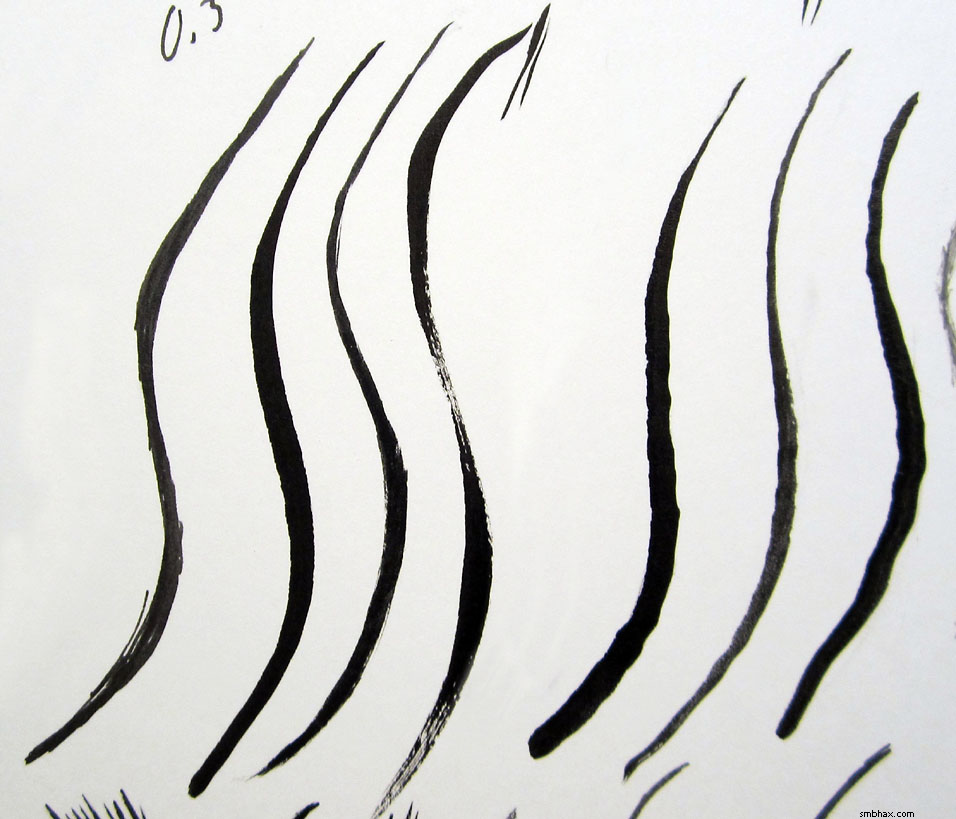
So from that first run, I chose some finalists: the Kuretake Fine, the Multiliner SP BS, and the Tikky 0.3and I threw in an actual brush, my trusty Raphaël 8404 sable brush, loaded with Deleter 3 ink, for a final showdown. You can see this in the lower right of the test paper in the photo at the top of the article. I had some trouble with the brush, as my ink was kind of old and thick; I watered it down slightly, although I hate doing that, but even with that, I didn't manage a smoother curve with the brush than with the pens, plus you have the added mess, and the inability to do long quick thin lines. I continued to have some trouble handling the KuratakeI'd thought I'd get used to itit proved unable to do straight solid lines, and wore away under the eraser.
That left the Tikky 0.3 and the Multiliner SP BS; the BS wears down awfully under an eraser, but, rather surprisingly for a brush pen, it can do really bold, fast straight lines, which you see to the right of its test curve in the lower right corner. It also has a really light, brushy feel that is just fun to draw with, so I proceeded to populate the test sheet with SP BS doodlesnotice the great, easy line width variability it has. Super fun! The Tikky can also do solid lines, but doesn't get any variability in widthalthough this makes it pretty good when you want a more consistent hatching pattern. The thin hatched lines in the lower left of the test sheet in the photo are from the Tikky 0.3; the thicker ones to the right and below those lines are from the SP BS.
Finally I would go on to do some sight drawings from the pencils with the Tikky 0.3 and the BS SP, to give them more of an actual shakedown for inking this piece. Thatand doodles from bothwill be covered in part 2, tomorrow. Wooo!
UPDATE: Part 2 took me a little longer than that to finish, but it can finally be found here.
|
·····
|
| |
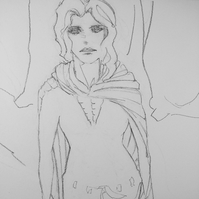
| Why Can't Pencils Just Be Ink | Jun 10, 2014 2:17 AM PDT | url |
| | |
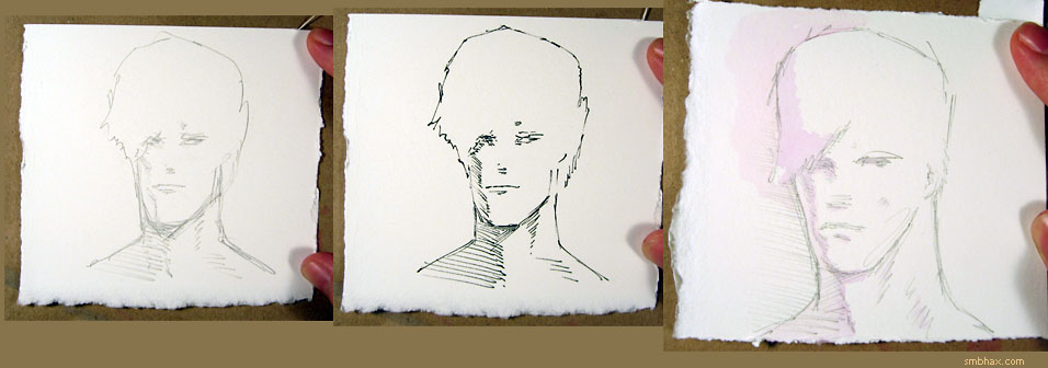
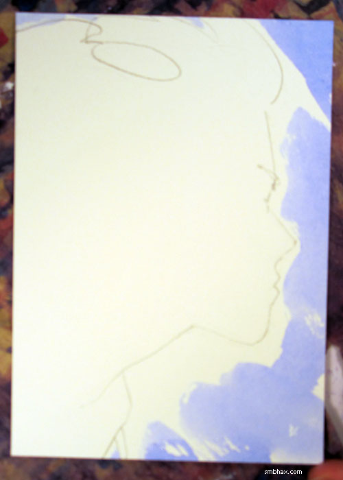
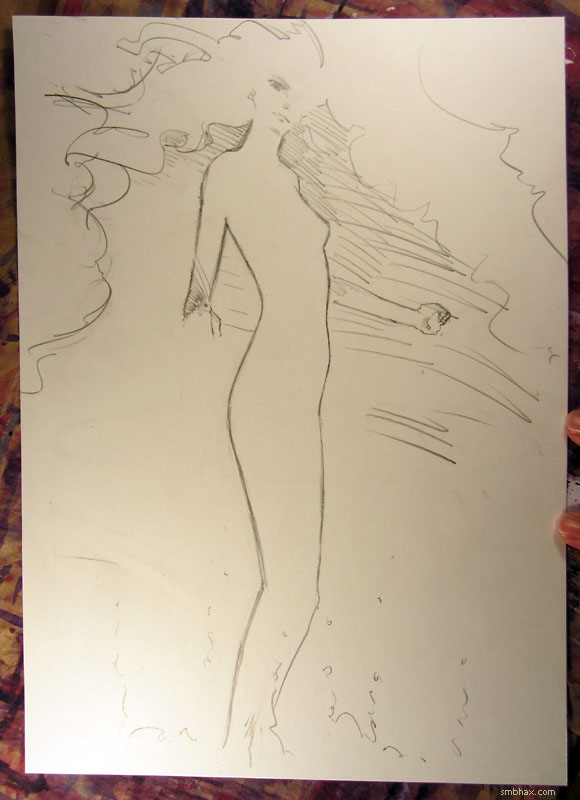
Added 1 new A* page:I didn't get the big-ish (10"x14") pen illustration I wanted to get done over the weekend done, but I did finish the pencils for it, at least:
So maybe I can get it inked next weekend. Only, last night I got really scared at the thought of trying to ink it, because I'm just not a good enough inker to capture those sweeping pencil outlines with a pen or brush. So I got out a bunch of various brushes and pens and brush pens—this is still last night, past my bedtime : p—and set about seeing which one of them I could ink a big S-curve with the best. I'll try to get that written up for tomorrow's blog article, because everyone loves to hear about art supplies as much as I do, right?? : D Anyway I did find a new pen I like, so positive results, huzzah.
Still terrified at the thought of inking this. Just gotta accept that no matter what, I'll feel like I screwed it up somehow, but that's just how these things go. Doesn't mean it won't still turn out neat!
~~~~~~
Sort of related to the trove of free digitized Golden Age comics I was so excited about finding last week, I came across several series of interesting blog posts on kirbymuseum.org about the early (1940) comic work of Joe Simon and Jack Kirby, the team best known perhaps for creating Captain America, who surged onto the scene by punching Hitler right in the jaw on the cover of his first issue, in early 1941, before the US had entered WWII. One of the blog series, about the start of Simon & Kirby's collaboration, on a series called "Blue Bolt," begins here (only it's in reverse order, so you have to scroll to the bottom of the page, then read the articles going upward, then skip back down to the bottom, click "Newer Posts," and then read from the bottom of the next page upwards : p), and the other series, about Simon's artwork, and how it was often confused with Kirby's (Kirby would become the better known and far more prolific penciller of the two), begins here.
The 1940s Blue Bolt comics the articles refer to, by the way, are now in the public domain, and can be downloaded from The Digital Comic Museum here. And I should mention that a friendly DCM admin kindly pointed out to me that in their web-based comic previewer, you can click the down arrow thingy at the top center of the page to bring up a thumbnailed, clickable index of the current issue's pages, which can be pretty handy.
|
·····
|
| |
| I should stop playing in Photoshop all night | Jun 07, 2014 8:54 AM PDT | url |
| | |
Added 1 new A* page:Here's a brush-and-ink sketch I mailed to a reader a few weeks ago as a reward for their support of A* through Patreon in April:
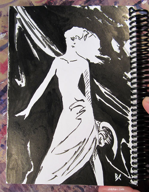
Many many thanks to all my supporters on Patreon! If this webcomic manages to survive year in and year out it will most likely be in large part due to your generous contributions!! <33 (< that's a double-scoop ice-cream cone heart : D).
~~~~~
Speaking of my black and white work, well I've sort of screwed up my Saturday staying up into the morning here playing with the scanned colors of this page for hours in Photoshop (and then deciding to use only the first ten minutes of it : P) buuuut my big mission for today, which is now Saturday, has been to keep my schedule clear so I could do a large-ish (10"x14" I think?) A* pen drawing, since the last few pen sketches I've done as Patreon rewards have been pretty fun and came out pretty well, I thinkand I want to see if anyone's interested in more of that sort of thing, so this one will go up on eBayprobably Monday evening-ishand we'll just see how it does. Assuming I get it drawn, that is!
|
·····
|
| |
| Great Comets! Free 75-year-old comics! | Jun 06, 2014 2:09 AM PDT | url |
| | |
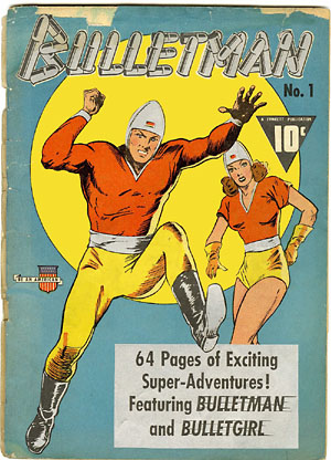
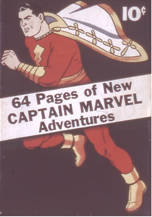
Added 1 new A* page:Holy time-waster, Batman! So I discovered today (from Wikipedia, naturally, as I was looking up a nutty old comic villain"The Weeper"who was appearing in an episode of "Batman: The Brave and the Bold" that I was watching on Netflix) that there's this web site called The Digital Comic Museum that is collecting and making available for free reading/download old comics that have fallen into the public domain. Most of these are comics from the era when comics were invented and thrived to a degree nearly unimaginable today: in "The Golden Age" of comics, from the late '30s to the early '50s, comics in just about any genre you can think of (and some you probably can't; heck, Gabby Hayes was practically a comic genre to himself! : o) and from many different publishersalmost all of them long since defunctflourished, with the big ones like Donald Duck, Tarzan, and Captain Marvel selling upwards of one or two million copies of each issue! Compare that with today, where, with a population twice as big as the Golden Age's, the biggest-selling comic in the past ten years or sothe first issue of a Spider-Man reboot series that started a few months backjust managed to crack half-a-million copies sold.
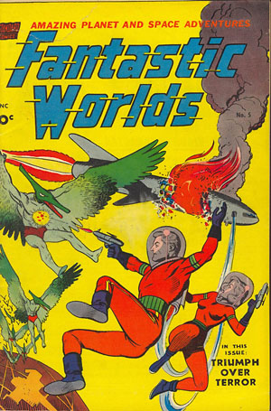
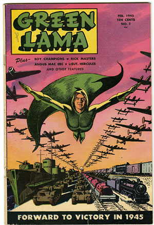
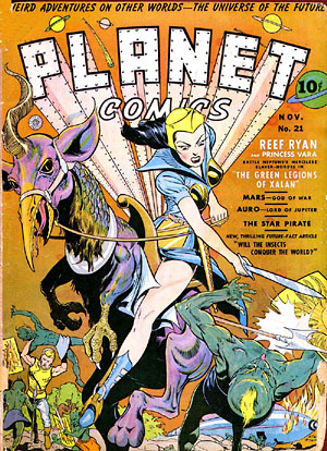
So yes, comics were bigger then (usually with way more pages per issue, too!), and now I'm wondering why I've been so concerned about trying to follow modern comic happenings via Comixology preview pages when I could have been reading thousands of entire comics from the time when comics were much more of a vital force! The web-based reading experience at the DCM isn't so greatthe pages don't scale to fit your screen nicely or anything like that, and all you can do is move one page at a time, forward or back (UPDATE: a friendly DCM admin kindly pointed out to me that clicking the down arrow widget at the top center of their preview pages will bring up a clickable thumbnail list of the current issue's pages!)but where it really comes into its own is when you download issues you like, then load them up into the comic reader of your choice on the device of your choice; in my case it's the Android "Komik Reader" app on the hand-me-down Nook HD+ tablet an affluent technophile friend gave me a few weeks backit's finally being put to good use perusing crazy comics like these (the other nice thing about these comics being public domain is that I can extract the graphics and do whatever I want with them : D):
Sweeeet.
|
·····
|
| |
| Darn you, Moebius--darn you to heck! | Jun 04, 2014 11:05 PM PDT | url |
| | |
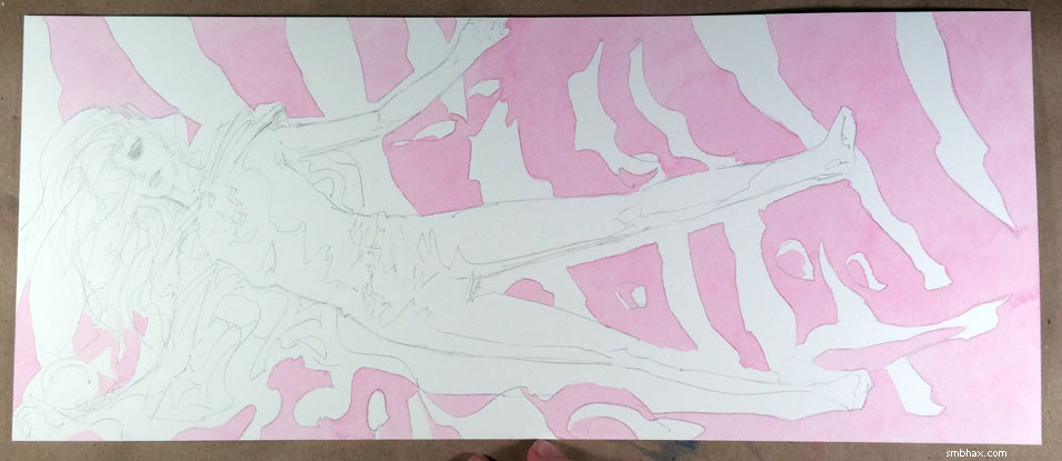
Added 1 new A* page:For the past week or so I've been spending a bit more time on the coloring, trying some different things, and I think it's been helping, but I've definitely overthought it a few times. Today's watercoloring, for instance, went a circuitous route. It started out with tighter-than-usual pencils:
With the lines all nicely tied up, I thought to myself man I can just fill these in with flat colors and it will look all neat and tidy, like Moebius (excuse me, "Mbius" : p)! I should probably stop saying that to myself when I think I may be on the verge of doing something cool. Anyway that thinking got me to this
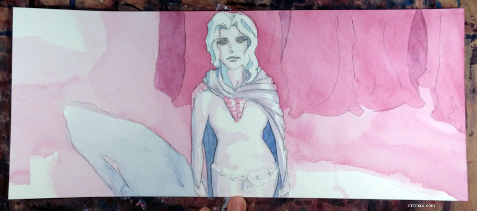
which was indeed neat and tidy, but I thought it was too...neat and tidy. So then I had to spend a lot of time mussing it up, trying to get it to look more like the open and flowy page 9—and not really successfully in that respect, because it was already too closed-down. In the end I was throwing lots of red and blue washes here and there and it came out kind of different and maybe not so bad.
And I was thinking the neat-and-tidy approach just doesn't work for me and I won't try that again in the future, but just now, comparing the two versions again, it struck me that the problem I was having with it (this is how not-self-aware I am while working ; P), the thing I didn't like, I mean, was probably not so much the neat and tidy look itself, but the neat and tidy look *in this scene*, where the mood is supposed to be more dark and dank or dusty and a bit mysterious. And come to think of it, there will probably be a stretch later in this episode where neat and tidy may be just the thing...so I suppose it's not too unlikely that I'll be trying the neat-and-tidy watercoloring approach again later, and we'll just have to see if it works better for me there than it did here.
(By the way, this time I've been spending on coloring is time I've been neglecting keeping up on emails and starting to get the rewards for May's Patreon support sent out to people, so uh yeah such is my excuse. Each day I keep thinking I'll finish up the day's page before bedtime, but um...well there's always tomorrow! Anyway what I mean to say is that I haven't forgotten about that stuff, it'll be taken care of ummm soon-ish!)
|
·····
|
| |
| Next episode spoiler! Hair. : P | Jun 04, 2014 1:05 AM PDT | url |
| | |
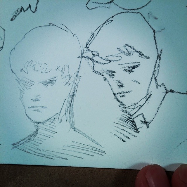
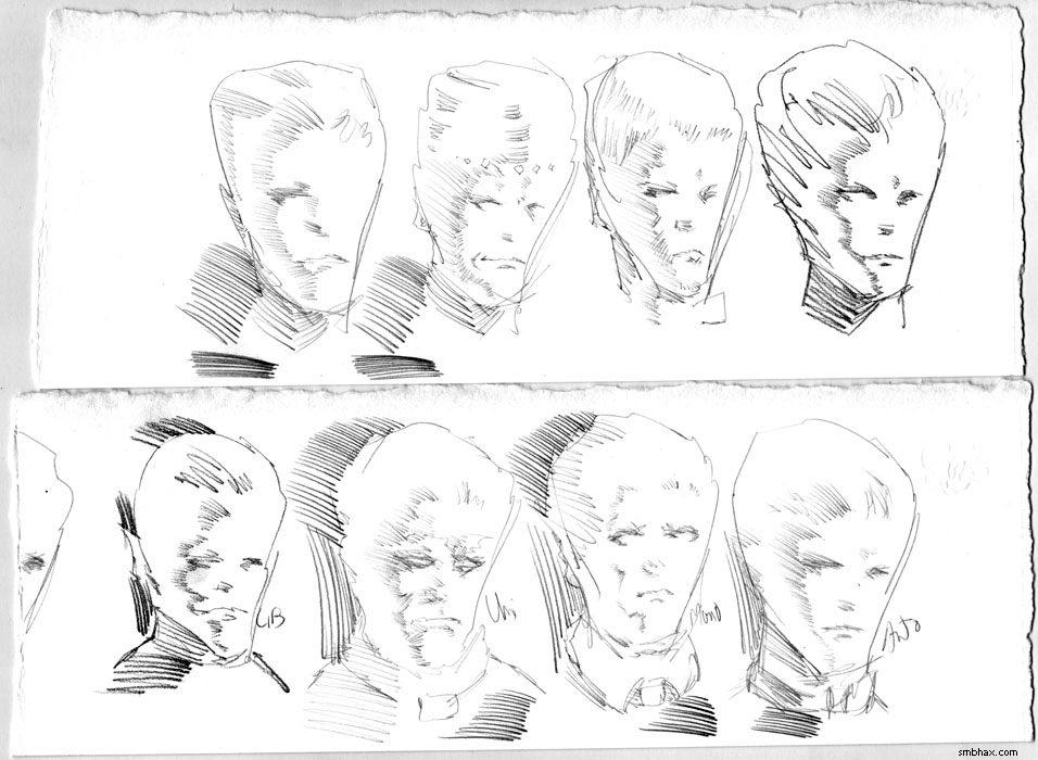
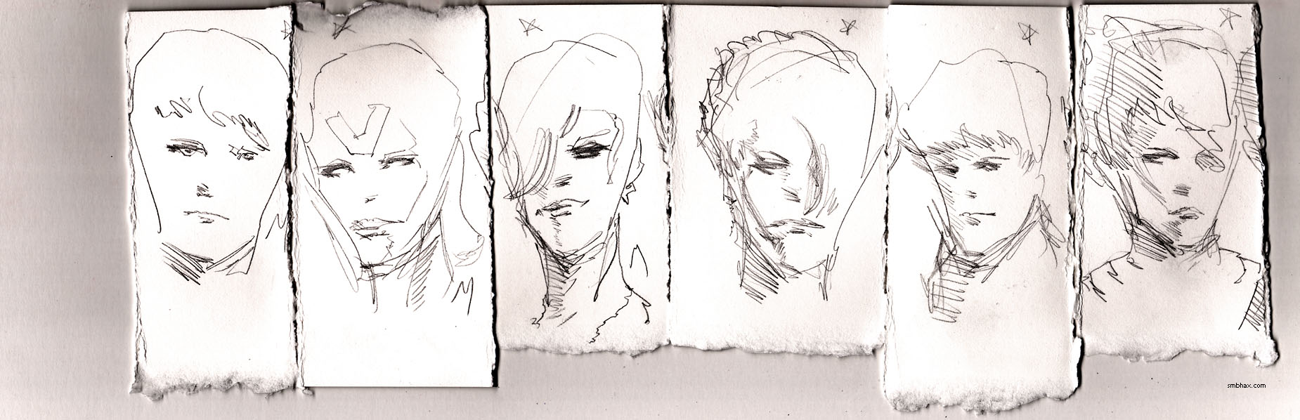
Added 1 new A* page:I gotta go cold turkey on bald guys for a while after this—getting too hard to make them all visually distinct! It spend ages trying to get him to look not so much like Vero, and I thought I'd come up with a design in my sketchbook that I could live with
and I didn't realize until I'd drawn from design for the actual full size A* page that that's still Vero-like, just sort of raisin-ified. : P Well heck. And the final version probably looks too much like Marvel Comics' "Thanos."
So yeah. Next episode's new male character(s) will have hair, darn it. : P
|
·····
|
| |
| A* art show at The Grateful Bread, Seattle! | Jun 02, 2014 10:14 PM PDT | url |
| | |
Added 1 new A* page:My local traveling show of A* art has moved from one Seattle bakery to another! : o For this month of June, framed A* artwork can be seen while noshing on delicious fresh-baked goods inside the inviting confines of The Grateful Bread Baking Company & Cafe at 7001 35th Ave NE, Wedgwood, Seattle (map):

A couple of the brand new framed prints on display:
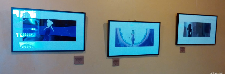
I couldn't get a wider shot because pretty much as soon as my mom and dad (show wouldn't have existed without 'em! : ) and I finished hanging the artwork, there were people snarfing down pastries beneath it—and I'm not one to interrupt someone else's snarfing if I can help it! But I can tell you that their mint chocolate brownies look pretty darn tasty. : d
|
·····
|
|
|