Added 1 new A* page:For some reason, when I made a mistaken journey into color at the beginning of last week, I really latched on to drawing the pages with very light ink wash--much lighter than the pencil lines I'm putting it over. I think maybe it works for me because it's so light I can't see it well enough to obsess about its details prior to scanning it, so I just lay it on and get it done.
But I second-guessed that to start this week, thinking that if I just went with a slightly darker wash, I could get it to go full black (or whatever darker color I choose) rather than being light and dithery in spots when I process it. So I did a careful pencil drawing of Selenis' face over a period of some hours, kept twiddling at it now and then, and finally started in with a darker wash that had shown itself capable of coming out nice and solid in Photoshop. Well, it was a disaster. Part of that was probably due to the drawing being stiff--ah, Mondays--but I think also it was just that with the darker wash I could see it well enough to start worrying about it and second-guessing its placement. So anyhow I had to scrap that one and get something done fast, so I went back to the lighter wash, and--maybe just now that I was warmed up, who knows--was able to knock out the page you see today fairly quickly. Yeah it is a bit scrappy but that's what I get for wasting most of my drawing time today on a dead end.
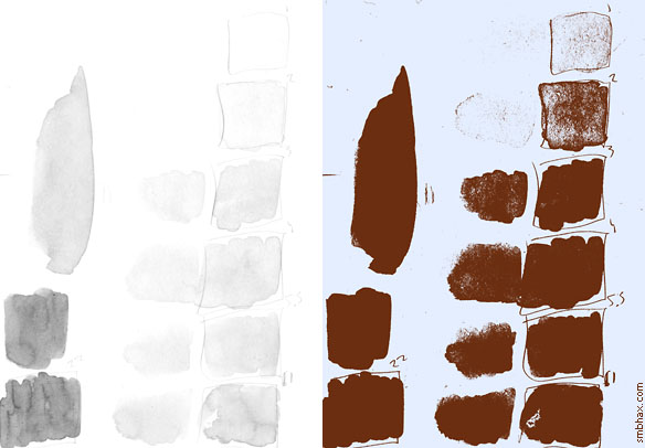
Here's the ink processing test I did when trying to find the "ideal" ink wash concentration; the numbers are drops of black ink per little jar of water, each jar holding about 2200 drops of total fluid. 5.5 is the mix I've been using for the light wash; I was looking at 1 and 2 as possibilities for a sort of magic automatic gray/dither tone, and then at 22 as the one to use for solids--that's the one that turned out to be too dark for my picky self to work with without fretting, so it's back to the ol' 5.5 for now:
(I know this is probably frightfully boring but I'm in a rush to bed! =o)
I got a great amount of very earnest feedback on this whole color business in response to the question I put in the previous blog entry--more feedback than I'd dared to hope to expect, in fact, so that was really encouraging and very helpful, and thanks very much to everyone who took the time to write in and give me your thoughts on the matter! The responses were incredibly varied in terms of what type of color or non-color scheme readers preferred, but they were all positive and convincingly heartfelt, and I just can't tell you how nice it is to get such a response. :) I'm still far from certain how this color jaunt will end up, and I suppose the odds are against me being able to meet everyone's exact preference, whatever the outcome, but at least now I'll *know* what preferences I'm not meeting, which is just as useful as the other way around--from my point of view as the self-appointed (nobody else wanted the job at the time, I swear!) A* art dictator, at least.
So I'm not sure exactly even how tomorrow's page will look (that would be boring to know in advance anyway, psh), but I'll try at least to keep things interesting, and uh hm maybe even not have an art disaster quite every *single* day, even! ... I suppose I can't make any promises on that last part though. :o
(Incidentally, for those of you out there better at Photoshop than me, aside from the colors, the processing I did on that ink wash sample, for instance, to get the grays to a solid thing was just to drop a maxed-black Levels layer (253, 1, 255) over them.)
|