Added 1 new A* page:There's really no way you'd notice but I've lost way too much sleep fussing over this so I'm going to point out a little change I've made to the appearance of the comic in the past day or so (and back-applied it to two pages before that): I've gone back to something I was doing (and talked about at length) back in the digital days, namely using Photoshop's "bilinear" filtering option when shrinking the comic down to its web size from the source scan, rather than the usual "bicubic" setting.
The reason is that "bicubic" gives smoother but fuzzier results, with lines around 1 pixel in thickness getting pretty blurry. You can try to correct for that with a "sharpen" filter, but "sharpen" tends to emphasize the wrong things, create heightened contrast where you don't want it, and subtly make the whole thing a bit uncomfortable to look at. "Bilinear," on the other hand, yields results that are pixelated enough not to require sharpening--maybe they're a bit more pixelated than one might like at first glance, but they're more faithful to the original. Anyway I think the general result is easier to look at, especially in an image with lots of tiny lines, like some of the recent pages have had. Here's a 200% zoom comparison between the results of "bicubic," "bicubic" followed by a bit of "sharpen," and "bilinear"; notice, for instance, that even with "sharpen," small lines like Selenis' nose remain a bit blurry, and the lines in general all get pushed toward something of the same emphasis, subtly distorting the balance--that little white line in the background just above Selenis' face, for instance, gets brightened significantly after "sharpen," giving it too much emphasis:
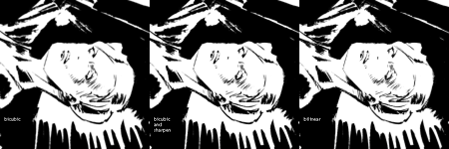
I'd stopped using "bilinear" after going traditional, I think because with texture from the gray ink washes and fuzzier paper I was using initially, it was resulting in too much distracting pixelization throughout areas that were supposed to be flat. Now that I'm doing just pure black and white, though, "bilinear" doesn't disturb those fill areas.
~~~~~~~~
Ugh, looking back at the old digital days of the comic is always a little frustrating, since it's much easier to get sort of eh bold and stylish results with Photoshop's "Lasso Tool," as I was using it, vs dabbing ink on paper. Working traditionally has been much better ergonomically though, so I don't think I can go back to digital even if I totally wanted to. I just gotta...still got a long way to go in terms of capturing liveliness and dash in ink. I'm trying, for instance, to cut down on excessive cross-hatching, which tends to give everything a static or wishy-washy look (like yesterday's, oy), and to start to consolidate shapes into bolder sections of black and white--as is so utterly easy to do digitally with the Lasso Tool.
On the other hand, my actual drawing ability has improved quite a bit since going traditional, even if it isn't always immediately obvious; working digitally, I could just kind of keep cutting and moving things back and forth until they looked right--and after going traditional I realized that this had let me draw, for instance, parts of human anatomy that I didn't really know how to draw consciously! So I've had to learn to draw those things intentionally, which is good, but now I want to be able to recapture some of that feeling of tossing shapes around with wild abandon. Oh well maybe I'll figure something out.
~~~~~~~~
I'm grateful to an attentive reader for pointing out on Twitter that I forgot to put the bracketing colons around Selenis' last line of dialogue (page 31). I always appreciate having my boo-boos pointed out so I can go fix 'em!
|