Added 1 new A* page:Another day, another set of scans of prints from my old college senior project of self and flower portraits:
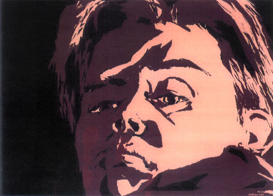
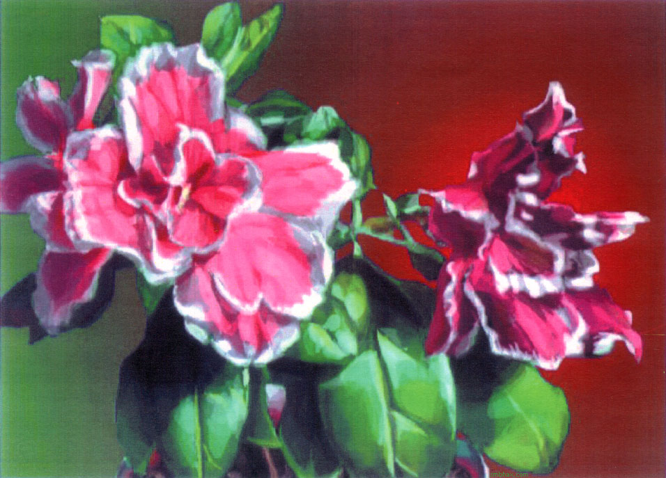
Got pretty Lasso-Tooly in an A* vein in that self-portrait there, didn't I? And all the way back in 1996!
~~~~~
I've been following comic artist Giannis Milonogiannis on Tumblr for a little while now and finally just realized he has his own sci-fi sorta webcomic--with small amounts of gore and adult language--Old City Blues; I say "sorta" webcomic because it's in one of those Flash-style "graphic novel" reader interface things.
While obviously extremely manga influenced, his art comes at it in a reasonably unique loose and intuitive style that sometimes doesn't quite nail perspective, anatomical structure, or specific action, but is pretty darn good at achieving a certain mood and zest, particular with the light gray tones he uses over his thin black lines. It's the kind of feeling-out approach to drawing that I was able to do when I worked digitally, with the quick give-and-take of the Lasso Tool, and which I've struggled to find an analog for (I may have just misused that word a bit) since I stopped working digitally. But you can also see, if you compare his more recent chapters with his first, that it's a delicate art that treads a thin line--pun not really intended but I'll take it--between order and chaos; in his early chapters or issues or whatever you can see that he was using heavy black lines and areas, but these tended rather to obliterate the sense of the more delicate linework and shading. And that's something I find even working traditionally as I do now: you can have something that looks really lovely and subtle in the low-contrast, thin-lined world of a pencil sketch, and then you try to translate it to ink, and the higher contrast just blasts away the feel and meaning that was so clear in fragile graphite.
So finding a way to keep that sense of spontaneity and delicacy in ink has been tricky for me. I have to watch myself because especially if I'm tired or just too sort of set on getting something just right, the art will get all clenched up and lose the looseness and life and light that I'd like it to have. I realized while thinking about it today (and I think I realized this before at some point, and forgot about it, as I usually do) that if you do it right, you don't even have to be going in and painstakingly drawing heavy and exact shadow shapes everywhere; one variety of magic is organizing the drawing in such a way that dark shadow is implied in a white area.
Another thing I have to watch is overcomplicating a drawing with too much cross-hatching and so forth; it can all look kind of neat on its own on the page, but then when you scan it in and try to take it all in as a single comic image, it's just way too broken up and scattered to comprehend. I had to go back and cover large sections of page 68 in black ink, for instance, because all the white-and-black shaded ground and sky and armor detail I had left in initially was just impossible to read all at once. So cohesive black and white areas would seem to be the way to go, for the most part--only how do you manage to form those and yet still keep them loose and light? Well, that's one trick I'm still working on getting down. Once in a while I think I pull it off in a minor way--the figure of Selenis on page 65 of this episode, for instance, got closer than I've otherwise managed lately.
Oh yeah and another thing I'm still working to get over is a fear of screwing up; there's no Undo key when working traditionally, so you can't just feel things out or cut back and forth like you can do so easily in the digital realm--I relied on that ability in building up my digital drawings with the Lasso Tool, but in ink you tend to be much more committed when putting something down. One way to help, obviously, is to plan things out better beforehand; that can cut into the spontaneity of the thing, though, so past a certain point I just have to train myself to be willing to run some risks in black ink, and then to be willing to go back in with a lot of white ink, and worth them back and forth like that. I've got waterproof white and black ink so I *should* be able to do that, but contemplating mistakes and cleanup in real ink is still a little scary--not to mention time-consuming. Some of the best magic can happen in those unexpected backs-and-forths, though, so I just gotta push past those misgivings.
Hm uh okay /end art ramble. For now!
|