Added 1 new A* page:Before I get into the hardcore art supply nerdery, here's an interesting video of Canadian astronaut Chris Hadfield wringing out a washcloth in microgravity on the International Space Station; since the water has no gravity to tell it where to go once it's squished out of the cloth, well...maybe you can guess what happens! Anyway it looks cool.
~~~~~~
I had quite an exciting day--by my standards--experimenting with various art tools and techniques. These experiments won't look like much to you but, as probably they say in science somewhere...ahem uh we can learn more from failure than success! And I learned an awful lot. =o
A couple readers on Facebook pointed out intriguing art supplies I hadn't considered before: water soluble pencils, and those kneaded rubber erasers--generally you see them come in gray, like the Prismacolor ones I got, but I discovered they also come in all sorts of bright colors, too. The water soluble pencils I was able to find were a 4B Cretacolor Monolith woodless pencil, and 6B and 8B Derwent pencils--you can tell water-soluble pencils these days because they'll have some sort of wet brush head icon printed on them. I experimented with these things and scanned and processed the results like I'd want to to get them good and black in Photoshop, with this ghastly looking page of results:
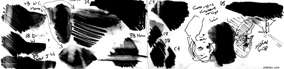
Which I won't attempt to sort out in full, but here are the main bullet points:
- The Derwent 6B and 8B pencils are rated at darker grades, but don't look darker than the Cretacolor 4B when used like normal pencils
- The Derwent pencils, which are rated darker and should thereby be softer, feel much rougher and scratchier and even oddly more uneven than the Cretacolor, which by contrast is a joy to push against the paper
- When water is brushed over them, the resulting wash from the Derwent pencil marks is much darker than that from the Cretacolor
- Even though I can get a sufficiently dark tone for my purposes from the Derwent pencil wash, it kind of looks awful in person--the pencil marks are still visible under the wash--and there's still plenty of elbow grease needed for laying down the pencil marks in the first place
- The kneaded rubber eraser doesn't erase as much as my white plastic eraser
- On soft pencils (4B and softer), the white plastic eraser tends to smear before it erases, while the kneaded rubber eraser doesn't smear at all
- Dried pencil wash doesn't erase all that well
- Oh also there are some unrelated upside-down thumbnail pen sketches in there : p
That was sort of mixed results, so I then tried something I tried briefly early on in that color phase of episode 18, which was using a light ink wash together with pencils. I had made this chart back then to figure out how many drops of ink to put in one of my little water jars to make the right tone of wash:
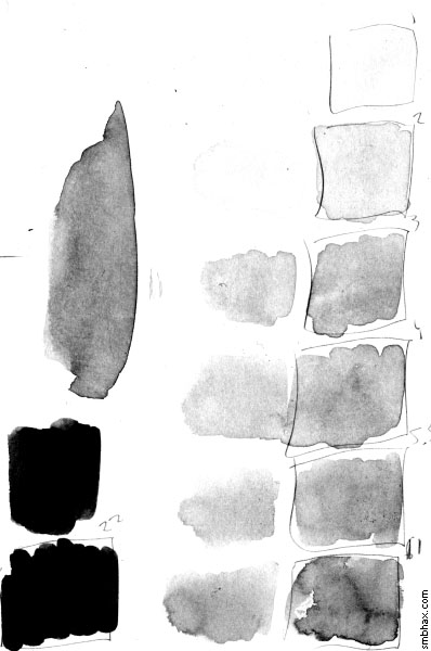
With the Photoshop contrast settings I want to use, 22 drops, once Photoshopped, makes a good black: that comes out to 1 drop of ink for every 100 of water. The reason to use a wash rather than pure black ink is that it is easier to manipulate than pure ink, which is thicker and doesn't spread as well, and it more closely matches the darkness of the pencil lead, so you can get a better idea of the relative overall darkness of the pencil and wash composition when you eyeball it while working--and besides those important considerations, there's also much less chance of a rug-ruining disaster with a highly dilute wash than pure ink, plus it's much less likely to ruin your brushes, which is nice.
So I used that 1:100 ink wash for the black space background in today's A* page--my arm was already starting to ache from various tests I'd been running, blacking in large areas with only dry pencil--and that seemed to work so well that I was even inspired to try, at the end, a bit of a gray tone with a 1:400 wash; that, unfortunately, turned out to be too dark with the Photoshop settings I'm using now--I think I'd have to use a 1:800 or so. Incidentally, here's episode 18, page 23, with the setting I'm shooting for now (levels 208,1,255; back then I was using 253,1,255, ie max black, which I now realize was really the cause, together with too-light pencil strokes--of the dark, rough lines that I couldn't stand):
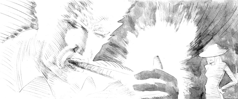
Kind of a neat effect, actually, if not exactly the black I would have wanted.
But the real problem with this wash idea, I realized a while after having scanned today's page for a third time, was that washes cause the paper to warp quite a bit--far more than just plain ink does--and that can make it very difficult to scan without getting shadows in the scanned image from where the scanner's light hits the cockled paper at an angle, even though I've got it pressed down on the glass under a weighted board. That old page 18:23 scanned pretty cleanly this time, but it's been straightening out under a board and a pile of other pages for months now. Anyway, I recall now that this shadow problem does tend to happen with the ink wash pages--it manifests on today's page in slightly off-white areas at the edges of the larger ship's fuselage, for instance--and that is a bit of a pickle.
Another thing to consider is that with these fills, the original art looks a little bizarre:
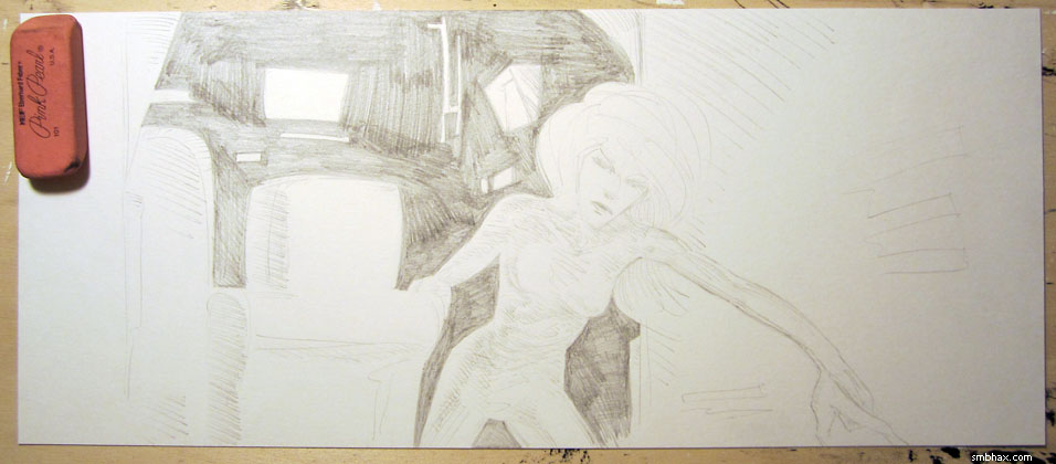
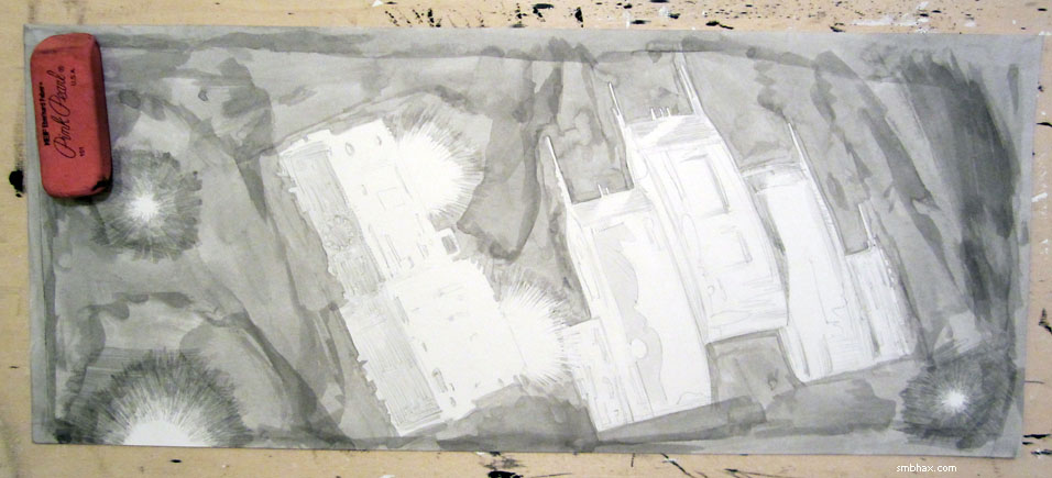
In theory I could just use pure ink and have less warping and shadows, but there would probably still be some here and there (and the originals would still look rather bizarre, you'd just see the big black fills and the lighter pencil lines would be pretty much invisible). But I think the real real problem here is that I'm trying to put gradated pencil lines up together with large pure black areas, and when you do that, the pencil lines are just going to have a tough time looking like they belong; in fact, there's a bit of a disconnect between the pencil and the ink areas that's a little jarring if you think about it too much. I tried to mitigate that a bit on the previous page, where the black fill was with a dark pencil, by allowing a little white to creep in between hatched fill lines in a couple corner spots, but the large black areas drowned that attempt at mediation out quite easily.
So now I'm thinking maybe the thing I have to learn is that black doesn't have to be black, you just have to be able to understand that it's black relative to the rest of the drawing. That's part of what I liked, I think, in page 2 of this episode: there's a bit of pure black around Selenis' eye there, but we also read that zig-zagged hatched area on her nose as near black, because it's the next closest thing to black on the page, and, moving farther away, even those very loose zig-zag fills on her arms read as possibly black, because there's nothing else near that line density around them, and together these different "black" areas, by changing density with distance from left to right, also convey a sense of an atmospheric glow, all with just a few strokes.
So I'm going to try to work more from that angle here next and see if I can make my not blacks seem black in other drawings. And I *am* concerned that this is sort of taking the black out of supermassive black hole A*, that's why I tried full-on black areas in the past few pages instead--but well heck black holes aren't even black, you know: you can't actually see the singularity that pulls everything including light in, and the event horizon around it won't really look black, I don't think, even if it somehow isn't active and nothing much is being pulled into it or orbiting at radiant speeds around it, because gravitational lensing will be warping images of its surroundings from every angle--or at any rate very unusual angles--at you like a very odd funhouse mirror. I think. Anyway, it ain't black. Well maybe that's wrong, I dunno. I'm gonna try this technique anyway. : P
|