• Added 1 new page: A* Episode 20, Page 14
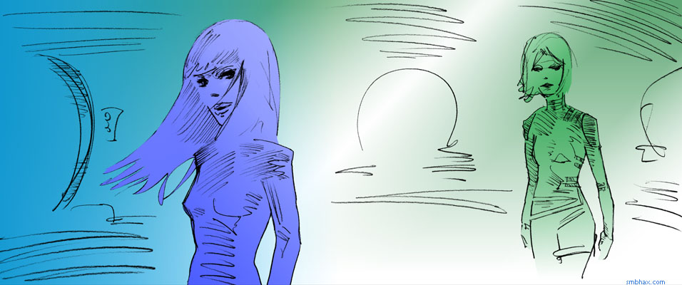
Today's new coloring discovery was that in the later stages of overall color tweaking, while just a regular Hue shift (with a "Hue/Saturation" adjustment layer) can yield interesting results, you can get quite a variety of sometimes more subtle, sometimes more polarizing color shift effects by changing that Hue shift layer to a different Blend mode, so that it doesn't just shift the full spectrum of the image evenly, but operates upon it in a more selective way, say just shifting the colors that would lighten, or changing their hue but not their value or saturation. Hm! These were the original colors for today's page, for instance
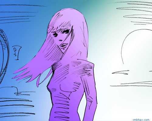
and I got to the final colors by putting a Hue/Saturation adjustment layer over the color layers, set at +90 Hue, Overlay blend mode, at 53% opacity.
Actually what I did at first was do it at full opacity, compact that all into one layer, set that aside for a moment, and then do two more separate Hue operations on the original color set, using Screen blends this time, and then combined those at low opacity with the Overlay one, all over the original color layers. That let me tweak out some subtle pinks in Treban, but aside from washing out some other areas, the real problem that cropped up was color banding: even working in 24-bit color, if you blend too many copies or variants of the same bitmap together, you're essentially aggravating the rounding errors (well not errors, but compromises, shall we say) that make up any of your color gradients, so the individual colors start to separate from each other and their 24-bit flaws become exaggerated; for instance, in this snippet from the original version I uploaded, if you look very closely you can see purple bands of color running diagonally across the lower right side of Treban's hair, and weird reddish and other bands running diagonally the opposite direction in the background off to the right of her shoulder. I kind of knew this would happen when I've done this kind of thing before, but it had never gotten this bad, at least not unintentially; I don't mind color banding in some situations, like in the highlight rings on the planet in yesterday's page, for instance, but this stuff today was getting a bit out of hand.
So, coloring lessons I need to remember from today's Photoshop follies: blend modes can be nifty on Hue adjustment layers, and don't rely on creating complicated composite color sets by blending differently tinted versions of the same image together, because eventually you'll get banding, silly.
|