 | |
| |
|
|
| |
| Color, it's truly truly truly outrageous | Jan 11, 2014 1:18 AM PST | url |
| | |
Added 1 new A* page:I spend all day yesterday complaining about perspective and then I go and do a little of it today, go figure.
It was probably hard to tell but this week the way I apply watercolors changed significantly (for me), because my watercolor tubes arrived! Yep, instead of having to moisten some dry little cakes of color to rub some of it off, I can now just squirt out a concentrated little chunk of color, and they're super-easy to mix in different quantities in a little palette dish. This lets me do bigger and bolder applications of color, whee!

Actually on the first day I hadn't thought to do that, and was just slapping the concentrated tube contents right down on the paper, which is what was behind the blueish excess of page 25; in fact that one has three or so spots of pure dried aquamarine so thick that you could add a little water to them and probably make like four paintings out of the watercolor that's just caked up there. It was fun though, kinda like building up big blobs of oil paint; and getting intense concentration and dry brush effects with insufficiently wetted watercolor concentrate felt a lot like using ink, only in color.
If you were paying closer attention than I was last week when I said I was ordering the tubes, you'd have noted that I said I'd ordered tubes of my three "primary colors," "red, blue, and green" (paraphrasing here)—but you'd have realized that properly speaking, those are the primary colors of *screen* (additive) color, whereas the primary colors of physical (subtractive) color are red, blue, and *yellow*. Thing is though that a) I'm not overly fond of the yellow range and b) I haven't found a yellow that mixes well with my red (quinacridone magenta) and blue (aquamarine blue, green shade) of choice. So I guess I have to do a little more research on that.
One final color oddity: check out how the colors of today's page came out when I photographed it with my digital camera under the mix of weak incandescent and strong fluorescent lights given off by the full blast of my drawing table lamps:
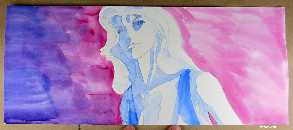
Oh the colors, Batman! That isn't really how they actually look...as far as I can tell...but gosh. So I spent some time seeing if I could use that photo for the final page, or if I could manipulate the scanned version to pop with color like that—layering the scan on itself as a Soft Light layer came close...but in the end it looked a little too manipulated. And I guess getting into editing the color is kind of falling down a time-sucking rabbit hole that I don't really need right now. :P So we're still flying au naturale as far as the scanned color is concerned—well, aside from darkening up overall the gamma a fair amount so it doesn't look washed-out when put up against a black background.
Oh yeah, and who else is sort of secretly a fan of
?
>_>
Speaking of holograms, I really ought to get around to talking about (ie regurgitating the Wikipedia page of) them some time, because how they work is pretty darn cool, and full of some interesting possibilities for cosmology and sci-fi (and I don't just mean floating glowy virtual keyboards or heads) alike.
|
·····
|
|
|