Added 1 new A* page:I added another piece to the Supermassive Art Sale--which is to say, I made another piece of art available for sale through this web site, where all my pieces of original art--the actual combinations of pigment on paper I have made on my drawing table, I mean--are now just $10. The new one is one of the first ink wash illustrations I did, sort of a "proof of concept" before I took the plunge to doing A*'s daily pages traditionally:

I had it in the episode 13 gallery before, but not for sale--so now it is!
~~~~~~~
I conducted another art experiment over this past weekend. It went like this:

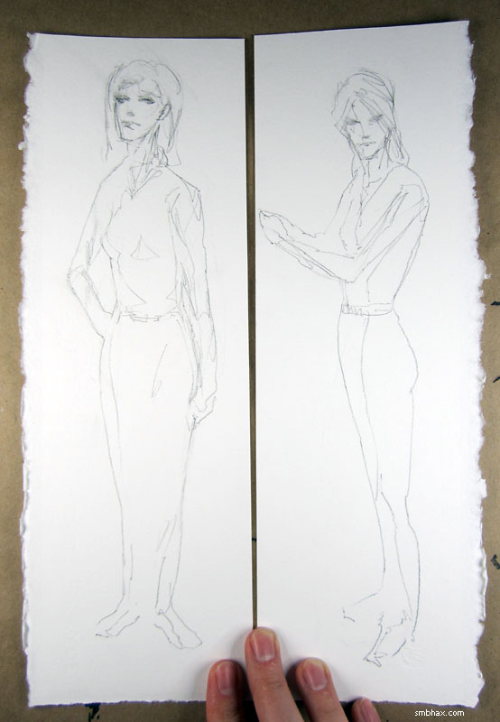
^ A couple quick pencil sketches on awkwardly shaped scraps of this super heavy 300 lb watercolor paper I've been using lately.

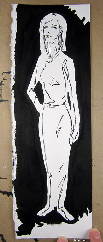
^ The first of them, very hastily and inaccurately inked. You see here I've followed the sort of pooling shadow areas together approach that I've been doing in some of these recent watercolored A* pages. I was wondering how the ink would take to this heavy paper, which has more texture on it than I've tried with ink before, and somewhat to my surprise, it worked great! Went on really smoothly, in fact, and it also reminded me that the ink holds the brush tip in a nice point better than watercolor does--I guess because it's thicker and maybe also because it has a binding agent in it? But waterproof ink like this will also ruin your brush a lot quicker than watercolor, because try as you may to wash it off, it accumulates inside the ferrule--the metal grip around the base of the bristles--and gradually pushes the bristles apart, so they can't form a good tip. In the past I've been able to get maybe 20 inked A* pages out of one of these Raphael size 4 sable brushes before the tip is definitely in bad shape, although that's with an assist from a larger brush to fill in big huge black areas.
Anyway, on with this experiment:

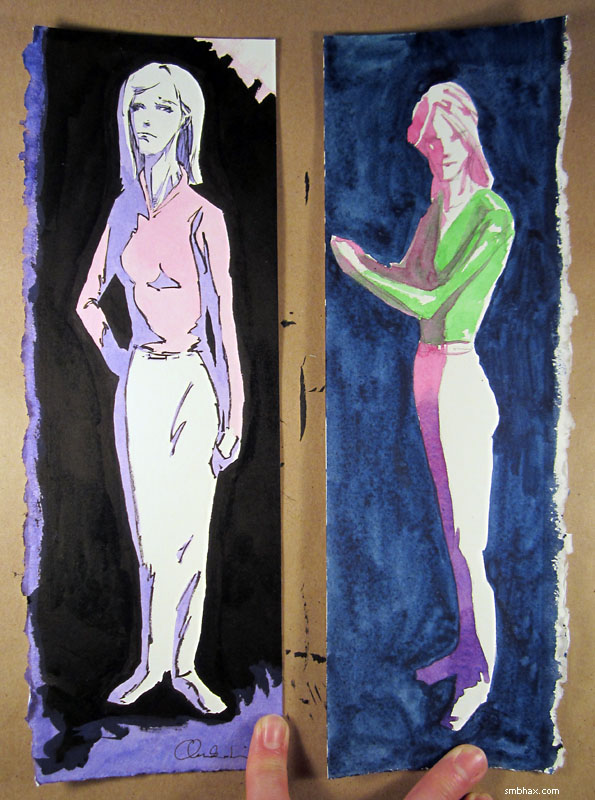
^ Now I've applied watercolor--again hastily and messily--both to the inked drawing and to the non-inked drawing. Mostly I wanted to see how ink + watercolor would work, and boy, I can how this combination would work pretty well for, say, coloring Sunday comics in the days before everything was computer colored. Pretty sharp! At first I was thinking gosh, I guess I should do the A* pages that way, but then I got to thinking about it more.
I was wondering about ink because I was thinking this current scene we're in now, which is kind of a dark scene, might need ink rather than just watercolor, since watercolor itself can only get so dark. But looking at that inked sample some more, I realized that, as I had kind of suspected, putting ink around the watercolors more or less negates the light-emulating properties of watercolor; good watercolor can look like an actual light-filled scene, but inked watercolor is just going to look like a drawing of a light-filled scene, if that makes sense. I do kind of like the stained-glass-window look it gives when used with this sort of pooled lighting style--kind of reminds me (in a very poor way, of course) of a European comic style, like oh say Esteban Maroto's stuff on this page; he even gets into some pretty cool abstract color use there--definitely possibilities in that direction. But there's also very little sense of actual lighting in those scenes. Contrast that with say this painting where he doesn't use black lines, and still uses some abstract color.
Admittedly, the inked method is faster, and easier--at least in the sense of getting a sharp-looking result. But if you can pull it off, there's a much wider range of situations you can get across with the more painterly approach; and I think filling in lots of little ink shapes every day would start to drive me buggy, it's more of a paint-by-numbers thing.
I dunno, I guess I won't really be able to tell until I try it out on some actual full-size pages. Not sure I'll be tempted to do that, guess we'll see.
Another thing this taught me was that watercolor looks nicer when kept lighter; I tried going as dark as I could with it on the non-inked page background by combining my red, blue, and green all at once into a super-saturated mix, but you can see that it was so pigment heavy it didn't sit evenly on the paper, and came out icky and clumpy, whereas the lighter tones in the inked page look nice and smooth. I do think the dark purple directly on white on the feet of the non-inked page looks cooler than anything on the inked page, though. (On the other hand, the pink inking, pink-to-purple fade, and green overlapping pink color experiments above that were resoundingly unsuccessful. : P)
|
