Added 1 new A* page:MAN was today's page ever a learning experience. You aren't going to read this, because it is way too long a session of art nerdery. : P I'm just making notes and thinking aloud for myself so I can work all this out and not forget it. : )
First of all, after many, many, many failed attempts at drawing the scene from the angle I'd been planning, I finally realized that something about that view just wasn't working for me, and sort of gave up and let my pencil draw the view it wanted to draw. This has actually happened on the last four pages now, which coincides exactly with when I decided to force myself to draw in a less rounded and cartoony manner. So I guess my brain's camera man is still trying to film in cartoon mode : p—either that or to get this look I want it simply *is* necessary to let the drawing have the reins a lot more.
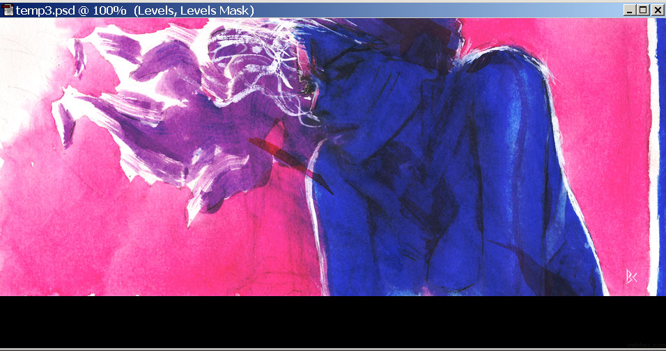
Second—the drawing! Aside from a bit too much jut in the jaw—which was easy enough to work out in the watercolor stage—or would have been, if I'd gone about it logically >_>—I feel like this one really *did* hit the mark I've been trying for in terms of drawing style—a sleek, angular, expressive look:
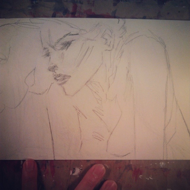
Bam! How about that? Well it isn't perfect but I'm excited. It took so much erasing that the paper got pretty messy from all the ground-in graphite, and my pencil was completely blunt by the time I finished...but again I think maybe those were necessary, forcing me to adopt a looser, brushier stroke with the pencil. Intermediately, I had gone through a phase where I was trying to draw shading directly, without drawing the thing the shading was on first...which didn't really work, I think at least in part because it gets super messy and I want to leave the shading more up to the watercolors, but it did get me (desperately, perhaps) out of my usual drawing mode.
Of course, after hours and hours of watercoloring over those pencils, I thought I had more or less ruined them by overworking it—a not uncommon feeling for me at the end of a day's work—but this actually turned out pretty well because I learned a new Photoshop trick to salvage the nearly lost lines, AND in all that overworking I also got in about three times as much watercolor experimentation as usual, and figured some stuff out there as well. : )
Let's do the Photoshop trick, since it has pictures. This is probably an awful way of doing things—or everyone knows about it already—but anyway, I start my nightly comic processing with the freshly scanned image, which always comes in from my scanner looking very light:
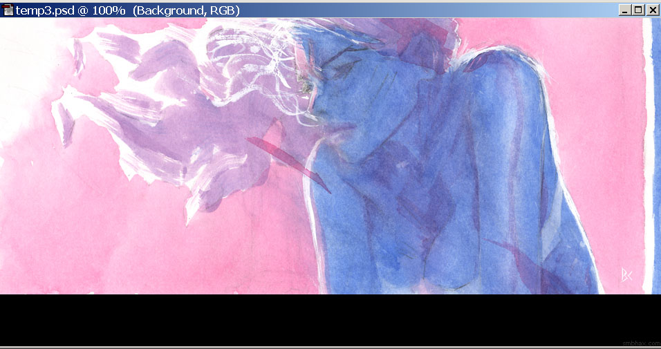
Normally I just drag the left slider in enough to make the dark end of the image near enough to black—or full color saturation—that it doesn't look washed out against the black background of the A* site. But the ridiculous amount of washes and scrubbing I'd done over the course of battering away at the shading of Selenis on this page had left the surviving pigments all jumbled around and piled up on the watercolor paper's textured surface, so just bringing out the most intense dark parts just brought the resulting speckled patterning to the fore in a very distracting way:
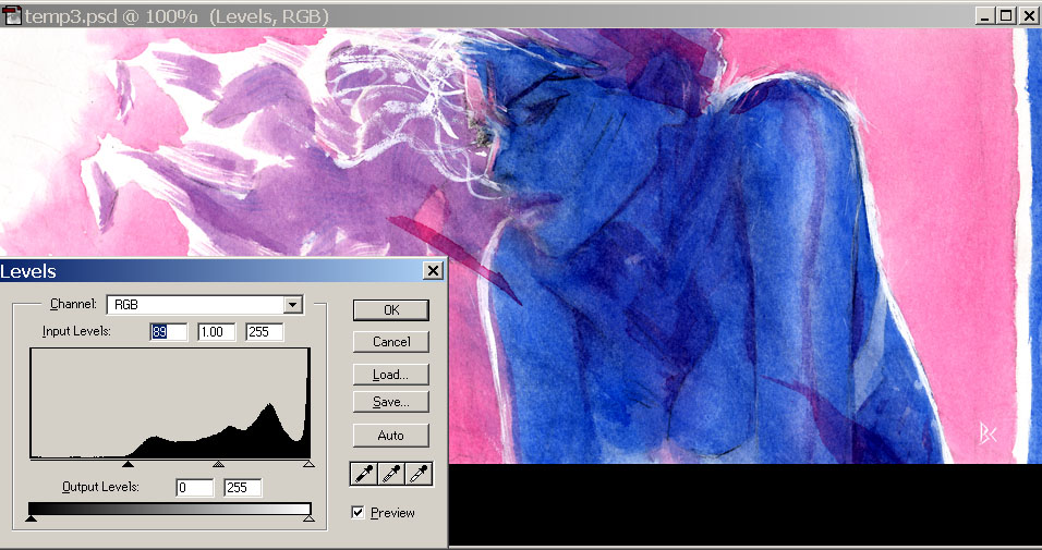
Bleh! What to do? Well in the past I've used the middle slider—gamma—instead of the left slider; gamma adjusts the midtones, leaving the dark tones alone so that dark patterning isn't as obvious, but relying primarily on the gamma results in a slightly muddier look than I would like, since you can't get the same degree of contrast that way. But suddenly a crazy scheme popped into my head: TWO Levels operations! Not that multiple adjustment layers is anything out of the ordinary in Photoshop, of course—far from it!— but normally I don't want to pile up multiple lossy adjustments of the same kind if I can help it because the data losses from pinching and pulling those pixels around will start to magnify each other. However, desperate times... So for the first of the two Levels adjustment layers, I went way overboard on bringing up the dark values
which "crushes" the darker colors down to their darkest possible state—this is a huge loss of colors, so I normally try to avoid it, but in this case it would force the areas around the dark speckles to be just as dark as the speckles themselves, thus eradicating the worst of the speckles! The remaining flat black and dark blue areas are way too dark to read, but you can lighten them, and restore some of the apparently lost image detail to visibility, by taking that crushing Levels adjustment layer you just made and reducing its opacity, say to 64% in this case:
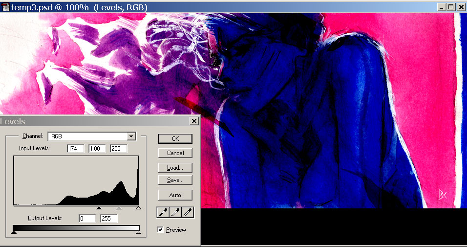
Great, but now it's back to looking washed out like it was when we started out, only darker overall. Right—so it's time for another Levels adjustment layer, on top of that first one! In this second one, I set the left slider to the new end point of the darkest tones, to restore their contrast, while also raising the gamma way up, to separate the midtones back out from the darkest parts of the image, and voila, I've got my lines back, and all nice and dark, but without all the surface texture noise that was there originally:
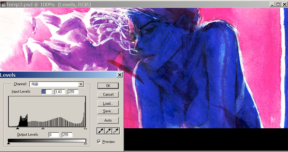
Saved! (I did end up lightening the final version's gamma just a tad more; and I had left most of the dark tones a bit gray, so the image looks just ever so slightly washed out, to give the feel of how your eyeball or a camera gets washed out when pointed toward a bright light source, like the implied sun at the left side of the drawing.) The resulting look is somewhat unnatural, and not the sort of digital mauling I want to give the watercolors normally, but in this case they were mauled to begin with in real life, and fortunately Photoshop could un-maul them a bit. : )
~~~~~~
Oh yeah other things I learned from this watercoloring ordeal that I want to remember:
- The pure magenta flashes splashed on here and there, like across the shoulders and the ear, are fun and pretty effective in adding some abstract spice and focus (or distraction ; ); I first did one of those two days ago, over Selenis' eye, because the face there was just...too blank and bland, and the resulting weird patch of color turned out to be just the thing to add interest—that whole page had felt flat before I finally did that.
- The gradated background worked pretty well. I started off with a little pool of pure water on my palette, then after laying down some background area with it, going from upper left to lower right, I would dip in just a little bit of concentrated magenta, gradually adding more and more pigment that way as I progressed across the page—made for a pretty smooth transition. : ) I did run out a *bit* of the added magenta toward the far right side, so, still need more practice to figure out the pacing better. ; )
- If I want to keep my pencil lines...which I thought I really should have for a while here, until I rescued this page in Photoshop...now I'm not so sure. But anyway it would probably at least be better to leave myself the option, so, the important thing is not to go too dark over areas of pencil detail I want to be able to read, like Selenis' face on this page—where I in fact *did* go in too dark, which meant that I would have to "ink" the pencil lines with very dark watercolor in order for them to be visible, which I may not really always want to do, especially with this this type of long, lively line, because they always lose energy when inked (especially by me : P). And in fact the blue around them was *so* dark that it was hard even seeing the lines in order to ink them, and it took a messy few attempts to get anywhere at it.
- And I think maybe the reason I *did* go in darker with the blue fill on Selenis' body than I had intended was because it was the darkest area in the page, and on the previous page I'd been able to go as dark as I'd wanted for the darkest end of the drawing, because it was just a dark blue shadow area behind Selenis, with no pencil line detail in it to worry about obscuring; so I think I was thinking subconsciously that I could go as dark as that over Selenis' face on this latest page. So I guess the lesson would be just to go lighter overall with the watercolor if my darkest area also has line detail in it. ... Or maybe not, because weird things can come out of the alternative catastrophe! : P Hm.
|