Added 1 new A* page:I got a new pencil! : o
This is going to be a long post.
See I've been thinking for a while that I wished I could figure out a way to make the pages look a little sharper—I'm constantly thinking oh what about going back to ink or trying pens or something, for instance. Yesterday's page particularly struck me in a could-have-used-sharpening-up way, once I saw how it came out digitally, and that got me thinking about how some of the pencil-only pages I was doing a few episodes back had come out pretty sharp—this one, particularly.
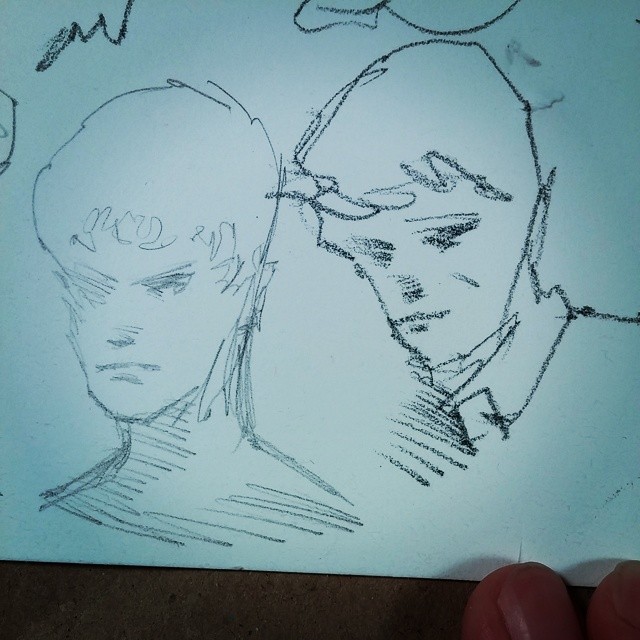
That was done with a mechanical 0.5 mm drafting pencil, before I switched to woodcase pencils, soon settling on the 4B Tombow Mono that I've been using more or less ever since. So I thought hm, maybe I should take a look at how the drafting pencil does on this relatively rough watercolor paper I'm using these days—the soft 4B Mono breaks up and scatters a bit on it, you see. I did a quick side-by-side sketch of the drafting pencil and its narrow H-grade-lead line next to a sketch done with the 4B Mono, as a proof-of-concept (this is closer-up than the standard A* comic drawing size):
Yeahhh, the drafting pencil and its H-grade lead came out much finer—just think of the increased detail I could get in! I would have way less of an excuse not to draw noses properly! But then I had a further thought, namely that woodcase pencils come in H-grade too, silly—and that I even had some in my shame-filled art supply cabinet: a fancy box of imported (back before I realized they were available much cheaper domestically : p) Monos, and differently designed yet similarly fancy box of imported (these are not sold here in the States, alas) H-grade Mitsu-Bishi Hi-Uni pencils, which I got when I was first investigating woodcase pencils. So I pulled one of each of those pencils out, and did a bunch of series of comparison sketches with them, the 4B Mono, and my (yes, another import : p—these things all come from that amazing source of Japanese and some German art/office supplies, jetpens.com) Platinum Pro-Use II mechanical drafting pencil loaded with (non-imported : p) Pentel H-grade leads. Here are a couple of those sets; the top row goes (l-r) H mechanical pencil, H Hi-Uni, H Mono, 4B Mono; the bottom row l-r is 4B Mono, H Hi-Uni, H Mono, and H mechanical:
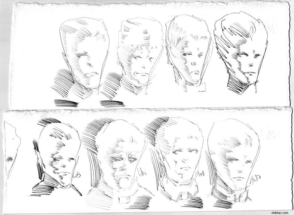
(Drat, I forgot to sharpen that scan after shrinking it in Photoshop; just pretend the slight blurriness isn't there. : P) I found that the mechanical pencil, though a high quality one, had just a tiny little bit of play in the lead, which I suppose is inevitable when you're dealing with moving parts, vs the woodcase pencils, which have zero moving parts; this leads to just a hair less control when drawing; for instance, you can't be sure that the lead won't rotate slightly on you when you press down on its leading edge, which will displace the line you're trying to draw ever so slightly; or, the slight flex in the metal clamps or whatnot inside may cushion things ever so slightly when you try a quick application of pressure; I'd never noticed these things before, but now that I've been used to drawing with woodcase pencils every day, it really jumped out at me.
The other drawback of the mechanical is that the Pentel leads had a slightly waxy consistency; this allowed them to leave a very smooth, unbroken line on the rough paper, but that line was slightly, well, blurry compared to the crisp lines made by the woodcase pencils. It drew really zippy, but, coupled with the slightly lesser control, I found that I was mostly making quick, dashed lines, rather than carefully drawn ones; this had a stylish kind of polygonal effect, since it was hard to brake with the thing (another factor in this may have been the mechanical pencil's greater weight), but wasn't really helping me draw in great detail; same with my trusty 4B Mono, even though I was having the highest success rate of decent sketches with it, probably because it's been my daily drawing tool for oh nearly forever now.
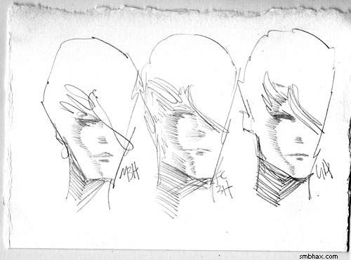
So the drafting pencil and the 4B Mono were out, leaving me with the H-grade Tombow Mono and Mitsu-Bishi Hi-Uni: a showdown of Japanese titans! Most of the sets of sketches I did last night
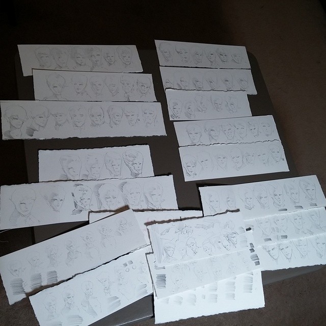
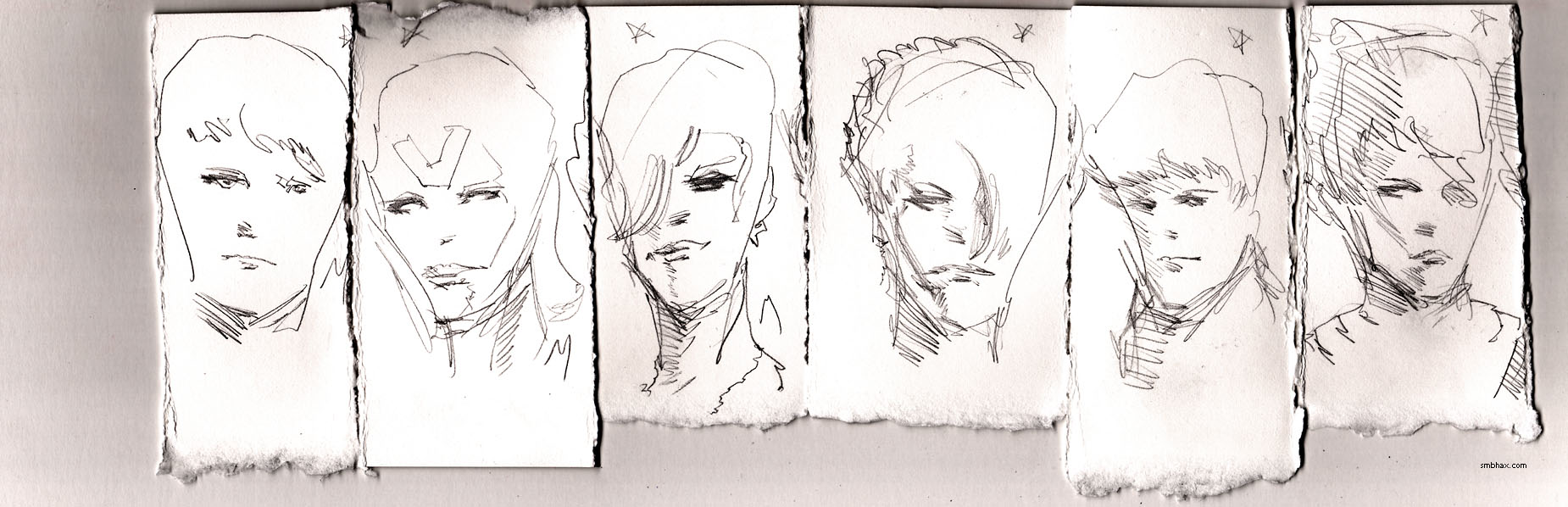
were battles in that titanic and closely-matched struggle; I was having a hard time deciding! I seemed to have a higher success rate of decent sketches with the smoother, softer, darker Mono, but there was something about some of the ones I managed with the Hi-Uni, even though it didn't draw quite as darkly, and the harder point made it feel much scratchier than the Mono... It was too close to call! I drew set after set, scrutinizing them intently, but couldn't pick a clear winner. The night was almost gone! Finally, I tore up the strips and narrowed it down to a comparison of the three best representative sketches done with each of the two pencils (this is to scale with standard A* comic size; click it for the larger 1080p size):

The three H Mono sketches are on the left, and the H Hi-Uni sketches are on the right. You can see the Mono is darker (note that I darken all of these scans relatively in Photoshop for greater legibility), and there's more of a liveliness or style about its drawings, I think because the smoother, softer lead moved more easily across the paper, so I could just let my hand have fun zipping off crazy lines—relative to the harder, scratchier Hi-Uni, where I had to put more conscious effort into moving the pencil tip across the paper—but that seems to have given me more control, or maybe it was just the process of having to fight and struggle and re-draw... Anyway, in the end I couldn't deny that the Hi-Uni sketches, although fewer of them had come out well, were better drawings—something more life-like and true had come out of fighting that hard lead point across the rough paper.
Oh yeah, the other thing in the Hi-Uni's favor was that the slightly harder lead broke up less easily on the paper, so the lines were a little more solid than the ones made with the more easily scattered, softer lead in the Mono (yes these are still both rated "H" grade by their manufacturers—but pencil grades aren't made to be consistent between manufacturers), which was the whole reason for trying a different pencil (than the very soft 4B Mono I had been using) in the first place.
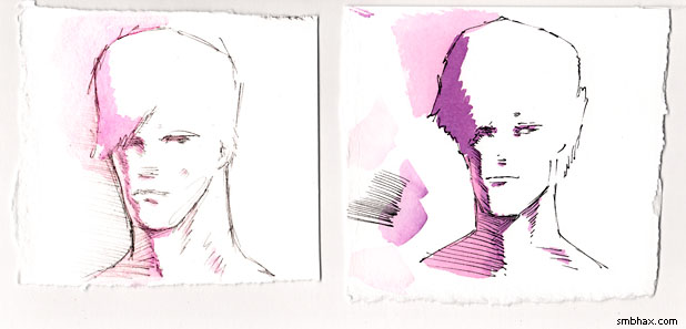
Which reminds me, I had done one other pencil test last night; when still thinking the mechanical pencil would be the way to go, I did a quick to-A*-comic-scale (width, anyway) test, with a dash of watercolor, to make sure its lighter lines could come out okay (and I would have to go correspondingly lighter with the watercolor, so that when I applied the necessarily greater darkening to the lines in Photoshop, the watercolors wouldn't come out too dark/saturated):
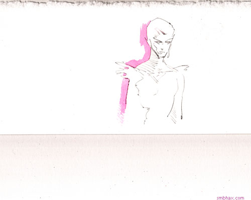
When scanned and scaled to that size, it broke up where I'd gone lighter, but mostly worked pretty well, and the Hi-Uni lead would be darker anyway—in any case, the jump in sharpness over the 4B Mono was obvious.
~~~~~~
I got up this morning today thinking that I'd better make sure the Hi-Uni H, which had seemed to be the winner of the evening's battery of tests, could work with watercolor and digitally prepped for the comic; also, I'd gotten to thinking that if I just needed dark lines, what about inking Hi-Uni drawings with my trusty, waterproof Rotring Tikky Graphic 0.3 pen? So I gave those things a shot:
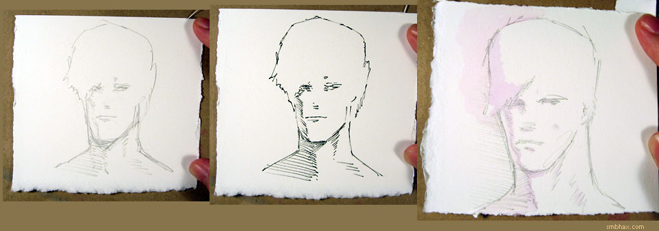
It wasn't a great sketch with the Hi-Uni H (this is why I don't usually try drawing before breakfast : p), and I hadn't drawn as heavily (and thus darkly) with it as I had in the previous evening's sketches, but it came close to darkening up reasonably well in Photoshop; as for the pen test, the pen and watercolor combo still wasn't quite clicking with me—I guess I still haven't quite wrapped my head around how to a) translate pencils well into a water-colorable pen drawing, and b) how to paint over the pen lines in a meaningful way. And the Tikky's normally dependable ink flow was breaking up a bit across the watercolor paper's toothy surface, even in these relatively short lines. On the plus side, its ink at least didn't run in any really perceptible way when painted over, which I'd been wondering about for a while.
Still, it looked like I was going to go with just watercolor plus Hi-Uni H, but I wanted to try more brands (it would be nice to find one sold domestically, for instance, which would be way cheaper than importing the Hi-Unis from Japan), and more grades: particularly, grades harder than H. I knew I wouldn't really be able to convert lead lines much lighter than those made by the Hi-Uni H to legible watercolored comics, but I suspected that a 2H Mono, for instance, might be just as dark as an H Hi-Uni. So while out running some errands I popped into the small neighborhood art supply store; they don't have a wide selection, and in fact at this point had just two pencil lines: the Tombow USA Monos, and Faber-Castell's German-made "Castell 9000" series; these get pretty high marks on the internet, and also I wanted to see if European leads really were, as I'd read online, harder than Japanese leads, which are reputed to be softer than the rest of the world's, generally.
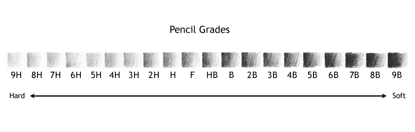
This was indeed the case; the best match for the feel of the H-grade Hi-Uni was a 2H Mono, and an HB Castell 9000: so, at least at this part of the range, the Mono is one grade softer than the Hi-Uni, and the Castell 9000 is two grades harder! (The pencil grading name convention is kinda weird; here's a refresher of the schematic I've posted before:
modified from the original image by Untitledmind72 (source))
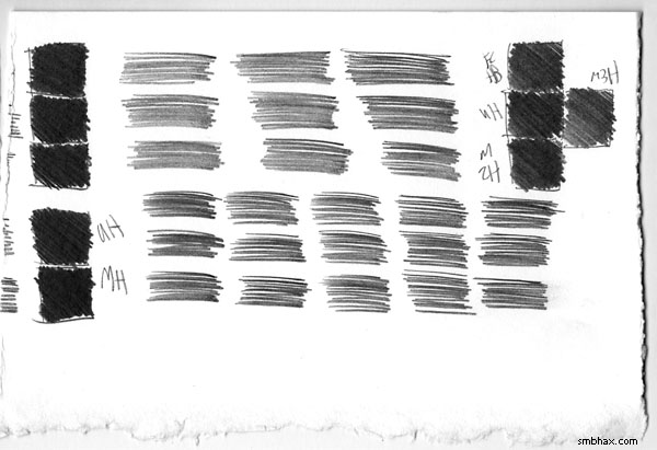
Between those three, then, the Hi-Uni was just a shade darker than Castell and the Mono, although the lines they made were really hard to tell apart, as you can probably (not-ish) tell from this test matrix I made with them (and one sanity comparison test of the Hi-Uni H vs the Mono H in the lower left corner—the significantly softer Mono H was still darker, phew):
So the Hi-Uni, the expensive import, was still the one that seemed like the best balance of hardness and darkness for my A* watercoloring purposes. : P
I did find that I liked certain different hard grades of the Mono and Castell, for whatever reason: just sketching sets with all of them (I had H through 6H in Monos, and HB through 4H in Castells), I just pure liked best the 3H in both the Monos and the relatively much harder Faber-Castells; higher than that in both ranges became uncomfortably scratchy, and they were already too light for using in scanned watercolors, but just for sketching I liked their feel, particularly the Castell 3H, where you can scratch together so much very light, fine detail, it's just neat to play around with and see what it can do; here's a little set of sketches using those two and then the Hi-Uni H at the end:
And that, thankfully, brings us just about to the end of this horrifically long article. I used the Hi-Uni H in today's A* page, and I think it did help me get into a more ambitious layout than my usual. I knew I'd have to mentally recalibrate my sense of how saturated to go with the watercolors—I'd have to go lighter to match the lighter pencil lead—but I still managed to slather them on a bit too heavily in a few spots, resulting in some spottiness and the inability to reach quite the darkness of line I would have liked in my Photoshop adjustments. But! It kinda came close. I think this'll work out well with a bit of practice.
|