Added 1 new A* page:Here's an Instagram I took midway through the watercoloring of today's page:
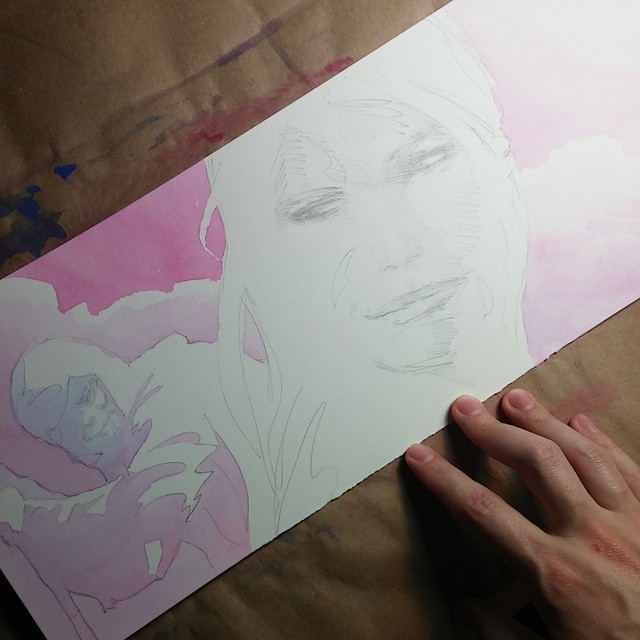
After the odd adventures I had coloring yesterday's page—which went a little weird after I tried doing some local color on Selenis—like, making her skin pink while the clothing around it was blue—I looked back over recent pages whose coloring I like the best, like 50 and 80, and came up with some thoughts on what worked in those. I noticed that the parts of those pages I liked didn't really go for dark blue, and instead used shadows that were more in the purple range. Also, they tended to have a lot of color mixes: purpley reds, bluish purples, and lights and darks of all the colors in between. One thing I had done with page 80, for instance, was prepare twice as much intense red and blue watercolor beforehand as I usually would, so I'd have plenty for mixing, because for that page I'd decided I wanted to use a lot of color gradients.
So looking back at that stuff, I resolved always to have plenty of mixing colors ready to go, to use purples instead of dark blues for the darkest shadows, and to go from red to blue when doing gradations, to help avoid throwing down a pure dark blue.
Of course, when I tried going with a wide application of light blue here over Selenis' face, it came out all super-pebbly; I'm not sure why the blue does that sometimes and not so much other times; I'd thought it had to do with high concentrations of blue pigment, but it was actually a fairly light blue, so...maybe it happens more when laying down a lot of wash at once, as I did here, as opposed to brushing it on slower and dryer—but I'd felt I had to move fast here to keep some of the color blends around the face from drying before I was done with them. Hum. Maybe I need to avoid even light pure blues, at least in sensitive areas. Oh well I guess I've still got some stuff to figure out. : P I'd like to find a non-pebbly blue, but I'm not sure there is one that's as intense as this Winsor & Newton "Ultramarine Blue (Green Shade)" I'm using, or that mixes as well with the Quinacridone Magenta.
|