Added 1 new A* page:I learned more art lessons from making today's page! The initial sketch (well, after the usual first draft that I thought was good but wasn't) looked like this
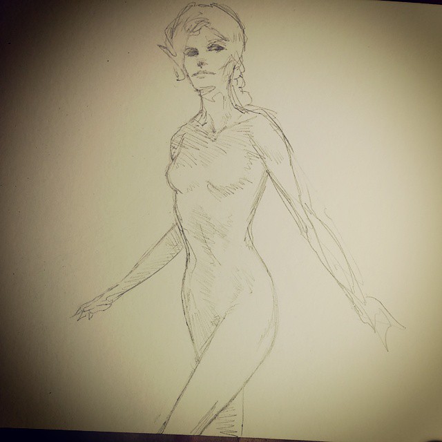
The limbs obviously had some problems there but I also got into hours of futzing with the lines of the body to try to tidy them up, and also I got to thinking maybe I should draw Selenis more like this other artist drew a character of his decades ago (I am way too absorbent of whatever I'm reading—I'll probably talk about that particular source of suction next week), and eventually ended up with this
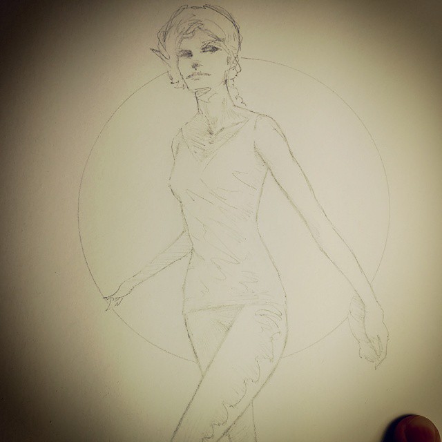
which isn't *bad* by my standards, and is certainly tidier, and many of the changes were technically for the better, and hm well I guess the pose is a bit more furtive, as it should be for this scene, but the obsessive correcting and re-drawing has also sucked a lot of the energy out of the drawing. So after some more agonizing I erased the body lines and redrew them quicker and rougher, trying to put some of the original muscularity and zing back into them.
(Those and even more process photos from tonight's drawing session, like the horrid first attempt, and the near-final redrawn rough treatment, and an in-between pre-clothing muscular detail version, can be found on my tumblr / Twitter / Instagram .)
Anyhoo so I need to remember that I don't need to redo lines just because they're a bit rough—as long as they give the right idea, that's okay. (On the other hand, things like her right forearm, which is too elongated in the initial drawing, I *do* need to correct, otherwise they will torment me eternally.) And for me, two sketchy lines for an outline of an object are often better than one neat line; there's a life in two lines as your eye and brain vibrate back and forth between the possibilities, or maybe it's that the object itself is kind of in motion between them in a life of its own. Anyway, in my work, neater usually doesn't always work out better. (And the art I tend to like from other artists is often the rougher styles.) (And I find more and more that I am becoming completely unable to draw in the classic "How to Draw Comics the Marvel Way" etc way of constructing everything out of simple geometric shapes—every time I try to do that now, I end up with a geometric horror show that looks like it went a few rounds with a black hole. : o And then I just have to go back to my weird silhouette scribble style.) Must keep up the energy!
In the coloring phase, I wasn't sure if I should go with a pure red for the night sky in the window, or a darker purpley red—and that key color would affect how I would color everything else around it. So I did a quick digital mock-up when I could play with the colors before committing something to paper:

Crudely awful but it did help confirm my initial idea of going with a pure red in the window!
And the sort of spots in the blue and purple watercolor along the sides, especially the left, are I *think* fingerprints—at least, I only noticed them after I'd been bending the paper back into shape right after having washed my hands, which maybe were still very slightly damp as I was handling the paper? I dunno. Maybe I should test that out though, fingerprint watercolors might come in handy at some point, you never know.
|