Added 1 new A* page:The reader who won the auction for the page 65 original art (each new A* page is up for auction on eBay for a week after it comes out—look for the blue and gold "original on eBay" link to the lower left of the comic image!) a month or so back sent me a photo to show how it looks since they got it all framed and stuff:
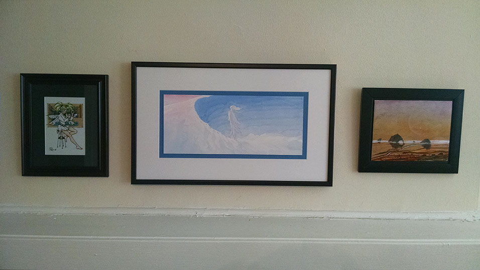
Man, talk about fancy! I really like that color-coordinated blue inner mat, and the art itself has been "float-mounted," which means it's elevated off the mat by a slightly smaller piece of foam core, so it appears to "float" above the mounting—I had to look this up 'cause I don't know much about advanced framing techniques! Anyway, it sure looks like a bang-up job to me, and, well, it's nice to see these funky little paintings I scratch away at all night getting out and about and being enjoyed. : ) Kind of what art is all about, really! Yay ^_^
~~~~~~
Speaking of the art, you may notice today's page is lighter than most of the ones before it. Since oh soon after I switched to this heavy watercolor paper early last episode, I've been going pretty light on the watercolors, then cranking down the gamma in Photoshop after I scan them in; this works great and all, *except* it's always a struggle to find an acceptable gamma setting for each new page (and I think I've been getting it wrong a lot of the time : P), and then when trying it with today's page, I realized that lowering the gamma really threw things out of whack: for instance, the red around the figure's face was just getting oversaturated, while the purple of the breathing mask was getting darker, so the value balance of the head was going awry. Besides which, cranking the gamma crushes values and colors together, causing a loss of visual subtlety. Altogether, it was getting ugly.
So for now (a highly variable length of time...my gamma resolutions haven't tended to last very long : P) I'm going to stick with a minor gamma adjustment of 0.75, which my scanner seems to need to get the scanned image to match what you'd see looking at the thing with your eye, more or less—it's the value I've been using on the scanned images of them that I put up with the daily auctions—and maybe start playing with higher concentrations of watercolor...although I'm worried that thicker watercolors could start clumping or clotting or, more hazardously, obscuring my pencil lines, at which point everything would probably start to get a bit too blobby and lacking in definition—not to mention that I would lose my drawing and start going crazy trying to get it back with paint on the fly. : P That way lies madness! And have I developed sufficient control to handle painting in higher contrast without losing subtlety and overall color balance? I mean, I like the easy-on-the-eyes lightness of the paintings I've been doing, but maybe I'd also like more color-concentrated ones? Only one way to know, I suppose! So uh yeah we'll see how this latest loop around the gamma rollercoaster goes. : o
|