 | |
| |
|
|
| |
| Natural light art photos, gee! | Jul 11, 2016 8:30 PM PDT | url |
| | |
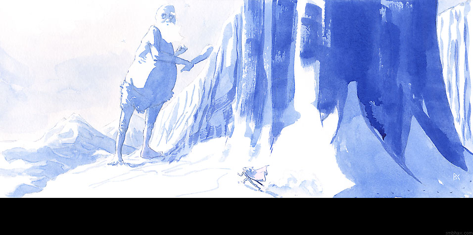
Added 1 new A* page:I figured out a way to get better photos of my A* art! Turns out that snapping a shot of them in the natural light of my kitchen window works better than under the artificial lights at my drawing tablewhich had been yielding even spottier results than usual lately since the last of my incandescent 100 watt bulbs died and I had to replace it with one of these newfangley curly flourescents or whatever they are. So if you had for instance looked up the original art for a recent page and found the colors in the photo of the art looked weaker or weirder than those in the scan of the art you saw in the comic itself, and thought I was trying to pull a fast one or something : P, well, I couldn't have blamed youbut now the photos pretty nearly (slightly favoring blue over red, maybe) match the scans, which pretty nearly match the actual physical paintings I make and try to sell to you every day. : D
So just in case those old photos with yellowish or pale colors had been disturbing people, I reshot a few that just happen to be still up for auction on eBaybut ending in a day or two as of this writing! So for instance here's page 48 (auction here) in natural light
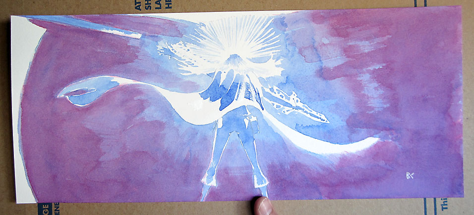
and page 49 (auction here)
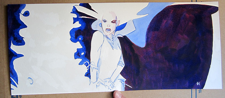
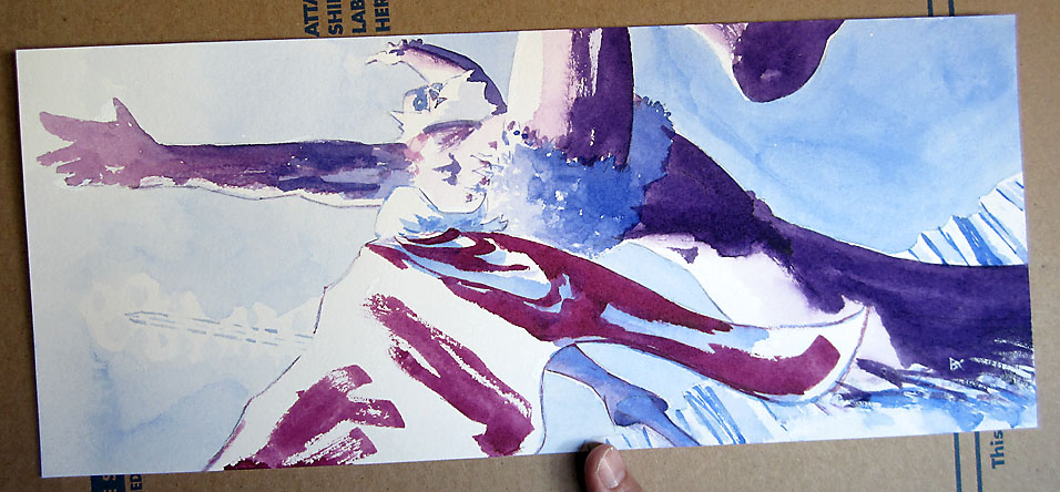
and you can compare those with today's page (auction here):
So yeah! Now I suppose I should go back and re-shoot some of the older ones that might have come closest to selling, like say page 45 (for immediate sale directly through my site here), but by the time I thought of that today the natural light was a bit dimmer, so eh well at least they can serve to show how the color in the old photos didn't look as good as it should have; the photo of page 45 taken in my artificial drawing table light and then processed by me to try to salvage something out of the yellowy ick it came out as looks like this
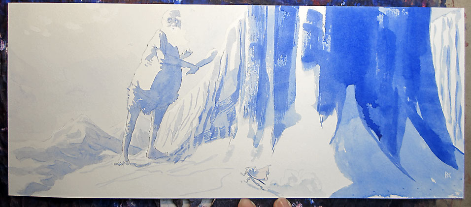
but the actual artwork pretty much does look like the scanned version, whose colors came out much better:
While I'm nearly on the topic, I suppose I should note once again that while in old episodes I used to darken the scans artificially in Photoshop, which made the colors you saw in the comic darker and richer than the watercolors I'd painted on paper were (which is one reason why I've always also included the best photo of the artwork itself that I could manage, for comparison!), over a series of episodes, as I got more and more accustomed to handling watercolors, and especially darker mixes of watercolors, I was gradually able to tone down the degree of my color darkening for the comic, until with episode 28, page 20 I finally stopped my Photoshop gamma adjustment of the scans entirely, and from then on the artwork you see in the comic has been pretty much what you would see if you bought the original artwork and held it up in front of your peepers. : )
(Hm and this shooting in natural light thing means that by winter time I'd darn well better be able to finish up a page by 4-ish pm each day! That leaves me some months here to get my daily production consistency down a bit better. ; ))
|
·····
|
|
|