Added 2 new A* pages:Page 7 was one of those pages that insists on being difficult. I made a little animation chronicling my struggles with it!
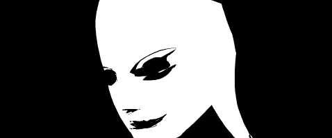
So first I tried drawing it freehand, and came up with a nice rough face, but not at the right top-downish angle. So I brought in my storyboard sketch (that sketchy second frame in the animation) and tried using that as a direct drawing guide, but as is often the case when I try that, I'm just not feeling it, and the face ended up twisting around on me, so that it was more side-on than top-on--and of course I don't realize this until I'm nearly done with it, but something isn't quite right and I keep trying this and that and then you realize the whole thing is just off. ;| So I thought *maybe* I could just tweak the details a bit to angle it back...but that didn't work, of course. So I had to scratch the figure and start over, back to freehanding it rather than tracing off the storyboard, and fortunately, this time it came out pretty well on the first try. Phew.
I'll have to ask other art people if they have that problem, because it happens to quite a bit: trying to draw a figure at an angle--not side or face-on, I mean--and it stealthily twists around to the wrong angle as you're working on it, just to be contrary.
~~~~~~~~~
I'm still messing around with the computery font size a bit, so if you find your browser has had to reload the first few pages of this episode a few times, that's why... It's the same size in relation to the main subtitle font as it was back when I used it in oh say episodes 1 & 2, but back then I always put the computer text up in the picture area, rather than down on the subtitle bar, so I never really realized in a concrete way that it's a) a lot wider and b) shorter than the regular font--so when you put them next to each other at the same size in that subtitle bar as I'm doing in this episode, they don't really play nicely together. I've gone to a compromise size now for the computer font, and hopefully that'll work all right, because having to go back and redo all the previous strips in the episode when I decide to tweak the font a bit is a pain! :P
~~~~~~~~~
Yesterday I was sort of making fun of myself for resorting (or trying to resort) to an old big blinking lights on the wall type of sci-fi interior decorating; well today a friend of mine just happens to send a link to a real-life interior that *looks* like a super sci-fi lair, without resorting to the flashing lights! It's a data center (where they keep the servers and stuff) for a Swedish ISP, Bahnhof, built 30 meters below solid rock in what was originally a Cold War-era anti-nuke military bunker. You can check it out at your own speed in some nifty 360-degree panning photos here, or hitch a ride on a walk-through of it with their CEO on YouTube.
Sweet pad, hm?
|