 | |
| |
|
|
| |
| Episode 14, Moon maps, Saturn storms | Nov 19, 2011 10:32 AM PST | url |
| | |
Added 2 new A* pages:So if you didn't notice from the episode title page ;), this is a flashback episode. Don't worry, it'll be brief--only about twelve pages (not counting the title page), in fact. Also pretty punchy. It might just be the best episode EVER.
~~~~~~
NASA and ASU just released Moon-wide high-resolution maps taken by the Lunar Reconnaissance Orbiter. Here's a sample:
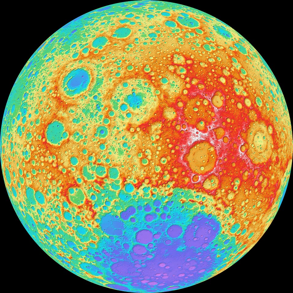
image by NASA's Goddard Space Flight Center/DLR/ASU (source)
You can get your own--at pretty much any size and angle--from ASU's LRO color-shaded relief map explorer.
~~~~~~
Photos of Saturn gathered by the Cassini probe have been put together to show the evolution of the longest-lasting storm ever recorded on the ringed gas giant:
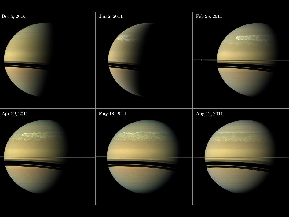
image by NASA/JPL-Caltech/Space Science Institute (source)
That "great white spot" was a bit wider than Earth, and over its record 200-day lifespan has grown into a storm band that encircles Saturn. According to this article, only five other white storms like this have been observed on Saturn in the past 135 years.
~~~~~~~
Today's page is the third of four attempts. The first took hours and hours, following the pencil, ink, wash process I've sort of been building up--it took all that time, I say, and came out badly. This has made me realize that a lot of the more fundamental problems I'm having with these pages come from the pencil stage; I've been working in a thin, hard, mechanical pencil lead, so light it's hard to see, and it can't be used to do shading very effectively to test things out; also, I'm on a relatively thin (70 lb) paper at the moment, and it probably couldn't take really heavy pencil and eraser work--not without risk of damage, anyway. It's also been "buckling" (also called "cockling"--anyway, warping in random waves that form distracting light and dark patterns across the scanned pages) a bit from the ink and wash layers I've been applying, AND unlike the fifteen year old acid-having pad I did my initial tests on, this new acid-free stuff doesn't really show the ink any brighter than the cheap (I now realize) Strathmore Bristol I was using earlier.
So it's time to upgrade my materials again, I think: I want to get one of those cool "lead holder" pencil-like things some of the pros use, so I can really throw graphite around heavily; I think the give and take, fighting it out that I used to do digitally with the lasso tool is going to have to take place at the pencil stage, because ink takes, but doesn't really give. :P So I need to pencil (and erase) heavily to work out a dynamic image, because all the inking in the world won't fix a dull pencil sketch. Gar!
And to do that I also need a sturdy paper, and ideally one that will buckle less from liquids, and show ink more brilliantly. I hear good things about this fancy French "Arches" (pronounced "arsh") paper, and if I get it in bulk packs at the local art supply store and cut the sheets carefully, it'll only cost a bit over $1 per A* page, which really isn't that bad for 140 lb bright white hot press top quality watercolor paper. Hopefully they have some in stock when I storm over there tomorrow. I'm not sure they have the lead holders, so I may just have to order that online; speaking of which, I've also got a couple more paper pads, these by Canson, another French company, on their way from dickblick.com; one is another 70 lb drawing pad, which I now realize probably won't work because it's too light for the washes I want to do, but the other is a 140 lb illustration pad, and it supposedly has a special surface treatment that minimizes bleeding or something and makes it great for pencil and pen and ink. So I'm kind of interested in seeing how that does when it gets here, although it does have an "ultra-smooth" surface that I'm not too sure I'll like.
Anyhoo, so this surviving version of today's page was freehanded without any pencil layout--fortunately it was a pretty simple subject, so it only came out a *little* funky looking. It does have a nice dynamic free ink look that most of my pages have lacked, though, so I need to find a way--hopefully by some of the means described above: heavier paper and pencil and attacking--to marry that with reasonably accurate layouts.
|
·····
|
|
|