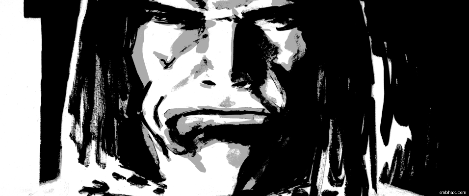
Added 2 new A* pages:So what I did *this* past weekend instead of working on the A* subscription mode thing is worry a lot about how I've been shading the comic—I haven't really liked the gray washes I've been doing lately; they've been coming out particularly messy. On Friday with the first page (92) I tried starting with light gray, as I had done in a burst semi-recently (culminating reasonably successfully with page 73), but it came out light and then I didn't want to try messing with it more because it was already pretty messy, and, ehh. Here's a quick Photoshop simulation of maybe how I should have shaded it:
Then on the second page on Friday (93) I was tired of washes and my brush was beat up anyway so I just did a lot of dry brush instead, which sorta worked in a way I guess.
Then at some point I happened to watch this Toronto Comic Con 1974 interview with Vaughn Bode, who I guess was kind of an "underground" artist back when they still made that distinction. He's...well, he's a little full of himself and his stuff, but I dunno maybe that was just the times. He's coloring with markers, though, and that got me thinking that for all my recent marker phase, I never thought to try shading with a gray marker.
So I ran out and got the little "cold greys" pack of Faber-Castell's "big brush" markers, which comes with their three "cold" grays and a black marker, which I didn't really need since I have like 80 of them but the store didn't have the lighter "cold" gray separately so oh well. Rather bizarrely, the light gray one is so light that I can barely even see it on the paper I'm using—like, I think it maybe actually be lighter than the paper. :o Not very useful. The middle gray seemed okay. The dark one is this ugly greenish shade, bleh. So one marker out of four, ah well... I went and tried shading some sketches with it:
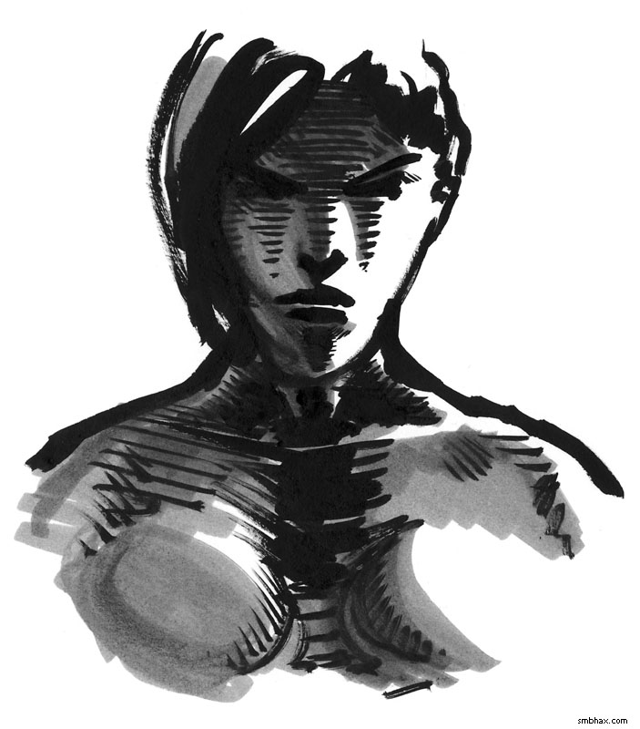
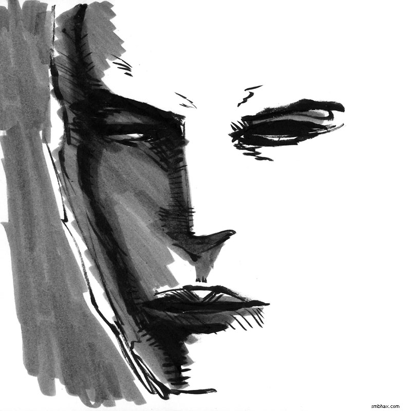
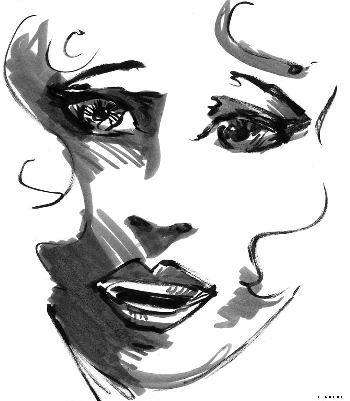
It worked fairly well, and I think it would definitely make a good portable sketching pair along with the Pentel Pocket Brush brush pen (which is what I used for the black ink in the last two sketches there). It does have some drawbacks though. For one thing, it's kind of a pebbly gray, as you can see, and that's I think from the surface of the paper getting roughed up a bit by the marker. That would be sort of all right, but while you can get a darker tone by making a second pass with the marker, as I did in places in the first and second sketches, if you try a third marker layer, the paper surface really starts to get chewed up to the point where you can see it looking rough if you tilt the paper against the light. AND when doing that you may notice that the black India ink you covered with marker is now all shiny, which probably won't scan as well as it would have otherwise. Plus the tip isn't very precise and I don't feel I can take the time with it to follow lines carefully, because the marker dries really fast, and if you don't watch out it'll dry in spots before you can quite finish them up, and then when you do go back to catch the last spots, the marker will start layering with the already dry marker lines and then you'll get darker patches where you now have two marker layers—so it's hard to make a really smooth tone, even aside from the pebbling problem.
Another thing I tried was dry brush with various brushes, since I came across a comic recently in which the author uses dry brush (with the Pentel brush pens) very effectively for small areas of shading, and since it had been sort of successful for me on Friday's page 93.
Oh yeah, another factor in these considerations for me is that one drawback of using ink wash for shading is that it doesn't cover white ink very well, in fact when you try it it usually turns out downright ugly, like on the goon's shirt back on page 55. Ugh! I need white ink to cover mistakes though, especially since I'm working directly in ink now rather than doing layouts in pencil first, so a lot of the time I end up with areas I'd like to shade with a wash, but can't because there's white ink there and the wash over it would just look really uneven and ugly.
The gray marker, on the other hand, actually covers the white ink very well; it isn't quite seamless, but it is a lot smoother over it than the ink wash is, and I wouldn't be nearly as hesitant with the drawing in general if I knew I was able to shade over white ink that well. And dry brush works *very* seamlessly over white ink...but then, dry brush is kind of all seams, if you think about it, and it gets pretty unattractive over large areas—also, it can be tricky to handle, and shade fairly unevenly—at least in the tests with various brushes that I tried.
Before I tried the dry brush stuff though I actually tried something else, something I've done before, which is using ink wash, but from pre-mixed jars of specific shades of gray. The unpredictability of on-the-fly mixed ink wash has been particularly troublesome for me since I started working with this new, much darker ink (that started on page 46); the ink looks especially dark before it dries, if you try laying down what as far as you can tell should be a medium gray wash, it will probably look pitch black at first, and I generally panic at that point and try rubbing it away. It's tricky to work with in a controlled way and I thought I'd have the hang of it by now but I don't seem to.
So the pre-mixed washes started sounding attractive again. I last used them on episode 13, page 157, and that page and the one before it are still some of my most successful ink wash shading attempts, I think. I stopped using it back then because I thought it was becoming too much of a crutch, and had too much of a paint-by-numbers look (and it really was paint-by-numbers, since I had numbered the five jars of light to dark washes I'd mixed); I thought I'd do better to force myself to get good at mixing the correct shade of wash on the fly. I eventually did get okay at that, but, especially since switching *away* from proper watercolor paper (I started using watercolor paper on episode 14, page 3, and stopped with episode 15, page 25, because watercolor paper is kind of a pain to work with in most other ways—it's fuzzy and not very white, and is particularly prone to warping), it's been hard to lay down any sort of largish area with an even tone of gray, and that's starting to bug me.
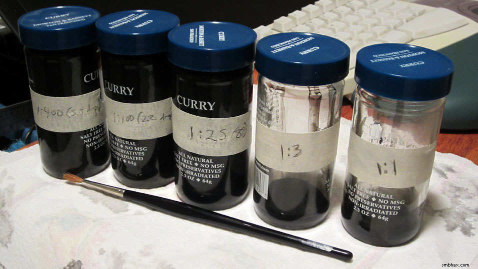
So I mixed up five gray washes, trying to find a nice range of tones. Here are the test patches I made as I tried to find a good set of ink-to-water proportions (I did this kind of in a dumb, ink-wasting way, but ah well...hopefully those jars of ink I just ordered will get here soon :o):
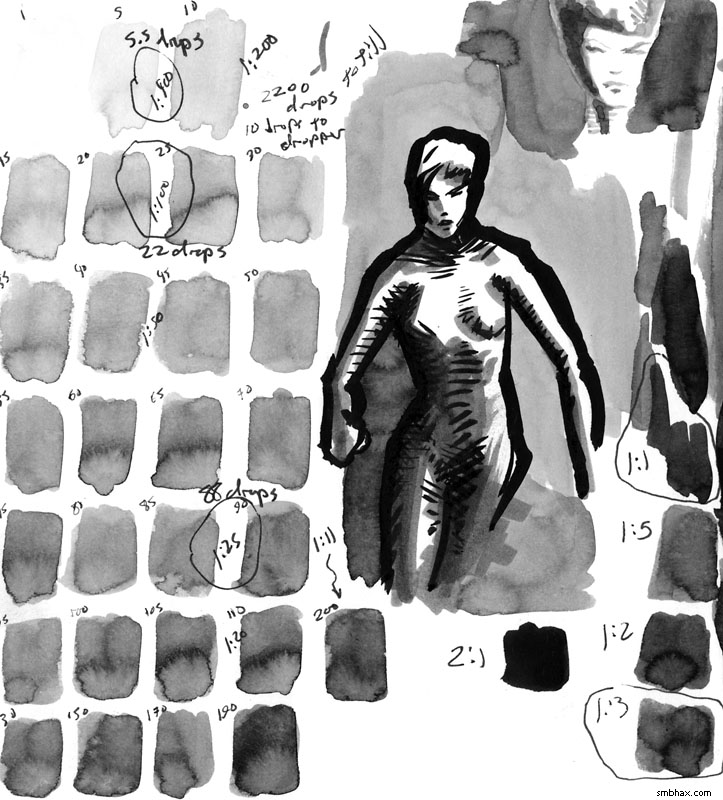
And here are the jars, labelled with their proportion of ink to water:
Spicy!
So that will probably work a little better—I used them in today's pages—but I also just want to stop relying on grays so much anyhow. I finally got to reading a bit of compilation book of Mac Raboy Flash Gordon comic strips I found at a used book store a year or so ago (it's this one), and I couldn't help noticing that he rarely uses grays (once in a long while they throw in some Zip-A-Tone on a strip, but I guess for the most part they didn't want to go to the bother—it *did* make me wish I had some Zip-A-Tone sheets to play with, though, and I even fleetingly considered ordering some from that Japanese joint, Deleter, who kind of specializes in them, but I can only guess they wouldn't hold up super well if you wanted your original to be, like, a permanent art piece; maybe they would, I dunno).
So for the most part, Raboy's Flash strips are these gorgeously bold black and white compositions with nearly peerless line work—but the compositions are also often quite abstract, as he had a lot of panels in which to establish locations anyway, and also constantly had to draw his way around the large caption letters. Like eh well like this:
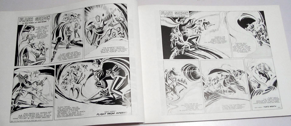
Now in the actual Sunday paper comic page they'd be colored, of course, and Raboy certainly composed his black and whites with color in mind, but still, they do show that black and white can get along pretty well on their own without help from a lot of gray. And if I don't need to put washes everywhere, then that means I can be much more liberal with using white ink where I need to cover black ink, and just in general be a lot more loose and carefree with what I try doing in black ink. So even though I've got my little pre-mixed grays for somewhat more attractive washes now, I want to see if I can keep the use of gray to a relative minimum without the black and white being *too* harsh on the eyes. I'm fairly pleased with how the last page (95) came out in that regard. I did screw it up in one way, though: I'd intended to do a light, marbled wash across the floor, but accidentally put black ink down there next to Thierry's arm—so I had to cover that up with white ink, and then couldn't do a wash there. That's the trouble with wash! So the more I can teach myself to lay things out so I don't need it, the better, I think.
|