Added 2 new A* pages:Time once again for a self-indulgent A* art talk!
I was frustrated with the drawing of the monorail approaching the base yesterday (page 63), and after thinking about it for a while I realized that a good part of its dullness came from my not having a clear handle on the lighting for the scene; like, I had a hazy idea about this gleaming rocket lit up in the otherwise mostly dark spaceport, but I didn't really work out where the light would be coming from, how illuminated the surroundings should be, and so forth. And when I don't have a sharp idea of lighting for a drawing, that's pretty much proven to be a guarantee of generating an immensely mediocre image.
So once I remembered/realized that, I swore a bitter oath to myself that never again would I let myself go into a drawing without *some* solid idea of what the light should be doing. And I had a brainwave this morning that maybe it would help, at the start of a drawing, to block out the light and dark portions with a very rough, very light wash--in theory, this could help me go in with a better handle on the overall layout and proportion, and on the lighting.
I tried it in the warmup drawing of the face on the left, and quick and blocky as it was (you can see it very faintly in a light gray on the right side of the nose and cheek, and I think under the eyebrow), it definitely seemed to help solidify the proportions:
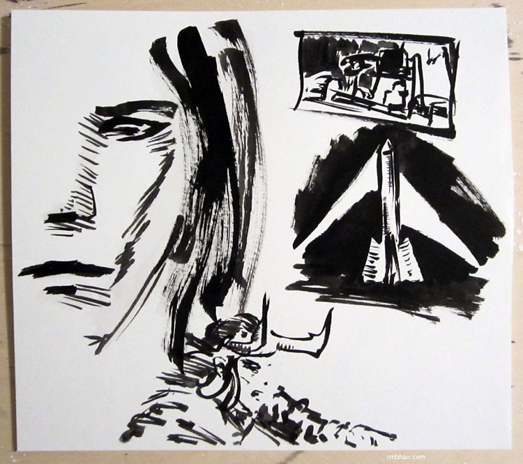
You'll notice I was also trying to work on ideas for lighting the rocket. How to lay out the page was preying even more on my mind, though: how to show the train being unloaded, and the cargo loaded into a huge rocketship, all in one panel so it's all easy to decipher at a glance. So the thumbnail in the upper right is actually the rough of the layout I ended up going with. Also, Loki seems to have slipped in there somehow. >_>
But I had the idea for the layout, so I tried blocking it in with a light wash:
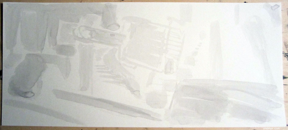
I realized midway through doing that that I was making it too detailed at that stage--I should have left the crane, for instance, as simpler, stronger shapes. And I got so obsessed with the layout or something that once again I didn't really get a grip on the lighting throughout--I knew I wanted the monorail and crane-thing lit from the rocket on the far side, so they'd be mostly in shadow on our side--but once again I didn't work out how the lighting on the rocket actually worked. So it just kind of...glows? Argh. The result being another profoundly dull drawing. UGH.
Thankfully, for the next page there was a rocket launch to draw--can't really miss with a nice single-point lighting scene like that. The blocking-in was probably a little too organic and curvy, but at least I mostly remembered to keep it simple:
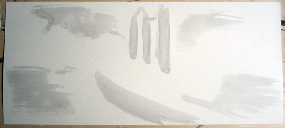
I would like to be able to get to the point where I can have areas of the pages that are angular, sharp, and semi-abstract, yet still communicating a clear sense of depth and lighting--rather than being sort of a bendy muddle. I think this blocking-in approach could help get me there--just gotta concentrate on keeping it clean and crisp, and definite on the lighting.
|