 | |
| |
|
|
view titles only (low bandwidth) |
| |
| MESSENGER maps of Mercury | Apr 28, 2012 8:27 AM PDT | url |
| | |
Added 1 new A* page:I got two people who linked to me to thank in one day, I think that's probably a record or something. :D Anyway a nice internet person said some nice things about A* in a post on other comics to read on the Freakangels webcomic forum. Thanks for the link! And then the author of the science fiction webcomic The Big Crunch (comedy, some mature themes) wrote some nice things about A* in a blog post. Yay, thanks! The Big Crunch is *also* set in the vicinity of the supermassive black hole at the center of our galaxy--what are the odds??
~~~~~
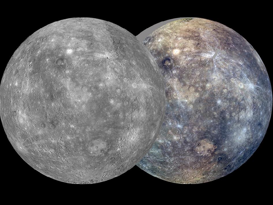
image by NASA/Johns Hopkins University Applied Physics Laboratory/Carnegie Institution of Washington (source)
^ That is a nifty couple of maps being constructed out of photos of Mercury taken by the MESSENGER probe; this image was posted by NASA in October, with this caption:
| After its first Mercury solar day (176 Earth days) in orbit, MESSENGER has nearly completed two of its main global imaging campaigns: a monochrome map at 250 m/pixel and an eight-color, 1-km/pixel color map. Apart from small gaps, which will be filled in during the next solar day, these global maps now provide uniform lighting conditions ideal for assessing the form of Mercurys surface features as well as the color and compositional variations across the planet. The orthographic views seen here, centered at 75° E longitude, are each mosaics of thousands of individual images. At right, images taken through the wide-angle camera filters at 1000, 750, and 430 nm wavelength are displayed in red, green, and blue, respectively. |
Oh the colors, children!
~~~~~~
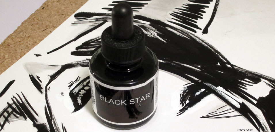
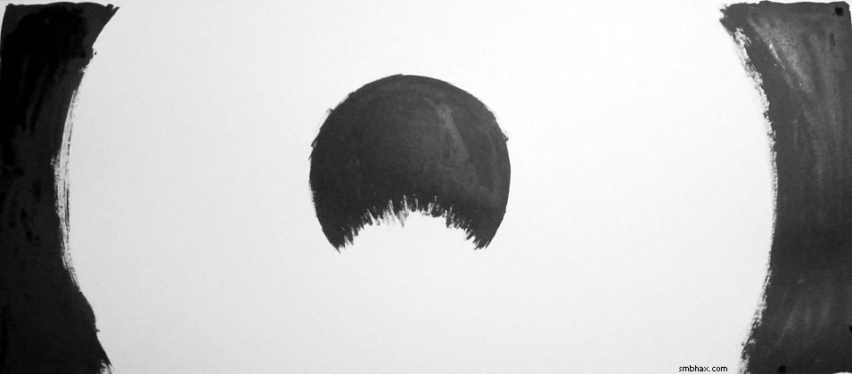
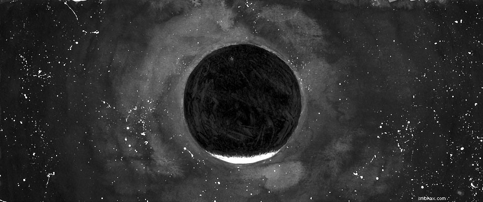
This is A* though and we don't do colors; in fact, that photo I posted yesterday of my mystery black A* ink sitting on top of a black and white ink painting was just tooooo colorful for my liking, so here's an artsy pure black and white take on it that I decided to make for some reason:

The identity of A*'s mystery ink will be revealed next week! Assuming I'm able to get all the results of my big ink round-up written up and posted in timely fashion, that is. In any case, when they ask you what your favorite Photoshop filter is, you tell them it's the black-and-white-creating Threshold filter, by gum!
|
·····
|
| |
| Supermassive Black Ink Round-up! | Apr 27, 2012 6:27 AM PDT | url |
| | |
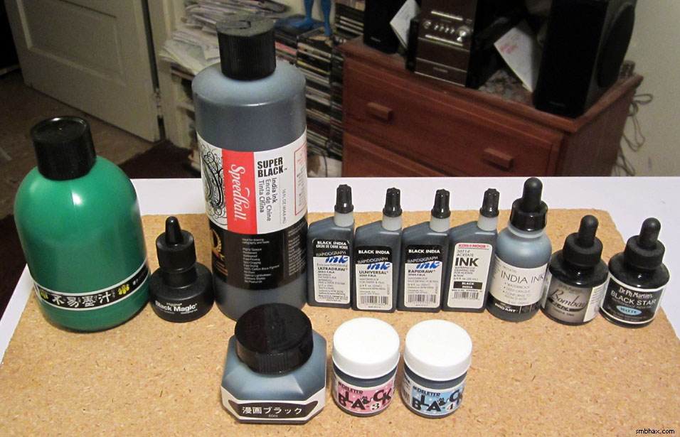
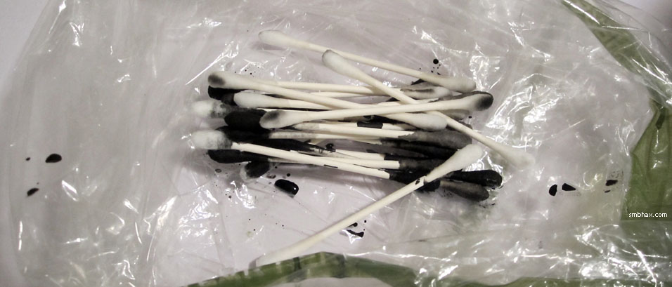
Added 1 new A* page:As I mentioned at the beginning of the week, I'm using a new black ink for A* now! This is the one I am using, but I warn you, it is in disguise, and is not what it appears:
What ink is it? It's one of these thirteen participants in my weekend waterproof black pigment ink testing extravaganza:
Did you notice the typo in the ink name on one of the labels? ;)
Here was the round 1 report card:
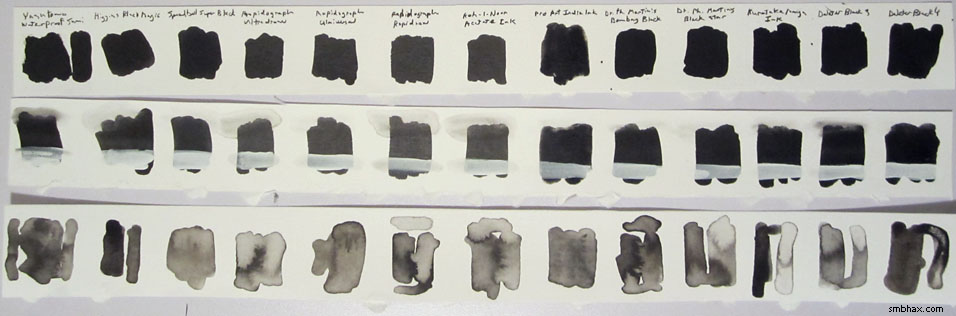
These noble Q-tips were harmed in the making of it:
I'll break it down in detail in the next part of this inky round-up! Oh the excitement, children! Plus: a dark horse late entry???
Ready? Then head on to part two!
|
·····
|
| |
| My trusty homemade drawing board | Apr 26, 2012 6:19 AM PDT | url |
| | |
Added 1 new A* page:I've got to be up tomorrow, so it's another late/early morning of cut-rate bloggetry! Here's a photo of an early version of today's page:
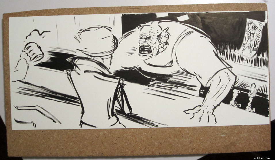
Hm, I probably overdid the hatching and feathering by the end, but this new ink I'm using has this fascinating property of holding the brush firmly together in a strong tip, which makes such details a lot easier to do! Must be whatever binding agent makes it more waterproof than the sumi ink I was using before. Anyway I will probably have this increased lining urge worked out of my system in a week or so, at which point we'll hopefully get back to art that's a little less cluttered. :P
Oh hey and that's the old board I've been using as a drawing board for the past few weeks, just holding it in my lap, usually propped up on one crossed knee. Works pretty well! It's 3/4" thick and I know you can go buy nice thin and light drawing boards, but this one just so happens to fit my pages pretty much perfectly, so I have become attached to it. Also I'm the one who cut it to this peculiar size--that was a while back, to serve as a bit of elevation for when I stand at my stand-up computer "desk" (which is really just an old bookshelf); but I've got others that are currently providing plenty of height in a little wooden platform I constructed for that purpose, so this one was free to get ink on it; I suppose eventually it'll be pretty black around the edges.
|
·····
|
| |
| That little bit in the corner was perfect | Apr 25, 2012 12:04 AM PDT | url |
| | |
Added 1 new A* page:Oy! It seems to be taking me forever to draw the new male characters in this dive. I should bring Vero back, he was easy to draw. :P I gotta wrap things up and get some sleep, so here's just an early stage of today's page:
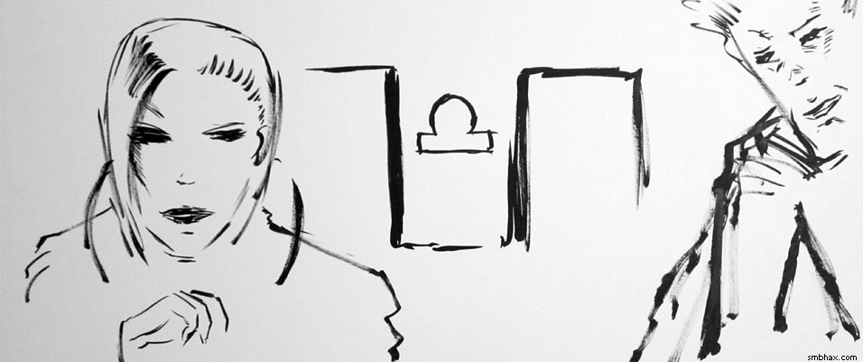
Hm... I think I kept the door frames and bits of hair. Everything else got redrawn, probably a few times! It's like two to four paintings in one! >_>
~~~~~~
Also, thanks to those dedicated readers who've been supporting A* at TWC. You got A* moved forward a page in their listing which has helped more people find it! So thank you, I really do appreciate it. :)
|
·····
|
| |
| Because I can't sing or dance | Apr 24, 2012 8:24 AM PDT | url |
| | |
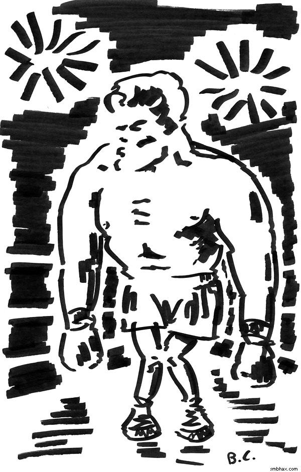
Added 1 new A* page:I'm using a new black ink now! But eh it's late so tales and images of this weekend's furious ink-testing will have to wait for another update; for now I present you with the majesty that is the sketch I did for this week's drawing topic at the letsdrawblanks.blogspot.com sketch blog--can you guess the topic? :o
|
·····
|
| |
| A dust devil on Mars | Apr 21, 2012 10:20 AM PDT | url |
| | |
Added 1 new A* page:In looking up something for that "elephant" on Mars photo by the Mars Reconnaissance Orbiter yesterday, I came across a couple more recent cool MRO photos! So here they are:
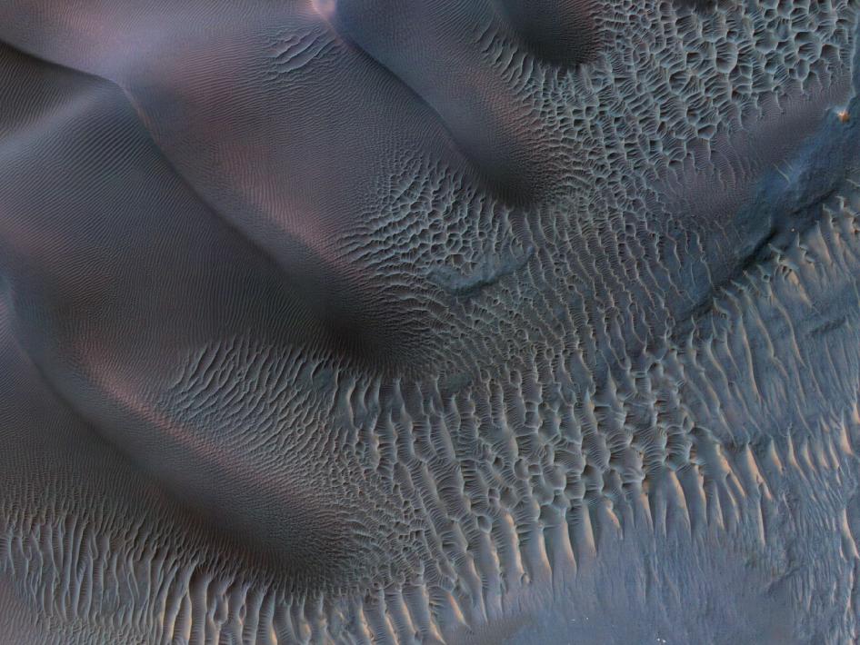
image by NASA/JPL-Caltech/Univ. of Arizona (source)
^ Those are sand dunes in "enhanced color," which...well I'm not sure what it means, but it sure is pretty. The dunes are in an impact crater, and the image shows an area about 1 km wide.
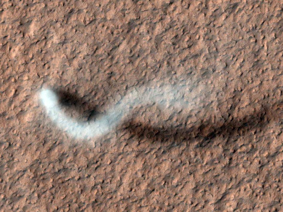
image by NASA/JPL-Caltech/Univ. of Arizona (source)
^ A Martian dust devil! This image is about 600 meters across; the dust devil was estimated to have been 30 meters in diameter and 800 meters high. The background surface here looks almost like a tiling texture, doesn't it? Ooh caught you, NASA! Juuuust kidding. :P
Gonna do my big ink comparison testing this weekend! This should be interesting. Detailed ink blots next week!
|
·····
|
| |
| A* art shows in May & June; Martian elephant | Apr 20, 2012 11:29 AM PDT | url |
| | |
Added 1 new A* page:My work will be shown at the delicious chocolate/coffee/tea shop Chocolat Vitale in Seattle's Phinney neighborhood in May and June.

May is a group show, with the opening on Friday, May the 11th, from 6-9 pm. I'll have two framed prints of my digital work in the show; it sounds like they'll have a lot of artists, so the opening should be quite a party!
Then the following month I have the place all to myself, and will try to fill it up with both digital and traditional work. This solo show opens on Friday, June 8th, from 6-9 pm.
Stop by and say hi, check out my art and their chocolate (man, it's good).
~~~~~~~
An elephant on Mars? When pigs fly! But some clever analysts monitoring photos taken by the Mars Reconnaissance Oribiter found a lava flow with a definite pachydermal appearance, at least from orbit:
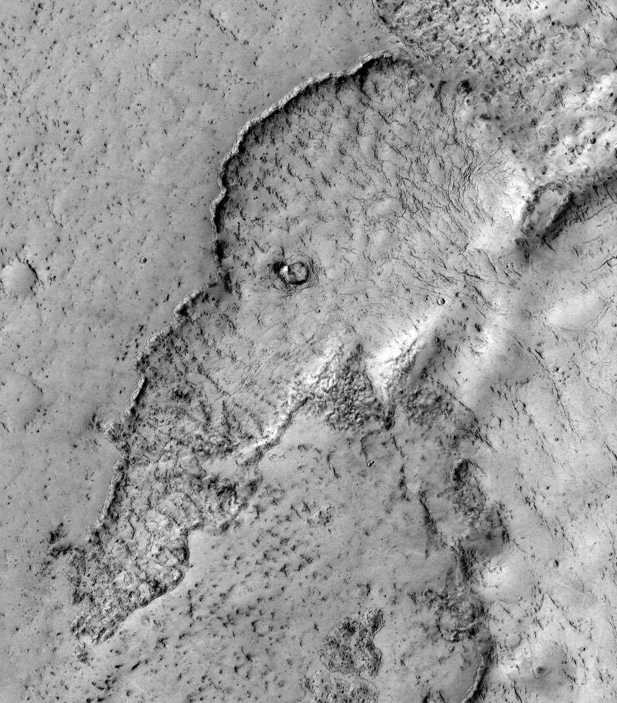
image by NASA/JPL-Caltech/Univ. of Arizona (source)
This Yahoo! blog thing where I found the image link says the lava flow is no more than 100 million years old, which is pretty recent in planetary terms. Lava flow and elephants graze no more on the red planet, but at least we have this natural formation to hatch conspiracy theories about now.
(That blog article mistakenly calls the "Mars Reconnaissance Orbiter" the "Mars Reconnaissance Rover." :P)
|
·····
|
| |
| Universal scale again; art (very) roughs | Apr 19, 2012 9:30 AM PDT | url |
| | |
Added 1 new A* page:You've probably seen at least one of those online scale demonstrations, where you zoom from human size to very small or very big. Well, a new one this year is (warning: Flash required, music auto-plays after clicking "Start") The Scale of the Universe 2; it isn't radically different from all the others, but it's probably the slickest implementation I've seen so far, and there are a good deal of interesting nebulae and things in there to size up; no supermassive black hole event horizons as far as I've noticed, but you can see that a neutron star--which is kind of what you get if you're just sub-massive enough to miss out on collapsing into a black hole--would just about fit in the state of Rhode Island--although Rhode Island might be a bit worse for wear afterwards.
Thanks to my dad for the link! :)
~~~~~
Some marker concept sketches I started with today for this barkeeper character:
And the first black ink pass on today's page:
Yeesh! Fortunately his face didn't have to stick that way, thanks to the miracle of white ink. Whew!
|
·····
|
| |
| Enceladus & star flybys, Black Hole pinball | Apr 18, 2012 1:21 PM PDT | url |
| | |
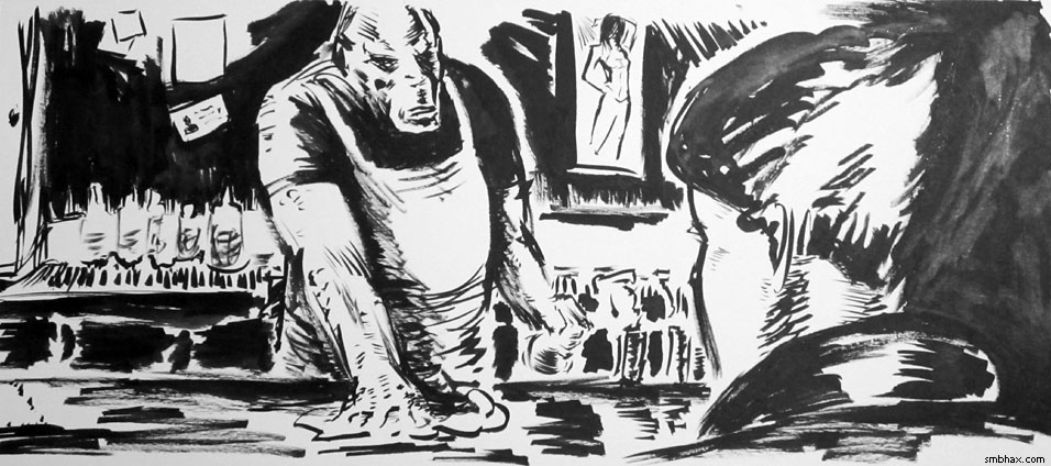
Added 1 new A* page:Another page, another planetoid! I keep wanting to do one that's, well, not spherical or elliptical, but having done some "research" around Wikipedia today, I think I've finally managed to convince myself that gravity more or less make that impossible--at least if you want to have something large enough to have gravity that holds people to the floor, which I do in this case.
So it had to be roundish. But I still wanted to distinguish its presentation visually in some way from the other similar roundish bleak planetoid thingies I've done in the past. I was looking up some photos of pretty much my favorite moon, Enceladus, and noticed something (this is a cropped repost of part of a set I posted ages ago on the forum):
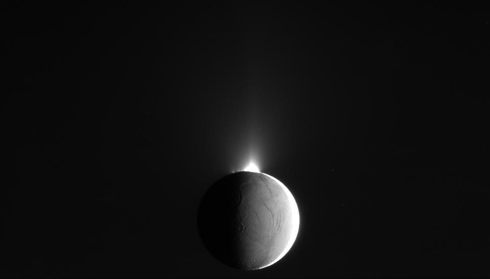
image by NASA (source)
Atmosphere! Actually it's clouds of ice crystals ejected from the moon's cryovolcanoes that now form a faint, thin ring among the many other rings around Saturn. I wanted to do an icy world anyway so I thought I'd go with that nifty space atmosphere look. Wikipedia's page on cryovolcanism says the instances we think we know of cryovolcanoes are thought to get their energy from tidal friction, which is to say the mechanical stress induced on cryovolcanic moons by the gravity of their parent planet slinging them around--and I'm not sure that I want this particular planetoid here being a moon, *but* Wikipedia's page does leave hope for other mechanisms causing cryovolcanism: theoretically they could be powered by radioactive decay, or even a "sub-surface greenhouse effect" enabled by "translucent deposits of frozen materials."
Anyway, back to Enceladus. Here's a nice mosaic image looking south from its north polar region that gave me the idea for the lighting on today's A* planetoid (although I somehow got it exactly backwards in the initial stages but nevermind :p):
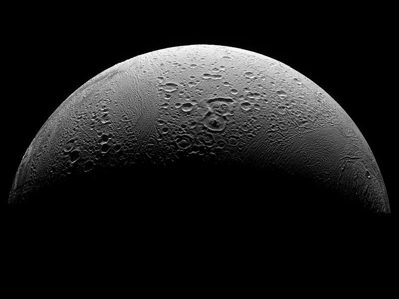
image NASA/JPL/Space Science Institute (source)
The three photos used in that image, like pretty much all the decent photos of Enceladus, came from the Cassini probe--a 2008 fly-by, in this case. But Cassini's still going, and in fact just did another flyby of Enceladus, passing within 46 miles of the surface a few days ago, on April 14th--it flew through some of the geysers of ice crystals shooting out of the moon's "tiger stripe" surface fractures. A fresh photo from that flyby helped give me the idea for showing a planetoid in nearly pitch-black aspect:
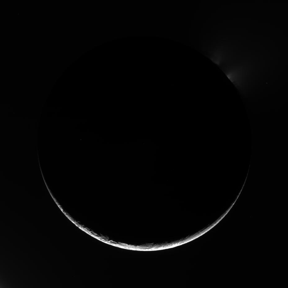
image by NASA/JPL/Space Science Institute (source)
~~~~~~~~~
I posted a few early stages of today's page to A*'s Twitter, Facebook, and G+ accounts as I was making them earlier today. Here they are and some later ones I haven't posted before now because they were causing me some consternation:
I probably should have stopped with this nice energetic initial outlay of black:
Or after the first ink wash to establish the "space atmosphere" effect:
But I decided that was too bright still--I made this mockup in Photoshop from that ^ scan to convince myself going darker would be closer to what I wanted:
So after a bunch of washes and star spattering (had to use my old non-waterproof white ink for that--the gluey waterproof stuff tends to spatter in strands) and re-painting over the planet with straight waterproof ink which I figured would a) make it extra black and b) give it a bit of maybe ice-like texture from the shine using non-watered-down waterproof ink gives--the gleam of all that lacquer, you know, I had...a blurry, warped, wavy looking planet :P:
That was no good, so I tried dulling the gleam and straightening out the planetoid's profile with black marker, as well as sharpening up the horizon with a thin wash of the non-waterproof white ink:
...which rather backfired, as I now had a super-dark planetoid full of marker-line gleams, and even less round than it had been. So I went back over it with watered-down black ink to kill the gleam, and, after using a Photoshop mockup with a computer-drawn circular overlay to show me where the not-so-round parts were sticking out (as I'd noticed was a side benefit from my earlier computer mockup), touched up the edges some more with marker and white ink wash, and finally white waterproof ink when I wasn't satisfied with the sliver of sunlit area I'd whittled it down to. And then wet down the back and squished it under heavy stuff on the scanner glass for a while until it decided to scan with a reasonably even black on the planetoid--which finally worked after some persuading, thank goodness. (Note to self: this is why you need to do that ink round-up and see if you can't find yourself a nice, really dark matte black ink. :P)
And that's just how simple it was to get the final version! :P
Good gravy I am bad at drawing round things that don't fit the sweep of my elbow or wrist. ;P I should smarten up and just use a protractor or jar lid or something, I suppose--but then what would I do with myself for the rest of the evening? :PP
This was also an interesting one in that I usually use Photoshop's "Auto Levels" function at default setting in my macro to recalibrate the scanned image to cover the full gamut from true computer black (ie RGB 0, 0, 0) to full white (RGB 255, 255, 255), so it doesn't look washed out just as a result of the scanner's lighting and capture ability, but doing that on this one made it come out way too contrasty--turns out Auto Levels' 0.5% black and white clip values (in my ancient 4.0 version of Photoshop, in the Auto Levels window, I have to hold "Alt" to change the "Auto" button to an "Options" button to see/change the clip settings--I didn't discover that until a month or so ago and have kind of been wondering about it ever since) were totally clipping past the stars and light part of the planet here, so the light end as a result was being boosted way too much, since it tried to make a full white out of probably some of the grayish atmospheric stuff around the planetoid. Checking in the significantly less ancient Photoshop CS2, the default clip values there appear to be 0.1%, which doesn't stomp the far ends of the value gradients nearly as much, so I guess I'd better use that in Photoshop 4.0 instead of 0.5% like I had been (which I *think* was the default, although I suppose I can't be sure since there's no way to reset it to the default, at least not within the program :P); the difference is scarcely visible in most of my pages, but for ones like this one (okay so this is the only one I've noticed it really needing tweaking on so far) where there are very few pixels at one end of the spectrum, it certainly makes a big difference. So! That...is good to know, and now my beloved ancient version of Photoshop is riiiiiight up to speed >_> and I can do more subtle shading.
~~~~~~
A neat Christian Science Monitor article at abcnews.com on supermassive black holes was shared with me on Facebook. Thanks, Dave! The article describes a theory of what supermassive black holes feed on, and where "hypervelocity" stars zooming out of our galaxy get their high speed--about 20 have been spotted since 2005--and these were predicted by Los Alamos astrophysicist Jack Hills back in 1988, who said that the tell-tale sign of a central supermassive black hole in our galaxy would be lone stars catapulting outward faster than 1 million miles per hour (light speed is about 671 million miles per hour, by the way).
The idea is that when binary stars fall too close to the supermassive black hole--and because they orbit each other at quite a distance, they only have to fall within about one Astronomical Unit (the distance from the Earth to the Sun, about 93 million miles) of A*, whereas a lone star would have to get as close as the distance between the Sun and Mercury, which is close to just a third of one AU--one of the pair gets stripped off by the hole's huge gravity, and flung outward at high speed. The other is pulled into a cloud of similar stellar "orphans" orbiting the hole; eventually, that cloud is disrupted when one star too many drifts in, and their own resulting gravitational interactions eventually result in one of their number plunging down into the supermassive black hole, which releases a mighty energy flare as the doomed orphan star is consumed. Such flares, "a so-called tidal disruption event," have been seen in the cores of other galaxies, and based on that, it is calculated that A* might eat a star and send out a flare "once every 1,000 to 100,000 years" (which seems like a rather wide range, but hey).
The new research behind this article had to do, I think, with calculations of just how much mass the black hole could expect to gain from this binary-eating mechanism: "it could explain how black holes in some of the largest elliptical galaxies, with central black holes of several billion solar masses, can bulk up when the galaxies they inhabit have so little gas to feed on." The researchers hope to refine their estimates as more sensitive telescopes let them spot more escaping stars.
(Nearly a couple years ago now, I made a news post about a similar theory--this one seeking to account for the existence of blue hypergiants flinging out of the galaxy, since their trip from the galactic center must have taken something like 100 million years, and blue hypergiants only live about 20 million years: the idea was that they actually come from trinary stars that drift too close to A*: A* pulls off one, violently flinging off the remaining binary, and then the two stars in that binary merge to form the hypergiant on their way out of the galaxy.)
~~~~~
Stretching the black hole topic even further, I've been playing a re-creation of a mid-80's Gottlieb pinball table, "Black Hole," in a new pinball game collection called "The Pinball Arcade"; it's available on all sorts of portable and otherwise systems--I've got the PS3 version. "Black Hole" was the first pinball table to cost a super-massive 50 cents--and as a result, it was the most profitable of all time, or something like that. These black holes, they're relentless I tell ya!
When you start a game on the Black Hole table, a computery voice ominously declares "NO ONE ESCAPES THE BLACK HOLE." The big gimmick is that you can get swallowed down into a small, reversed pinball table revealed beneath the glass floor of the main table; and that table is really tricky, so basically you want to get out as soon as you open the "gate" that will allow your safe "re-entry" to the main table. It's really scientific! Anyway here's a demonstration play by the game's creators, although it skips the start-up voice, alas:
video on Youtube
I'd like to think that if Gottlieb was still around, they'd release a "Supermassive Black Hole" follow-up, that would cost...eh...4 million times the mass of a regular table rather than just two times...where's my calculator...$1,000,000 per play! Ka-ching!
|
·····
|
| |
| Checkpoint interview; nebula Sharpless 2-106 | Apr 17, 2012 8:36 AM PDT | url |
| | |
Added 1 new A* page:Checkpoint Interviews just posted an interview with me about A*, in which we talk about the origins of the comic and why it is the way it is now and so forth. Thanks for the interview, Checkpoint!
~~~~~~~
The Hubble Space Telescope Google+ account posted a pretty gorgeous photo of the nebula Sharpless 2-106 over the weekend:
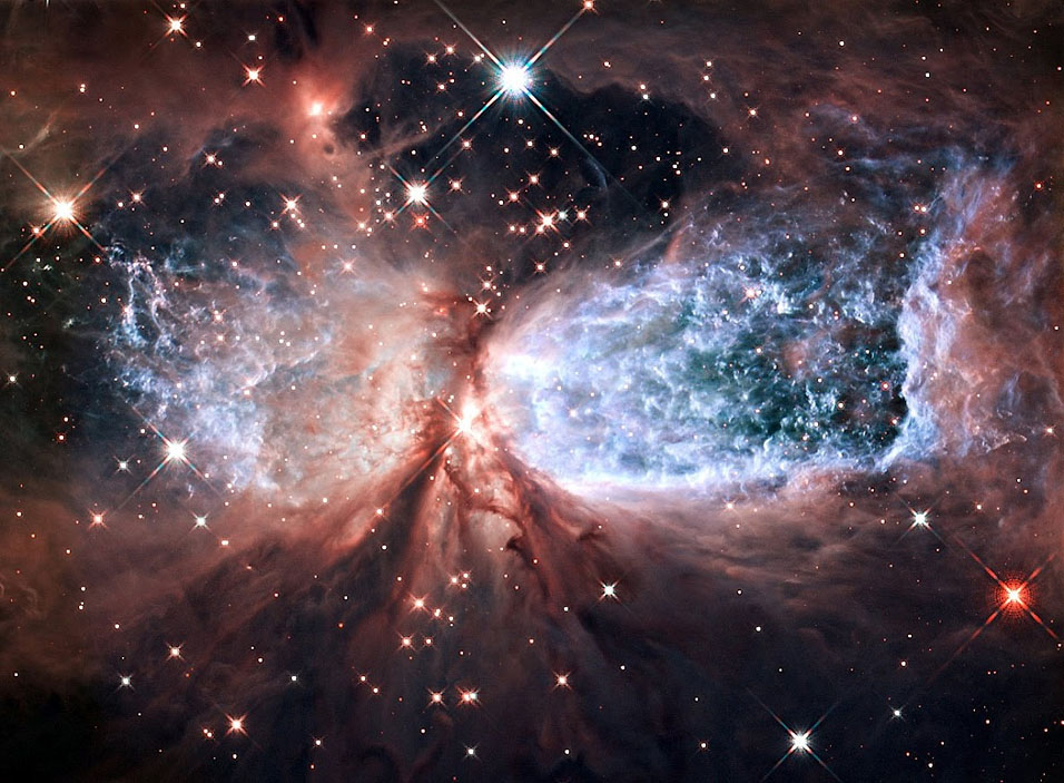
image by NASA, ESA, and the Hubble Heritage Team (STScI/AURA) (source)
I can't find an entry for this nebula on Wikipedia, so all I know about the nebula comes from that G+ post: it's several light years long, 2,000 light years away, and being blown out into that "angel wings" shape by a large young central star, IRS 4 ("Infrared Source 4"). Infrared studies of the cloud have found it to be home to over 600 brown dwarfs--proto stars less than a 10th the size of the Sun: too small to sustain nuclear fusion. The photo is a combination of visible spectrum (the bluish hydrogen emissions from the central star) and near-infrared (the reddish gas and dust around it) filters on Hubble's Wide Field Camera 3.
~~~~~~~
Boring internet trivia related to the above photo:
- Hubble's G+ post also links to the entry for the photo and article on hubblesite.org, but for some reason the versions of the photo there, though available in much higher resolution, are way blurrier. I guess the Hubble folks are saving the best for G+? :P
- Sharing posts found on G+ is way more of a pain than it should be. Especially if you're using a page profile (my A* G+ page profile, in this case), when you use the little "link to this post" menu item to get a URL for a post you see on G+, it tends to give you a URL that...only you can see--for other people, it just goes to your profile. Not all that useful, G+. ;P
It was pointed out to me that I can get a sharable URL for a post by reposting it (although I can't repost my own posts, so to link to one of them I have to go view it from a different profile ;P); I had done that with the Hubble Sharpless 2-106 post, but doing that also strips out the identity of the person you follow who had actually shared the post with you, which is not really cool. Credit where credit is due, G+! :P Anyway sometimes people are a little taken aback if they see their name pop up in the blog, so to be on the safe side I'll just link to the sharer's profile. Thank you, sir!
|
·····
|
| |
| Supermassive asteroids (sorta); Yuri's Night | Apr 14, 2012 8:15 AM PDT | url |
| | |
Added 1 new A* page:Hey, it's a name! I didn't have it in this conversation at first, but then I came up with what I thought was a dandy name for him, and wanted to get it out there (it's so much easier to talk about a character if they have a name, after all), so I rather tacked it on to Selenis' line here. Ah, dirty tricks!
~~~~~
I'm not sure how old it is, since NASA's image feature page doesn't have a date on it, but this artist's rendering of an asteroid field around supermassive black hole Sgr A* at the center of the Milky Way was their "Image of the Day" at some point. It seems to me the asteroids are way larger than actual scale, but I guess that was to make them easier to see. The reddish color of the gas and dust around the event horizon would be due to everything being redshifted as it is sucked away faster and faster into the black hole--until it reaches the even horizon, of course, at which point not even photons can scatter back to show us what's going on; although this rendering doesn't appear to be attempting to incorporate phenomena such as gravitational lensing or other crazy effects that could very well be showing up in such unimaginably extreme conditions:
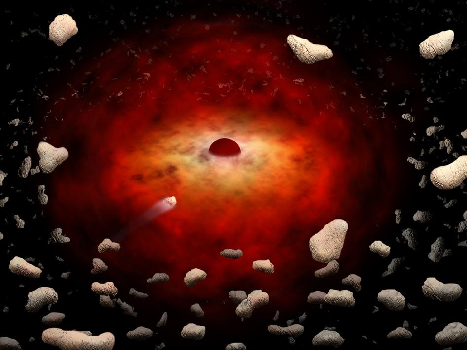
The accompanying text is pretty interesting--it's actually pretty hard to find any clear descriptive text on the internet about the hot space in the near vicinity of our galaxy's central supermassive black hole, but this is a decent chunk:
| A new study provides a possible explanation of mysterious X-ray flares detected by the Chandra X-ray Observatory for several years in the region of Sagittarius A*, or Sgr A*. The study suggests a cloud around Sgr A*, a supermassive black hole at the center of our Milky Way Galaxy, which contains hundreds of trillions of asteroids and comets that have been stripped from their parent stars. The flares occur when asteroids of six miles or larger in radius are consumed by the black hole. An asteroid that undergoes a close encounter with another object, such as a star or planet, can be thrown into an orbit headed towards Sgr A*. If the asteroid passes within about 100 million miles of the black hole, roughly the distance between the Earth and the sun, it is torn into pieces by the tidal forces from the black hole. These fragments would then be vaporized by friction as they pass through the hot, thin gas flowing onto Sgr A*, similar to a meteor heating up and glowing as it falls through Earth's atmosphere. A flare is produced and eventually the remains of the asteroid are swallowed by the black hole. |
~~~~~~
Oh yeah, and I was just informed by someone more alert than I that yesterday, April 12th, was "Yuri's Night"; since I know nothing about this I'm just gonna roll in some Wikipedia:
| Yuri's Night is an international celebration held on April 12 every year to commemorate space exploration milestones. The event is named for the first human to launch into space, Yuri Gagarin, who flew the Vostok 1 spaceship on April 12, 1961. In 2004, people celebrated Yuri's Night in 34 countries in over 75 individual events. Locations have included Los Angeles, Stockholm, Antarctica, the San Francisco Bay Area, Tel Aviv, Tokyo, and the International Space Station. |

image by Jcranfordteague (source)
So there we go! Not that I'll remember this next year or anything, although last year I did manage to mention several times, more and more belatedly, that it had been the 50th anniversary of Gagarin's flight. But if you want to be more responsible than me you can keep tabs on this stuff on the Yuri's Night site, yurisnight.net.
|
·····
|
| |
| High on Deleter White #2 | Apr 13, 2012 7:28 AM PDT | url |
| | |
Added 1 new A* page:Today's page features a new white ink! And uh hopefully you can't tell the difference. ;) There's definitely a big difference when using it, though! It's Deleter White #2, which you can get from Deleter's "Manga Shop" right here. An honest to goodness waterproof white ink! Man! Now instead of getting a muddled mess when trying to go in with black back over white, the ink just...stays on the page where I put it. :) For instance, in this page I went back and forth over Selenis' left shoulder a few times, and did a wash over some white ink running down the edge of her face, and they both stayed crisp. This is AWESOME okay? :D
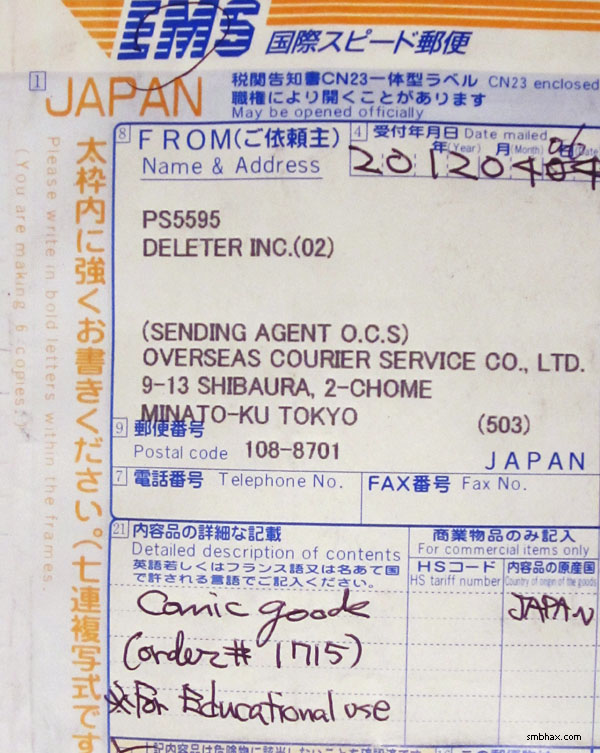
Deleter is a Japanese company and they have some curious ways about them; for instance, on the shipping label, which spent several days in US Customs, they claimed the contents were "comic goode" (which is pretty accurate, actually), "for educational use":
Hm. Is A* educational? Have you learned anything from it? Well gosh, maybe they're right, and didn't just put that there to get some kind of easier/cheaper shipping. What do I know? I'm just an educator, apparently. :P (Dad will be so proud!)
Deleter definitely carries comic goods, though; aside from black and white ink for brush work (I also ordered two of their waterproof black inks, #3 (matte) and #4 (extra dark); I'll have to get my big black pigment ink review done some time soon...eh after that black pigment *pen* review I keep promising...), they also sell their own brand of dip pen nibs, several lines of alcohol and water-based markers (the NeoPiko-2 line in particular seems to be going after the same many-colored comic coloring clientele as the perhaps better known Copic markers), several types of comic paper, and a vast library of stick-on screen tones for adding pizazz to manga-style black-and-white comics. They even threw some small samples of a handful of those in with my order, along with a ton of little catalogues and brochures:
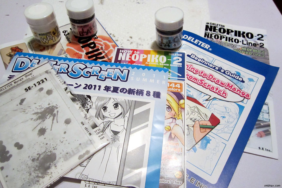
Jeez, the freebies there dwarf the three little 30 ml (~1 ounce) plastic jars of ink that I actually ordered. I imagine the tone sheets are at least somewhat similar to the "Zip-A-Tone" or whatever is/was sold in the West to achieve similar shading effects in black and white print comics--but these Deleter sheets are the only tone sheets I've ever actually seen in person; they're patterns of black dots, in all kinds of configurations from simple solid grays to pretty ornate things like flames or whatnot that could pretty much make a comic page all on their own. The included guide on how to draw manga shows that what you do with them is lay them over the thing you want to gray-up, cut them to shape slightly larger than needed--with a "box cutter" :o--then remove the adhesive backing, stick them onto the page, and cut away the over-sized edges you left; the guide warns not to cut into the paper while you're doing all that razor work on your page, but...I dunno, that sounds easier said than done. The guide also says to use their dip pen nibs for drawing lines and such though, and metal nibs like that (I haven't used theirs) chew up paper pretty good on their own, so maybe actual razor cuts in addition aren't considered a big deal, I dunno.
So anyway, that white ink. It has a smooth, mellow consistency and pretty darn good opacity--at least as good as the non-waterproof Dr. Ph. Martin's "Bleed Proof White" that I've been using. But the Bleed Proof White would dry into this crusty stuff (particularly inside the jar, which is particularly aggravating) that left little white grains flaking over everything (I always had to edit a few out from my scanned pages in Photoshop--they're tiny and get EVERYWHERE); the Deleter White #2, on the other hand, dries a little quicker when laid down thickly, and solidifies into sort of a latexy rubbery state that doesn't flake at all. Nice.
The only down side I've noticed from the Deleter White #2 so far is that it has a distinct, fume-laden odor, something like strong Elmer's glue; I actually got slightly dizzy after I'd been using it for a while with the jar pretty nearly under my nose, and no ventilation going to speak of. Sooo yeah, from now on I'm gonna have the windows open and the jar away from my face when using the stuff. 8P (I suppose glue-sniffing types might consider this all a bonus but I never picked up a taste for it.) HOPEFULLY that will keep the fume effects to a minimum, but I guess I'll wait for a few more days of using it before I make it the official replacement for the Bleed Proof White and order it in bulk--did I mention it's nearly half the price of the Bleed Proof White? Sure, shipping is a little pricey, but that's why you order a bunch of it at once, I suppose.
One final quirk I'll allude to about this order: the invoice features some prominent spelling errors, with one in particular standing out: above the shipping address, instead of "SHIP TO:," it...well, let's just say they used one different letter in "SHIP," inadvertently (one hopes) transforming it into a four-letter word you don't usually find on an art supply invoice!
EDIT:
One thing I should have mentioned about the Deleter White #2 is that, since it dries to a kind of plasticky latexy state, painting back over it it slightly tricky since the ink (in my case) may not adhere to the dried White #2 as easily as it does to the paper around it; for instance, although I did a light wash down the area just to the left of Selenis' cheek in this page, if you look closely you'll see there's still some whiter area there on the outer cheek edge--that's where I had put down some Deleter White #2, and the subsequent ink wash just sort of washed right over without settling on it. Pure ink seemed to stay a lot better, and there were various places around the page where I went back over the dried White #2 with full black ink and it stayed with no problem at all; the one exception was in some heavily built-up ridges of white (me being sloppy :p) on her left shoulder, where I had to go over the highest peaks a second time to get the ink to cover them evenly.
EDIT #2:
Ooh also you can't just let this stuff dry on your brush in a clump and expect to wash it off easily like I used to do with the Bleed Proof White. :o Guess I'll have to get an actual rinse jar for it and stop treating my white brush (which is a bit of a beater--white ink being so thick and all) like such a second-class citizen. :p
|
·····
|
| |
| Supermassive Sketchdump! | Apr 12, 2012 6:03 AM PDT | url |
| | |
Added 1 new A* page:Some of the less hideous sketches I went through in testing and comparing various pens and brushes in recent weeks--my Raphael 8404 brush, a Pentel Pocket Brush, PITT "big brush" and "calligraphy pen" markers, Kuretake Disposable Brush Pen markers, Copic Multiliner markers, and...hm, I think that *might* be about it for these:
I still have a pen round-up I want to do to sort of wrap up my pen phase--now that I seem to be back to just the brush, that is. But just because I haven't ended up using a pen, primarily, doesn't mean it was a total waste of time and money--in fact, I'd have to say that it was pretty successful in helping me move into a new and promising phase, as I probably wouldn't have gotten into the no-pencil-all-brush approach I've been using for the past week and a half if I hadn't gotten a taste for going straight to ink while doodling with all these pens. I've also continued to use a few of the pens for doodles and touch-ups, which they're quite handy at. So! My brush and I thank you, pens.
|
·····
|
| |
| Sweet Edoardo Amaldi ATV retrorocket action | Apr 11, 2012 5:58 AM PDT | url |
| | |
Added 1 new A* page:NASA posted a pretty stellar image of the Edoardo Amaldi ATV (aka "ATV-3") firing its retro-rockets during its automated docking sequence with the International Space Station on March 28th. I discussed these Automated Transfer Vehicles in detail back in August, but essentially they are robotic modules launched into orbit on a rocket; they dock themselves to the ISS, the crew collects the supplies carried inside, then the ATV sits there for months while the crew gradually fills it up with trash, at which point it is released to burn up in the atmosphere. The Edoardo is the third one, named after an Italian physicist of many achievements--he co-founded CERN, for instance. Of the module, Wikipedia says "At the time of its launch, it was the world's largest single operational spacecraft, with a total mass of over 20 tonnes (44,000 lb)." Gear! Anyhoo here's that photo:
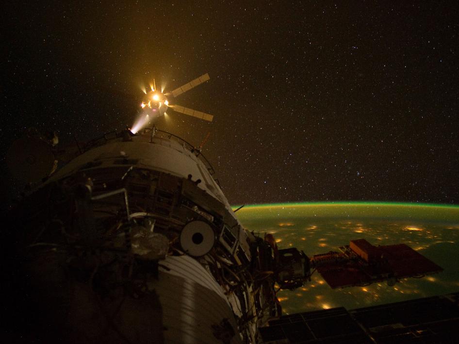
image by NASA (source)
|
·····
|
| |
| Subscription mode progress, floor painting | Apr 10, 2012 6:15 AM PDT | url |
| | |
Added 1 new A* page:On Saturday I finally sat myself down and got in a good day's work on the long-promised A* subscription system; here are some screenshots from development pages that I tweeted over the weekend:
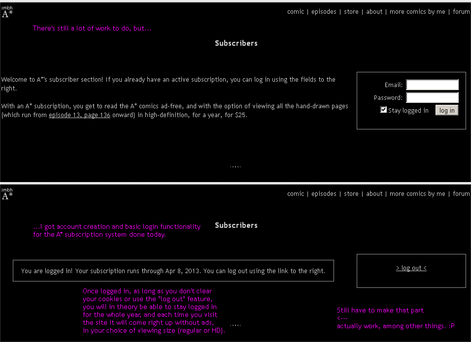
So hopefully I'll be getting some more weekends here to work on the rest of it, and if that happens, then in a month or so it might be ready to roll out. Although I've had the "subscription preview mode" going for a while now (that link in the bottom right corner of the comics), it doesn't save your settings like this one will: with the subscription system, once you've logged in and—optionally—selected HD comic viewing mode, every time you come back to the site, if you haven't cleared your cookies or whatnot—it'll pop right up in subscription mode with your desired comic size, instead of you having to click something first.
~~~~~~~~
Also over the weekend I jumped on the week's new Drawing a Blank sketch challenge, which this week is Mario, the video game plumber. I know drawing popular characters is big on the Internet, but I wasn't sure I wanted to put yet another cartoon Mario into the mix, so I tried a different approach which I wasn't sure I was satisfied with in the end anyway—there's a ink version and a cleaner and extra-soulless digital version; the ink one at least was interesting because I decided to make the "pixels" by carving a two-headed stamp out of an old eraser, which you can see in the upper right corner here:
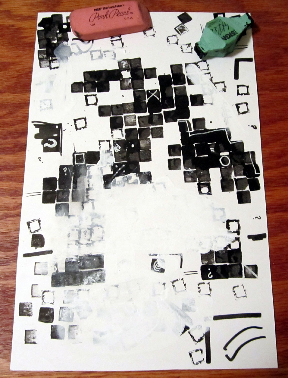
But I still couldn't really get into it; I used my less-favorite Higgins ink, for instance, and didn't even bother scanning it very tidily. Maybe I'm just not that big on drawing other people's copywritten characters, at least not without their permission; I suppose I'll probably avoid such sketch topics in the future. :P
~~~~~~~~
A fussy muscle in my drawing forearm, near the base of the elbow, has been making itself heard of late as I've been trying to draw at my drawing table, and today, as I felt it start to get sore as soon as I sat down and picked up a brush, it occurred to me that painting with a brush is very different, muscularly, than drawing with a pencil or pen, and I've been kind of trying to sit...well actually it's been a sort of halfway position that hasn't been quite pen/pencil sketching mode—forward, leaning on elbows, tight grasp of the drawing tool—or brush painting mode, but rather some mixed-up compromise position that neither is happy with.
I guess an easel wouldn't work well with ink wash—unless I wanted all my washes to head straight down—so I went back to using what I used for the very first few ink sketches I did as tests of the process: just using a board balanced on my legs. I conveniently have one that's just a little larger than the pages I make for A*, and this way I can sit—cross-legged, straight on a chair, whatever—and move the brush across the paper with my arm completely free of encumbrances. So I think that helped get the looser, more fluid brush strokes in today's page, which seemed to come out with unaccustomed fluency. Afterwards my shoulder was tired from holding my arm up all on its own, but I think I may have been tensing it a bit more than I needed to—still expecting a high desk support, maybe—instead of relaxing it. So hopefully that's something that can be worked out with a little practice.
And actually what in a way worked even better was when I moved to putting on some washes, and just put the board and page down on the floor, and worked on it in a variety of sitting or crouching positions; I've been thinking about trying that since I saw a movie of a local artist painting that way last week, and I thought it might be tough on the back or who knows what else, but actually—and my back has been sore the past few days, in fact, after I spent what felt like all of the non-working parts of the weekend out and about sitting in awful seats ;P—being able to work from a variety of positions was quite refreshing, and getting up from work afterwards, I'll be darned if I didn't feel raring to go. So maybe there's something to that! And if I end up not using my drawing table much, it's a folding model, so I can just pack it up and like double the free space in my little apartment. :D
See how much fun working from home can be?
~~~~~~
Some time ago now I posted about Saturn's two-tone, "walnut-shaped" moon Iapetus, one of the most unique moons in our solar system; its "walnut" shape comes in part from a 20-km-high ridge running all the way around the moon!
A new space.com article describes a new theory of how the moon-ringing ridge could have formed:
Now investigators suggest this ridge could be the remains of a dead moon. Their model proposes that a giant impact blasted chunks of debris off Iapetus at the tail end of the planetary growth period more than 4.5 billion years ago. This rubble could have coalesced around Iapetus, making it a "sub-satellite," a moon of a moon.
Under this scenario, the gravitational pull Iapetus exerted on this sub-satellite eventually tore it back into pieces, forming an orbiting ring of debris around the moon. Matter from this debris ring then rained down, building the ridge Iapetus now sports along its equator fairly quickly, "probably on a scale of centuries," Dombard said.
The researchers suggest that, of all the planets and moons in our solar system, only Iapetus has this kind of ridge because of its unique orbit so far away from Saturn. This made it easier to have a moon of its own if Iapetus was closer in, Saturn might have tugged Iapetus' moon away, Dombard said. |
|
·····
|
| |
| Supermassive Selenite: Naica Giant Crystals | Apr 07, 2012 4:55 AM PDT | url |
| | |
Added 1 new A* page:Jason of the pretty far-out sci-fi webcomic Carpe Chaos is an A* reader, and has been kind enough to give A* a little advertising space on the Carpe Chaos site. Thanks, Jason!
~~~~~~
Yesterday I was talking about art "crystallizing" and freezing a moment in time. Well, little did I realize that there's a crystalline mineral called selenite, which comes from the Greek for "moonstone," and shares the same "moon" root as the name of our outer-space anti-heroine, Selenis. Selenite, which is one form of the mineral gypsum, can grow into crystals that are quite long and gorgeously transparent, like this 23 cm (9 inch) example
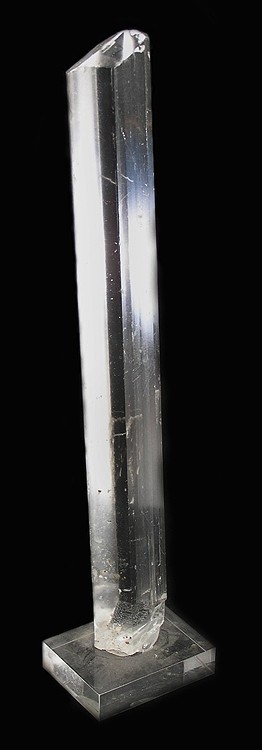
image by Rob Lavinsky, iRocks.com CC-BY-SA-3.0 (source)
and those "swords" of selenite crystal may grow in clusters, like so
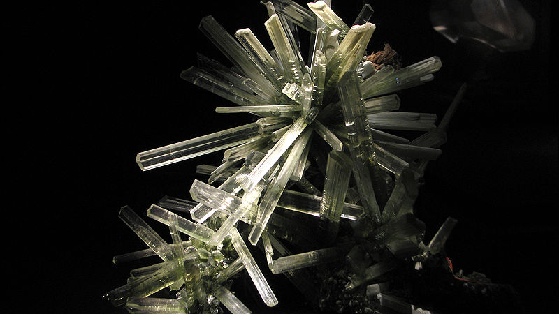
image by mockbird (source)
Both of those samples come from the Naica cave complex in Mexico. In 1910, miners there discovered the "Cave of Swords," 120 m below the surface, with many such crystals. But that was really just the tip of the selenite berg--because ninety years later, in 2000, extensive mine expansion that pumped out huge quantities of the 50 degree Celsius (122 degrees Fahrenheit) water filling reaches of the mine much deeper, around 300 meters down, discovered the previously flooded, football field-sized Cave of Crystals, containing selenite crystals that had grown, in remarkably stable scalding water above a magma chamber over the course of 500,000 years, into mammoth jewels stretching up to 11 meters (36 feet) in length!
video on Youtube
This really awfully overdramatic Discovery channel documentary on some scientific investigations in the cave mentions that the crystals are hot to the touch, and soft, "like fingernails." Ew! Even with massive pumps keeping the hot water out, the cave is still just as hot and humid as can be, meaning that anyone entering has to wear a respirator and cooling suit (they've been using these bulky suits lined with mesh pockets holding ice cubes--no joke!) in order to avoid succumbing to the sweltering conditions within minutes.
Anyway it's pretty neat. Apparently it is thought that the cave will eventually be allowed to fill back up so the crystals can get back to doing their slow, hot work. Go, selenite!
~~~~~
Oh yeah, here's an early stage in the painting of today's page--energetic but rough! I ended up using quite a bit of white (and black!) ink on this one:
But hopefully if I keep this up and get more practice, I'll get to the point where I don't have to do a whole lot of editing to get the initial vigorous work presentable, and energy and spontaneity will go hand in hand with legibility! =o
|
·····
|
| |
| Blame it on Frank Miller | Apr 06, 2012 1:06 AM PDT | url |
| | |
Added 1 new A* page:^ I blame this one on Frank Miller. Although he has had some pretty hefty PR problems in recent years, before going to Hollywood and Crazy Town, Miller made some really good comics, particularly if you like gritty, high contrast stuff. Today for some reason I got it in my head to see if there were any interviews with him about comics on YouTube, and of course there are! So I compiled some of the more useful ones—where he's actually talking about comics and his thinking that went into them and so forth—into this here playlist; the first interview in particular shows some good examples of his black and white work, the second is I think from earlier days before he went into film, and they both contain some pretty good quotes, like "I don't think there's such a thing as a mistake in art" (or something like that, I'm paraphrasing :P).
https://www.youtube.com/watch?v=a3veX7NgKTM
[Edit 5/26/18 - looks like two of the three videos I originally had in that list are no longer on YouTube : P]
And after thinking about some of his art and why I didn't really like the art in yesterday's A* page—I mean, it wasn't full of horrible mistakes, but it also just felt a bit too ordinary—I realized that since I've been working in traditional art materials, I've sometimes been lured into trying to illustrate too much. Like, the previous two pages have been establishing shots, but in yesterday's I put in this big black void around the characters, then felt I had to fill it with little details; you'll also notice, if you look at the photos of the earlier stages that I posted yesterday, that at one point I had way more little brush strokes and light and shading in Selenis' clothing—but then I scanned it in and looked at it on the screen and realized all that detail was just distracting, so I blacked it out with a fuzzy old marker, and I think that helped de-clutter that page *a little*. But it still felt flat and lacking in dynamism, and it occurred to me that, well, if that's what I want, I don't necessarily have to illustrate everything around it, in fact maybe I *don't* want to illustrate everything around it, because the more you do that the more it has the effect of crystallizing the moment and making it feel absolutely frozen in time.
Or something like that, I dunno. As usual I'll probably change my mind tomorrow. :o
|
·····
|
| |
| Pilot Parallel Pen practice and pictures | Apr 05, 2012 9:12 AM PDT | url |
| | |
Added 1 new A* page:My Pilot Parallel Calligraphy Pen came today! These are inexpensive light plastic pens with tapering, hollow barrels and a unique nib consisting of two flat metal plates laying one on top of the other; ink flows between the plates, and you can use their edges to make wide lines--or narrow, if you use the eh side edge. As the name implies, these pens are mostly intended for calligraphy, but I since I've taken a shine to PITT Calligraphy markers lately, I thought I'd the PPP a try to see if it could be useful for A*. (Incidentally, the name is written "Para//el" on the packaging.)
Here it is--I got the 6 mm-wide nib model--broken down into its pieces! It disassembles quite easily for cleaning--it even comes with a little pump you insert where the ink cartridge would usually go, that lets you flush old ink of the feed very easily--and then snaps right back together:
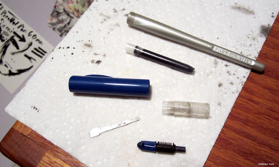
I wasn't gonna use the included cartridge of non-waterproof ink, though! 'Cause I saw on the internet, like here, several people talking about successfully using the PPP with other inks, simply by leaving out the cartridge and instead filling the whole barrel, which is hollow and seemingly airtight, with the ink of their choice.
So I filled mine with the waterproof sumi ink I use for A*! It's a much thicker ink than the stuff the pen comes with, and I had to shake it upside-down for a minute or so to get the ink to work its way through the feed to the nib (did this with the screw-cap on just in case the ink decided to start jetting out), but then it did indeed start flowing when the nib was pressed onto the paper. Here's the rather massacred test sheet I made with the pen:
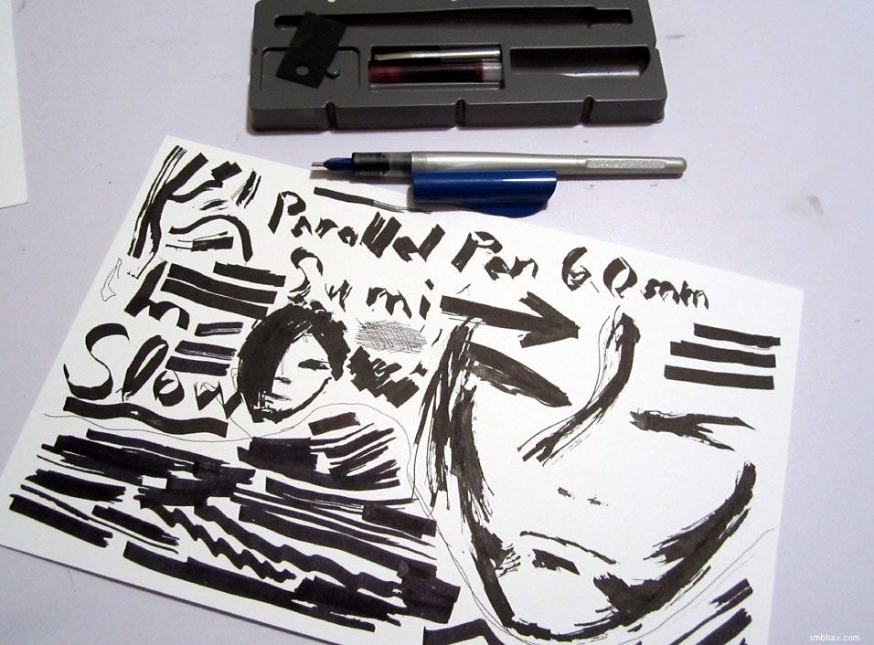
Eesh! Well, I found that, especially with the thicker sumi ink, the ink wouldn't quite come out smooth and even unless I was very careful to go slowly and keep the nib's leading edge very flat against the paper. I've never really done calligraphy, and I imagine that's a basic skill for that discipline, but it's one that I haven't developed and...well, am too impatient to really try bothering with. ;) So the output was pretty spotty.
I cleaned the pen thoroughly and tried it at the bottom of the page with the included ink cartridge, and--after a bit of additional flossing using the included plastic sheet that extracts paper fibers and such from between the plates of the nib--found that it was a little easier to make solid lines with, thanks to its more fluid nature, but even with it I could still get spotty lines quite easily if I moved the pen too quickly, or didn't keep pressure applied very evenly across its leading edge. Admittedly this is due in large part to my lack of training and patience, as some people can produce nice unbroken lines when drawing with it.
I suspect that the narrower nibs--there are three, going as small as 1.5 mm across--probably flow a little more readily and are easier to keep even on the page. I'm not going to bother trying one, though, because I found the nib also chews into the surface of the paper something fierce, especially when you're going over a spot that's already had some ink on it, which I do constantly while drawing. In fact in the above photo you can see some of the chewed-up parts, because their broken surface reflects less light so they look darker: look for the dark patches in the middle of the cheekbone shadows, and in the middle of the black bang of the smaller head--those areas are torn up a bit. Drawing with the corners of the nib for a thin line is at least as rough on the paper as a standard metal drawing nib, but even drawing with the flat edge will start to gouge the paper, because instead of the edge being perfectly smooth, it consists of a series of small square teeth.
So! The Parallel Pen is an interesting tool, very affordable to mess around with, and surprisingly flexible in terms of what ink it can use--but it doesn't really suit my drawing style.
~~~~~
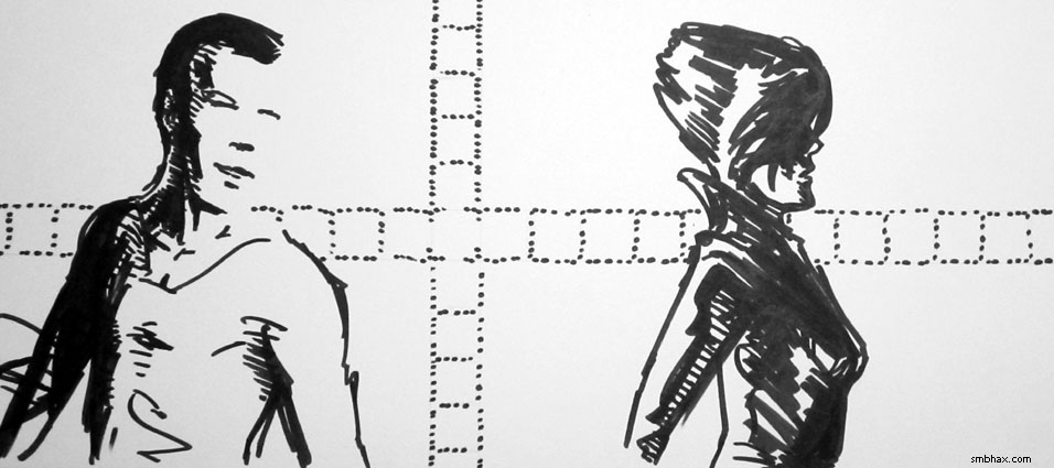
Here are a few early stages of drawing for today's page--I'm still on my no pencil / straight to ink kick, and I've found that you don't even really have to worry much about getting all the details right on the first go: just get the basic layout, poses and proportions down, and then come back in later with black fill or white ink and work in the details; for instance, here you can see that the profile of the face isn't really there yet, and the shoulders are too wide--and heck, the bottle isn't even very straight:
But it would be okay eventually. Yay for white ink! =)
|
·····
|
| |
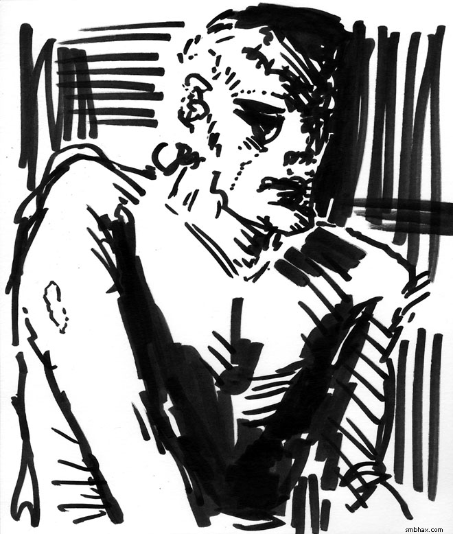
| A pretty decent drawing happens somehow :o | Apr 04, 2012 10:23 AM PDT | url |
| | |
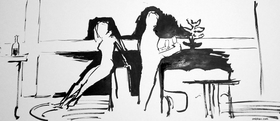
Added 1 new A* page:Man, I don't... So apparently if I stay up all night trying to paint or draw something, finally at the desperate end some sort of miracle will occur and the image is salvaged. THIS time--having decided to go with all brush today, since yesterday I was all big marker and got sort of frustrated with its lack of precision--but I did skip pencil again today, and just went straight to ink--I just could not seem to get the guy in the background (no we don't know his name just yet) to come out right; he somehow came out pretty well in marker yesterday, and maybe I was trying to duplicate that too much or something--duplication almost never works for me, which will tell you something about my general lack of proper artistic discipline :p--but anyway I couldn't even seem to get the rough proportion of his head and face to match his body, much less get his face to match the facial characteristics I wanted it to have (the more I worked it, the more he would end up looking like eh generic clean cut young dude). Here are a couple earlier stages, before I finished everything else and really sat down to get him right, and you can already see maybe that things weren't set up very well for his face:
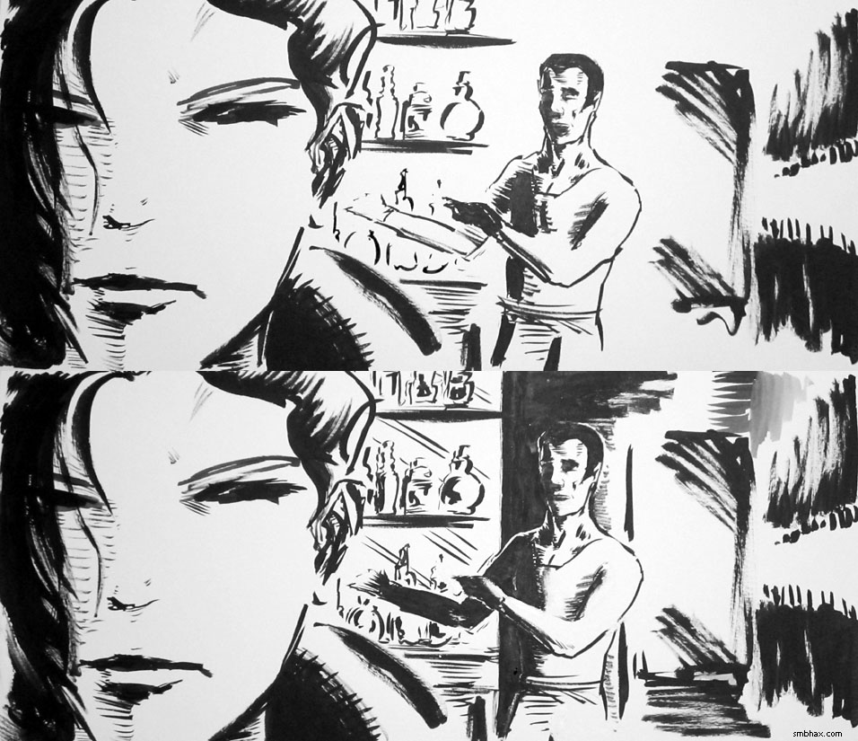
(^ Have you noticed I seem to paint bottles on walls a lot? Strange.)
I ended up blotting it out with white ink and repainting it...um...a lot of times. Finally it built up too much and I had to just sort of scrape/rub it off and start back fresh; this works because the white ink I use is not waterproof, so wetting it will always lift it off. It was kind of interesting to do that because it revealed the original face or two at the bottom; I was also rather surprised the paper was holding up as well as it did under all this abuse--only a few little tippy top layer flakes came off even with all that scrubbing and repainting.
So I did start over from the bottom a few times, and his face still refused to come out. Finally--and I was getting tired of the black mushing into the white beneath it--I decided I might as well try blotting the face out with black ink, then drawing it in white ink--generally the opposite of how one works with ink on white paper, where you put black ink on the white paper to create the forms. I always did think that going from black to white with the old Lasso Tool I used when drawing A* digitally--although I didn't usually do it in that order--could give a perhaps stronger sense of lighting, if pulled off correctly, since when adding white you're sort of "painting with light," as it were. Anyway I can't even really remember if I got it all covered over in black, because really the next thing I can remember, the deeply shaded, very individual face you see--touched up and brought out a bit more--in the final page was there staring back at me.
(Who does this look like? I know it looks like some eh actor or entertainer or something, but I just can't quite place it. I had been looking at a photo of Harry Lennix shortly before it happened, but his face wasn't really what I was after, for the most part, and I don't see much of him in the drawing.)
Um... So yeah I don't quite know how that happened; I only know that every face I draw from now on will feel inadequate by comparison as I futilely strive to recapture that lifelike a rendering. Hum! So let's just enjoy this one for what it is, and tomorrow we'll be back to (relative) stick figures. =p
Actually we could be back to something pretty primal tomorrow because my Pilot Parallel Pen is arriving, and goodness knows what that's going to do.
Hm and today I *did* find a white ink that purports to be waterproof--Deleter White #2, a Japanese brand that one has to import in one doesn't happen to be in Japan--and if it IS, then does that put an end to this weird mystery miracle method? And anyway would it be bad because I'd just keep on building up layer after layer of white and black waterproof ink until I had a veritable relief map coming up off the paper? Hum. Well, I guess we'll find out. I did see a user review somewhere saying that it's more like water *resistant* than water*proof*, whatever that means exactly.
|
·····
|
| |
| Frankenstein and other Big Art thoughts | Apr 03, 2012 6:12 AM PDT | url |
| | |
Added 1 new A* page:Over the weekend, I drew Frankenstein--and you could, too! See, one of those swanky sketch clubs, where each week someone gives a subject to draw, and then everyone has a go at it in their own particular way, has just started up, and anybody can get in on the action: it's Drawing a Blank, and it certainly seems to be off to a good start, already boasting quite a few interpretations of ol' Franky. Here's mine:
But head over to Drawing a Blank to check out the others, and heck, draw one yourself!
~~~~~~~
As you can see with that and today's page, I *am* somewhat overindulging in using this PITT "big brush" marker--not the most precise of drawing tools, but darned if its ability to put down big, hard-edged black areas quickly isn't the closest I've come to a real-world approximation of the Lasso Tool I used when I did A* digitally; I do grow wistful sometimes looking at the old lassoed pages and how sharp and expressive that tool is. The "big brush" isn't the full answer, but I do feel like I'm getting back...to black. So that's something.
What I really should do, I suppose, is do the initial layout work with the much sharper PITT Calligraphy marker, then come in with the big brush where necessary. I'm a little worried that I'd lose some spontaneity doing that, though, as I often do when doing any kind of inking over pencils; I even started this page with some pencils, thinking I'd need to do it that way due to the more complicated, two-person layout, but after a bit of penciling I got tired of making temporary marks, up and erased them all, and just started drawing from scratch with the big brush marker--and darned if the fellow on the left, who I had been trying to pencil out, didn't come out much better when approached fresh with the big marker. So I definitely feel much better just jumping right into ink and going from there, nutty as that sounds. Here's a midway point in today's page:
I *am* still on the lookout for a drawing tool that will let me work both big and sharp like I used to do digitally; lots of hopes resting on that Pilot Parallel Pen currently rolling its way toward an Amazon Locker near me. =o Although a little searching around today didn't turn up much in the way of people doing amazing non-calligraphic artwork with it. Hm. Well I suppose I'll be a trailblazer, then. <_< Meanwhile I'll probably continue to abuse the big brush, 'cause it's fun. Thanks for your patience while I flail around with new art tools! :o
|
·····
|
|
|