 | |
| |
|
|
view titles only (low bandwidth) |
| |
| Chinese Astronauts & the Mongolian Death Worm | Jun 30, 2012 6:11 AM PDT | url |
| | |
Added 1 new A* page:Saw a news bit today about China successfully landing their first female astronaut (and a couple guy astronauts :p) after a visit in space to their orbiting space module, planned to be the start of an honest-to-goodness Chinese space station--and you know, with the ISS nearing retirement age, currently we're looking at a not so distant time where China's going to have the sole manned space station! And to think they became the third nation (behind the US and Russia) to achieve manned space flight only as recently as 2003! (I *think* that's the date I saw--don't quote me on that :P) Go China!
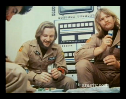
What particularly grabbed my attention about the news item was the footage of their capsule landing with a splash of sand in a deserty grassland in China's vast Inner Mongolia Autonomous Region (which contains part of the Gobi Desert: home, according to local legend, of the Mongolian Death Worm--never seen by science (HMMMM) but so deadly, the locals have it, that merely to touch it means INSTANT DEATH... Oh and it is 2 to 5 feet long, they say, and can spray deadly acidic venom, or shoot electricity or something--good story! :P). Looked like a bumpy landing! And the newscast pointed out that the US is the only nation that lands its spacecraft in water.
Here's some pretty good footage of the landing:
video on Youtube
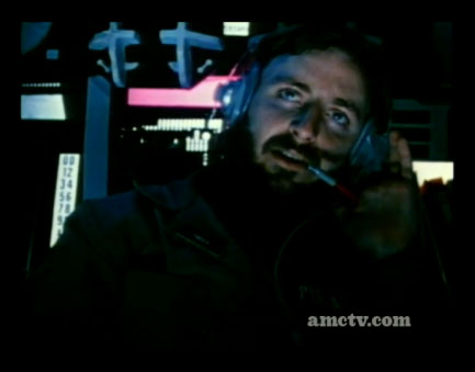
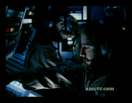
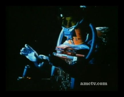
If you're quick on the pause button, you'll see a very quick retro-rocket fire just before touchdown! That must be to cushion the landing a bit. Here are some frames of it firing:
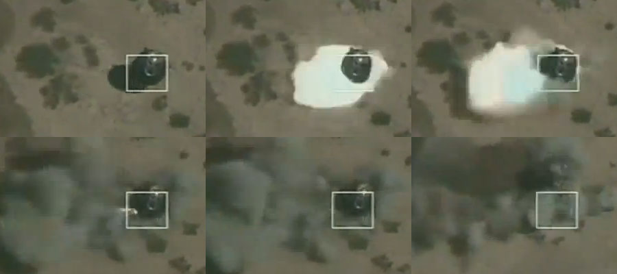
Pretty slick! Although then the capsule touched down and rolled around a bit, which must not have been too much fun for the occupants (who had to be carried out because their legs were too weak to stand on, since they didn't use 'em while weightless in space for 13 days). Kinda neat to see how charred parts of the capsule are too (around 1:00 for instance), I guess that's probably from atmospheric friction in re-entry.
Hm another news item I saw while looking for a good video said that the female astronaut was something of a last-minute addition, to get more attention, since apparently the Chinese public hasn't been too excited about the Chinese space program so far. Well... I guess it worked!
~~~~~~
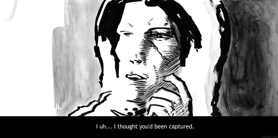
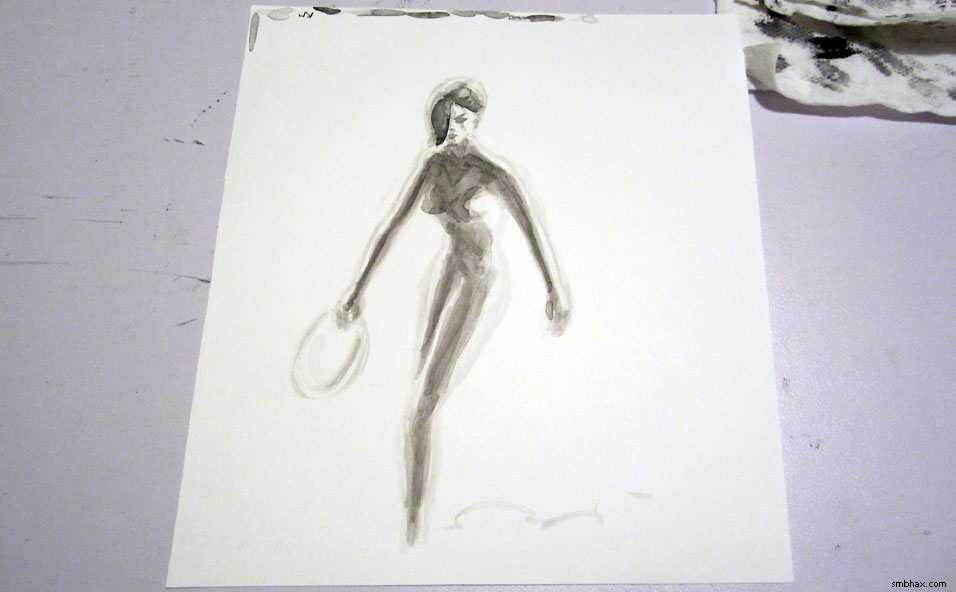
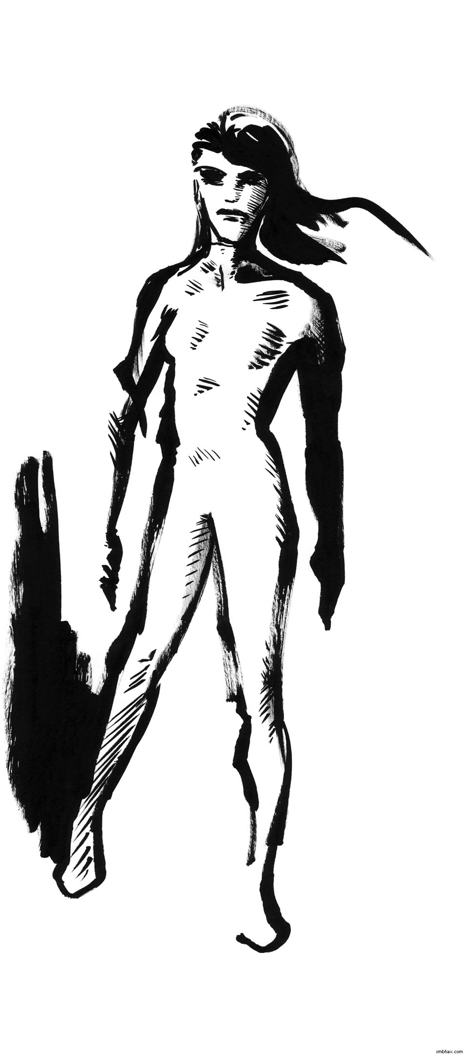
For some time now--maybe years?--I've been in the habit of drawing people starting with the eyes. This kind of lets you make sure you're maximizing the impact of the eyes, which I like, BUT I've been noticing that it sometimes leads me to make the composition a little too head-heavy--like, favoring funky perspectives where the head is closer to the camera and proportionately bigger than usual. That's great once in a while but I don't want to do it all the time and I kind of have been, so maybe next week I'll get brave enough to try drawing the "normal" way, which is to sort of sketch out the whole figure first and then put the eyes in it later. :P I tend to default to that when I don't have to draw a face--like on page 95--and wouldn't you know it, the figures there aren't all crazy bobbleheaded perspectivey, because I wasn't so preoccupied with the eyes. So yeah I'll have to see if I can do that and still get some decent eye action.
|
·····
|
| |
| A paper trimmer for A*! Slice, slice! | Jun 29, 2012 7:58 AM PDT | url |
| | |
Added 2 new A* pages:I got a paper trimmer! Whee! Since I'm doing two pages a lot of days, it was getting to be kind of a drain to have to cut my A*-sized pieces of paper out each day to work on, so I got one of them big swinging guillotine blade paper cutter things like the teacher got to use in grade school, you know like a machete hinged to a cutting board. Sweeeeet. I hadn't got one originally because a cursory look showed them to be surprisingly expensive, like in the several hundreds of dollars for some reason. But fortunately I just found the Dahle Vantage Paper Trimmer, which is not super-expensive, had really good user reviews, and comes in an 18" size that is just the width of the paper I need to cut for A*! Here it is looking dangerous, even after cutting out nine pages in a flash:
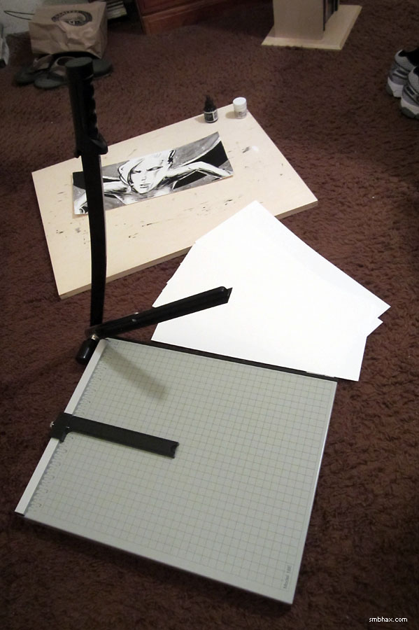
(Mind you, it's only on the ancient brown shag carpet for show--you're supposed to have it on a flat, level surface when cutting with it, etc.)
It was a little puzzling to get the blade open at first--turns out it has a simple locking mechanism to hold it in place so you don't accidentally cut off body parts when carting it around: just pull it sideways a half inch or so, then raise. It says this on the back of the instructional sheet pinned under the adjustable measuring stopper thing, but it took me a minute to find/extract that. :P
So I cut my 18"x24" sheets of Canson Illustration Paper three times to get three 18"x7.5" pieces--but I still need to slice an inch off one end of each one to get them down to the 17" length that my scanner accommodates. The Trimmer, though, is only about 14 cutting and measuring inches wide, so I can't measure 17" with it to slice them down to the final size, and jamming 1" in from the blade side doesn't really work because of the nifty automatic holder / safety thingy there (and it would probably be pretty dangerous anyway so I'm glad I'm not tempted to do it!), and because it's just hard to hold 1" of paper in place with 17" draped off the side. BUT! I found that the little adjustable measuring thingy, which I have to remove anyway to lay the sheets across the trimmer, is *exactly* 9.5 inches long, so if I lay it lengthwise along the track at the top of the trimmer, with one end on the 7.5" ruler mark, I then have a nice 17" measure to cut by. It would be nice if the board was 3" wider, and if the measuring thingy was a little more sturdy-feeling, but ah well.
The trimmer can't cut six of these pieces of 150 lb paper at once, at least not without getting a little jammed at the very end (I tried :P), but it can do three at once, so that's pretty all right I guess. Way faster and neater than cutting with scissors! :) I'm so enraptured with it I went and cut out three more pages just for fun, wooo.
|
·····
|
| |
| Apollo 16's Far Side | Jun 28, 2012 9:53 AM PDT | url |
| | |
Added 2 new A* pages:Here's a nice photo of the far side of the Moon, taken by the Apollo 16 mission in 1972--notice how the far side (don't call it the "dark side," it isn't any darker than the side facing us really!)--is rougher, with way more cratering going on; that side was less shielded by Earth from incoming asteroids!
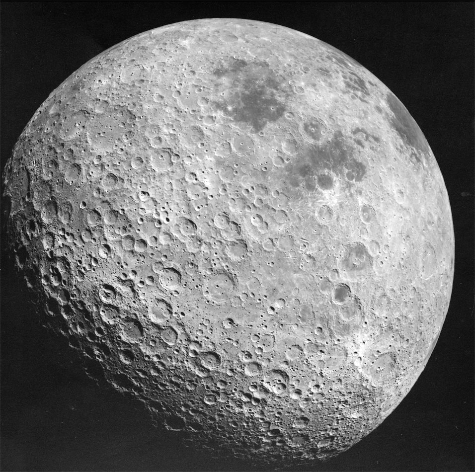
image by NASA (source)
~~~~~~~
I think I've managed to get my drawing surface too close to my face again--when this happens I can't see the whole canvas well enough, and things come out cartoonish and warped until I finally get up and travel all around my apartment trying to paint the thing at the correct distance to fix it, even holding it reversed in the bathroom mirror or whatnot. Madness. I'll try to remember to lower my drawing table tomorrow. :P
Here's what it looked like eh about the second or third time I thought I had it done before scanning it in and seeing tons of stuff wrong with it once it was zoomed down on the computer screen (flipping images horizontally helps too, like looking at them in the mirror):
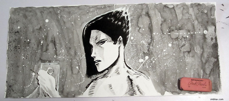
EDIT: Ugh, that one I uploaded was still awful! Reworked again (with my drawing table now in a highly inclined position so I can actually look at the thing straight...still gotta figure out how to make this not kill my back though :P). Here's the initially uploaded awful version:
|
·····
|
| |
| A Curious Martian landing maneuver | Jun 27, 2012 9:25 AM PDT | url |
| | |
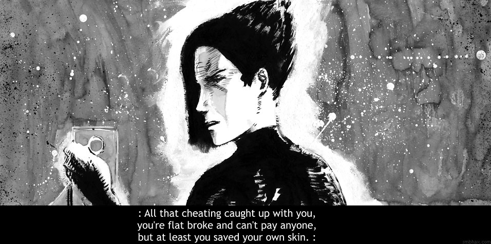
Added 1 new A* page:An astute reader pointed out to me on Twitter that Thierry was echoing Han Solo in Star Wars yesterday. Specifically:
Han to Greedo: "I don't have it with me."
and
Han to Luke: "Got some old debts I gotta pay off with this stuff."
Although I think Thierry will be lucky if he proves to be half the charming scoundrel Han was. ;)
~~~~~~~
Today's (single) page took me forever. I keep trying to do this pose and I'm not sure why because I have a really hard time with it! Blargle-argle.
~~~~~~~
NASA's large Mars Science Laboratory rover, aka Curiosity, will land on Mars on August 5th--if it survives a surprisingly elaborate landing maneuver; apparently it isn't easy to land something that big and heavy intact, so those bright boys doing the science have got a complex routine involving multiple jettisonings and jettings, which they spell out for us in this impressively over-dramatized video:
video on Youtube
Here's a handy scale comparison: the following photo has two regular-size adult humans, surrounded by a "flight spare" for the first Martian rover, the 1997 Sojourner, in the foreground, a working copy of the Spirit and Opportunity rovers, which landed on Mars in 2004, on the left, and a test rover about the size of Curiosity on the right:
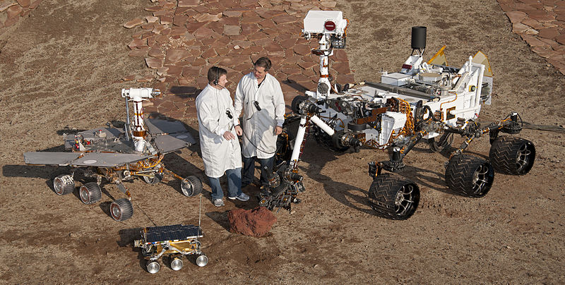
image by NASA (source)
Here's Curiosity itself, being assembled in 2010:
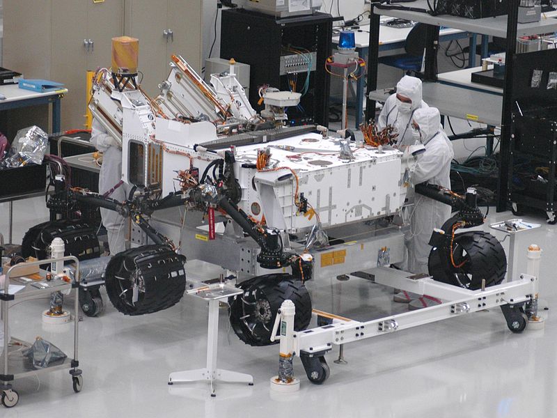
image by NASA/JPL-Caltech (source)
The tread pattern in those wheels, newly installed above, isn't just for traction in the treacherous Martian soil! Nope! If the Martians can read Morse code, they might get a clue as to who made the thingy what left such strange tracks:
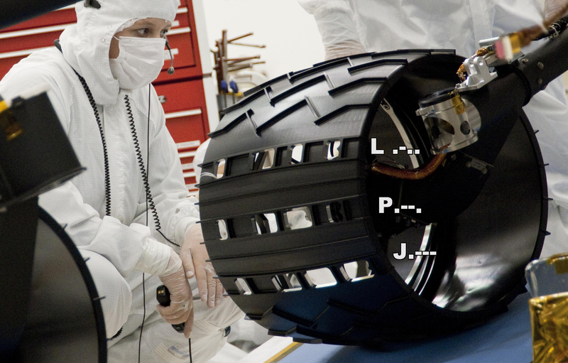
image by NASA/JPL (source)
"JPL" standing for NASA's "Jet Propulsion Laboratory," naturally. So if things go according to plan in 39 days or so, Mars will start having "JPL JPL JPL..." stamped across it. ... For science!
|
·····
|
| |
| Wishing for less washing | Jun 26, 2012 7:27 AM PDT | url |
| | |
Added 2 new A* pages:So what I did *this* past weekend instead of working on the A* subscription mode thing is worry a lot about how I've been shading the comic—I haven't really liked the gray washes I've been doing lately; they've been coming out particularly messy. On Friday with the first page (92) I tried starting with light gray, as I had done in a burst semi-recently (culminating reasonably successfully with page 73), but it came out light and then I didn't want to try messing with it more because it was already pretty messy, and, ehh. Here's a quick Photoshop simulation of maybe how I should have shaded it:
Then on the second page on Friday (93) I was tired of washes and my brush was beat up anyway so I just did a lot of dry brush instead, which sorta worked in a way I guess.
Then at some point I happened to watch this Toronto Comic Con 1974 interview with Vaughn Bode, who I guess was kind of an "underground" artist back when they still made that distinction. He's...well, he's a little full of himself and his stuff, but I dunno maybe that was just the times. He's coloring with markers, though, and that got me thinking that for all my recent marker phase, I never thought to try shading with a gray marker.
So I ran out and got the little "cold greys" pack of Faber-Castell's "big brush" markers, which comes with their three "cold" grays and a black marker, which I didn't really need since I have like 80 of them but the store didn't have the lighter "cold" gray separately so oh well. Rather bizarrely, the light gray one is so light that I can barely even see it on the paper I'm using—like, I think it maybe actually be lighter than the paper. :o Not very useful. The middle gray seemed okay. The dark one is this ugly greenish shade, bleh. So one marker out of four, ah well... I went and tried shading some sketches with it:
It worked fairly well, and I think it would definitely make a good portable sketching pair along with the Pentel Pocket Brush brush pen (which is what I used for the black ink in the last two sketches there). It does have some drawbacks though. For one thing, it's kind of a pebbly gray, as you can see, and that's I think from the surface of the paper getting roughed up a bit by the marker. That would be sort of all right, but while you can get a darker tone by making a second pass with the marker, as I did in places in the first and second sketches, if you try a third marker layer, the paper surface really starts to get chewed up to the point where you can see it looking rough if you tilt the paper against the light. AND when doing that you may notice that the black India ink you covered with marker is now all shiny, which probably won't scan as well as it would have otherwise. Plus the tip isn't very precise and I don't feel I can take the time with it to follow lines carefully, because the marker dries really fast, and if you don't watch out it'll dry in spots before you can quite finish them up, and then when you do go back to catch the last spots, the marker will start layering with the already dry marker lines and then you'll get darker patches where you now have two marker layers—so it's hard to make a really smooth tone, even aside from the pebbling problem.
Another thing I tried was dry brush with various brushes, since I came across a comic recently in which the author uses dry brush (with the Pentel brush pens) very effectively for small areas of shading, and since it had been sort of successful for me on Friday's page 93.
Oh yeah, another factor in these considerations for me is that one drawback of using ink wash for shading is that it doesn't cover white ink very well, in fact when you try it it usually turns out downright ugly, like on the goon's shirt back on page 55. Ugh! I need white ink to cover mistakes though, especially since I'm working directly in ink now rather than doing layouts in pencil first, so a lot of the time I end up with areas I'd like to shade with a wash, but can't because there's white ink there and the wash over it would just look really uneven and ugly.
The gray marker, on the other hand, actually covers the white ink very well; it isn't quite seamless, but it is a lot smoother over it than the ink wash is, and I wouldn't be nearly as hesitant with the drawing in general if I knew I was able to shade over white ink that well. And dry brush works *very* seamlessly over white ink...but then, dry brush is kind of all seams, if you think about it, and it gets pretty unattractive over large areas—also, it can be tricky to handle, and shade fairly unevenly—at least in the tests with various brushes that I tried.
Before I tried the dry brush stuff though I actually tried something else, something I've done before, which is using ink wash, but from pre-mixed jars of specific shades of gray. The unpredictability of on-the-fly mixed ink wash has been particularly troublesome for me since I started working with this new, much darker ink (that started on page 46); the ink looks especially dark before it dries, if you try laying down what as far as you can tell should be a medium gray wash, it will probably look pitch black at first, and I generally panic at that point and try rubbing it away. It's tricky to work with in a controlled way and I thought I'd have the hang of it by now but I don't seem to.
So the pre-mixed washes started sounding attractive again. I last used them on episode 13, page 157, and that page and the one before it are still some of my most successful ink wash shading attempts, I think. I stopped using it back then because I thought it was becoming too much of a crutch, and had too much of a paint-by-numbers look (and it really was paint-by-numbers, since I had numbered the five jars of light to dark washes I'd mixed); I thought I'd do better to force myself to get good at mixing the correct shade of wash on the fly. I eventually did get okay at that, but, especially since switching *away* from proper watercolor paper (I started using watercolor paper on episode 14, page 3, and stopped with episode 15, page 25, because watercolor paper is kind of a pain to work with in most other ways—it's fuzzy and not very white, and is particularly prone to warping), it's been hard to lay down any sort of largish area with an even tone of gray, and that's starting to bug me.
So I mixed up five gray washes, trying to find a nice range of tones. Here are the test patches I made as I tried to find a good set of ink-to-water proportions (I did this kind of in a dumb, ink-wasting way, but ah well...hopefully those jars of ink I just ordered will get here soon :o):
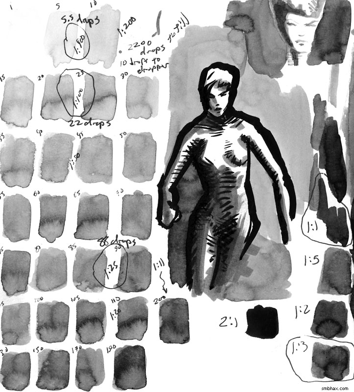
And here are the jars, labelled with their proportion of ink to water:
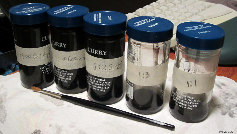
Spicy!
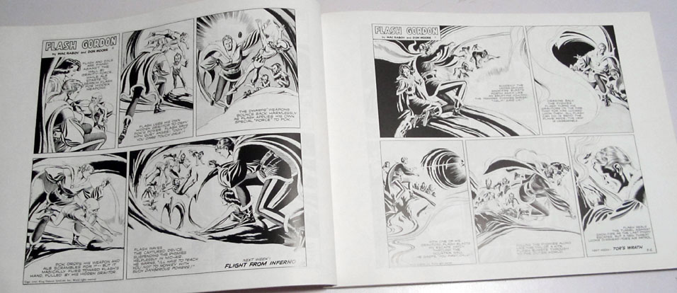
So that will probably work a little better—I used them in today's pages—but I also just want to stop relying on grays so much anyhow. I finally got to reading a bit of compilation book of Mac Raboy Flash Gordon comic strips I found at a used book store a year or so ago (it's this one), and I couldn't help noticing that he rarely uses grays (once in a long while they throw in some Zip-A-Tone on a strip, but I guess for the most part they didn't want to go to the bother—it *did* make me wish I had some Zip-A-Tone sheets to play with, though, and I even fleetingly considered ordering some from that Japanese joint, Deleter, who kind of specializes in them, but I can only guess they wouldn't hold up super well if you wanted your original to be, like, a permanent art piece; maybe they would, I dunno).
So for the most part, Raboy's Flash strips are these gorgeously bold black and white compositions with nearly peerless line work—but the compositions are also often quite abstract, as he had a lot of panels in which to establish locations anyway, and also constantly had to draw his way around the large caption letters. Like eh well like this:
Now in the actual Sunday paper comic page they'd be colored, of course, and Raboy certainly composed his black and whites with color in mind, but still, they do show that black and white can get along pretty well on their own without help from a lot of gray. And if I don't need to put washes everywhere, then that means I can be much more liberal with using white ink where I need to cover black ink, and just in general be a lot more loose and carefree with what I try doing in black ink. So even though I've got my little pre-mixed grays for somewhat more attractive washes now, I want to see if I can keep the use of gray to a relative minimum without the black and white being *too* harsh on the eyes. I'm fairly pleased with how the last page (95) came out in that regard. I did screw it up in one way, though: I'd intended to do a light, marbled wash across the floor, but accidentally put black ink down there next to Thierry's arm—so I had to cover that up with white ink, and then couldn't do a wash there. That's the trouble with wash! So the more I can teach myself to lay things out so I don't need it, the better, I think.
|
·····
|
| |
| Asteroid Mining, Moon Ice, #1 Supercomputer | Jun 23, 2012 7:40 AM PDT | url |
| | |
Added 2 new A* pages:Did you know there's an asteroid mining company? It's still pretty much speculative I guess (they like to say there are 1,500 or so asteroids as easy to get to as the Moon, so I guess their plan is supposed to be to mine near-Earth asteroids), but it's backed by some of the biggest big-wigs from Google, with some brains from NASA people, so I dunno if I'd be against Planetary Resources one day cornering certain heavy metal markets with lucrative space hauls. :P
~~~~~~~~~~~
NASA just announced that a detailed study of Shackleton crater, a 12 mile deep and 2 mile wide crater at the Moon's south pole, has revealed the presence of more ice than previously seen on the Moon—they think that ice may make up as much as 22 percent of the crater's surface. They didn't say what kind of ice, though, and a Yahoo blogger seems to have assumed they meant water ice and went off on what a find this is for the possibility of colonization and so forth. Well, they didn't indicate ingredients; their study with the cameras on the Lunar Reconnaissance Orbiter just showed unusually bright areas, which are assumed to be ice of some kind.
Here's a simulated overview of the crater, constructed with laser-measured altitude data from the LRO:
video on Youtube
Here's a neat simulation they made showing how little light gets into the crater—this time-lapse rendering covers the month of June:
video on Youtube
Here's the pretty altitude map they constructed from the LRO's laser altimeter data:
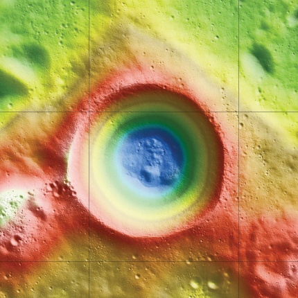
image by NASA/Zuber, M.T. et al., Nature, 2012 (source)
~~~~~~~~~~~
NASA also just announced that they upgraded their Pleiades supercomputer to make it 14% faster—it can now calculate at a sustained 1.24 petaflops. They talk about what a big deal that is, and, granted, that's pretty fast considering that the fastest PC GPU (which are more single-purpose, so clock way more FLOPS ("floating-point operations per second") than say your computer's main CPU) is still only in the single-digit teraflop range, ie 1000 times slower (and less flexible) than Pleiades, which is this huge system weighing in with more than 100,000 processors
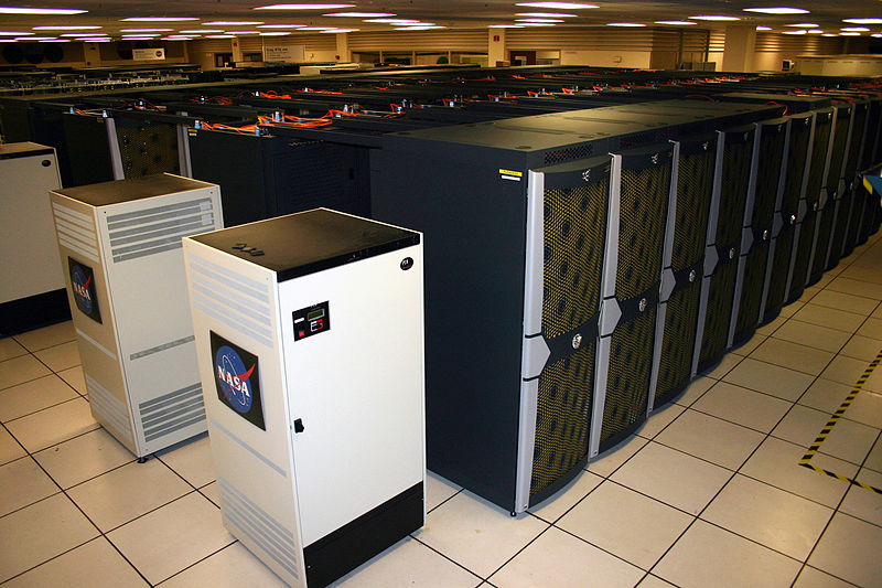
image by Marco Librero, NASA Ames Research Center (source)
at NASA Ames Research Center near Mountain View, California, but the fact is that Pleiades isn't even among the top 10 fastest supercomputers—hm although it's *just* shy of the number 10 spot by .03 Pflops. Four of the top 10 are using IBM's Blue Gene/Q architecture; the new number one, IBM Sequoia at the government's Lawrence Livermore National Laboratory, has just been fully deployed this month, and has clocked an impressive 16.324 Pflops already, nearly 6 Pflops faster than the Fujitsu-engineered "K Computer" in Japan. Third spot is the Blue Gene/Q-powered "Mira" at the US's Argonne National Laboratory outside Chicago; Wikipedia doesn't have a picture of that, but maybe it looks something like this older Blue Gene/P model, deployed there in 2007:
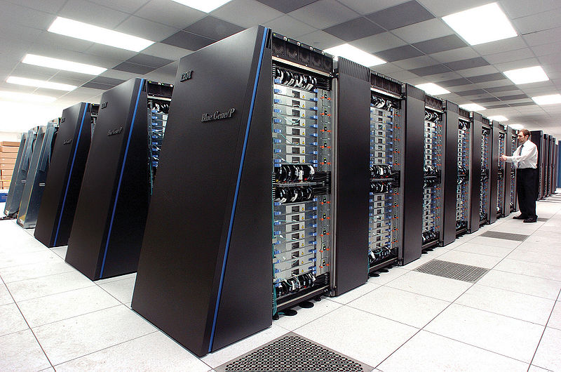
image by Argonne National Laboratory (source)
And the other top-10 at a US National Laboratory is the sixth-place Jaguar, mustering just under 2 Pflops, at the Oak Ridge National Laboratory in Tennessee, and interestingly enough it's a Cray machine—I always remember "Cray supercomputer" being talked about as the big thing in ultimate computer power when I was a kid. It isn't the ultimate these days, but it does look pretty racy:
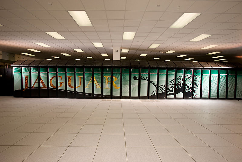
image by US Government (source)
(And not to be confused with the mostly unsuccessful Atari Jaguar video game console from the early '90's—64 bits! "Do the math!" :o)
All of the top 10 are running Linux, which I guess is probably no surprise to people who know fancy computers.
(I have my PS3(s), when on and idle (mostly in winter, since this helps heat my apartment and is too hot to do in summer :P), participating in Stanford's Folding@home distributed computing project, running protein folding simulations, (supposedly :p) for disease research; Folding@home was "the first computing project of any kind to cross the 1, 2, 3, 4, and 5 native petaFLOPS milestone," and is currently running at about 5.6 Pflops, thanks to thousands of networked private PCs and computer consoles participating in the project.)
|
·····
|
| |
| Rejected drawings & my art in a book | Jun 22, 2012 6:40 AM PDT | url |
| | |
Added 2 new A* pages:Hey lookit that, two days of two pages each, haven't done that in...I don't know how long. Maybe this pace is burning me out already though because MAN I had some art block on that second one--ended up filling four pages, front and back, with various attempts at it--finished off an ink bottle, used the last of my hand-cut paper, and may have just about killed my brush in the process, too. :P Just as well I ordered some more art supplies earlier today! (And a real paper trimmer, with one of them big swing-arm blades and everything! Dang that's gonna be sweet.)
Here are a couple of the more successful practice attempts:
I kinda liked the one on the left for the page, but it was just drawn in the blank area on the right side of a page whose center I had already ruined, so I couldn't use it. :P
~~~~~~~~~~~~~
Hey here's something neat: a drawing I did is gonna be in a book! Then I can call myself a published artist. :D The authors of the modern romance webcomic "And To Be Loved" seem to like A*, and it happens that they're putting a book of their own comic together now, and their artist very politely asked me if I'd be willing to do a portrait of one of their characters as an extra for the book. I was procrastinating from some A* thing on a recent weekend and went ahead and made them a little ink wash painting--I picked their character whose hairstyle happens to be pretty much identical to Selenis' current 'do. ;). They've released a tiny and somewhat blurry sneak peak at a tiny part of it in a recent blog on their comic, specifically right here, but I guess to see the whole thing you'd have to buy their book. ;) BUT in exchange their artist did a really neat full-color portrait of Selenis, using a very interesting combination traditional/digital technique and...it hasn't been posted on their site yet. I'll let you know when it's there!
|
·····
|
| |
| Trying two pages a day...yet again ;) | Jun 21, 2012 5:07 AM PDT | url |
| | |
Added 2 new A* pages:Hey, two pages! Yeah, so I was inspired by Alex Raymond's classic Rip Kirby comic strip, which I talked about yesterday, to see if I could get back to multiple pages a day. And maybe I can!
Originally of course I was doing like three to four pages a day--that was back when I was drawing them mostly in plain black and white, with an eye toward producing an animated episode (episodes 1 through 7 were animated--check 'em out in their YouTube playlist here), so they were pretty simple. Once I stopped doing them for animation I started making the comic images bigger and more detailed, which eventually slowed me down to one per day. The last time I resolved to go back to multiple pages per day was back in September--that lasted for a whole day. :P Shortly after that I started messing with doing stuff in actual ink rather than digitally, and that slowed me down and stuck me firmly back to one page a day.
Until now! If Raymond could do three beautiful Rip Kirby panels per day, dang it, can't I manage at least two A* panels? Of course he had decades of professional illustration experience and was probably just way better than me to boot, but eh...I can try, anyhow. The reasons for wanting to do multiple pages a day are mostly spelled out in that ^ resolution back in September--pacing, keeping it loose and expressive, and so on. I've been getting bogged down in futzing and fudging with a page all night, second guessing myself until I'm just obsessively altering some little detail back and forth, and that's just no fun. My favorite pages tend to be the breezier ones.
And I've kept thinking that I'd get faster at the drawing and just get up to being able to do multiple pages a day naturally, but I've found that doesn't happen--instead, I just find more ways to spend more time messing with the same image. Comic book artist Sean Murphy recently wrote an interesting article about a general slowdown in comic production over the decades--Why are we slower?--and it's a well thought-out, well-informed article by an industry pro that is well worth a read. That's been percolating in the back of my head since I read it over the weekend, and it does seem to me that one reason we draw slower is because we just aren't forced to draw faster; cameras and 3D rendering can now handle the illustration needs of the world, so there's no need for illustrators to be cranking out material for industry, marketing, etc etc. That's what pushed the old illustrators to hone their craft, get fast and sleek, and without that, well naturally we slow down and go more at our own pace.
So if I wanna get faster, I just gotta force myself to get more pages done, I think. No sitting around fussing over a page, or what the rest of the internet is doing, or how to network with other webcomic people; I've learned a lot doing that stuff, but now I feel ready just to buckle down and crank out pages.
... We'll see how long it lasts this time. ;) I'm already futzing even in this new mode--for instance, if you happened to log in just after midnight, you saw the original version of page 88:
That seemed just *too* sketchy and not heavy enough, though, so I added loads of black ink.
As I mentioned in September, Fridays will almost always be just one page still, since I hang with peeps most Friday evenings. There will also be plenty of days where I only manage one for some reason; for instance, yesterday as I test I tried doing the page (87) faster, and I thought I had it all wrapped up in good time but then I thought hm the vertical scale is off a bit, tried adjusting it, and then it just kept twisting and shrinking and...man that one really got away from me, I think maybe because I was kneeling at my drawing table instead of actually sitting, so my face was too close to the paper--I lose my view of the page as a whole when I do that, and things start to get wonky. Anyway so I had to redraw that one entirely from scratch--so that would have been a just-one-page day, if I'd been going for two.
Also as I mostly mentioned in September, I will post on A*'s Twitter, Google+, and Facebook pages as soon as each page goes up during the day, so follow me on one of those if you want to get 'em as soon as they're up; the RSS feed is only updated later, once I've got all the day's pages and news posted.
~~~~~~~~~
What's that, you want some science? Well how about this cool photo of a "stained glass" meteorite from China that was shared with me on Google+? That's a slice of the Fukang meteorite, and boy aren't those olivine space crystals pretty when the sunlight hits 'em.
|
·····
|
| |
| Alex Raymond: Flash Gordon & Rip Kirby | Jun 20, 2012 5:52 AM PDT | url |
| | |
Added 1 new A* page:Hm it seems I've never mentioned my Mac Raboy Flash Gordon book here before, so I guess there's no need to mention that I haven't mentioned it...I do need to finish reading it, anyway. :P Still I've had Gordon on the brain for a while, so imagine my surprise when, browsing through some online syndicated comic listings, I found that Flash Gordon Sunday comics are still running in a small number of papers. These are, however, reprints of the Jim Keefe 1996-2003 run, after which no new Flash Gordon comics have been published.
Keefe's work doesn't have the incredibly graceful artistry of the Raboy era ('48-'67), but a pretty good account of the history of the Flash Gordon strip made plain to me what I should have known long ago, which is that the original Flash Gordon artist and (at least) co-creator, Alex Raymond (b. 1909, d. 1956), did some quite amazing work.
After three years as a staff artist with King Features Syndicate, Raymond was asked, in 1933, to create a comic to compete with the wildly popular 1929 invention, Buck Rogers. Raymond's and a series of ghost writers' creation, Flash Gordon, launched at the beginning of 1934 and soon surpassed Buck in popularity; another Raymond strip, Jungle Jim--this time seeking to horn in on the popularity of the Tarzan strip--ran along the top of Gordon.
Raymond's Flash work soon became filled with large panels of sweeping shading lines, with--aside from a mastery of the human figure--exhibited a brilliant use of positive and negative spaces: just look at the curling line-packed shadows defining a vase of flowers in the second panel of this 1937 strip.
But Flash isn't even my favorite of Raymond's comic work. Raymond left the strip in 1944 to enlist in the U.S. Army; four of his five brothers had already enlisted. While in the military, he created official posters, greeting cards, and the like, including this painted cover for the Marine Corps bulletin:
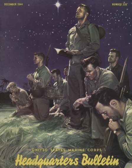
image by Alex Raymond / U.S. Government (source)
Demobilized and back home in '46, Raymond found that the syndicate didn't want to oust the Flash artist who had moved into the strip when Raymond resigned his position, but they offered him the chance to create a new strip. The result--again aided by writers--was Rip Kirby, a modern private eye just returned from military service himself; unlike the old pre-war pulp PIs, Kirby did more thinking than fighting, had an assistant who was *not* a gorgeous blond, had a steady girlfriend, wore glasses, and aged as the strip progressed. To match this newly modern take on crime adventures, Raymond came up with a new, sleeker style consisting of thin, angular outlines and thick, solid black volumes--if this sounds familiar, it's because "The Raymond Style" was much copied! And unlike the Sunday Flash, Rip was a daily strip.
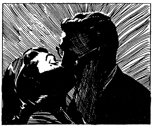
I love the sharpness and contrast of Raymond's Rip work, from his big, dramatic shadows in action scenes to the luscious massed blacks of contemporary fashions (I particularly like that one since you can see where he painted over with ink a few times--for instance, he painted the facial features of Rip in the last panel, then decided to shade in the whole face), it seems like he could do it all. Dig his loose, fuzzy borders around figures, his abstract hatched backgrounds, and his lovely pattern work in textures in this strip, the semi-abstract way in which he lets patterns and contrast define the outlines of figures in this panel--along with his seemingly effortless distillation of telling poses--and the way he let huge black areas and hatching patterns run into each other in this strip. And he could get really wild:
(Hopefully that one sample panel can fall under "fair use"; the Spanish-language series of strips that's from can be seen here.)
So yeah, Raymond was The Man. He probably used models to get his figures down from time to time (I wonder if he had a "Rip" model?), but that didn't stop him from verging off into highly expressive territory with his copious black ink.
Inspiring stuff! And it may have answered that stylistic dilemma that's been troubling me for a week or so. In fact, after looking at those Rip dailies of his, I had a thought of bringing you much more daily A* than I have been. Not sure I can pull it off... Maybe I'll give it a try tomorrow anyhow!
I don't think I'm the only one these day's who's getting into Raymond's work, either; not just one but TWO multi-volume compilations of his Flash Gordon work are on their way this year, according to Amazon, and a Rip Kirby one just finished covering his work on that series last year. Needless to say, a few sample volumes from some of these series may have found their way into my A* Amazon Wish List. >_> (What's kind of scary is that some of the earlier, now out-of-print volumes in the Kirby series are going for a minimum of hundreds of dollars a piece from Amazon sellers. :o)
|
·····
|
| |
| Stylistic waffling, NASA's "Blue Marble" | Jun 19, 2012 5:01 AM PDT | url |
| | |
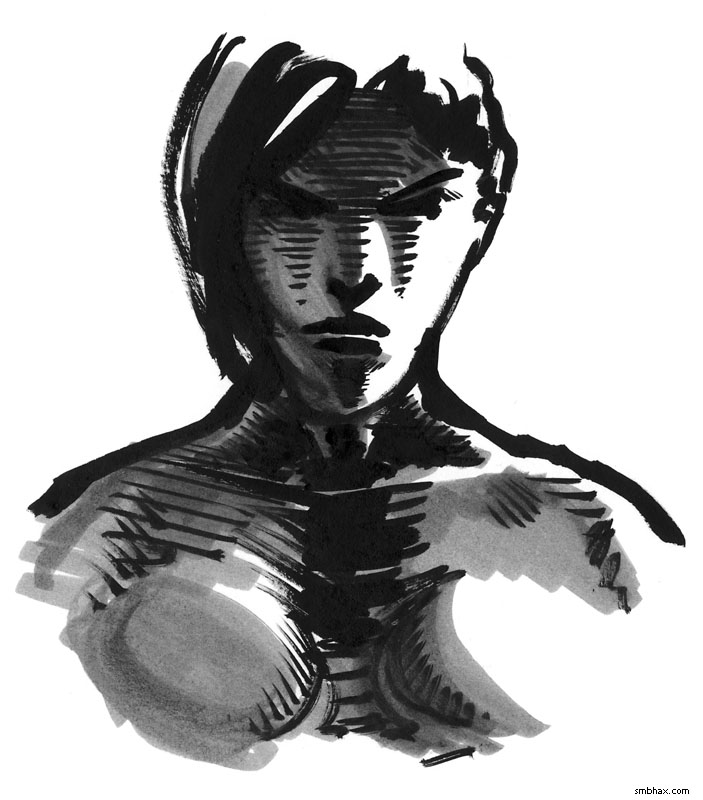
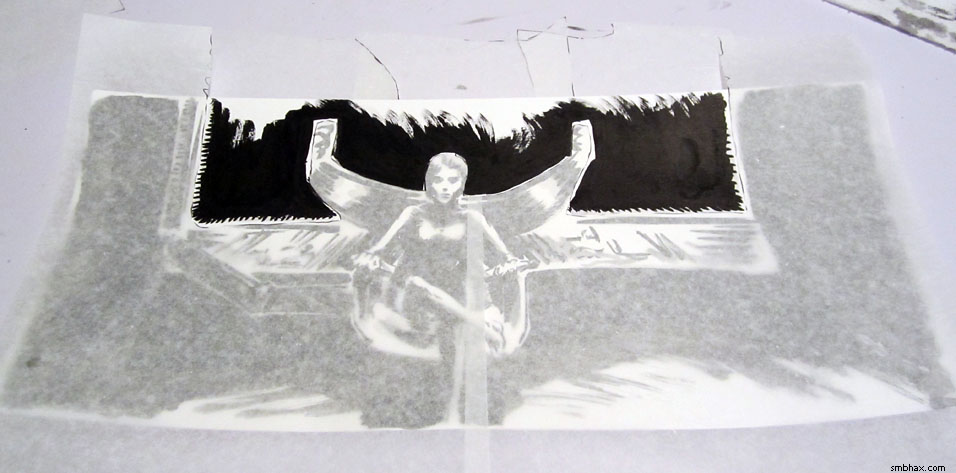
Added 1 new A* page:Aside from fussing with the previous page a few times (I ended up blacking out the front of the chair, darkening the control panel behind her, and blacking out the white "halo" lines I'd left around parts of the chair, etc), over the weekend I was torn over a question of style/approach, so I did this little test sketch (pay no attention to the lack of white ink cleanup/highlights and the wonky proportions :P):
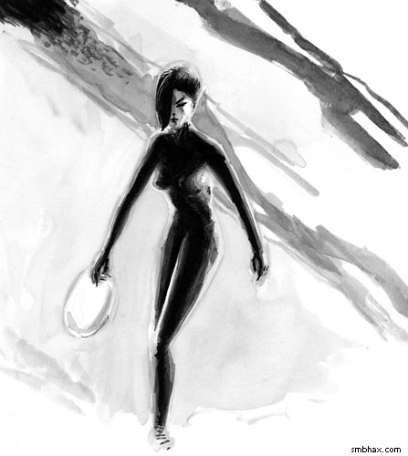
(There's a larger version in the gallery, but the version above is closer to the relative size it would get shrunk to if it was an A* page, sorta.)
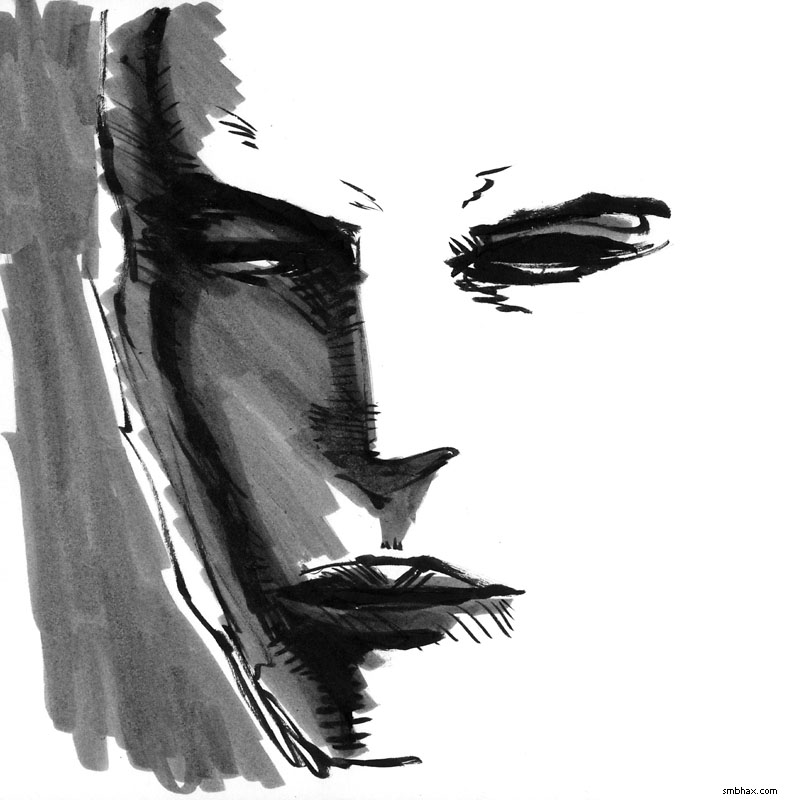
The approach starts by sketching the layout in very light gray, the proceeding to fill things in from light grays to darker and darker grays and then black, in theory--whereas normally, I start with black, then fill in grays where needed. Here's that sketch in an earlier, light gray stage:
It was something I sort of stumbled into trying for five or six pages starting back with page 69; the most successful was probably page 73:
Contrast that with page 82, which I think is probably the most successful recent example of my usual black-first approach:
The light-to-dark one is certainly smoother, isn't it? In fact I was quite surprised at how nice all those overlapping light washes came out; I kind of thought they'd just leave ugly border lines everywhere. But they didn't, so I've been conflicted as to whether or not I should adopt that approach as my main working method--but I wasn't sure I could reproduce that level of finish, thus the weekend test sketch--which showed page 69 wasn't a fluke, I think.
I like both approaches--the subtle gradations and light sourcing of the light-to-dark method, and the sharp punch of the black-first approach. Ideally I guess I'd be able to combine them, and I don't think there's a reason *why* I can't do that...I've just got to get used to using the right one where appropriate, I guess. I started out today's page with a light layout sketch, but somehow it just wasn't coming off--I couldn't really feel the facial features like I wanted to--so I had to go to full black ink instead. Hum. The black ink approach *is* a lot more immediately satisfying, I have to say; all the little washes and blends of the light-to-dark can feel a bit tedious--and I discovered in this sketch that it doesn't work against a pure white background, because the white edges of the figure just read as part of the background, so the figure looks bizarrely skinny.
Anyway I'm sure I'll keep waffling and flailing around with this. :P
~~~~~~~~~
A bunch of interesting space news ran across my screen today (I swear I don't go looking for this stuff!):
- According to this Time article, a geologist at Queensland University of Technology in Brisbane, Australia, appears to have come up with an explanation for the unearthly properties of dust brought back from the Moon by the Apollo missions some 40 years ago. Superfine and filled with minute orange and green glass beads produced in the intense melting and cooling of billions of years of asteroid impacts, moon dust is unusually chemically reactive (rather than inert as you might have expected), a very good insulator against heat, and floats when subjected to a static charge.
Apparently that's all due to nanoparticles! Examining miniscule glassy bubbles in the moon dust, the researcher found that instead of being filled with gas, they were filled with extremely tiny glass particles, some no larger than a molecule. Apparently, that tiny size can account for the unusual properties of the dust. Formed inside cooling bubbles from impacts and then smashed apart by subsequent impacts, these particles have thoroughly permeated the lunar soil.
- This space.com article reveals that two researchers from the University of Colorado, Boulder have completed four years of painstakingly counting, cataloging, and mapping all the large craters photographed on Mars to date. Their total count? "More than 635,000 impact craters at least 0.6 miles (1 kilometer) wide."
- NASA just posted a super-high-definition photograph of the Earth, centered on the North Pole. The photograph is a composite, put together from photos taken over fifteen orbits of the Earth by the Suomi NPP satellite, which launched at the end of this past October:
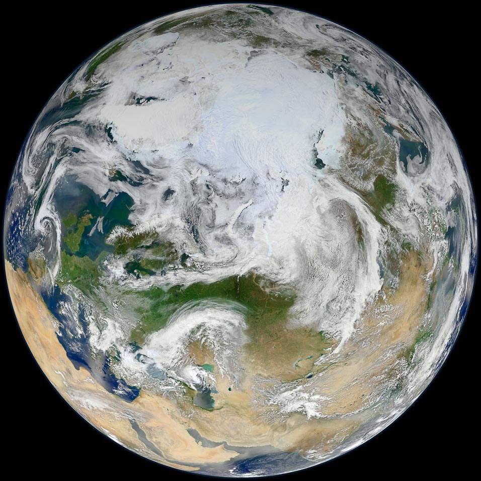
image by NASA/GSFC/Suomi NPP (source)
NASA says:
Over the last decade NASA launched a series of satellites that offer an unparalleled view of Earth from space. That series, known collectively as NASA's Earth Observing System (EOS), has provided striking new insights into many aspects of Earth, including its clouds, oceans, vegetation, ice, and atmosphere. However, as the EOS satellites age, a new generation of Earth-observing satellites are poised to take over.
The Suomi National Polar-orbiting Partnership represents a critical first step in building this next-generation satellite system. Suomi NPP orbits the Earth about 14 times each day and observe nearly the entire surface. The NPP satellite continues key data records that are critical for climate change science. Read more here: npp.gsfc.nasa.gov/ |
Here's a Suomi composite of North America, taken in January:
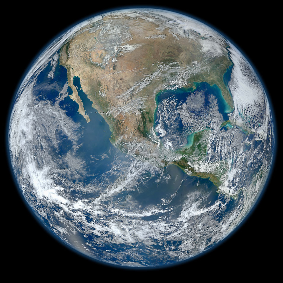
image by NASA/NOAA/GSFC/Suomi NPP/VIIRS/Norman Kuring (source)
Notice that the Earth isn't quite as round when seen from near the equator as it is when seen from the pole--it widens out around the equator due to the centrifugal force generated by the Earth's rotation.
|
·····
|
| |
| Tracing & spattering paper; space angel? | Jun 16, 2012 8:52 AM PDT | url |
| | |
Added 1 new A* page:I meant to have another sketch of another photo of that gym ad model done today, and I actually did not just one, but four! But they were all pretty bad. Actually the first three were downright apocalyptically awful, and then I lowered my drawing table back down to a more horizontal level like it was when I did yesterday's sketch, and then the fourth sketch magically came out better--it had all the major facial features complete in their approximate correct locations--and I thought I'd go with it, but looking at it now...it's still pretty ugly. :P So it goes in the bin! At least I've learned to keep my drawing table closer to the horizontal. :P Maybe I'll take another shot at sketching that photo next week.
I do though have this scintillating photo I took of working on today's A* page, having just masked off the non-video-screen part of the page so that I could spatter some white ink stars onto the screen part:
A friend gave me a pad of this tracing paper some weeks back, and I had no idea what I was going to do with it, but then I realized it makes delineating the shapes of ink spatter masks much easier! I just put the tracing paper over the page, draw where the edges of the mask(s) need to go to on top of the tracing paper with a marker, then cut it out with scissors, and voila. Way easier to see through and find the edges with than regular paper. :D
~~~~
I'm not sure why I drew those big eh curvy things on the top of the chair Selenis is sitting in in today's A* page, BUT earlier this evening a friend and I somehow ended up looking through the artwork for angel cards in that so-popular Magic: The Gathering trading card game--which I have never played; it seems highly technical! and expensive! :o--to verify our supposition that those heathen artists they get to do the card art tend to depict angels as unusually attractive young women. And upon researching the topic, this does indeed appear to be the case! >_> Man, that's a good Friday night right there. Anyway, I wonder if that subconsciously influenced the funky wingy design of this chair back. :P They *did* seem to add some majesty to the thing!
|
·····
|
| |
| Photudy 1 | Jun 15, 2012 9:34 AM PDT | url |
| | |
Added 1 new A* page:I have a huge backlog of neat science stuff to cover, like finishing the Tycho's Remnant coverage like I said I would, doing a big series about non-rocketfuel spaceflight like I told someone else I would (starting with their nifty illustration of a space elevator), and even recent stuff like the prototype Space Shuttle Enterprise being shipped up the Hudson by barge over the weekend, or that black-hole-seeking satellite NASA just launched yesterday. HRM.
But I've also been itching to do some sketching--I ordered a huge box of these Faber-Castell "BIG BRUSH" India ink markers back when I thought I was going to do A* in pen, and they've just been burning a hole in my art supply closet of shame, for instance--AND tribulations I've been having with art in the past week or so--I felt like I was finally getting somewhere with the breezy yet sharp rendering of Thierry's face on page 82, but now I seem to be having trouble following that up...as I generally do when trying to duplicate my own previous drawing styles--got me to thinking. The best thing if you're trying to get better at realistic drawing of people is drawing from live models, of course, but if you're poor to hire models, or too antisocial to get friends to model for you, or too chicken to spy on people from the corner of a coffee shop or to set up a little portrait booth on a street corner or something, then you've got to come up with something else. Well it struck me that I could just practice drawing faces from photos, which is what a lot of artists do for their actual art anyway.
This is where I need a stack of trashy magazines or something, but I don't have that. I've got this ad for an invasive health club chain that came in the mail a while back and which I saved because their ridiculously tan model had some Selenic qualities (not the tan, though :P); after that I've got hmmm a book on the history of Italian fashion photography, which has a lot of people photos in it (although perhaps not the best variety as they're mostly you know slender 20-something models), and after that...uhh I guess I have some music CD jackets. After THAT, if I'm not sick of it yet, I might just have to go buy People magazine or something. ;P
Anyway so here's the first try (the gym model--there are three more photos of her in the brochure, so that might keep this blog busy through early next week...):

I realized after doing this one that some of the many distortions--the too-small nose and the too-large hair, for example--might have been due to my having my drawing surface at a nearly horizontal angle, which caused me to view it--and the photo I was working from--at an angle as I sat above them; in the past I've noticed that I sometimes overcompensate for that viewing angle by drawing the upper parts--the parts farther away from me--too large, since they seem smaller in the drawing from my angled point of view. I wonder if that's sort of neutralized if you're working from an image that is also at that same angle...well it doesn't seem like it was, since it happened here.
So anyway I spent some time wrestling my drawing table into a higher angle; I did have it at a higher angle for a while after getting it, although it was never *that* high, and I eventually gave that up because I was having trouble resting my arms firmly on the surface. I've discovered in the past week though that that arm resting problem was actually due to having my feet slightly elevated, which I guess had the effect of pushing me back in my seat, subtly making it difficult to lean my weight forward onto the drawing table in a meaningful way. Another ergonomic problem solved! Leaning forward onto an angled table is revealing a new crop of ergonomic challenges, of course. Never a dull moment! :P
Hm one other thing I have been noticing but not really doing anything meaningful about lately is that in reality, the primary facial features--eyes, nose, mouth--usually take up quite a tiny part of the face; they're sort of concentrated in the lower middle, really. I've been drawing those facial features too large, for the most part--I suppose out of a subconscious urge to make them more expressive, or maybe just because that's what I focus on when looking at a face. So maybe this type of exercise will help me get that under control a bit.
|
·····
|
| |
| Potentially hazardous flying cats & asteroids | Jun 14, 2012 6:58 AM PDT | url |
| | |
Added 1 new A* page:A 500-meter asteroid is coming within "14 lunar distances of Earth" today, and that's big and close enough that in theory, Earth-based telescopes will be able to spot it.
Asteroid 2012 LZ1 was only just spotted this week, according to the news article! Makes you wonder what else we're missing out there, doesn't it? :o
| Because of its size and proximity to Earth, 2012 LZ1 qualifies as a potentially hazardous asteroid. Near-Earth asteroids generally have to be at least 500 feet (150 m) wide and come within 4.65 million miles (7.5 million km) of our planet to be classified as potentially hazardous. |
Sweet! =o
~~~~~~~
I speculated on our chances of death at the hands--or whatever they have--of swarms of robotic "quadrotors" back in March, but now there's a much creepier four-rotored flying machine to fear...because a Dutch artist made one out of his dead cat. :ooo I give you...Orvillecopter.
|
·····
|
| |
| Four new A* T-shirt designs for summer! | Jun 13, 2012 5:13 AM PDT | url |
| | |
Added 1 new A* page:Some weeks ago when Seattle had an unexpected day of decent weather, I was considering my summer wardrobe and realizing that I was sorely in need of some less decrepit T-shirts with which to cover myself when going out in public. It's been...a while since I've done actual T-shirt shopping, and I was thinking "so how would this work? Would I just go to...a department store?" Clearly it was an unfamiliar, confusing, scary world upon whose brink I found myself, but then the fortunate thought came to me that I'm supposed to be making my own T-shirts anyway! So I made myself some A* T-shirts. They're in the A* T-shirt store so I suppose you could get them too if you want! These four new designs are available in men's and women's sizes, and you can pick your own cloth color if the default black shirt color isn't your thing--I went with white, myself:
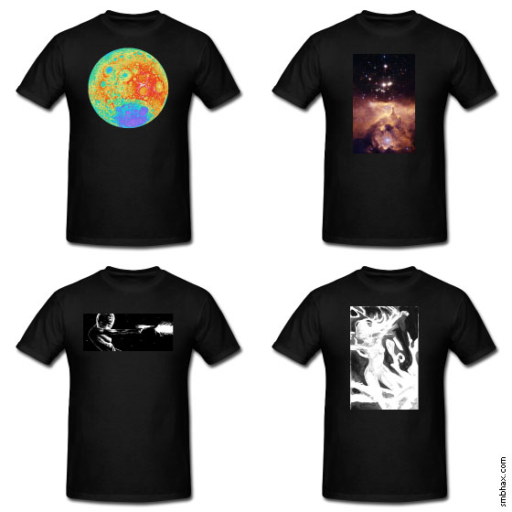
Those first two are thanks to some fine images from NASA that have featured in A* news articles in the past: the first design is a NASA color-coded relief map of the Moon based on elevation data captured by the Lunar Reconnaissance Orbiter spacecraft, and the second is a Hubble photo of Nebula NGC 6357 and its large Pismis 24 star cluster. The third is a page from earlier in this A* episode, and the fourth is this funky illustration of Selenis as the embodiment of winter that I drew a little while back.
So yes slapping an existing rectangular image on a blank T-shirt is my ultra-masterful design strategy! Subtle gradients and fine detail don't come out incredibly sharply in the T-shirt medium, as the prototypes of these shirts that I ordered for myself reveal, but that's not going to stop me from wearing them around this summer. :PP
|
·····
|
| |
| Doodlin' and crashin' stuff | Jun 12, 2012 4:56 AM PDT | url |
| | |
Added 1 new A* page:Here the doodle I doodled on the back of today's page while waffling over some of its fiddlier bits (click for the smaller version if this one is just too big to take in :D):
Looks like a certain webcomic author might be missing drawing his main character in the actual comic! >_>
I got a bit more of the some-time-upcoming "subscription mode" done over the weekend, in fact it's about the last of the sort of back end / secondary functions that I have to do as far as I know, so next I get to work on actually making the comic appear at the selected size based on your cookie-stored setting, which should be more fun. This last thing I did was the whole surprisingly convoluted process of how to get a new password if you lose yours, which involves emailing a time-limited code that takes you to a special form and so on...which isn't quite working yet exactly as the script is crashing when it should be taking you to that form. So yeah I didn't really get a chance to start debugging that part yet. :P BUT after that I get to do the more fun part involving the actual comic size, so that's nice.
|
·····
|
| |
| A* art show opening adventures! | Jun 09, 2012 6:27 AM PDT | url |
| | |
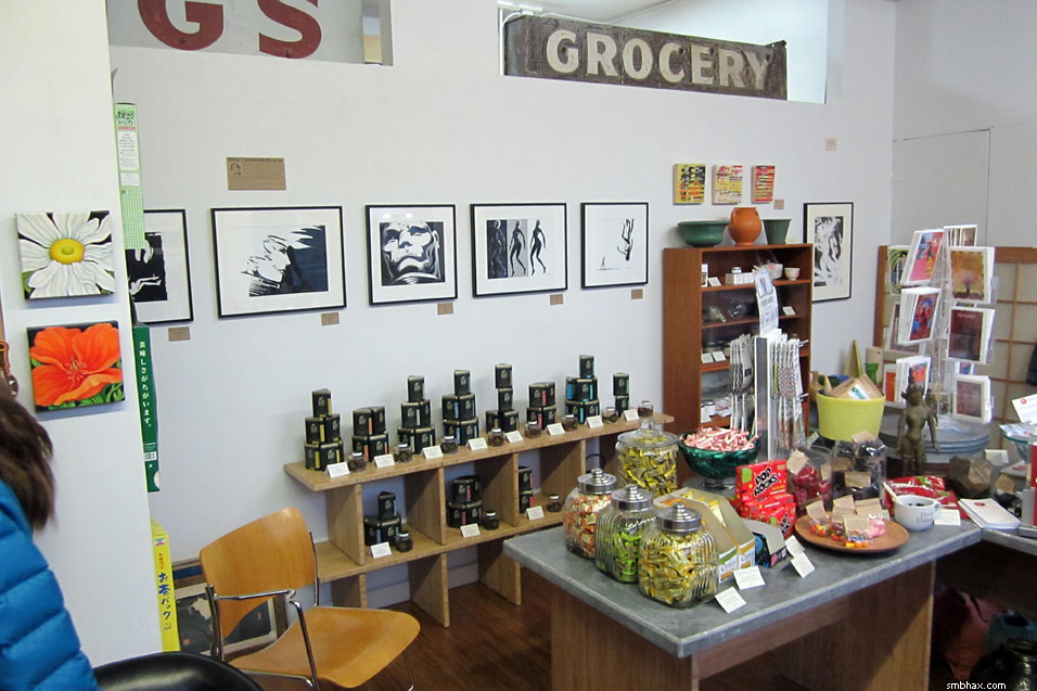
Added 1 new A* page:The opening bash for my art show at Chocolat Vitale in Seattle's Phinney neighborhood was this evening, and it was pretty darn successful I think! Loads of people came by and chatted, and some were even artists I got to compare notes with! The live DJ was great AND she had some really cool and unusual records to play, plus there were so many refreshments on hand I couldn't even eat them all myself. Also I think three or four of my pieces even got purchased right off the bat!
The show goes for a month so there's *still* loads of time to check it out if you happen to be in the vicinity. You won't be able to escape the A* art attack there: it's coming at you from all four walls. Here are two of them:
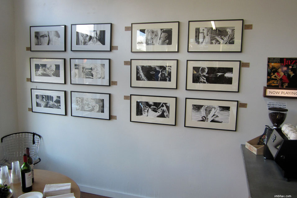
(^ That wide white coffee mug on the stone table there, by the way, contains free samples of black licorice Scottie dogs. Highly recommended! :d Unless you don't like stuff getting stuck between your teeth, because MAN those dogs come home to stay I tell ya.)
Thanks to everyone who came by so far, to my dad who pretty much made it all happen, to my friends and family who have been so supportive, and to the generous and enthusiastic proprietors of Chocolat Vitale. :) It was a swell opening party. :D
|
·····
|
| |
| One accretion disc to clue them all | Jun 08, 2012 4:45 AM PDT | url |
| | |
Added 1 new A* page:NASA's Goddard Space Flight Center recently posted a nifty video showing a simulated view of how the X-ray emission in a nearby galaxy with an active central supermassive black hole doesn't come from the exact position of the hole, but rather from a point above its accretion disc; an *echo* of these X-rays then bounces to us off of the hole's accretion disc:
video on Youtube
It sounds like they don't know exactly why the X-rays are being emitted from that other point, but then we still don't really understand how the intense, jet-forming magnetic fields around massive and rapidly spinning objects in space really work anyway--but maybe this will give smart people some clues!
The finding was made from data captured by the ESA ("European Space Agency") X-ray-detecting satellite observatory XMM-Newton, launched in 1999. The galaxy being examined, NGC 4151, at just 43 million light years away, is one of the closest galaxies to us that has an actively feeding supermassive black hole, which makes it a good galaxy to look at if you want to learn about how they work! It's been nicknamed the "Eye of Sauron" for reasons that this composite Chandra image (blue = X-rays, yellow = optical, red = radio) may make clear:
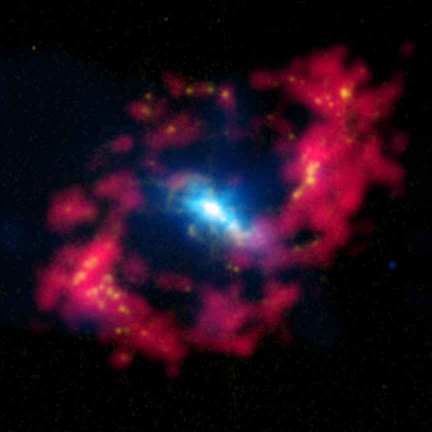
image by X-ray: NASA/CXC/CfA/J.Wang et al.; Optical: Isaac Newton Group of Telescopes, La Palma/Jacobus Kapteyn Telescope, Radio: NSF/NRAO/VLA (source)
~~~~~~
My June art show opens tomorrow (okay, today--Friday!) in Seattle's Phinney neighborhood, 6-9 pm! I got a glimpse in while driving by today and it looked like they had a full wall of my artwork--there are hm something like 17 original A* ink paintings, and another ten or so framed prints of art from A* as well as a few from my other (now discontinued) comics, The Princess and the Giant and Sketchy. They will have refreshments and maybe even a DJ! :o But if you want some free eats you'd better come early, otherwise I'm liable to eat them all. :d
|
·····
|
| |
| Streaming sci-fi B-Movie classic: "Dark Star" | Jun 07, 2012 5:24 AM PDT | url |
| | |
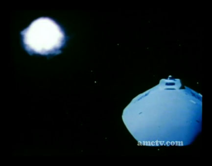
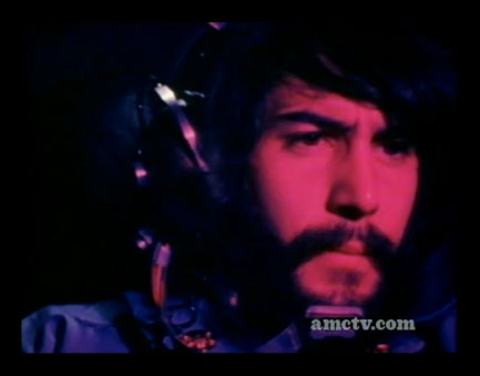
Added 1 new A* page:Don't know about you but I just watched the 1974 (the year I was born!) sci-fi movie Dark Star over on (warning: auto-playing video with sound) AMC's streaming B-Movies site. [As I post this, that whole site appears to have gone blank, but eh I'm sure it'll be back shortly. >_>] It's pretty weird! Written by John Carpenter and Dan O'Bannon--Carpenter of course went on to fame in the horror film genre, and O'Bannon, who passed away in 2009, did computer effects for a little film called Star Wars three years later, and then went on to write some films you may have heard of, including Alien (1979), two segments of Heavy Metal (1981), Blue Thunder (1983), Total Recall (1990), and Alien vs Predator (2004)--back when they were film students, and on a $60,000 budget they were able to squeeze out this bizarre dark comedy tale of a highly dysfunctional crew sort of trying to complete a questionable deep space mission on a damaged ship. Carpenter did the music, O'Bannon did the special effects and starred as one of the main crew members (the incredibly hapless "Pinback," who didn't even qualify for the mission but was selected in a case of mistaken identity), and while the bottom-of-the-barrel production values and highly wacky plot (engaging in existential arguments with their own planet-busting artificially intelligent bombs, for instance) solidly relegate it to B-movie status, it's...well, it's pretty fun if you go for this type of thing.
I tried to take some representative screenshots:
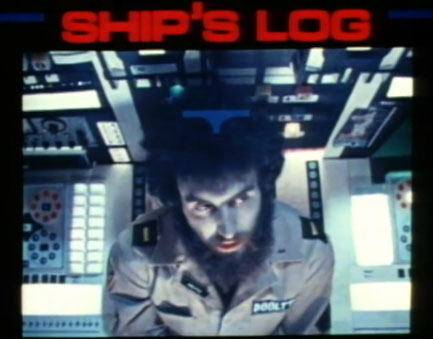      
Wikipedia says the student film was 45 minutes long, and a producer wanting to take it commercial paid to have them add 38 minutes to bring it up to feature film length for theatrical release--if that's so, I suspect the added part is the oddly long and otherwise pretty much plot-and-actor-isolated slapstick segment of Pinback (O'Bannon) vs "the alien." While the episode is patently and purposefully absurd, the theme of a bickering crew on an isolated space ship haunted by a rogue alien, not to mention a mission gone horribly awry, and AI that don't necessarily act in the best interests of the crew, would be reworked by O'Bannon into the wildly popular Alien. Dark Star, unsurprisingly, was wildly *un*popular--not being helped by the producer deciding to market it as a horror movie, which it most certainly is not.
The "science" in the movie is absolutely awful, except that some of the outer space landmarks they mention are real; one of their destinations, the Veil Nebula, for instance, is the large but very faint remnant of a supernova that exploded 5 to 8 thousand years ago; at maybe about 1500 light years away and having six times the diameter of the full moon, it is one of the brightest X-ray sources in our sky. Here are some photos of various parts of it:
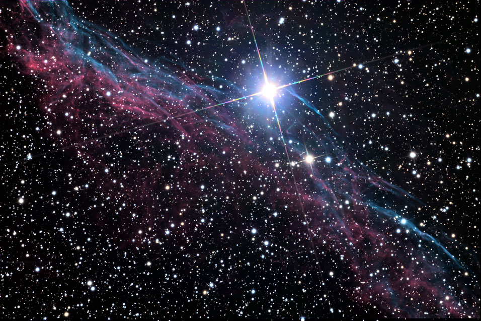
image by Jschulman555 (source)
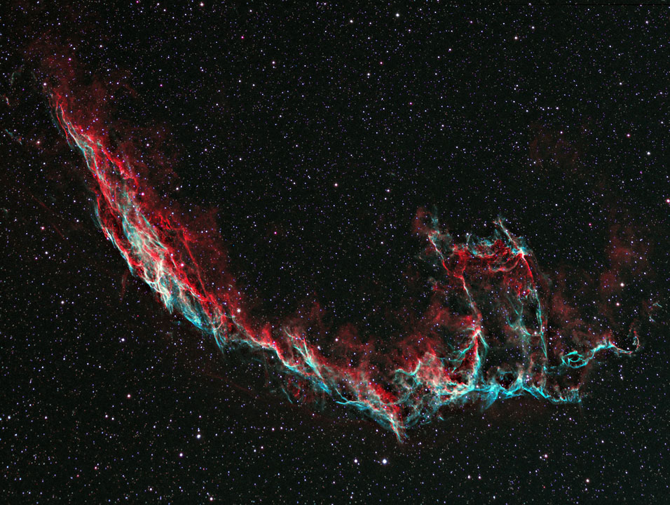
image by Hewholooks (source)
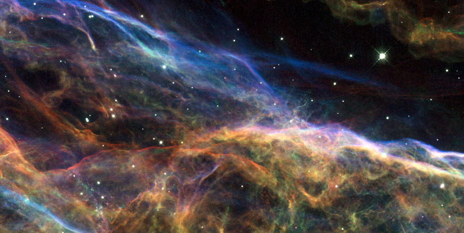
false color multiwavelength image by NASA, ESA, and the Hubble Heritage (STScI/AURA)-ESA/Hubble Collaboration (source)
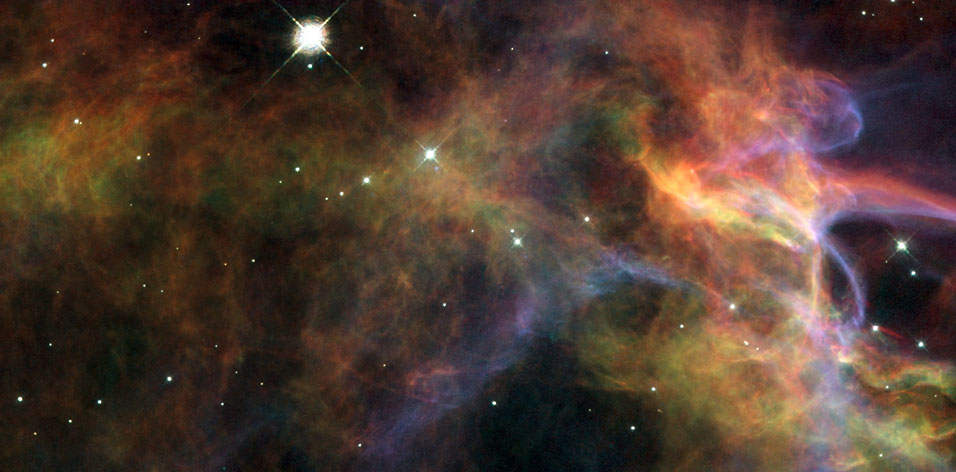
false color image by NASA, ESA, and the Hubble Heritage (STScI/AURA)-ESA/Hubble Collaboration. Acknowledgment: J. Hester (Arizona State University) (source)
~~~~~~~
Venus just crossed (or "transited") the Sun from our Earthly point of view, which got people excited since it won't happen again until 2117. A glance at the live stream on NASA's site the other day was predictably unexciting (a small dark dot on a big white dot), but their Solar Dynamics Observatory spacecraft in Earth orbit captured some rather stunning high resolution footage of the event at multiple wavelengths, which they've cleverly spliced together as a time-lapse music video sort of thing:
video on Youtube
Does that remind you of the Death Star headin' places, or what?
|
·····
|
| |
| Orlando Ferguson's Square & Stationary Earth | Jun 06, 2012 5:23 AM PDT | url |
| | |
Added 1 new A* page:While looking up the stuff for yesterday's article, about Kepler's Copernican heliocentric model of the solar system, and Brahe's "geo-heliocentrism," I came across this baby:
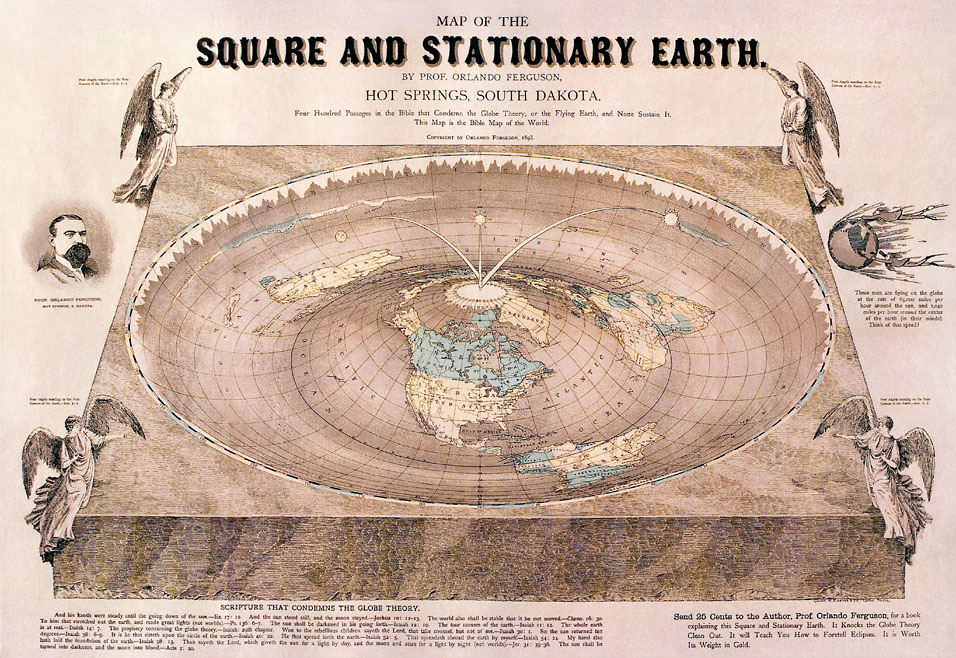
image by Orlando Ferguson (source)
That's Orlando Ferguson's 1893 diagram demonstrating how the Earth can be both the center of the universe, and square, as certain folks who take every colorful translated turn of phrase in the Christian Bible absolutely literally--and without researching it, generally--seem to want to believe, even in recent times--these are the modern geocentrists, and they have some fascinating ideas of how the universe works. Rather ironically, though, it appears that most of them now take the "out" provided by relativity--the whole thing about everything being a matter of your particular frame of reference, so from our Earthbound frame of reference, you could pseudo-scientifically say that relativity supports your claim that you're at the center of the universe. Clever!
The geocentric view, of course, has been around since at least the Greeks in the 6th century BC. Likewise, the idea that the Earth is flat goes back...well, probably to the first time some human bothered to think about what the thing they were walking on was shaped like in the big picture--but in terms of being written about, back to Homeric times in Greece (8th century BC), and quite far back in a multitude of other cultures as well. The Greeks, though, started figuring out that flat couldn't quite explain everything they were observing, and by the 1st century AD it appears that the spherical Earth was pretty much an accepted thing in Greek society.
This, along with a lot of other science from the ancient world, struggled to get passed along in the tumultuous upheavals of late antiquity, and, again, Christian writings seemed happy with the idea of a flat Earth, which thus began regaining ground in medieval Western culture. The round Earth idea never disappeared, though, and was in fact espoused in some of the most well-known learned tracts of the early Middle Ages--and it only became more widespread when the West was introduced to Islamic astronomy in the 11th century.
~~~~~
News has just broken that a US spy agency, the NRO (National Reconnaissance Office), has given two "spare space telescopes" to NASA; each has an eight-foot-wide primary mirror, plus a secondary mirror, making them potentially more powerful than the optics aboard the Hubble Space Telescope, which has a 7'10" mirror. While NASA thinks the earliest they could get the gift 'scopes refitted and launched would be 2020, a surprisingly long-sounding way off, that could work out quite nicely, as Hubble, already 22 years old, is expected to begin ailing by around that time, both due to equipment failures and to the gradual decay of its orbit--no further repair or boosting missions to extend the life of the telescope further are planned.
So two Hubble+ scopes to swing right in as replacements would be grand, especially since there really isn't a true successor to Hubble in the works; the James Webb Space Telescope is the official successor, but it's an infrared telescope, so even though it is due to have a whopping 21 foot mirror (consisting of carefully fitted smaller mirrors) at its planned launch date in 2018, it won't be able to return the type of spectacular visible light images that Hubble can. It's actually been downright puzzling to me that they *didn't* have an optical replacement in the works...but maybe somebody knew about these gift telescopes years ago? Well, who knows. Anyway, this is an excellent development for people like me who love spectacular visible light space photos!
|
·····
|
| |
| Tycho's Supernova Remnant | Jun 05, 2012 3:46 AM PDT | url |
| | |
Added 1 new A* page:I'm sort of surprised I never posted this NASA picture because it's one of their better known ones of our galactic scenery, I think, but better late than never:
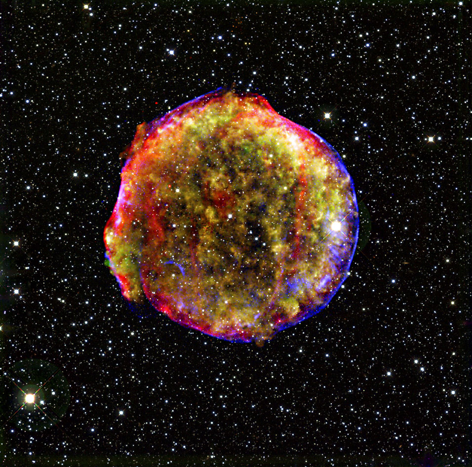
image by NASA/CXC/SAO (X-ray), NASA/JPL-Caltech (Infrared), MPIA, Calar Alto, O.Krause et al. (Optical) (source)
^ That rainbow fuzzball is Tycho's Supernova Remnant, also known as SN 1572--which I suppose stands for "Supernova of 1572," since that was the year in which it appeared in Earthly skies: "the New Star, never before seen in the life or memory of anyone," as Danish astronomer Tycho Brahe put it in the title of a tract he published containing his detailed observations of the startling phenomenon--a newly appeared star so bright that it was visible to the naked eye in broad daylight. Here's one of the diagrams he made showing the star among other stars in the constellation Cassiopeia--it's the one marked "I" in the upper-left: "Noua Stella":
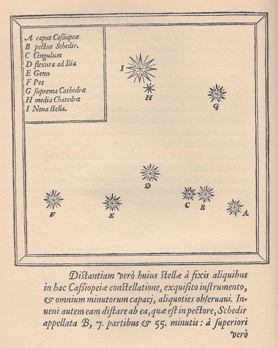
image by Tycho Brahe (source)
The apparition--one of perhaps eight supernovae visible to the naked eye in recorded history--faded from view within a few years. Thanks to the observations of Tycho and other contemporary astronomers, though, scientists armed with radio telescopes were able to locate a radio signal from its recorded position in the '50s, and achieved an optical observation of the remnant of the explosion in the '60s.
Tycho's observations and deductions of the "new star" revolutionized fundamental astronomical concepts:
| Because it had been maintained since antiquity that the world beyond the Moon's orbit was eternally unchangeable (celestial immutability was a fundamental axiom of the Aristotelian world-view), other observers held that the phenomenon was something in the terrestrial sphere below the Moon. However, in the first instance Tycho observed that the object showed no daily parallax against the background of the fixed stars. This implied it was at least farther away than the Moon and those planets that do show such parallax. He also found the object did not change its position relative to the fixed stars over several months as all planets did in their periodic orbital motions, even the outer planets for which no daily parallax was detectable. This suggested it was not even a planet, but a fixed star in the stellar sphere beyond all the planets. |
Tycho, "the last major astronomer to work without the aid of a telescope," seems to have been a pretty interesting fellow--a nobleman as well as the leading observational astronomer at the time--and the Wikipedia page on him is worth a read. But if you want something a bit more dramatic, I encourage you to check out the bit from Carl Sagan's classic "Cosmos" series dramatizing the meeting, in 1600, between Brahe and Johannes Kepler, who needed Brahe's observations of the movements of the planets--the most accurate ever made up to that time--to help work out his theories of planetary motion--these would eventually help Kepler discover that the planets move in elliptical orbits around the Sun, but not until after Brahe's death from overindulgence. That fun movie-like bit is on YouTube, beginning here. It also explains for instance why Brahe had a gold nose. :o Kepler had previously believed that the planets followed circular orbits; Brahe, for his part, did not follow the "heretical" heliocentric Copernican model of the heavens favored by Kepler, but "proposed a 'geo-heliocentric' system in which the Sun and Moon orbited the Earth, while the other planets orbited the Sun." This gained a following, particularly after 1616, when the Catholic church officially decreed that "the heliocentric model was contrary to both philosophy and Scripture."
The photo above is a false-color composite view; NASA's description runs as follows:
| The explosion has left a blazing hot cloud of expanding debris (green and yellow) visible in X-rays. The location of ultra-energetic electrons in the blast's outer shock wave can also be seen in X-rays (the circular blue line). Newly synthesized dust in the ejected material and heated pre-existing dust from the area around the supernova radiate at infrared wavelengths of 24 microns (red). Foreground and background stars in the image are white. |
Indications are that it was a Type Ia supernova, ie a white dwarf star that sucked in enough material--usually from a binary star companion--to reach the Chandrasekhar limit--the maximum mass in which matter's electron degeneracy pressure is able to resist the force of its own gravity--in other words, the point at which gravity, having squeezed the white dwarf down to just barely larger than nothing, overcomes the normal quantum mechanical laws of matter, and matter collapses entirely. Or forget that and see if you can figure out this rather more technical explanation:
| "...observe that, as we add mass to a white dwarf, its radius will decrease, so, by the uncertainty principle, the momentum, and hence the velocity, of its electrons will increase. As this velocity approaches c, the extreme relativistic analysis becomes more exact, meaning that the mass M of the white dwarf must approach Mlimit. Therefore, no white dwarf can be heavier than the limiting mass Mlimit, or 1.4 Solar masses." |
Although actually, in the case of a Ia supernova, the white dwarf doesn't *quite* reach the ~1.4 solar masses of the Chandrasekhar limit; instead, as it approaches the limit, the pressure raises the temperature, which increases the rate of fusion at the core until it reaches such a state that all the remaining carbon in the star detonates at once.
(Interestingly enough, in the past ten years or so, at least four Super-Chandrasekhar mass supernovae have been observed, starting with the Champagne Supernova of 2003; these are believed to be type Ia supernovae in which the white dwarf exceeded the Chandrasekhar limit by as much as 100% before exploding--several theories have been put forth as to how this is possible: a) the dwarf was spinning so quickly that centrifugal force helped hold it up, or b) two white dwarfs merged.)
The more spectacular nebulae tend to come from other types of supernova explosions--one where an incredibly massive star collapses all at once--but as in the case of Tycho's Remnant, Ia supernovae can still leave a pretty cool cloud of debris behind. The superhot cloud is thought to be expanding at maybe around 5,000 km/s; by way of comparison, the speed of light is 300,000 km/s.
The observations forming the above photo were done in 2003, and the photo was published in 2009. Immediately after that, though, succeeding observations would begin picking out details of the Remnant--which is maybe about 9,000 light years away and 20 light years across--that may contain clues not only to the forces driving such debris clouds, but even to how exotic cosmic rays are generated! I will get into these in another post soon. :D
~~~~~~
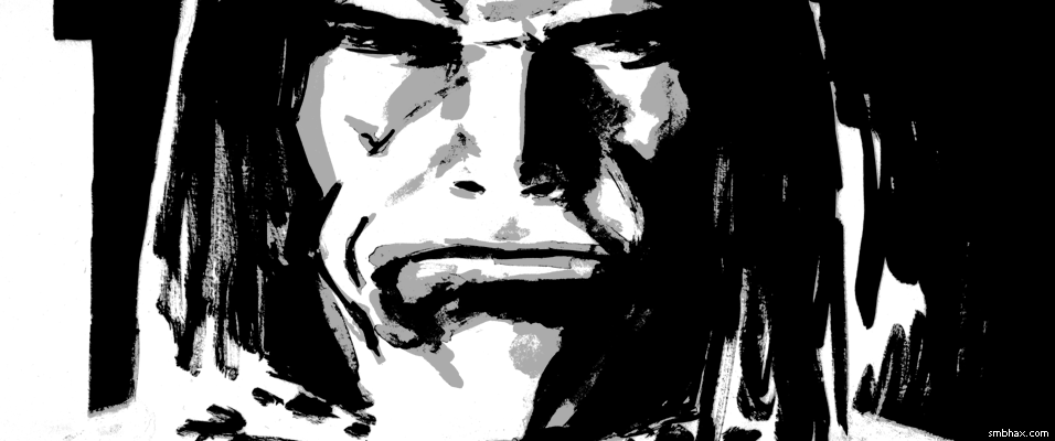
Here's what's on the back of today's A* page (click it for the "subscription preview" HD version):

I sketched out what would become the final page, but as a light ink sketch it looked way too...normal. So I flipped the page over and tried something a bit more dramatic and gestural, and it had some nice things in it, but the features weren't quite Thierry, you couldn't see him hiding behind the big guy, and I couldn't figure out what to do with the hair. I flipped back to the first sketch and threw some heavier black onto the eyes, the sides of the head, and the shoulder, and then it started to look a little more interesting, so I went forward with that instead.
|
·····
|
| |
| Plasma, the state that matters! | Jun 02, 2012 5:57 AM PDT | url |
| | |
Added 1 new A* page:A few days ago I posted about the new finding of what appears to be fairly solid evidence that our galaxy's central supermassive black hole, Sgr A*, shot out a galaxy-spanning beam of plasma some tens or thousands of years ago, the result of swallowing something like the equivalent of 10,000 Suns. Well that reminded me that I wasn't too sure what exactly is covered by the term "plasma," so I went and looked it up!
According to Wikipedia, plasma "is a state of matter similar to gas in which a certain portion of the particles are ionized." Oh! Well, that's pretty easy. Like a gas, it doesn't have a definite shape, BUT--unlike a gas--plasma, being ionized (positive or negative ions, or electrons), can be shaped or guided by magnetic fields.
You've probably manipulated plasma with the magnetic field of your body, in fact, by touching the outside of one of these babies:
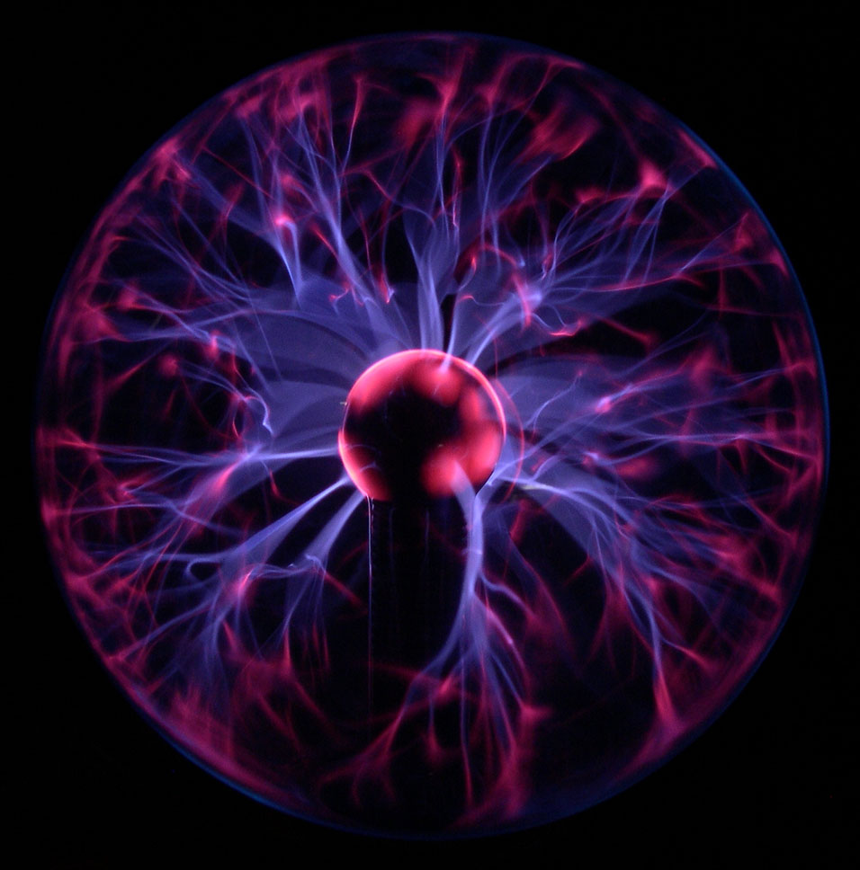
image by Luc Viatour / www.Lucnix.be (source)
But you can get plasma all over the place! For instance, the Space Shuttle Atlantis left a trail of plasma as it plunged through the atmosphere to come in for its last-ever landing last July:
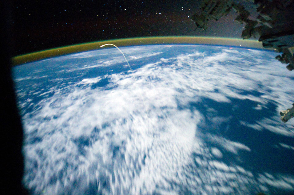
image by NASA/ISS Expedition 28 (source)
And in fact, plasma is the most common state of matter (as opposed to solids, liquids, or gasses) in the visible universe! It's plasma that makes for much of the cool glowy stuff I do so love to post in space photos. Let's review some of A*'s greatest plasma hits!
You see a big ball of plasma in the sky probably nearly every day. That's right, we call that plasma the Sun! Stars are fusion-powered plasma:
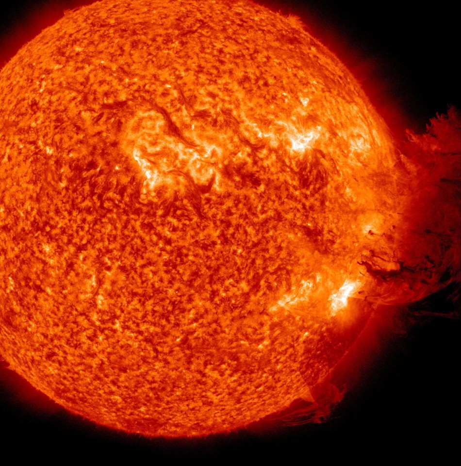
image by NASA (source)
Powerful magnetic fields in stars like our sun shape the plasma into all sorts of shapes: tube-like structures in sunspots
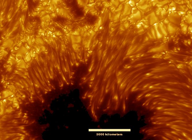
image by SST, Royal Swedish Academy of Sciences / NASA (source)
and into huge leaping arcs called "coronal loops":
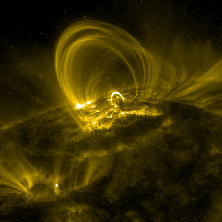
image by NASA (source)
Of course we already know that plasma can be shaped into huge jets by the incredibly powerful magnetic fields generated by supermassive black holes, like this 5000 light-year-long (!!), near-light speed jet coming out of the center of galaxy M87, one of the most massive galaxies in our little corner of the universe (~53 million light years away, and maybe 200 times as massive as the Milky Way):
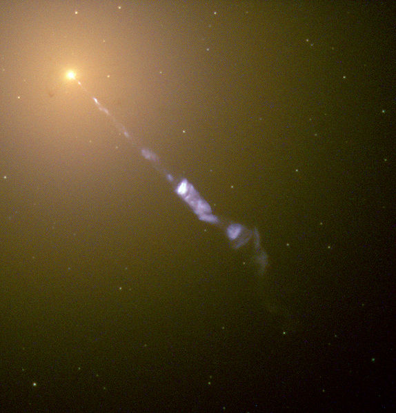
image by NASA/ESA (source)
And on a more local scale, you're seeing plasma when you see lightning. And it can be generated for space travel purposes, as with the slow-but-efficient Hall Effect ion thruster ("Over 240 thrusters have flown in space since that time [of the Soviet "Meteor" satellite in 1971] with a 100% success rate")
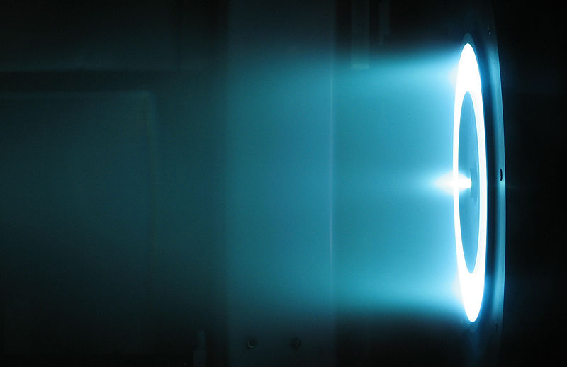
image by NASA (source)
or to impress people with your scientific and commercial ideas, Tesla-style:
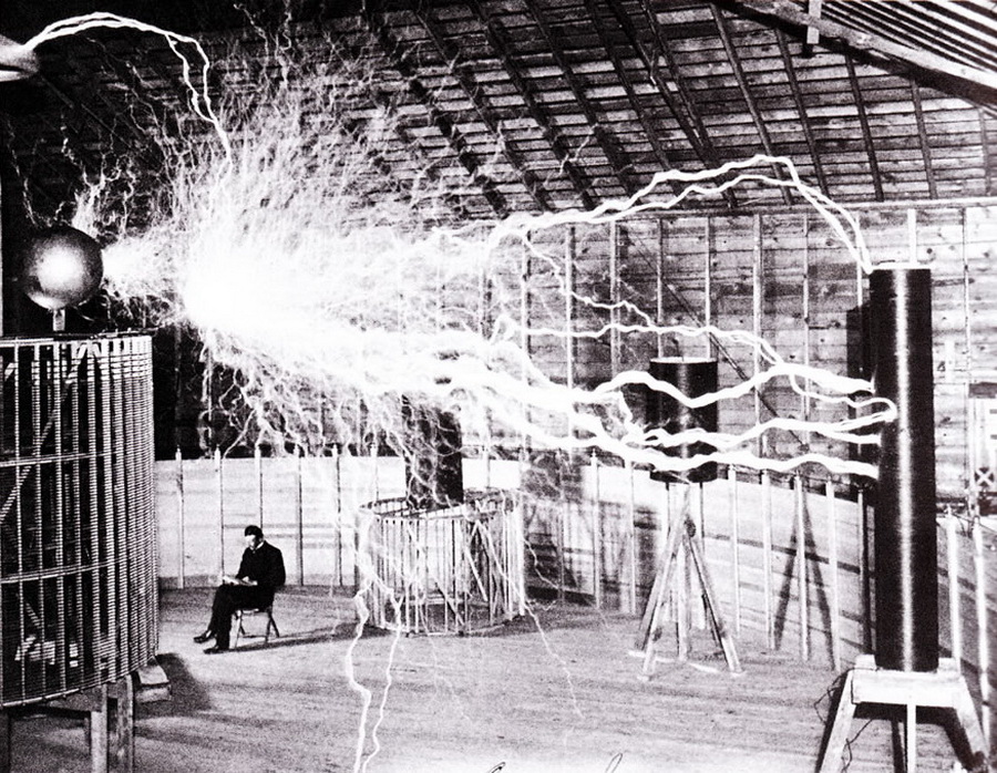
image by Dickenson V. Alley (source)
(Mind you, not even the ambitious Nikola Tesla liked the idea of sitting that close to such a powerful electrical field, so he had his photographer use a double-exposure to *appear* to capture him alongside that raging plasma in his Colorado lab in 1899.)
Fun stuff, that plasma!
|
·····
|
| |
| Rollin' Icebergs; Charles Addams and Family | Jun 01, 2012 6:15 AM PDT | url |
| | |
Added 1 new A* page:Maybe it's a truly ominous sign of global warming, as some would have it, but...a huge iceberg rolling over off the Upsala Glacier in Argentina makes for (WARNING: auto-playing video with sound) a pretty cool tourist video.
~~~~~~
Listening to Tall Tale Radio episode 146 this evening while drawing today's page, I heard Kenosha Festival of Cartooning founder Ann Hambrock mention growing up on the cartoons of Charles Addams (1912-1988), whose most famous creation took his name: The Addams Family. They began as recurring characters in his often macabre cartoons, many of which were done for The New Yorker. Perhaps his first gig, touching up photos of corpses (removing the nasty-wasty blood) for True Detective magazine was quite instructive!
Anyway I mention him because his cartoons were done--somewhat unusually--in ink wash, which is what I use, much more crudely, for A*. If you check out some of his cartoons, such as this one and this one and this one and maybe even this one, you'll see just how neatly he managed both sharp shadows and smooth gradients. Man! Well, practice, practice, practice I guess. :o
|
·····
|
|
|