 | |
| |
|
|
view titles only (low bandwidth) |
| |
| Hit the lights | Sep 28, 2013 8:52 AM PDT | url |
| | | |
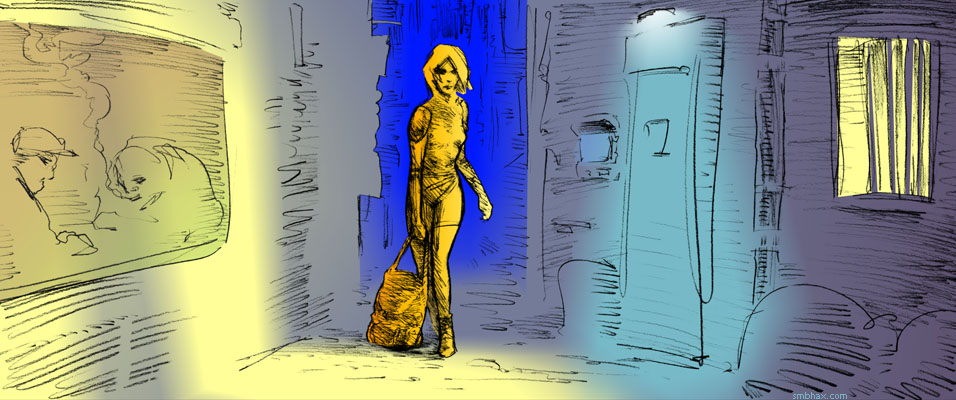
Added 1 new A* page:I got a lot of feedback on the previous page; it seems that people like it when I get some darkness into the picture. Although today's page has a light background, we are just heading into several dark scenes that will wrap up this episode, so there will be a lot of dark pages to come for a while here--provided I can manage to figure out how to color them! : o
|
·····
|
| |
| "Difference" to the rescue : P | Sep 27, 2013 6:48 AM PDT | url |
| | |
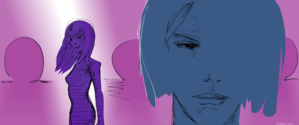
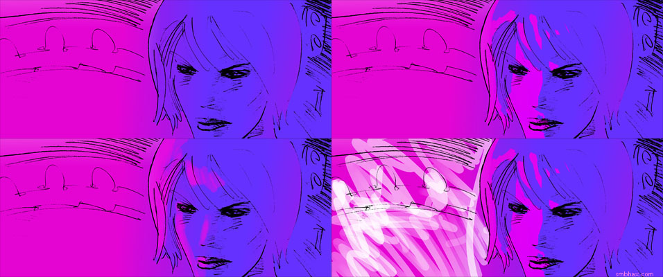
Added 1 new A* page:Today's dark colors came from a Hue/Saturation layer set to Difference blending mode, which is something I haven't used before. We're coming up on some dark scenes, and I think I'm gonna have to get used to using dark colors and not relying on Difference to switch bright colors to dark later on like this. Also the lighting is probably too gradient-y; I thought about using a grayscaled version reduced to 16 colors as my desaturation layer; banding from overlapping bitmap layers wouldn't be a problem because I'd basically be introducing my own, much stronger bands with the 16-color grayscale layer, giving those nebulous gradients some contour. In the end I felt that approach didn't really improve the look for this page, though. Anyway here's the colors before more or less inverting them with a Hue/Saturation layer on Difference, then partially desaturing them with a Hue/Saturation layer set to "Color":
Maybe tomorrow I'll be able to pick a darker scheme on my own like a big boy. : P
|
·····
|
| |
| Non-destructive partial grayscaling | Sep 26, 2013 9:21 AM PDT | url |
| | |
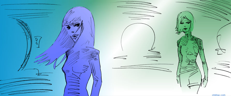
Added 1 new A* page:You might be wondering where the color went today. I removed it. Or at least, 80% of it. See I got to this point
and while trying to decide between the virtues of one color adjustment and another in Photoshop, I shifted them to grayscale so I could measure their overall brightness (as I would learn later, this is not a precise way of doing that), and the grayscale was pretty neat looking, I thought. So I undertook the seemingly simple task of converting an image most of the way to grayscale, without having to resort to overlapping bitmaps that would exacerbate color banding in my background gradient (speaking of which, another couple things I found today were: you get much less banding in a white-to-color gradient than in a color-to-color gradient, and Photoshop CS2 is in some cases better at avoiding excessive color banding in color-to-color gradients when shrinking an image down than my beloved and even more ancient Photoshop 4--but it's kind of a pain to jump over to CS2 just to do that so I probably won't unless I end up with some unavoidably ugly banding somewhere).
Turns out that converting non-destructively to partial grayscale is not so simple after all--at least, not as far as I could find on the internet. In fact, just converting to grayscale is a rather more complicated process than any reasonable person would think. For instance, if you compare a color-to-grayscale conversion operation on Photoshop to just desaturating the color image, you find that the gray version you get via desaturation has a lot less contrast than the one you made gray by converting it to grayscale color mode; this is apparently because, since our eyes see different pure colors at different brightness levels (pure RGB green is brighter than pure RGB blue on your monitor, for instance), you have to convert them to gray at different values if you want to end up with something like what your eye sees. Lots of pages will tell you lots of different mixing forumulas to use to convert a given color to its visually matching gray, like "30% of the red value, 59% of the green value, and 11% of the blue value" or maybe "0.21 R + 0.71 G + 0.07 B".
The problem is, as far as I know there's no non-destructive filter in Photoshop (or even a destructive one) that'll just let you pop these conversion ratios in. So I'm not sure how helpful those numbers are for the Photoshop user.* Actually I got a little lazy there, and that second formula (I could have used some others I found instead, but I didn't keep track of them : P) is supposedly something slightly different: not a formula for converting to grayscale (I saw several references to Photoshop's unknown grayscale color conversion ratios as the "magic numbers" everyone wants to know--but maybe Adobe keeps it a closely guarded trade secret?), but rather the formula for luminance, which is sort of the same thing, only not so secret. And it's pretty easy to tease out a color image's luminance in Photoshop, except it's destructive: as detailed on that "30% of the red" page I linked in the previous paragraph, you just make a white layer, pop your color image in above it, and set the color image layer to "Luminosity" blend mode--voila, there's your luminosity in glowing grayscale.
That comes out fairly close, in terms of gray tones, to Photoshop's mystic grayscale conversion, but it *is* destructive in the sense that you can't get partial color back out of it if you wanted--it's either all Normal or all Luminosity; sure, you could layer that over a normal color version of your image, but then the banding, etc.
So at this point I was stuck. I looked into all sorts of other methods of converting to grayscale to try to find one I could blend properly, but didn't really find one. I even tried concocting my own Hue/Saturation mixing formula for the six primary/secondary RGB colors, by making a Hue/Saturation layer over a Red/Yellow/Green/Cyan/Blue/Magenta checkerboard, then playing with the brightness of each of the six main colors in the Hue/Saturation adjustment layer, while flicking back and forth to compare the results with an overlaying version of the checkerboard I'd converted to grayscale, and that seemed to work on the checkerboard, but then failed miserably when tried on colors of different value levels.
And then finally, in this article about using "Fade" after a "Desaturate" operation, I found a clue; the author says to use Desaturate, which is destructive, but then reel it back by using "Fade" to revert it by whatever percentage you like, while picking "Color" as the blend mode while doing so. And *that* prevents it from altering the luminosity of the original colors, and gets you pretty darn close to Photoshop's grayscale conversion results--but it's destructive! So I'm not sure why the author uses it, because the obvious, non-destructive way to perform that operation is to make a Hue/Saturation layer, set to its maximum desaturation setting, and set to blending mode "Color"--or to "Hue," which has the same result. Voila! A vibrant, pretty darn close to "grayscale" gray conversion that sits non-destructively in its own single adjustment layer, and can be mixed into your color image in whatever degree you like. For today's image I set mine to 80% opacity--which was probably excessive, but hey, let me enjoy my grayscaling discovery here for a minute. : P
[* Oh right, I'd forgotten to look this one up: there *is* a function in Photoshop CS2 and later that accepts grayscale color conversion ratio numbers: the "Channel Mixer" adjustment layer. Check the "Monochrome" box in its settings, pop those numbers (30% red, 59% green, 11% blue) into the color conversion boxes, and bang zoom, you get an adjustment layer that gives exactly the same result as my Hue/Saturation layer (and also the same as the destructive "Luminosity" technique I described earlier), only you had to punch more numbers into yours. Hah. Also I'd ignored Channel Mixer because it doesn't exist in Photoshop 4, and I don't want to use the annoying and bloated CS2 when I can use the sleek and stylish and only slightly crash-prone ancient PS 4 instead. : P]
[[With either adjustment layer method, bright saturated colors, except--for the most part--yellow, come out too dark vs a standard grayscale conversion, especially blues and magentas, which are way too dark, and reds, to a lesser degree.]]
|
·····
|
| |
| Hue blending and color banding | Sep 25, 2013 5:50 AM PDT | url |
| | |
• Added 1 new page: A* Episode 20, Page 14
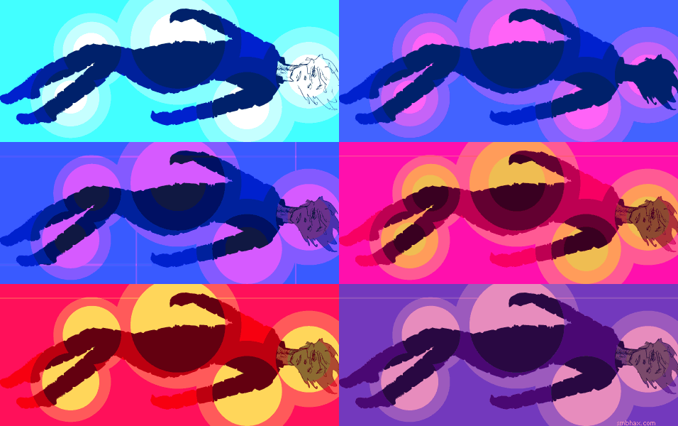
Today's new coloring discovery was that in the later stages of overall color tweaking, while just a regular Hue shift (with a "Hue/Saturation" adjustment layer) can yield interesting results, you can get quite a variety of sometimes more subtle, sometimes more polarizing color shift effects by changing that Hue shift layer to a different Blend mode, so that it doesn't just shift the full spectrum of the image evenly, but operates upon it in a more selective way, say just shifting the colors that would lighten, or changing their hue but not their value or saturation. Hm! These were the original colors for today's page, for instance
and I got to the final colors by putting a Hue/Saturation adjustment layer over the color layers, set at +90 Hue, Overlay blend mode, at 53% opacity.
Actually what I did at first was do it at full opacity, compact that all into one layer, set that aside for a moment, and then do two more separate Hue operations on the original color set, using Screen blends this time, and then combined those at low opacity with the Overlay one, all over the original color layers. That let me tweak out some subtle pinks in Treban, but aside from washing out some other areas, the real problem that cropped up was color banding: even working in 24-bit color, if you blend too many copies or variants of the same bitmap together, you're essentially aggravating the rounding errors (well not errors, but compromises, shall we say) that make up any of your color gradients, so the individual colors start to separate from each other and their 24-bit flaws become exaggerated; for instance, in this snippet from the original version I uploaded, if you look very closely you can see purple bands of color running diagonally across the lower right side of Treban's hair, and weird reddish and other bands running diagonally the opposite direction in the background off to the right of her shoulder. I kind of knew this would happen when I've done this kind of thing before, but it had never gotten this bad, at least not unintentially; I don't mind color banding in some situations, like in the highlight rings on the planet in yesterday's page, for instance, but this stuff today was getting a bit out of hand.
So, coloring lessons I need to remember from today's Photoshop follies: blend modes can be nifty on Hue adjustment layers, and don't rely on creating complicated composite color sets by blending differently tinted versions of the same image together, because eventually you'll get banding, silly.
|
·····
|
| |
| Man, I can buy a hamburger with that! | Sep 24, 2013 1:50 AM PDT | url |
| | |
• Added 1 new page: A* Episode 20, Page 13
As I mentioned in an impromptu post over the weekend, I just got the silly idea of putting each new A* page drawing--the original pencil art, I mean--up for bid eBay, pretty much as I draw them. I've already got the line art for today's page up for auction, as well as those for the previous two days; you can pop over to check them out by way of the sorta orangey yellow gold "original on eBay" link beneath them in the comic browser, although here are their direct auction links for posterity: Hello Dalí, Alone, and The Planet Below.
See I get to give them titles, which is fun. Photos of the drawings go up in these auctions before the pages themselves appear on A*--because it takes me hours afterward to color them, you know--and the titles will mostly be based on the dialogue that will appear in the final page ("Hello Dalí" isn't part of the page 11 dialogue, obviously, but maybe you can figure that one out : ), so I suppose the line art and its title constitute a kinda teaser for the finished page that'll appear later in the evening. I'm going to be posting links to them as soon as they're posted to eBay on the A* Twitter, A* Google+ and A* Facebook accounts (oh hm and you can probably also just follow my eBay profile directly--yes it is a silly, very old name that was easy to type : p), so you can keep an eye on those if you're interested in getting these as previews of sorts.
Besides which, since the auctions start at just $0.99, this is probably gonna be a pretty inexpensive way for people to pick up actual A* original art, if you're interested. I mean, I hope to make a couple bucks on some of them here and there (page 12 has already shot right up to $10 :ooo) buuuut I'm sure there will be plenty available for a steal. Anyhoo I certainly appreciate anyone who puts up a bid on any of these--it's a little embarrassing how much spring that $10 put in my step today. I suppose being excited at the prospect of getting $10 for a day's work means you've been in webcomics too long, but hey, :D.
|
·····
|
| |
| Two original A* drawings just up on eBay | Sep 22, 2013 6:43 PM PDT | url |
| | | |
Got the nutty idea of putting the original art behind each new A* page up for bid on eBay, fresh off the drawing board each day. Bidding on each starts at $0.99, so this will probably be a pretty good way for you to get my original drawings affordably. Maybe *too* affordably >_>...we'll see how this goes. : D I'll have more on this tomorrow in a proper update, but anyway the most recent two A* page illustrations are already up for bid--and I get to give each one a wacky name, so that's fun; they're going as Hello Dalí (page 11) and Alone (page 12); the live auctions will always be linked from the orangey (gold?) "original on eBay" link right up there under the page's image in the comic browser.
|
·····
|
| |
| Rope-a-Dope Drawing, Round 12 | Sep 21, 2013 11:02 AM PDT | url |
| | |
• Added 1 new page: A* Episode 20, Page 12
Drawing's a funny thing. Sometimes, even if you don't know exactly what you're going to draw, things click into place fairly quickly and bang, you're off to the races. Yesterday's page went sort of like that, after a few quick false starts--well, the Selenis part, anyway. Other times, the clicking just won't start, and I find myself drawing awful drawing after awful drawing, feeling pretty lost for, like, hours. That was today. I think the problem was I didn't quite know what pose I wanted--just which ones I *didn't* want. So then there's just this slow process of drawing the wrong things for a long time--I think until the conscious part of my brain that's struggling and frustrated just gets so punchy it can't offer much direction, and then things are even more muddled for a while, until finally there's nothing left for your hand to do except draw an actual thing instead of what you thought was your *idea* of the thing. That's sort of how this one felt in the end. For me, drawings that emerge like that tend to be the most successful at capturing a lifelike appearance (the last one like that was episode 19, page 81, I think)--if only they didn't take so darn long to work themselves out!
|
·····
|
| |
| Awaiting the Great Pumpkin | Sep 20, 2013 11:25 AM PDT | url |
| | |
• Added 1 new page: A* Episode 20, Page 11
Alternate color schemes:
I really kinda like that orangey one but it's a bit harsh on the eyes at full size.
|
·····
|
| |
| Orbital's Cygnus shoots for space station | Sep 19, 2013 6:30 AM PDT | url |
| | |
Added 1 new A* page:"Orbital's Cygnus space freighter embarks on maiden voyage" is the big space headline; you probably remember hearing about that commercial SpaceX module that docked with the International Space Station; well, Orbital is the other company that got a nearly $2 billion contract to fly cargo to the ISS, and now it's their turn to show what they can do. We'll know in a few days when their robotic module tries to maneuver into docking position! Launch via their Antares rocket apparently went flawlessly.
I mentioned the Cygnus about two years ago at the end of my space module roundup, saying it uses the old Spacelab module design just like pretty much every other space module, and as this new article points out, the manufacturer of the Cygnus' pressurized cargo vessel, Thales Alenia Space of Turin, Italy, previously produced modules for NASA's Space Shuttles to carry to the ISS. Nice to see they're still in the game after the end of the Shuttle program.
|
·····
|
| |
| Why I shouldn't try digital painting | Sep 18, 2013 5:50 AM PDT | url |
| | |
Added 1 new A* page:I've had a feeling since...oh a long time ago, at least to some degree, that at some point I'd just end up painting each A* page. And now we're almost there, because I've sort of pushed filling with the Lasso Tool and Gradient Tool as far as I care to take them in Photoshop. I did all I could with them for today's page and it was still pretty...well, flat, I guess, but I don't mean it that way. You can see it in the upper left of the composite below:
So from there I took it from my standby ancient Photoshop 4 into Photoshop CS2, found a hard, irregular brush I kinda liked (Large Oil Pastel), and painted in some facial color detail using my keyboard's touchpad. That actually worked pretty well (upper right corner above). Then I tried some other stuff, back in PS 4, such as doing a more standard type of digital painting with a normal round brush (the only kind PS 4 supports, actually : P), and pressure-sensitive opacity; that was kind of gross and boring (lower left corner above). It did work a bit better as a sort of laser-motion-trail-like effect (left side of lower right corner above), but since these pressure-sensitive modes require using my drawing tablet, which irritates my arm in various ways after a while, I don't think I'm gonna mess with them much. So the semi-transparent white strokes in the final version of the page were done with fixed 50% transparency and my touchpad again (you can kinda tell because, aside from not having smooth opacity transitions in a single stroke like the tablet-drawn one has, since I use my touchpad with my right index finger, the strokes slant the opposite direction of my tablet stuff, which I use holding the stylus in my left hand). But even the stuff in the final version of the page is kinda wild and experimental because, again, I have no idea what I'm doing.
Oh yeah and in that vein, the lines here are pretty grainy because, as with um oh yeah page 140 of episode 19, they come from a photo rather than a proper 600 dpi scan of the pencil lines; it's the ol' "oh there's just that one thing I'll touch up real quick here" and that reveals something else that then doesn't work and before you know it you've redrawn most of the drawing, thinking you're improving it mightily, and then you step back and compare it with the photo you happened to take of it before you started second-guessing everything, and you realize you've turned a decent drawing into something much worse, and now you're tired and late and have no chance of drawing something that decent again today, and you have to do terrible things to the photo in Photoshop to try to salvage even a rough approximation of the lines you stupidly obliterated in the name of progress.
So yes, quite another fun cavalcade of errors today. I do think I'll have to stick with doing some finger-painting on the pages, though--at least until I think of some other approach. I actually like that Oil Pastel brush from CS2 quite a bit--kind of a chunky but still sharp look, smoother and more solid than what I can get with the freehand Lasso Tool, and much faster than what I can do with the polygonal Lasso Tool--especially on a touchpad. : P And actually using it with the touchpad rather than the tablet does sort of accentuate the rough and chunky aspect of it--hopefully not too much, but enough to keep it a little unpredictable, maybe, and to prevent me from being tempted to try wasting time on a lot of minute detail. Eh hopefully I'm also not going to be tempted to delve into the massive world of custom Photoshop brushes, though, because that way lies madness, not to mention digital crutches. (Admittedly though I did try painting on A*-sized pages earlier in the day with the sort of fancy painting tools in ArtRage and GIMP, and neither of those programs was up to the task, at least not on my aging computer.)
One thing that surprised me slightly was that, while I knew the round brush, drawn past a certain size/speed, would leave a slightly pebbly trail rather than a smooth one in PS 4 (you can see the wavering edges of those white strokes in the 1080p version of today's page), the much more recent Photoshop CS2 has exactly the same un-smooth painting problem. So I'll probably try to avoid using the round brush a whole lot, I guess. Switching between Photoshops just to use the Oil Pastel brush in CS2 (which is quite responsive compared with most of the others I've tried) is going to be kind of a pain, but oh well, such is life.
|
·····
|
| |
| Everyone loves jpgs, right? | Sep 16, 2013 11:57 PM PDT | url |
| | | |
Added 1 new A* page:Oh dear, now it is just straight gradients in full color. So much for principles! : P
|
·····
|
| |
| Why sleep when you can sketch | Sep 14, 2013 6:31 AM PDT | url |
| | |
Added 1 new A* page:I meant to have something actually interesting to post, but agonizing over whether to render this page out as a jpg, 32 or 256-color dither, or the 32-color flat I've been using took way too long. In the end I stuck the the flat 32 because it gives some shape to the central event, which was sort of the point of the layout. Also because dithering (the scattering of contrasting colored pixels among each other to create the illusion of intermediate colors, I mean, not the agonizing over whether or not to do it) or going with more colors would almost certainly be a short slippery slope to just doing full fledged color, which...I dunno I think it would be hard to keep that abstract and weird, like I'm almost forced to be with just 32 un-dithered colors. But I also wish I could have pages that look as smooth and natural as page 6, but it seems like that can only happen if there's like no really visible lines at all, and then how could I do, say, faces? Except to meticulously draw the outlines of the colored areas that would define the highlights of the face, in pencil, and then use that as a guide for the digital color...oh dear. Oh dear I wish I hadn't thought of that because that would be hard. Maybe I'll manage to forget it by Monday.
Bleh well have some frustration sketches (why go to bed grumpy when you can stay up and sketch? :"P), digital and pen:
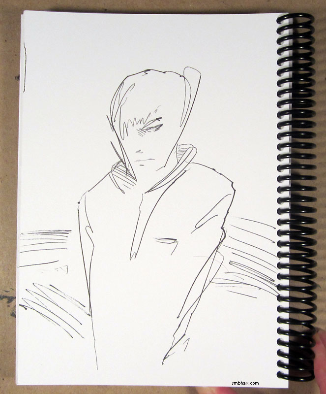
I've been wanting to make myself do more sketching, pen in particular. Haven't really been managing it. Maybe I'll get some done this weekend. The pen is a Pentel Rolling Writer--they have a big, fat, grungy, liquid ink roller ball line that I've been using since high school (which was a loooong time ago). Since I started doing A* traditionally I've tried all kinds of fancy schmancy art pens but you know, none of them have been quite as satisfying as a plain ol' Rolling Writer.
|
·····
|
| |
| Voyager-1 goes interstellar | Sep 13, 2013 2:25 AM PDT | url |
| | | |
Added 1 new A* page:The big space news today was confirmation that the Voyager-1 probe has left the Solar System--in fact, new calculations show that it left the bubble blown in space by the Sun's magnetic field and entered the interstellar medium on August 25th of last year. So huzzah! Launched in 1977, Voyager-1 is cruising along at about 100,000 mph (45 km/s), some 12 billion miles (19 billion km; 17 light hours) from Earth; the crossing point out of the Solar System occurred at about 11.25 billion miles, or 121 Astronomical Units (1 AU is Earth's distance from the Sun). Now it's got about 10 years of juice left in its plutonium power pack to measure the interstellar medium directly, something which, obviously, we've never been able to do before. It's already "revealed a near-100-fold jump in the number of protons occupying every cubic metre of space" in crossing out of our Solar System. This is real, galactic space now! Exciting stuff!
|
·····
|
| |
| Another silly way to color | Sep 12, 2013 3:24 AM PDT | url |
| | |
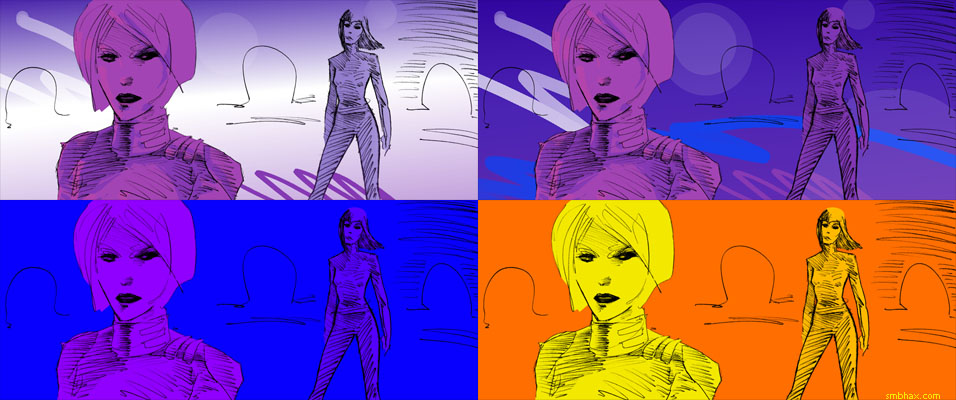
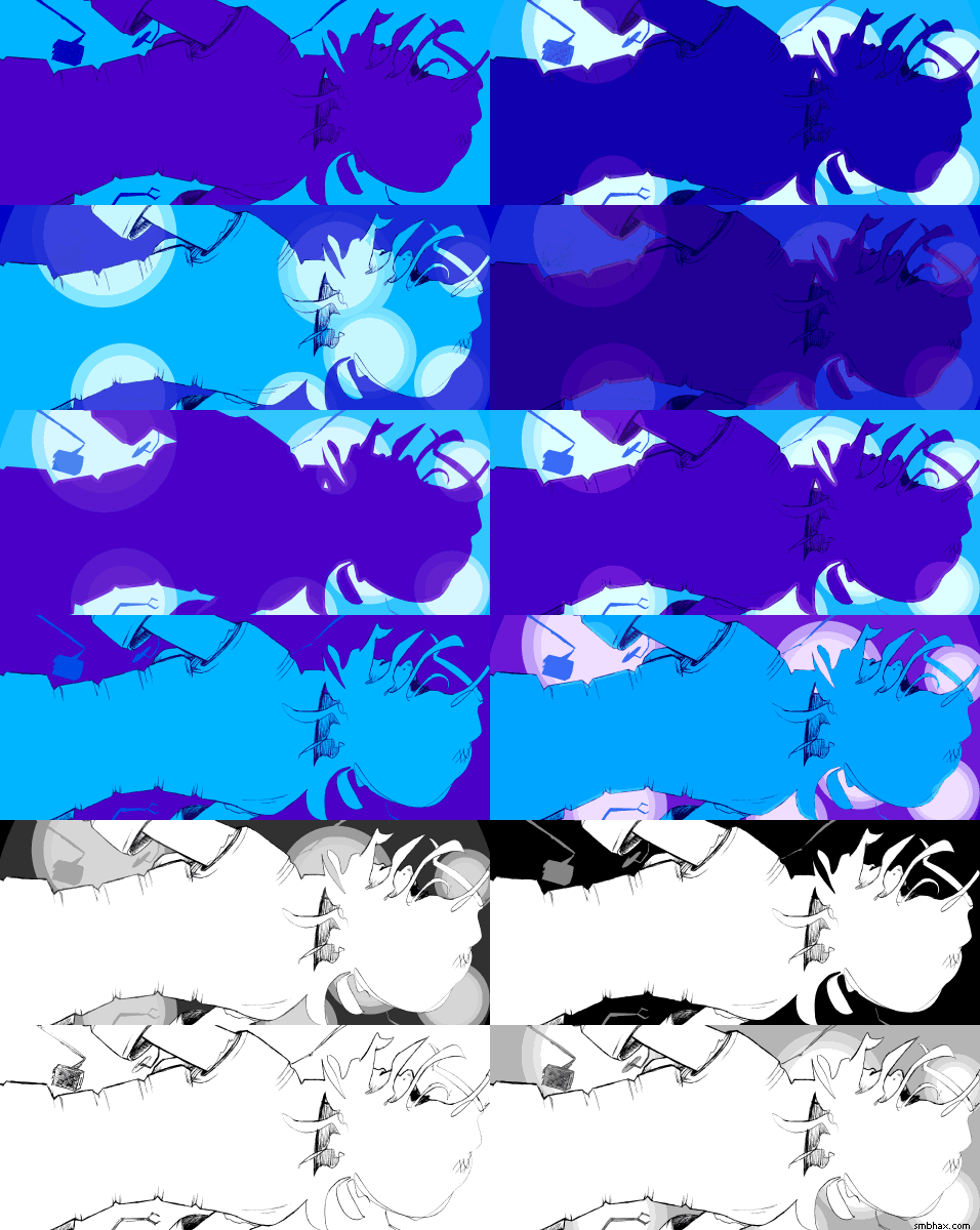
Added 1 new A* page:I don't mean to keep boring everyone with color "process" playback images every day, but a) the color is taking me so long I don't have much time to write about anything else, and b) since I'm still figuring this color thing out, there are things I want to document for my own reference just in case I'm looking back and wondering how the heck I got the result I did on some page. So for today's I ended up doing something slightly different to come up with the final colors--basically I kept altering colors and then blending back into the previous result; I'm not sure why, but it seemed to build up an interesting color set with a bit more subtlety than my usual, maybe. Anyway here is a sort of step/blending diagram of the colors without the lines, which I'll endeavor to explain:
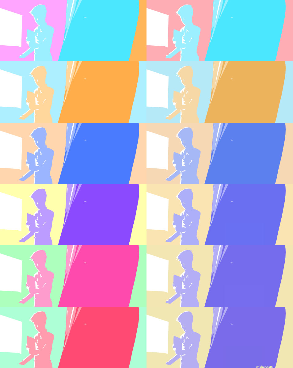
The beginning colors are in the upper left, although sort of split between two background colors I couldn't quite decide on: the pink on the left (left) and the orange on the right (the right half of the upper left image, I mean). So I blended those together equally to get a new background color, which you see in the result in the upper right.
I started using a Hue/Saturation adjustment layer to traverse the color wheel with that color set as the base, just looking for interesting relationships that might pop up. The first, on the left, second row, I then blended back into the previous result at 90%, and you can see the new result on the right side of the second row (the left column is the new blend color and the right column is the blend result, basically, from here on). Then I altered the hue of the original set again, in row 3, and blended that in with the previous result, again at 90%. Ditto, row 4, but I only blended that one in at 30%, then 7% for row 5, and just 3% for the final, row 6.
[UPDATE: Then after having uploaded it and looked at it a few times, including on my phone which has a much more stable gamma than my PC monitor, I applied a hefty Levels adjustment to darken it so it didn't look kinda washed out. Man, once I get rich off webcomics I gotta get a monitor with a wider viewing angle : P.]
It is a sort of literally circuitous route to getting a color set, but it's actually more organic than it sounds, and because shifting hue also shifts value (light/dark) relationships--since our eye sees pure digital blue, for instance, as darker than pure digital yellow...or pretty nearly any other of the fully saturated, full value colors, really--it also lets you tweak value relationships in a sort of intuitive way as you go along. You do tend to lose a bit of saturation with all the blending, of course, but you can always get that back by upping the saturation if you need to. Letting a bit of the saturation go, at least in some areas, does make things a little easier on the eyes, though, as survivors of my earlier colored pages can probably attest.
|
·····
|
| |
| Yeah it's electromagnetism, that's the ticket | Sep 11, 2013 2:51 AM PDT | url |
| | |
Added 1 new A* page: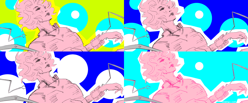
Yeah see I'm telling myself that I don't want to abuse halftone patterns, but I think I see at least one reason--aside from the eye-catching patterning, I mean--illustrators have liked them: they're good at filling in awkwardly empty areas that your layout left too open, like the space above Selenis here. But one simple filter and BAM it's filled with uh magnetic field lines or what have you.
|
·····
|
| |
| But what would the Fonz do? | Sep 10, 2013 2:21 AM PDT | url |
| | |
Added 1 new A* page:The episode 19 e-book is now available from the episodes & e-books page--contribute however much you want to get the 141-page .pdf.
Well it was another overtime coloring odyssey today because I don't know what I'm doing:
I waffled over whether to go with the line-less version on the middle-left there for, like, ever; color outlines were done with the polygonal Lasso tool in Photoshop. But in the end it just didn't quite seem to have enough definition; for instance, without lines there was really no way at all to see that her sleeves had been cut off and were being removed. And then something about the color started bugging me when I went and looked at the nice simple black and white pencil line drawing I uploaded as the original art photo, so I just started messing around in black and white without really knowing what I was getting at; that had clarity but not the depth and flavor of the color. Finally I just threw the b&w over the color at 50% opacity, and somehow that actually kind of worked, I think. Anyway that's where we're at. : P
This episode is going to get a little weird and dark. I mean, more so. Not as weird as next episode, which will be a gleeful exercise in galactic shark jumping (seriously, I think there will be jet skis... okay but probably not a shark I guess), but a little strange and unhappy. Just a heads-up! : P
|
·····
|
| |
| Lines and colors and laser beams, oh my | Sep 07, 2013 3:18 AM PDT | url |
| | |
Added 2 new A* pages:NASA's LADEE probe ("Lunar Atmosphere and Dust Environment Explorer") just lifted off for the Moon; when it gets there in a month or so it will be examining the Moon's incredibly thin atmosphere, or "exosphere," "so thin that the individual molecules are so few and far between that they dont interact with each other; they never collide." It'll also be investigating a phenomenon Apollo astronauts reported, of lunar dust levitating above the Moon's surface, hypothesized to be the result of picking up a charge from solar particles.
I've mentioned that levitating Moon dust a time or two before so it's neat it's actually being looked into now, but the main thing that interests me so far about this mission is that it's also testing a new long-range laser, or "optical," communication system that's supposed to be capable of much higher data rates than radio communication--"download rates in the region of 600 megabits per second." Space laser communication! Cool.
~~~~~~~
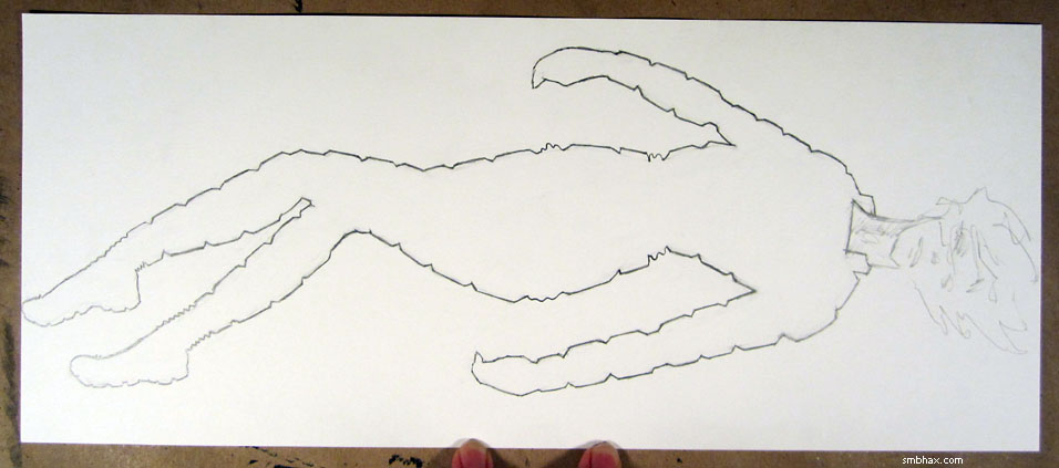
With people crammed in cockpits for the ending of the last episode, it's been so long since I've really drawn someone full-figure that I had to draw a detailed version of the body beneath the suit for this page first before drawing the suit over it and then erasing the body; in fact it took me about five tries and checking general references just to get the body worked out. I took a photo of it at that stage; I guess some pointy-haired boss could get the wrong impression at a quick glance, so I'll hide it here under a maybe mildly NSFW warning.
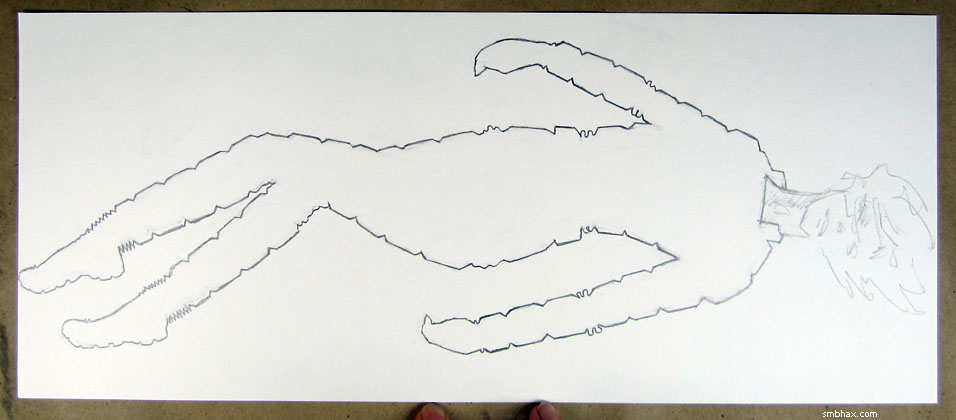
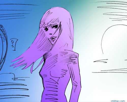
Drawing the suit and erasing the body beneath it got me to here:
but then I realized that I'd followed the body's contours too closely, and the resulting form-fitting suit didn't really look like something Selenis just grabbed off the mining ship's rack last episode. So I reduced the tapering at the joints and so forth, which got me to
and that seemed a little more believable. And of course later I was playing with colors for a long time trying to get something worked out, and, as usual, the final result only came about after a few fortunate accidents:
|
·····
|
| |
| Episode 20 starts tomorrow! | Sep 05, 2013 11:47 PM PDT | url |
| | |
Added 1 new A* page:
That's the last page of episode 19--episode 20 starts tomorrow!
EDIT: Whoops, almost in bed but had to boot the ol' computer back up after I suddenly remembered an idea I'd had earlier in the day about the colors:
|
·····
|
| |
| Silliness and foolery | Sep 04, 2013 11:45 PM PDT | url |
| | |
Added 1 new A* page:
If the lines in today's page have more of a Xeroxed look than usual, it's because that silly thing I said yesterday that I had a feeling I was going to try today...did not work, and I foolishly neglected to keep a good backup plan. Basically, I had the brainwave late yesterday, after looking through the ink work from the previous episode and pining for those nice thick black areas and relatively clean ink lines, that I'd go back to ink, and then do digital color over that like I've been doing recently over pencils, so I'd have the full pencil->ink->color trifecta going on, just like a real comic! Man!
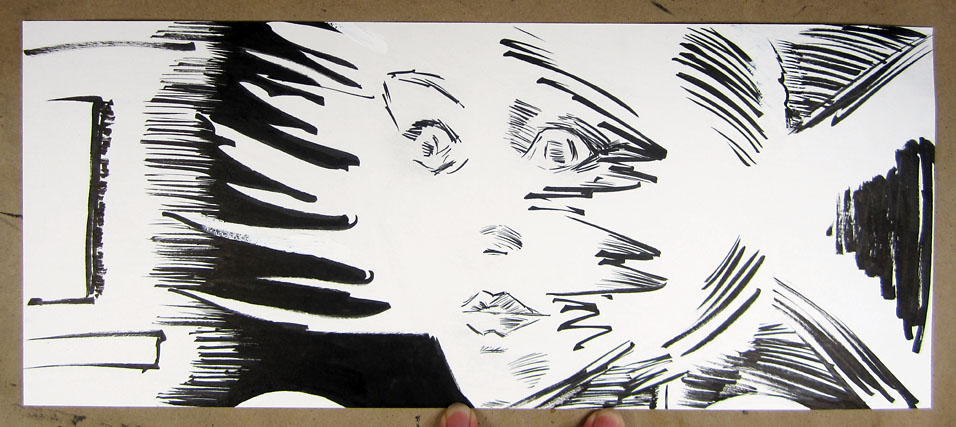
The problem with this is that apparently I'm still an awful optimist in certain ways, to the extent that I was able to ignore/forget all the frustrations I had with ink, and how I'd already tried inking two of the pencil pages I did earlier in this episode and neither one had been improved by the ink. No, for some reason it was all going to work out fabulously this time, it would be my triumphant return to ink, and I gayly brushed aside the little voice in my head that said "hey maybe you should scan those pencils just in case before you put ink on them." What could go wrong?
Well I got the ink all done and then realized it had, as before, lost critical meaning from the pencil stage, because you know I'm not really an inker when it comes to using a brush, I'm more of a painter, and that means I'm not very good at drawing inside (or along) the lines once I get a wet brush in my hand. I'm not going to post the inked version directly because I think it's unduly ugly, but if you want you can see it right here.
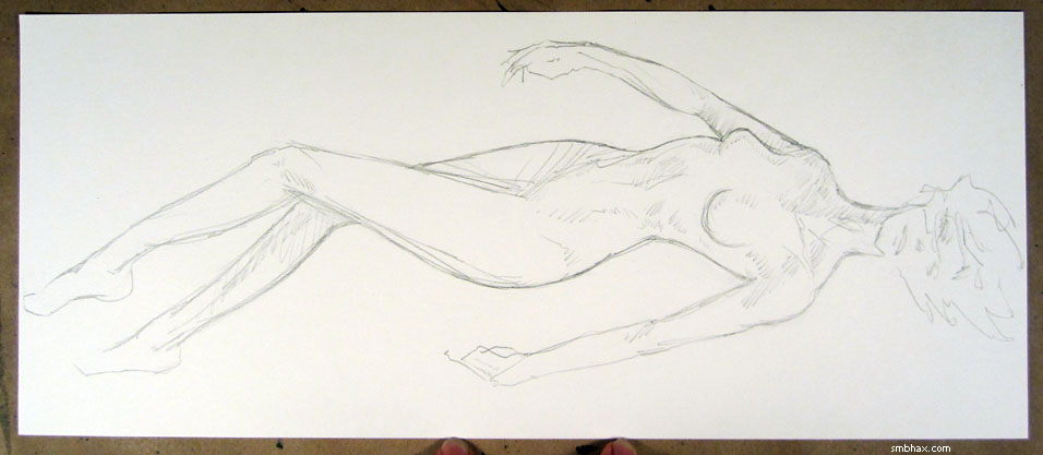
The lines for today's page, then, came from a photo I happened to take of the pencils. This photo, in fact
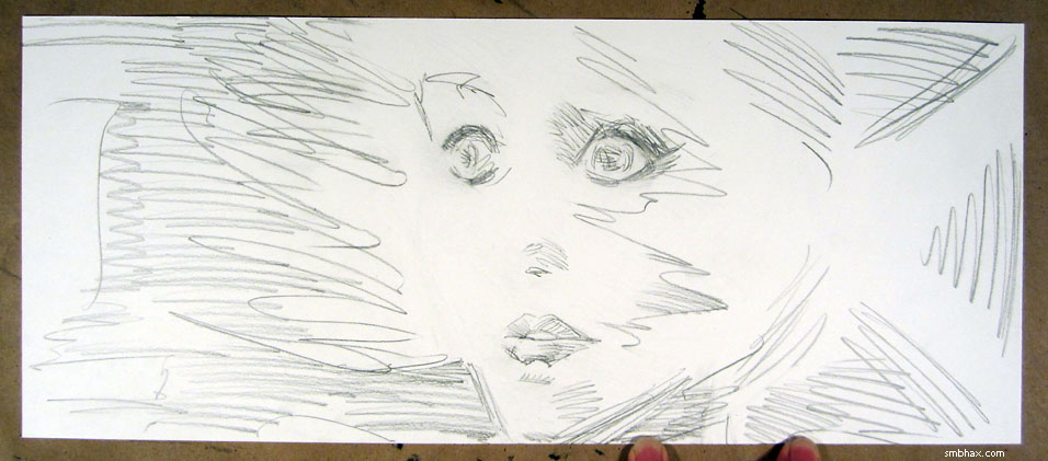
so if you look at the finished page, you'll see two little black hemispherical areas down near the bottom just right of center, and those are my fingertips that I didn't bother Photoshopping out.
So that was kind of a shambles. Hopefully this third attempt to improve upon pencils with inks will finally teach me to stick with pencils. Another lesson came out of it that I think could be helpful, at least, and that is that I do better when I cut loose and don't worry about the exact final result; I struggled and erased and redrew and smudged and so forth with the pencil work today, because I didn't think I'd be keeping any of it, so I didn't think I needed to keep it nice and pristine, and although the final pencil drawing definitely has some weird issues that maybe I would've handled better if I'd been able to make myself get a full night's sleep, it did improve quite a bit over the initial efforts, and I think the final result, for all the struggle, has a fuller feel to it than pages where I carefully lay down some lines (maybe carefully erasing and starting over a few times) and try very hard not to mess them up. And really my favorite pencil pages from this episode, like 2 and 81, have been the results of making a big mess for a while. I keep telling myself that I do better when I cut loose but I haven't really been doing it, so I've really got to do better at letting go and not being so darn precious (to borrow an expression from Sean Murphy) about it all.
So yeah, pencil. Final page of this episode tomorrow.
|
·····
|
| |
| Forebodings | Sep 03, 2013 11:04 PM PDT | url |
| | |
Added 1 new A* page:
I have a feeling that I'm going to try something really silly tomorrow. ...
Two pages left in this episode.
|
·····
|
| |
| This Old Sketchbook | Sep 02, 2013 5:14 PM PDT | url |
| | |
Added 1 new A* page:Here's a recent-y sketch from my old sketchbook:
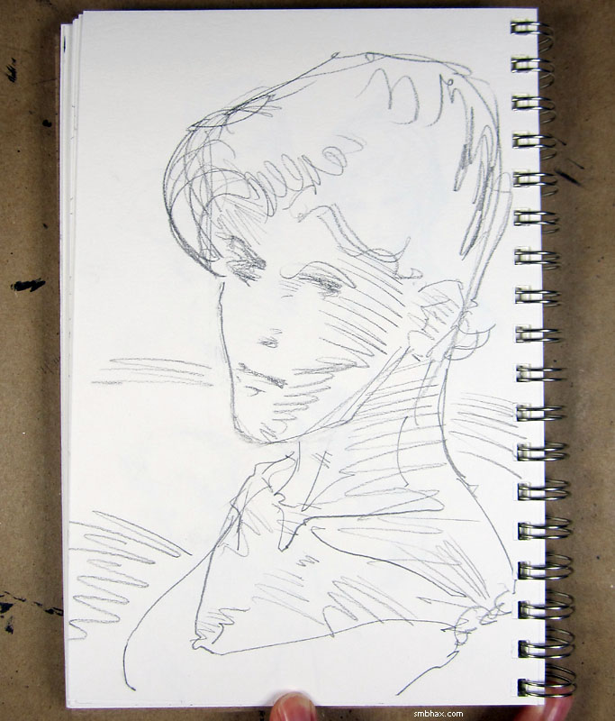
It's actually a fairly new sketchbook, but it's now my old sketchbook because I dug up a trove of old, unused sketchbooks that I like better--so those old ones are now my new sketchbooks, and the new sketchbook is my old sketchbook! Progress.
|
·····
|
|
|