 | |
| |
|
|
view titles only (low bandwidth) |
| |
| Are Pulsars Superfluid? | Jan 31, 2014 1:35 AM PST | url |
| | | |
Added 1 new A* page:Apr 13, 2012: "Neutron Soup" --Pulsar Creates New Alien State of Matter - "The dense core of a nearby collapsed neutron star is undergoing a rapid chill, providing the first direct evidence that the cores of such stars are so dense that atomic nuclei dissolve, and protons and electrons combine to form a soup dominated by neutrons a state of matter that cannot be created in laboratories on Earth. If conditions are right, these neutrons ought to be able to pair up to form a superfluid a substance with quantum properties that mean it flows with zero friction."
|
·····
|
| |
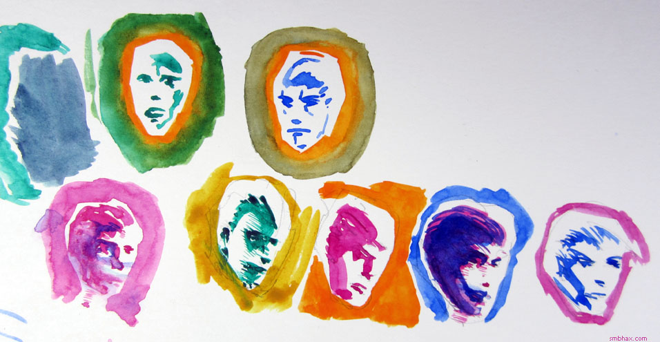
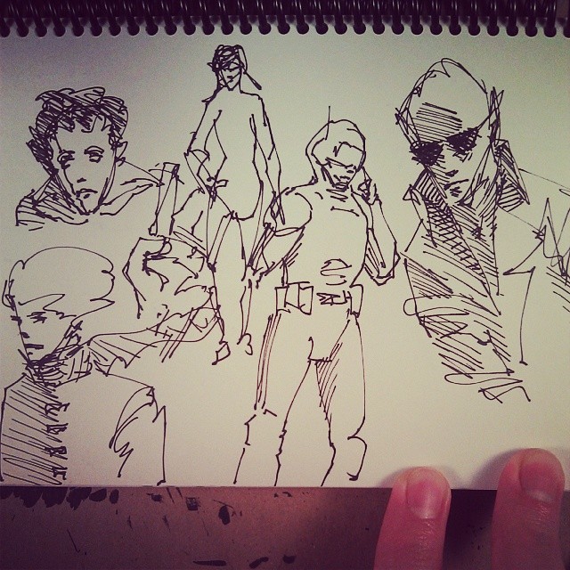
| How to spend all day drawing one thing | Jan 30, 2014 1:23 AM PST | url |
| | |
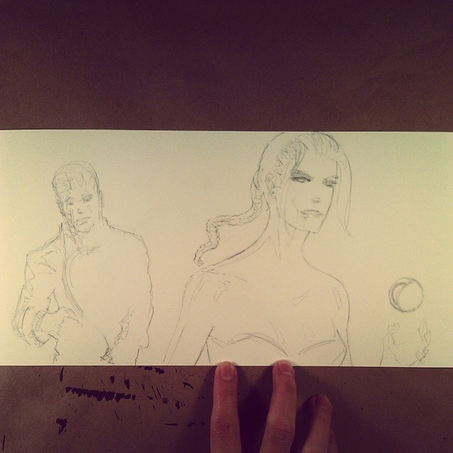
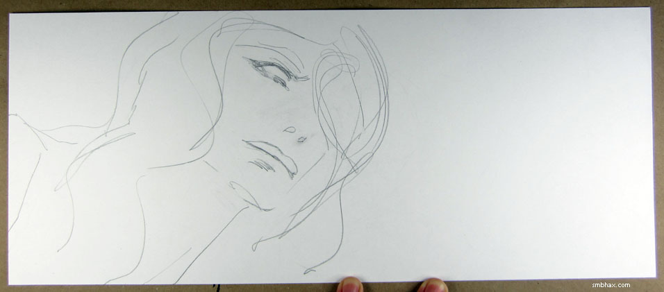
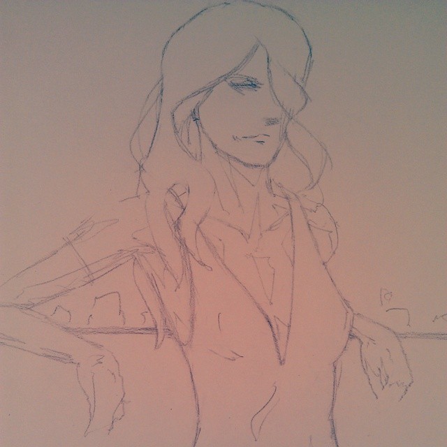
Added 1 new A* page:As I found myself creating and erasing multiple drawings trying to get the layout for today's page right, I figured I might as well photograph them since they weren't all bad, just not exactly right for what I wanted. Starting with the second and going up to just about the final pencils:
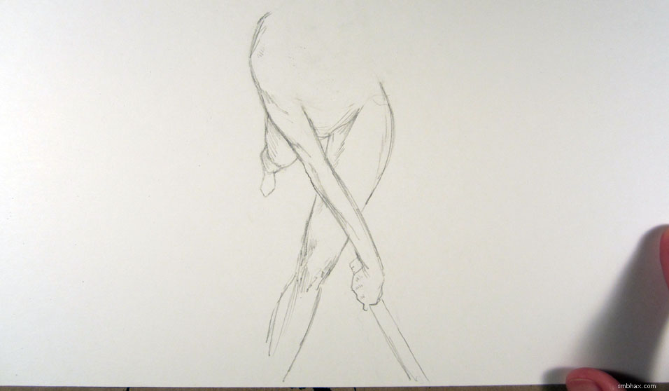
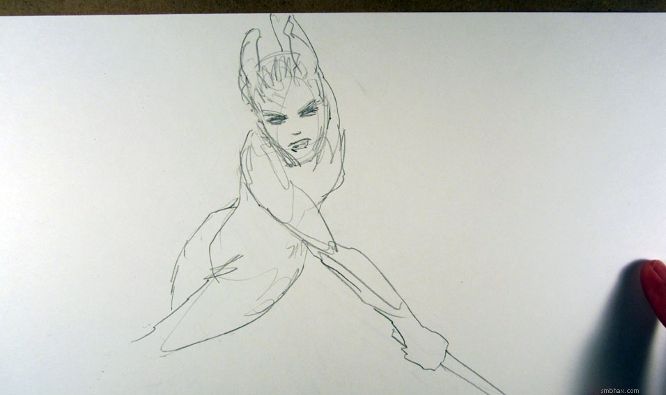
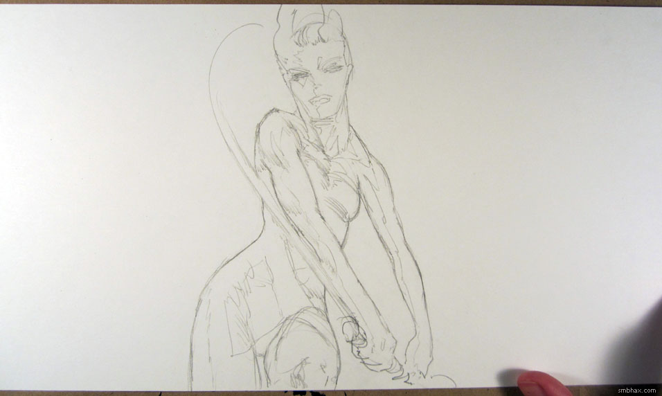
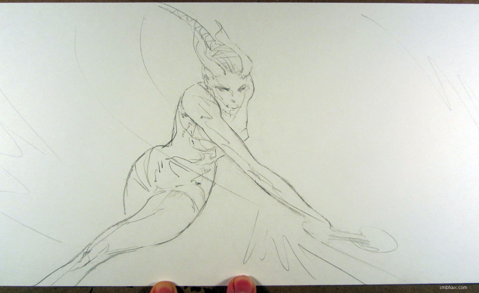
That third one was the result of trying to do more of a head-on view of the shot, and some experimental clumsy play-acting in my bathroom mirror--and I kind of like the drawing that came out after that, but the stroke of the racquet wasn't quite dynamic enough. So I ended up going back to pretty much the layout of the second one, but I guess I had finally tricked myself into drawing a little less cartoonishly. Also I'm glad I took that last photo because, looking back at it and liking the dividing lines of shadow, it made me try to put slightly darker strokes along those edges--since the darkest part of a shadow, particularly on a rounded surface, can occur just along its edge--which seems to work pretty smoothly in watercolor. I'll hafta remember that trick.
|
·····
|
| |
| Aquarius Stream, blazars, and zig-zag jets | Jan 28, 2014 11:26 PM PST | url |
| | |
Added 1 new A* page:Continuing to go though my stockpile of old space news links:
Feb 17, 2010: Astronomers dig up cannibalised galaxy (abc.net.au) - Scientists identify the "Aquarius Stream": a ribbon of stars in our galaxy moving separately from the rest, revealing them to be the remnant of a dwarf galaxy swallowed by the Milky Way some 700 million years ago
Apr 14, 2012: A Universe of Blazars --"Supermassive Black Hole Jets Pointed at Earth" (dailygalaxy.com) - The headline pretty much tells you what a "blazar" is; as of the writing of this article, NASA's WISE ("Wide-field Infrared Survey Explorer") satellite had identified over 200 of them by spotting the "specific infrared signature when particles in their jets are accelerated to almost the speed of light"
Dec 3, 2013: Massive Black Hole Duo: Possible Sighting by NASA's WISE (jpl.nasa.gov) - Okay so I just stumbled across this one from the previous article; it talks about the discovery of an anomalous signal from the center of an active galaxy: instead of emitting a straight, steady jet from its center, as most supermassive black holes at the centers of active galaxies do, WISE analysts were reading a jet coming out in a zig-zag pattern; the most likely explanation seems to be that this is the result of the end stage of a galactic merger, where two supermassive black holes from colliding galaxies are spiraling together, and the gravitational pull or jet from one is disrupting the jet of the other
|
·····
|
| |
| Super-old news about supermassive black holes | Jan 27, 2014 11:23 PM PST | url |
| | |
Added 1 new A* page:Okay I need to start chewing down my backlog of news-ish links, I'm too scared to even look at it in its entirety right now to see how long it is--but the ones at the bottom are from November 2011. : P I think I actually still have like two news link lists older than that that I never got to, archived somewhere, but hey you gotta start cutting somewhere:
Nov 4, 2011: Monster Black Hole Eats Worlds (abc.net.au) - This one is actually about A*, with a team saying that the little daily flares of x-ray and infrared light they see coming out of the supermassive black hole at the center of our galaxy on a daily basis must be from it munching on a steady diet of planets and little gas clouds, whereas the much much bigger flare you'd get from a star will only come along every 100,000 years or so at current activity levels.
Dec 5, 2011: Team sees biggest black holes yet (bbc.co.uk) - This article talks about the two supermassive black holes at the centers of galaxies NGC 3842 and NGC 4889 as being freshly calculated at weighing in at just under 10 billion solar masses each (A* is only about 4 million), saying that "until now, the biggest known was some 6.3 billion times the mass of the Sun." I'm not sure why they'd say that though since, as I already mentioned in a post from June of that year, the biggest known even then was the supermassive black hole at the center of galaxy OJ 287, estimated at a whopping 18 billion solar masses. Don't be dissin' my OJ 287, BBC!
|
·····
|
| |
| Hawking's event horizon chaos | Jan 25, 2014 3:07 AM PST | url |
| | |
Added 1 new A* page:Stephen Hawking, the theoretical physicist who has shaped much of the thinking on black holes in recent decades, has just put out a new paper, Information Preservation and Weather Forecasting for Black Holes, in which he posits that the idea we've had of event horizons being these nice smooth spheres of no escape around black hole singularities is incorrect--that they're more likely to be "chaotic," and likens their unpredictability to weather on Earth, in the sense that you can't predict the weather (super-accurately, I guess he means) more than a few days in advance.
The paper is just a couple pages long but extremely dense, even for an theoretical astrophysics paper. : o I'm not going to pretend I understand much of the details, but the raison d'etre appears to be the old black hole information paradox, which Hawking himself helped create in 1975 when he proposed the idea that black holes slowly radiate energy, dubbed "Hawking radiation." This would mean that any information--stuff--that goes into them comes out in a single form, so whatever they were before has been completely obliterated--which would violate the principle that...in quantum ways I don't really understand--information is not supposed to be destroyed. This led to all sorts of arguments over the years, and Hawking in 2004 conceded a bet and reversed his original stance, saying that "quantum perturbations of the event horizon could allow information to escape from a black hole, which would resolve the information paradox."
That explanation didn't satisfy everyone, and other theories were proposed, including the idea--which Hawking takes care to shoot down specifically in this latest paper--that a "firewall" of energy might surround the black hole, zapping incoming stuff and re-emitting its information losslessly, or something. It seems anyway that even Hawking has no longer been satisfied with his or other theories that tried to get around the information paradox, so now he's throwing out the whole event horizon notion that spawned it in the first place:
| "The absence of event horizons mean that there are no black holes - in the sense of regimes from which light can't escape to infinity. There are however apparent horizons which persist for a period of time. This suggests that black holes should be redefined as metastable bound states of the gravitational �field." |
Stuff doesn't fall in and get scrunched into a singular state in which its history is lost, he says, but rather it swirls around in this chaos of "apparent horizons" for a "period of time"--but ultimately it will radiate back out and still be unique little snowflakes, so its information doesn't get lost and we can all be happy. I think. The idea of nice neat event horizons was abstractly pleasing, but yeah I guess if you think about how things in our universe tend to work out, a messier picture of what black holes are actually like would seem more in keeping with our observations of other phenomena; Hawking is saying that our tidy picture of black holes, under which you supposedly could know all there was to know about a given black hole by putting either its mass or radius through Schwarzschild's simple equation, was far too simplistic--and in fact it is a reliance upon that approximately correct, but overly simplistic model "that is responsible for the information loss in gravitational collapse": if you don't smooth things out with an approximation, the information should emerge.
Hawking, I should point out, did not invent the idea of the event horizon in the first place--that came much earlier; Wikipedia says "In 1958, David Finkelstein identified the Schwarzschild surface as an event horizon"--and Schwarzschild's equation, leading to the idea of a singularity in the first place, goes all the way back to 1915--and even centuries before Einstein's equations actually made approaching this stuff in a coherent way possible (actually the specific equation Hawking was referring to as being responsible for making people think information would be lost was the Kerr metric, discovered by Roy Kerr in 1963, that gave the geometric solution for a rotating black hole--Schwarzschild's had only been for a non-rotating body), some scientists had a notion that what we would come to know as black holes could exist: in 1783, John Michell wrote: "If the semi-diameter of a sphere of the same density as the Sun were to exceed that of the Sun in the proportion of 500 to 1, a body falling from an infinite height towards it would have acquired at its surface greater velocity than that of light, and consequently supposing light to be attracted by the same force in proportion to its vis inertiae, with other bodies, all light emitted from such a body would be made to return towards it by its own proper gravity." But back then there was no idea of how gravity could influence light, so those original "dark star" ideas didn't stick.
And it's just as well since now Hawking says we should throw a lot of this stuff out!
|
·····
|
| |
| Gouache, Who Needs Faces? | Jan 24, 2014 12:51 AM PST | url |
| | |
Added 1 new A* page:After yesterday got a little strokey and washed-out, I decided to go hardcore on the "spotting blacks" style today, I mean using the pencils just to outline areas that will be filled with solid shading, and avoiding hatching and feathering, for the most part. Today's near-final pencils looked like this (uploaded as I finished them earlier today to Instagram/Twitter/Tumblr):
It strikes me as odd now that I hadn't really tried this approach in watercolor yet, since it was what I went to right away when I moved into coloring pages digitally earlier in this episode, but I guess I was so enamored with watercolor's swirly color mixing that it didn't even occur to me that they could be effective in this bold, solid fashion. And you know, I think they even work better than the digital stuff with the polygonal lasso tool did, in a way, since watercolor's natural shades and eddies add hints and variety to what would otherwise be flat, plain areas of solid fill.
Probably another side benefit of this approach is that it forces me to define contours pretty precisely in the pencil stage; otherwise I tend to leave bits and pieces of the outlines undefined, and then wind up with a big mess on my hands in ink or watercolor when I find they don't connect like I'd hoped. : P
Oh yeah and you can see in the pencils that I'd drawn the facial features, and I tried working them in, like, leaving the eyeballs and teeth white in the shaded faces--I was kinda doing this in the earlier digital stuff--but it just looked cartoonish. It was scary and for the dude I mocked it up first in Photoshop, but it's actually surprising how not having the face there doesn't necessarily feel like the face and its expressive qualities are missing. Although, some of the pencils are still there under the watercolor, you can see them if you look close--'cause you can't erase 'em once they've got watercolor on 'em, at that point they get soaked into the paper or something.
Before I went in with watercolor I even busted out my long-neglected gouache (aka "opaque watercolor") tubes to see if that sorta thicker, creamier, more intensely colorful medium might work better for this approach, but I still found, as I had before--the pink on the hand in the foreground of episode 18, page 29 is I think the only spot gouache made it into the comic, back when I originally got them--that some gouache colors scan in, in some bizarre chemistry of electromagnetism that I don't understand, extremely faintly, *particularly* that pink, Winsor & Newton's Opera Pink, which is actually highly intense in real life, and which I had to edit severely in Photoshop to restore its vibrancy after scanning. And I can't be doin' no color without my hot pink. (And I think maybe one or two other gouache colors I have also scan in a more faded way than the others, although to a much lesser extent than the pink.) Also they don't cover pencil any better than regular watercolor, really, and they spread more smoothly, so they don't have the mysterious shadings and fadings that regular watercolor does, which I think in this application would make them a little more boring. But mostly I just like the quinacridone crimson / ultramarine blue combination I've found in regular watercolor--I haven't found a combo in gouache that complement and/or mix with each other nearly as well.
|
·····
|
| |
| A-Wishin' and A-Washin' | Jan 23, 2014 2:58 AM PST | url |
| | | |
Added 1 new A* page:Tried to push myself in a slightly different direction with the drawing and coloring today, feel like I got a little of the way there I guess. For the colors I tried doing a wash in a different color over colored hatching lines to let it blend into them and move them around and change color in unpredictable ways, which is pretty much what happened. It does mean some of the definition in the shading gets washed away, though. Might try something different tomorrow (okay so that's no surprise : P).
|
·····
|
| |
| The Life and Death of Supertiny A* | Jan 22, 2014 1:39 AM PST | url |
| | |
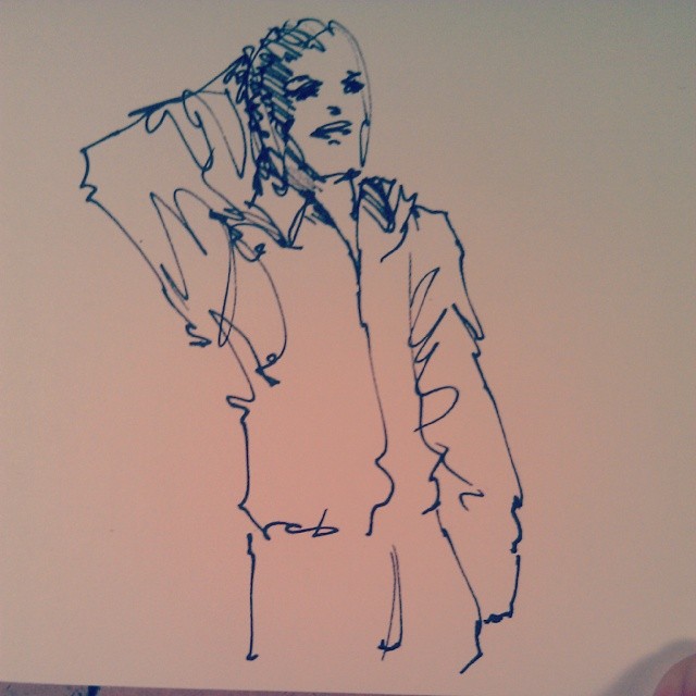
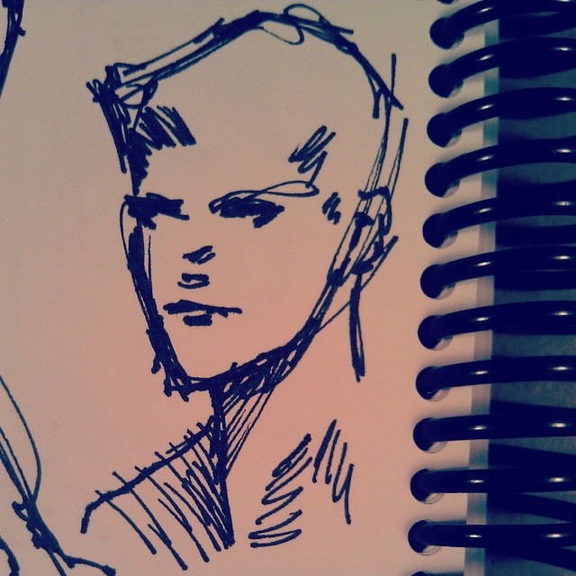
Added 1 new A* page:So because I was frustrated slightly more than usual with yesterday's page, I of course got to dreaming up some miraculous solution in the form of an art materials change. This started taking a definite direction when right before bed last night I did this little marker pen ink sketch
which was kind of fun and for not the first time I thought yeah see I could just do the whole comic in this combination of large and small black markers. Look how sharp and easy it is! I could probably even do multiple pages per day! That thought is not unusual but this time I went a step further and thought hm well full-size pen sketching hasn't worked that well, but WHAT IF I were to say make the page smaller, like the size of this sketch? How could that not work? So this afternoon I cut out some 9.25" x 3.9" pieces of my favorite marker paper--much tinier, you see, than A*'s usual 16" x 6.75" pages--and I'd had the additional brain stroke that at this particular 9.25" width, they just fit neatly into regular #10 business envelopes, so I could offer free shipping when I sell them, instead of having to ship them expensively in a box. And I wouldn't even have to go down to the post office to do it! Bonus!
The problem with this plan of course, as I have proven to myself more than once in the past, is that it doesn't work: I can't do much more than a simple non-specific character pose in a sketch, at least not on purpose. So like when I took a shot at drawing today's A* scene straight out in pen on these tiny pages, I could do the dude by himself okay
but as soon as I tried to add the figure of Selenis' self-declared friend in relation to that, and in a more complicated pose (the layout I was trying at first was somewhat different, but in any case some perspective was still involved), the drawing just refused to work itself out neatly, and I went through four or five tries before giving up and going back to start in on my usual 16" page with a pencil and lots of erasing.
I still dream of doing an awesome off-the-cuff sketch comic...but uh yeah I apparently am not really able to make that happen. Maybe if I keep practice-sketching away, some day...
Hm I suppose one way to manage it would be to switch to more like a square page size, so as to just focus on one character per page/panel. I don't think I'm particularly anxious to do that, though.
|
·····
|
| |
| Two colors! Four characters!! | Jan 20, 2014 11:56 PM PST | url |
| | | |
Added 1 new A* page:Welcome to overly ambitious Monday! Sheesh. Gotta remember to keep things simpler for myself. Obviously it's dangerous to take the weekends off. ; )
|
·····
|
| |
| Ink and Watercolor not yet PB & J | Jan 18, 2014 6:11 AM PST | url |
| | |
Added 1 new A* page:I put that experimental pen ink and watercolor drawing I did yesterday up for auction right here on eBay--starting at 99 cents, as usual. It looks like this:
The waterproof ink from the pens I used (a Tikky Graphic 0.3 and a Faber-Castell "big brush") held up fine under the watercolor, but I don't think the ink and watercolor looked like they belonged together--it was better before I added the watercolor, I mean, which is not a feeling I have when using watercolor over pencil or over lines "inked" with watercolor. Watercolor over ink lines is fairly common in illustration as far as I can see, but the examples I've seen tend to use the watercolor in just a sort of "fill in the lines" sort of way, rather than as a reflection of light, which is what I prefer to go for--and I think the watercolor is usually just used to fill in the lines because the black of the ink is on a value scale outside the reach of watercolor, so there's always going to be a discontinuity between the two; on watercolor, the ink is deadening both directly in terms of perceived color intensity, and on a more abstract level, in that its nearly absolute black interrupts the illusion of a light-filled space otherwise created by the watercolor.
There's probably some way that can be used constructively, but I think it would be tough to do with pens, which is a shame because they're pretty handy things otherwise. With the help of a reader I've found some examples of brush-applied ink used pretty effectively in a light-enhancing manner with watercolor--basically used as a dark silhouette, or as smoke; this piece by Lawrence Yang shows both of those uses in action. I should probably try something like that some time. (I did do a brushed ink and watercolor in a fill-in-the-lines way earlier in this episode, here; hm and then this mixed approach a few pages later was pretty unsuccessful; the page after that was probably the most successful, where I went pretty light with the ink, but even so I did end up manipulating it in Photoshop quite a bit to restore some feeling of illumination.)
~~~~~~
Anyway on to more experimentation today, here are some awful color combinations I tested as I tried to figure out what approach to go with in coloring today's page:
I was thinking I'd go a bit blue (mixing to purple) over the crimson as seen in the lower left there, but in the end I couldn't find a sure starting point for going in with the blue, so I just stuck all crimson. Another surprise to me was that mixing the phthalocyanine green (blue shade) (aka "Winsor Green" from Winsor & Newton) with the crimson produced a kind of nice grayish blue (upper left); I'd thought it would've been more like an extremely dark gray--I was used to making a "rich" black in oil paint in college by mixing pthalo green and alizarin crimson. Then again I suppose I should get some actual alizarin crimson watercolor if I want to try that. : P (Only handprint.com rates alizarin crimson watercolor poorly in lightfastness, and it also looks pretty dull in their sample photo, so I don't think I'd really want to use it on its own. : p)
|
·····
|
| |
| "Inking" in color | Jan 16, 2014 11:16 PM PST | url |
| | |
Added 1 new A* page:Bah, it's late! Agonizing as usual over my approach, I tried inking a test page with pens before going in with watercolor--I'd been thinking for a week or two now that I should try ink with watercolor, but suspecting that they'd kind of clash with each other...but this inked thing was looking pretty decent so I thought it might work...and it didn't. They just didn't go well together, the ink had looked better by itself. I will get that scanned in to show to you soon-ish (tomorrow?), heck maybe I'll put it up for 99 cents on eBay along with the usual day's page just in case anyone with a big ink hankering wants it.
But with that in mind, flipping back through some of the pages I've done over the past week or so, I was reminded that I'd gotten away from sort of "inking" over the pencil here and there with watercolor, before going in with the watercolor as larger, space-filling washes. So I started today's watercolors by going in and doing some saturated lines, and I think that helped quite a bit. Funny how I forget these things. : P
|
·····
|
| |
| Marvelously Mad Monowheels | Jan 15, 2014 10:06 PM PST | url |
| | |
Added 1 new A* page:Today I'm here to talk to you about monowheels! These are one-wheeled vehicles, dating from the late 1800s to today, in which the passengers sit inside the wheel--like this for instance:
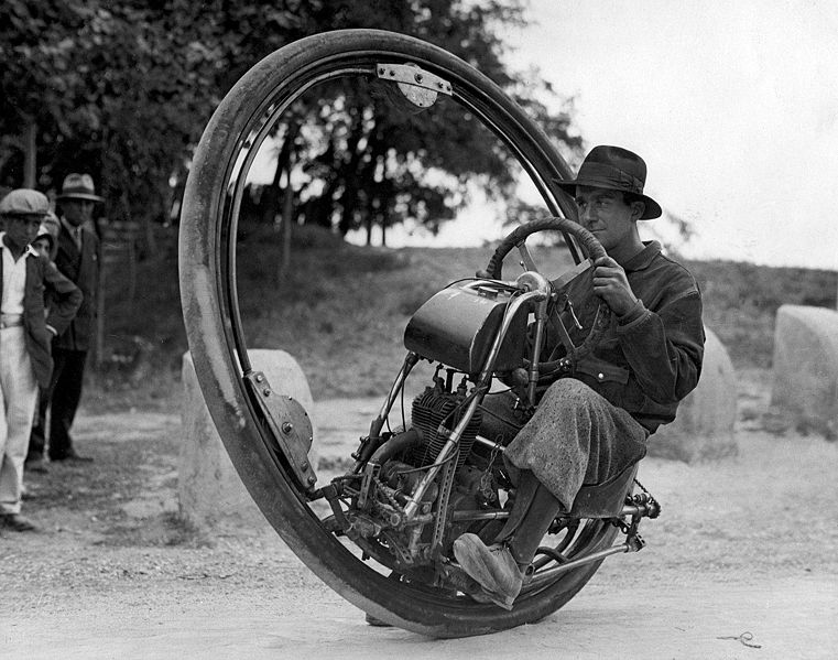
image from the Nationaal Archief of the Netherlands (source)
^ That is a M. Gerde mildly enjoying himself at the helm of 1931's "Motor Wheel" in Arles, France (source). You can see loads of other monowheels from the past 150 years at this site. And check out the excellent newsreel footage of the British "Dynasphere" in action in 1932...and you'll see why monowheels have never made it as a form of popular transportation--little problems like poor handling, blocked visibility, low storage space, and my favorite: gerbiling, a colorful term describing what happens if friction or some other force prevents the pilot's compartment from rotating freely inside the wheel, where gravity is supposed to keep it balanced and the passengers upright; when you're gerbiling, you're going around inside the wheel, instead of it going around you--like a gerbil who's run too slow or two fast on its exercise wheel, you see. Probably not fun for very long!
But stubborn physical laws haven't stopped mad tinkerers right up to the present day from coming up with new one-wheeled designs, for some reason. Monowheel!
|
·····
|
| |
| Do not write scripts this way | Jan 14, 2014 10:41 PM PST | url |
| | |
Added 1 new A* page:Had to spend some time today working out the dialogue for this new scene from my crude outline. Or maybe I should say "scribbling out" since I recently discovered I enjoy the whole script process more if I can write it out with a pen--although this is probably mostly because I try to keep my computer off during the day to avoid getting distracted by the internet. >_> So if I can have the script on a sheet of paper next to my drawing table, that's pretty handy! This started happening (instead of me squinting at the typed script on my cell phone) because late one night I had the inspiration for the latter half of the previous scene, at the bar there, and just grabbed a pen and scribbled it down on whatever was handy, which happened to be the back of the bill for the nice new shipping boxes I send A* art off in:
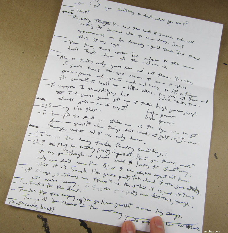
That is some pro script writing there! >_> If you can read that, I'm a little worried for you. But I can mostly decipher it ("high power" is duplicated twice because today I wanted to make sure I was using the same pen for the latest scrawling ;) so it worked out pretty well. For this next scene, I did type the lines out on the computer first today, but then I wrote them out on more scrap paper (the backs of some non-mandatory insurance questionnaire forms :) so I can keep them right next to me as I draw. They are written even more illegibly!
|
·····
|
| |
| Interstellar Transcontinental | Jan 13, 2014 10:56 PM PST | url |
| | |
Added 1 new A* page:Monday! I got to mail off some artwork to Russia's greatest A* fan today, that was fun. : ) And shipping from Seattle to Moscow isn't as expensive as you might think! Although at the post office they told me rates would be going up later this month. : p
Some practice sketches done over the weekend (took a lot of tries to get this loose finally, maybe I cramp up on my days off!):
And the last batch of warm-up sketches I did today, again trying to get loose (the first ones are much worse : p):
|
·····
|
| |
| Color, it's truly truly truly outrageous | Jan 11, 2014 1:18 AM PST | url |
| | |
Added 1 new A* page:I spend all day yesterday complaining about perspective and then I go and do a little of it today, go figure.
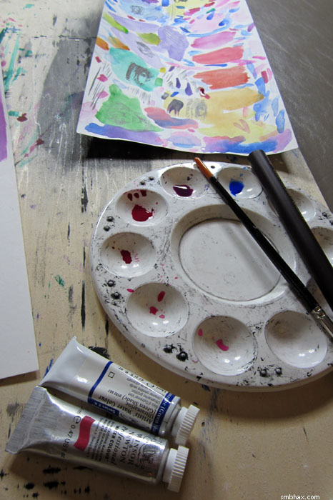
It was probably hard to tell but this week the way I apply watercolors changed significantly (for me), because my watercolor tubes arrived! Yep, instead of having to moisten some dry little cakes of color to rub some of it off, I can now just squirt out a concentrated little chunk of color, and they're super-easy to mix in different quantities in a little palette dish. This lets me do bigger and bolder applications of color, whee!
Actually on the first day I hadn't thought to do that, and was just slapping the concentrated tube contents right down on the paper, which is what was behind the blueish excess of page 25; in fact that one has three or so spots of pure dried aquamarine so thick that you could add a little water to them and probably make like four paintings out of the watercolor that's just caked up there. It was fun though, kinda like building up big blobs of oil paint; and getting intense concentration and dry brush effects with insufficiently wetted watercolor concentrate felt a lot like using ink, only in color.
If you were paying closer attention than I was last week when I said I was ordering the tubes, you'd have noted that I said I'd ordered tubes of my three "primary colors," "red, blue, and green" (paraphrasing here)—but you'd have realized that properly speaking, those are the primary colors of *screen* (additive) color, whereas the primary colors of physical (subtractive) color are red, blue, and *yellow*. Thing is though that a) I'm not overly fond of the yellow range and b) I haven't found a yellow that mixes well with my red (quinacridone magenta) and blue (aquamarine blue, green shade) of choice. So I guess I have to do a little more research on that.
One final color oddity: check out how the colors of today's page came out when I photographed it with my digital camera under the mix of weak incandescent and strong fluorescent lights given off by the full blast of my drawing table lamps:
Oh the colors, Batman! That isn't really how they actually look...as far as I can tell...but gosh. So I spent some time seeing if I could use that photo for the final page, or if I could manipulate the scanned version to pop with color like that—layering the scan on itself as a Soft Light layer came close...but in the end it looked a little too manipulated. And I guess getting into editing the color is kind of falling down a time-sucking rabbit hole that I don't really need right now. :P So we're still flying au naturale as far as the scanned color is concerned—well, aside from darkening up overall the gamma a fair amount so it doesn't look washed-out when put up against a black background.
Oh yeah, and who else is sort of secretly a fan of
?
>_>
Speaking of holograms, I really ought to get around to talking about (ie regurgitating the Wikipedia page of) them some time, because how they work is pretty darn cool, and full of some interesting possibilities for cosmology and sci-fi (and I don't just mean floating glowy virtual keyboards or heads) alike.
|
·····
|
| |
| When it just isn't right | Jan 09, 2014 11:38 PM PST | url |
| | |
Added 1 new A* page:Struggled to find a drawing for this one; here was an earlier go I just couldn't quite get to come together:
I used to do a lot more extreme perspective--angle-wise I mean, and particularly of the face--than I do now. I suppose the thing is that it's really hard to get it to look right; this is something you can see backfiring even in drawings by some of the most renowned draftspeople in print comic books (although it's also interesting to read comics with this in mind and to see all the ways that clever artists *avoid* having to use extreme facial perspective, without seeming to). I don't think anything is far far off in that drawing there, but I just couldn't seem to get it to feel right somehow.
The other thing is that while if you don't get it *too* wrong you may increase the *wow* factor for some viewers, extreme perspective reduces the "readability" of faces, since we're used to seeing people more or less straight on; and in a webcomic, your latest page is always the first page for a new reader. Not that I would hesitate for the sake of potential new readers to use some face-smushing perspective if I really thought it was called for, mind you; but I also don't want to go throwing it around just for the heck of it--and maybe I've learned other, less compromising ways to make an image interesting.
And yeah as with today's draft there I find--as I'm a bit more picky these days--that sometimes I'm just not getting it quite right, and I don't feel like settling for "not quite right" anymore!
|
·····
|
| |
| Own Flaming Sword and Shoulder Pads! | Jan 08, 2014 9:55 PM PST | url |
| | |
Added 1 new A* page:I have a new little sketch up for auction on eBay--starting at $0.99, with free shipping!--called Flaming Sword and Shoulder Pads because
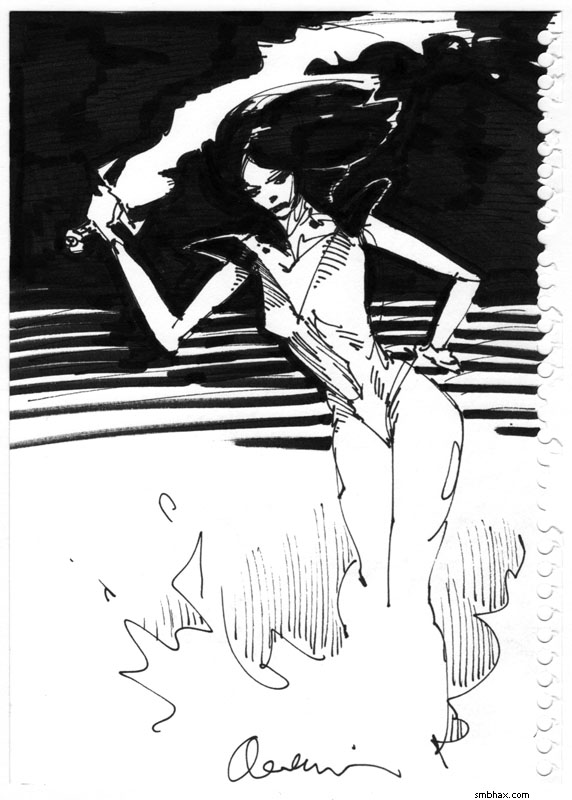
I'm not sure why that happened, except that in the list of the coolest things to have in a drawing, flamings swords have gotta be up there. Also maybe I've been looking at too much Esteban Maroto. Anyway if you like flaming swords and shoulder pads too maybe you will consider bidding in the auction (yes that is the same link : P) for this little sketch from my sketchbook!
Oh yeah it was drawn with a Tikky Graphic 0.3 pen and a Faber-Castell Pitt "big brush" marker.
|
·····
|
| |
| A* fan art from John Waltrip! | Jan 07, 2014 10:25 PM PST | url |
| | |
Added 1 new A* page:I got my second-ever A* fan art! And it's...boy. From John Waltrip (click it for a bigger version):
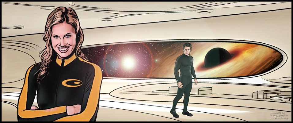
Is that sharp or what? Gratuitous lens flare and everything! : D Pretty snazzy body suits, too--should keep 'em looking stylish right up until that black hole in the background spaghettifies 'em or whatever. : oo
As you can probably tell from the illustrative skill visible there, John is a long-time professional comic artist; in fact, my first encounter with his work was just over two decades ago, in the Robotech II: The Sentinels series that he and his brother, Jason, drew--in theory my copies of that are still safely in their poly pags in a comic long box somewhere in the crawl space under my brother's house. The Waltrip brothers are sufficiently established to merit their own Wikipedia article, and there's also their web site, where you can read John's very own sci-fi strip, Xenocosm. AND you can catch his work five times a week in the webcomic Guilded Age.
You can imagine then that him contacting me out of the blue--with fan art for A* no less!!--came as a real kick in the pants--uh I mean if a kick in the pants is AWESOME. Thank you very much, John!
|
·····
|
| |
| A* art show at the Wedgwood Ale House & Cafe | Jan 06, 2014 10:18 PM PST | url |
| | |
Added 1 new A* page:For this month of January, you can catch a bunch of my artwork hanging on the walls of the Wedgwood Alehouse & Cafe, a staple of Seattle's scenic Wedgwood neighborhood. Here's what it looked like just after my dad and I finished putting it up, and before they unlocked the front door to let in their early flood of regular patrons:

^ A bunch of nice glossy color prints of recent A* pages line the front room--exactly the same prints you can order though this web site (these are the 17"x11" size), only expertly framed by my dad. :) They seem to have an interesting remodel going on there. >_> (If you want to see what the rest of the front area looks like--at an early date before my show started--you can spin around in this Google Maps interior view.) And in the back room, we put up a mix of prints of newer and older A* stuff, and a few A* original pieces (there are also a few prints from my old "Princess and the Giant" and "Sketchy" strips here and there):
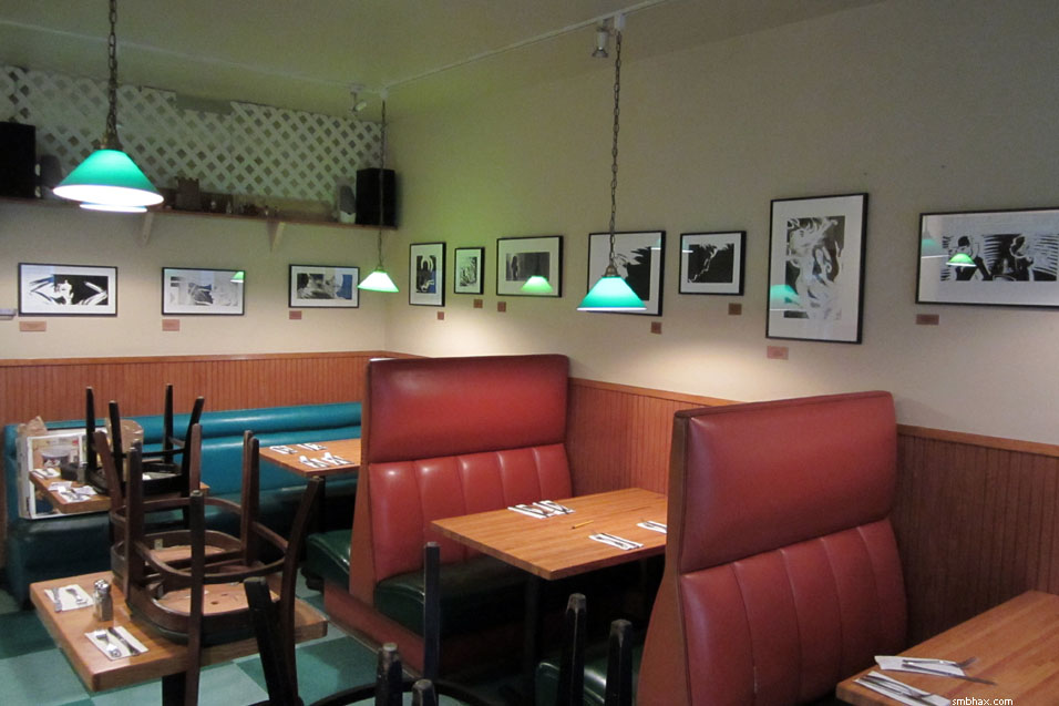
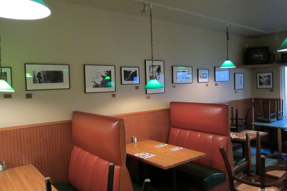
It's nice to put stuff up in a place where you can just hammer nails into the wall, as opposed to places that try to be fancy and make you hang everything from fishing line (which doesn't sound fancy when you say it, but that's what it is!). Also say hi to Kevin the bartender if he's there when you go, he's a nice dude.
~~~~~
Speaking of A* original art, I just shipped four boxes of it off to eBay winners on my regular Monday bi-weekly trip to the local post office this frosty morning--a new record! : D Thanks again to everyone who's been bidding on stuff; there's been quite a few new bidders appearing in the past few weeks, which is really encouraging. : )
|
·····
|
| |
| Spotting Ultramarines and Other Things | Jan 04, 2014 5:54 AM PST | url |
| | |
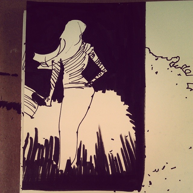
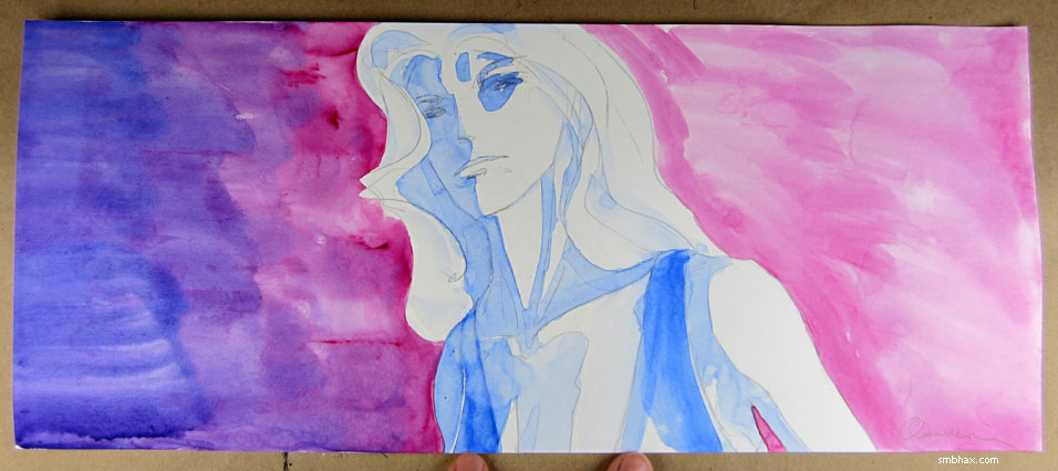
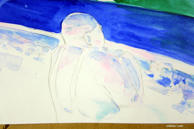
Added 1 new A* page:I tried a couple different things in today's page. One was something I'd told myself to do when I first started doing watercolor, but hadn't actually done until I made myself do it today: drawing the outline of shadow areas, rather than just sort of stroking them in with hatching lines:
That let me do a bit of a cleaner shading job in the end with watercolors, though I still did my compulsive best to muss everything up. ; )
Another different thing I guess was using quinacridone magenta as the other shading color along with ultramarine blue; I guess I did a little of that combo in one of the first watercolor pages, but this is the first time I went all out with them. They combine into a nice purple. : ) Here's a midway point in the watercolors, after I'd done the bulk of the magenta; at this point I went to dinner and let things dry so I could come in clean with the areas meant to be pure ultramarine (although at the end I added a bit of magenta back in here and there for reflective highlights):
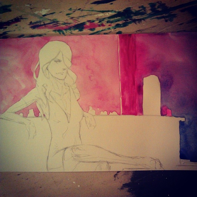
(That was before I redrew that knee on the left a bit, which I am still sort of agonizing about but I think mainly that's because an overload of watercolor straightened the fall of the hemline over the thigh a bit too much--don't think I can retouch that cleanly at this point though; that's watercolor: at a certain point you just gotta move on. ;)
But really the other main thing I did a bit differently was the attitude toward the drawing; when I trashed my first attempt at yesterday's page, I'd started out drawing--at an entirely unusually early hour : P--in a really sort of tight, light, precious way, where I thought I was getting this amazing jewel-like drawing, and every stroke should be measured carefully; I even remember thinking to myself at one point something like "wow this is so refined, maybe this is the new improved way I'm going to draw in 2014." (;PPP) But that approach pretty much never works out for me; if I peck away at a drawing like that, inevitably I lose track of the overall thing and the nice individual pieces just don't hold together, and in the end the entire thing falls apart; this is the same reason why I can't work zoomed in to a tiny part of a drawing if I'm working digitally. So for the second attempt yesterday, which had to be done fast since I'd wasted most of the day on a dud of a drawing, I just kind of went with it and didn't worry about all the things I'd been worried about earlier--head size, for instance--and it went pretty okay. So today, while I had more time and didn't need to rush or anything, I still tried to keep that brisk approach, so that even if the drawing involves lots of revision and erasing, it can still be approached with gusto and verve, rather than thinking "wait is this part I'm doing super realistic? Careful, careful!" And I find it interesting that when I *don't* do that, immediately this sort of semi-cartoonish but also kind of more linear and elegant style emerges all on its own. And now that I think about it, that could be where some of my favorite A* drawings have come from.
Or not? Maybe? I dunno, anyway it seemed to make sense when I was thinking about it. : P
|
·····
|
| |
| I can't draw this year | Jan 02, 2014 11:53 PM PST | url |
| | |
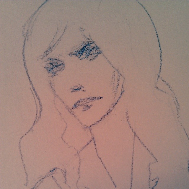
Added 1 new A* page:Had to be up and hanging around my place to be sure I'd intercept a delivery of A* prints I need for a new art show going up this weekend, so instead of going to the gym in the morning as I usually do, I just sat down and started working on the day's A* page, and you know...that didn't work at all. I was pretty out of it I guess, because I couldn't seem to draw anything and eventually just sort of doodled a face and went from there with no particular thought toward overall layout. Blugh. Here's an early face, just before it was erased--I liked it, but it was too large (that's a problem I tend to have and I was struggling with this mentally all day; I think to a certain extent though Selenis, being slightly below average height, has come to have a proportionally bigger head than say a tall fashion model in my own head, and I just can't seem to shake that picture of her):
And near the final phase I went with that first try--next would have been sharpening things up with some white ink, but after actually going to the gym in the late afternoon (after securing the prints, whew) and coming back, I realized that even the mighty waterproof white ink wasn't going to salvage this (and this is the best part of it probably):
I actually like that photo of it, crops out the big empty areas all around the tiny rough Selenis figure; also the Instagram filter gave it a warmth and center focus it didn't actually have. After that though I tried to rearrange the features a bit (still obsessed with head size) and messed them up again and gave up. : P The barkeeper was okay too I guess; I liked the angle and outline, but couldn't really figure out how to make him stand out properly:
Sooo I threw that aside and just started over, even though it's later than I'd have liked, and a bit hurried, I think the second try was an improvement. Oh yeah here's a warm-up sketch (the only decent one of a *ton* I attempted--I was in a pretty deep drawing funk I guess!) I did before the second stab at the page:
Almost felt like a Monday today. : P
|
·····
|
| |
| I'm taking New Year's off after all | Jan 01, 2014 5:31 PM PST | url |
| | |
Sorry for the late notice, but as usual my working schedule has fallen later as the week goes on, and I've just realized that I *have* to be up at the crack of dawn tomorrow to make sure that I catch the UPS delivery person at the door this time, because they of course came by with my urgent overnight package while I was in the shower on Tuesday, didn't just leave it at the door because for some reason they wanted me to sign for it, didn't feel like delivering anything today, and if I miss them on Thursday that will be trouble because these are A* art prints that my dad and I need to get hung on the walls in frames and stuff for a new art show on Sunday. So I will be taking New Year's Day off after all; I've got to take care of anything that would take me out of the apartment tomorrow today, and then it's early to bed for me this evening so I can spend all day tomorrow sitting around unbathed and waiting for the package to arrive. So the new year is starting off with me slacking off, huzzah. >_<
I did at least get a little A* interview done today, hopefully that will get put up on the internet so I can link you to it some time soonish.
|
·····
|
| |
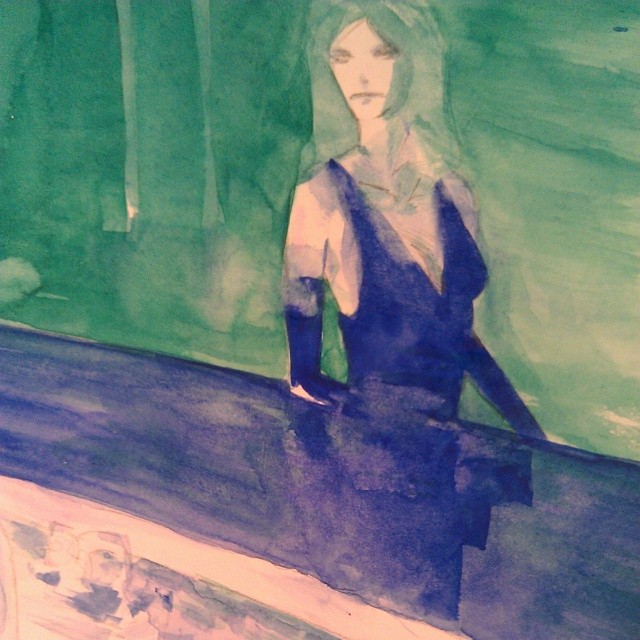
| A Visit to Hopper's Nighthawks | Jan 01, 2014 4:28 AM PST | url |
| | |
Added 1 new A* page:Thought I'd try some different colors today. : ) I did discover though that the quinacridone magenta doesn't get as dark as the ultramarine blue; in fact, looking through watercolor technical analyses, it looks like nothing else in the red range gets as dark, at least not with nearly so much brilliance, and in general there isn't much in the watercolor world that gets more intensely dark than ultramarine blue. So I may tend to end up staying in a blue period, I dunno. The blue is awful nice to work with.
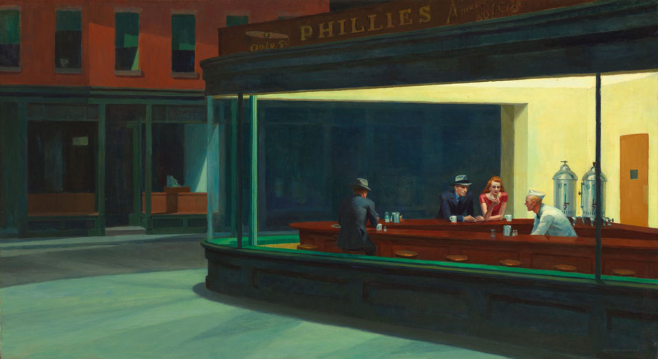
Thinking over the blue page from last Friday got me thinking about the paintings of Edward Hopper, who is best known for his Nighthawks from 1942:
(source)
As an art student in Chicago, I always tried to spend some quality time with Nighthawks whenever I got downtown to visit the Art Institute. One curious thing about most of Hopper's paintings featuring people--and a similar thing in the recent A* page, as well as the kinda paint-streaky outside of the bar in that page, is what got me thinking about Hopper--well and I guess the barkeep in that scene might have reminded me of the diner attendant in Nighthawks--is that by and large the people aren't doing much of anything. Not that they strike you as layabouts or anything, but just at the time he happened to capture them, they weren't doing anything, and probably weren't really about to do anything. So his paintings have that nice restful, timeless quality about them, reinforced by the solid, simplified construction of architectural volumes around them. And he's very good at using light and shadow in a firm but subtle way.
A couple other Hoppers I particularly like, that I haven't seen in person, are his earlier works Chop Suey
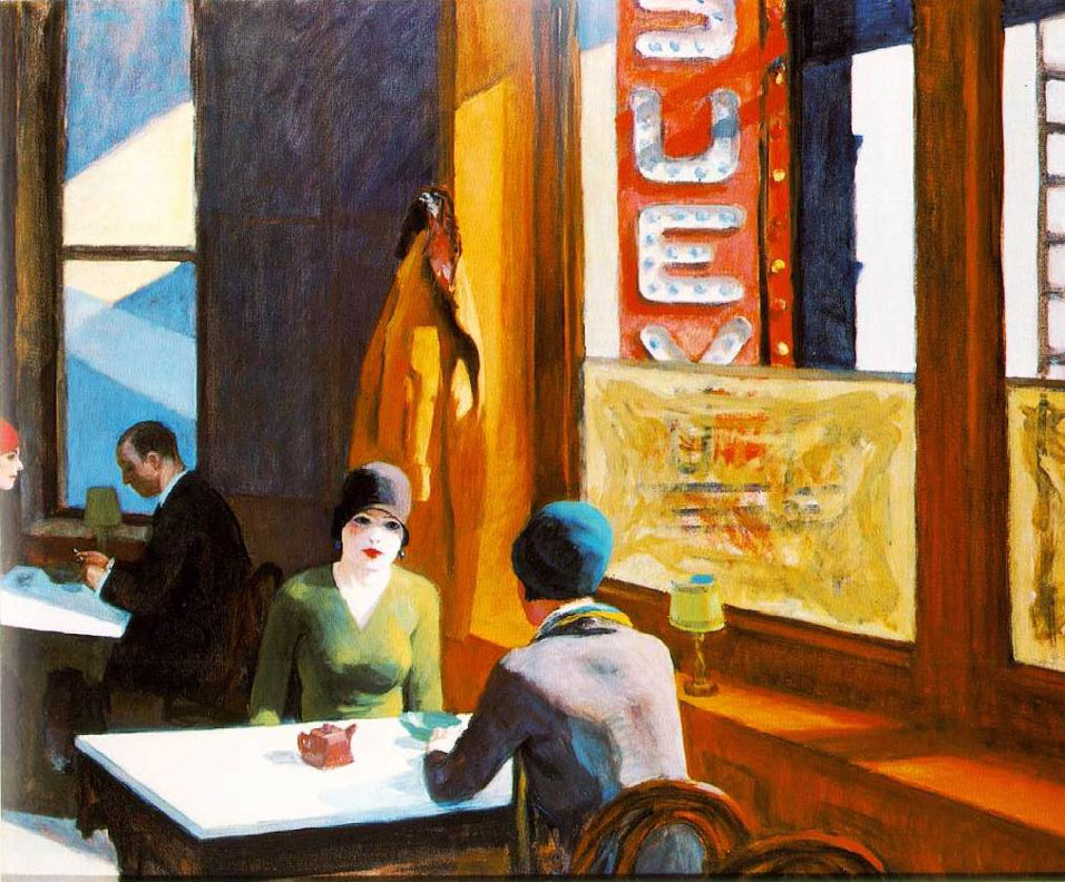
(source)
and New York Movie
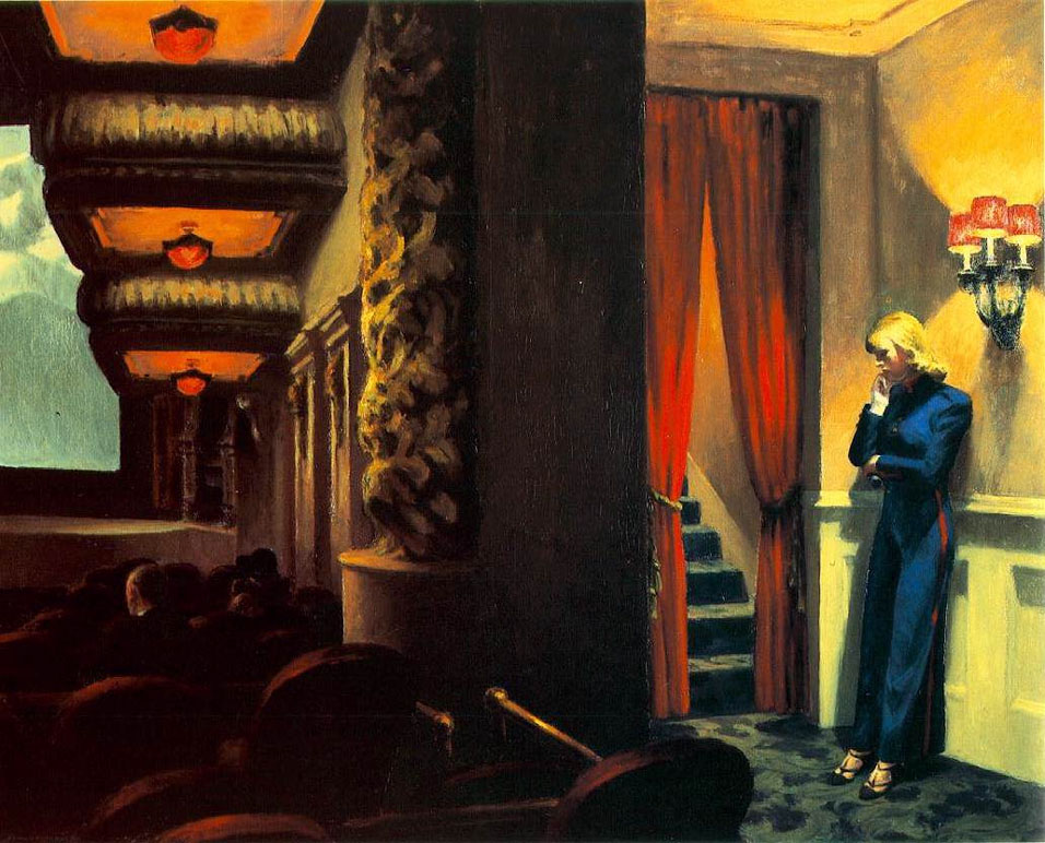
(source)
And on an unrelated note, happy New Year! : D
|
·····
|
|
|
