 | |
| |
|
|
view titles only (low bandwidth) |
| |
| A* is on Patreon! | Feb 28, 2014 11:35 PM PST | url |
| | |
Just launched A* on the Patreon crowdfunding service:

I'll have a full post on this in my regular blog article after I finish today's A* page--just got a little antsy and pulled the Patreon trigger a bit early. : )
|
·····
|
| |
| So I like pink, okay? | Feb 28, 2014 8:02 AM PST | url |
| | |
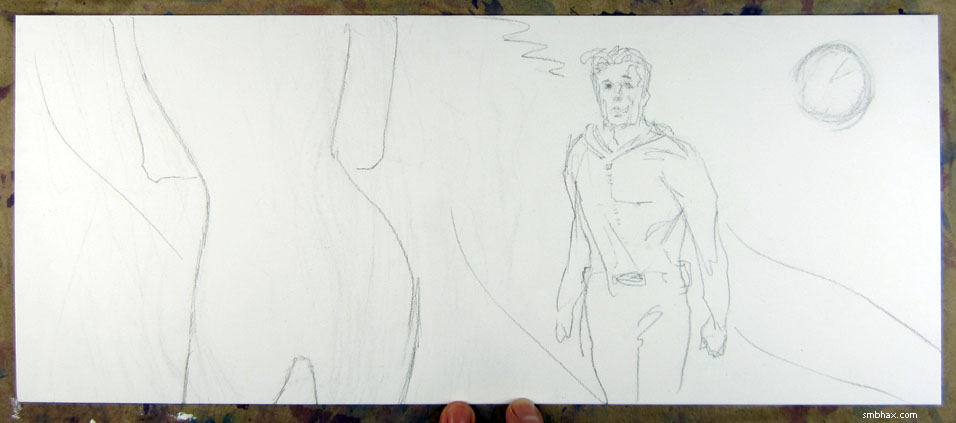
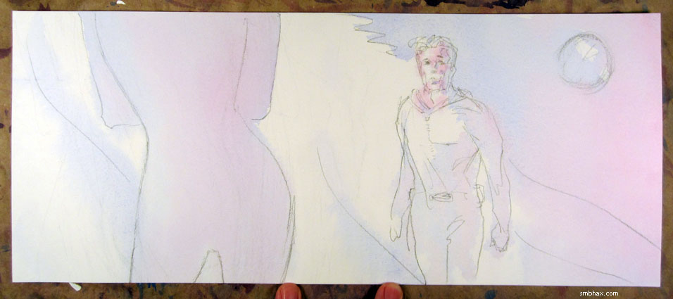
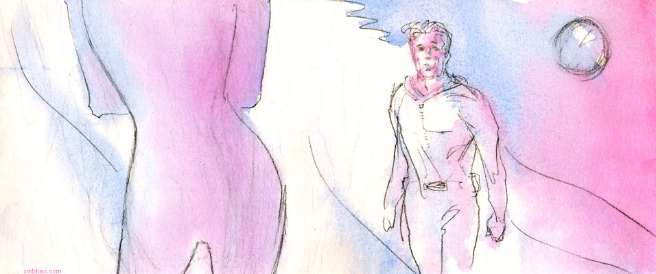
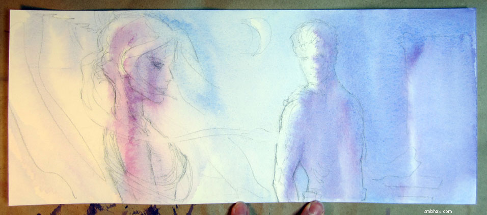
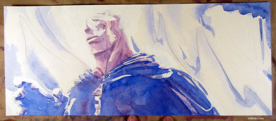
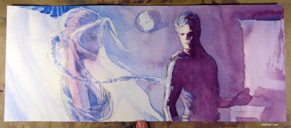
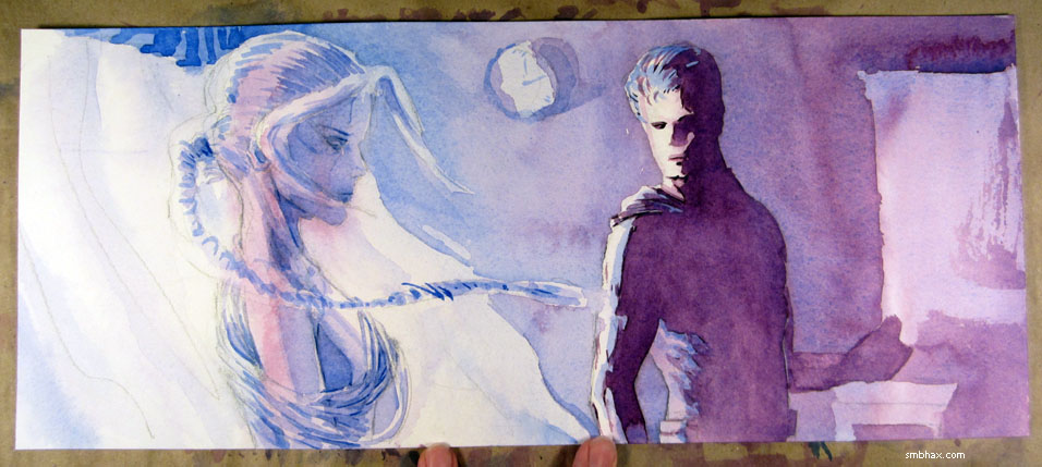
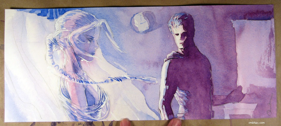
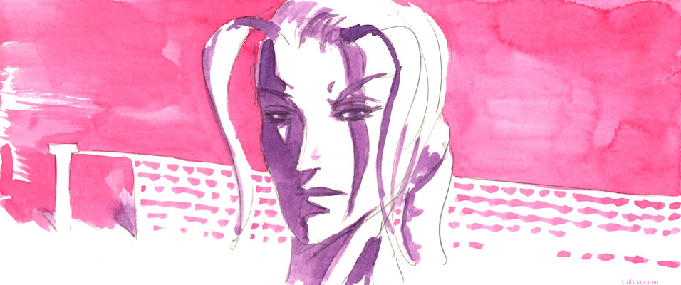
Added 1 new A* page:Ended up spending quite a bit of time (come to think of it the drawing of this took me forever, too--for the longest time I couldn't figure out what to put in the upper right corner, mostly : P) waffling over what colors to use for this new scene; I just got the tube of Cadmium Lemon watercolor I ordered a week or so ago, and thought hey that's great, I can use it for this sunny scene (it's a bright yellow), BUT it turns out that it doesn't really mix well with any of my main colors except green (I used a tiny bit of it to give the night vision green on page 51 a slightly isotopic glow)--and I don't think I would want to do a whole scene in greenish-yellow flesh tones, at least not one that doesn't take place in a radiation chamber or something. So upon reflection I decided to stick with the magenta and ultramarine combo I've been using; it really does have a lot of range, and the red end of it gives a reasonably sunny impression, I think.
Also in this art supply shipment was a half-inch-wide flat brush, called a "one stroke" brush, which is kind of a silly name. I was a little surprised that the bristles (this is the Winsor & Newton model) end in a flat tip, rather than a tapered point, or line, and for my money that makes it less precise than I would like. But I mostly got it for big brush strokes, so I guess I can live with it--well that and I don't know who makes a better one. And the bushy end actually makes for some interesting split-bristle effects, like the hatching patterns in the purple shadows, or the sort of boxy stippling in the upper right; it can definitely create a different feel than the round brushes I've been using, so that should be handy.
Gee, it's a good thing I switched to a 26-hour daily schedule three weeks ago, or I don't know *how* I'd have been fitting all this watercolor experimentation in. : P Now if only I could figure out how to prevent Saturdays from getting completely squooshed as a result. ; )
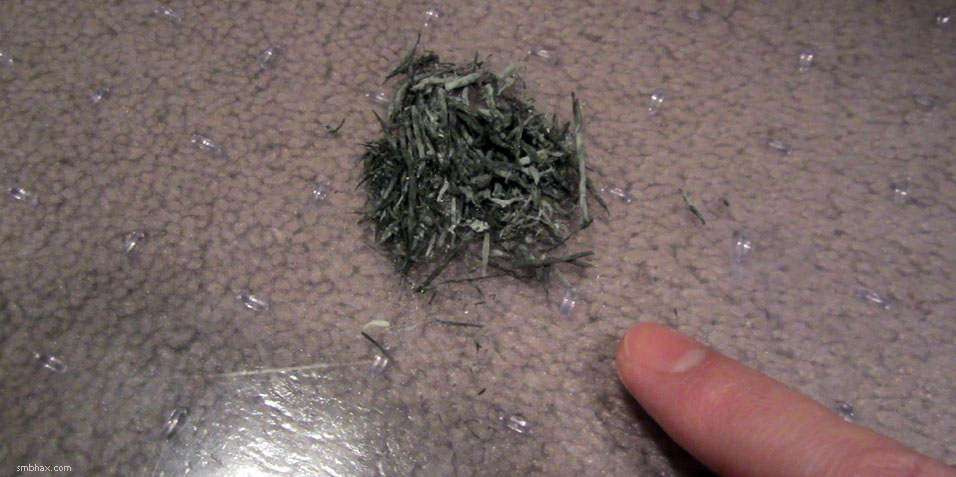
Oh yeah here's a photo I took two days ago of a single page's worth of eraser shavings (minus the ones I tracked around my carpet = p):
|
·····
|
| |
| More Wishing and Washing | Feb 27, 2014 6:45 AM PST | url |
| | |
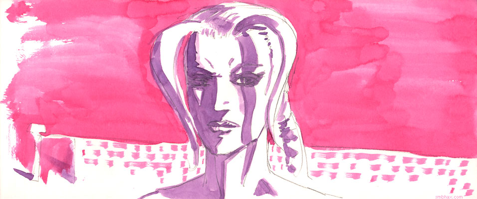
Added 1 new A* page:Warning: more watercolor blathering today!
Lately I've been spending more time on the penciling stage
trying to make sure there's something to them and they aren't just sort of bloated and cartoony, which is how they tend to come out if I'm not paying attention. : P And I was all happy with how the initial, wet-on-wet layer, which I've been calling the "underpainting" for the sake of convenience, went today
and once again I was thinking hm that could almost work on its own, maybe with a few white ink touch-ups here and there. So I did a test scan of it (no white ink yet), but after doing this I was reminded that it's difficult to use a watercolor that light, because you have to darken it a lot so it doesn't look washed out the screen, and that brings out all the little artifacts in it and it comes out fairly grungy, even if you keep it on the light side of things
So that probably wouldn't have worked. Which is too bad because it would be the best way to preserve all the zip of the pencils, rather than kind of having to redo them in paint, and the underpainting itself tends to be kind of zippy, since it has to be done pretty fast, before any part of it starts drying. But on the plus side, this little investigate did help explain to me why I haven't really been able to recapture the dark richness of page 55, which has been puzzling me for a while, even though I wrote a tutorial on it at the time. But comparing the above photo of today's underpainting with the photo I took back then of page 55's underpainting
shows that I've been going lighter on the underpainting since then, which I guess has been satisfying the control freak in me, but kind of gives me less to work with for the final image. And now I recall that my attitude at the time was that it was okay if the underpainting was messy, since that was just something to work from, and it can always be tightened up afterwards. And that worked really well. So I gotta get back to using more saturated washes to start off with, I think, and not trying to be so dainty and controlled at first by going light on the colors. Although tomorrow's a change to a brighter setting...hm so we'll see how that works.
~~~~~~
Oh yeah and I tried a couple experiments in today's page. One was painting wet-on-wet for the second layer, for Selenis and the back wall, to try to get some gradient flow going in them. It *sorta* worked, but apparently doing a second wet-on-wet layer above a first one washes the pigment around so that it collects and dries in little piles, leaving a leathery pattern--which I didn't necessarily want here. So maybe I won't do that so much. : P
The other experiment was just working in blue and red, without mixing them into a purple on my palette; if I needed a purple area, I just laid on some red over a wet blue layer. This I think worked pretty well, kind of kept the colors a little more vibrant--and would be particularly good for the underpainting, I figure.
(Hm I guess the other thing with page 55 that let it get kind of dark and rich was that the figures are seen mostly in shadow, and at least somewhat against dark backgrounds, whereas since then I've mostly got them from more directly lit angles, or against white backgrounds, which makes it trickier to get that swirly dark look.)
|
·····
|
| |
| Considering Patreon crowdfunding of A* | Feb 26, 2014 4:29 AM PST | url |
| | |
Added 1 new A* page:A generous reader sent me a contribution via PayPal today, which I was very grateful to receive--but further than that, they also asked if I'd looked into Patreon, a crowdfunding service that would give them and other like-minded readers an easy way of contributing to A*'s continuing development each month.
I *had* looked into Patreon when I first heard of it some months back, but it was early days for the service at that point, and it was a little hard to tell exactly how it would work in practice. Now that I look at it again, though, I see that some well-known webcomics are using it quite successfully, and even webcomics with smaller readerships than mine are getting significant support from their readers through Patreon.
So I'm thinking I should give this thing a try. I wouldn't slap a big Patreon banner up on the front page or anything--maybe on the About and/or Store pages >_> --but I'd probably be doing sketches as prizes for higher level contributors, and showing photos of them in the blog, which would be a good excuse to mention the thing now and then. And a good excuse to get more sketching done, which I've been neglecting of late. Anyway maybe I'll see about getting set up with them over the weekend.
|
·····
|
| |
| With Apologies to Jean Giraud | Feb 25, 2014 1:07 AM PST | url |
| | |
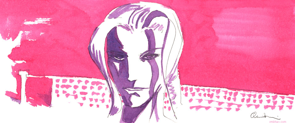
Added 1 new A* page:Went back to *not* necessarily doing the underpainting in local colors (ie coloring skin like skin), I guess I like the impressionistic possibilities you can get with that, although there's something to be said for the more straightforward sorta European-y "ligne claire" look I got a few pages back doing things the other way--you know kinda like Moebius, only a lot scrubbier. : P
The other big news before I go to bed is that I switched from signing my last name in pencil to just doing my initials (almost illegibly; um...needs practice : P) in watercolor. I'd already erased most of the pencil in today's page so it seemed silly to add more at that point. And this way my signature is harder to erase and replace with...well I don't know why you'd want to do that, anyway. :PPP
|
·····
|
| |
| Which one is the real page 58? : o | Feb 22, 2014 2:10 PM PST | url |
| | |
Added 1 new A* page:After several days of working all day on a watercolor A* page only to decide its awful and then make myself generate a second page late at night, I'm apparently so paranoid that I'll do a perfectly decent page, decide it's awful, do another page, and then, bleary-eyed, realize that oh, the first one was okay, just needed to straighten the nose and add some of the usual white ink touch-ups here and there. >_> So I went with that one, but that leaves me with a superfluous alternate version of the page--so I've put it up on eBay along with the past week's regular pages; the auction of the alternate version is here. Here's a preview:
Did I go with the right version? : o
So you can buy that stuff and the other A* pages from the past week on eBay as usual, also don't forget that I'm having a Supermassive Art Sale! Which means that all the original art for sale on this site is currently going for just $10 a piece--that includes the original art behind the hand-painted daily comic pages, the bonus art in the episode galleries, and so on. If you like my art, think about getting some to hold in your own two hands; it's affordable, unique, so A*-y, and when you buy it, it helps me pay my rent and have food so I can go on living and making more A*! : )
|
·····
|
| |
| Another two page day! >_> | Feb 21, 2014 10:12 AM PST | url |
| | |
Added 1 new A* page:Of course I wanted to duplicate the relative success of yesterday's page, and I thought I could do that by drawing vigorously (I stopped listening to podcasts--too distracting, maybe?--and just listened to the same Pandora music channel I'd been listening to while up late late late last night churning out yesterday's page: a poppy channel I set up for a friend who came over for a little dinner party one time--on the theory that it's peppy and will keep me stimulated, but might not be something I can take for too many hours at a time, so maybe it'll spur me to working expeditiously. ; ) Also it was part of yesterday's magic formula. : P
Anyway of course it didn't work. The funny thing is that the very first thing I did was what I was number one telling myself specifically to avoid, namely a boring layout with a cartoony character. Don't do this:
So I erased it and went through a lot of frenetic sketching and finally came up with something I thought had some zip
and went right in to color it, which is where things went obviously wrong:
Well I blotted out the face in a last ditch effort / burst of frustration, and to cover up the worst of it. : P I kinda like how the hand and the shoulder above it came out--those have a nice simple solidified shaded look--but on the rest I was trying to do way too much modeling with the watercolors, which doesn't really work; you have to let them do their own thing. It all got blotchy. Also eventually I realized that the exaggerations of the proportions--the enlarged shoulder and zipper and so forth--that I thought were adding zip were really just more cartooning, and going away from the direction I want to go in; exaggerating stuff is an easy way to add pizazz, but I shouldn't be using it as a crutch. Gotta find a way to make each panel memorable without resorting to that type of distortion--it should be possible, darn it, even when the image doesn't call for action or whatever. Heck tomorrow's is a still shot without even any dialogue, we'll see how many tries it takes me to get that one! : oo
I put together a little checklist of things to remind myself to watch out for based on today's initial attempts, and then on the final one, in which I kind of wanted to rediscover what worked about yesterday's page with a different subject, and found, by missing them, some things that had worked well yesterday that I hadn't been sufficiently aware of:
- don't cartoon
- keep it simple
- don't do too much modeling
~~~~~~~~
- don't draw shadow borders in pencil--work them out with the big brush in watercolor
- use magenta for flesh underpainting, not purple--purple is the shadow that goes on top later
So we'll see how much of this I manage to forget tomorrow. :PP
|
·····
|
| |
| Come over and look at my underpaintings | Feb 20, 2014 8:57 AM PST | url |
| | |
Added 1 new A* page:Well hopefully this page isn't too risque for the pointiest haired bosses out there. See this wasn't the page I set out to make, but that one turned out to be an awful mess after I'd worked on it all day--I think maybe the layout was a little bland and the lighting was complicated, and that recipe made me color it really carelessly or something...anyway it came out looking like it had been attacked by an entire kindergarten finger painting class : P--so it was about 4:30 am and there I was with nothing at all to show for the day, and nothing to do but take another stab at the page, from scratch. So I had to do something quick, and just started drawing and erasing furiously and this is what came out of it after about eight sketches (the previous seven did leave some grungy graphite residue on the page which you can kinda see in the curtains in the background of the final version, but...well I had already wasted ONE $3 piece of paper today, and as a full-time webcomic author I ain't exactly made out of money you know : o). Don't ask me what's going on there, I suppose it's all Freudian as usual.
At least it isn't bland! :p
For a few minutes I harbored hopes of just going with the underpainting, maybe with some white ink touch-ups, but a quick scan of it at that stage while I was technically still waiting for it to dry completely
showed it did need a good deal more refining.
~~~~~~
Oh yeah I'm a day late on my promise of showing you the test sketch I did over the weekend that showed me that starting pages by doing an underpainting on wet paper was the way to go. Here's that:
Underpainting! That one has some dried-out big brushwork on it though--which blended with the underpainting amazingly well. I think that was another error I made in the botched first attempt at today's page--I came in with fill colors over the underpainting that were too dark, and kind of lost the balance of the whole thing...which is now in the trash and will never be shown to anyone : oo
|
·····
|
| |
| Watercolor Eureka? | Feb 19, 2014 7:15 AM PST | url |
| | |
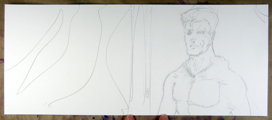
Added 1 new A* page:For today's page I set out to implement the new brush procedure I was talking about coming up with after yesterday's page, namely using a big brush for most of it, then coming in just at the end to sharpen things up with the smaller brush, but I realized too that for this to come out like I wanted I'd also need to draw both more realistically and more freely, like really going to town with the pencil and not worrying so much about coming out with something clean and streamlined. For me this often means erasing the first drawing, because for some reason I tend to start out with something more cartoonish.
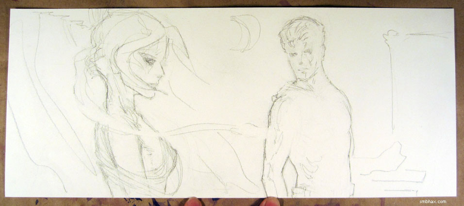
Like, the first thing I drew today was this dude's head, but after drawing his body and then Selenis--and the pencils finally loosened up there--it was clear his head was too like '60's comic bookish, so I finally convinced myself to erase it and put a new head on his shoulders, which took some doing to get it all lined up. : P (I usually start a figure with the head, maybe the general shape but especially the eyes, then the nose and the mouth, then the rest of the head, then I usually sketch out a rough outline of the body attached to it, and refine from there as needed--so changing the head out is kind of a disruption to my normal plan of attack. ; )) (Another thing I do that is probably wrong is only adding the background in later, after the figures, most of the time anyway; I think because I find it much easier just to draw the figures how I want to and fit the background to them, rather than having to work out how to get them to fit the background.)
Oh yeah, I also realized that with the pencil and big brush and all I'd just have to be fearless; to get the look I want I think that's pretty much what you have to do, just go for it and not worry about ruining your pencils or whatever, heck you can always draw new ones if you really need to, but a mediocre drawing will haunt you forever. : P So I didn't worry too much when the on-wet-paper underpainting looked disastrous:
As long as I can still see the pencils it isn't ruined yet! Then as per the new plan I whacked in the main colors with the big brush:
Gosh, pretty much done already, right? So now we break out the small brush and go in to sharpen things up, first with very saturated dark watercolor for the lowlights
and then white ink for the highlights; something I found yesterday was that adding just a little water to my white ink made it much more liquidy and easier to lay down gracefully and fluidly, without lessening its covering power--actually improving it, really, since it lays down over the paper better; I took more advantage of that today to give the highlights some swirl--may have gone a bit overboard but you know I always gotta find the limits when I get a new toy:
And that was it! Just a bunch of waffling around with value levels in Photoshop after that. : P It all worked shockingly well, actually, and I feel like I've finally worked out the combination of materials and method to start getting where I was hoping to go with watercolor in the first place. Whew! For a while there I was afraid I just wasn't gonna be able to figure it out, and about five times a day I'd fantasize about just falling back to ink (the sales leader!) or the computer (so clean and sharp!) or pencil (so pure and straightforward!!). But maybe I'll be able to hang with this for a bit.
|
·····
|
| |
| Just Add Water | Feb 18, 2014 4:36 AM PST | url |
| | |
Added 1 new A* page:I made a discovery about this watercolor stuff over the weekend: the trick to getting that smooth, glowy atmospheric look that the better watercolor paintings have is...water. I mean, wetting down the paper before painting your base layer, so that instead of jagged areas of color with seams between them like you saw when I showed my underpainting in Friday's page, you get this gorgeous smooth undulating plane of color with mysterious shapes and shadings.
My test sketch from the weekend makes this pretty clear, but it's already past my bedtime so I'll try to get it scanned tomorrow. I tried this approach in today's page, but the effect is pretty subtle because I went very light on the first layer and a lot darker on the next, which is most of what you're seeing. And I was worried about getting enough detail over the blurry underpainting, so I switched to my small brush and went right into detail work on the second layer, but now I'm thinking that maybe it would have kept a more lively, abstract look if I'd stayed with my bigger brush for putting in the shadows and main colors, *then* finally switched to smaller brushes just for the final highlights and shadow details. Also along with that maybe I'd consolidate the shadowed areas of the figures more--not adding all the interior shadow detail on the neck and torso, for instance--so the brush would have a larger area to play and wash across and create those surprising gradients that watercolor is so good at. Oh well, something to try on the next page.
One big advantage of this approach for A* is that the final page comes out smoother, with less jagged edges and clumps of pigment, so once I scan it into Photoshop I can make it just about as dark as I want without having to worry about dark artifacts becoming too prominent; the original artwork for this page isn't as dark as the artwork for the previous page, but because it's smoother I could adjust the final version to be darker.
|
·····
|
| |
| The Underpainting's Hidden Horrors | Feb 15, 2014 1:20 PM PST | url |
| | |
Added 1 new A* page:In case you missed me constantly plugging it earlier in the week, I'm currently having a Supermassive Art Sale! Which means that every piece of original art for sale on this site is going for just $10, rather than the usual $50. Look for the "original art" links below the comic pages, or next to the pieces in the episode art galleries. The money goes directly to supporting my work on A* so....yeah buy my art. : )
~~~~~~~
Still working on this whole layering business with watercolors, probably pushed the limits a bit with today's page--like, going over I dunno two or three layers of watercolor seems like it starts to get a little grungy. Here's what the first layer looked like:
: o
|
·····
|
| |
| Glazed over | Feb 14, 2014 10:45 AM PST | url |
| | |
Added 1 new A* page:I don't remember in exactly what order the realization came, but it struck me today that I was trying to use watercolors like ink or paint rather than watercolor: I was slapping down the color I wanted to be in a spot, thinking I had to get it right on the first try, and ending up with oversaturated pigment gathering into unsightly lumps (exacerbated by my trying to make everything darker in Photoshop), rather than using the runniness (which apparently is not a word) and transparency of watercolors to build an image up out of layers of thin, semi-abstract glazes. Confirmation for the validity of this approach came from Bill Sienkiewicz's recent piece, "Kelby," which is pretty darn neat if you ask me.
So then I went on YouTube looking for helpful instructional videos on watercolor. Searching for "watercolor," there are of course a ton; skipping somewhat randomly down the list, I found this one, this one, and this one pretty useful. Now I want a nice square brush. I've started doing watercolor on my angled drawing table rather than on a flat work table, to take advantage of gravity to direct pigment spread, and to prevent pooling. And I should probably get some titanium white, might work better in some cases than the waterproof white ink I've been using.
And I had to use more than I would have liked of that today because the pencils for today's page had the typical male caveman artist dislocated spine problem. Urgh.
With the watercolor I made some pretty big mistakes right off the bat, and lost the face later, but I could see some things working. Progress will be made.
|
·····
|
| |
| Shipping art! | Feb 13, 2014 7:10 AM PST | url |
| | |
Added 1 new A* page:I seem to be making things a little complicated for myself in these pages; with watercolor I gotta remember to stick with a straightforward plan of attack so things don't get muddled. But then I also find myself looking at a page I'd done and thinking boy, this looks too plain--then I go in and muddle it up on purpose a bit. : P Maybe I just like some muddle!
Up pretty late at this point for which I blame a record day shipping off A* art at the post office: I shipped 20 original A* pages to people today! : o Took forever just to get 'em all sorted out and boxed up. ; ) But these are good problems to have I think! Most of them were from people taking advantage of the ongoing Supermassive Art Sale, where all the original art pieces available on this site--like the actual drawings behind your favorite A* pages--are currently just $10 each. And eBay accounted for the rest--and if you're looking for even bigger bargains on A* art, you might want to check out what I've got up for auction on eBay, because I always put the latest A* pages up there, starting at just $4.99 each. And none of the ones up there currently have bids yet, so there's a pretty good chance you could get yourself some art there for just half of the already ridiculously low price of art on this site.
Thanks to everyone who's been buying my stuff! It's really helpful. It's already paid for over half my rent this month, whew! :) (Yeah I'm the low-rent type. : p)
Here was an early sketch for today's page--it was an okay drawing by my standards, rather pleasant even, despite the eyes not quite lining up, but it was too low on the page, so there was nothing for it but the eraser:
|
·····
|
| |
| Watercolor...plus ink? | Feb 12, 2014 1:54 AM PST | url |
| | |
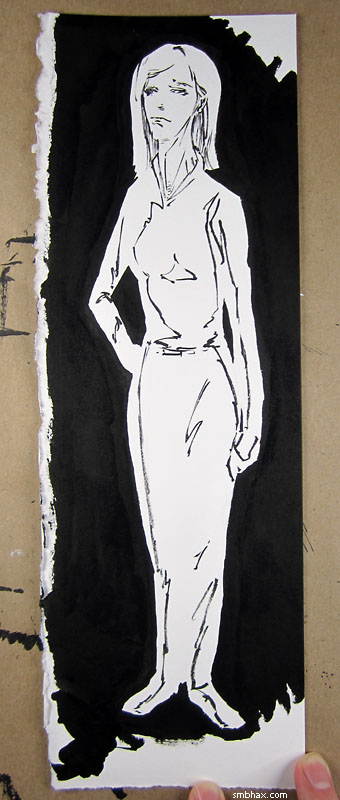
Added 1 new A* page:I added another piece to the Supermassive Art Sale--which is to say, I made another piece of art available for sale through this web site, where all my pieces of original art--the actual combinations of pigment on paper I have made on my drawing table, I mean--are now just $10. The new one is one of the first ink wash illustrations I did, sort of a "proof of concept" before I took the plunge to doing A*'s daily pages traditionally:

I had it in the episode 13 gallery before, but not for sale--so now it is!
~~~~~~~
I conducted another art experiment over this past weekend. It went like this:
^ A couple quick pencil sketches on awkwardly shaped scraps of this super heavy 300 lb watercolor paper I've been using lately.
^ The first of them, very hastily and inaccurately inked. You see here I've followed the sort of pooling shadow areas together approach that I've been doing in some of these recent watercolored A* pages. I was wondering how the ink would take to this heavy paper, which has more texture on it than I've tried with ink before, and somewhat to my surprise, it worked great! Went on really smoothly, in fact, and it also reminded me that the ink holds the brush tip in a nice point better than watercolor does--I guess because it's thicker and maybe also because it has a binding agent in it? But waterproof ink like this will also ruin your brush a lot quicker than watercolor, because try as you may to wash it off, it accumulates inside the ferrule--the metal grip around the base of the bristles--and gradually pushes the bristles apart, so they can't form a good tip. In the past I've been able to get maybe 20 inked A* pages out of one of these Raphael size 4 sable brushes before the tip is definitely in bad shape, although that's with an assist from a larger brush to fill in big huge black areas.
Anyway, on with this experiment:
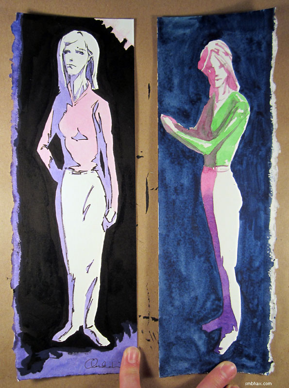
^ Now I've applied watercolor--again hastily and messily--both to the inked drawing and to the non-inked drawing. Mostly I wanted to see how ink + watercolor would work, and boy, I can how this combination would work pretty well for, say, coloring Sunday comics in the days before everything was computer colored. Pretty sharp! At first I was thinking gosh, I guess I should do the A* pages that way, but then I got to thinking about it more.
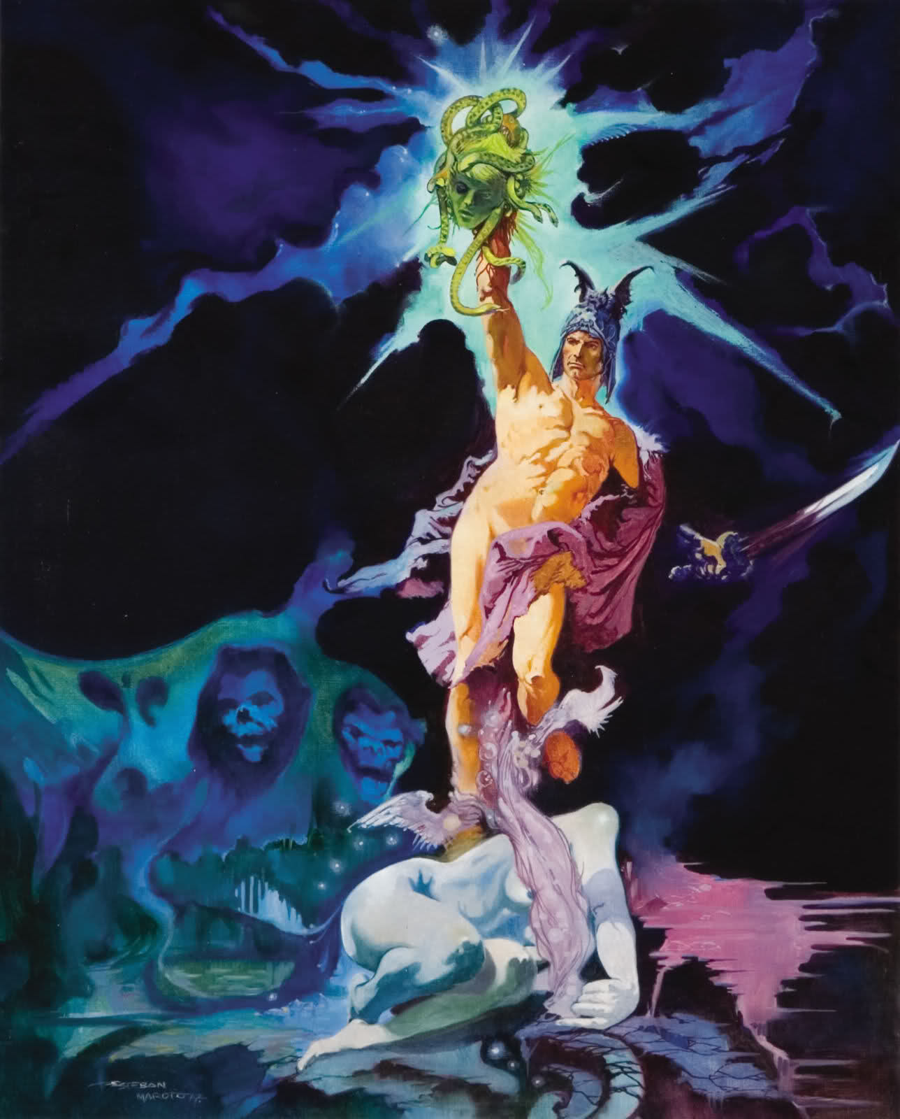
I was wondering about ink because I was thinking this current scene we're in now, which is kind of a dark scene, might need ink rather than just watercolor, since watercolor itself can only get so dark. But looking at that inked sample some more, I realized that, as I had kind of suspected, putting ink around the watercolors more or less negates the light-emulating properties of watercolor; good watercolor can look like an actual light-filled scene, but inked watercolor is just going to look like a drawing of a light-filled scene, if that makes sense. I do kind of like the stained-glass-window look it gives when used with this sort of pooled lighting style--kind of reminds me (in a very poor way, of course) of a European comic style, like oh say Esteban Maroto's stuff on this page; he even gets into some pretty cool abstract color use there--definitely possibilities in that direction. But there's also very little sense of actual lighting in those scenes. Contrast that with say this painting where he doesn't use black lines, and still uses some abstract color.
Admittedly, the inked method is faster, and easier--at least in the sense of getting a sharp-looking result. But if you can pull it off, there's a much wider range of situations you can get across with the more painterly approach; and I think filling in lots of little ink shapes every day would start to drive me buggy, it's more of a paint-by-numbers thing.
I dunno, I guess I won't really be able to tell until I try it out on some actual full-size pages. Not sure I'll be tempted to do that, guess we'll see.
Another thing this taught me was that watercolor looks nicer when kept lighter; I tried going as dark as I could with it on the non-inked page background by combining my red, blue, and green all at once into a super-saturated mix, but you can see that it was so pigment heavy it didn't sit evenly on the paper, and came out icky and clumpy, whereas the lighter tones in the inked page look nice and smooth. I do think the dark purple directly on white on the feet of the non-inked page looks cooler than anything on the inked page, though. (On the other hand, the pink inking, pink-to-purple fade, and green overlapping pink color experiments above that were resoundingly unsuccessful. : P)
|
·····
|
| |
| Scene! | Feb 11, 2014 1:34 AM PST | url |
| | |
Added 1 new A* page:The Supermassive Art Sale is off to a pretty good start, with lovely readers like you buying up 16 pages of A* original art over the weekend. : ) What's the Supermassive Art Sale, you ask? Why, simply that all the original art for sale on this site--the actual pigments on paper behind the A* daily comics, and many of the pieces in the episode art galleries--now cost a mere $10 each. Before Saturday, most of 'em were $50! So take advantage and snap up your favorite pieces before I come to my senses. These are one-of-a-kind works, so once someone buys one, it's gone! Just look for the "original art" link next to your favorite comic page or gallery listing.
~~~~~
I was pretty irritated with myself for the previous page (the luau), I guess because I felt like, not having a good idea of a layout that would let me stay in a more preferred drawing mode, I kinda fell back on a wide overhead view with a pretty cartoonish rendering of the scene. I guess that sort of fit the mood of the page, but still it bugged me. Later I did some pen drawings to try to cleanse the palate--also I hadn't tried pens on this heavy watercolor paper I switched to last week:
The pens work pretty good on it! The big black marker in particular soaks in really nice and dark.
This morning while waiting for my tirelessly generous father to bring some A* art over (some of the pages people ordered off the site over the weekend were ones we had in a collection we'd been keeping at his place of pieces we've taken around to art shows), I decided to try some costume sketches for the new scene that started in today's A* page; I think I shouldn't try drawing before breakfast but anyway here's one of them:
Toga, toga! Thinking it over later I decided it would be better to go for a more casual sorta silk jammies look or something instead of the Roman thing there. : P
I didn't have the full dialogue/staging for this scene written coming into today, and I guess that was worrying me subconsciously because I woke up in the middle of the night and couldn't fall back asleep so I lay there thinking about the scene, and then it all sorted itself out in my head and I had to jump up and jot it down, and then I could go back to sleep! Whew.
Oh yeah here's a snapshot of the pencils before I doused them with watercolor. I should'a noticed at this stage that the hair part of the head was too big--had to pare it down with the watercolor already one it later, which was a pain--but I tend to have a blind spot for big domes on Selenis:
Also almost inevitably the eyes changed around on me through the "inking" (aka watercoloring) stage. I gotta get better at preventing that, it is really hard to try to fix 'em afterward, bleh. Although I suppose part of where I went wrong was that after I'd "finished" the pencils and sat down to color them, I realized that I needed to color them darker than I'd drawn them--bigger shaded areas and much smaller highlight areas, you know--since this room is supposed to be pretty dark, but then I was too lazy to redraw the shadows, like across the face and stuff, and just colored them in freehand instead. : P Not the smartest!
One thing I tried did work pretty well though I think, and that was coloring first with the lighter purple shadow wash across most of the picture, then once that had dried, going in with a smaller brush of darker purple and finally white ink to bring out the details. The first big brush stage goes pretty quick when you only have to worry about one color. : D
|
·····
|
| |
| Supermassive Art Sale! | Feb 08, 2014 9:30 AM PST | url |
| | |
Added 1 new A* page:All A* original art for sale through this site is now just $10! Yes, get any of the ink/watercolor/pencil drawings I've done, either for the daily A* pages or for related illustrations found in the episode galleries, for just $10 each! Pretty good deal considering most of 'em are normally $50. : D
Just look for the "original art" link next to your favorite pieces on the site, and take advantage of this silly low price before I come to my senses and raise it back up. : P Also, remember that these are one-of-a-kind items, so once someone buys one instantly through the site with their credit card or PayPal, it's gone; for that matter, I should mention that most of the episode 13 pages, from back when I first started working traditionally, have already been snapped up, and there aren't all that many ink/pen/watercolor pieces starting from the second half of episode 20 up to last week that have made it unsold through the daily eBay auctions in which they've been starting out—so if you had your eye on one of those, you might want to get it sooner rather than later.
All told there are some 400 pieces left for you to choose from—and my goal is to sell them all! You need unique art to spiff up your wall, and I need to pay rent, so let's do some business. : )
Update: The sale's been pretty successful! It will be wrapping up at the end of April, so get your sale purchases in before the art goes back to its normal prices in May!
|
·····
|
| |
| Tied up in space tethers! | Feb 07, 2014 7:20 AM PST | url |
| | |
Added 1 new A* page:The sequence starting with this page of the webcomic "Paper Streamer At Def-Con 5" reminded me about some of the many flavors of non-rocket spacelaunch. Although things like a ground-to-orbit space elevator would require materials we haven't quite developed sufficiently yet--like maybe a huge carbon nanotube cable or something--there are lots of other uses for, say, space tethers, like electrodynamic tethers: "long conducting wires, such as one deployed from a tether satellite, which can operate on electromagnetic principles as generators, by converting their kinetic energy to electrical energy, or as motors, converting electrical energy to kinetic energy."
These long wires generate power by intersecting the Earth's magnetic field, and in fact there have been lots of space missions testing their usefulness. A lot of these test wires have tended to have trouble deploying, or have snapped; you can watch the attempted deployment of a 20 km tether during Space Shuttle mission 75, in February 1996, right here (spoiler: it doesn't *quite* make it).
Also in '96, the US Navy launched the Tether Physics and Survivability Experiment (TiPS); its 4 km tether between two test objects was predicted to hold up for just a few years, but it didn't snap until July 2006, after 10 years of test service, a demonstration of the feasibility of long-term space tether use.
On the 28th of this very month, Japan is scheduled to launch a 300 meter electrodynamic tether with the intent of attaching it to a dead satellite, "generating current as it rotates, and decelerating the piece of space junk to bring it into a successively lower orbit until in reenters the atmosphere."
The future of space could be lots of tethers!
~~~~~~~~~~~
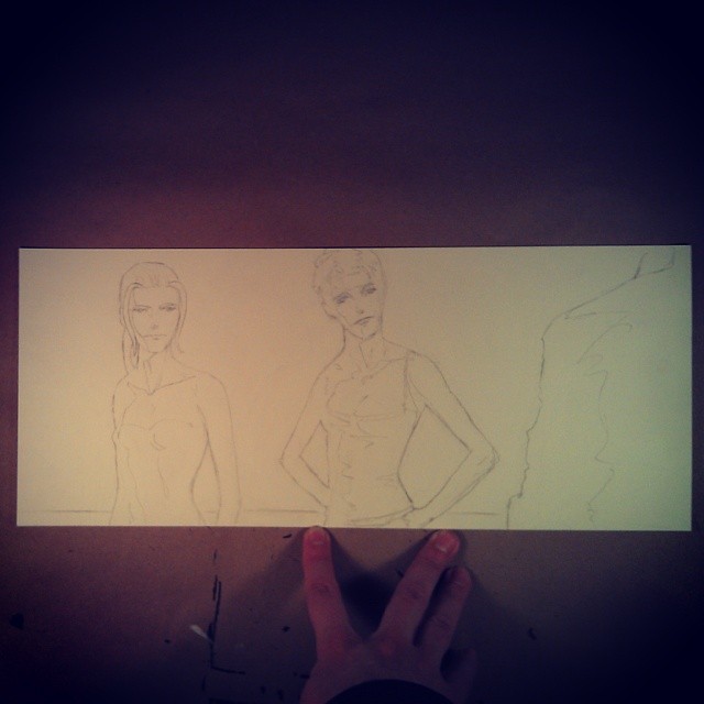
Probably tried to overshade today's page; detailed shading works better than it did on my previous paper, but it came out really boring, like paint-by-numbers, so I tossed the remains of my palette on it, then slashed at it with white ink for a while in an attempt to spice things up. Probably should'a just done a light wash over the pencils--which I took an Instagram of, but that didn't work all that great either : P:
Oh well I guess this is how I learn things. That, and Wikipedia. : P
|
·····
|
| |
| Solar System's Largest Mountain's on Asteroid | Feb 06, 2014 2:37 AM PST | url |
| | |
Added 1 new A* page:Old Space News, New Science News:
2011: Rheasilvia (wikipedia.org) - "Rheasilvia /ˌriːəˈsɪlviə/ is the most prominent surface feature on the asteroid Vesta and is believed to be an impact crater. It is 505 kilometres (314 mi) in diameter, which is 90% the diameter of Vesta itself, making it one of the largest craters in the Solar System, and at 75°S latitude, covers most of the southern hemisphere. It partially obscures an earlier crater, named Veneneia, that at 395 kilometres (245 mi) is almost as large. It was discovered in Hubble images in 1997, but was not named until the arrival of the Dawn spacecraft in 2011. It is named after Rhea Silvia, a mythological vestal virgin and mother of the founders of Rome.
Rheasilvia has an escarpment along part of its perimeter which rises 412 km above the surrounding terrain. The crater floor lies about 13 kilometres (8.1 mi) below the surrounding surface. This basin consists of undulating terrain and a central mound, almost 200 kilometres (120 mi) in diameter, which rises 22 kilometres (14 mi) from its base, the tallest mountain known in the Solar System."
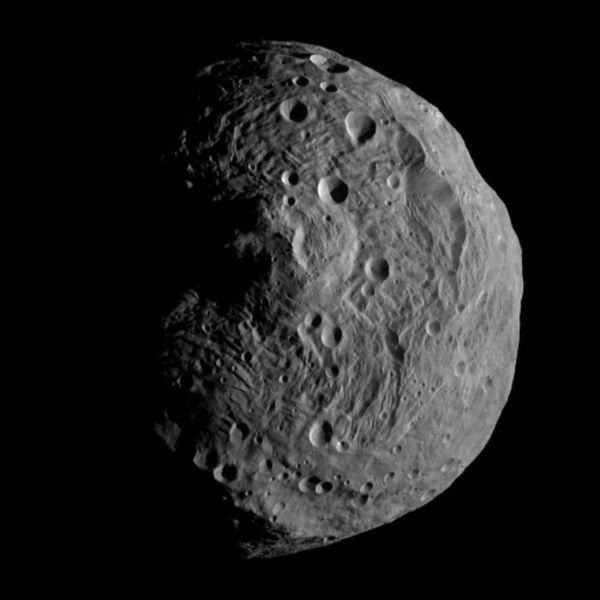
image by NASA/JPL-Caltech/UCLA/MPS/DLR/IDA (source)
Feb 5, 2014: Bionic hand allows patient to 'feel' (bbc.co.uk) - "During an operation in Rome, four electrodes were implanted onto nerves in the patient's upper arm. These were connected to the artificial sensors in the fingers of the prosthetic hand, so allowing touch and pressure feedback to be sent direct to the brain."
|
·····
|
| |
| Hello, Goodbye 21 Lutetia | Feb 05, 2014 3:18 AM PST | url |
| | |
Added 1 new A* page:Old Space News:
Apr 24, 2012: Rosetta Approaches Asteroid Lutetia (apod.nasa.gov) - A video flyby of asteroid 21 Lutetia (from the Gallo-Roman name of the city that was renamed Paris in 360 AD), compiled from photos taken by the ESA's Rosetta spacecraft. Space scale is funny; hard to get my head around this floating rock being 100 km across!
|
·····
|
| |
| Supermassive Watercolor Paper Bowl! | Feb 04, 2014 6:05 AM PST | url |
| | |
Added 1 new A* page:As excited as I was over the weekend about the local sports team going out and winning a supermassive bowl, I was just as excited (it was an excitement-filled weekend! : o) about paper--new paper to use for A*, that is!
The paper I've been using, Canson Foundation Bristol, 100 lb weight (that means 500 22"x30" sheets of it would weigh 100 pounds), is a nice, white, smooth one I picked out as specifically well suited to drawing in pencil, back when I was drawing exclusively in pencil back in episode 19. I stuck with it automatically as I began throwing watercolor into the mix in this episode, but difficulty in handling certain aspects of the watercolor--the fairly icky results of trying to do detailed shading on Selenis in Friday's page being the last straw--got me thinking that gee, maybe I should, like, use actual watercolor paper when working in watercolor. And I should have thought of this way sooner, because in fact I was working on watercolor paper back around episodes 14 and 15, when I was using ink washes.
I switched away from that paper because it would rumple up and get hard to scan, but there are heavier, more expensive watercolor papers made to resist the warping caused by wetting and drying the sheet--cotton (or wood pulp, in cheaper papers) fibers expand when saturated, then shrink as they dry, only this inevitably happens unevenly across the page, resulting in warping. So I thought I'd get a couple of those heavier papers, and try them out with watercolors against my current paper, and against the lighter watercolor paper I still have left over from the earlier episodes.
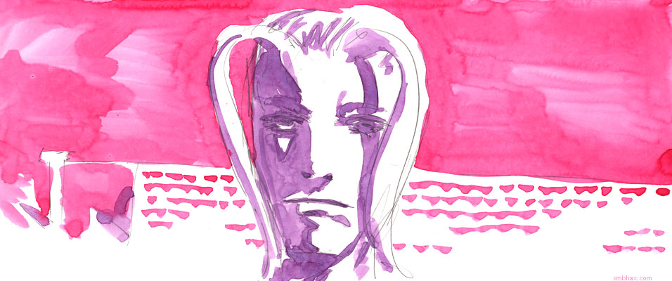
To do this, I decided to execute a quick and simple portrait of Selenis on the current episode's tennis court, using the same watercolor palette I've been using lately--I would do one of these at full A* page size on each of the different papers. Here they are in photos trying to show their relative shades of off-white, and then how much they buckle after being watercolored:
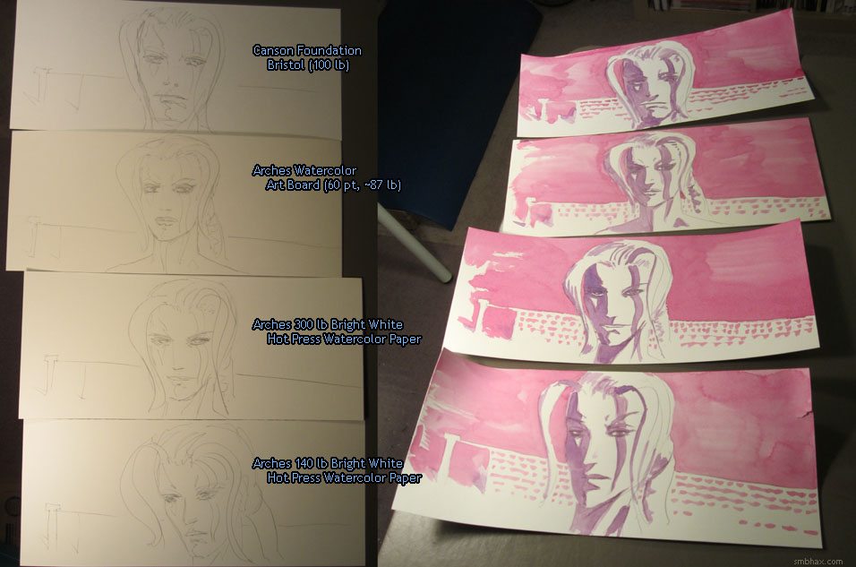
Let's take a closer look at these, shall we? In slightly different order than above:
100 lb Canson Foundation Bristol, Smooth Finish:
Yeaugh! And this is the paper I've been using with watercolors all this time. : o Trying to apply multiple coats, or just getting stuck trying to continue filling an area where some of the brush strokes have already dried--and they dry pretty fast on this relatively thin, stiff paper--results in just plain gross, bleed-covered mucky spots. The water pools irregularly, leaving messes of pigment here and there as it dries; the surface is pretty poor at catching the pigment, so you get a pretty washed-out look, and the bleeding makes it all pretty blurry.
As you can see in the first photo, this thin paper is prone to some rather extreme warping after being wet; surprisingly, this isn't really a problem for scanning, as the Bristol's stiff page (Bristol means paper that consists of multiple thin sheets glued together, which creates a single piece much stiffer than its component sheets alone) just folds upward as its top sheet contracts, and is easily bent back into something like its original shape. And the Bristol is easily the whitest of the four papers here, which also helps ease and accuracy of scanning. That's a pretty moot point when what you're scanning looks like puddled dreck, though.
140 lb Arches Bright White Watercolor Paper, Hot Press:
Arches paper (pronounced something like "Arsh") is produced at the Arches paper mill in Lorraine, France, founded in 1492. Today it is a brand of Canson, a French paper and art supplies company, after a series of mill purchases and mergers from the 1950s to the '70s brought them together (Canson itself is today owned by yet another, larger company with I guess a less marketable name). The Arches stuff still uses its own labels and imprints, though, and to look at an Arches paper pack or sheet, you'd have no clue it was now part of a larger company in any way. I haven't seen the usual grumpy old artist complaints about art supply quality degradation in these decadent modern times when it comes to Arches, so I guess someone there must be keeping a pretty firm hand on the tiller.
Their watercolor paper is pure cotton (Canson's Bristol does not make this claim, which means it is probably mostly wood pulp), making it naturally acid-free. Their regular paper has a sort of light khaki, off-white color; their "Bright White" versions have acid-free white pigment added to lighten them (rather than being bleached, like cheaper papers; my source on this stuff is this speech by a US Arches marketing rep). When seen up-close, though, the "Bright White" 140 lb sheets really aren't much brighter in tone than the regular "Natural White" versions. They're thin and pretty stiff, but not quite as stiff as the lighter Bristol. As you can see in the top photo, they warp pretty good when wet; experts on the internet pretty much all advise pre-wetting and stretching these lighter watercolor papers, but the process is, as far as I can tell from the various articles and videos on a topic, a failure-prone, painstaking pain in the whumpus, and there's no way I'm going to try doing it for every daily A* page; I tried some quick half-hearted versions of the stretching process over the weekend, which failed completely--so I'm pretty much stuck with the warping. And this is a problem for scanning, because unlike the Bristol, this stuff warps both up and down, so pits and bulges will form in the middle of the page, and there's no getting rid of them; they show up as shadowy, out-of-focus areas on the scanned image; I finally gave up on this paper, after using it for an episode and a half, when extensive cockling from multiple layers of ink wash created deep vertical stripes on the cheek of a starship captain in episode 15, page 25 that were so extreme I couldn't even correct them with the special Photoshop process I'd been using up to that point to hide the warped areas.
I will say, though, that, when not suffering from a particularly bad warp bulge, this paper makes the watercolor look pretty nice; you get some elegant smooth shadings with it, and not nearly as much dry overlapping as with the Bristol; I suppose the gelatin "sizing" compound Arches adds to their watercolor paper to slow absorption of the watercolor is part of what makes this possible. It *is* fairly thin paper, though, so it is still prone to drying out relatively quickly, and you'll get some streaking and overlap unless you work really really fast; you can see I got some for instance in the purple shadows under the nose and lower lip.
Watercolor papers from Arches typically come in three surface types: "Hot Press," "Cold Press," and "Rough." Hot Press is the smoothest, resulting from sort of steaming the paper flat between hot rollers, or something like that, and since the initial pencil drawing I do kind of needs a smooth surface, Hot Press is the one I use. Further, each sheet has a smoother side and a rougher side--again, I opt for the smoother. For the sake of experimentation, I did try the rougher side in another sketch (it's actually the one you see in the pencil stage of the top photo--I realized I'd done the sketch on the rough side by mistake ; ); the rough side breaks up the pencil lines a little more, and seems to catch pigment a little better, for slightly more saturated colors, but overall it isn't much different than the smooth side. To my surprise, it is just about as smooth as the Bristol, as far as the pencil is concerned, allowing for very tight pencil work.
Color intensity on this paper is pretty even and reliable, unlike the Bristol, but the thin paper still doesn't absorb all that much pigment, so the color isn't extremely saturated.
Arches Watercolor Art Board, Hot Press:
This art board consists of a fairly thin sheet of watercolor paper (I guess it's probably their 90 lb watercolor paper--the antique pounds to metric gsm (grams per square meter) conversion system rather eludes me : P) glued to a 1.2 mm paper board--that might not sound like much but it makes for a very thick, hefty, extremely stiff drawing surface that feels like the paper equivalent of plate mail. Kind of neat! As you can see in the top photo, this stuff did not warp at all when worked on, which is of course entirely the point of it. The drawback is that the very light watercolor sheet on top can't absorb much pigment, so the results are streakier and less saturated than the 140 lb paper. Also, it doesn't come in a "Bright White" version, so it was the yellowest of the four papers here. The stiffness makes it super-easy to scan (and to frame, presumably), and I guess you can kind of compensate for the yellow coloration in Photoshop or something if you feel a need to. It is pretty expensive--it would cost me about $2 per A* page, just for the paper.
Somewhat surprisingly, even though the surface is very hard, and feels smooth, my 4B pencil lines scattered a bit on the surface--somehow it act rougher than it looks as far as the graphite is concerned, so it isn't quite as easy to draw on as you'd think.
300 lb Arches Bright White Watercolor Paper, Hot Press:
The heavier end of the Arches line, their 300 lb paper feels like an entirely different beast than the 140 lb stuff: whereas the 140 lb Bright White, Hot Press paper is thin, smooth, stiff, and fairly yellow, the 300 lb sheets are thick, fuzzy, sponge-like, and markedly lighter in color. Even the smooth side of the Hot Press version has a rough surface that breaks up the pencil lines significantly; I tried drawing on the rougher side as an experiment, and had to give it up.
Put some watercolor on it, though, and you'll immediately see and feel why this stuff would set me back about $3 a page: it handles watercolor like a dream. You can blend and re-work areas extensively even after they've dried completely (I almost entirely redid the area above the woman's head in today's A* page, for instance), layering applications of color results in prismatic beauty, pigment piles up on the surface with unsurpassed intensity, and goes down with so much control that you get extremely sharp edges--none of the blurry feel of the other papers; in fact, combined with the rougher surface, you get a jagged textured quality to the edges that is rather pulpish, if I may say so.
While thick (maybe a bit over half a millimeter), it is not hard like the Art Board, and does curl a little bit after being worked on, as you can see in the top photo. But the curls are big and smooth, and the soft and spongy material can be molded back to a reasonably flat shape pretty easily--easier than the Bristol, even.
~~~~~~
All the papers had at least one advantage over the others, and their own drawbacks, but in the end I couldn't resist the vividness of the 300 lb watercolor paper. I was worried at first that the rough drawing edges would make detail work difficult, and I'll admit that the tiny tennis court figures in today's A* page weren't easy to pull off on it, but so far I don't really mind the bit of abstraction it forces in that kind of situation--at least not when paired with the ease of intense color application, and the ability to mess around with them as much as I want. Also, the soft, fuzzy surface feels like the paper equivalent of butter. I know that doesn't make sense, but it feels nice.
This stuff *is* expensive, and to compensate I'll be starting the auctions of the original art I do on it at $4.99, instead of the $0.99 I've been starting auctions of art done on the lesser papers at. I think the results more than justify the costs, and I hope you will too! In order to be able to afford drawing on this stuff, I'll need to keep up a steady stream of sales, so I'll have to work hard to make drawings you guys will want to own. : ) If you're one of those lovely folks who has bought some of my earlier watercolor pages, you'll definitely see increased saturation and definition of these new pages immediately--neither my scanner nor my camera can quite capture the full velvety quality of the watercolor on them, but that's why it's nice to see art in person, I suppose. And I think you'll be pleased by the heft and sturdiness of the paper, too.
Today's A* page is already up for auction in the usual way, of course--the link in gold under the lower left corner of the artwork, or right here if you don't want to scroll up to it--and I've also put the Selenis tennis court portrait seen above up for its own auction, in case anyone is interested in picking up my very first supermassive 300 lb illustration!
|
·····
|
| |
| Saturn Snowball; Martian Glass; Billion Stars | Feb 01, 2014 6:19 AM PST | url |
| | |
Added 1 new A* page:The last of the old news articles of potential interest from my mining of dailygalaxy.com a year or two back:
Apr 24, 2012: Mystery Objects Revealed in Saturn's Rings by Cassini Space Probe - Small moons and the like disturbing Saturn's F ring can cause the formation of half-mile-across "snowballs," which slowly (4 mph, or 2 m/s) drift through the ring, leaving glittering ice particle trails that can stretch over 100 miles
Apr 26, 2012: Dark 'Seas' of Glass Hint at Mars' Subglacial Lakes --Hotspots for Microbial Life - "Dark regions covering more than ten million square kilometers in the northern hemisphere of Mars" are composed largely of small, sand-like glass particles, possibly the result of magma mixing with ice or water during explosive volcanism. "Such geological features are not unique to Mars. Iceland boasts thousands of square miles of volcanic desert dominated by glass sand."
Apr 27, 2012: Image of the Day: A Billion Stars of the Milky Way - Talks about the gathering of data for this interactive viewer of a mosaic image of about a billion stars of the Milky Way, compiled by the Wide Field Astronomy Unit of the University of Edinburgh from sky survey data. Fun to zoom in and see what you can find! For instance there's a neat "little" pink nebula just a little to the right of the large central rectangular area.
~~~~~~~~~
One of the things I realized after I'd finally made myself stop poking away at today's A* page with watercolor and ink was that my favorite parts of it--the back part of the guy's right sleeve, and the bottom of his shorts--also happened to be the parts where I'd laid down just a really thick layer of watercolor wash on the surface of the paper, and let it dry--and what happens then I guess is that you get this nice smooth, slightly speckly fill with a thin, sharp, intensely saturated rim around it, where the pigment in the watercolor has condensed along the sides of the drying puddle of water, and it looks really cool, and even does a nifty version of that dark edge shading I was talking about yesterday for you automatically, and way more precisely than you could possibly do by hand; the parts where I went in drier with the brush and tried to do various kinds of graduated shading with layered brush strokes, like around Selenis' shoulders, don't look nearly as keen and smooth. This week it's gradually become clearer to me that a key to watercolor is to go in really wet--it's just scary to do that as a beginner. Hm and now I'm remembering that I *did* go in wet at first around her shoulders on this page, only then I got scared and blotted it up. Hafta remember not to wuss out next time!
Huh and speaking of wetter watercolor, I still have some of the fancy watercolor paper I used for ink wash for a while--episode 15, page 25 was the last page where I used it; at that point I got fed up with how it would warp under a heavy wash and get hard to scan. But there are heavier versions--although these would cost $3 per A* page, just for the paper! : P--and board-mounted versions, and alternatively, spraying the back of the page with water might help flatten them out. (You're supposed to pre-wet watercolor paper, then fasten it down somehow so it will stretch as it dries (and tries to shrink)--but that's kind of a pain. : P) Anyway, the watercolor paper has an additive called "sizing" that makes it less absorbent, so you can wash the colors around more easily, leaving less of the dry streaky lines you may get otherwise; also, supposedly it causes more of the pigment to sit on the surface of the paper rather than soaking into the interior, thus keeping more of color intensity as it dries. I never actually tried it with watercolor, though! Maybe I'll run around to art supply stores tomorrow and see if I can get some heavier samples to experiment on.
|
·····
|
|
|