 | |
|  |
|
|
view titles only (low bandwidth) |
| |
| From beneath a blanket of eraser shavings | Sep 30, 2014 7:22 AM PDT | url |
| | | |
Added 1 new A* page:For no readily apparent reason, this page took hour and hours and hours and hours to draw. : P Darn you, Monday! Oh well, that must mean the week can only improve from here, right? Right?? : o
|
·····
|
| |
| Queene of the Galaxie! | Sep 27, 2014 10:35 AM PDT | url |
| | |
Added 1 new A* page:Here's a sketch I sent to a reader as the reward for their support of the A* Patreon campaign in August:
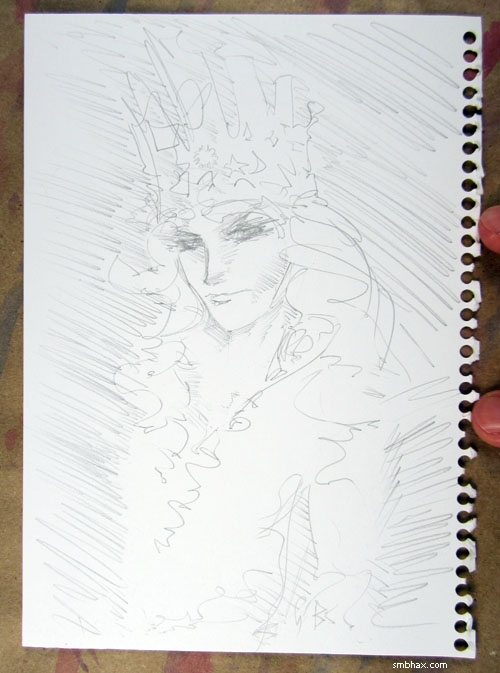
Queene of the Galaxie! >_> Anyway Patreon is internet thingy that lets you automate kicking a buck or two to your favorite content creators each month, and it's a huge deal for me in being able to keep doing this webcomic gig, so I super-appreciate everyone who's helping me out! And it gives me a good excuse to draw wacky A* sketches every month. ^_^
~~~~~
Apropos of yesterday's resolution to try painting with higher concentrations of watercolor pigment, I did that today, mixing in twice as much pigment as I have been doing, and I did indeed lose the pencil lines here and there—it was touch and go for a bit, I don't mind telling you...sort of bailed myself out somewhat by going a little crazy with the white ink : p—oh, yeah, here are the pencils:
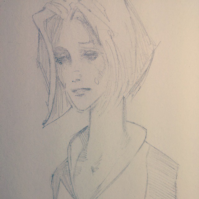
So like sort of around the eyes and stuff, and definitely the mouth got lost and kinda botched and white-inked-over and redrawn in pencil, for instance. : P And as you can see—since I'm now adjusting these in Photoshop to look pretty much like they do in real life—the watercolors, so obscuring when painted on wet, hardly came out any darker than they did in yesterday's page, painted with my tried-and-true pencil-friendly lighter solutions. Soo yep I'm going back to those, whew. : P
|
·····
|
| |
| A* framed! (And float-mounted : o) | Sep 26, 2014 10:59 AM PDT | url |
| | |
Added 1 new A* page:The reader who won the auction for the page 65 original art (each new A* page is up for auction on eBay for a week after it comes out—look for the blue and gold "original on eBay" link to the lower left of the comic image!) a month or so back sent me a photo to show how it looks since they got it all framed and stuff:
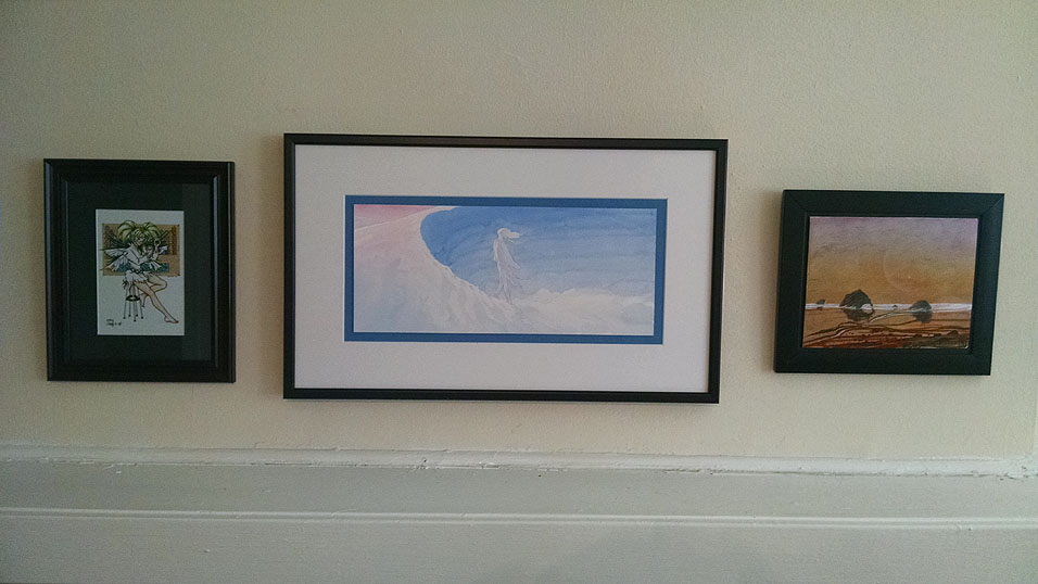
Man, talk about fancy! I really like that color-coordinated blue inner mat, and the art itself has been "float-mounted," which means it's elevated off the mat by a slightly smaller piece of foam core, so it appears to "float" above the mounting—I had to look this up 'cause I don't know much about advanced framing techniques! Anyway, it sure looks like a bang-up job to me, and, well, it's nice to see these funky little paintings I scratch away at all night getting out and about and being enjoyed. : ) Kind of what art is all about, really! Yay ^_^
~~~~~~
Speaking of the art, you may notice today's page is lighter than most of the ones before it. Since oh soon after I switched to this heavy watercolor paper early last episode, I've been going pretty light on the watercolors, then cranking down the gamma in Photoshop after I scan them in; this works great and all, *except* it's always a struggle to find an acceptable gamma setting for each new page (and I think I've been getting it wrong a lot of the time : P), and then when trying it with today's page, I realized that lowering the gamma really threw things out of whack: for instance, the red around the figure's face was just getting oversaturated, while the purple of the breathing mask was getting darker, so the value balance of the head was going awry. Besides which, cranking the gamma crushes values and colors together, causing a loss of visual subtlety. Altogether, it was getting ugly.
So for now (a highly variable length of time...my gamma resolutions haven't tended to last very long : P) I'm going to stick with a minor gamma adjustment of 0.75, which my scanner seems to need to get the scanned image to match what you'd see looking at the thing with your eye, more or less—it's the value I've been using on the scanned images of them that I put up with the daily auctions—and maybe start playing with higher concentrations of watercolor...although I'm worried that thicker watercolors could start clumping or clotting or, more hazardously, obscuring my pencil lines, at which point everything would probably start to get a bit too blobby and lacking in definition—not to mention that I would lose my drawing and start going crazy trying to get it back with paint on the fly. : P That way lies madness! And have I developed sufficient control to handle painting in higher contrast without losing subtlety and overall color balance? I mean, I like the easy-on-the-eyes lightness of the paintings I've been doing, but maybe I'd also like more color-concentrated ones? Only one way to know, I suppose! So uh yeah we'll see how this latest loop around the gamma rollercoaster goes. : o
|
·····
|
| |
| India 1st nation to reach Mars on 1st try | Sep 25, 2014 7:44 AM PDT | url |
| | |
Added 1 new A* page:The big space news today was India's first Mars satellite 'Mangalyaan' enters orbit (BBC); this means that India reached the red planet on their very first try, something no other nation has accomplished. Congratulations, India!
Mangalyaan (which means "Mars-craft") has already had its first photo from Mars tweeted; a bit blurry, maybe, but compare that tweeted photo with the first American close-up photo, taken by Mariner 4:
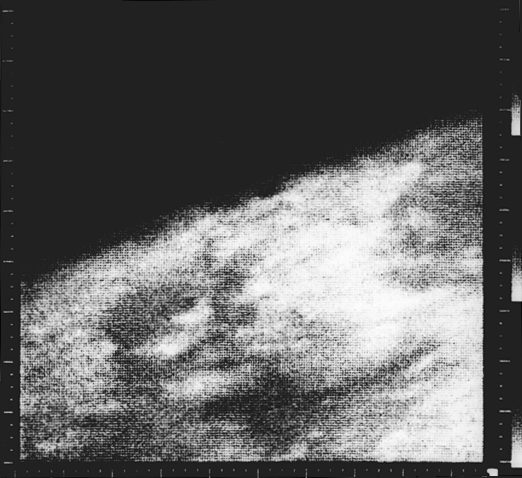
image by NASA/NSSDC/GSFC (source)
Granted, that was taken July 15, 1965, but it's still pretty grainy even by then-contemporary space standards—still, it *is* the first-ever up-close (well, 17,000 km away) photo mankind took of another planet—and the image was actually first seen on TV as rendered by NASA in pastel crayons, because it was faster to draw the ones and zeros Mariner 4 was sending back (Mariner 4 would send about 634 KB, total) by hand than waiting for the computers to process them, which would take hours. That wasn't a problem for Mangalyaan, apparently. ^_^
And speaking of the Mariner program, remember how I said India was the first nation to reach Mars on its first try? Well, Mariner 3 had launched three weeks before Mariner 4, "but the shroud encasing the spacecraft atop its rocket failed to open properly, and Mariner 3 did not get to Mars. Unable to collect the Sun's energy for power from its solar panels, the probe soon died when its batteries ran out and is now derelict in a solar orbit." (Wikipedia) (The planet Venus was the target for Mariners 1 and 2, in 1962—and again, the first try was a failure, going off-course and being remotely destroyed five minutes after lift-off; Mariner 2 did make it to Venus, but didn't capture the first up-close photo of another planet because "due to the planet's thick, featureless cloud cover, no cameras were included" (Wikipedia).) AND the Mariner probes didn't even try to enter orbit, as Mangalyaan has done successfully; they were just fly-bys, trying to collect as much data as possible on their single pass of a planet.
|
·····
|
| |
| David Wright's Judy & Carol Day | Sep 24, 2014 6:08 AM PDT | url |
| | | |
Added 1 new A* page:British illustrator David Wright's pin-up art brought him fame early in his career, particularly during WWII, but starting in the 50's he turned his expertise to the illustration of adventure comic strips with female leads in British dailies: the somewhat cheesecakey Judy from '53 to '57, and Carol Day from '56 until his death in '67. You can see lots of samples of both strips at those links; I like the simplicity and grace of his Judy, but he really hit his stride with brush and ink in Carol Day, with intense hatching and organic modeling of lines, a seemingly endless variety of shading techniques (toward the end of the run he incorporated halftone films, but I wonder if the blue pencil fill in that earlier one gave a halftone-type effect when photographed?), abstraction of forms in contemporary styles, intense natural effects, and memorable character designs. Wright certainly wasn't afraid to experiment and push against the usual boundaries of comic strip graphic design; even today, if a strip like this showed up in your comics page, you might just about flip your wig!
|
·····
|
| |
| Whose Idea Was This, Anyway? | Sep 23, 2014 5:25 AM PDT | url |
| | | |
Added 1 new A* page:Huh! Painting this way takes a long time! : P The auctions for these A* page watercolor paintings are still starting at just $9.99, so you could totally buy one or even two maybe—just follow the little blue and gold "original on eBay" link at the lower left corner of the comic image. And yeah so I have nothing actually new and exciting to say because it's late and I'm going straight to bed...uh well at least after I cross-post this page everywhere and stuff as usual, yep, webcomics.
|
·····
|
| |
| Supermassive Mohawk : o | Sep 20, 2014 8:15 AM PDT | url |
| | |
Added 1 new A* page:Here's a sketch I recently sent out to a supporter of the A* Patreon campaign for their support of the comic in August:
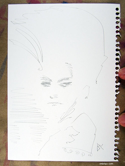
Thanks *very much* to everyone who's kicking in a buck or two or even more than that a month through Patreon! I use the money for art supplies and food and rent so I can keep making A*so this support is a really big deal as far as I'm concerned!
~~~~~
Thanks also to a kindly reader for warmly recommending A* in the comments section of an io9 article about webcomics; I guess it was posted about six months ago, but I happened to notice some visitors coming in from there today. : )
|
·····
|
| |
| The Rough Stuff | Sep 19, 2014 8:35 AM PDT | url |
| | |
Added 1 new A* page:I learned more art lessons from making today's page! The initial sketch (well, after the usual first draft that I thought was good but wasn't) looked like this
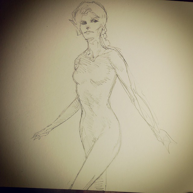
The limbs obviously had some problems there but I also got into hours of futzing with the lines of the body to try to tidy them up, and also I got to thinking maybe I should draw Selenis more like this other artist drew a character of his decades ago (I am way too absorbent of whatever I'm reading—I'll probably talk about that particular source of suction next week), and eventually ended up with this
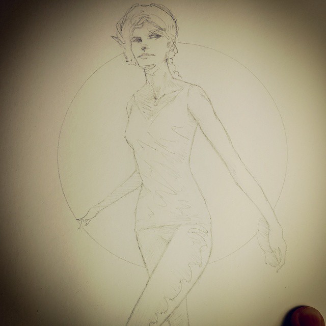
which isn't *bad* by my standards, and is certainly tidier, and many of the changes were technically for the better, and hm well I guess the pose is a bit more furtive, as it should be for this scene, but the obsessive correcting and re-drawing has also sucked a lot of the energy out of the drawing. So after some more agonizing I erased the body lines and redrew them quicker and rougher, trying to put some of the original muscularity and zing back into them.
(Those and even more process photos from tonight's drawing session, like the horrid first attempt, and the near-final redrawn rough treatment, and an in-between pre-clothing muscular detail version, can be found on my tumblr / Twitter / Instagram .)
Anyhoo so I need to remember that I don't need to redo lines just because they're a bit rough—as long as they give the right idea, that's okay. (On the other hand, things like her right forearm, which is too elongated in the initial drawing, I *do* need to correct, otherwise they will torment me eternally.) And for me, two sketchy lines for an outline of an object are often better than one neat line; there's a life in two lines as your eye and brain vibrate back and forth between the possibilities, or maybe it's that the object itself is kind of in motion between them in a life of its own. Anyway, in my work, neater usually doesn't always work out better. (And the art I tend to like from other artists is often the rougher styles.) (And I find more and more that I am becoming completely unable to draw in the classic "How to Draw Comics the Marvel Way" etc way of constructing everything out of simple geometric shapes—every time I try to do that now, I end up with a geometric horror show that looks like it went a few rounds with a black hole. : o And then I just have to go back to my weird silhouette scribble style.) Must keep up the energy!
In the coloring phase, I wasn't sure if I should go with a pure red for the night sky in the window, or a darker purpley red—and that key color would affect how I would color everything else around it. So I did a quick digital mock-up when I could play with the colors before committing something to paper:

Crudely awful but it did help confirm my initial idea of going with a pure red in the window!
And the sort of spots in the blue and purple watercolor along the sides, especially the left, are I *think* fingerprints—at least, I only noticed them after I'd been bending the paper back into shape right after having washed my hands, which maybe were still very slightly damp as I was handling the paper? I dunno. Maybe I should test that out though, fingerprint watercolors might come in handy at some point, you never know.
|
·····
|
| |
| Those Ultramarine Blues | Sep 18, 2014 3:53 AM PDT | url |
| | |
Added 1 new A* page:Here's an Instagram I took midway through the watercoloring of today's page:
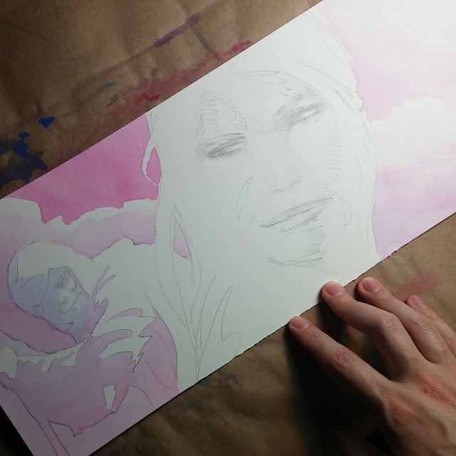
After the odd adventures I had coloring yesterday's page—which went a little weird after I tried doing some local color on Selenis—like, making her skin pink while the clothing around it was blue—I looked back over recent pages whose coloring I like the best, like 50 and 80, and came up with some thoughts on what worked in those. I noticed that the parts of those pages I liked didn't really go for dark blue, and instead used shadows that were more in the purple range. Also, they tended to have a lot of color mixes: purpley reds, bluish purples, and lights and darks of all the colors in between. One thing I had done with page 80, for instance, was prepare twice as much intense red and blue watercolor beforehand as I usually would, so I'd have plenty for mixing, because for that page I'd decided I wanted to use a lot of color gradients.
So looking back at that stuff, I resolved always to have plenty of mixing colors ready to go, to use purples instead of dark blues for the darkest shadows, and to go from red to blue when doing gradations, to help avoid throwing down a pure dark blue.
Of course, when I tried going with a wide application of light blue here over Selenis' face, it came out all super-pebbly; I'm not sure why the blue does that sometimes and not so much other times; I'd thought it had to do with high concentrations of blue pigment, but it was actually a fairly light blue, so...maybe it happens more when laying down a lot of wash at once, as I did here, as opposed to brushing it on slower and dryer—but I'd felt I had to move fast here to keep some of the color blends around the face from drying before I was done with them. Hum. Maybe I need to avoid even light pure blues, at least in sensitive areas. Oh well I guess I've still got some stuff to figure out. : P I'd like to find a non-pebbly blue, but I'm not sure there is one that's as intense as this Winsor & Newton "Ultramarine Blue (Green Shade)" I'm using, or that mixes as well with the Quinacridone Magenta.
|
·····
|
| |
| Space Freedom Fries! | Sep 16, 2014 11:29 PM PDT | url |
| | |
Added 1 new A* page:NASA had an announcement today about choosing the Boeing CST-100 and SpaceX Dragon capsules to take American astronauts to the International Space Station—we've been relying on primarily Russian capsules for that since the end of the Space Shuttle program.
The more interesting part of the announcement was where they said that having commercial agencies handle that stuff would help free them up to reach their main goal, which is getting a manned crew to Mars. Leading up to that, they plan to have innovative manned missions: taking samples from an asteroid, going beyond the orbit of the Moon (maybe to a Lagrange point), and growing ("and eating") their own food.
|
·····
|
| |
| A big head | Sep 15, 2014 10:03 PM PDT | url |
| | |
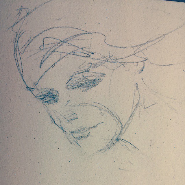
Added 1 new A* page:Here's a head I tried drawing for today's page, but I ended up having to erase it because it was a little too big for the page : P
|
·····
|
| |
| Gunwallace's musical A* theme--downloadable | Sep 13, 2014 5:28 AM PDT | url |
| | | |
Added 1 new A* page:A reader was kind enough to isolate the ethereal A* theme composed by Gunwallace from the "Quackcast" podcast I mentioned a couple weeks ago, and that got me thinking I should get in touch with Gunwallace and ask him if he could send me a cleanly cut version of the music to host—which he very kindly did! So you can download it in mp3 form (1.56 MB) right here—and that link is also on the about page should you need to find it later. Thanks again for the cool music, Gunwallace! : )
|
·····
|
| |
| How to combine script writing and recycling | Sep 12, 2014 7:19 AM PDT | url |
| | |
Added 1 new A* page:This is what my working scripts have been looking like lately:
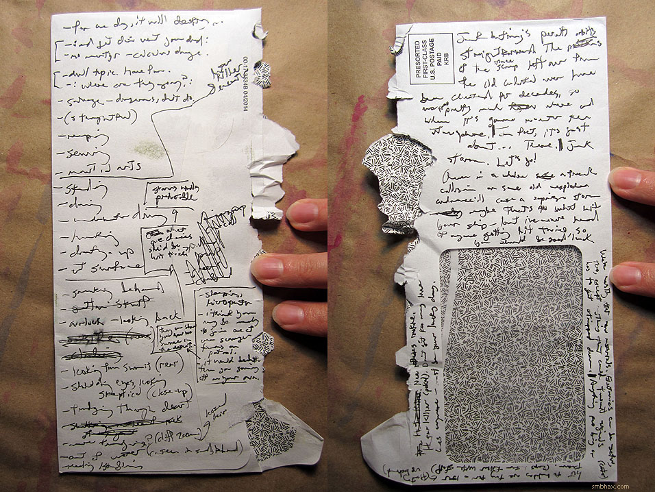
Way more fun than writing it out neatly. ^_^
|
·····
|
| |
| The astounding sharing buttons of yesteryear! | Sep 11, 2014 7:01 AM PDT | url |
| | |
Added 1 new A* page:I added "+1," "Tweet," and "Like" buttons below the right side of the comic images, so if you're on Google Plus, Twitter, or Facebook and want to let the rest of that social network know you really like a particular A* page, you can just click that network's respective button and get yourself counted! Yes, I am now up on the latest internet sharing wave of five or ten years ago! : D
UPDATE: Removed the buttons 'cause the way they wait a second or so to appear was too distracting. Get back to me when you've invented faster buttons, social networks! : P
(There is also still the old, sedately gray "SHARE" widget immediately beneath the comic image which, with maybe a click or two more, gives you access to 289 OTHER networks and programs and apps or whatever the heck they have these days for sharing internet stuff these days. 292 total! I've never even heard of most of them! Man I'm so bad at this stuff.)
(Dev note! The Facebook Like button, not surprisingly, had a bit of a problem: in the mobile version of the Chrome browser, it forces out a ~20-pixel space above and below itself as it loads, shoving the rest of the page content out of the way momentarily, which makes pages sort of jump around while the FB button muscles its way in. Giving it "absolute" CSS positioning in the page code prevents that, thankfully.)
|
·····
|
| |
| The super precision eraser you already have | Sep 10, 2014 3:38 AM PDT | url |
| | |
Added 1 new A* page:I think I worked out a few things about how I want to handle the watercoloring over the past three pages or so. We'll see if they stick. ; )
~~~~~
Super art supply tip! Okay so probably everyone knows this but me—and it *does* seem tremendously obvious now that I've found it—but a few weeks back I figured out something that's been helping my erasing an awful lot:
Okay, if you erase a lot like I do, you're probably using a block eraser of some kind. They generally come with nice sharp corners out of the box, very handy for erasing small details:
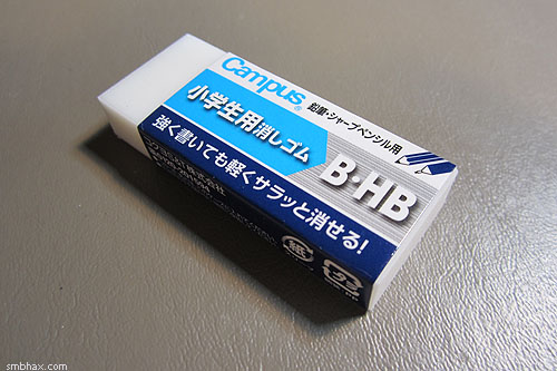
But those corners wear down really quick. Yet you plod along with your rather clumsy erasing until you've worn the block down to a little nub that's just about too small to hold and erase with:
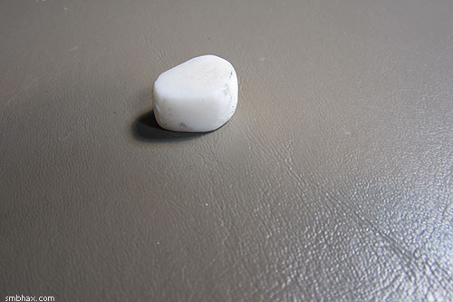
Once you get tired of dropping it and chasing it as it rolls around the room, you throw the nub away and start over with a fresh block, right? Or, getting a little smarter, you slice off an end of the block once the corners have worn down a bit, so now you have some nice sharp new corners, yeah? Or you could get one of the thin, pencil-shaped erasers that are specifically made for precision erasing, even if they're kinda clunky and not the best erasers and even expensive despite not feeling all that sturdy, like the several I covered in Round 2 of my Supermassive Eraser Round-up, eh? Well, I finally realized that you can do something even better with that little left-over eraser nub you already have: cut a slice off!
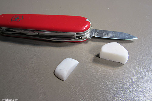
Voila!
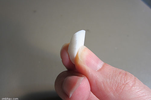
You've got yourself a perfect little precision eraser for free from the nub you were about to toss—and you can probably get at least a few more slices out of it before it's used up. The slice has all the qualities of your favorite block eraser, and it can reach those little delicate details with ease. Erasing level up!
|
·····
|
| |
| What Falls Down Must Stand Up? | Sep 09, 2014 12:51 AM PDT | url |
| | |
Added 1 new A* page:This could very well be the single most action-packed page I ever make. : o Probably should have been two separate pages (the shot from the satellite, then the retaliation from the staff), buuuuuut what the heck. Also, if it looks darker than usual, I went back this weekend and darkened up all the pages since I switched to my current gamma adjustment method, or anyway starting with page 18, and am now kind of erring on the side of pages being too dark rather than too light; I *had* been trying to do the least amount of gamma adjustment possible, but in flipping through the last four or so episodes over the weekend I realized that, at least against the site's dark background, darker pages are easier on the eyes...as long as they aren't so dark you can't see them, which hopefully isn't the case.
The article doesn't note whether or not it fired back, but Meteorite leaves crater in Nicaraguan capital Managua (BBC) talks about a large object that just fell to Earth and left a crater not too unlike the one Selenis is looking at right now! (Hm well okay, maybe it was a little larger.) Hopefully someone had a super taser staff on hand just in case it turned out to be a dangerous robot, because, well, you never know, do you? Anyway in this case it was pretty lucky nobody was hurt, because it left a 12m crater in a city of 2.2 million people! They think it might have broken off from a house-sized asteroid that just passed within about 25,000 miles of Earth ("about one-tenth of the distance from the centre of Earth to the Moon"), and which scientists hadn't even spotted until a week ago; a meteor about the same size as that one exploded over Chelyabinsk, Russia a year and a half ago, "injuring more than 1,000 people"; its total kinetic energy amounted to "2030 times more energy than was released from the atomic bomb detonated at Hiroshima."
|
·····
|
| |
| Sophisticated space eveningwear | Sep 06, 2014 9:33 AM PDT | url |
| | |
Added 1 new A* page:Here's a brush and ink sketch I mailed off to a very generous A* reader as the reward for their support of the comic through the A* Patreon campaign in the month of July:
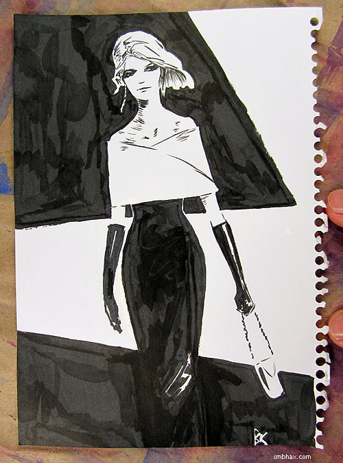
I'll get the month's batch of A* e-book rewards mailed off over the weekend to those supporters at the e-book-per-month reward level. : )
|
·····
|
| |
| Late night art frustration sketch heads 0.3 | Sep 05, 2014 5:49 AM PDT | url |
| | |
Added 1 new A* page:Late night art frustration sketch heads from last night:
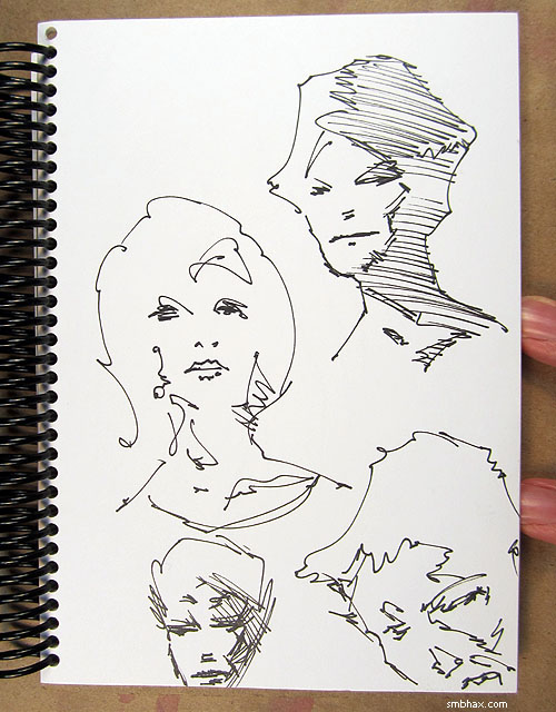
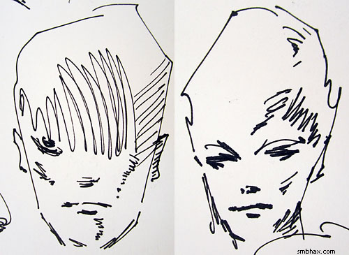
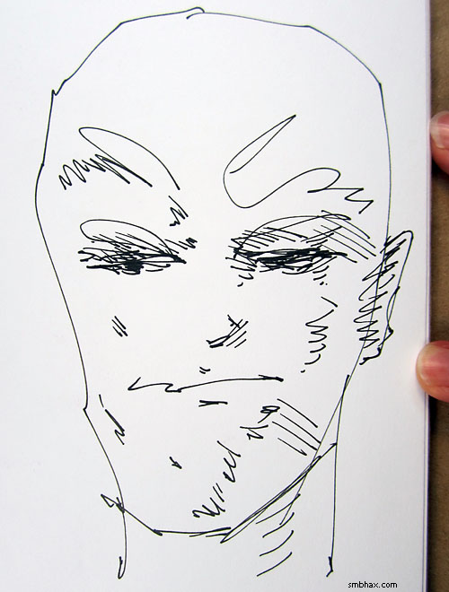
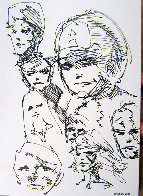
Scribbled these out with my ol' 0.3 Tikky Graphic pen; the 0.1 I'd used with reasonable success for a few recent Patreon reward sketches I showed is putting out a pretty anemic line now that I've done a few more sketches with it—it's got plenty of ink left and the tip *looks* fine but the ink just isn't flowing as much as it was before, so I guess I'll stick with the thicker 0.3, which is really the one pen of this type that I never have ink flow problems with, it can keep up with me no matter how manically I scratch away. Still can't do long lines or curves accurately with it, but that's just my own hand/eye coordination / fear-of-the-permanence-of-ink problem, not the pen's. ; ) It's about the best thing I've got for rapid-fire freehand sketching, though—and it even has an advantage over pencils in that since it can't be erased, there's no slowing down or going back. ; ) Onward! ^_^
|
·····
|
| |
| Seven Grains of Stardust | Sep 04, 2014 2:42 AM PDT | url |
| | |
Added 1 new A* page:Exotic grains from cosmos identified (BBC) is a several-weeks-old article about the little bitty micrometeoroid grains of material sent back to Earth by NASA's Stardust probe in 2006—half of Stardust's "Interstellar Dust Collector" of aerogel tiles (the "lightest manmade solid"; "a silicon-based material that is more than 99% empty space") has been analyzed, and scientists reported that, out of maybe a million microscopic specks of dust found embedded in this section of tiles and surrounding foil from the tennis-racquet-sized collector, almost all of them came from the spacecraft itself—except for seven, which *may* even be from another star—but they have to test their levels of oxygen isotopes—particles made by our Sun have signature proportions of these isotopes, so if the proportions in one of the bits of dust is different, that would strongly suggest it came from outside our solar system—to confirm that, and doing that "will require several years of hard work to refine the techniques available to measure the abundance of oxygen isotopes in the dust particles without destroying them."
Still, kind of neat to hear about their progress. In addition to collecting all those little bits of dust, you may recall that Stardust flew by two comets (sampling particles from one of them) and an asteroid—the asteroid Tempel 1, which was hit by an impactor from the Deep Impact probe in 2005; Stardust was able to get a grainy photo of the impact site on the asteroid, so we have a before/after comparison showing—barely—a shallow ~150m crater created by the impactor:
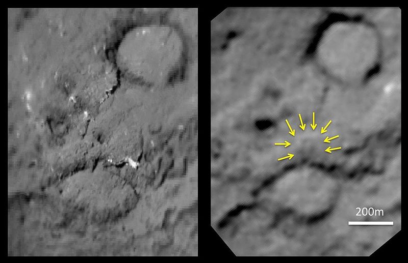
image by NASA/JPL-Caltech/University of Maryland/Cornell (source)
And here's a photo of a test particle trapped in aerogel—the particles Stardust collected were mostly less than a micrometer (one millionth of a meter) across, and could be traveling at hypervelocity—5 km/s relative to the spacecraft—but the gel was able to slow them down gently so they didn't vaporize on impact:
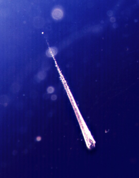
image by NASA/JPL-Caltech (source)
Aerogel, a thin slice of which is able to insulate against direct bunsen flames, and support a hefty masonry brick (you can see photos of those stunts at the "source" link below), is pretty weird-looking stuff (seen here with JPL scientist Peter Tsou):

image by NASA/JPL-Caltech (source)
For more on Stardust's mission, you can also go back in time and read the A* forum post I wrote about it way back in 2010 : o.
|
·····
|
| |
| Darn these dunes | Sep 03, 2014 12:29 AM PDT | url |
| | |
Added 1 new A* page:After I painted today's page I started wondering why I'd made the dunes (this is supposed to be a sort of eagle's eye view downward, you see, kind of zoomed out from yesterday's page) jagged, and shouldn't they be nice and smooth curves? So I tried doing it over, but while I could draw the curves okay, nothing else seemed to want to go right—the scale of the little figures, the curve of the falling debris, the balance of tones, etc. Here's one try:

After a bit more of that sort of thrashing around, I realized my heart wasn't in a revision, and I stuck with the original, jagged dunes and all. I think maybe I'd done that kind of subconsciously to break things up a bit, I dunno.
Somewhere in the middle of that I found myself on the internet, looking up photos of Martian sand dunes taken from overhead—specifically, by NASA's orbiting Mars Reconnaissance Orbiter. I didn't quite find the kind of dunes I wanted to be drawing here, but I did find some neat photos so here they are anyway:

image by NASA/JPL-Caltech/University of Arizona (source)

image by NASA/JPL-Caltech/University of Arizona (source)
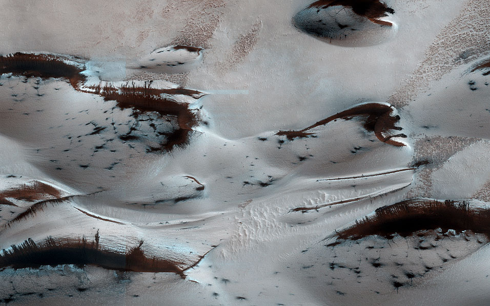
image by NASA/JPL-Caltech/University of Arizona (source)
^ Carbon dioxide ice thawing off dunes in the Martian spring.

image by NASA/JPL-Caltech/University of Arizona (source)
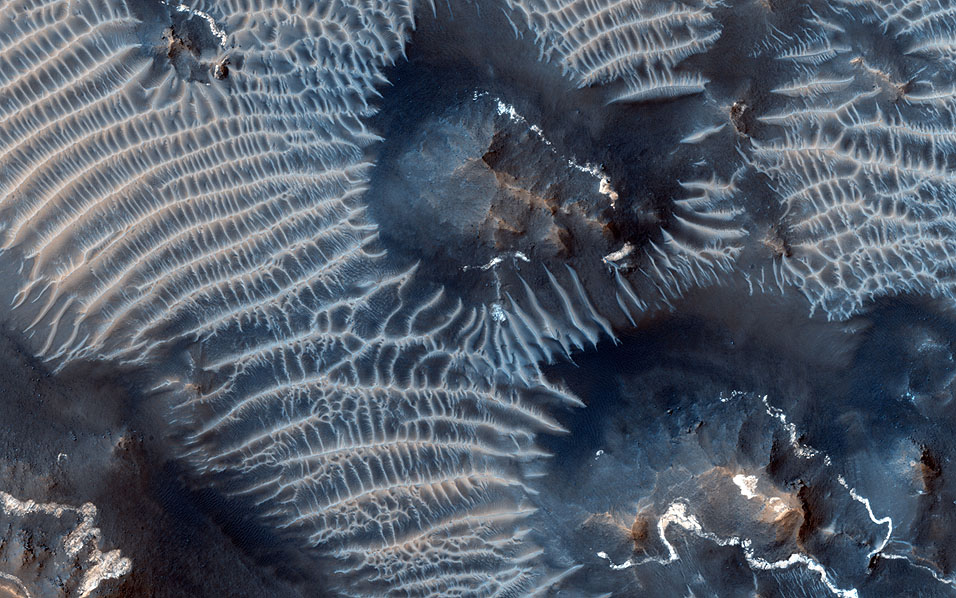
image by NASA/JPL/University of Arizona (source)

image by NASA/JPL/University of Arizona (source)
|
·····
|
| |
| Yet another A* webcomic! + A sketch. | Sep 02, 2014 12:58 AM PDT | url |
| | |
Added 1 new A* page:It came to my attention today from a Marvel Comics artist Chris Samnee tumblr post that his fellow comic artist Dustin Weaver has a new webcomic called Sagittarius A*! The more galactic core comics, the better, I say. Soon we will reach critical mass... >_> ; D
~~~~~~
Here's a watercolor & pen sketch I sent off last month to a reader as the reward for their support of *this* webcomic through the A* Patreon campaign in the month of July, which I really really appreciate because Patreon is like my one actual stable income source as I make this here comic. Whew! Oh right, here's the sketch:
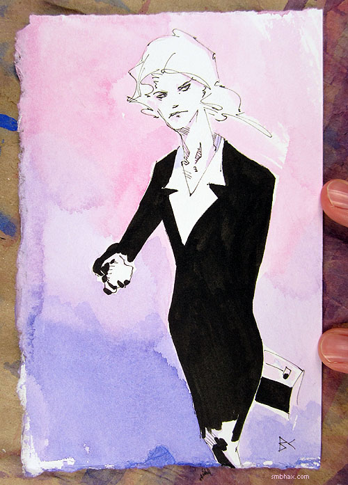
One bit of art supply trivia that I found interesting here was that the marker I used for the big black areas, a waterproof Faber-Castell "big brush" artist series marker, really soaked in to the watercolor paper heavily and make this surprisingly rich black—compare how it looks in this photo to how it looked on lighter drawing paper in the sketch I posted on Friday. Pretty neat! (Also notice how I again arranged the drawing so that the thin lines only have to be fairly short and straight, to hide my inability to make nice long curved ones with the smaller marker. ; ) And the pens (the thin one is a Rotring Tikky Graphic 0.1, also waterproof) stood up just fine to being watercolored over, which was nice.
|
·····
|
|
|
