Added 2 new A* pages:Boy, black paint applied with big horsehair bristles over wettish non-waterproof white ink (that's the Dr. Ph. Martin's Bleed Proof White that I've only been using for stars lately) produces some pretty cool nebular dust cloud effects! Gonna hafta practice that more.
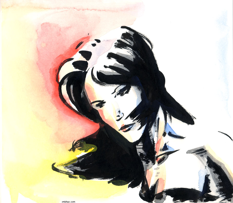
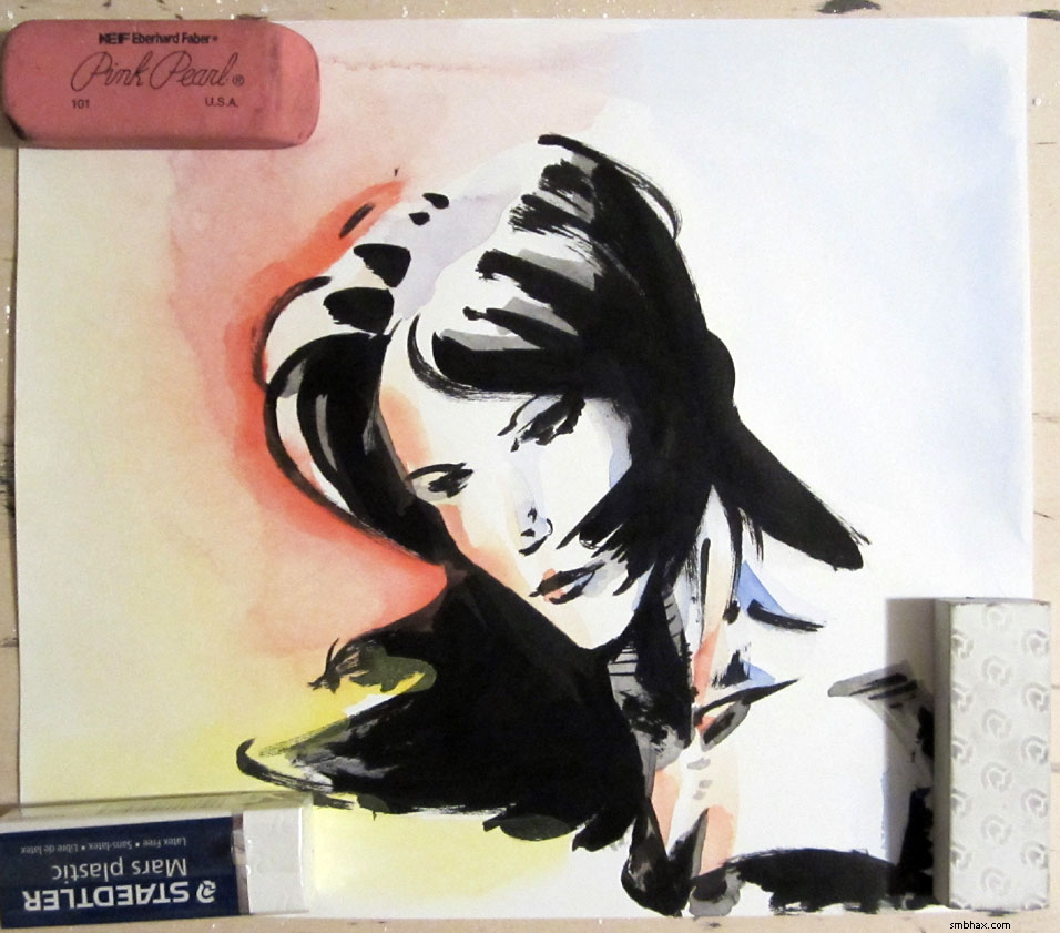
When I was at the art supply store getting some replacement brushes and a new X-Acto knife and other fun stuff over the weekend I picked up what I thought was a cheap six-color watercolor kit by Pelikan (ah, like this) turned out to be a cheap gouache (aka "opaque" watercolors) kit by Pelikan with very nebulous labeling. Gouache is kinda like thicker, slightly creamy watercolor, I suppose; since it's thicker you can get brighter colors kind of but it will also cover up black ink somewhat, which isn't what I wanted because I was looking for something I could throw as a splash of color over an inked piece, that would just color the non-inked areas. So anyway as you can see in this little test I did, the yellow gouache for instance covers the black ink of her hair a bit where it overlaps:
Pretty bright, at least! One other problem with that set is the red is more of an orange, and looking through the single pans you can buy separately (which is nice and I wish more watercolor pan sets did that), I'm not convinced they really have a good red in there. Also the colors lost a lot of saturation when I tried mixing them, so I guess if I was going to use these for something I'd have to bump up to a larger set so I wouldn't have to do as much color mixing to get other colors.
I went back to find a *transparent* watercolor set, but apparently these are like over twice as expensive. :| As a last attempt I popped into the art aisle of the local anything store, and didn't see much there, BUT in the back-to-school aisle, what did I find but a 99 cent kit of 16 watercolor pans. The brand name ("Debbie Lynn" or something) did not fill one with confidence, but hey, even if it was junk, as was likely, I'd only be out 99 cents. So I tried it:
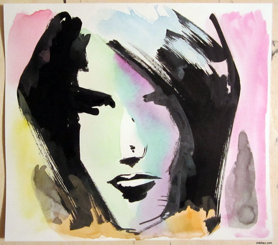
Man, the chalky residue! Ew. Also pretty weak/dull colors.
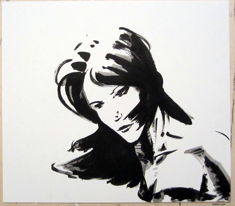
So I'm not sure what I accomplished but I guess I learned a couple very basic things about what not to do. :P I think I probably mostly just muddled up two fairly decent ink sketches; oh yeah, here's what the first one looked like before smearing cheap gouache all over it:
And a pretty nearly matched photo with the color on, for comparison:
Hum. Well some people who know more than me have pointed me to an actual quality transparent watercolor set that isn't too expensive, so maybe I'll pick one of those up the next time I order supplies from the place that carries it.
Am I thinking of doing color in A*? Well...I guess it's a possibility. I don't think I'd want to do full color, ever, because man, who wants to spend all their time mixing flesh tones? :P And I don't want to dilute the stark power of black and white. But it might be fun to keep you guys on your toes by being able to pop some non-representational color in now and then for effect, like for instance the red Mar back when I was working digitally.
~~~~~
That second sketch, the one with the unfortunate green face, was all wrong at first and I despaired of using it for anything, until the next day I realized the problem was just that the eye was a bit too high, and I could fix it by drawing a lower eye and just covering the original one in deep shadow of the eye socket. This worked dandy, and in fact reminded me that I should do deep eye socket shadows more.
|