Added 1 new A* page:I'm frustrated with my grays at the moment. Two days ago when I had to do a second try at a page with little time to spare, the result was a black and white page with no grays that, when I look back at it now, has a mystery and power that most of my ink wash gray pages don't have, or only in diluted form, at any rate. Once I got into inking in the blacks on today's page I got to thinking that I'd just do it all black and white, and I almost did. It looked like this:
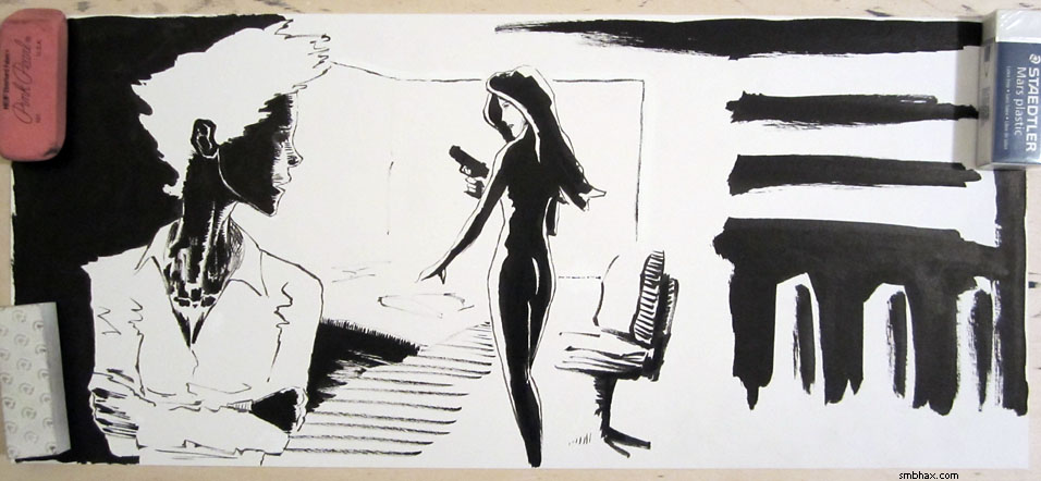
But, looking at that photo on my computer screen, it just seemed too flat to me--the spaces between the screens and the wall, and the screens and the foreground figure, weren't worked out well enough. So I thought I'd better put grays in after all, even though they'd mix with some of the non-waterproof white I'd used for patching up the black edges of the screen, and bits of the console operator's shirt. That did happen, and whisking the resulting gray mess away with a paper towel resulted in some kind of interesting "blast" effects in the gray areas.
Still though I think I use gray as a crutch too often; and I think that if I'd planned to use only black and white in the image from the outset, I'd have been able to work out those spacial relationships without needing to resort to gray. So maybe I'll try going straight black and white for a while and just see how I do.
One thing that frustrates me with the grays is that I've been unable to find a black pigment ink that can lay down consistently smooth tones on paper--you just tend to get seams and rivulets and other marks and uneven areas; I keep telling myself not to leave big wide areas that need grays where that kind of problem could show up, but somehow I can't seem to avoid leaving myself open to it, and then it just annoys me all the more.
That spurred me into a little art supply experiment some weeks back: it occurred to me that non-waterproof inks might spread and mix more smoothly than the waterproof inks I've been using, so I got some and tested them out in little circular gradient washes. Here's the result:
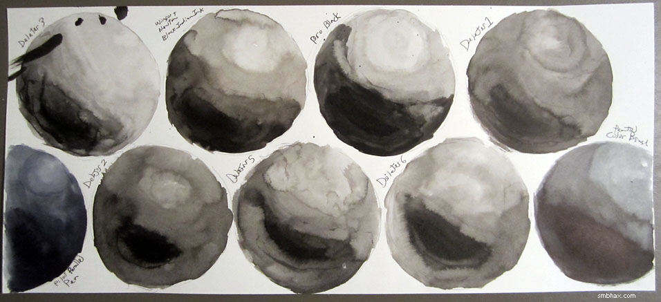
That black mess in the upper left corner is an ink spill--that epic ink spill that splashed clear across my room that I showed some weeks came while I was swapping these inks around for this test. :P Anyway the Deleter 3 circle in that top left corner is the waterproof ink I use for A* now. The other circles are all non-waterproof inks, aaaaaand...they aren't really a whole lot smoother than the waterproof one--and most are a lot yellower, too. So much for that idea.
The bluish ones at the left and right sides of the bottom row are what I'm pretty sure are black dye-based inks I had sitting around: ink from a Pilot Parallel Pen on the left, and from a Pentel Color Brush on the right. They spread a little more smoothly than the pigment inks--the Pentel Color Brush ink particularly--but not super-duper smoothly. And anyway apparently dye-based inks are a no-no for artwork you really want to last, although I'm not really sure why. Those two at least are also comparatively rather expensive.
So I don't know of an ink solution for this choppy grays thing. It does happen less with Arches watercolor paper, I think, but that paper isn't ideal in other ways--even the "bright white" version is still distinctly off-white, for one, so you lose some contrast against black ink, and you gain sometimes unwanted contrast against white ink; also, there's all this stretching and pre-soaking you're supposed to do or it'll rumple up and be hard to scan; I suppose I could try to find some of the super-thick 300 lb variety, but that is a) very expensive and b) harder to cut and harder to manipulate freely on an inclined drawing table, I'm guessing.
There are halftone screens you can apply over black and white drawings, old-school print style, but those are quite expensive these days, and I'm not sure how well the adhesive on them lasts--and it'd mean a lot of time spent cutting them into the desired shapes, anyway. :P
Of course you can simulate halftone screens on the computer these days. I've found myself experimenting with that a few times; frustration with yesterday's rather dull grays (and drawing in general :p) had me at it yet again; I found an interesting way of doing it in Photoshop, which was basically
a) copy the scanned 1200 dpi grayscale art
b) switch it to Bitmap mode with a 72 dpi, 30-degree, size 1 halftone screen
c) switch that back to Grayscale mode and accept the scale default or whatever that is
d) scale it to the comic's final screen size
e) lay that in over the grayscale comic as a Soft Light layer
So with yesterday's comic that looked like this--from the regular grayscale, to the shrunk bitmapped layer, to the Soft Light combination of the two:
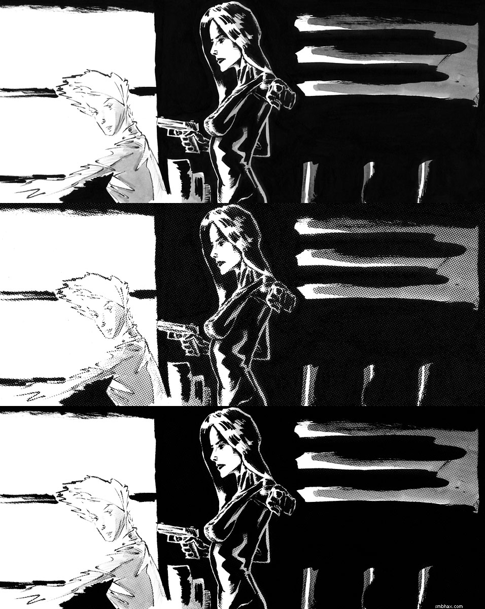
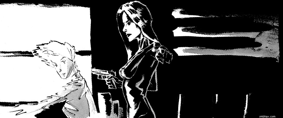
Sort of a half-halftone if you will, because the dots are applied in a semi-transparent way over the grays they came from, which are beneath them. I like that result a little better than just regular dots darkening over black and white artwork, which produces a harsher result like so:
Mind you, there are all sorts of ways to generate completely artificial halftones and apply them very neatly. But for that matter you can also generate perfectly smooth gray layers and apply them extremely neatly, kind of like I used to do when I was working digitally. So I could just do that, but I would much prefer a solution in which the actual piece of artwork looks more or less like the final version you see on screen, and doesn't rely on computerized effects for its finish.
So these are some of the thoughts with which I've been occupying myself. I've got a new fairly decent watercolor kit I want to start playing with, too; maybe I'll manage to whip up a colorized sketch of some sort this weekend. But I might also just take the weekend off, since I haven't done that in a while! In the meantime, anyway, I'll try to make myself stick to straight black and white and see what happens with that.
Hmm another possibility is that I just need to learn the patience and diligence required to lay washes down smoothly; large gray areas came out reasonably smoothly on page 81 and page 95; or at least, I think it did on 95... I went back in and broke it up with darker grays and whites afterward, so I guess I can't be sure now how smooth it was. The background grays on page 81 were the result of a lot of very light washes layered over each other...which is a slow process and can't really get very very very dark. Also it probably helped that the areas were mostly nice big wide open ones; they did get a bit messy in the jagged parts around the central figures.
|