Added 1 new A* page:While I was on a break from the strip in order to move apartments a week or so back, a kind reader wrote me some words of encouragement that I very much appreciated, and they also passed me a link to a fantasy comic that, while no longer updating, was done in a very intense black and white style that makes what I'm doing currently look positively gray by comparison; the comic is Dark Places. An interesting example of how to push black and white pretty hard in a sharp digital style!
~~~~~~
Here's one of many unused pencil layouts I tried for today's A* page:
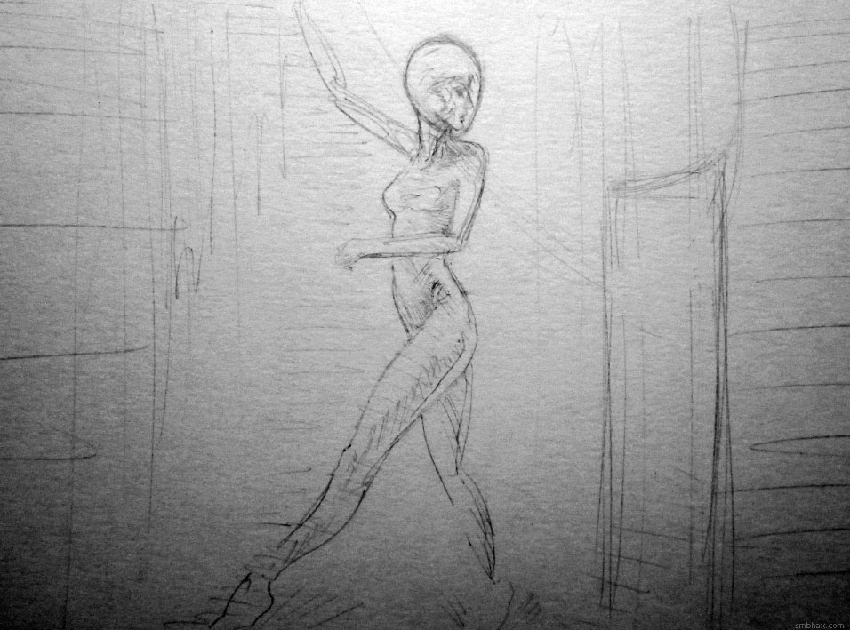
Unfortunately boring! I've caught myself doing some plain side views in recent weeks, and I've got to stop doing that so often, I think. A while back I started doing it more than I had been before, and was making the excuse to myself that well if you look at the popular comic pin-up illustrations online, or even popular photo portraits on tumblr and so forth, they're almost all just from a side view, which is not only what we're most used to seeing when looking at people around us, and thus perhaps most easily comprehensible, but which is also the easiest view to draw.
Furthermore, if you really look at say the print comic professionals and what viewing angles they use, even those you might have tended to think of as very dynamic don't use dramatic high or low perspective angles willy-nilly--they'll kind of save them up and just use them once in a while when they really need the effect. Reading super hero comics and how-to-draw-superhero-comics stuff at an impressionable age, the use of dramatic perspectives and foreshortening really impressed themselves on me, and I sort of fell into a habit of almost always attempting some kind of radical perspective in every character drawing I did. The problem with that is that it's difficult to pull off well; again, if you scrutinize what the pros do, generally speaking they'll stick to something relatively easy to pull off for their rare dramatic character perspective shots, and if they don't, quite often even the most technically precise among them will still not quite get every aspect of the characters perfectly rendered at the correct angles and sizes--and even if they *do*, it can often lack emotional impact since it's harder to decipher human expressions when they're seen at unusual angles.
So all of that got me into making excuses about using more plain jane side shots, but eh well there are still ways to make those dramatic, even if you do overuse them, that I wasn't always doing, like using dramatic near/far size contrasts, subtly angled character poses, or just, you know, arranging objects and lights and things in the image to make a visually interesting composition, regardless of the camera angle. I made a conscious effort to do a bit more of that in the previous page, and I think it helped. So that's just something I'll need to keep reminding myself to put in the extra effort on, so I don't end up rendering away all night on what is, irrespective of any labors of detail or brushwork, just a blah scene design.
|