Added 1 new A* page:Only one page (kinda for Monday) 'cause I spent too much time playing with art supplies, 'cause on Sunday I decided that the toothy texture on the Canson Artist Series Illustration Paper I've been using since oh somewhere in episode 15, and which worked so well for brush work, is breaking up pencil lines too much for them to scan cleanly, particularly with wider/softer leads; if you look at the large versions of the past dozen or so pages, for instance, which were done with a wooden H pencil, you'll see that the lines are fuzzy rather than crisply solid, and even on the small page size, a sort of crayon-like quality is evident and, I think, rather unattractive.
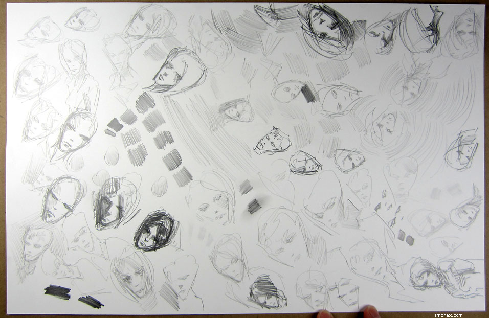
So I needed a smoother paper, and fortunately I had a dozen or so pages of the old Strathmore 300 Smooth Bristol that I started with when I first made the switch from working digitally back in the middle of episode 14. I scribbled out a bunch of boringly identical sketches on a page of it, using various pencils--my mechanical 0.5mm drafting pencil with H lead, a Tombow Mono H-grade pencil, and Cretacolor Monolith woodless pencils at softer 2B, 4B, 6B, and 8B grades; the heads on the left in this first photo were done with the 0.5mm, for instance, but the one on the right was probably a 6B+:
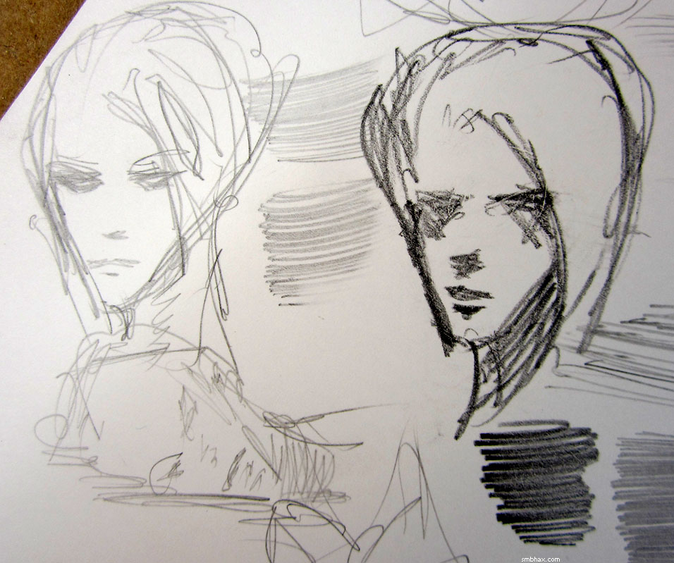
I found that the Mono at grade H was kind of scratchy on the Bristol, whereas the H-grade 0.5mm mechanical pencil wasn't; also, with the Cretacolors, I found that I really liked the 4B: went on like butter, and wasn't annoyingly soft and crayon-y like the 6B and 8B. One thing I'd suspected but had never tested with those woodless Cretacolors, though, was difficulty in sharpening them; I finally tried one in my sharpener, and, unlike with wooden pencils, it didn't sharpen to a point and then stop, so I probably ground down about a fourth of the pencil by accident. Pshaw!
Anyway I found that I was also pretty comfortable on the Bristol with my old 0.5mm drafting pencil, even though it draws very lightly with its thin, harder lead, and I thought maybe since its lines would be more solid on the less textured Bristol surface it would scan without the breakup problems I tended to encounter with it when I was trying it on the Canson Illustration paper at the beginning of this episode. So I did today's page with the drafting pencil on the Strathmore 300 Bristol, but found, upon scanning, that the paper was *just* off-white enough to start to register as patches of gray tone; the pencil lines did indeed come through in better shape than on the rougher paper, but I had to boost the overall white value to get rid of the patchy grays from the paper, and that weakened the lines, so the end result isn't nearly as much of an improvement over the old paper as I'd been hoping it would be. Dang. Also, the hard 0.5mm point feels annoyingly spongy on the Bristol's 2-ply surface, which was one of the reasons I'd stopped using it in the first place--and it takes a lot more elbow grease to erase from, too.
This was not, actually, the Bristol I'd wanted to use; Canson, whose Illustration paper I've liked so much, makes a Bristol of their own, which at least one review on the dickblick.com art supply supersite says is smoother than the equivalently priced Strathmore 300. I'm hoping it will also be a tad whiter, but I'll have to wait until the shipment I ordered arrives in a few days to find that out--I had to order some as none of the art supply stores I called around Seattle had any in stock, although the physical Dick Blick store (or "Blick Art Supplies," as they're trying to style themselves now) across town *said* they did, and I drove all the way over there in the morning only to find they actually had the Canson only in the rougher "vellum" surface type. Argh.
So as not to have the trip be a total waste, though, I felt some time comparing the look and feel of the more expensive Strathmore 400 and 500 papers that they had in the shop, but found that the 400 felt a little more pebbly than the 300, and the 3x as expensive all-cotton 500 wasn't perceptively smoother, and was definitely darker--almost verging on a very light brown egg color that I can't think will behave very well at all in the scanner. A helpful store clerk who showed up and admitted to a penchant for paper-groping herself (I admitted to nothing >_>) said that she'd heard the only difference between the 300 and 400 was that one was recycled, but I haven't found any evidence for that. I wondered aloud if the Utrecht store, in the same neighborhood as the Blick store, might have some of the Canson Bristol, but the clerk pointed out that the two stores had merged--but I think it's more a case of Utrecht having been absorbed by Blick, because Utrecht stores and web site now just redirect to Blick. So that option was out. : P Anyway, hope remains for the Canson winging its way to me in the mail.
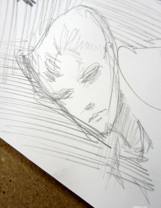
The only thing I actually bought at the store was a 99-cent grade 4B Tombow Mono, which turned out to be rather delicious on the old Strathmore 300 Bristol. Here's a scanned sketch from that combination, shown at the same relative size as the regular and large A* pages:
The line is dark enough that it doesn't break up when I have to adjust for the darkness of the paper, and the lead, while much softer than my usual H-grade, is still holding together pretty well on the fairly smooth surface. I think I'll try the next A* page with this combination and see how it goes; I suspect I'll smudge the 4B all over...but we'll see. It would be kind of nice if I could just stick with the 0.5mm mechanical, since I'm most confident with its always-there point--and too lazy to sharpen regular pencils regularly enough--but I think this last page showed that I have difficulty creating contrast between a lot of different surfaces in a complex scene with the narrow and fairly fixed 0.5mm line. Also, the 4B is easily visible to the eye, which would make for nicer originals, and perhaps less eye strain while drawing, too! Anyhoo I'll give it a shot.
|