Added 1 new A* page:I don't mean to keep boring everyone with color "process" playback images every day, but a) the color is taking me so long I don't have much time to write about anything else, and b) since I'm still figuring this color thing out, there are things I want to document for my own reference just in case I'm looking back and wondering how the heck I got the result I did on some page. So for today's I ended up doing something slightly different to come up with the final colors--basically I kept altering colors and then blending back into the previous result; I'm not sure why, but it seemed to build up an interesting color set with a bit more subtlety than my usual, maybe. Anyway here is a sort of step/blending diagram of the colors without the lines, which I'll endeavor to explain:
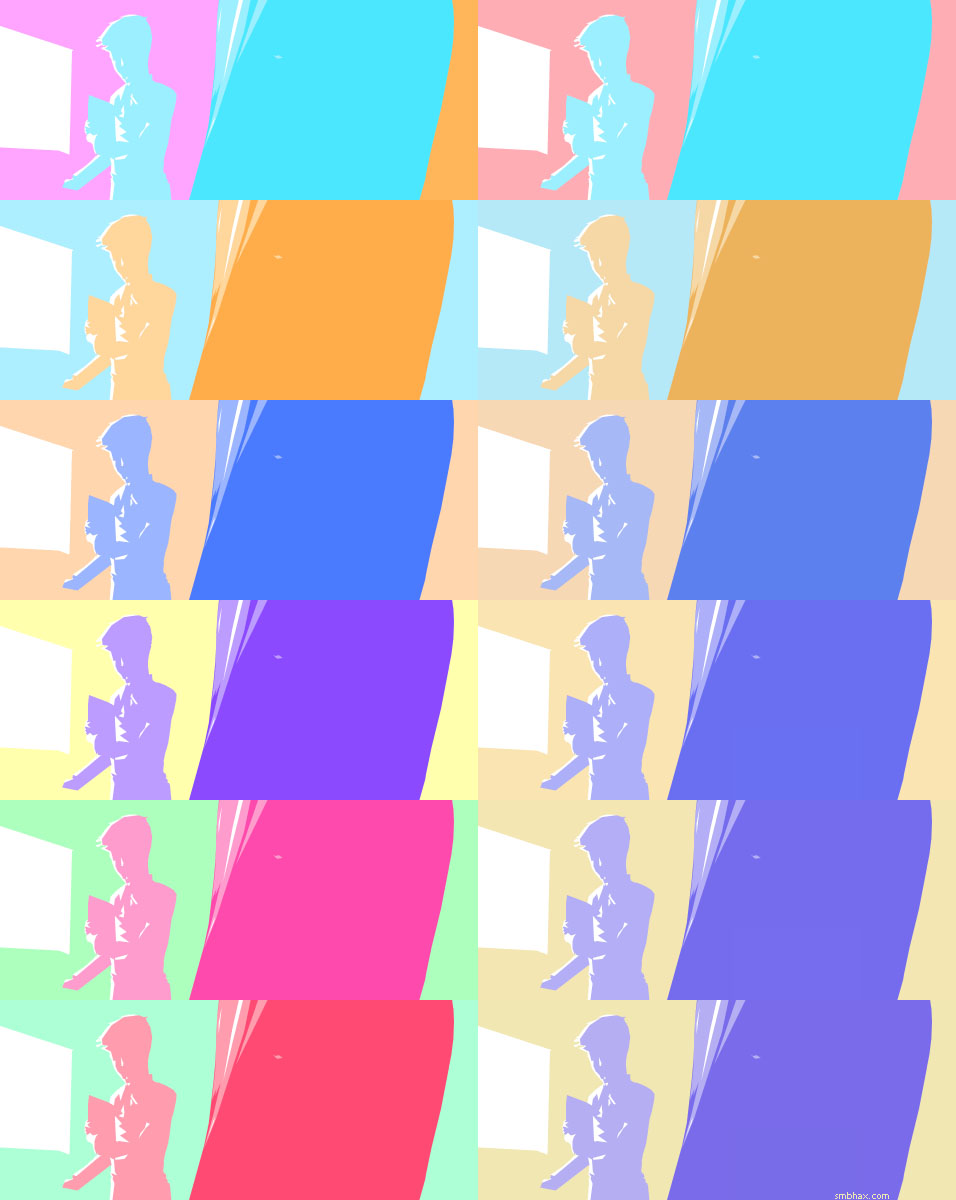
The beginning colors are in the upper left, although sort of split between two background colors I couldn't quite decide on: the pink on the left (left) and the orange on the right (the right half of the upper left image, I mean). So I blended those together equally to get a new background color, which you see in the result in the upper right.
I started using a Hue/Saturation adjustment layer to traverse the color wheel with that color set as the base, just looking for interesting relationships that might pop up. The first, on the left, second row, I then blended back into the previous result at 90%, and you can see the new result on the right side of the second row (the left column is the new blend color and the right column is the blend result, basically, from here on). Then I altered the hue of the original set again, in row 3, and blended that in with the previous result, again at 90%. Ditto, row 4, but I only blended that one in at 30%, then 7% for row 5, and just 3% for the final, row 6.
[UPDATE: Then after having uploaded it and looked at it a few times, including on my phone which has a much more stable gamma than my PC monitor, I applied a hefty Levels adjustment to darken it so it didn't look kinda washed out. Man, once I get rich off webcomics I gotta get a monitor with a wider viewing angle : P.]
It is a sort of literally circuitous route to getting a color set, but it's actually more organic than it sounds, and because shifting hue also shifts value (light/dark) relationships--since our eye sees pure digital blue, for instance, as darker than pure digital yellow...or pretty nearly any other of the fully saturated, full value colors, really--it also lets you tweak value relationships in a sort of intuitive way as you go along. You do tend to lose a bit of saturation with all the blending, of course, but you can always get that back by upping the saturation if you need to. Letting a bit of the saturation go, at least in some areas, does make things a little easier on the eyes, though, as survivors of my earlier colored pages can probably attest.
|