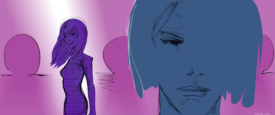
Added 1 new A* page:You might be wondering where the color went today. I removed it. Or at least, 80% of it. See I got to this point
and while trying to decide between the virtues of one color adjustment and another in Photoshop, I shifted them to grayscale so I could measure their overall brightness (as I would learn later, this is not a precise way of doing that), and the grayscale was pretty neat looking, I thought. So I undertook the seemingly simple task of converting an image most of the way to grayscale, without having to resort to overlapping bitmaps that would exacerbate color banding in my background gradient (speaking of which, another couple things I found today were: you get much less banding in a white-to-color gradient than in a color-to-color gradient, and Photoshop CS2 is in some cases better at avoiding excessive color banding in color-to-color gradients when shrinking an image down than my beloved and even more ancient Photoshop 4--but it's kind of a pain to jump over to CS2 just to do that so I probably won't unless I end up with some unavoidably ugly banding somewhere).
Turns out that converting non-destructively to partial grayscale is not so simple after all--at least, not as far as I could find on the internet. In fact, just converting to grayscale is a rather more complicated process than any reasonable person would think. For instance, if you compare a color-to-grayscale conversion operation on Photoshop to just desaturating the color image, you find that the gray version you get via desaturation has a lot less contrast than the one you made gray by converting it to grayscale color mode; this is apparently because, since our eyes see different pure colors at different brightness levels (pure RGB green is brighter than pure RGB blue on your monitor, for instance), you have to convert them to gray at different values if you want to end up with something like what your eye sees. Lots of pages will tell you lots of different mixing forumulas to use to convert a given color to its visually matching gray, like "30% of the red value, 59% of the green value, and 11% of the blue value" or maybe "0.21 R + 0.71 G + 0.07 B".
The problem is, as far as I know there's no non-destructive filter in Photoshop (or even a destructive one) that'll just let you pop these conversion ratios in. So I'm not sure how helpful those numbers are for the Photoshop user.* Actually I got a little lazy there, and that second formula (I could have used some others I found instead, but I didn't keep track of them : P) is supposedly something slightly different: not a formula for converting to grayscale (I saw several references to Photoshop's unknown grayscale color conversion ratios as the "magic numbers" everyone wants to know--but maybe Adobe keeps it a closely guarded trade secret?), but rather the formula for luminance, which is sort of the same thing, only not so secret. And it's pretty easy to tease out a color image's luminance in Photoshop, except it's destructive: as detailed on that "30% of the red" page I linked in the previous paragraph, you just make a white layer, pop your color image in above it, and set the color image layer to "Luminosity" blend mode--voila, there's your luminosity in glowing grayscale.
That comes out fairly close, in terms of gray tones, to Photoshop's mystic grayscale conversion, but it *is* destructive in the sense that you can't get partial color back out of it if you wanted--it's either all Normal or all Luminosity; sure, you could layer that over a normal color version of your image, but then the banding, etc.
So at this point I was stuck. I looked into all sorts of other methods of converting to grayscale to try to find one I could blend properly, but didn't really find one. I even tried concocting my own Hue/Saturation mixing formula for the six primary/secondary RGB colors, by making a Hue/Saturation layer over a Red/Yellow/Green/Cyan/Blue/Magenta checkerboard, then playing with the brightness of each of the six main colors in the Hue/Saturation adjustment layer, while flicking back and forth to compare the results with an overlaying version of the checkerboard I'd converted to grayscale, and that seemed to work on the checkerboard, but then failed miserably when tried on colors of different value levels.
And then finally, in this article about using "Fade" after a "Desaturate" operation, I found a clue; the author says to use Desaturate, which is destructive, but then reel it back by using "Fade" to revert it by whatever percentage you like, while picking "Color" as the blend mode while doing so. And *that* prevents it from altering the luminosity of the original colors, and gets you pretty darn close to Photoshop's grayscale conversion results--but it's destructive! So I'm not sure why the author uses it, because the obvious, non-destructive way to perform that operation is to make a Hue/Saturation layer, set to its maximum desaturation setting, and set to blending mode "Color"--or to "Hue," which has the same result. Voila! A vibrant, pretty darn close to "grayscale" gray conversion that sits non-destructively in its own single adjustment layer, and can be mixed into your color image in whatever degree you like. For today's image I set mine to 80% opacity--which was probably excessive, but hey, let me enjoy my grayscaling discovery here for a minute. : P
[* Oh right, I'd forgotten to look this one up: there *is* a function in Photoshop CS2 and later that accepts grayscale color conversion ratio numbers: the "Channel Mixer" adjustment layer. Check the "Monochrome" box in its settings, pop those numbers (30% red, 59% green, 11% blue) into the color conversion boxes, and bang zoom, you get an adjustment layer that gives exactly the same result as my Hue/Saturation layer (and also the same as the destructive "Luminosity" technique I described earlier), only you had to punch more numbers into yours. Hah. Also I'd ignored Channel Mixer because it doesn't exist in Photoshop 4, and I don't want to use the annoying and bloated CS2 when I can use the sleek and stylish and only slightly crash-prone ancient PS 4 instead. : P]
[[With either adjustment layer method, bright saturated colors, except--for the most part--yellow, come out too dark vs a standard grayscale conversion, especially blues and magentas, which are way too dark, and reds, to a lesser degree.]]
|