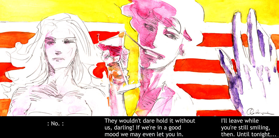
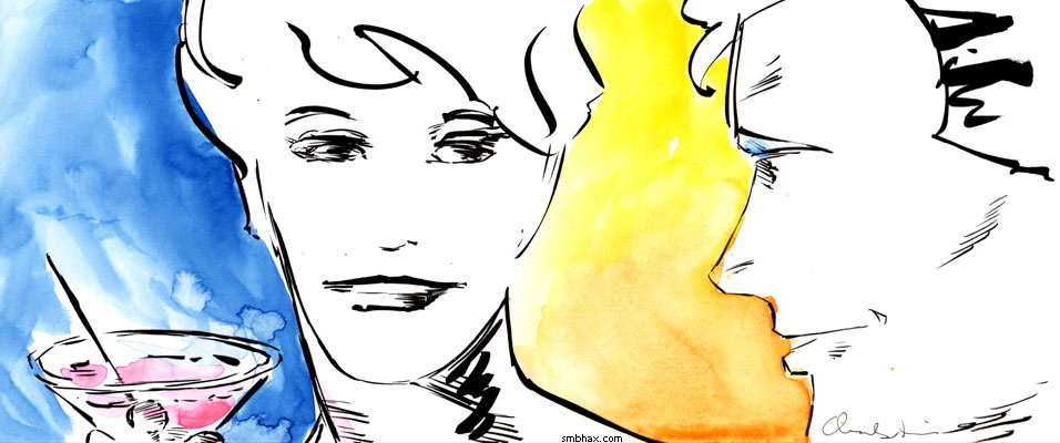
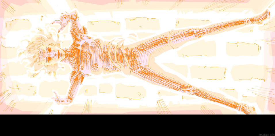
Added 1 new A* page:Another wacky traditional/digital art hybrid for today's page : P. I got worried after doing watercolor or pencil and watercolor for the last two pages, because well nobody has ever bought any of my artwork that didn't have ink in it, and those pages have been no exception so far--whereas nearly all the stuff with some sort of blank ink in it has sold lately. So I thought I should put ink in, and even went back over yesterday's page and inked it, with maybe mixed results as you can see if you turn back to it (you might have to refresh your browser's view of it). If you've forgotten, here's what it looked like in pencil:
Now, another reason I inked that one, and pretty heavily, is that the one I had done with heavy inking a few days ago, looking totally different than the final version of that page in the comic
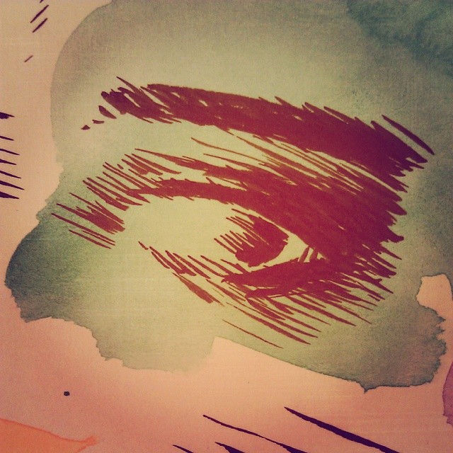
is doing relatively well on eBay. But trying to repeat that fat inking didn't turn out so hot (although admittedly this second page is more zoomed out, which probably makes the thick ink lines less appropriate, and also it's messier with the pencils because I put watercolor over the pencils instead of replacing the pencil lines with ink *before* going in with watercolor). I was a little worried my brush's point was already getting worn out, so I did a test sketch a couple inches wide, trying for delicate lines:
Seemed like the brush was okay (although I did just before that finally order the extra-pointy version of these Raphael brushes I use, that'll be interesting to try out), I'd just been ham-fisting it, maybe a bit out of practice what with all the pen and digital work lately. So I went over today's watercolors fairly delicately with the ink, not screwing up too bad for the most part I think. : P But I'll confess I'm massively conflicted about what approach to take, particularly for the traditional art side. Like, I'm pretty sure now that I won't be happy with the final output unless I get to do some digital polygonal Lasso Tool work over it to sharpen things up where they need it, but to what degree should I do that, and how should the traditional art be executed? The pen work was selling pretty well, for instance, and it's pretty fast and zippy to do
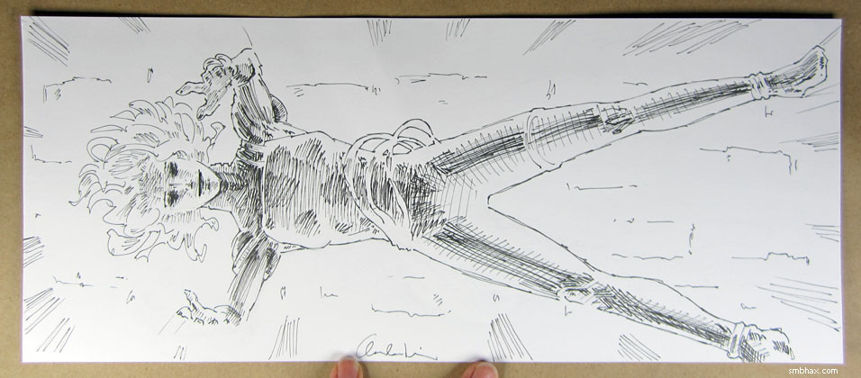
and if I'm careful it can be incorporated pretty well into lasso work (this is the last page of last episode):
Or there's the heavier hybrid watercolor merged with pencil lines under lasso outlines thing I tried a few days ago, but that results in a rather loosey-goosey-looking original art piece due to the need to avoid ink lines...although I could try doing it *with* them, I suppose. Then at the other end of the spectrum there's pure lasso work based off pencils; for instance, I think page 8
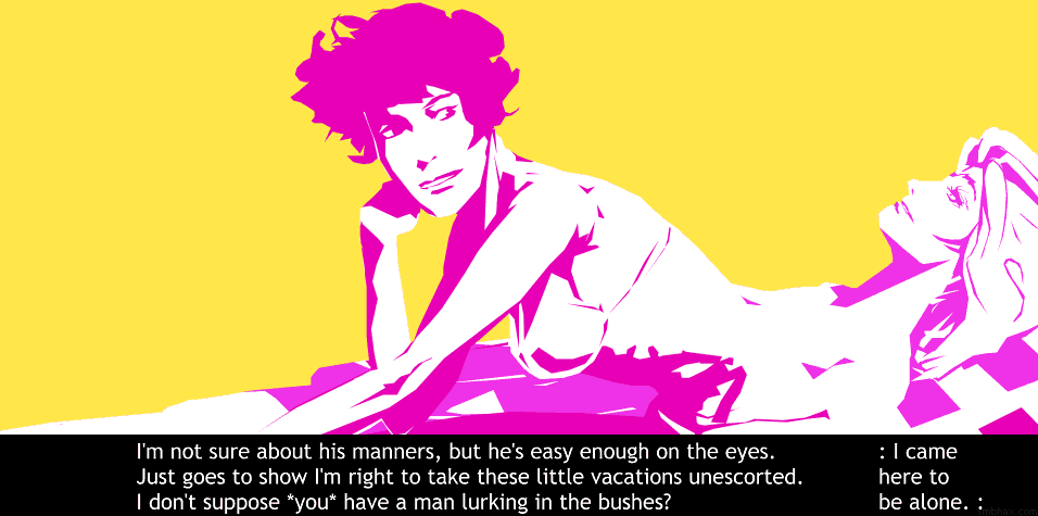
was one of the most successful pieces I've done in a while, and nary a whiff of the original artwork comes through (although even more confusingly, its bizarre hybrid brush/pen ink job sold okay). Will the original art for today's page, which is much more on the loose watercolor side of things, and which took a lot longer to make, do as well? Would the sort of richer final page it helped generate have improved the bold flat look of page 8? Will I ever be able to loosen up and sort of go big and gestural and abstract with the watercolor, and to any good effect? Because I've been doing a bit too much careful filling in of things with it to be really interesting, I think.
Hum. I suppose I can't read too much into sales results based on such a small sampling, but darn it, the temptation is there because working toward some kind of income from A* artwork is vital if I'm going to keep this up really long term. But really the only conclusion I've been able to draw up on my own this evening is that the approach I take to the traditional art depends heavily on the subject at hand: big brush strokes work better for close-ups, for instance, and maybe watercolor showing through fills works best for filling out large shaded sides of things, I dunno. I suppose tomorrow I'll end up doing some other permutation of all these variables! : oo
|