Added 1 new A* page:I put that experimental pen ink and watercolor drawing I did yesterday up for auction right here on eBay--starting at 99 cents, as usual. It looks like this:
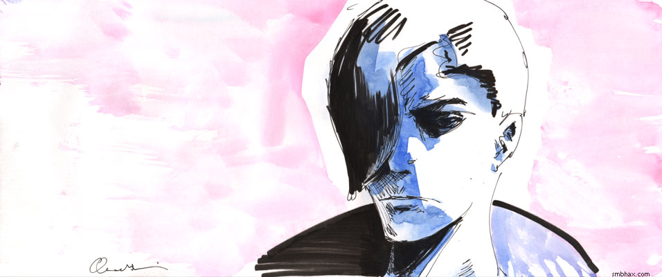
The waterproof ink from the pens I used (a Tikky Graphic 0.3 and a Faber-Castell "big brush") held up fine under the watercolor, but I don't think the ink and watercolor looked like they belonged together--it was better before I added the watercolor, I mean, which is not a feeling I have when using watercolor over pencil or over lines "inked" with watercolor. Watercolor over ink lines is fairly common in illustration as far as I can see, but the examples I've seen tend to use the watercolor in just a sort of "fill in the lines" sort of way, rather than as a reflection of light, which is what I prefer to go for--and I think the watercolor is usually just used to fill in the lines because the black of the ink is on a value scale outside the reach of watercolor, so there's always going to be a discontinuity between the two; on watercolor, the ink is deadening both directly in terms of perceived color intensity, and on a more abstract level, in that its nearly absolute black interrupts the illusion of a light-filled space otherwise created by the watercolor.
There's probably some way that can be used constructively, but I think it would be tough to do with pens, which is a shame because they're pretty handy things otherwise. With the help of a reader I've found some examples of brush-applied ink used pretty effectively in a light-enhancing manner with watercolor--basically used as a dark silhouette, or as smoke; this piece by Lawrence Yang shows both of those uses in action. I should probably try something like that some time. (I did do a brushed ink and watercolor in a fill-in-the-lines way earlier in this episode, here; hm and then this mixed approach a few pages later was pretty unsuccessful; the page after that was probably the most successful, where I went pretty light with the ink, but even so I did end up manipulating it in Photoshop quite a bit to restore some feeling of illumination.)
~~~~~~
Anyway on to more experimentation today, here are some awful color combinations I tested as I tried to figure out what approach to go with in coloring today's page:
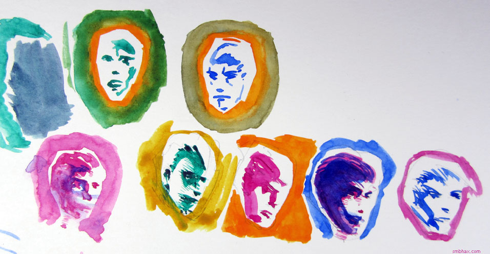
I was thinking I'd go a bit blue (mixing to purple) over the crimson as seen in the lower left there, but in the end I couldn't find a sure starting point for going in with the blue, so I just stuck all crimson. Another surprise to me was that mixing the phthalocyanine green (blue shade) (aka "Winsor Green" from Winsor & Newton) with the crimson produced a kind of nice grayish blue (upper left); I'd thought it would've been more like an extremely dark gray--I was used to making a "rich" black in oil paint in college by mixing pthalo green and alizarin crimson. Then again I suppose I should get some actual alizarin crimson watercolor if I want to try that. : P (Only handprint.com rates alizarin crimson watercolor poorly in lightfastness, and it also looks pretty dull in their sample photo, so I don't think I'd really want to use it on its own. : p)
|