Added 1 new A* page:As I mentioned in the last post, the variety of spacey colors in the backgrounds here are coming from manipulating the underlying scanned watercolor in Photoshop with Hue/Saturation and Levels adjustment layers. The trick I found to giving those layers something to work with in the watercolor involves intentionally washing away part of the watercolor that's initially painted down. As you can see in the photo I took of the original artwork (which, like all the newest A* pages I do, is up for auction on eBay),
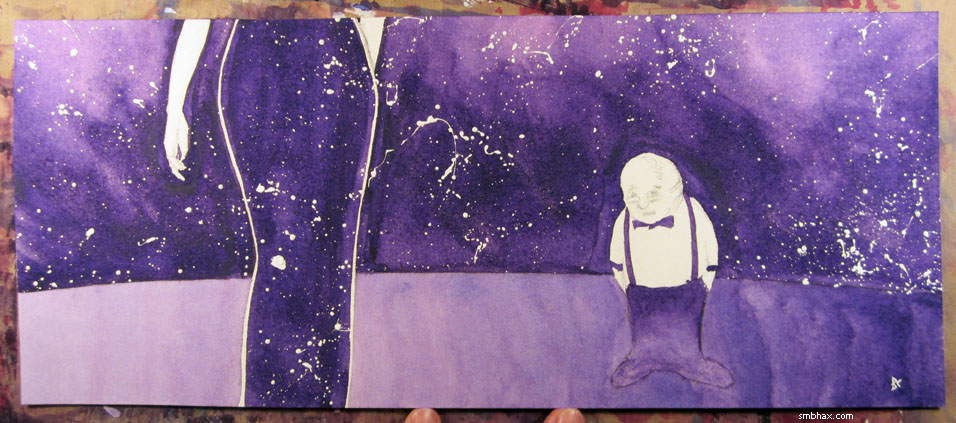
the top of the outer space section, except for the part seen in Selenis' dress, is lighter than it is lower down. It would have been very tricky to paint all those lightened swirl areas directly, but it's easy to do by subtracting: I painted the whole area the same dark purple, let that dry, turned the page upside down, took a brush dipped just in plain water, and then scrubbed away at the areas of outer space I wanted to lighten, just letting the water on the brush pick the dried watercolor up and wash it away; it sounds weird, but the heavy 300 lb watercolor paper I use makes it simple, since the pigment piles up really heavily on the top of the paper. So simply washing away the areas you want to lighten with a watery brush is pretty much all you need to do; once you scan the lightened swirls you've made into Photoshop, a few black-and-white-gradient-filled Hue/Saturation layers over the painted swirls will produce a really natural looking colorized effect, because the texture of the pigments piled up and washed around on the thick paper hides the artificial nature of the Photoshop gradients you're laying over it.
Those gradients, by the way, look like this:
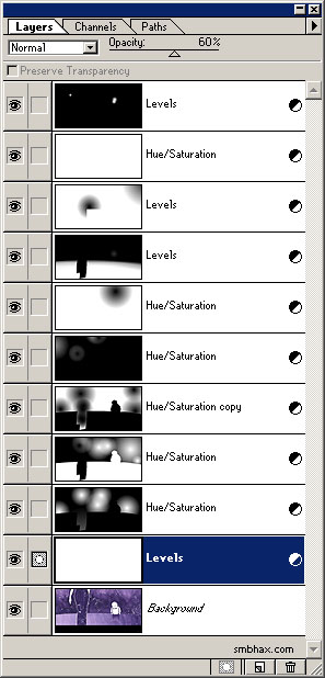
As you can see, the adjustment gradients are just made from simple Linear or Radial "Foreground to Transparent" black and white applications of the Gradient tool. I've found that I can keep more subtle colors by making the lower, initial Levels layers—used to darken the scan, which always comes out light and washed-out looking from the scanner—partially transparent, and then putting a final, fully opaque Levels layer (or two! I needed a second to get the pencil lines of Selenis' hand and the bartender's face, in this case) over the top to bring the dark end of the image down to pure black. Most of the Hue/Saturation layers are in "Hue" blending mode, but one or two are left on "Normal," which usually has the effect of lightening the affected colors, giving space a bit of a glow in selected areas. All of the Hue/Saturation layers are just manipulating the "Hue" component, moving along the color wheel to change a purple to a blue or red, for instance—except for the top-most Hue/Saturation layer, which applies a tiny Saturation boost to the whole image to restore the bit of color vibrancy that gets lost in all the overlapping manipulations.
As I'm making the adjustment layers, I'm always working with them over the scanned artwork, so I don't see them on their own—it's kind of interesting to see what that looks like, though, which is something like this:
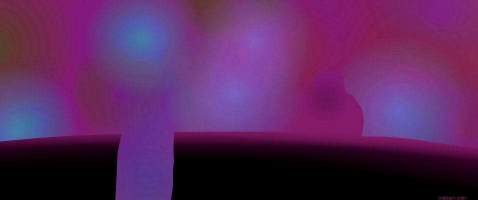
I used the Polygonal Lasso tool to make a simple mask dividing the foreground from the space background, so I could manipulate the colors in one or the other separately when I wanted to create a contrast between them; the Polygonal Lasso leaves sharp edges, but because my computer chugs when I try to work in color at the 600 ppi scan size of the scanned artwork, I do the coloring in a 10%-sized copy of that, the same size as the normal comic page it'll end up as (956 pixels wide, whereas the scanned artwork is 9560 pixels wide), then scale it up 1000% and apply a 30-pixel Gaussian Blur to the gradient layers to smooth away the enlarged pixel edges, which also has the effect of fuzzing the Lasso-created masking edges so they don't stand out in the final artwork. I drop the enlarged and blurred color adjustment layers over the full-sized scanned artwork to composite the whole thing together—and then I add the text over that, save it as a high-res TIF, and from that produce the smaller screen-sized versions you see on the web site.
(You'll also notice that the floor seen in the original artwork was painted lighter than the outer space scene through the window behind it—that seemed to work well in the watercolor but was all wrong when it came to darkening the scanned watercolor up and coloring the outer space areas, so I had to do a fairly radical artificial darkening of the floor, bleh. :"P)
|