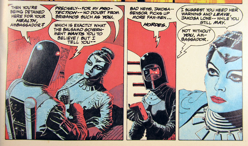
Added 1 new A* page:Epic Comics' (a short-lived creator-owned Marvel imprint from the '80s) first limited series, the 4-issue Six from Sirius (1984) by writer Doug Moench and artist Paul Gulacy, made a big impression on me when I read it as a kid; the story and art were quite a bit different than the super hero comic I'd been reading. The original issues were among the comics I rescued from my brother's recent give-our-comic-collection-away bonanza, so I've been re-reading them, and it strikes me that Gulacy's colors could quite possibly have had something to do with my current red and blue color palette for A*; while Gulacy doesn't limit himself to just a few colors, *sometimes* he does for a panel or three, with striking results. A sequence from issue 1:
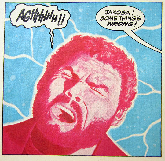
And a shocking panel in issue 2 that omits black entirely:
A full-page bio of Gulacy at the end of issue #2 (along with one on Moench; they didn't do anything by halves at Epic Comics!) says that "the coloring is the result of an arcane and complex process of experimentation utilizing a variety of mediums, including acrylics, markers, colored inks and pencils." It also mentions that he had taken a break from comics to work in commercial illustration for two and a half years before returning to do Six from Sirius, and I wonder if that's where he picked up some of these multimedia tricks; the character in that second photo also looks heavily photo-referenced, which I understand is used much more in commercial illustration than it usually is in comics.
Another thing I'm noticing, that I couldn't really articulate when I read these back in the day, is that he omits a lot of outlines, which naturally gives a more photo-realistic look—this stands in stark contrast to traditional comic inking, especially inking in the mid '80s, where a hefty black line surrounds pretty much everything.
Anyway yeah, neat art in these. (And it looks a lot better in the original issues than it does in the recent trade paperback from Dynamite Entertainment that I picked up a few years back: the artwork there is reproduced slightly smaller, blurrier, and the colors are much too dark.) I've looked around for more of Gulacy's work, but I haven't been able to find a significant chunk of it that reaches out and grabs me as much as his work in this limited series does—and that is certainly due in no small amount to the outrageous coloring he did here!
|