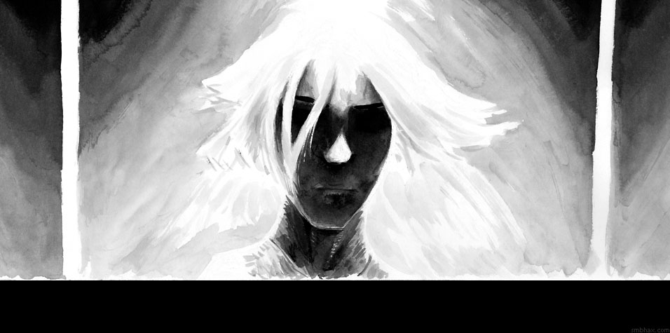
Added 1 new A* page:Thought I'd try putting grays to a bit better use in the art; I've been avoiding them a bit lately, since I wanted to make sure the impact of full black ink was coming across, and especially since a) I stopped giving myself the benefit of pencil layouts, so I've been relying on black strokes to form on-the-fly layouts, and b) I switched to a different, much darker ink about 23 pages ago, and found I would have to re-learn exactly how many swishes in water it takes to get such-and-such a gray tone out of it. In a hundred or two pages with the previous, sumi ink I'd pretty much gotten the hang of that, but in my ink testing I realized nearly every ink acts differently, especially in a wash, so I've been kind of scared to try anything more in the way of grays with this new one than simply adding a spot or two for decoration here and there after the full black ink.
But that, of course, misses out on really the whole point of using ink wash in the first place; I realized what I've been doing during much of the bar scene and then definitely during this fight scene has been kind of just traditional "get everything down in black" type of comic inking, which can do some things pretty well, but doesn't take advantage of the full range of ink wash for depth and atmosphere. In short, it was starting to look a little crude and lacking in subtlety to me. :P
Trying to work directly in with ink wash grays without any type of layout to follow is kind of scary, but I took the plunge today, and while it looked like a definite disaster at a few points, I think in the end it's a semi-decent start--kinda messy in some of those larger gray areas where it took me a while to get shapes and tones worked out, but there is at least some increased sense of light and depth that gets across, I think. It isn't any worse than any of the other artistic restarts I've tried of late, anyway. ;)
I thought I'd put together a little collection of where I feel I've had the most success with ink wash grays in the past; I've been studying these over the past day or so to try to see if I could figure out what exactly it was that worked in them, and how I could put it to use now, and that's actually been semi-useful. So clumping them together here will be helpful for my review purposes, and cathartic as I rattle on about each one. ;) Ready? Here we go!
Episode 13, Page 156

^ This one felt like a breakthrough at the time--just about 20 pages after the switch from digital art--and I was never really quite able to replicate the feel of it. Like a few of these pages, it resulted from a long struggle: I'd started with black outlines of the facial features, but by the end I'd covered most of them with white ink, and reshaped the whole right side (her left) of the head, whose shape had been even more off than it is in this final version. :P
After I switched from digital to ink wash I'd very quickly worked up a little array of five pre-mixed tones of ink wash, from light to dark gray, that I kept in separate little bottles (old curry powder spice jars :P), and when I wanted to lay down some gray I'd say to myself "okay that's light but not to light, so we'll use bottle 2" or whatever. Pretty simple! ("Space Girl" comic book artist and ink wash virtuoso Travis Charest does something similar, I discovered later, but with just three gray washes.)
But I knew that I wanted to do a freestyle wash from her eye downward, around the cheek, as if eyeshadow was running in the shower. I hadn't really tried such a thing before, but I just kind of did it and it worked way better than I'd hoped! That pretty nearly completed the picture right there, but I went in with my measured washes to round out the face, get a little abstract (originally I was thinking like squarish light patterns from shining through a textured glass shower door or something) with the grays in the background, and fix the outline of the hair, although a lot of that would get buried under white ink eventually.
So that was pretty encouraging, and another, larger episode of sort of controlled freestyle washes on the next page went pretty well too--well enough that I then chucked the little wash bottles (they were annoying to have to keep around, anyway) and went all freestyle washes from there on out. This did lead to some disastrously muddled pages at the end of that episode (*shudder*), but by not too far into the next episode I kind of had a handle on it.
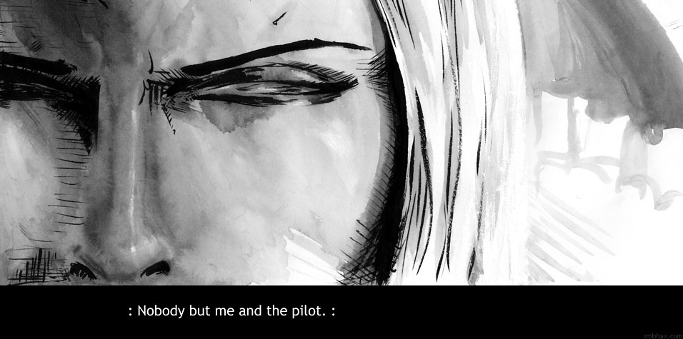
Episode 14, Page 6
For instance, this page was almost all big washes, and went over pretty well, although it took me ages to get the shadow sufficiently dark under her eyes; one tricky thing about ink wash is that once the paper has been saturated by one wash, from then on out (maybe not once it's dried *completely*, but I'm not that patient) it is a little resistant to taking on subsequent washes, so what looks like a dark wash will only affect it lightly. So I went through a lot of washes, which was frustrating--oh and I had to rebuild the nose at one point, which had gotten a bit sideways--but in the end it resulted in this really thick-feeling, moody shadow on the face, which creates some quite effective atmosphere, particularly in conjunction with the bright light above and hanging shadows down the sides. It did kind of scare me off of trying another wash this thick...or maybe I just got a little better at remembering to go in with a darker wash on the second go-around. I should probably try some many-layered washes here and there, I suppose, although whether or not the paper will hold up well is always a question.
Episode 15, Page 7
Trying another shadow across the face, but I needed to show facial features, so it had to be lighter, and it was a close-up, so it had to have more detail. Somehow this miraculously came out in what seems to me a fairly effective semi-abstract fashion; the first attempt or two weren't quite right, but dashes and sponging offs and swipes with the finger somehow resulted in things that suggested worn makeup, furrowed brow, and, the capper, an actual fully modeled nose, something I hadn't really done up to that point--and haven't matched since. I know I did a swipe with a paper towel or finger down the bridge of the nose to create that raised, lightened look, and then added just the barest white ink highlights to suggest protruding, glossy skin along the bridge and tip, but...well I still have the feeling that if I really tried doing something like that again fully on purpose it would result in a big muddle. Scaredy-cat! So, yet another thing I should really try to do more.
Episode 15 Gallery: Solstice
This was practice with the new paper I was thinking of switching to: from absorbent but potentially rumpley and hard to scan and sorta yellow (and expensive) Arches watercolor paper to Canson "Illustration" paper. This Canson stuff has an invisible clay or something coating designed to prevent ink from bleeding, and I found in this, which was almost all washes, that the coating can lead to sort of greasy looking patterns in wash areas. Which can be kind of cool, if you're open to it. This was also a rare one where I outlined in gray wash from the start, rather than leading with full black to define the main shapes--it gave a lovely sense of atmosphere and freedom (no enchaining black lines!), and that's one thing I'm trying to work in again here with my latest gray foray.
Episode 16, Page 21
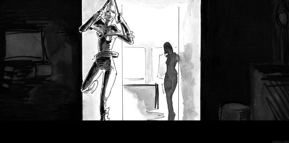
Well into my pen phase, I thought I'd try gray rather than black silhouettes for this view from the dark to the light end of a passageway; PITT calligraphy pen outlines made it pretty easy to keep the shapes in the desired form--a bit of a crutch, but it certainly works. I thought this was pretty successful, and I've been regretting getting away from a working method that could make such gray shadowed shapes possible.
Episode 16, Page 42
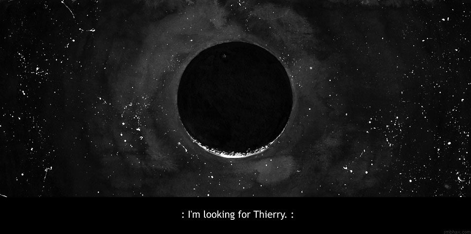
I wanted to see if I could get a sense of atmosphere in a space scene by using really dark gray washes rather than full black for the background. The answer is yes, but it can get a bit fiddly if you find yourself having to readjust the edges of major shapes around the dark gray, as I did in attempting to get the planetoid closer to being circular, and then lighting it the right way. In the end I had to try a light *white* ink wash around the rim of the planet to restore a bit of the space/planet atmospheric interface, as it were, and this was frightening but seemed to work pretty well; in fact, since white inks wash slightly blue (whereas black inks wash slightly yellow, if anything), it created an interesting color contrast suggestive of a thin, separate atmosphere around the planetoid--well, in the full-color real life view, anyway. :P
~~~~~~
That's about it! A lot of my grays have been disastrous, and there was definitely a period where everything was just *too* gray and dull. So I don't want to fall back into that trap--when in doubt, add black!--but I do want to be able to get the most out of all the grays ink wash can produce; and I think overall a nice gray tone looks better than a lot of black line hatching--well, better than *my* black line hatching, anyhow. :P
One idea I had that I tried in today's page was working from light to dark--the opposite of what I've mostly done all along, which is starting with full black ink, then diluting down into washes and filling in the dark grays, then the lighter grays. So this time I started with very light grays, sort of feeling out the shapes, and only brought in full black when I was sure I had some places that needed it. One thing's for sure: you can always go darker! You *can't* really always go lighter, on the other hand, because gray (black) ink washes don't look very good over white ink--they get this weird spotty texture, as you can kind of see in the gray lines on the right of today's page, which are over white ink that I used to cover up some black outlines that weren't working over there. You can try white ink washes to lighten over black ink, as I did in a few very small spots here, but those don't work great over large areas as they come out kind of spotty too.
Just for the sake of completeness, I may as well mention that the other main technical trouble with ink washing is that the wash tends to dry lighter than it looks while wet, so you have to get a feel for what what gray will be when dry, and this varies by ink.
~~~~~
Token science time! Researchers at MIT claim to have invented a slick "structured liquid" coating for glass that solves the ages-old problem of getting ketchup to come out of the bottle. WILL THERE BE A GREATER SCIENTIFIC LEAP IN OUR TIME?? Anyway you can see a video of ketchup dregs just flowing straight out of a treated bottle, supposedly, in the article over here.
|