 | |
| |
|
|
| |
| Stylistic waffling, NASA's "Blue Marble" | Jun 19, 2012 5:01 AM PDT | url |
| | |
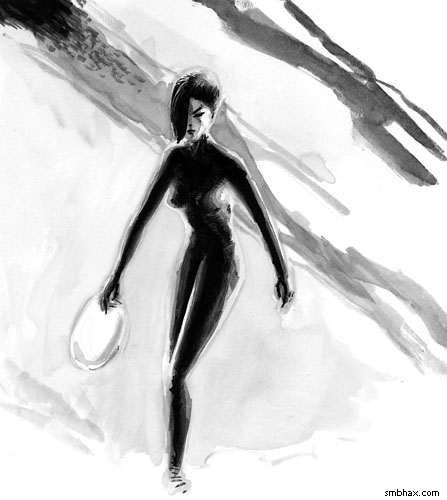
Added 1 new A* page:Aside from fussing with the previous page a few times (I ended up blacking out the front of the chair, darkening the control panel behind her, and blacking out the white "halo" lines I'd left around parts of the chair, etc), over the weekend I was torn over a question of style/approach, so I did this little test sketch (pay no attention to the lack of white ink cleanup/highlights and the wonky proportions :P):
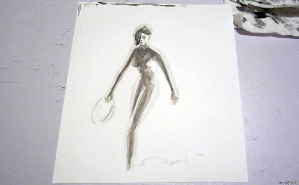
(There's a larger version in the gallery, but the version above is closer to the relative size it would get shrunk to if it was an A* page, sorta.)
The approach starts by sketching the layout in very light gray, the proceeding to fill things in from light grays to darker and darker grays and then black, in theory--whereas normally, I start with black, then fill in grays where needed. Here's that sketch in an earlier, light gray stage:
It was something I sort of stumbled into trying for five or six pages starting back with page 69; the most successful was probably page 73:
Contrast that with page 82, which I think is probably the most successful recent example of my usual black-first approach:
The light-to-dark one is certainly smoother, isn't it? In fact I was quite surprised at how nice all those overlapping light washes came out; I kind of thought they'd just leave ugly border lines everywhere. But they didn't, so I've been conflicted as to whether or not I should adopt that approach as my main working method--but I wasn't sure I could reproduce that level of finish, thus the weekend test sketch--which showed page 69 wasn't a fluke, I think.
I like both approaches--the subtle gradations and light sourcing of the light-to-dark method, and the sharp punch of the black-first approach. Ideally I guess I'd be able to combine them, and I don't think there's a reason *why* I can't do that...I've just got to get used to using the right one where appropriate, I guess. I started out today's page with a light layout sketch, but somehow it just wasn't coming off--I couldn't really feel the facial features like I wanted to--so I had to go to full black ink instead. Hum. The black ink approach *is* a lot more immediately satisfying, I have to say; all the little washes and blends of the light-to-dark can feel a bit tedious--and I discovered in this sketch that it doesn't work against a pure white background, because the white edges of the figure just read as part of the background, so the figure looks bizarrely skinny.
Anyway I'm sure I'll keep waffling and flailing around with this. :P
~~~~~~~~~
A bunch of interesting space news ran across my screen today (I swear I don't go looking for this stuff!):
- According to this Time article, a geologist at Queensland University of Technology in Brisbane, Australia, appears to have come up with an explanation for the unearthly properties of dust brought back from the Moon by the Apollo missions some 40 years ago. Superfine and filled with minute orange and green glass beads produced in the intense melting and cooling of billions of years of asteroid impacts, moon dust is unusually chemically reactive (rather than inert as you might have expected), a very good insulator against heat, and floats when subjected to a static charge.
Apparently that's all due to nanoparticles! Examining miniscule glassy bubbles in the moon dust, the researcher found that instead of being filled with gas, they were filled with extremely tiny glass particles, some no larger than a molecule. Apparently, that tiny size can account for the unusual properties of the dust. Formed inside cooling bubbles from impacts and then smashed apart by subsequent impacts, these particles have thoroughly permeated the lunar soil.
- This space.com article reveals that two researchers from the University of Colorado, Boulder have completed four years of painstakingly counting, cataloging, and mapping all the large craters photographed on Mars to date. Their total count? "More than 635,000 impact craters at least 0.6 miles (1 kilometer) wide."
- NASA just posted a super-high-definition photograph of the Earth, centered on the North Pole. The photograph is a composite, put together from photos taken over fifteen orbits of the Earth by the Suomi NPP satellite, which launched at the end of this past October:
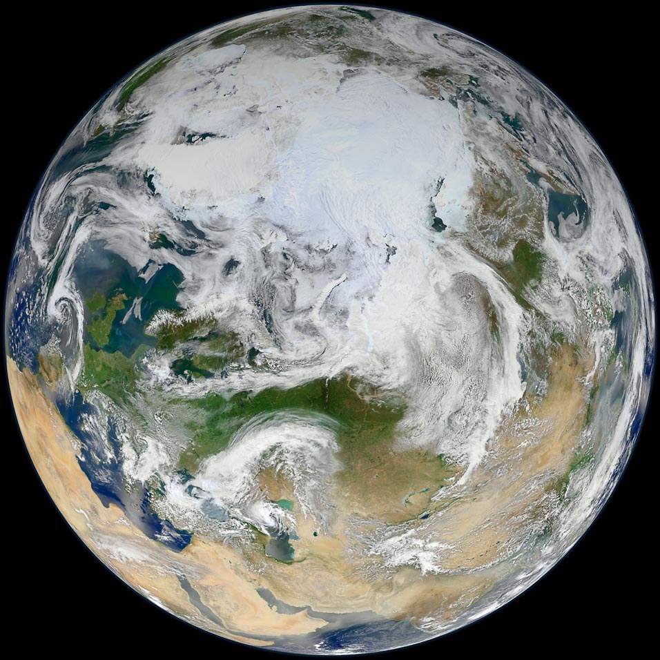
image by NASA/GSFC/Suomi NPP (source)
NASA says:
Over the last decade NASA launched a series of satellites that offer an unparalleled view of Earth from space. That series, known collectively as NASA's Earth Observing System (EOS), has provided striking new insights into many aspects of Earth, including its clouds, oceans, vegetation, ice, and atmosphere. However, as the EOS satellites age, a new generation of Earth-observing satellites are poised to take over.
The Suomi National Polar-orbiting Partnership represents a critical first step in building this next-generation satellite system. Suomi NPP orbits the Earth about 14 times each day and observe nearly the entire surface. The NPP satellite continues key data records that are critical for climate change science. Read more here: npp.gsfc.nasa.gov/ |
Here's a Suomi composite of North America, taken in January:
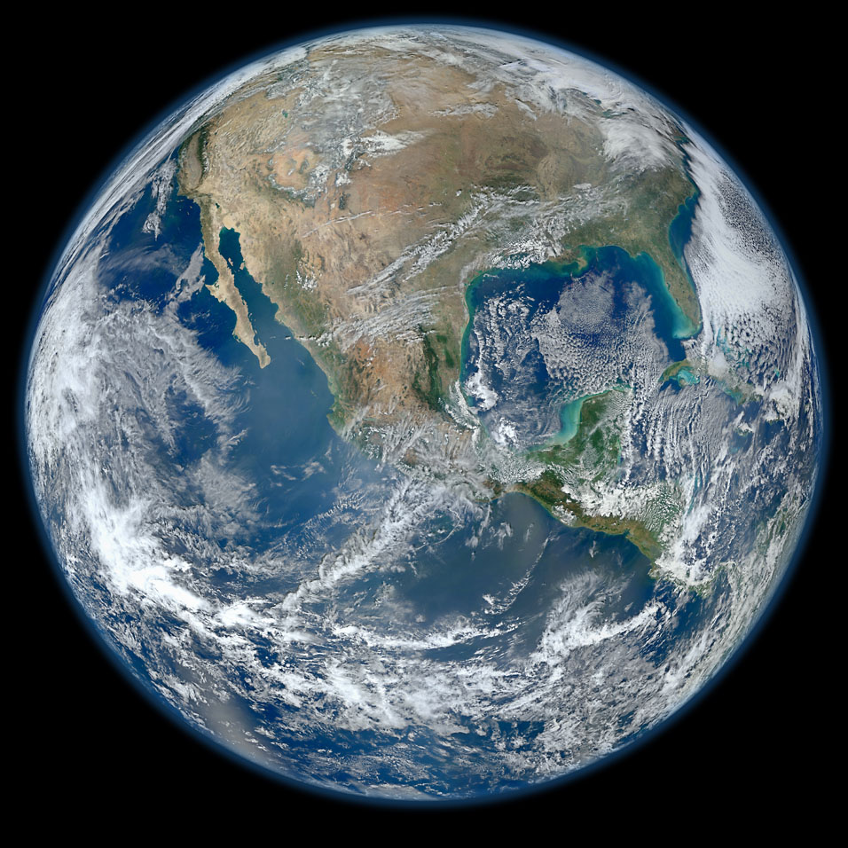
image by NASA/NOAA/GSFC/Suomi NPP/VIIRS/Norman Kuring (source)
Notice that the Earth isn't quite as round when seen from near the equator as it is when seen from the pole--it widens out around the equator due to the centrifugal force generated by the Earth's rotation.
|
·····
|
|
|