 | |
|  |
|
|
view titles only (low bandwidth) |
| |
| I call it sharp | Jul 31, 2014 12:22 AM PDT | url |
| | |
Added 1 new A* page:Now, realistically speaking, if you were gonna do some back-to-the-land-kinda farming, and didn't have horses, you'd probably want to get yourself a cradle (aka cradle scythe, grain cradle), since it slices *and* collects the stuff in a single swing—unless you were going for picturesque effect, in which case yeah you'd totally go with the good ol' Grim Reaper-style scythe Selenis is modeling here.
Here's an Instagram I shared on tumblr and Twitter this afternoon of the pencil work in progress:
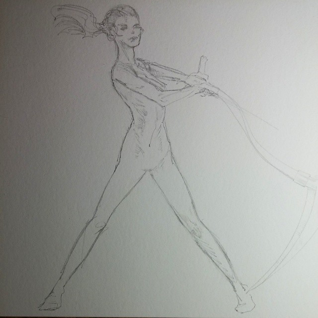
You know, if you'd told me a few years ago that I'd be drawing Selenis swinging a scythe, I'd have called myself crazy. >_>
|
·····
|
| |
| Reflections on reflecting a reflection | Jul 30, 2014 1:24 AM PDT | url |
| | |
Added 1 new A* page:Like today's page? You know the painting itself is on eBay, just like the paintings behind the last week's worth of pages always are, right? : ) (Just look for the little blue and gold "original on eBay" link at their lower left corner.)
Speaking of liking, do you like A*? Well you're here so hopefully you do, at least a little! And do you like tumblr? If so, did you know you can like A* on tumblr? It's true! And aside from the comic updates that I post there, I also post extra sketches, and draft versions of pages you might not see otherwise, and other people's art that inspires me, and heck even the occasional bad poem. When someone likes my stuff there (did you know you can just press the "L" key on your keyboard to like the post you're currently looking at on your tumblr Dashboard? And "R" to reblog it? Try it on some of mine! : D), the tumblr app on my phone makes it blink a little blue light, and that little light can cheer me right up if I'm sitting frustrated at my drawing board working away on A* artwork, which is what I'm usually doing. So <3 (and reblog! unless you're ashamed of me -_;) my stuff on tumblr and help keep me happy and productive on A*, yep! : ))
Like, if you were following me on tumblr today you'd have seen a lot of draft versions of the pencil drawing for today's page, as it sort of tortuously evolved over the hours, for a particular reason that kind of caught me by surprise. I won't show you the hideous earliest versions here—you can go scroll back through my tumblr archive a bit to find 'em yourself : )—but here's a sort of midway one:
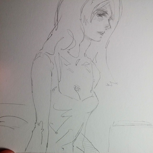
So the difficulty I had was that I had Selenis all drawn out in pencil—heck I had pretty much the whole darn page all drawn out—after just a few hours and I was all happy and thinking I might set a new record by getting to bed on time for the third day in a row, and then I got to thinking well gosh I'm so ahead of schedule maybe I'll try drawing her reflection in the window like I'd considered doing earlier but thought I wouldn't because it's hard for me to duplicate a likeness that closely, not to mention backwards. Well, so—oh, hubris!—I decided to try drawing the reflection, and sure enough it was taking forever to get something that looked like a reflection of her face from the left side of the page. That wasn't the real difficulty, though; that came next: once I finally got a decent reflection drawn, I realized that it was way better than the original figure it was reflecting. The reflection put the original in the shade!
I think it's at least partly because it didn't have to bear the brunt of a figure being constructed and all that, it was just pure "okay that line goes here and over here are these lines and" so it got that slight, easy abstraction to it that makes something look less drawn and more actual; and as sometimes happens, after trying to draw something over and over my brain kind of went blank and my hand just did stuff. So for instance the hair zig-zagging through her eye, though not, in fact, happening in the face on the left, came out way cooler than if I had really been trying to do that consciously. Dagnabbit.
So I struggled with this in my head for a while and there was just no help for it, I had to erase the original figure and try to redraw it to be more dynamic and cool and slightly abstracted, like the reflection—except reflected back the other direction, naturally. I knew, of course, that this was more or less impossible—I still haven't been and I don't suppose I ever will be able to draw completely fearlessly and unconsciously at will :"|—and, sure enough, it was rough going. Drawing the reflection of a reflection was tricky! >_< Plus, the reflection didn't show me what to do with her arms, which insisted on getting in the way.
Bleh. Well, more hours flew by, and my once mighty eraser wore down to a round nub that kept rolling off my lap and away across the floor, so I had to keep getting up to chase it, but eventually I did get the reflection reflected in a way that was a pretty large improvement on the original figure that had been there. So I guess the lesson is... Keep drawing, keep erasing, keep abstracting, keep fighting until it actually looks cool instead of just kind of like the thing you wanted to draw. Even if it keeps me up past my bedtime. >_< I guess if I was going to be all hardcore about this I might go ahead and draw a reflection of each figure in each drawing I do, then erase the original and reflect the reflection back, and thus end up with an improved figure, but um yeah I probably won't be doing that.
I should definitely do more sunset scenes, though, 'cause apparently watercolors are bonzo at sunsets! Who knew?
The other thing working well here I think is that I didn't leave much pure white space—seems to leave it with a richer feel. So I guess even on pages where they're supposed to be very light, I should still put in a really light color everywhere except a spot or two I really want to highlight.
Hm another thing is that I had been kind of afraid of using purple for a while, and that was probably silly.
Oh and yet another thing was that near the end of the pencil work I went back over parts of Selenis' outline with the pencil, pretty hard. I wasn't sure at the time why I was doing that, and I'd been avoiding doing that up to now for the most part because I thought it would sort of fuzz up my lines, but it ended up being just the right amount of reinforcement needed to keep the figure sharp and highlighted even though her colors are very similar to those of the background; so it finally kind of enabled the coloring over the lines I've been wanting to do for a while now, even though I didn't actually go over the lines really—but I did come close to matching the colors on either side in a lot of areas, which helped give her and her room a nice unified atmosphere. Actually that and the white space thing really come down to having a solid grasp of the light sources in a scene, which I don't always manage in some settings.
|
·····
|
| |
| Attack of the Brush Pen Heads | Jul 28, 2014 8:54 PM PDT | url |
| | |
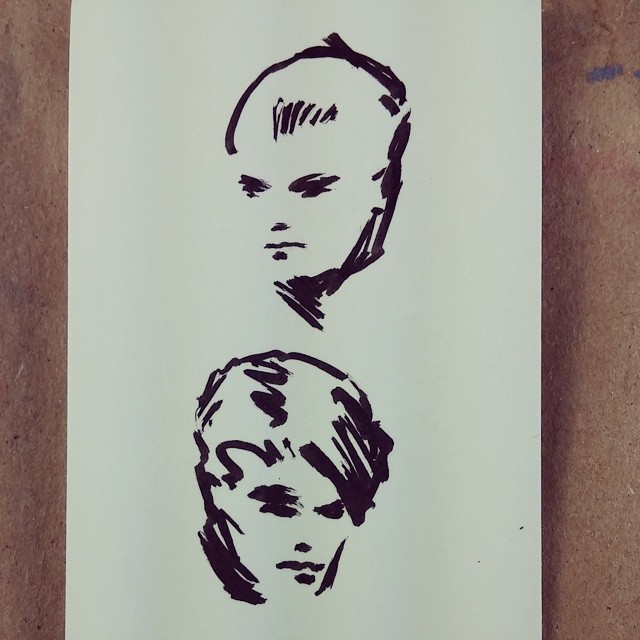
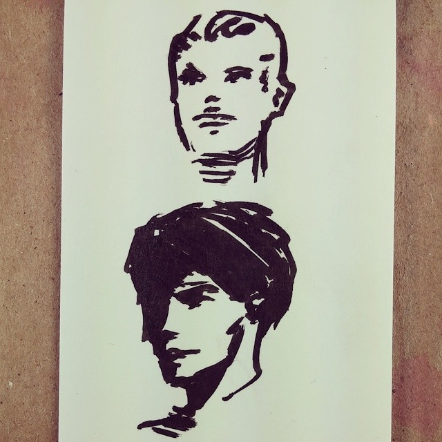
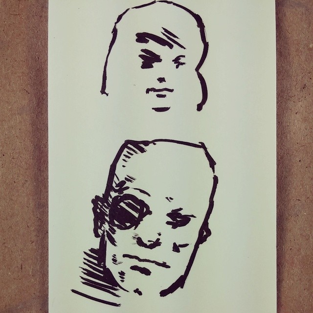
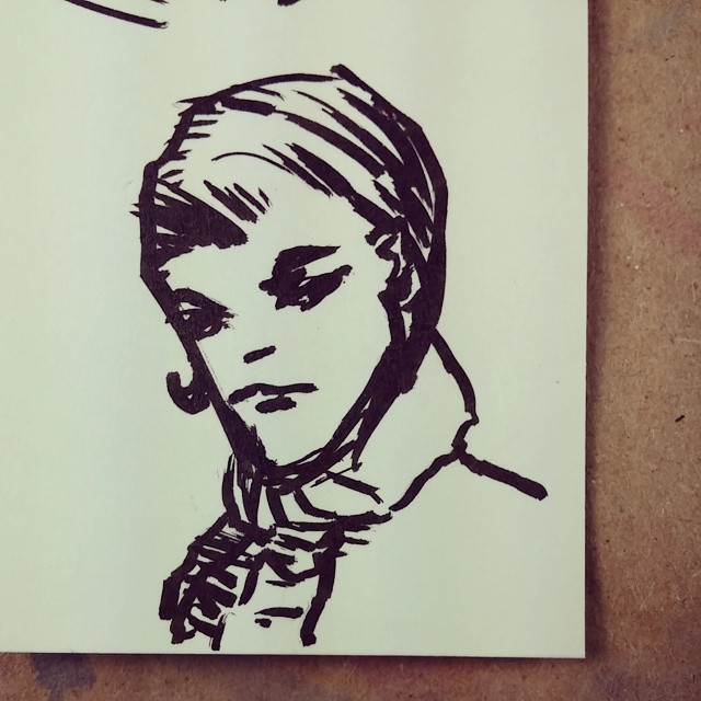
Added 1 new A* page:Broke out my neglected Copic Multiliner SP BS brush pen over the weekend for a little doodling; I think I tend to doodle heads because they don't usually have things that would be tricky to draw without planning it out in pencil first, like legs or arms that might cross in front of the body or other limbs or something; also you can just go with it and let the head come out however it wants and voila you've got a funky new character! : D
|
·····
|
| |
| Is it possible to overdose on orange juice? | Jul 26, 2014 6:33 AM PDT | url |
| | |
Added 1 new A* page:I drank nearly a whole carton of orange juice while making this page! Well okay some was while trying to paint the first version of the page, which did not go so well... But I got it done on the second try, and I'm probably well ahead of the curve on vitamin C at the moment, too. : oo
And say if you want to help keep me in the vitamins and drawing, one really good way to do that is by contributing to the A* Patreon campaign! These days I have funny conversations with my friends when we get together; they may be all like "oh man refinancing my house is a pain, there are all these forms..." and I'll be like "I was able to buy myself OJ today!" : D It's a fun culture clash that enriches us all, and anyway my sort of point is that every buck or two helps—that's about half a carton of OJ! I also get to draw and mail sketches in envelopes to qualifying supporters on Patreon, like here's one I mailed to a kind supporter earlier this month for their support in June:
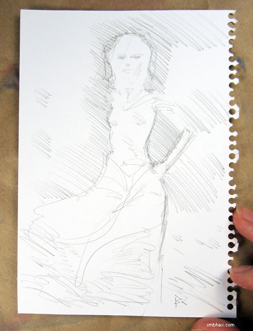
So yep! Vitamins!
|
·····
|
| |
| Quick! To the Catbox!! | Jul 25, 2014 1:14 AM PDT | url |
| | |
Added 1 new A* page:Oops, I think I just drew Batman! Drat, my no-Batman streak has been ruined!
But wait! The shape of those ears... Could it be?? Desert Cat-Man?!
So then is this just a tiny brush pen doodle I doodled aimlessly earlier today
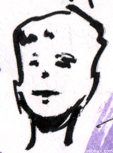
or is it actually Desert Cat-Man in his mild-mannered civilian guise??
|
·····
|
| |
| Independence for Russia's space rockets | Jul 23, 2014 10:58 PM PDT | url |
| | |
Added 1 new A* page:Russia recently conducted a public test of their new 'Angara' rocket; for years or probably even decades they've been launching stuff into space with Soyuz rockets from the Baikonur Cosmodrome in Kazakhstan, but "Angara is designed to give Russia full control over its space activities, reducing its reliance on technologies and facilities of former Soviet states. These include the rocket components currently sourced from the Ukraine"—and this certainly fits in with Russia's alleged geopolitical policies in that region of late. They're even building a new spaceport, one that isn't on leased land like Baikonur: "Russia wants to launch the Angara family both from Plesetsk and the Vostochny Cosmodrome, which is currently being constructed in the Amur Oblast, in the Russian far east."
Politics and rockets have quite a history together on Earth, and I suppose that won't be ending any time soon—although the rise of commercial space use might start to change things a bit.
|
·····
|
| |
| 67P/Churyumov-Gerasimenko makes bath time fun | Jul 22, 2014 11:41 PM PDT | url |
| | | |
Added 1 new A* page:Well this is last week's news but if you missed it, it's new to you! The European Space Agency's Rosetta probe, due to enter orbit around its research target, the comet 67P/Churyumov-Gerasimenko, on August 6th (and to land a robot on it on November 11th), is getting more detailed photos of the comet as it gets closer, and it has now (or did a couple Fridays ago) gotten close enough to notice—as seen in photographs in the BBC article I'm taking this all from—that Churyumov-Gerasimenko has a very distinctive dual-lobe shape, suggesting that it is maybe two separate objects that stuck together (would they call one "Churyumov" and one "Gerasimenko"?)—either that, or a 4.5km-wide giant rubber ducky coated in ice, which would go a long way to proving one quack's theory that the solar system is really going down the drain. : o
|
·····
|
| |
| Less is more! Or anyway, easier. | Jul 22, 2014 12:54 AM PDT | url |
| | |
Added 1 new A* page:The previous page (page 43) was originally drawn out like this
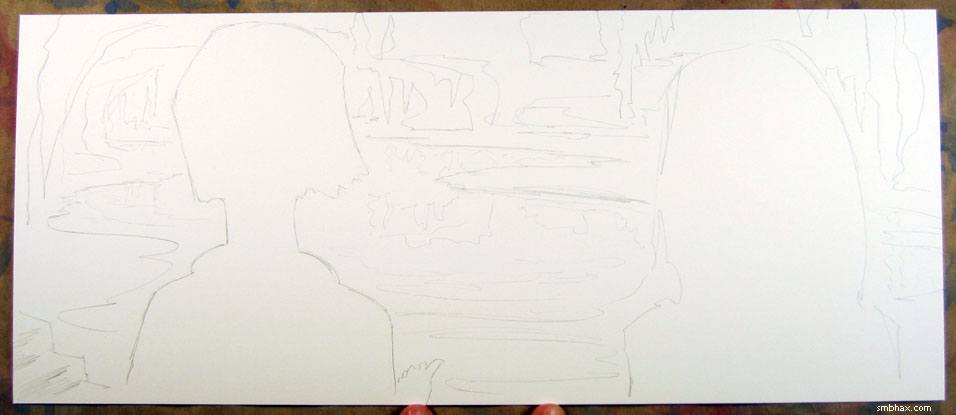
but then I realized that while those lines looked okay—by my standards—in themselves, there was no way my noobish watercolor skills would be able to color them in in any way that wouldn't end up being a big blob; caves, after all, have a primary distinguishing characteristic of being DARK—and if you image Google, say "underground lake," you will find that most of the photos achieve their picturesque effect only by the insertion of many bright colored lights above or below the water; the few that have not availed themselves of a spectacular artificial light show simply look like dank dark holes.
I didn't really want to end up with a dank dark hole if I could help it—and I generally do hate establishing shots anyway, having to be all zoomed out and get in a bunch of detail and all that—and at about that point it occurred to me that I could keep it simple and just have the view pointing upward at the two women, as if from just below the surface of the water being discussed—and I could, in theory, let the watercolor do its stuff to look like watery stuff should. Besides, when will I ever have a chance to do a page seen from this weird vantage point again, anyway? I did a little sketch to see how the poses might work
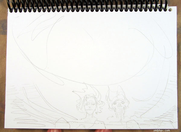
and on the strength of that little scrawl (ignoring the feet which I threw in experimentally at the end, forgetting that this was supposed to be a view from below the water's surface, not a reflection seen looking down from above : p) I figured I'd go for it—and the watery effect somehow worked out pretty well. Yay watercolors! (The nice thing is, when you have to do something like that in watercolor, you have to work fast to keep the whole thing seamless, and it helps me avoid dickering around and muddling things up to much, as I am very prone to doing otherwise. : p)
Erasing that original cavey drawing pretty much exhausted my last eraser, but fortunately my restock eraser shipment had arrived that same day. : )) (It had been a close call because when I went to order, I found that jetpens.com was moving offices and thus couldn't ship for a few days—what are the odds! : P (I mean, considering that the last thing before that that I ordered was some prints I needed for an art show and it turned out to be a super tight deadline even with their fastest, most horrendously expensive shipping, because they were closed for a week—keep in mind this is a big, online print shop—for Passover! That was a new one on me.) Anyway, now I've got plenty of erasing power on hand, huzzah.)
|
·····
|
| |
| Selenelion & other names for art & astronomy | Jul 19, 2014 8:39 AM PDT | url |
| | |
Added 1 new A* page:I came across the coolest word the other day: "selenelion." I stumbled into it on Wikipedia, where it is explained as the name for the occasion "when both the Sun and the eclipsed Moon can be observed at the same time. This can only happen just before sunset or just after sunrise, and both bodies will appear just above the horizon at nearly opposite points in the sky. This arrangement has led to the phenomenon being referred to as a horizontal eclipse. There are typically a number of high ridges undergoing sunrise or sunset that can see it. Indeed, the reddened light that reaches the Moon comes from all the simultaneous sunrises and sunsets on the Earth. Although the Moon is in the Earths umbra, the Sun and the eclipsed Moon can both be seen at the same time because the refraction of light through the Earths atmosphere causes each of them to appear higher in the sky than their true geometric position."
"Selenelion" probably shares something of the same root as the name of our anti-heroine, which I got from the name of the Greek goddess of the Moon, Selene. (Huh, and Google tells me that an actress on a popular show that's appeared since A* began also has the name Selenis, golly.) I came across it when I was trying to name the watercolor painting I had made for page 38, because I figure I should give them a name when I put them up for auction on eBay, which I always do just before the A* page using them appears on this site. The page 38 painting looked like this
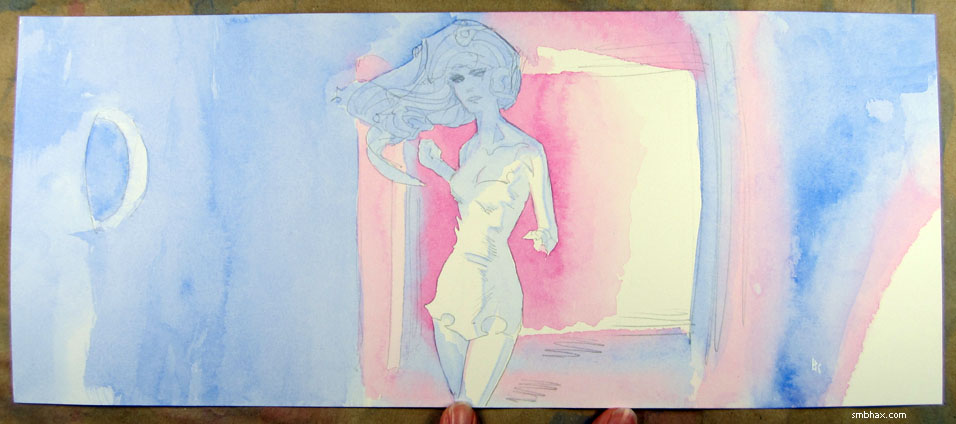
and I thought hm well Selenis is kind of eclipsing the disc of light cast by the round window at the end of the hall she's facing, which is almost like a moon, the basis of her name. I wonder if there's a cool name for a lunar eclipse or something... And that got me to looking up "lunar eclipse" on Wikipedia, which happens to be the same page that contains "selenelion," and obviously I was going to use that. : )
Not at all coincidentally, my "Selenelion"-named artwork is back on sale on eBay, or more specifically, up for auction on eBay; as I mentioned a couple days ago, I initially put the painting, and the two done for the two A* pages after it, up on eBay as "Buy It Now" listings, but nobody liked them that way (not even eBay : P), so a few days ago I took those down and put the art up as good ol' regular auctions, like I've been doing with each day's A* page artwork for ages now. So, yep, auctions starting at $9.99 for those paintings—oh, page 39's auction and secret artwork name is here, and page 40's auction and wacky name is here, and they look something like (although in higher resolution in the auction listings) this
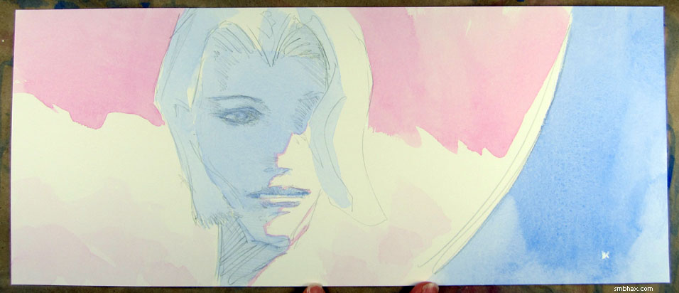
and this
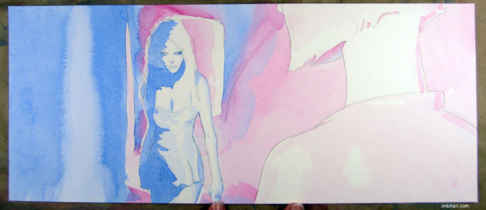
, respectively.
And that's prrrrrobably the last time I'll plug these re-listed art listings, so never fear (the link to a new A* page's art auction, which usually runs just for a week after it first appears as the newest comic page on this site, can always be found as the blue and gold text at the comic image's lower left-hand corner)! Next week we'll talk about...other stuff?
|
·····
|
| |
| Cave Giants and Other Agricultural Pests | Jul 18, 2014 5:06 AM PDT | url |
| | |
Added 1 new A* page:Boy, painting caves is hard! How did those prehistoric people do it? : o
In my initial drawing for this page, I had Selenis and the Hierophanta at a much larger size. Uh let me sort of awkwardly composite the photo I took of them in their first pencil incarnation with the final scanned watercolors:
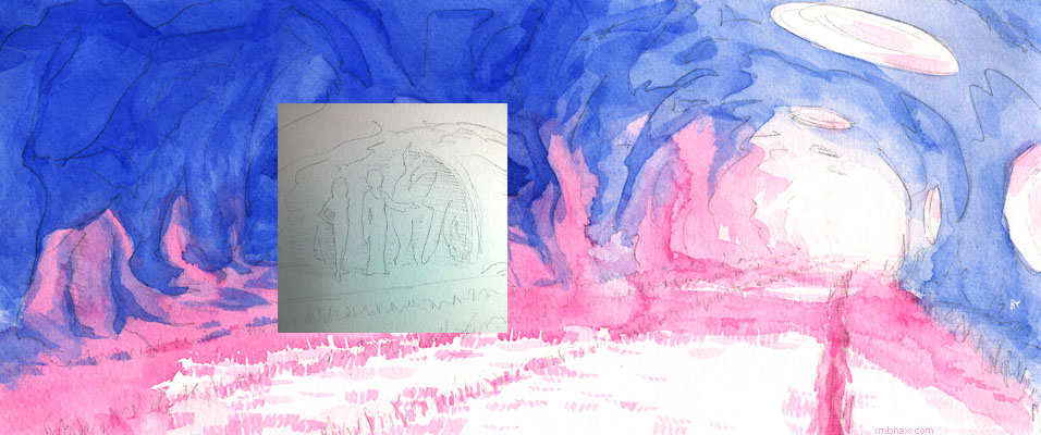
Giants they were! But something seemed weird about it so I made them tiny and it felt like they fit better. Anyway with caves, the bigger the better, riiiiight?
|
·····
|
| |
| Buy It Later :p A* originals back at auction | Jul 17, 2014 12:42 AM PDT | url |
| | |
Added 1 new A* page:I wasn't getting so much as a nibble since trying to sell the original artwork for the latest A* pages as "Buy It Now" listings on eBay, so I've killed those and relisted the artwork as good ol' regular auctions. It's funny, even eBay itself does its best to discourage your from putting things up as "Buy It Now": while configuring a "Buy It Now" listing, you get multiple messages on-screen from eBay, telling you that you really should do it as an auction, and that you're more than twice as likely to sell the item as an auction rather than as a "Buy It Now." AND on top of that, they charge you a $0.30 fee just to list it as "Buy It Now." Plus, with almost all "Buy It Now" listings, the buyer is forced to pay right away, so combined shipping doesn't work automatically, if you have that set up (shipping for my stuff is free for all items 11"x17" or smaller, after the first).
So chalk up another learning experience but now it's back to auctions starting at $9.99 as usual (I'm slowly starting to suspect my buyers are much smarter than me (well, that part almost went without saying) and knew they could just wait me out ; )). The "original on eBay" links for pages 38 through 40 have been updated to point to their new, regular auction listings, but why don't I just roll those out right here for you since I really would like you to bid on them, yep:

eBay auction for page 38

eBay auction for page 39

eBay auction for page 40
Auctions!
|
·····
|
| |
| Off with her body! | Jul 15, 2014 11:25 PM PDT | url |
| | |
Added 1 new A* page:I've been trying to be fussy about the penciling lately and trying *not* to settle for the first thing I draw, because that usually comes out kind of cartoonish; some days—like yesterday—it seems like everything keeps coming out either cartoonish or an awful mess and I don't seem to manage a drawing that's more like something you might actually see until I've more or less exhausted my conscious drawing capability by continuous drawing and erasing. I'm going to try to document unused (and about to be erased) drawings better—at least the ones that aren't entirely hideous—I snap a shot with Instagram and that also automagically sticks it right up on tumblr and on Twitter—but quite often—like tonight—I don't realize I'm going to be erasing them until I've already erased most of them, because I'll think "hm no this isn't quite right, but maybe if I just erase that part there..." and then that doesn't quite do it and I erase something else and before I know it I'm back to blank paper with nothing to show for an hour or so of drawing AND I didn't even get a photo. : P Could've had a couple semi-decent alternate drawings to show tonight.
I did a bit better at this on Friday (early on I kind of realized it was going to be one of *those* nights, and got my phone ready), so here are some drawings you didn't see, or saw only partially, for page 38:
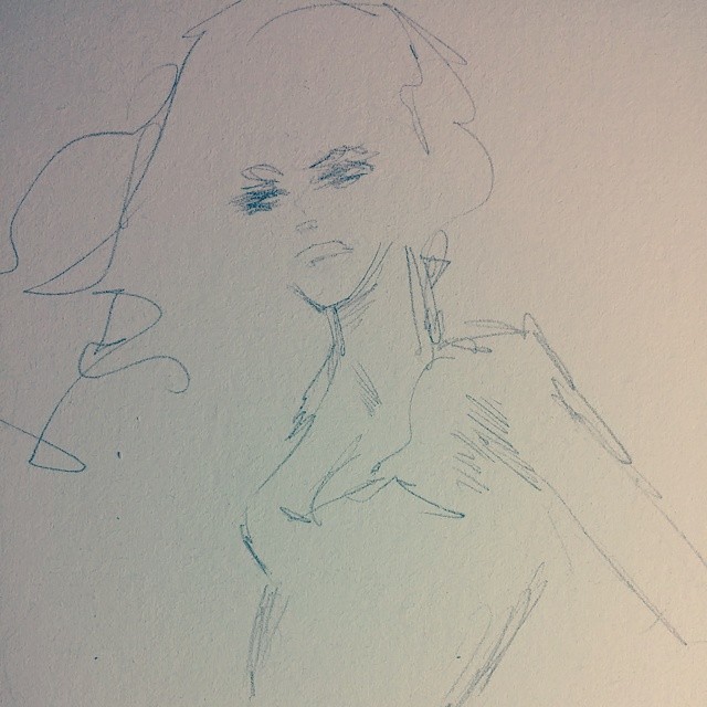
^ After some failures and erasures I got frustrated and thought maybe if I just do it all action and anime styleee~~~ : P
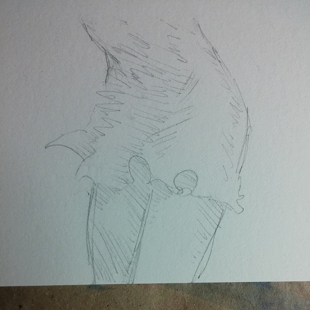
^ For some reason on Friday night I was having a lot of trouble getting heads to match up to bodies. Eventually I realized the head that had tried to go with this body was just not where it needed to be, but unlike the previous few tries I thought maybe I could salvage part of it, so I erased the head, kept the body, and thought I'd be able to draw a new head on top of it. I couldn't. ; P Might have something to do with my tendency almost always to start drawing a figure head-first.
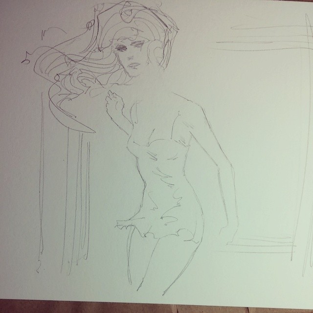
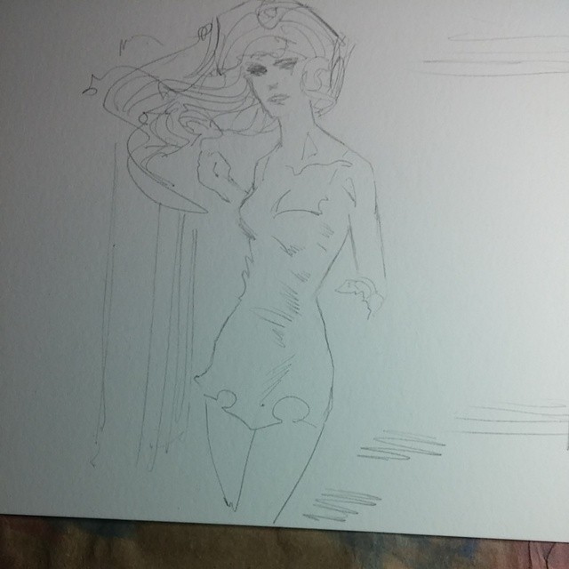
^ Still having the darnedest time getting heads to sit right on bodies. It was weird. This time I figured I'd try keeping the head—anyway I liked the kind of angular/linear look there—and erasing the body. That worked better and thankfully I was finally able to get a body under a head in something like the generally accepted fashion, resulting in the final drawing:
|
·····
|
| |
| The Pen is Sharper than the Pencil? | Jul 14, 2014 9:31 PM PDT | url |
| | |
Added 1 new A* page:Here's a pen sketch sent as a reward to a very kind reader for the support they gave A* for the month of May through Patreon:
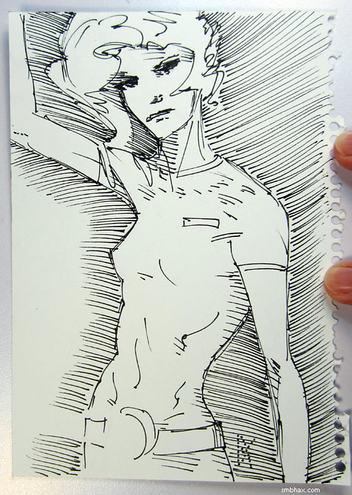
The sharp-ish lines in that are actually what got me searching around for some way to sharpen up the regular A* pages, which is what led to that pencil testing frenzy of mine a few weeks back, resulting in switching from drawing the comic with soft 4B pencils to drawing it with harder H pencils.
|
·····
|
| |
| A* original art is "Buy It Now"...now | Jul 12, 2014 6:30 AM PDT | url |
| | |
Added 1 new A* page:Starting with today's page, I'm selling the original watercolor artwork behind each new A* page as "Buy It Now" items on eBay (today's is here, for instanceyou can always jump to their eBay page using the blue and gold "original on eBay" link at the lower left corner of their comic page image), for $20. Like the auctions for previous pages, which have been starting at a bid price of $9.99, these new "Buy It Now" A* art listings will stay up for a week, and if they don't sell, they'll be available directly through this site for $50. So if you like them, that unusual price structure encourages you to purchase them sooner rather than later. : )
And since they are now "Buy It Now," that means you can't be sure the item will still be available on eBay in two or four or six dayssomebody could buy it right away! : o On the other hand, now you don't have to wait around for a week to buy an A* page you like, and you don't have to worry that someone may outbid youthere's no bidding, you just straight up buy the art immediately and it's yours.
Thanks to everyone who has been buying the new original pages as I put them up for auction each day! They've been selling very regularly lately in the auction format, which has been really encouraging, and I guess that's encouraged me to try the "Buy It Now" method, uh, now. I hope this format will work for everyone at least as well as the auction format did, and please let me know if you have any concerns or questions about it!
I suppose the trigger-happy nature of "Buy It Now" slightly favors those collectors who share my very odd scheduleby which I mean that new pages often don't go up until very late at night, or even in the wee hours of the next morning (Fridays are particularly bad in that way...really they almost always end up as Saturdays!). A* page artwork appears on eBay sometimes hours before it appears as an actual comic on this site, though, and as soon as I've got a new page up on eBay, I post the link to it on Twitter, on Facebook, and on Google+, so if you want to get the very first word of new A* artwork as it becomes available for sale, just follow A* on one of those social networks and you'll be in the loop.
|
·····
|
| |
| Implants are soooo 2013 | Jul 11, 2014 3:41 AM PDT | url |
| | | |
Added 1 new A* page:But who needs implants when you can control your Google Glass with just your brain and an EEG headset? : o
|
·····
|
| |
| Alex Raymond, Flash Gordon poser | Jul 10, 2014 12:15 AM PDT | url |
| | |
Added 1 new A* page:Okay, we are continuing the discussion from yesterday, where I was pointing out panels in his Flash Gordon newspaper comic strips that seem to show artist Alex Raymond starting to switch up his art style in mid 1938: in general, going from the lustily inked, pure drawn-from-his-head style he'd honed since starting the strip in 1934, to something more photo-realistic, attained with the aid (in some cases speculative, but later definite) of reference or live models.
He was experimenting with these tools, I continue to conjecture, with both success and, sometimes, less than success. As an example of a success, I give you a panel from the May 31st, 1938 strip (two weeks after the last panel we looked at):
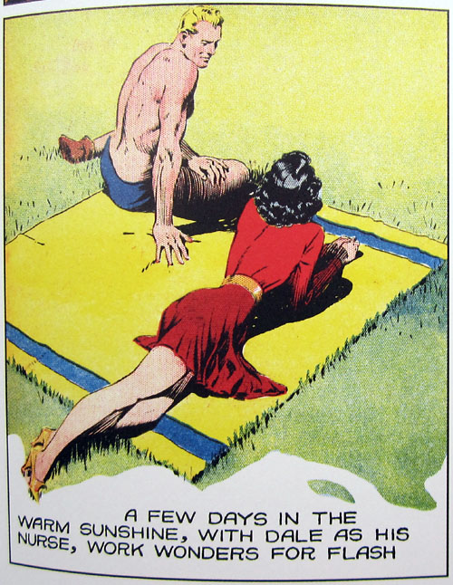
Here I would guess that he had the help of reference of some sort to achieve the seemingly effortless, perfect perspective and poses of Flash and Dale at rest. This high perspective had not really been seen in the strip up to this point, nor had we seen such an idyllic, relaxed, Earthlike scene, really. It was also unusual to have Dale completely turned away from the viewer; I would posit this suggests the use of a reference photo of two people at a beach, where the photographer wasn't concerned about capturing "characters," just forms. I could, of course, be completely wrong! Anyway, nice panel.
Ming the Merciless underwent probably the most drastic transformation in this transition of styles. It looks to me like Raymond found a very strong, very specific model's face to use for Ming, in particular one with very expressive high cheekbones and gaunt cheeks; we had not seen this particular style of cheek from Raymond before these experiments began (two more weeks on, from the August 14th, 1938 strip):
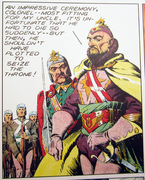
This new incarnation of Ming also has rather sad, lidded eyes—and this illustrates a down-side of relying on reference, because from the point a few months later where Raymond switched permanently to this new Ming, we never again would see Ming looking really crazily excited, eyes staring, as we had so often in the past; for instance (from April 10th, 1938):
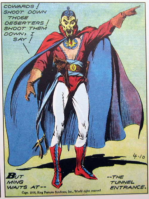
A much less attractive fellow there, to be sure, but one you could really believe was a maniac who wanted to rule Mongo at all costs, and didn't cry into his pillow at night.
Aside from facial expressions, there's also the question of being able to get the right poses out of your models. Consider Flash and Dale's body language in this very referenced-looking strip from October 23rd, 1938 (this is after Raymond switched permanently to the photo-realistic style, on September 11th):
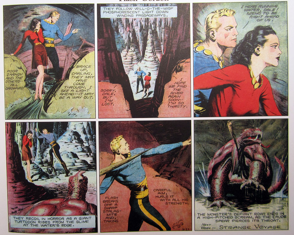
In panel 1, Flash is meant to be pointing toward a way out, but it looks like he's giving someone the evil eye. (Let's just pass over the weirdly elongated/plucked eyebrows on both "actors" in panel 3. : P) In panel 4, Flash is supposed to be recoiling in horror, but he looks like he's maybe doing some calf stretches. In panel 5, we can imagine Raymond telling his Flash model to look like he's about to throw a spear, and the model assumed the classic, millenia-old Greek javelin-thrower pose, as if this was going on an antique vase; unable to use a model to capture the more exciting "throws with all his strength" part of the caption, Raymond settled for the canned, much less dynamic "careful aim" bit, because that's what the model could do. Canned or static poses are another potential downside of relying on models.
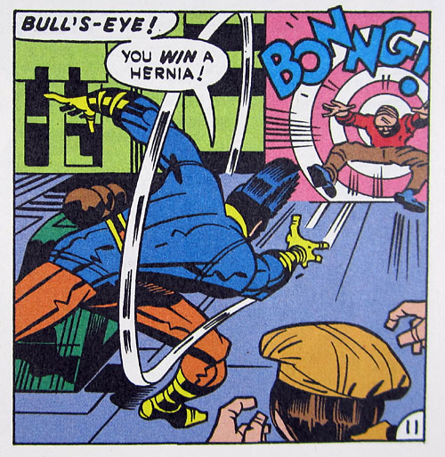
Dramatic foreshortening of figures in action, particularly in combat, wasn't really studied intensely by comic illustrators, maybe, until the ultra-exaggerated, hyper-dynamic "Marvel Way" (as Stan Lee dubbed it, I think) pioneered by Jack Kirby in the early '60s. Raymond, perhaps given courage by his access to models, tried a punch toward the viewer in this panel on November 27th, 1938,
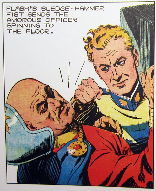
but it doesn't really come off as convincing, either in the scale of the foreshortening or in Flash's pose, which is far too static—and it's hard to imagine how his fist is connected to his shoulder, if he's really leaning into the punch. Punching and similar actions are another thing that's pretty hard to capture from a posed model; Kirby, by way of contrast, didn't use models, and in fact didn't even care about realistic anatomy, which allowed him to channel pure, violent action in its full sweep and animation.
Wait a sec, I know I have a sample Kirby panel around here somewhere. Ah, yes, this is the one I showed last November, from Kirby's OMAC issue 5, June 1974 (Do not try this at home!):
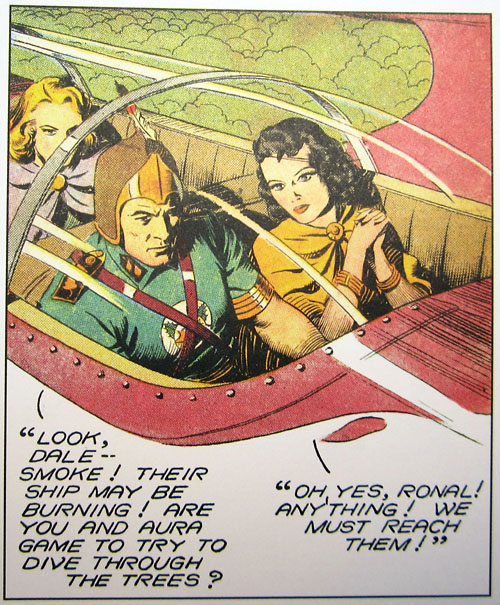
Anyway, back to Raymond. Use of reference did help Raymond do some really nifty stuff, though. For instance, check out the convincing directional lighting effect he gets on the characters in this cockpit in the January 1st, 1939 strip:
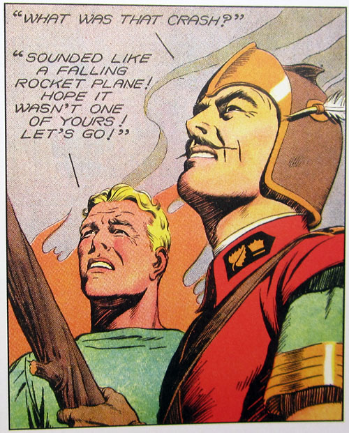
Pretty sharp! And, in that same strip, it was surely models that allowed him to capture a difficult under-the-chin double perspective and counter-reflected lighting in shadows so perfectly (Flash's eyes may be a bit too wrinkly, but alas, models age like anyone else : p):
And after these months of trial and error, Raymond eventually got his model method down to the point where he could blend it pretty darn seamlessly, most of the time, with his pure illustration, as we see in the February 19th, 1939 strip:
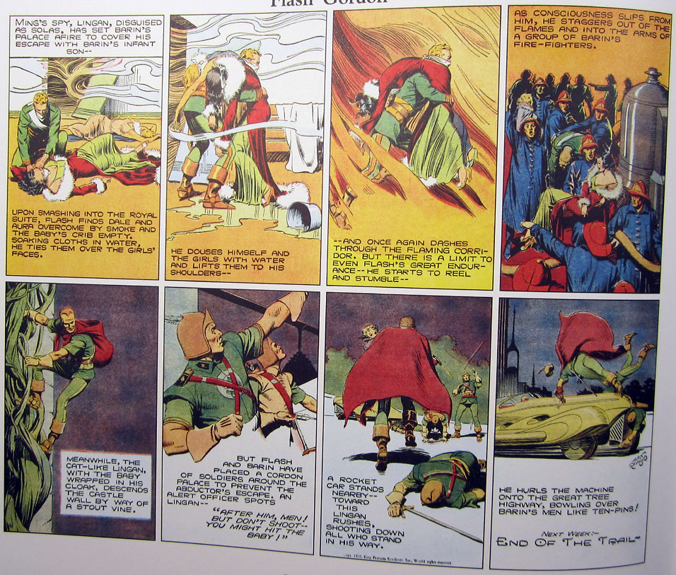
The complicated weighting of the figures in panels 2 and 5 there suggests the assistance of models, as does the posed but realistic positions of the archers in panel 6, and yet when Lingan springs into full action in the final two panels, in off-balance poses that no model could have held, and which would probably have been quite difficult to capture in a photo, Raymond is able to draw the poses he needs in a style that is as sharp visually as his more reference-assisted work. Notice also that he helped his cause with a clever bit of sleight-of-hand: by turning the non-referency poses away from the viewer, he saved himself the trouble of having to try to draw faces that would have had to match the faces on the more referenced preceding frames.
I would say that personally I still prefer my comic artists when they draw really well without reference, but I've yet to give volumes 3 and 4 of this IDW Flash collection a thorough going over, and if anyone can change my mind, it will be Alex Raymond.
|
·····
|
| |
| Alex Raymond's *Sudin* drawing innnovations | Jul 08, 2014 10:53 PM PDT | url |
| | |
Added 1 new A* page:So yesterday I started talking about how Flash Gordon artist and co-creator Alex Raymond seems to have shifted from drawing his famous comic strip just from his head to using live models and/or photographic reference in mid-September, 1938, and I went on to point out instances from the months leading up to that where his style was definitely shifting—perhaps making sporadic use of reference or some other new source of inspiration.
These experiments in deviating from the imaginative illustrative style he'd been honing since beginning the strip in 1934 did not always work out. For instance, this Flash, from the June 5th, 1938 strip, appears to have facial features (even make-up?) inspired by some sort of Hollywood actor's photo or the like, but it would be hard to say that the photorealistic quality of the features is an improvement on Raymond's previous, classic Flash look:
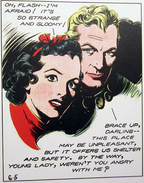
Fortunately, that version of Flash appeared in just a couple panels. Two weeks after that one, we meet a new character, with startlingly realistic facial features:
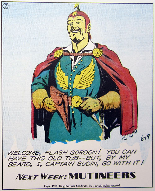
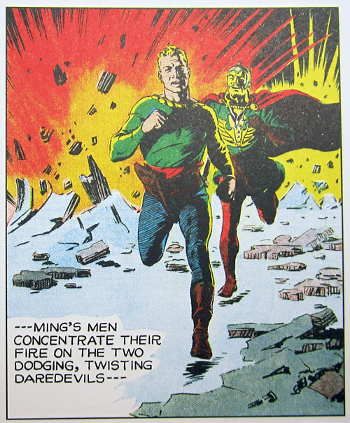
If Raymond was saving his experiments for new, minor side characters, that was probably a good idea—if they came out weird, nobody would really notice. He generally got this Sudin guy down pretty neatly, though. And there were other new things to see during this period, too. For instance, in this panel from the July 3rd strip, the faces of Sudin and Flash don't particularly look referenced, and neither do their poses, *but* whereas movement in Flash Gordon up to this point had almost invariably been side-to-side, in this panel, they're suddenly coming *right at us*:
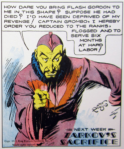
Pretty convincingly, too! I wonder if Raymond did have reference of some kind for that. He had very rarely had figures coming straight at the camera before, and generally only in more typical, less dynamic poses, like this pointing Ming ("Mongo wants YOU! ...For hard labor!") from November 7th, 1937:
By July 17th, 1938, Raymond was so good at drawing Flash—from his head, I think—that he could fit him in pretty seamlessly beside Sudin, whose realistic facial shading does strike one as having had the advantage of some sort of reference—and perhaps Raymond liked the look he was getting with that actor or model so much that he couldn't resist throwing in a few clones of him in the same panel:
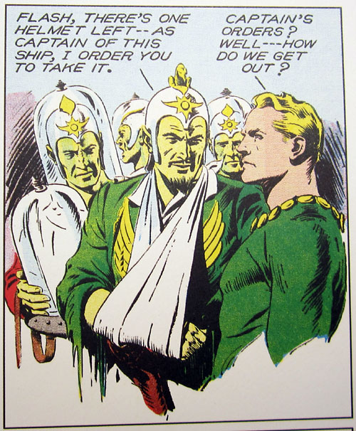
Remember, of course, that this is all just supposition and guesswork on my part.
Looks like that's about as far as I'm going to get today—darn these bizarre World Cup semifinal matches, anyway! : P >_> More dissection of Raymond's 1938 drawing experimentation tomorrow!
|
·····
|
| |
| Alex Raymond's model Flash Gordon | Jul 07, 2014 10:41 PM PDT | url |
| | |
Added 1 new A* page:The second reader-sent series of books I alluded to in my last blog entry was IDW's massive tomes compiling the Alex Raymond-drawn Flash Gordon newspaper comic strips: Raymond drew the weekly strip—the writing and coloring were handled by others—for ten years, from its start at the beginning of 1934 up until he left to join the Marines at the beginning of 1944 (leaving behind enough unpublished Flash artwork for his stuff to keep appearing in new strips through August of that year), and IDW has compiled those ten years worth of strips, along with the Raymond-drawn "Jungle Jim" adventure strips that ran next to them, into four massive tomes, the fourth coming out fairly recently. I'd put the early volumes on A*'s Amazon wish list, and an extremely generous reader ended up getting me all four of the huge volumes! Thank you once again, kind sir.
Raymond's Flash work is certainly some of the finest adventure strip art ever created, and a real inspiration for my chicken scratchings on A*. I'm only on the second volume of this compilation series so far—I paused for a long time because I couldn't figure out how to read these huge, heavy books without pulling some muscle or other; I've finally figured out I can read them safely if I lean them up on my drawing table, although once I did that, I realized a further danger: the rather formulaic writing will send me off to snooze-land, so I've decided I'll settle for just skimming the dialogue, and concentrating mostly just on the artwork. Anyway, in flipping through the second volume, one of the first things I noticed was that Raymond's artwork, which grew rapidly more refined in volume 1, from a fairly rough start, goes through a startling transformation in the second volume: it suddenly goes from clustered panels of twisting, detailed full figures drawn in dynamic poses and inked with rich rainbows of brush strokes to a lighter rendering, more line than brush, focusing on almost photo-realistic close-ups.
A bit of image Googling will show you plenty of photos of Raymond at his drawing board with a live model posing for him nearby, and it's well documented that during his Flash run he switched from drawing figures entirely out of his head to working from models and photographic reference; what I haven't seen documented is exactly when that switchover occurred. But looking at this sudden style change in volume 2 of the IDW compilation, I think I can guess.
Here's the Flash strip from September 4th, 1938:
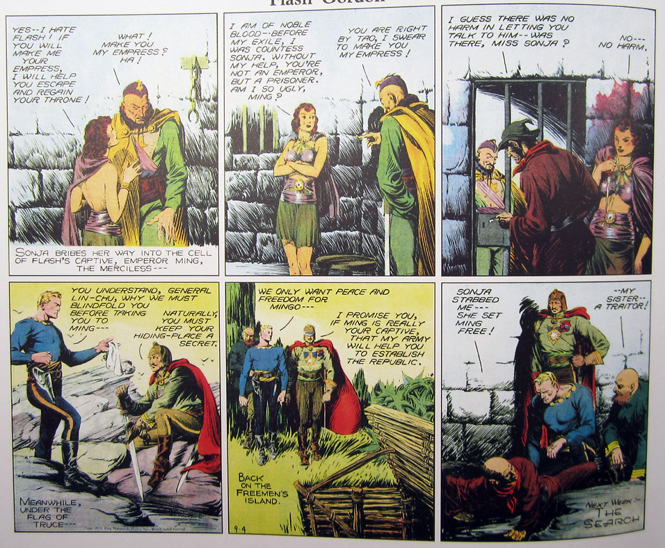
Note the full-figure scale, the heavy shading using thick arrays of curved brush lines, the rather awkward faces in perspective in the first and last panels, and especially the face of Ming the Merciless in the first panel. Now, compare with the strip from the very next week, September 11th:
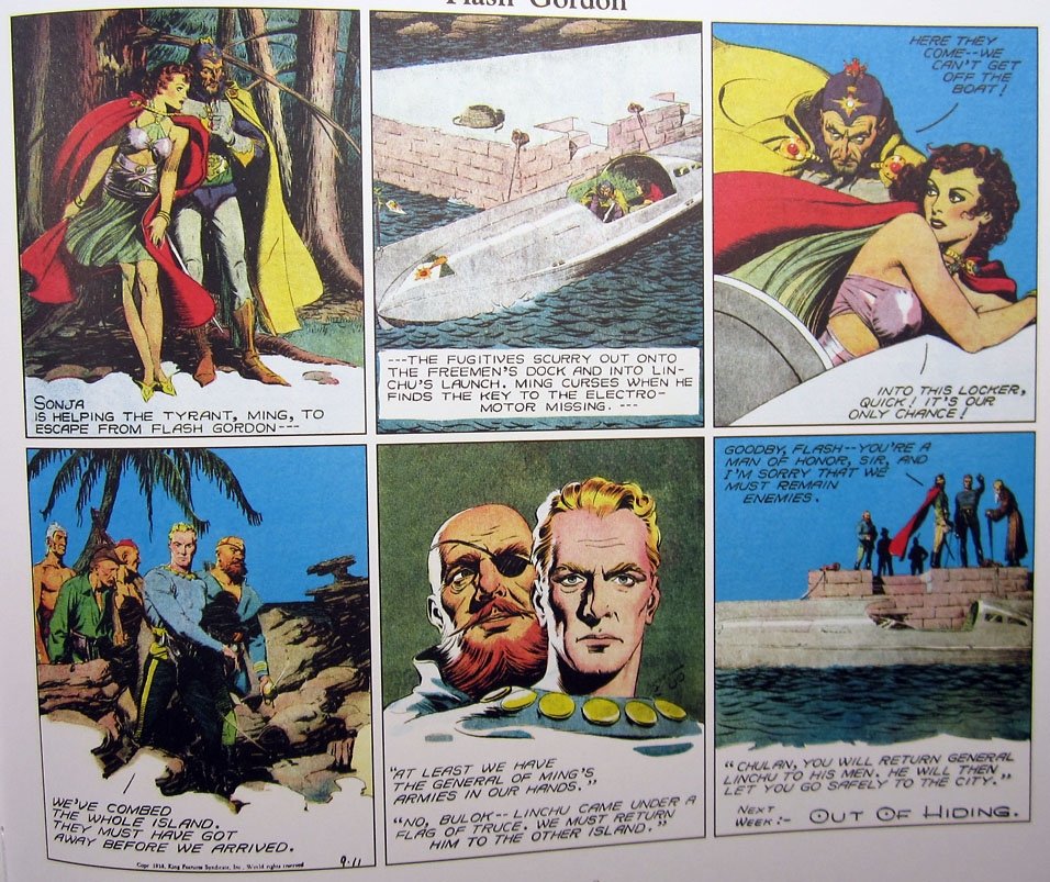
It's safe to say that a significant stylistic change has taken place in the space of a week, and, from the look of the faces in the third and fifth panels particularly—Ming and Flash himself have undergone dramatic facial changes—I think we can chalk this change up to Raymond switching to drawing the strip from models and/or reference; the subtle perspective of the tilted heads is suddenly flawless, and the faces themselves much more realistic, as you would expect from figures drawn from reference. The camera has shifted closer, the inking is lighter, using short, straight lines in the shadows, and thin lines around the figures and faces; the counter-reflective shading on the faces in the fifth panel is so photo-realistic that the colorist felt inspired to throw in some side lighting, and specular highlights on Sonja's clothing in the third panel.
From that point on, the Raymond's Flash artwork stays predominately in that referenced, photographic style. But although the switch seemed sudden there, he was clearly experimenting with drawing from reference, or at least a style that has all the hallmarks of that method, from time to time in the months before the final switch; let's roll back the clock a little further and see how that went. For our own point of reference, here's one of his last clearly non-referenced close-ups of the main heroes, from the March 6th, 1938 strip:
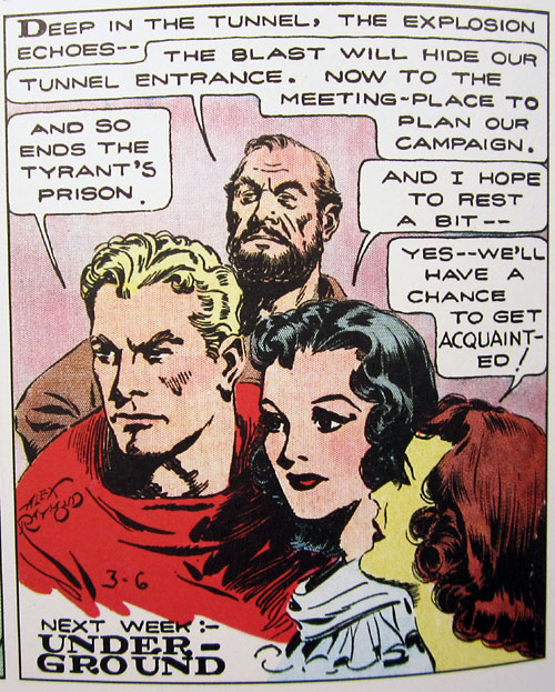
It's very realistic, but the faces have the feel of designs and archetypes worked out and polished in the artist's head, rather than having been taken from specific real-life faces. The heavy, curving brush lines are still there, and even somewhat more distinct here than was usual for him at this point; there's a rough, DRAWN feel to the composition.
All right. Now we jump a month ahead, to April 3rd, and a few panels look a little different than the rest:
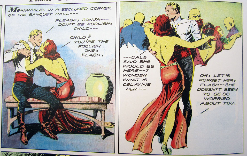
The inking is lighter, with more emphasis left to the outline, rather than sculpting the figures and faces out of heavy brushed shadows. Flash's pose in the first panel, where he raises his shoulders and hands lightly in perspective, is a subtle and complex one, and his expression, likewise, is not the pure fixed expression we're used to seeing on his chiseled face, but something both lighter and more complicated. It doesn't look definitely referenced, but there's certainly a new source of inspiration at work here in Raymond's art.
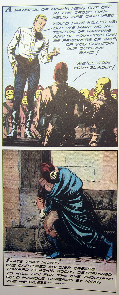
Two weeks later, Flash raises his eyebrow again—he really hadn't done this sort of thing before—even more noticeably this time; the heavy, voluminous drapery and perfect foreshortening of the face in the lower panel also stand out as different from Raymond's previous work (he had always loved drapery, but it was usually more graceful and flowing):
Three weeks further on—we're up to May 8th, 1938—and the light eyebrow and heavy shading styles are almost alternating from panel to panel:
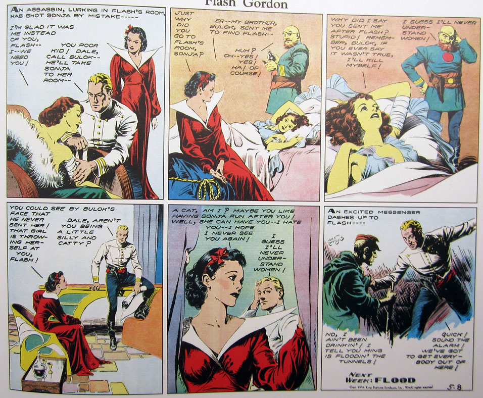
In panel 1, and especially in the last panel, Flash is done in a heavier style, with deep folds in his jacket and shadows across his face; in panels 4 and 5, on the other hand, we see the lighter, expressive eyebrow Flash. In panels 2 and 3, the bearded Bulok, and especially his reclining sister Sonja, have the lighter, outline-emphasizing style with its very subtle hand gestures and facial expressions, and the perspective of Sonja as she leans back from us in panel 3 is incredibly precise.
It's only a guess, but I have a feeling that Raymond was finding ways to start putting models or photographic reference to work here and there in the strip throughout the early part of '38. I have lots more to show of his experiments—not all of them successful—both leading up to and after he switched to the photo-realistic style for good later in the year, but they're hefty enough that I think I'd better save them...for tomorrow!
|
·····
|
| |
| The ol' Magenta, White and Ultramarine | Jul 05, 2014 12:17 AM PDT | url |
| | |
Added 1 new A* page:I hope everyone of you who's into it is enjoying a safe and happy 4th and can still count to 20 on your digits; in honor of the red, white and blue of the ol' Stars and Stripes I present to you a sketch, newly in the hands of some very generous A* supporters, as their due reward for supporting the comic through Patreon in May:
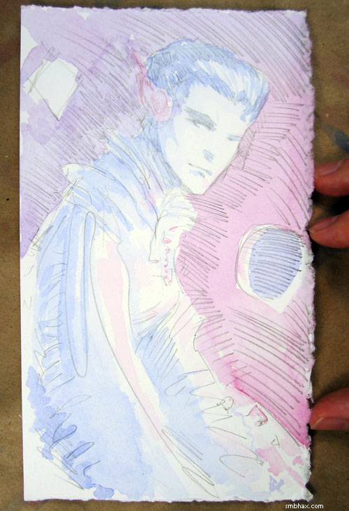
There we have my usual red (British quinacridone magenta), white (French 300 lb "bright white" watercolor paper), and (British ultramarine) blue, plus (Japanese) pencil stripes and, if you squint and imagine hard enough, (interplanetary corporate??) stars out through that little round portal. So apparently A* is really the most patriotic American webcomic around, pretty much! Yeah!
I had meant the figure to be a Selenis but it came out with kind of a different look and I'm not sure about the costume but I'm thinking this could maybe be one of Selenis' past lives that we haven't explored yet, and I think the costume may have been influenced by the stories of the (often) decadent Lords of the Instrumentality I've been reading about in this very odd collection of short stories that a reader sent to me, which I will probably have a little more to say about in the future.
Come to think of it, I still have a bunch to say about another series of books another reader has sent me, too! I'd thought I'd get that done a few days ago but then I spent all night agonizing over gamma adjustment instead. : P
|
·····
|
| |
| Happy Little Clouds; Gamma Haze | Jul 03, 2014 11:20 PM PDT | url |
| | |
Added 1 new A* page:Managed to do a little better on the color balancing act today, I think. The color blending on her body is wet-on-wet painting; I kinda figured out that's a handy thing in watercolor while I was painting the little smoke cloud in the right background of page 23: a friend called just as I had started painting it, and I couldn't stop, because the bit I had painted would dry and unsightly leave hard edges mid-cloud, but while holding the phone I only had one hand free (hm and I guess I was using the elbow of my phone hand to hold the paper on my drawing board) so I couldn't test colors or carefully mix colors, and I just started sort of dabbing on alternating colors of red and blue (and their middle, purple) here and there while half my attention was distracted by the phone, and it came out as this nice smooth multicolored cloud thing. I had my hands free for today's page but otherwise the approach there was kinda similar.
Forgot to mention a few things about using a harder grade pencil like I am now (H, vs the dark, soft 4B I had been using up to about a week ago): the harder leads are much less prone to smearing, which come to think of it is why I'd settled on H back in the old, pre-4B days. Conveniently for watercoloring, this also seems to mean that they're much more resistant to being washed off the paper by the watercolor washes. They also erase much more cleanly—less smearing/smudging—so I can mess up pretty much all I want (I think I did about a dozen mostly hopeless drawing attempts on this page before I finally got one that looked like something) without having to worry about leaving half-erased marks everywhere, which is nice and freeing.
Digital art nerdery: with the past two pages I've used a standard gamma adjustment (middle slider in Photoshop's "Levels" adjustment window) to darken the scanned watercolors for the web, rather than just raising the blacks (left slider in "Levels"); this means the lines don't get darkened proportionally more than the rest of the image, so they don't stand out quite as much as I might have wanted, and the colors don't get as super-saturated and "pop" like they have tended to in the past, but on the other hand other dark colors don't stand out more than they should, and the whole color balance of the image is much smoother and more natural. I had to do it that way with yesterday's page, because it was painted so light, and I kind of like the more naturalistic result, so maybe I'll stick with this adjustment method for a while.
|
·····
|
| |
| The Tonal Balance Tiptoe | Jul 02, 2014 11:24 PM PDT | url |
| | |
Added 1 new A* page:Still trying to get my light/dark balance right with the watercolor and this new, lighter pencil (H grade vs the softer, darker 4B grade I'd been using). First attempt at painting this ended up coming out too light to work with effectively in Photoshop
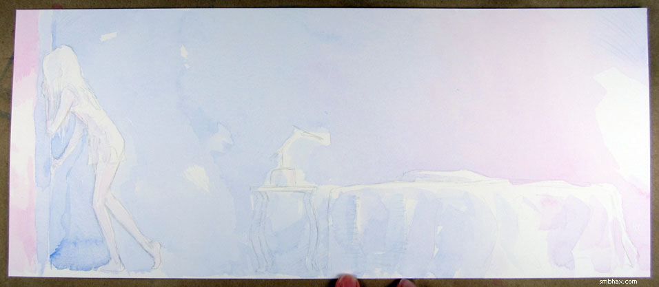
so there was really nothing for it but to lay on another layer of watercolor—which worried me because this can tend to wash the previous watercolor away at different rates in the troughs vs the peaks of the watercolor paper's textured surface, making the surface texture stand out more in the scanned version, which for some reason drives me to distraction.
But I recalled that one of my better watercolored pages to far, page 9 of this episode, had involved a lot of washing over and stuff, which I had just piled on for a while all in one go for some reason. (Although another of my sharpest colored pages so far, page 23, was all done in a single application, which has been haunting me ever since.) So that gave me a bit of hope, and I slathered on another watercolor layer; in the end this was definitely necessary, because I needed a general slight shading over Selenis and her end of the room, away from the window, which it hadn't had before:
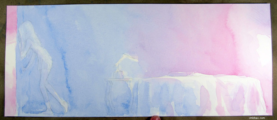
Aside from two dark trickly seams across the background where I wasn't on the ball enough handling the gradient, I guess it worked out okay. : P (And maybe some weird left-dry highlight bits at her feet that came out kind of like socks. : p) I probably should color less sloppily, then I wouldn't be left agonizing over things like that. Maybe.
|
·····
|
| |
| Toro, Roman! Something | Jul 01, 2014 10:19 PM PDT | url |
| | |
Added 1 new A* page:Yet another reward sketch sent to an A* reader for their support of the comic through Patreon in May:
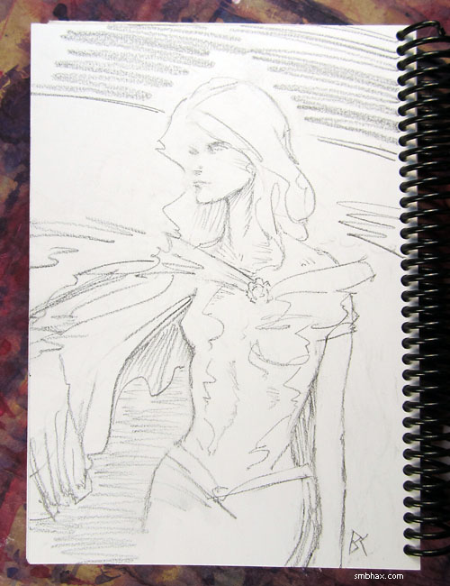
: D
|
·····
|
|
|
