Added 1 new A* page:Some of the steps in the coloring fun:
And here's a photo of the pencil stage with mockup shading drawn over it digitally as a test; the shading values didn't really come out like this, I guess that light wash I used was just too light and instead of trying a second, darker wash over it, I settled for hatched lines:
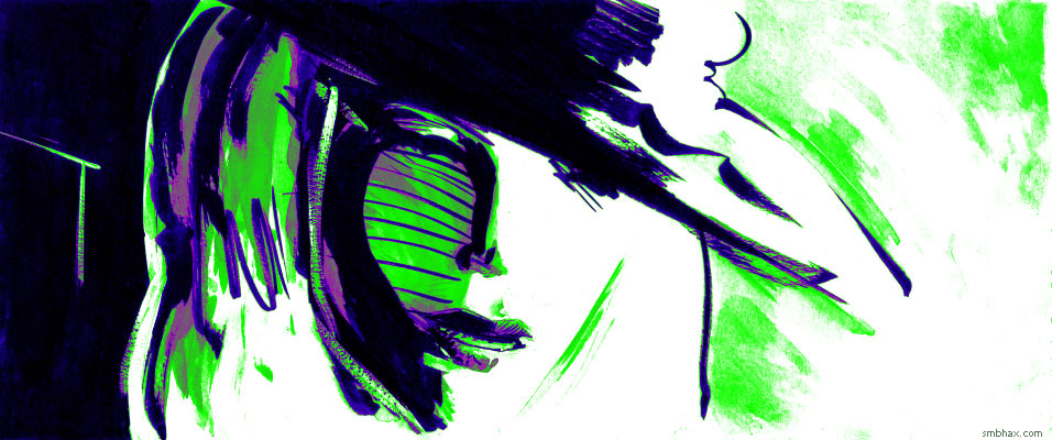
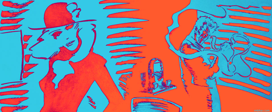
Did I mention this is a high-bandwidth, high-color post? Because it is. I ran a bunch of color tests today before starting on page 24; for a few of them (and page 24) I used the "Gradient Map" adjustment function in Photoshop; the ancient PS 4 I usually use doesn't have it, but I found it in my more recent PS CS2 after it was pointed out to me by a kindly reader on tumblr.
Test coloring an old page (ep 17, page 80) using Gradient Map--smooth!:
Simpler coloring scheme for a scanned version of yesterday's page; I kind of like the look, except that the pencil lines don't scan well and come out looking pretty scrubby, and the side of the Major's head, with just thin lines to cover it, gives me a bit of horror vacui; I should'a had the stones to put some shading on it:
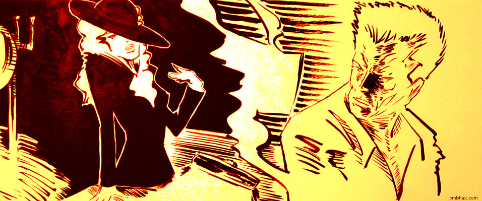
I began to suspect that pencil lines are just too faint or impermanent to make reliable scanning subjects, and that my attempts of working from photos had had problems with fuzziness because the pencil and light wash pages were just too low-contrast for the camera to see well. That page 17:80 above was one I wanted to test coloring because it has thin *ink* lines, and I wanted to see how those would hold up under color, as a switch from pencil lines. I also color-tested some other higher-contrast stuff, including something you haven't exactly seen yet but which may look familiar:
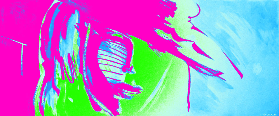
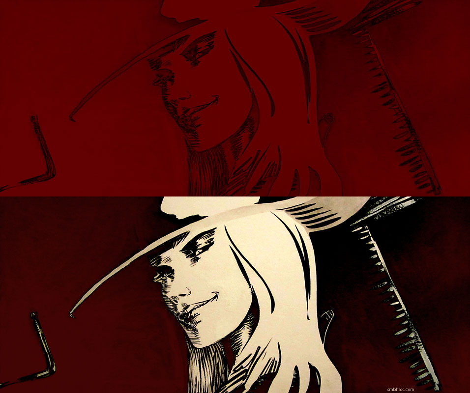
That's a gradient re-mapped photo of the final version of the piece of which a photo of an early stage--before full black inks were added--was used for the first of this current string of color A* pages, page 18:17. I'd been mad with myself over dousing the nice early, light shading job with more shading washes.
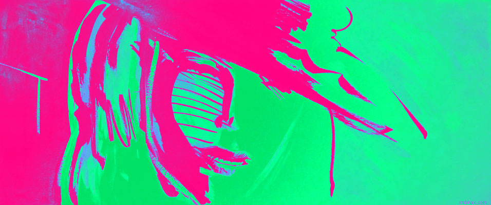
The colors chosen for the gradient map just came out of throwing layers with various blending modes over the original art--these color sometimes come out a little dull from all the mixing, so it's nice to be able to recreate and tweak them using a fresh Gradient Map. Here was the earlier version, with colors just from a lot of layer mixes:
I also tested that color mix on a scanned version of the drawing; it doesn't have the natural lighting gradient of the photo, so it comes out flatter and a little less interesting, I think:
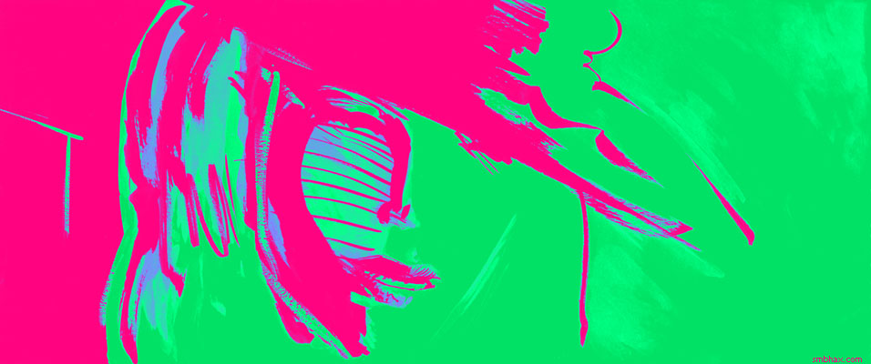
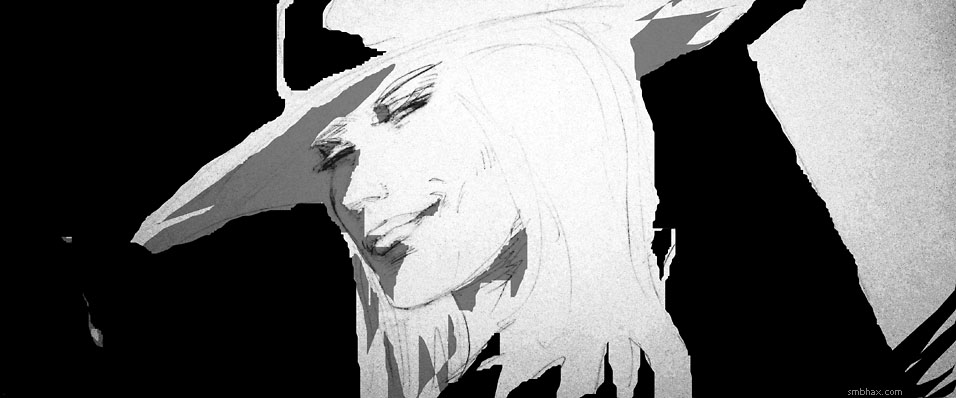
And an alternate Gradient Map, slightly less wacky coloring scheme, in fact since it keeps black and black and white as white, this is downright conservative by the standards of the other stuff I've been doing :P:
And I tried coloring some older stuff heretofore seen only in black and white. Here's a color test of a photo of page 18:15, to see what kind of color I could get out of a pure black and white page with no gray washes on it; the lighting on the page itself when I take the photo gives a tiny bit of volume to what would otherwise be an entirely flat two-color thing:
And similarly, a color test of page 18:16--this one was strictly black and white, but also had some white ink corrections on it, and I wanted to make sure those wouldn't show up too badly in the photo--rather surprisingly they really didn't:
So that's about it for now. What all this showed me was that a) if I want nice lines I'll probably have to stick to brushed, pure black ink lines, but b) I don't really have the patience to do a lot of thin lines with a brush, c) a bit of gray wash in there helps give a hook to getting a more than two basic colors out of full-page coloring filters, d) using subject pages of sufficiently high contrast, the photographed pages come out pretty much as sharp as the scanned ones, and have some interesting natural surface effects to boot--pretty much like 'em better than the scans, and e) the Gradient Map function is pretty handy for finalizing colors.
We start a new scene tomorrow, and I since I've had a chance now to try out pretty much all the color tricks I can think of currently, maybe this'll be a good point at which to start being a little less obtrusive with the color--unless the subject requires eye-injuring color, of course.
|