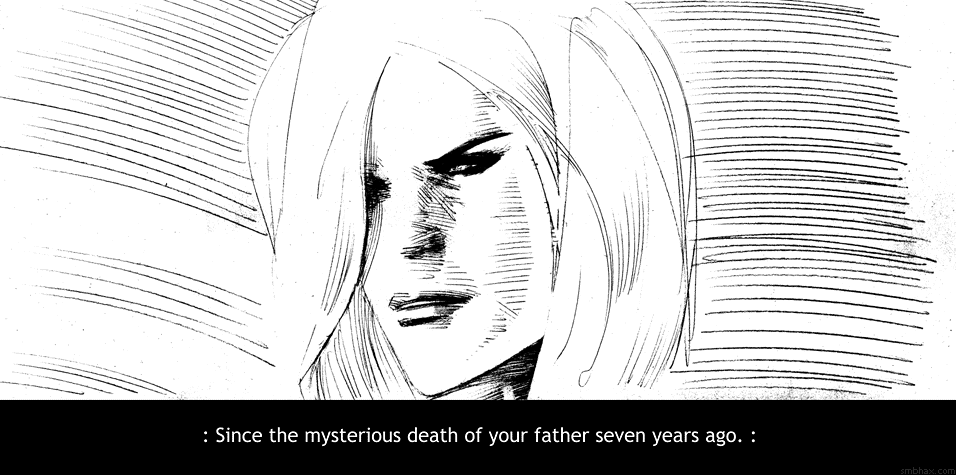
Added 2 new A* pages:Sorry about the uckiness of page 23; well I mean it isn't my best drawing, but then the contrast got kinda blown out because I had to compensate for the pencil having been sketched in too lightly, which has been a problem now and then so far in this episode's pencil-only odyssey. I tried to pay more attention to using sufficiently bold pressure in the next page, 24, for it to come through with more of a tonal range and less grunge, and I think that did work better, anyway.
Also comparing these two pages reminded me that with pencil I've really got to take an angle on the drawing in order for it to work out--I can't just sort of muddle into it and hope for the best, because without a direction--if you don't mind me mixing metaphors in a confusing fashion--the pencil is just way too aimless on its own, unlike, say, the brush, where even fairly random brush strokes still have some character of their own. On the other hand, given direction, it seems to me--for me, anyway--that the pencil can be steered to a wider variety of results than the brush; maybe this is due to the very anonymity of its mechanical line: it's easier to lose track of it in an overall design, so in a really composed pencil image you're less distracted by the pencil itself.
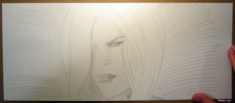
Or maybe that's all just silly talk, I dunno. I did try a few experiments today in going over the pencil versions with pen, primarily a Rotring Tikky Graphic 0.5, which is pretty much the only technical pen I've found that can keep up with a brisk drawing pace. Since I already screwed up the original version of page 16 of this episode with a failed pencil redraw, I tried converting that to pen; here's the actual page 16, the photo of the failed pencil redraw of it that I showed before, and the pen conversion:
That just about ends my pen curiosity, because although it scans a lot more cleanly, it can't do the subtle variations in width, texture, and tone that the pencil can do--and besides, I don't think I like the perfect cleanness of it; art shouldn't be completely clean and robotic-looking. : P
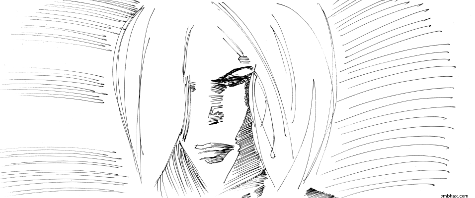
Not to mention that the redraw was just a bad drawing to begin with, so that wasn't quite fair to the pen, I suppose--but I don't want to ruin my good drawings. ;) So I tried one last pen-speriment with today's page 23, since I'm not too fond of that one, and...that one came out hideously, we're talking like the walking dead ugly here. Didn't really help that I thought I'd try using a much thicker pen--a Faber-Castell Artist Series Big Brush marker--for the hair, but really it was the awful uniformity of the shading lines I made with the Tikky across the face that just gave it a ghastly, spectral appearance, which I won't blight your eyes with.
So yeah, still stickin' with the pencil, still learning how to use it.
|