Added 1 new A* page:>_>
Excuse me while I go a little crazy.
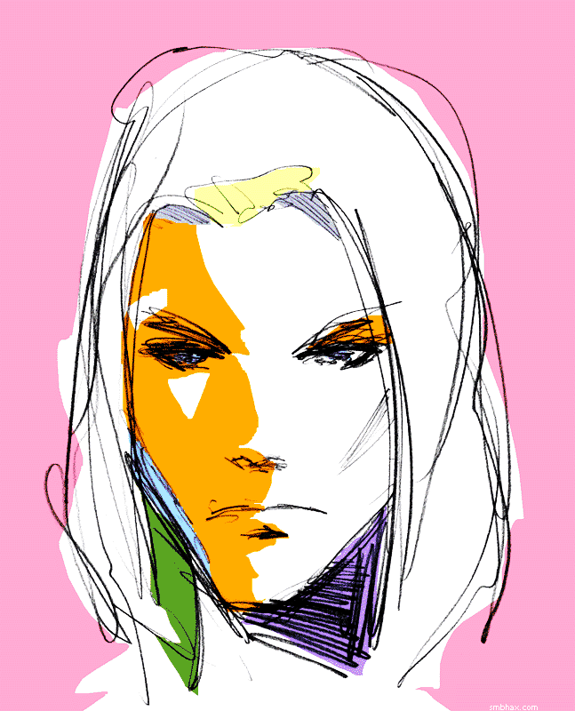
The thought that got me out of bed this morning was something along the lines of "maybe I could try throwing some planes of flat digital color over the drawings I did yesterday." After an hour or two of mulling it over over breakfast and various toiletries, the next pertinent thought was "what an awful idea that was, phew." Then I was fairly satisfied and was able to get on with some things, only a few hours later I got to thinking maybe I'd just play with it and have some fun. Hours later that resulted in this:
Then I thought hm maybe color's a bit much, but how about taking it grayscale or even dithered black and white? And that got me to through a rather bland gray one to a rather grand black and white one
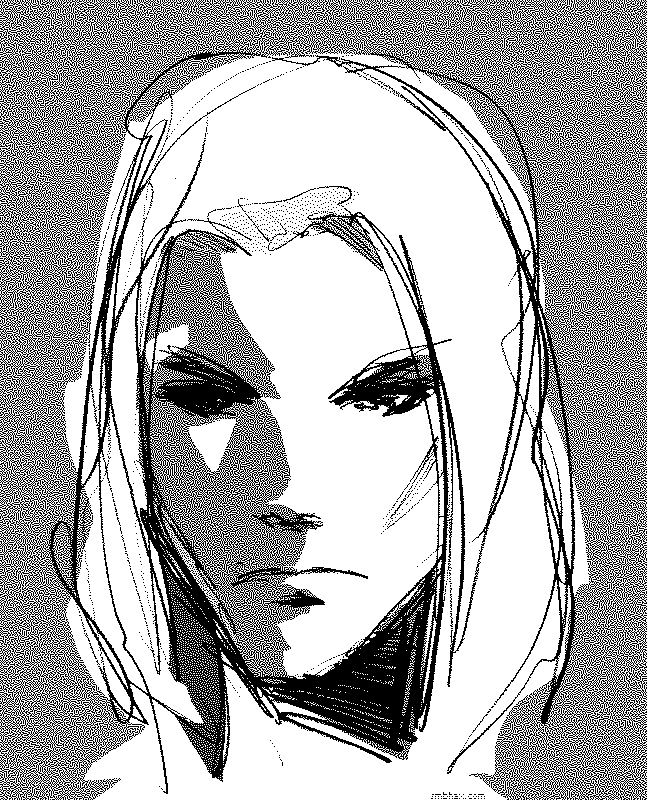
but the problem with that is that the dithering breaks things up too much at smaller scales
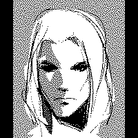
and it kind of falls apart. Besides which, my retinas couldn't deny, despite my ingrained habit of the past x years of wanting to be in black and white, that the color one was the one that was smiting them most mightily. They were smitten.
So I gave it a shot on an actual A* page. It worked out better than I'd thought it would--I've liked sort of flat, bright, abstract color like that for a while now--some nice examples that spring to mind are Kit Roebuck's completed sci-fi webcomic Nine Planets Without Intelligent Life and Matt Hollingsworth's colors in the current print comic Hawkeye (click the cover in the upper left corner to see some interior pages--these are all I've seen too, I can't afford comics : P). And of course if you're an old crab like me and remember working with GIFs in ye olde dialup days and having to optimize your limited colors so people could actually download them, you know that flat colors and sharp edges do quite well in technical terms on the web. So it kind of seems natural somehow even to this hardline black and white comic, I guess.
I'm not sure how I'm going to handle sequencing color palettes from page to page, my guess is I'll just wing it and it will be an awful fruit-loopy browsing experience for a while until I gradually learn to fit colors together across multiple pages. : P
~~~~~~
Oh yeah I was going to talk about how I did it--technical Photoshop details of the foolishness, I mean. The colors are all on separate layers, with the scanned pencil lines on a Multiply layer above them: I go down, make a new layer, pick a color that seems about right for the space I want to tackle, and fill in the whole layer with it (Alt+Backspace). I give the layer a layer mask, and usually swap it from white to black (CTRL+A, CTRL+X to select it all and cut it to the background color, X to swap foreground/background (white/black) if necessary) to make the layer invisible--alternatively, as I did in this one with that orangey color, I'll leave the full thing visible. Then with the Lasso Tool I clumsily (I'm just using my keyboard's tiny touch pad for this, I'd rather it be weird and snaggley and semi-abstract than nice and smooth with my tablet) select an area I want to fill or clear with current layer's color, and either cut to white in the mask to fill that area with the color, or cut to black to remove color from that area. Keep adding new colors on new layers and cutting into their masks until I've got sufficient color overload.
Ah but then there's the secret ingredient that makes it sing! Later versions of Photoshop are probably better at this, but anyway my ancient Photoshop 4's default color picker thingy is kind of weird and is good for exploring colors you might not have expected, but bad at making them vibrant. Or well probably I'm just bad at picking vibrant colors. So after all the colors are placed, one of the final steps, before converting it all to a 32-color image for exporting to a nice compact web file, is to create a copy of the image on a layer above the image, and set that layer to Hard Light blending mode. Suddenly the colors POP! Also it clears away weak lines and spots, sort of emphasizing the strong black areas, which is a plus. So yeah, Hard Light. Pew pew lasers!
There are probably tons of better ways to do this but whatever. : P
~~~~~~~
I suppose I will probably get sick of it all and go back to black and white after a week or so and then all the readers who survived the switch to freaky color will never forgive me. >_>
|