Added 1 new A* page:I have a new ink painting up for auction on eBay! It's called "Charged," and the auction is live right here.
This one is even bigger than the last one (24" x 18"), and I didn't plan to but ended up going kind of nuts with it and threw in not just black ink but also ink wash, plus two different white inks. So I hope you like it and maybe even are inspired to bid, 'cause I could really use the dough to support doing A*! Oh and here's a picture of the thing if you haven't already gone and looked at the higher-resolution one on eBay:
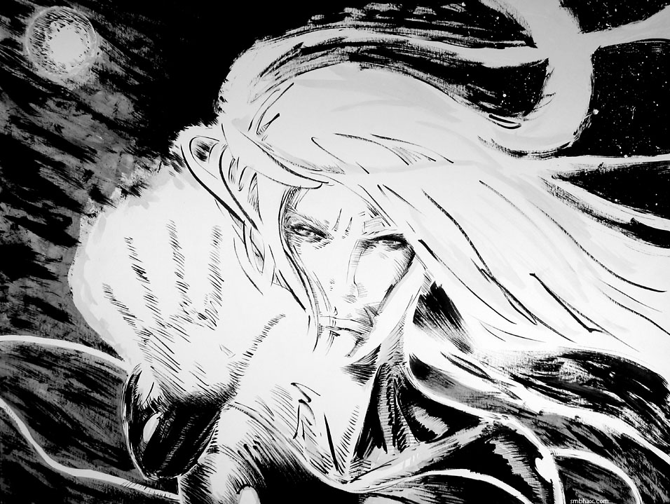
I don't know if Selenis will ever have an electrically charged gauntlet in the comic, but she sure does here--and winning it in this auction (or getting it from whoever does : p) is the only way you'll be able to enjoy it in fine natural detail (24" x 18" is pretty darn big in front of your face), because I'm not going to sell it as prints or anything. So anyway there's my pitch, I'll no doubt be bothering you about it slightly less but still a bit from time to time as the auction goes along over the next ten days.
~~~~~~
At the risk of breaking that time/space thing, I was fooling around today and also back over the weekend and found ways to pump up the color intensity of the daily comics even more (the two from last week have been updated 8 o). Also, I do think I'll get back to hitting two per day even with color (this simple color takes a little time I guess, but I also have to spend less time worrying over the pencil shading, so once I get the hang of the color thing it should end up taking about the same time as doing just the pencil), it's just that I haven't been managing my time so well for the past few working days, and uh also I'm still working out the coloring technique. Also the lines are super-sharp now, probably too sharp, but I kinda like how the thing comes out looking more computery this way...and anyway when I tried less sharp lines it made less visual impact and the effect on the lines from the light was reduced (currently lines in light color areas get kind of thinned and eaten away by the color, which helps with contrast in an unusual way) so I guess I'll stick with it unless I find some way to keep that while possibly smoothing them out just a tad.
|