Added 2 new A* pages:Things are hotting up, as the British say so charmingly.
Seems like I've been doing a lot of experimenting with my grays this week; one thing I've wanted to get more comfortable with is using them on their own, without black behind them. This seems to work well for Selenis' hair, for instance; in page 43 I drew her hair outlines in black, but the drawing was much clearer when I converted them to gray. And before that on page 42 I'd learned a good lesson, because at first I had three pretty complicated gray layers in the interiors of the figures--I think I was insecure about using them without black backing them up, so I kept piling them on--but that got confusing to look at, too, so I added a fourth layer of gray in broad, simpler shapes, and that came out so well on its own that I was able to ditch the previous gray layers and just go with the one simple one.
Say I made another important art history discovery in my perusal of Sydney Jordan's Jeff Hawke: he uses this devious intergalactic criminal "Chalcedon" in a few stories, and he doesn't draw attention to it, but he gave the character a special physical characteristic, aside from his unusual face:
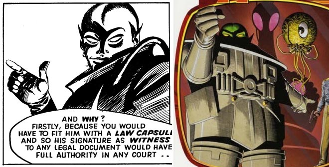
Quick ma, how many fingers? As you can see on the left, Jordan drew Chalcedon with six fingers per hand; but apparently the artist they got to draw the covers for the two volumes in this recent compilation, Brian Bolland, didn't notice that, and oops his rendering of Chalcedon for the cover, on the right there, is a few fingers short. Strange that everyone missed that, and particularly Bolland, who even collaborated with Jordan as ghost-illustrator of an unpublished Jeff Hawke story in 1977. And although Bolland is okay, wouldn't it have been both cheaper and closer to the spirit of the collection to blow up some of the old, actual Jordan art for the cover?
Well, here's some more Jordan art, just a panel I particularly liked:
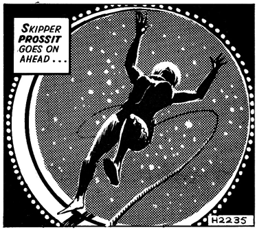
Jordan, good as he is at drawing men, seems less comfortable rendering women, and tends to give them shoulders like linebackers, but I still love the composition, lighting, and abstract ring of dots around the airlock in that panel from the 1961-62 story "Counsel for the Defense."
|