 | |
| |
|
|
view titles only (low bandwidth) |
| |
| The horror of space...news! | Oct 31, 2012 11:19 PM PDT | url |
| | |
Added 1 new A* page:How about a spooOoky space news roundup for Halloween? WoooOooo:
- The largest dark area on the Moon, the "Ocean of Storms," may be the scar from a massive asteroid impact maybe as much as 4 billion years ago that left a magma sea a thousand miles wide and hundreds of miles deep.
- That privately-owned SpaceX "Dragon" capsule that was the first private ship to take cargo to the ISS returned safely with some return cargo: "nearly 2,000 pounds of science experiments and old station equipment" and "nearly 500 frozen samples of blood and urine collected by station astronauts over the past year." With the Space Shuttles shut down, the Dragon capsules are the only vessels capable of delivering to and returning cargo from the space station.
- Over on Mars, the Curiosity rover analyzed its first scoop of Martian soil, using a technique called X-ray diffraction: "While X-ray diffraction has been around for a century, using the technology on Mars required years of work to scale down refrigerator-sized equipment into something that would fit into the space of a shoe box." So far, scientists have found that the sample it scanned "bears a striking resemblance to weathered, volcanic sand in Hawaii." Mars beach party!
- Based on readings taken over the past year+ by the Dawn spacecraft, scientists have concluded that the giant asteroid Vesta gets its dark coloration from carbon left on it by asteroid impacts. "It forces one to [suppose] most objects are contaminated this way, and this is the way the Earth got its water and organic material. It not only has implications for the surface of Vesta, but for most other airless inter-solar system objects."
|
·····
|
| |
| Once more into the bin | Oct 31, 2012 1:41 AM PDT | url |
| | |
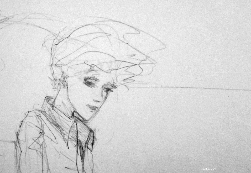
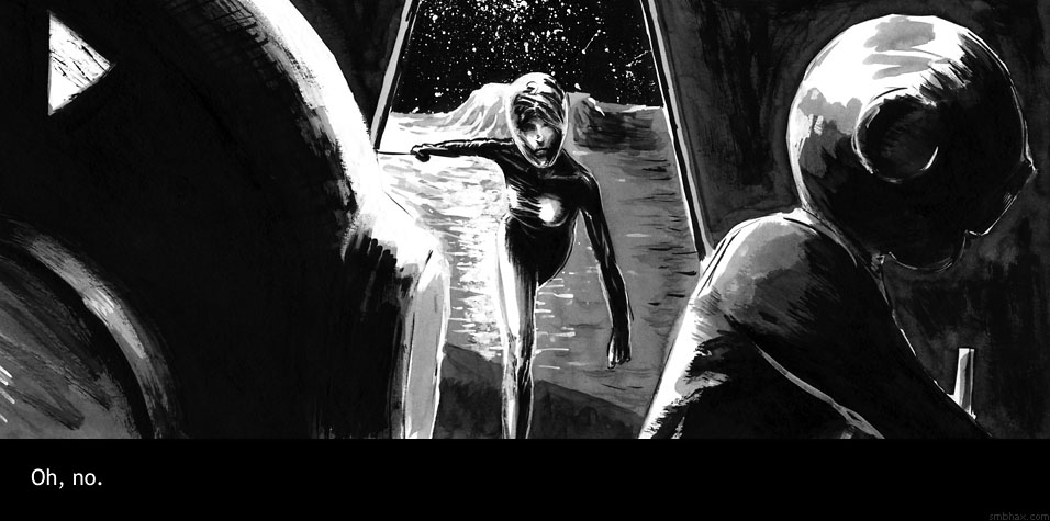
Added 1 new A* page:The first stab I took at this page:
But it wasn't quite exciting me enough so into the bin it went! Actually that's not quite true--it goes into my spare paper stack, so I can use the back to sketch on. :P
|
·····
|
| |
| A* art at the Dandelion Salon in Seattle | Oct 30, 2012 2:08 AM PDT | url |
| | |
Added 1 new A* page:I spent all afternoon playing with fishing wire in a hair salon today--that's right, my dad and I were hanging a new A* art show! This one is at the Dandelion Salon in Seattle's Wallingford neighborhood--they're on 45th, one block east of Stone Way--so we went with a hair theme for the pieces we selected. If you go there between now and the end of the year, you'll get to be up-close and personal with original A* art while you get your hair cut or your face facialed or whatever. Here are some views of some of the artwork hangin':


You could probably even ask them to do you like one of Selenis' 'dos!
|
·····
|
| |
| Supermassive Antarctic Seals! | Oct 27, 2012 8:24 AM PDT | url |
| | |
Added 1 new A* page:This isn't about drawing or space but darn it it's my blog and I can do what I want! :D I came across this tumblr post with photos of a leopard seal off Antarctica trying to give a penguin (it was penguin feasting season for the seals) to National Geographic photographer Paul Nicklen as he was taking photos. Wild stuff! Nicklen says:
One seal brought a penguin over to me. I didn't touch it; I just sat there and photographed. The penguin took off, and the seal grabbed it, brought it back to me, and put it on my camera dome again.
Eventually the seal got upset and started blowing bubbles at me. It was the most fascinating interaction I've ever had. |
And look at the size of that seal! Just dwarfs the photographer. Here is a photo of I think a smallerish one
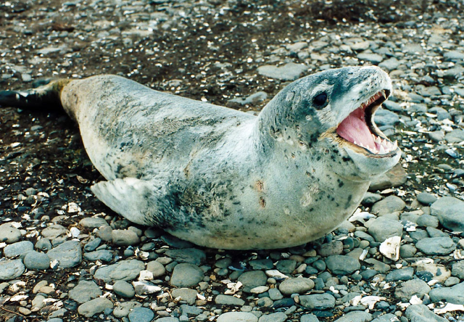
image by B. navez (source)
but in fact leopard seals get up to twelve feet long!
There's a larger seal species in Antarctica, though: the southern elephant seal back in 1913 was measured at 22.5 feet long! But here is a cute baby southern elephant seal picture because everyone likes those:
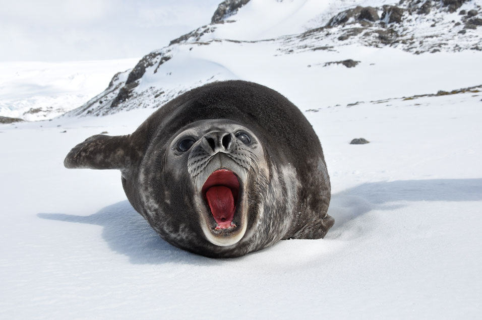
image by Serge Ouachée (source)
D-aww!
|
·····
|
| |
| A hot & strange Saturn storm | Oct 26, 2012 5:15 AM PDT | url |
| | |
Added 1 new A* page:A friend of mine pointed me over to this new NASA article with some analysis of the big white storm on Saturn that started in 2010. Such storms only happen every 30 years or so on Saturn, and this is the first one we've been able to observe up close, thanks to the Cassini probe orbiting the gas giant. The storm, which covered a range of latitude on Saturn as tall as North America and grew to wrap around the entire planet, dissipated in 2011; you can see the still large remnants as a bright swirly red and yellow cloud band in the upper part of this false-color Cassini photo from that year:
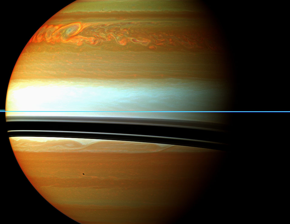
image by NASA/JPL-Caltech/Space Science Institute (source)
Crunching Cassini's readings of the storm shows that it was up to 150 degrees warmer than normal for Saturn's stratosphere; it also contained vast amounts of ethylene gas, which normally isn't seen on Saturn--its origin is a mystery.
The NASA article has some more info and a partially goofy movie about the storm, and this A* article from last November has a time-lapse photo sequence showing the storm's year-and-a-half lifespan.
~~~~~~~~
The Guardian just posted a pretty cool Voyager 1 and 2 photo gallery, with some great photos from the creation, launch, and early solar system exploration of those two space probes--now pushing the known boundaries of our solar system--from their youthful days back in the 70's and 80's. I got the link from this tumblr post.
~~~~~~~
I ran across a blog article thing about a NASA proposal to use solar electric propulsion to explore the inner solar system; solar electric propulsion, or "SEC," works by "generating electric power from solar arrays which is used to give a positive electric charge to atoms inside a chamber which are thrust out by magnets." This would allow spacecraft to have a long active lifespan; the trick is to find a way to generate the sufficient power from solar panels.
~~~~~~~~
Tried staying loose with today's page--thought I got a little too uptight with parts of Val yesterday. :P
|
·····
|
| |
| The ESO's 9-gigapixel galactic bulge survey | Oct 25, 2012 6:29 AM PDT | url |
| | |
Added 1 new A* page:The newest, highest-detail infrared survey of the galactic core:
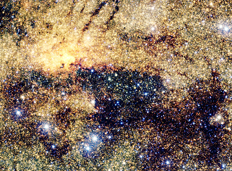
image by ESO/VVV Consortium, acknowledgement Ignacio Toledo, Martin Kornmesser (source)
^ Our galaxy's central supermassive black hole, Sagittarius A*, is in there somewhere!
That view is the highest zoom available of the gold spot you see in the top center of the full survey area seen below (compared with a visible light view of the same region, beneath it):
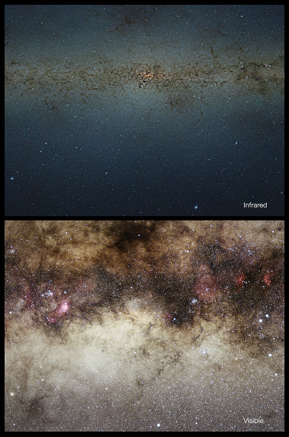
image by ESO/VVV Consortium/Nick Risinger (skysurvey.org), acknowledgement Ignacio Toledo, Martin Kornmesser (source)
The survey covered the entire galactic bulge (that's the bulbous center area of our galaxy), combining a mosaic of 1929 hours of observing time with the ESO's "4.1-metre Visible and Infrared Survey Telescope for Astronomy (VISTA)" telescope into a "nine-gigapixel" image; the detail of the core comes from the highest zoom level available in their Flash-based zoomable version; it and the site as a whole is running pretty darn slow right now, so I had to sit there waiting for a few minutes for it to resolve...hopefully it'll be a little more responsive by the time you read this, because there's a lot of stuff to pan around and see.
The ESO claims that the survey "contains more than ten times more stars than any previous study and it is the first time that this has been done for the entire bulge"; of the compiled 9-gigapixel mosaic, they say
| The image used in this work covers about 315 square degrees of the sky (a bit less than 1% of the entire sky) and observations were carried out using three different infrared filters. The catalogue lists the positions of the stars along with their measured brightnesses through the different filters. It contains about 173 million objects, of which about 84 million have been confirmed as stars. The other objects were either too faint or blended with their neighbours or affected by other artefacts, so that accurate measurements were not possible. Others were extended objects such as distant galaxies. |
They say they've already used the survey "to compile the largest catalogue of the central concentration of stars in the Milky Way ever created." I wonder if they've got Nena's sun in there yet. :)
~~~~~~
It's nearing the end of the month, which in this case means I have one art show wrapping up, and another one about to kick off. If there was an A* page whose original art was marked "held" that you were waiting on, check it now, because it the show it was in is ending and it might be available! The new show--also in Seattle--will have a hair theme, whee! The plan is to get it hung on Monday, so I'll probably have more to say then~~!
|
·····
|
| |
| Missing comet Boethin; Opplopolis comic | Oct 24, 2012 5:06 AM PDT | url |
| | |
Added 1 new A* page:Here's an interesting article about the asteroid the Deep Impact spacecraft was supposed to go after in 2007, instead of comet Hartley 2; the original plan was to go after the 11-year short-period comet Boethin, which had been discovered in 1975 and was seen again in 1986 as its elliptical orbit brought it back around toward the Sun. But Boethin...was never seen again.
| Whether because of the gravitational pull of a nearby planet, the pressure of pent-up gas from sublimating ice or some other mechanism, comet breakups are rather common. One study had estimated that short-period comets such as Boethin each have a better than 3 percent chance of falling apart in any given century. |
~~~~~~~~~
The person or people behind the quietly lovely, side-scrolling sci-fi webcomic Nine Planets Without Intelligent Life is/are back with a new webcomic, Opplopolis. It's early yet and I'm not sure if it's going to be science fictiony, but there's some kind of mystery, and words, and oh the colors, children!
(^ That tip, incidentally, came from the author of the silent, fantastic, black and white, and sometimes macabrily (okay that isn't really a word) gory webcomic Stupid Snake.)
|
·····
|
| |
| NASA gravity wave hunt; meteorite doorstop | Oct 23, 2012 6:08 AM PDT | url |
| | |
Added 1 new A* page:If I recall correctly, there have been some attempts to detect "gravity waves"--waves of gravitational force emitted by pulsars, black holes, colliding galaxies, or other massive bodies--but apparently they haven't been too successful, supposedly because the gravitational waves are too weak for their influence to be detected by traditional means. NASA is working on a scheme for a new kind of detector, one that would take advantage of one of those wacky quirks of quantum mechanics, according to this article:
The U.S. space agency has funded the possible solution, called atom interferometry, so that it might someday enable a mission consisting of three identical spacecraft flying in a triangle formation between 310 miles (500 kilometers) and 3,107 miles (5,000 kilometers). If a gravitational wave swept through the area, the spacecraft interferometers would sense the tiny disturbances.
[...] Researchers would first fire a laser to slow and cool the atoms down to a frigid temperature near absolute zero (minus 273.15 degrees Celsius), so that the atoms behave like waves rather than particles. Then they would fire more laser pulses that put the atoms into a "superposition of states," which allows them to exist in multiple states simultaneously.
The superposition means a single atom can split into different states that exist independently and go flying off on different trajectories like separate particles, before they recombine at a detector. If an atom's path is altered even a bit by a passing gravitational wave, the atom interferometer can detect the difference. |
Aside from being able to detect stuff like black holes, which of course is cool but not immediately practical, perhaps, there's the potential for such technology to make super-sensitive sensors usable in airplanes or submarines.
~~~~~~~~~~
A Tennessee family's generations-old doorstop--a funny rock found by the current mother's grandfather in a cow pasture near Tazwell, Tenn.--turned out to be a 4.5 billion-year-old meteorite--just about as old as the Earth itself! They were tipped off that there was something particularly special about the primordial stone when it set of a metal detector something fierce. It's thought to be part of a group of meteorites first found near Tazwell in 1853; this one is 33 pounds, which makes it the second largest of the bunch found--the largest weighing in at 100 pounds. So there you go, a surviving chunk of the early solar system could be sitting right there on your doorstep.
~~~~~~~~~
As part of my ongoing quest to show you webcomics that are much nicer-looking than mine, there's Space Mullet, a sci-fi adventure with aliens, trippy dream sequences, some pretty gory fight scenes, and a very nice black and white brushy art style, digitally shaded with a tasteful blue. Some nice dry brush technique in there, too.
~~~~~~~
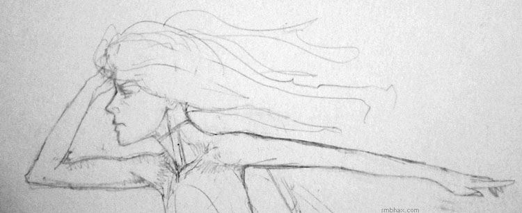
Oh and pencils for today's page--a bit different this time around as I wanted to make sure I got Selenis' disembodied leg in about the right place, so I put a second piece of paper below the actual page, and continued the layout sketch there so I could get a rough idea of where her leg should go relative to her torso:
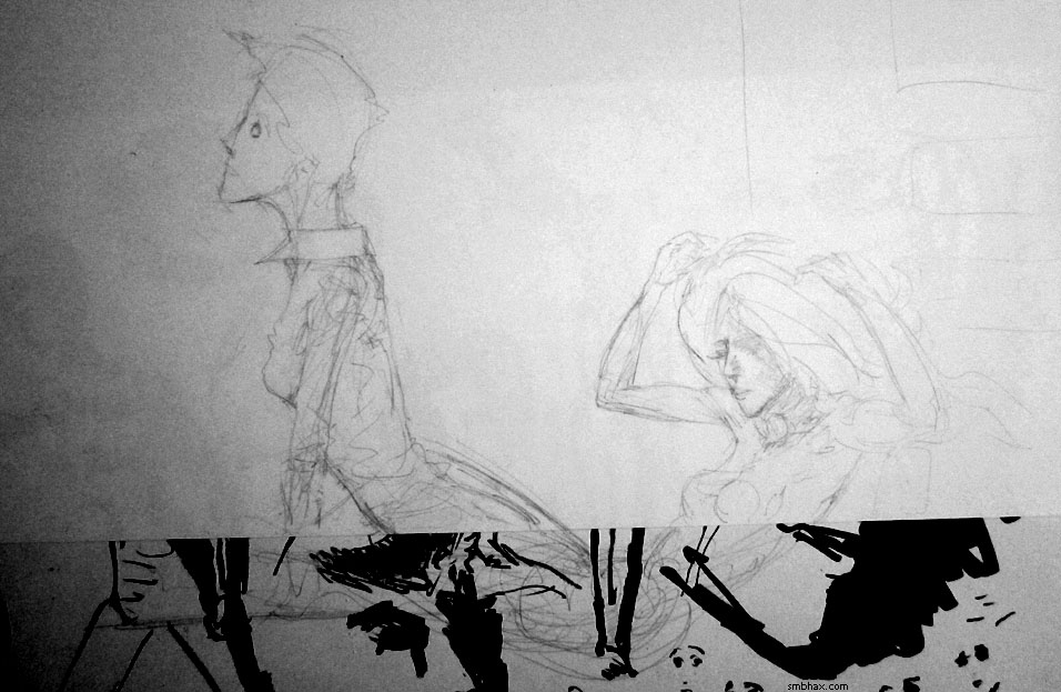
And then inking her face went way different than I'd planned, but eh probably came out more interesting for all that.
|
·····
|
| |
| NASA's X1 Exoskeleton | Oct 20, 2012 10:18 AM PDT | url |
| | |
Added 1 new A* page:NASA's been showing off their new "X1" exoskeleton, which they say could be useful for helping those with disabilities to walk, as well as potentially helping astronauts in heavy tasks and long-term space missions. Currently the exoskeleton is just for the legs. There's a video of it in action here, and here are a couple members of the NASA engineering team modelling it:
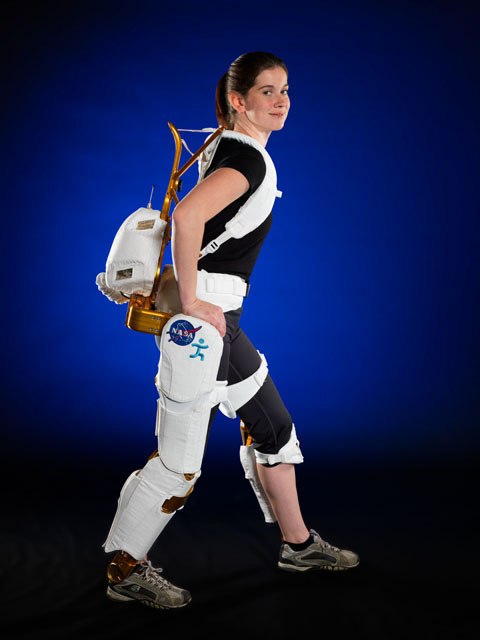
image by Robert Markowitz for NASA (source)
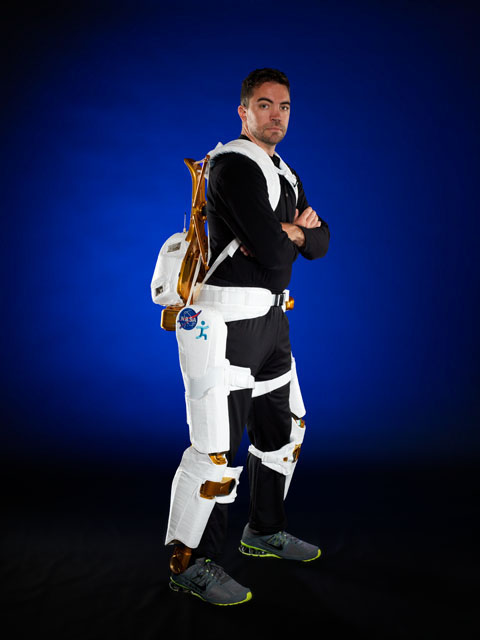
image by Robert Markowitz for NASA (source)
If the gold color of the metal parts looks familiar, that's because it was developed from Robonaut technology! Still waiting for that thing to go all rampage on the International Space Station.
~~~~~
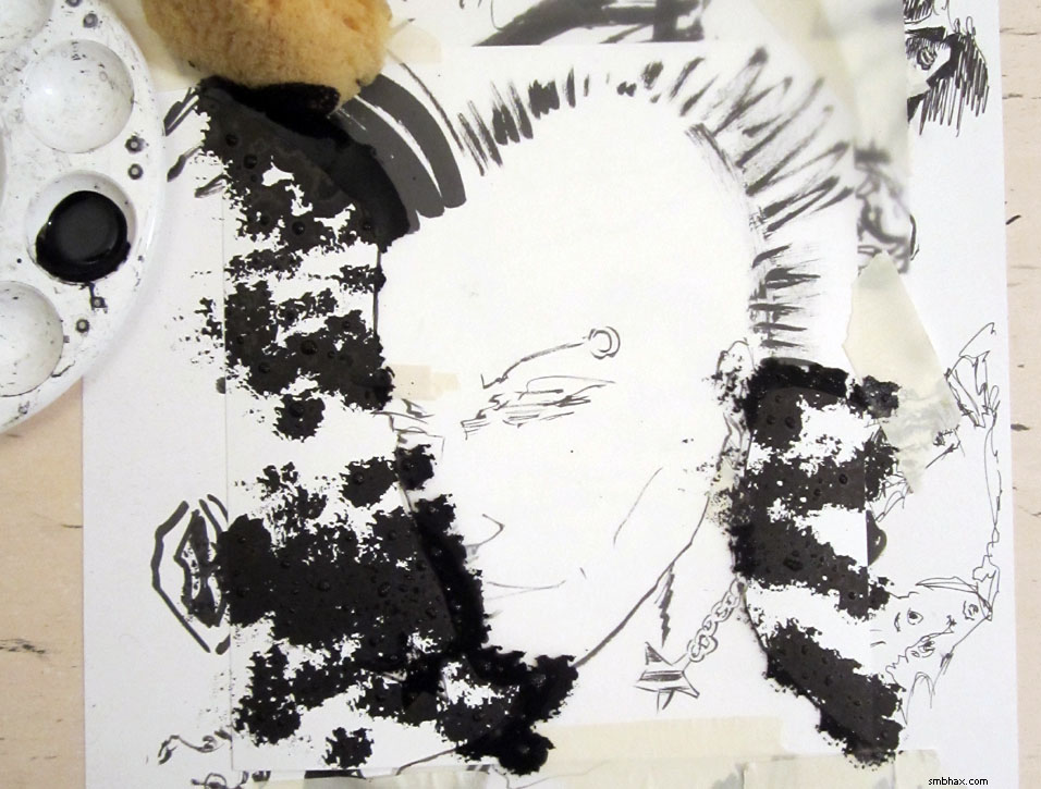
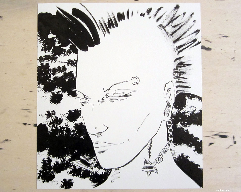
Oh goodness, I need some kind of automatic ink spattering machine. My black ink is thinner than my white ink which made spattering it all over the background take a long time. A long messy time
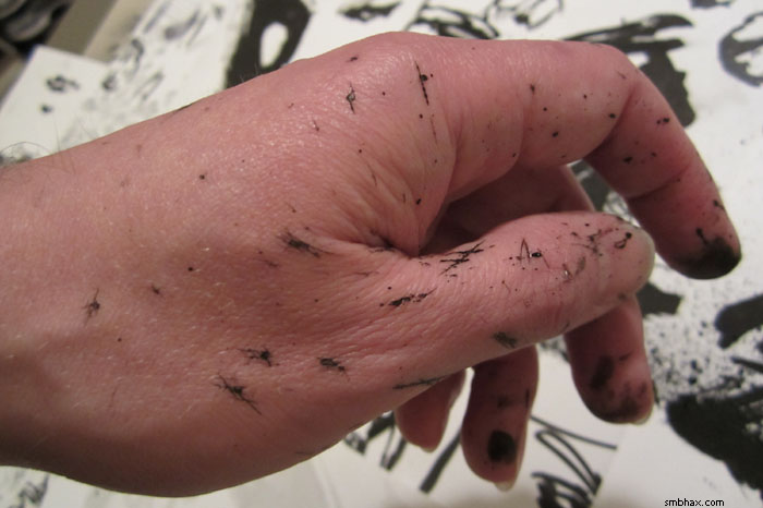
Broke three nibs in the process, too! Still though it is kind of a way to get a Zip-A-Tone-like effect--and one with a lot more flexibility--while keeping it all in the original single piece of paper and one type of ink, which is handy. Hm. Well maybe if I do this again I'll give the ol' toothbrush method a try, that might be faster.
|
·····
|
| |
| Brush drops and spatter shadows | Oct 19, 2012 8:42 AM PDT | url |
| | |
Added 1 new A* page:I know I'm posting too much about boring art stuff, but each week I promise and then fail to keep myself to a schedule that would give me time to both sleep AND post about something I'd actually have to research a bit. Sooo some more art excitement!
I broke a brush today! Perhaps I was discombobulated by the following dilemma: which pencil layout to ink for today's page?
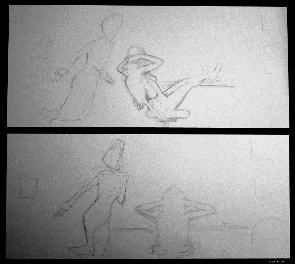
Yeah I'd waffled and ended up doing two pencil layouts: in the first I made the somewhat mistake of second-guessing my initial idea, thinking Selenis seen directly from behind lounging in the chair would be a boring or even indecipherable silhouette, so I turned her a bit to the side; that in fact ended up seeming rather boring, so then I did another sketch, sticking to my initial directly-behind idea--after a few redraws to try to get it halfway right--and that did I think end up being a bit more direct and memorable somehow. So after much wibbling and wobbling I sat down to ink that one.
I inked up my big Japanese sumi-e "Haboku" brush to lay down some of the larger black areas, moved it over my paper--and promptly dropped it. Eep! It somehow managed to avoid hitting the page directly, bounced off the back of my hand--mm, inky--and my drawing table, painted a streak down the side of my bookshelf, kicked off my hand-mirror, knocked a ruler over, and finally came to rest among the eraser shavings on my ancient brown shag carpet.
After a bit of a rinse-off--and clean up of various parts of my room--the brush seemed fine, but when I was all done and went to clean it up, I noticed the brush head sort of shifted a bit--the whole head was loose, and didn't take much coaxing to detach entirely:
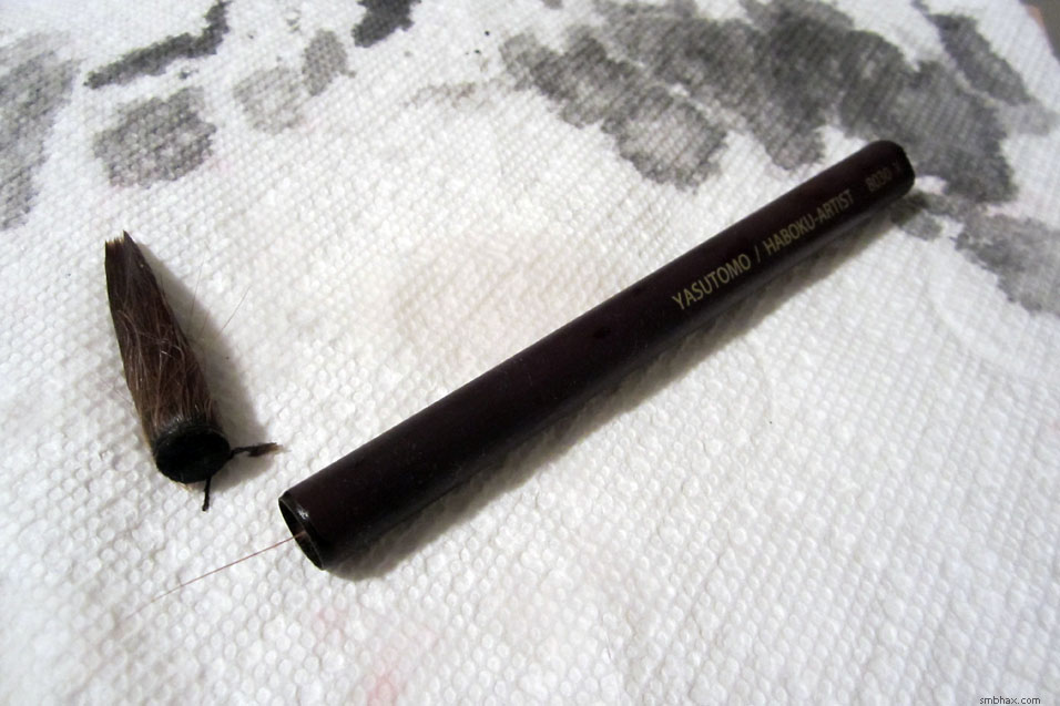
That's one ex-Haboku-X! This was the longest I'd used one, since I don't need them for precision work now that I'm using sable brushes for that, so I used it well past the time its tip ceased to hold a point--which isn't very long with these things. I'd kind of been wondering how long it would last--watching it shed a hair every day or two--and now I guess I know. As you can see in that photo, the head has only a few millimeters of blunt end with which to seat itself in the hollow bamboo handle; there was some kind of glue tasked with doing most of the holding, but I guess it just wore out after use, repeated washings, and maybe tonight's eventful drop. Not too surprising given the rapidity with which these things lose their point and bristles, I suppose. But they're pretty cheap, so I guess it works out. Good thing I thought to stock up with two or three spares!
Oh yeah while the brush head itself didn't hit the page, some ink spatter did--you can see it mostly around Val's left hand. That wasn't too bad, in fact I kind of liked it, but later I thought it looked a little lonely, and besides I could use a way to sort of break up the white/black area to her lower left a bit, so I thought I'd accompany the accidental black spatter with some white spatter. That worked pretty well I think, except I forgot how messy little white ink spatters on white paper make when it comes to trying to get a clean scan--they leave shadows. I should have masked off most of the page when going to do the spatter, but I thought I wanted a kind of rough and wild look anyway--and then had a lot of white-on-white spatter shadows to tidy up after scanning. Mmmaybe I'll mask some areas off next time.
|
·····
|
| |
| How'd Frank Miller draw Sin City | Oct 18, 2012 9:13 AM PDT | url |
| | |
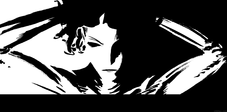
Added 1 new A* page:Why yes, I have been re-reading Frank crazypants Miller's Sin City comics lately. He does that big-black-and-white-areas-defining-form-dramatically thing so well, you know. I hadn't started out today's page intending to do something so close to that style; it was going more regular with line work and all, but parts were frustrating me--as usual--and I was trying to fix them and it was just making things worse, and finally I thought I'd better just set it aside and start over from scratch. But as often happens, while trying to start a new sketch I couldn't get the first one out of my head, and I kept looking back at it, and getting nowhere with the new sketch, and eventually there seemed to be no choice but to take the first try back up. So I started covering up a lot of things in it with white ink, and bringing black areas together into larger black areas with black ink to tidy things up, and eventually I just went kind of full bore with that approach and this is what happens, apparently--the main ingredients being: 1) frustration 2) time 3) buckets of white ink. But it's kind of nice because it really does boil things down to the core essentials, without those distracting line things all over.
It was so much easier to get that effect back when I was working digitally with the lasso tool. :P As I've been reading through the various collected Sin City volumes, I've been continuing to scratch my head as I've tried to figure out what tools Miller was using to get the look he got; I haven't been able to find anyone talking about it online. I don't think it's just brush work, because when he works all brush, for instance in this promotional sketch, it definitely looks a lot brushier--it's really hard to get hard, hard lines with a brush, at least as consistently as he seems to in most of the Sin City stuff.
For a while I was thinking he was using markers / tech pens, which a lot of artists use these days--Mike Mignola may be the most well-known example of a pure marker artist. Markers could account for the single-width "dead" lines he uses sometimes, like here around his magical ninja girl.
BUT! If you look closely into the black areas in scans/photos of his original art, like you can here, you notice that the swirls and patterns inside his big black areas definitely don't look like the even, regular streaky lines of a marker--they definitely look like they were filled in with a brush. So does he do just the edges with a marker, then fill them in with a brush? Well, I don't think so, because you'd most likely see a difference right around the edge between the marker ink and the brush ink--or at least an indication of where the two inks overlapped, and I can't see anything like that in these images of his originals; you do see slight variations at some of the edges, but it looks more like the variation you get in brush work between an area painted earlier and an area painted later. The blacks look very smooth from edge to edge, like here, and sometimes, like here, up close the thin lines look quite a bit more irregular than you'd expect from a marker.
And there are more arguments against his having used markers in Sin City. For one, this promotional sketch he did on the road, definitely in marker--which is a common tool used by comic artists for executing sketches on the road or at cons, because they're nice and quick and portable--looks way different from his actual Sin City comic page work. And secondly, he would have learned a lot about inking from the long partnership he had with veteran inker Klaus Janson--it was Janson who inked Miller's pencils in Daredevil and Batman: The Dark Knight Returns--and Janson, if the inking book I have that he wrote is any indication, is very much a devotee of the old school when it comes to inking, which means dip pens and brushes rather than markers for inking.
And if you look very closely at those "dead" lines of Miller's, say here, you can find ones that *do* have some width variation, like you'd get with a dip pen. And my final point I'll just toss in there is that in all of these you can see that he used a lot of white ink, which would almost certainly have to be applied with a brush.
And then tonight it occurred to me that with computer processing you can get brushy lines to look harder. The typical processing done to scanned ink lines, for instance, is to Threshold them, which is a Photoshop operation that converts them from the scanned grayscale range to pure black and white--that gets rid of little smudges and differences in black inks and all that, and sharpens up the edges of everything. Here's a version of today's A* page processed with a Threshold operation (before being scaled down from its 1200 dpi scan size), for instance:
You'll notice that it looks "harder" than the official version of the page: the Threshold has converted the little grayish bits here and there in the scan--like the zone on her left check where I let the black and white ink merge a bit, or the very light gray under her right eyebrow where the paper dimpled slightly between wetted areas, lifting just fractionally off the scan glass and thus receiving less light and coming out marginally darker--into either pure black or pure white. It's much quicker to use Threshold rather than what I'm using now, which is to make sure the areas I want white and black in the scanned version area actually as white and black in ink as I can make them, then--after scanning--using a Level adjustment to shift dark grays to pure black, and cleaning up scanned ink ridges, dust, and other impurities in the white areas by hand. Threshold is quicker than that, but the result is harsher and less organic than I prefer for my work, and you lose the subtleties and shadings of those little grays.
So why am I talking about it? Oh yes, because it finally occurred to me that a lot of the lines and shapes in Sin City that had been puzzling me probably *were* done with brush, but Threshold or similar processing ended up giving them the harder look seen on the printed page. And besides that, I think he did do a lot of work with a dip pen with a stiff nib, which would let you do dead-ish lines if you wanted--and besides all that, I think he just did a lot of really, really careful brush work. The result *looks* simple but it's actually achieved by pretty painstaking work, both conceptually and in its execution (I mean, when it's done right, not my flailing :P).
Oh, one last comment about Miller's Sin City work. I hadn't noticed this when I originally read them some decades ago, but he varies his approach to the art slightly from volume to volume, even though they're all (primarily) black and white. In the first four, for instance, he goes through various stages of experimenting with different line widths, detail levels, and black/white balance. The fifth, Family Values, which I don't think I read before (I guess I went off to college or something after the fourth volume came out back in the day--my brother had been the one collecting them, so I'd been reading his copies) and which I just finished, is the most radical departure so far: he starts going nuts with crosshatching and white ink spatters. Crosshatching definitely isn't his strength at this point so it will be interesting to see what he does in that regard in the last two volumes.
|
·····
|
| |
| Cardboard bikes, sketching, and...Thoroki? | Oct 17, 2012 10:00 AM PDT | url |
| | |
Added 1 new A* page:Here is an interesting article about a super-strong, potentially super-cheap cardboard bike created by an Israeli inventor. Looks a little uncomfortable, maybe, but hey whaddaya want in a disposable bike? :P
~~~~~~~
Detail from the pencils for today's A* page:
It interesting (to me :P) to compare this with yesterday's page, since I used fairly similar approaches with regard to the black and white treatment of Selenis and of the background; but although the drawing for today's page is more intricate and precise, I think yesterday's was more successful, because I figured out the distribution of white and black areas pretty well before starting in with ink—unusually well for me, in fact. Today's was more like usual, where I haven't quite figured out exactly which parts will be black and which will be white, and kind of feel it out as I go; this tends to end up with areas shaded in multiple stroke directions and types, which is a bit messy looking, more white ink corrections, which is time consuming, fewer smooth white/black outline transitions, and a less cohesive, less organic feel to the piece overall. So I should probably try to figure out the black and white mapping more clearly before starting the pages, eh, self? Yes.
Although admittedly, even with yesterday's page, I hadn't decided quite how much black to use for Selenis' suit until I got into doing it. So it's also nice to have a little luck where your first try happens to work out!
~~~~~~~
Speaking of figuring out what you're going to do before you start, I wanted to do a nice big black and white ink piece of some kind over the weekend, and I sat myself down and tried sketching something out...and tried and tried and came up with nothing that worked. First time that's happened, I think! And I think maybe the problem was again an issue of not having figured out what I'd be drawing—in this case not even having a subject in mind! So I found my pencil just trying to draw more or less random faces and figures, not having in mind anything in particular, but wanting this unspecified subject to be somehow dramatic, and in a neat, detailed way...and apparently that just doesn't work. I had to admit defeat.
In retrospect, I probably should have just drawn one of the two characters in our current A* scene—that probably would have given me enough to build from. But I was also kind of tired I guess and that didn't occur to me until later. But I didn't want to go to bed not having managed to draw anything on an evening where I'd planned to get something drawn, so eventually I grabbed a big marker and just did a doodle—which is the art form probably best suited to drawing when you don't have anything particularly in mind! Here's what came out:
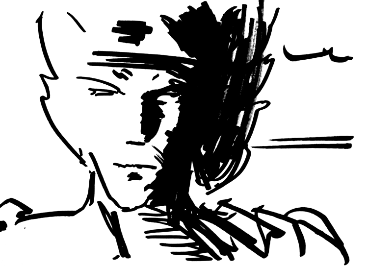
Now...as near as I can figure, that's sort of a hybrid of Marvel Comics' versions of Thor and Loki? Thoroki? I dunno. I think the only thing that had gone through my head when the marker started making marks was this video I watched months ago of Walt Simonson sketching a Thor head with a big marker in his usual lively linear style, and specifically of how he just whipped out those big helmet wing things.
Oh say that's the same marker I was using, now that I look at it again—a Faber-Castell PITT "artist pen big brush." I bought a ton of these things back in that marker phase I had last episode, when I got to thinking I'd be doing the whole comic in markers. So right now I just have boxes of them taking up a good chunk of a shelf in my art supply cupboard of shame. Might as well doodle more with them, I guess! They're definitely quicker and easier to play with than a brush, at any rate, even if they can't make the same variety of marks and their ink can't get as dark.
|
·····
|
| |
| Giant-size, ad-free-ish A* comics for all | Oct 16, 2012 8:22 AM PDT | url |
| | |
Added 1 new A* page:Particularly since entering this latest phase of experimenting with pure black and white in the comic, I've kind of been obsessively scrutinizing it, and I couldn't help noticing that the colorful, flashing ads beneath it were making that more difficult than it should be. So I've removed them, and since that constituted one of the main features of A*'s subscription service, I've gone ahead and made the other main subscription feature--large, 1080p HD-sized versions of the comics--free to everyone as well; you can switch to the king-sized version of the comic, and back again, with the link beneath the comic's lower-right-hand corner.
Making that stuff free made the subscription service pretty much obsolete, so I've ended it and refunded the lovely readers who'd subscribed. Incidentally, I also realized that the browser cookie that saves your preferred comic size setting wasn't lasting through browser restarts, which is embarrassing since that was a feature I'd mentioned as a selling point of the subscriptions on several occasions--and could have sworn I'd tested successfully multiple times! Dah. Anyway that's fixed in this free-for-everyone version, so if you set the comic size to the large size, close the browser, then start it up and come back to the site at some point, it'll come right up in your preferred viewing size, like it was always *supposed* to for subscribers.
There's still one horizontal ad at the bottom of the comic and news archive pages. The social networking bar that used to be under the ads that were under the comic--with links to A*'s Twitter, deviantART, Facebook, G+, Tumblr, etc--has moved to the "about" page, which has also been reorganized and tidied up a bit.
I hope everyone's happy with the changes (and that you'll let me know if you aren't!!). I feel like this brings the comic back to its original design intent, which was that of being a very intense, focused, cinema-format experience without colorful distractions, where you could really concentrate, if you wanted, on each panel. I think it will make new visitors much more inclined to stick around and actually read through it--but I guess we'll see!
|
·····
|
| |
| NASA/SpaceX burn satellite; "diamond planet" | Oct 13, 2012 8:49 AM PDT | url |
| | |
Added 1 new A* page:A few days back I mentioned a SpaceX Falcon 9 rocket having taken the first American robot commercial cargo module to the International Space Station, and that during launch one of its 9 engines failed, but the other 8 compensated.
Well, it got the cargo module to the ISS all right, but it turns out that it had a secondary mission not mentioned earlier. See, after launch it got itself to its target 202 mile-high orbit, then it spent the next two days going up another 48 miles to meet the ISS and deliver the cargo module. That went fine, it seems. But after that, it had an Orbcomm "experimental communications satellite" to deliver to a 466 mile-high orbit--only, the engine malfunction during launch had forced it to burn a little more of its kerosene and oxygen fuel than planned, so it was calculated to have only a 95% chance of successfully reaching the higher orbit--sounds like pretty darn good odds, but since a 99% chance had been stipulated in SpaceX's agreement with NASA before such an operation would be allowed to take place, they were not given the go-ahead for that, and the satellite had to be allowed to fall back to Earth, burning up in the atmosphere. Hm!
~~~~~~
Exoplanet "news" is pretty much all wildly speculative. How wild? Welllll....there is for instance a new article about a planet that's supposed to have been found around a star 40 light years away, weighing in about twice as massive as Earth, and that some scientists apparently think is about a third diamond. Yeah, diamond. The thing is, "exoplanet" stuff is all based on extremely small wobbles in little points of light or whatnot, and the claims built up on calculations made on those wobbles--which I think have a pretty high degree of error--get pretty wacky. But here's the article in case you want to check out the hype and see the silly cutaway drawing of the "diamond planet."
|
·····
|
| |
| A near-ish asteroid miss and a Martian hit | Oct 12, 2012 9:39 AM PDT | url |
| | |
Added 1 new A* page:A 56 foot / 17 meter asteroid will pass within 59,000 miles / 95,000 kilometers of the Earth today (Friday, I mean), according to this article, which mentions that that distance is about a quarter of the distance from Earth to the Moon. There will be live web broadcasts and so forth if you're into that kind of thing. This asteroid was only just discovered on October 4th! And another, even bigger asteroid already went by this week, although farther out: "On Sunday (Oct. 7), an even larger space rock the 100-foot-wide (32-meter) asteroid 2012 TV passed Earth at a range of 158,000 miles (255,000 km), or about 0.7 times the distance from Earth to the moon. The moon is on average about 238,000 miles (383,000 km) from Earth."
~~~~~~~~
A batch of asteroids originating from Mars landed in the Moroccan desert last July; they're called the "Tissint" asteroids after the village near their landing spot. According to this new article, scientists examining one have found its primarily basalt and olivine (an olive-green crystal) structure surprisingly shows that it contains materials from both the surface and interior of Mars; one conjecture is that "the rock's cracks and fissures were infiltrated by fluids washing down from the Red Planet's surface."
The asteroid also contains black glass, and, sealed inside that glass, bubbles containing small amounts of the Martian atmosphere; that means that those bubbles survived the cataclysmic event that blew them into space, the hot plunge through Earth's atmosphere and the landing in the Moroccan desert, and the ~700,000 years of drifting through space in between; that age was calculated by measuring the asteroid's content of certain isotopes of helium, neon and argon, which are presumed to have been created by cosmic ray collisions in interplanetary space.
3/4ths of all known Martian asteroids have been dated to 700,000 years in space, in fact, suggesting they were all created in some energetic event on Mars at that time.
|
·····
|
| |
| Radium: (maybe not so) good for what ails ya! | Oct 11, 2012 5:36 AM PDT | url |
| | |
Added 1 new A* page:You may recall that a year ago, at the bottom of a really long news article, I talked about the "Radium Girls," who were factory workers who painted the glowing marks on wrist watches in the 20's--the paint achieving its glow on account of it containing the radioactive element radium, which is not something you want around you or on your skin or in your mouth, which is where the workers were encouraged to put it, using their lips to keep their brush points sharp. Well although in some quarters it was known that radiation wasn't happy fun times, radium was in use in various consumer products as late as the 60's, and a new Atlantic article entitled We Used to Put Radium in Coffee tells us about some of the other things it was put in, like chocolate, toy "radiumscopes," toothpaste, and cosmetics. Yes, thousands (millions?) put some "zip" in their day with doses of "invigorating" radium--though we can *hope* that most of those products were fakes that had no actual radium in them! :o
~~~~~
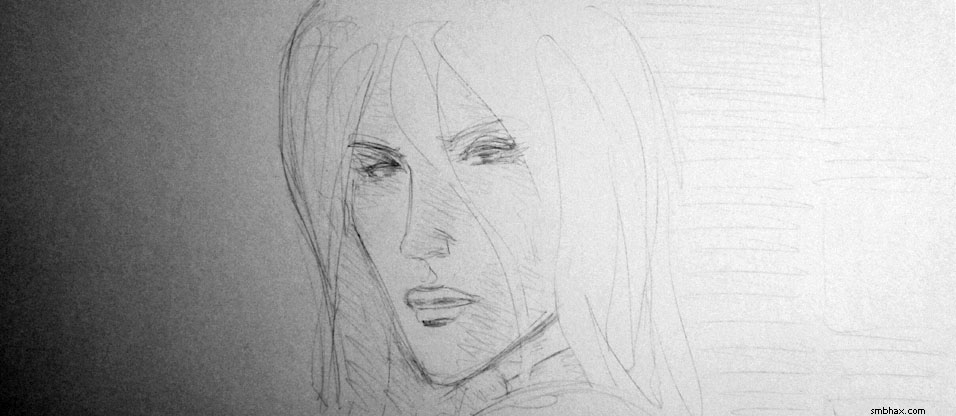
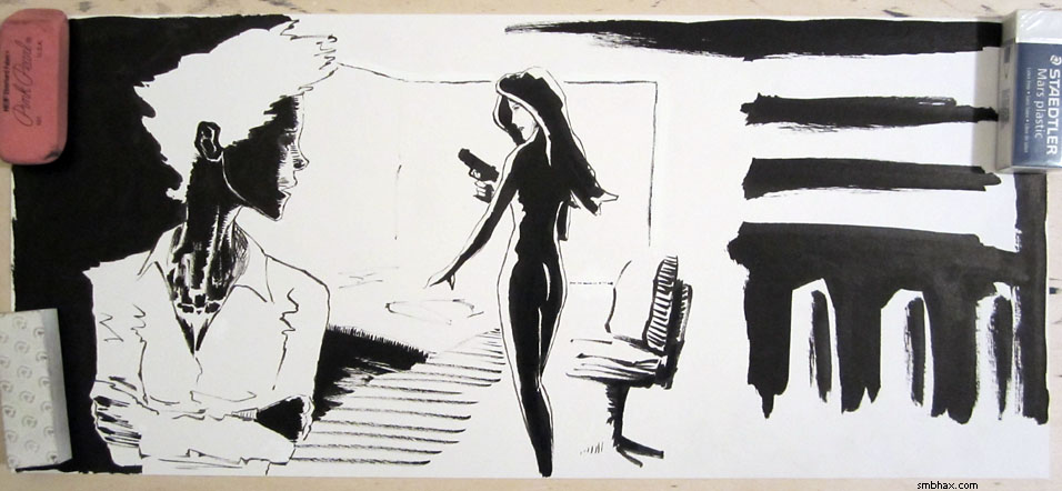
Detail from the pencils for today's page--I take these photos when the pencils come out pretty good and I suspect I may screw them up with ink :P--although I seemed to manage all right today:
|
·····
|
| |
| Mary Worth, Mars Rover Pieces, Nobel Prize | Oct 10, 2012 4:59 AM PDT | url |
| | |
Added 1 new A* page:Jeepies, inking today's page went smoother than anything else I've ever tried to ink, I think. Why, if I could stay in this zone consistently, I could...draw more stuff! (EDIT: Spoke too soon! She was cross-eyed and it took me two tries to sorta straighten her right eyeball out. :P)
It does remind me of like a sorta generic Mary Worth newspaper strip style, but eh...hm. Well, it probably won't last.
Here are the pencils before I starting putting ink on them--I took a photo because they came out fairly nice and I wanted to preserve them before probably ruining them with ink:
Notice I'd been thinking I'd do more shading of the face! But when you're just black and white--rather than ink washy like I've done up until the past few days--you gotta be a little more discriminating on what you do and do not shade, so I thought I'd err on the lighter side for the face today, for a change.
~~~~~~~~~~
More space debris news! But this is a big-un! A European Space Agency satellite that unexpectedly shut off in April could doom us all--well, okay, anyway it poses "an unusually large danger to a heavily populated corridor in polar orbit at 780 kilometers in altitude." That's because the ESA operators of the 26-meter, 8000 kg Envisat satellite didn't follow international guidelines, which say that you're not supposed to cruise your satellite around once it reaches the point where it has just enough fuel to move to a lower orbit; instead, they continued to operate it at its high orbit past that fuel point, meaning that it could no longer move to a lower orbit which would then decay and burn it up more or less safely in the atmosphere. And then its unexpected shutoff made things even worse, because it meant they couldn't "passivate" it, ie get rid of fuel remnants, live batteries, and other power sources that could cause additional damage. Now legal beagles are arguing over whether or not the ESA could be held liable if Envisat, which went into space in 2002, damages another craft during the 100-some years it will be drifting through that rather crowded space lane; this could potentially develop into the first case of legal space negligence!
~~~~~~~~~
Analysts and operators of the Curiosity rover on Mars just figured out that a mysterious "bright object" seen in the Martian soil next to the rover as it scooped up a soil sample on Sunday is a piece of the rover itself--exactly what piece and how it fell off remains a mystery. You can see it here as a little irregular silver thing in the dirt near the bottom center:
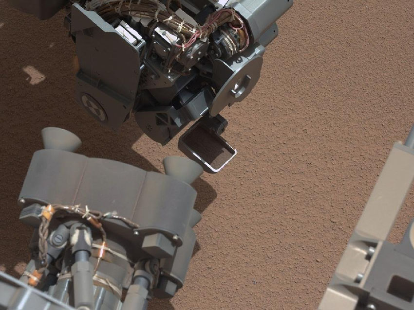
image by NASA (source)
~~~~~~~~
The Nobel Prize in physics just went to an American and a French scientist, who both specialize and quantum optics, and separately developed methods to measure and control isolated quantum particles. For instance, the American scientist, David Wineland, was able to prove experimentally the theory that quantum particles can be in two places at once--something which had been thought unprovable, but he found a way "to hit an atom with laser light, which according to quantum theory had a 50 percent chance of moving it, and observe the atom at two different locations, 80 billionths of a meter apart."
|
·····
|
| |
| I think I hate my new watercolor kit | Oct 09, 2012 4:50 AM PDT | url |
| | |
Added 1 new A* page:Over the weekend I tried out the interesting looking colors in my new little travel watercolor kit, on top of an ink sketch of the character Stella who we met early on in episode 16:

Normally I don't think I'd color anything in such a Christmassy riot of hues, but I wanted to get a look at as many of the colors in the kit as possible, and I have to say I wasn't all that impressed by them. Also I shouldn't have put the yellows in, that's just ick. But I definitely learned a lot about those watercolors, so mission accomplished I suppose. :P It is in the episode 17 gallery, and if you want to have it on your wall to scare the children, you can buy it right here.
I did the thick background stars by dotting on the black ink around them with a dried sea sponge. Here's the ink sketch masked off with a transparent overlay to protect the non-sky parts from the sponging:
Then I hit it with the inked-up sponge:
And here's what it looked like with the mask removed:
And then I assaulted it with the colors. I don't even intend to color things in a modeling-the-three-dimensional-form sort of way, only I kind of forgot that when I was doing this. Alas! Then the colors got muddy in spots because I was sloppy with them, and I needed some white ink highlights to kind of punch things up. So far I'm happier with the cheap gouache kit I used in a couple previous color experiments, but these transparent watercolors *do* cover up less of the black ink they happen to get over, which is a plus.
~~~~~~~~
A privately owned SpaceX unmanned Falcon 9 rocket and Dragon cargo module just blasted off for the International Space Station, marking "the first-ever cargo delivery trip to the International Space Station by a robotic, American-made spacecraft," and the first private space station cargo mission. A dozen of these SpaceX cargo flights have been scheduled, and with them the U.S. once again--after the cancellation of the Space Shuttle program--has a means of getting supplies to the station, instead of having to sit by the sidelines while the world's other spacefaring nations do all the heavy lifting. And the SpaceX missions can also return a load of cargo back to Earth, splashing down in the ocean, whereas the unmanned cargo missions from other nations don't bring stuff back, and just burn up in the atmosphere.
Apparently one of the Falcon 9's nine engines went out during its climb, but the other eight engines compensated for the loss and got the rocket to its designated orbit, as they're designed to do.
|
·····
|
| |
| Overhyped space debris, British robo-bees | Oct 06, 2012 8:39 AM PDT | url |
| | |
Added 1 new A* page:I'm kind of having a blast with this strict black and white business so far. :)
On the other hand, here's a proper scan of a sketch I did a little while back with cheap watercolors thrown over my usual black ink:

It's in the episode 17 gallery, but it isn't for sale because, well, you can see what a mess that 99 cent watercolor kit I got made--chalky residue all over the ink and so forth, yuck! I've got a halfway decent little set of watercolors now, hoping to get to play with them a little this weekend.
~~~~~~~
For the second time in a week, the International Space Station...didn't have to move after all to avoid space debris, after it had been reported that it might need to execute a dodge maneuver. And I think this is the last space debris story I'll report until something catastrophic actually has a high likelihood of actually transpiring. :P
~~~~~~
This episode's robot bee a little farfetched, you may have been thinking? Well, U.K. project "Green Brain" is reportedly already going to scan bee brains and model them with an eye toward building bee-level-intelligence robots. Booyah. Just don't give them venom, maybe.
|
·····
|
| |
| Excuse me, is my groove in here? | Oct 05, 2012 7:53 AM PDT | url |
| | |
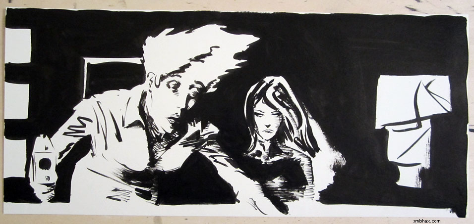
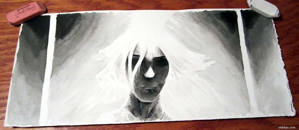
Added 1 new A* page:Page 100! Always nice to reach that in an episode. And maybe this will turn out to be another milestone of sorts in the strip for me as well; after becoming thoroughly disgusted with my use of gray ink washes yesterday, I vowed to try going straight black and white--no gray tones. I tried it today and it came out better than I could have expected--the second time, at least.
In the first, which is so awful I won't show it--although if you buy the original art for today's page you'll get to see it, because it's on the back :P--I spent a lot of time coming up with what seemed a nice detailed sketch of Selenis' face seen from slightly below, in nifty dramatic perspective, and sketching in the shapes of the shadows I wanted her mouth, nose, eyes, eyebrows, and cheekbones casting across the rest of her face.
That looked fine in a pencil sketch, but when I went to ink it, and started turning those sketched shapes into big solid black blobs, it just didn't hold up--in fact it turned into this horrid black morass. I suppose it probably has to do with trying to retrace my lines--I can't do it. Or I can, but when that's all I'm doing, there's no inspiration in it and it only results in an ugly, dead thing.
In this second attempt, I didn't try to fill in the sketched lines, or to maintain strict fidelity to their strokes; instead I...well I guess I just did whatever happens when I don't try to do that. It's more instinctive, more gestural.
Anyway it kind of worked, I think. Possibly the mouth is slightly too low, and maybe I should've got the hair closer in on the face, but, you know, details. Reflecting upon it, and then looking back over the pages from the past few episodes, I noticed that just about all of what I think are the most successful among them seem to have employed that same sort of...loose massing of heavy sketched lines, or something. And reviewing them all in a group like this, I realized they all share something else, too. See if you can pick out what it is:
16:14
16:69
16:82
16:95
16:102
17:6
17:7
17:8
17:22
17:66
17:94
Did you notice? Aside from the quick, massy lines, they also all pretty much feature a head in close-up, or close-to-close-up. I suppose almost all of my pages do, anyway, but I wonder if that's serving as a trigger for being able to get into this mode somehow--like, that kind of heavy stroke just happens to seem to my subconscious art brain to be the thing to use for heads at this viewing distance. For instance, I had a streak of it going on pages 6, 7, and 8 of this episode, but then there was a scene change and a series of longer-distance shots, and I lost it--and then I went to using a large brush exclusively for a while and that was its own distraction for a time.
But maybe I'm gradually getting onto something here. And maybe stripping things down to black and white will help me find out how to make it work. It happened, in fact, the other time I went straight black and white, which was page 17:22, in the list above.
There are other nice things about working in plain black and white for a change: it's easier to scan and clean up, leaves me free to use white ink whenever I want instead of constantly having to worry about mucking up an area I needed clear for a gray wash later, and it allows for greater abstraction. Like, I liked doing grayscale instead of color because you can bring together objects that would normally be separated by their colors; well, with black and white, you can bring to together just about anything you want! So it takes a little figuring, maybe--we'll see what happens when I need to do a scene with a deep background. But it's also fun and freeing to play around with, and I'm getting excited about where this might take things.
|
·····
|
| |
| Darn those shades of gray | Oct 04, 2012 9:20 AM PDT | url |
| | |
Added 1 new A* page:I'm frustrated with my grays at the moment. Two days ago when I had to do a second try at a page with little time to spare, the result was a black and white page with no grays that, when I look back at it now, has a mystery and power that most of my ink wash gray pages don't have, or only in diluted form, at any rate. Once I got into inking in the blacks on today's page I got to thinking that I'd just do it all black and white, and I almost did. It looked like this:
But, looking at that photo on my computer screen, it just seemed too flat to me--the spaces between the screens and the wall, and the screens and the foreground figure, weren't worked out well enough. So I thought I'd better put grays in after all, even though they'd mix with some of the non-waterproof white I'd used for patching up the black edges of the screen, and bits of the console operator's shirt. That did happen, and whisking the resulting gray mess away with a paper towel resulted in some kind of interesting "blast" effects in the gray areas.
Still though I think I use gray as a crutch too often; and I think that if I'd planned to use only black and white in the image from the outset, I'd have been able to work out those spacial relationships without needing to resort to gray. So maybe I'll try going straight black and white for a while and just see how I do.
One thing that frustrates me with the grays is that I've been unable to find a black pigment ink that can lay down consistently smooth tones on paper--you just tend to get seams and rivulets and other marks and uneven areas; I keep telling myself not to leave big wide areas that need grays where that kind of problem could show up, but somehow I can't seem to avoid leaving myself open to it, and then it just annoys me all the more.
That spurred me into a little art supply experiment some weeks back: it occurred to me that non-waterproof inks might spread and mix more smoothly than the waterproof inks I've been using, so I got some and tested them out in little circular gradient washes. Here's the result:
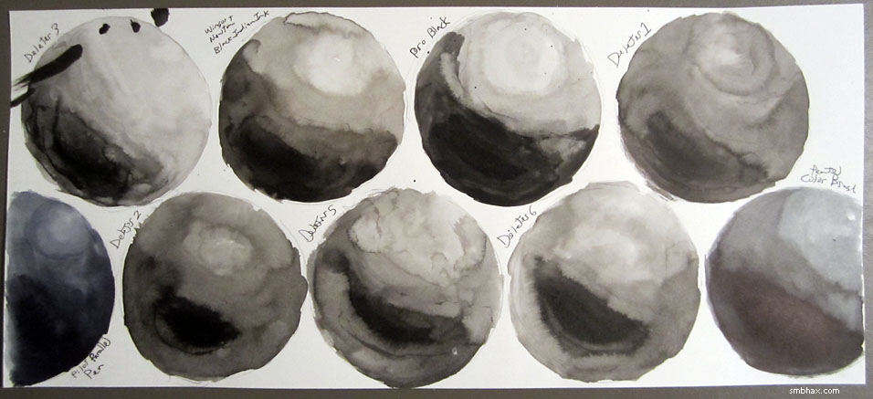
That black mess in the upper left corner is an ink spill--that epic ink spill that splashed clear across my room that I showed some weeks came while I was swapping these inks around for this test. :P Anyway the Deleter 3 circle in that top left corner is the waterproof ink I use for A* now. The other circles are all non-waterproof inks, aaaaaand...they aren't really a whole lot smoother than the waterproof one--and most are a lot yellower, too. So much for that idea.
The bluish ones at the left and right sides of the bottom row are what I'm pretty sure are black dye-based inks I had sitting around: ink from a Pilot Parallel Pen on the left, and from a Pentel Color Brush on the right. They spread a little more smoothly than the pigment inks--the Pentel Color Brush ink particularly--but not super-duper smoothly. And anyway apparently dye-based inks are a no-no for artwork you really want to last, although I'm not really sure why. Those two at least are also comparatively rather expensive.
So I don't know of an ink solution for this choppy grays thing. It does happen less with Arches watercolor paper, I think, but that paper isn't ideal in other ways--even the "bright white" version is still distinctly off-white, for one, so you lose some contrast against black ink, and you gain sometimes unwanted contrast against white ink; also, there's all this stretching and pre-soaking you're supposed to do or it'll rumple up and be hard to scan; I suppose I could try to find some of the super-thick 300 lb variety, but that is a) very expensive and b) harder to cut and harder to manipulate freely on an inclined drawing table, I'm guessing.
There are halftone screens you can apply over black and white drawings, old-school print style, but those are quite expensive these days, and I'm not sure how well the adhesive on them lasts--and it'd mean a lot of time spent cutting them into the desired shapes, anyway. :P
Of course you can simulate halftone screens on the computer these days. I've found myself experimenting with that a few times; frustration with yesterday's rather dull grays (and drawing in general :p) had me at it yet again; I found an interesting way of doing it in Photoshop, which was basically
a) copy the scanned 1200 dpi grayscale art
b) switch it to Bitmap mode with a 72 dpi, 30-degree, size 1 halftone screen
c) switch that back to Grayscale mode and accept the scale default or whatever that is
d) scale it to the comic's final screen size
e) lay that in over the grayscale comic as a Soft Light layer
So with yesterday's comic that looked like this--from the regular grayscale, to the shrunk bitmapped layer, to the Soft Light combination of the two:
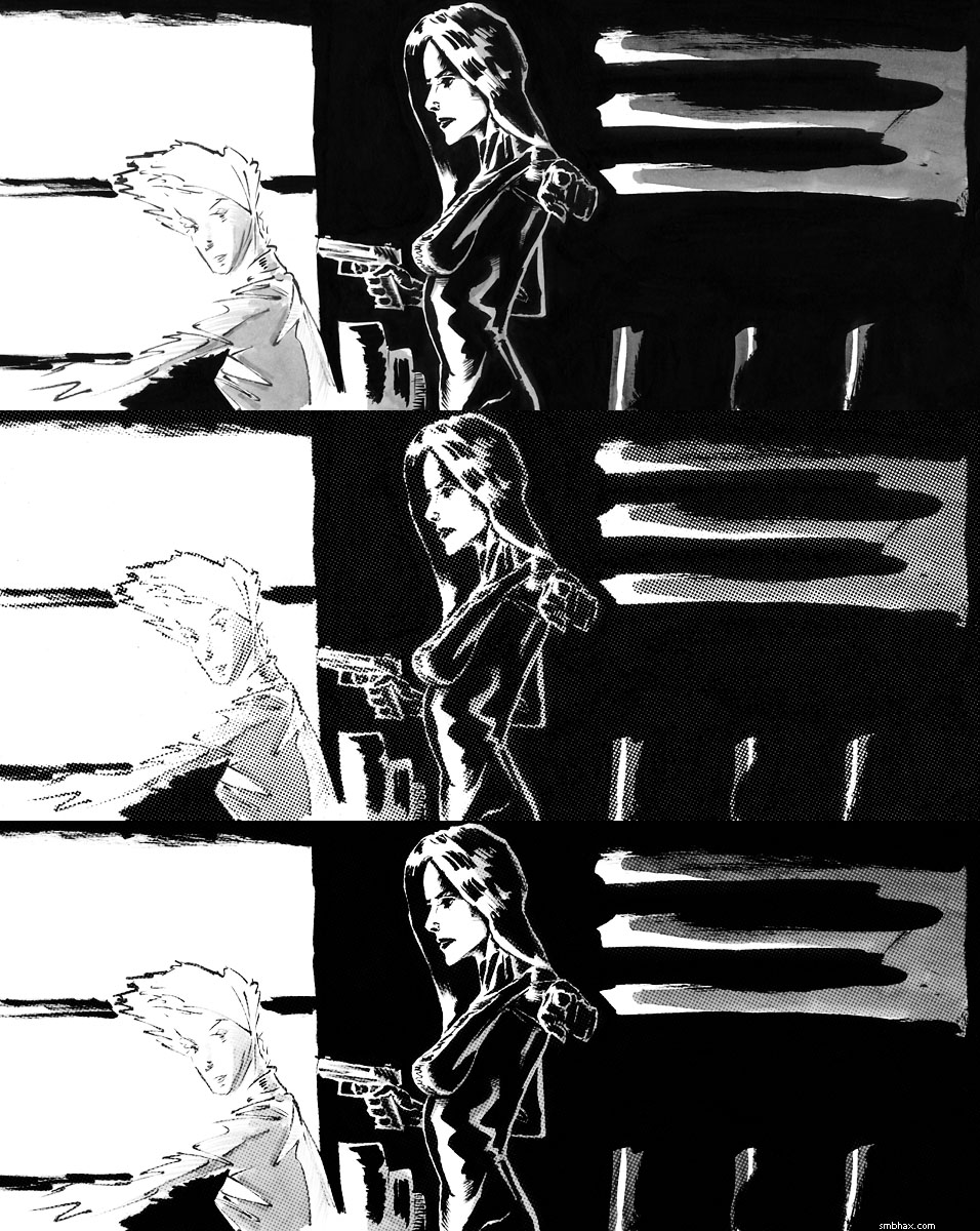
Sort of a half-halftone if you will, because the dots are applied in a semi-transparent way over the grays they came from, which are beneath them. I like that result a little better than just regular dots darkening over black and white artwork, which produces a harsher result like so:
Mind you, there are all sorts of ways to generate completely artificial halftones and apply them very neatly. But for that matter you can also generate perfectly smooth gray layers and apply them extremely neatly, kind of like I used to do when I was working digitally. So I could just do that, but I would much prefer a solution in which the actual piece of artwork looks more or less like the final version you see on screen, and doesn't rely on computerized effects for its finish.
So these are some of the thoughts with which I've been occupying myself. I've got a new fairly decent watercolor kit I want to start playing with, too; maybe I'll manage to whip up a colorized sketch of some sort this weekend. But I might also just take the weekend off, since I haven't done that in a while! In the meantime, anyway, I'll try to make myself stick to straight black and white and see what happens with that.
Hmm another possibility is that I just need to learn the patience and diligence required to lay washes down smoothly; large gray areas came out reasonably smoothly on page 81 and page 95; or at least, I think it did on 95... I went back in and broke it up with darker grays and whites afterward, so I guess I can't be sure now how smooth it was. The background grays on page 81 were the result of a lot of very light washes layered over each other...which is a slow process and can't really get very very very dark. Also it probably helped that the areas were mostly nice big wide open ones; they did get a bit messy in the jagged parts around the central figures.
|
·····
|
| |
| A* original art highlights | Oct 03, 2012 9:19 AM PDT | url |
| | |
Added 1 new A* page:Since you can now buy the original art behind the A* art you see on this site, I thought I'd highlight a few of what I regard as my more successful pieces from the past that are currently available for purchase:
In the episode 15 gallery, there's To Live Forever
which is an 11" x 17" piece that was the base art for a sort of A* "movie poster"--the final version with digital lettering is also in the episode 17 gallery, right here.
And then of course there are plenty of the A* comics with art you can buy; here are some to consider!
One of the earliest ones, for episode 13, page 155

came out rather nicely. That's back when I was doing them on pieces of 11" x 17" Strathmore bristol, and I see I had a lot in the margin areas there that didn't fit into the actual comic version that went up on the site.
There's also the art for episode 14, page 6
that's had some of the heaviest washing I've tried, making for a pretty moody face. Clone angst, you know!
The art for episode 15, page 15
is still some of the sharpest I've managed, I think. In fact I don't really know how I did it, but that's art for you!
In the art for episode 16, page 32
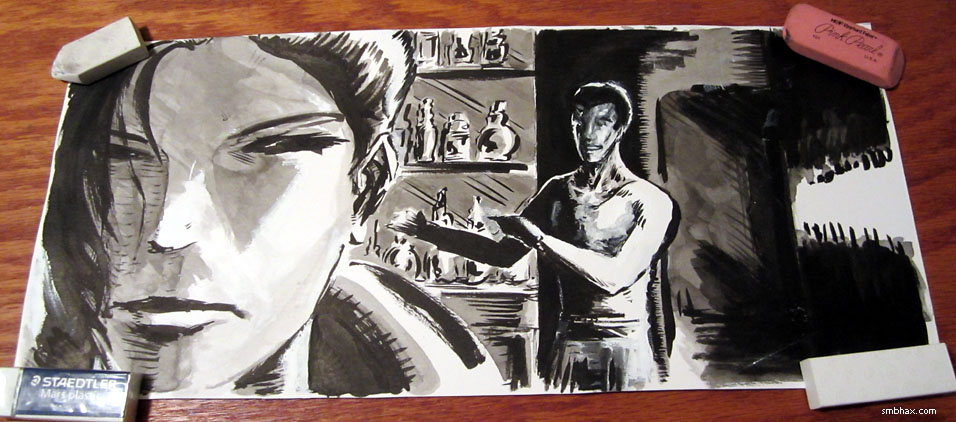
which was one of the first I did in my no-pencil-layout / all-freehanded-ink phase (which only just ended nineteen pages ago), I ended up repainting Titus' face uh a lot of times; finally it was this big puddle of gray ink and I had to scrape it off and then miraculously there was just kind of this amazing face looking back at me that wasn't anything like what I would have consciously tried to do; a few touch-ups and highlights and voila, one of the best male faces I've painted so far, definitely. I also had fun with the bottles he's pointing at behind the bar, and the various shadows in the background.
And each of those is going for the low, low price of just $50!
~~~~~~
After all that talk last week of the International Space Station possibly having to move out of the way of two pieces of incoming space debris, then not having to move after all, well, it looks like this week it will have to move to avoid what is I guess another piece of debris. The article points out that "NASA estimates that more than 21,000 fragments of orbital debris larger than 10 centimeters (3.9 inches) are stuck in Earth's orbit," so I suppose this is just going to be a regular fact of near-Earth space life.
|
·····
|
| |
| A* original art now on sale through the site | Oct 02, 2012 9:20 AM PDT | url |
| | |
Added 1 new A* page:You may notice the "original art" button below the lower left corner of today's comic--yep, I got the original-art-buying system finished and hooked up over the weekend, so you can now buy the original art behind pretty much all of the traditionally made illustrations on the site, both in the comic storyline and in the episode galleries. And because I have hundreds of these pieces of A* art carefully stacked up from the past year of doing them and *not* putting them up for sale, and because I'd like to get sales going and get them to lovely new homes, they're all currently for sale at just $50 each, instead of the $100 I'd planned initially--I don't think I can let them go for just $50 forever, though, so this is most likely a limited-time price--but at the moment, anyway, if you were planning on buying one, well, now you can buy two! :)
And you may find it interesting to click the "original art" link next to some of your favorite drawings even if you aren't going to order them, because the original art page for each one shows them in a color photo, zoomed out slightly and usually at a bit of an angle, which will show them in a different light than the straight-on, cropped black and white scan you're used to seeing. Like for instance, I do the A* pages on 17" x 7.5" pages, and go pretty much right up to the edges, but the version you seen in the comic is actually from just 16" x 6.75" of that page, so there are always border areas in the original artwork that you don't see in the regular comic.
Anyway they really do look even better in person than they do in the online comic pages, so if there's a comic page or art gallery piece you particularly like, I hope you'll think about making it your very own. :)
~~~~~
Speaking of the original art, I added a new piece to the episode 17 gallery--it was another one where I was messing around with a little gouache (that's a fancy name for opaque watercolors, apparently) to add color over the ink:
The original art page for that one is right here. I have a little kit of some nicer (and transparent) watercolors now, and now that I'm done with big feature additions to the site, finally, I hope to be able to do some more sketches and things for you on weekends, so maybe I'll get to do some more watercolor experiments in the near future.
~~~~~
*Today's* art was one of those that seems to be going okay, and I'm working away at it patiently, and then bits don't seem to want to resolve themselves nicely, and then after a while of trying to fix them its clear I can't fix them, and redoing them doesn't work either, and then finally the whole thing is revealed as an irretrievable train wreck and it's now very very late and I have to start the whole page over from scratch. Ooh! Maybe that's healthy sometimes though, and I should do more of the very direct approach of the second try you see in today's comic. At least, it seems to have some decent points--but I suppose I'll have to see how I still feel about it in a few days. =P
|
·····
|
|
|