 | |
| |
|
|
view titles only (low bandwidth) |
| |
| Keep the lights on! | Oct 30, 2013 11:21 PM PDT | url |
| | | |
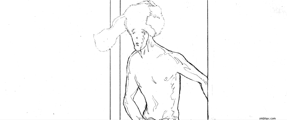
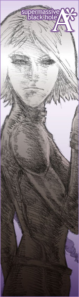
Added 1 new A* page:Phew, this took a long time to draw. Off to bed for me! Have a Happy Halloween!! Don't shut off your brain!
|
·····
|
| |
| Æon Flux and the part of inking I hide | Oct 29, 2013 11:56 PM PDT | url |
| | |
Added 1 new A* page:I don't often show the first inking bit I do after pencils, which is kind of just trying to capture the important part of the pencils in ink so I can then erase the pencils and work the rest of the way in ink:
I'm thinking though that maybe that stage is a bit too conservative, and I should go right in to just inking up a storm rather than getting those first tracings down; I haven't tried that so far because a) erasing scuffs the ink a bit, so for looks it's better if you can have a minimal amount of ink in the way when erasing, and b) I'm scared. But that "tracing" stage must necessarily prevent me from being more expressive with how I go about inking, so eh...I don't know, maybe I'll have to ink some practice drawings to work up the nerve or something.
Also, I guess maybe I don't show the first inking stage much because it just tends to accentuate drawing problems that I spend a lot of time working out later, bleh. : P
~~~~~~~~
The new month of expiring Netflix streaming movies is almost upon us and I'm still squeezing some in; just caught Æon Flux which I thought I'd heard was bad so I'd never watched it; it was reasonably decent, though! Now, when I was a kid we didn't have cable so I only caught bits of the original animated MTV show here and there at friends' houses, so I can't say how true this is to those--obviously live action can't really have the crazy exaggerated, organic style of the cartoon, and I suppose you do lose a lot there since that was such a big part of the show's original impact and atmosphere. This film version has more of the super antiseptic, clean, slick/cheap look of Ultraviolet, if you've seen that one (it came out in 2006, one year after Æon), only not quite so exaggerated. Both films have a violent heroine fighting an evil male dictator type in a futuristic city; Æon in particular has very A* themes--immortality and other things I won't quite spoil for you--which just goes to show how very original I am! Hmph. In Æon it's all down to more love and mysticism than science really, but still it was kind of fun, and Charlize Theron had a pretty good look going there as Æon. In fact I was thinking the profile of Selenis in today's page might be a bit Theronic--I tend to pause a movie to study interesting faces and lighting when they come along, and I did that during this movie a few times--but in the end I think Charlize got somewhat upstaged by Mia Farrow, and Fiona Staples' "Alana" from the "Saga" comic series.
|
·····
|
| |
| Not that I want to give people neck cramps :o | Oct 29, 2013 12:57 AM PDT | url |
| | |
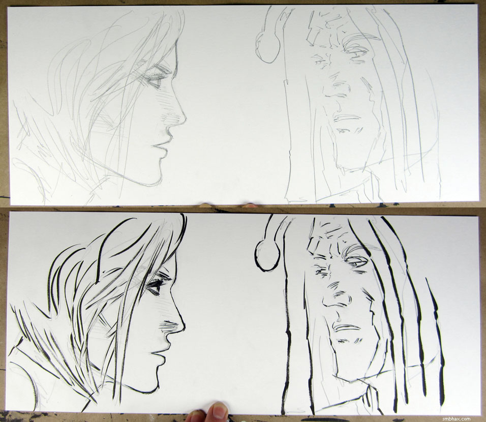
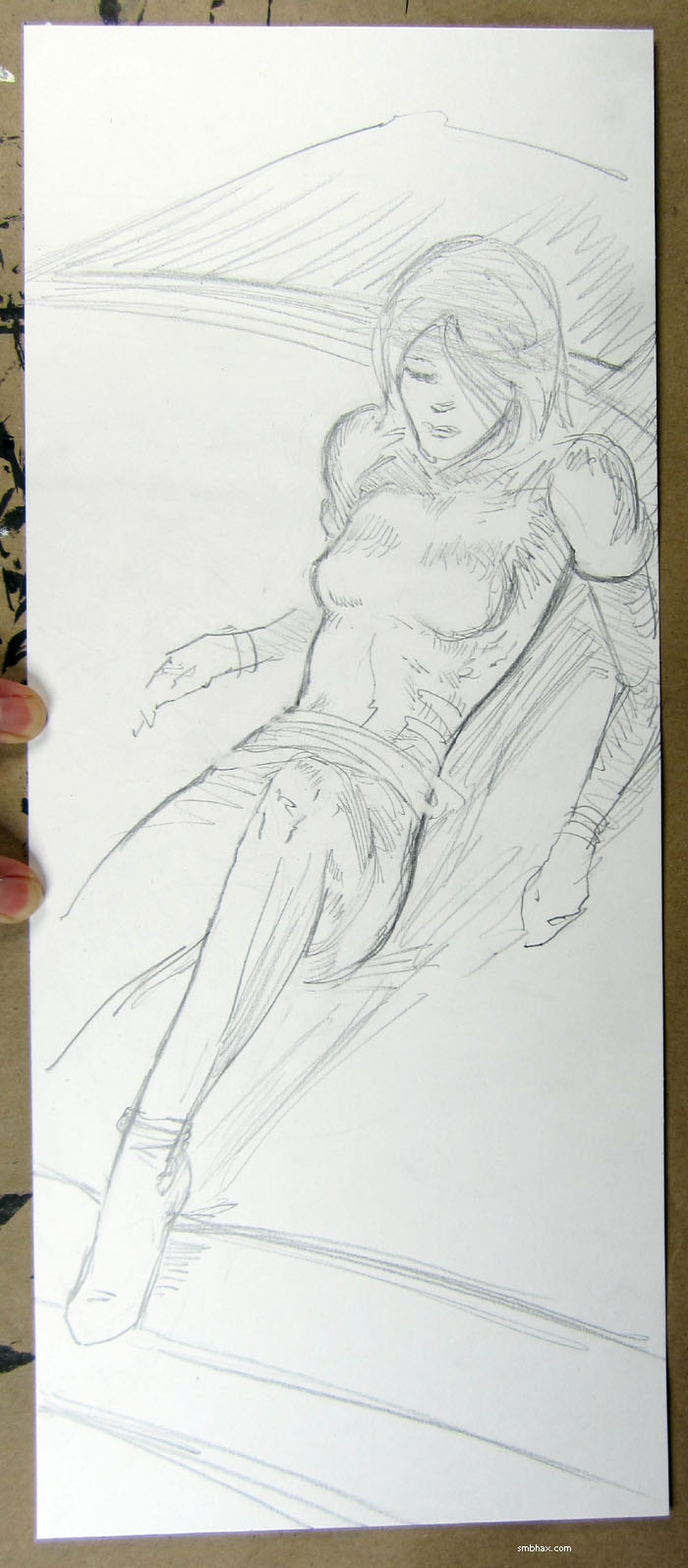
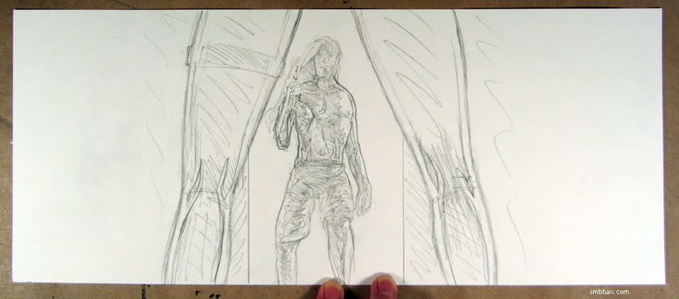
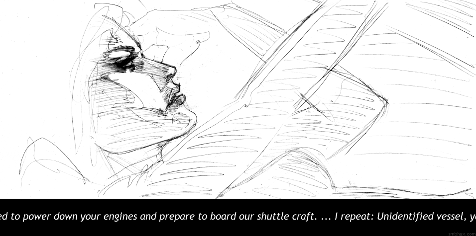
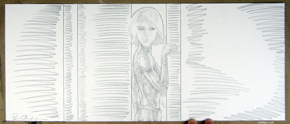
Added 1 new A* page:I was having a lot of trouble figuring out how to lay today's page out until I finally just said to heck with this horizontal stuff and turned the page diagonal--then it was easy! Although, turning it back after I'd sketched it out, it was like uh-oh I drew this at exactly the wrong angle for a horizontal image, didn't I? But I dunno, maybe it kinda works; anyway it's a change from all the horizontal pages--in fact I was starting to worry I was stuck in a strict horizontal perspective for a while there. Here's a vertical look at the inked (pre-color) version:
I made that for the auction of the original art on eBay, and of course if you were to bid (starts at just $0.99!) and win it, you could turn it any way you wanted.
I think maybe I'll turn my pages more when drawing, it's actually pretty fun. Here's what the pencils looked like, before I inked over them and then erased the pencil lines:
This became a really *long* blog entry : o
|
·····
|
| |
| I wonder what time Einstein got up | Oct 26, 2013 12:39 AM PDT | url |
| | | |
Added 1 new A* page:Ugh I had a couple options for things I wanted to talk about but I'm going with quicky option 3 instead because I gotta get some sleep; I did a particularly bad job of that this week so next week I'm going to try a radical experiment involving getting up at a regular morning hour every day just like I hear smart people do, no matter how late the previous day's page kept me up. It sounds scary but we'll see how it goes : o
|
·····
|
| |
| It tolls...for YOU : o | Oct 25, 2013 11:12 AM PDT | url |
| | | |
Added 1 new A* page:Continuing my tour of films expiring soon on Netflix streaming, I just finished "For Whom the Bell Tolls": Gary Cooper, Ingrid Bergman, good stuff--if you can get past Hemingway's sorta extreme idea of ideal male and female behavior. The look of it is interesting: in 1943 it wasn't even what you could call an early Technicolor film, but it's still got the punched-up black shadows of a black and white movie; you can see this right from the start, a night-time chase through the countryside after sabotaging a train. There's a lot of attention paid to the lighting, and some interesting tricks used to get shadows and colored lighting just so. It struck me that it's not all too dissimilar from what I'm doing with A* at the moment, namely that I draw it in ink like a black and white comic, then try to add a little more depth and definition with color over the dark shadows.
|
·····
|
| |
| Narcoleptic Terror of the Internet | Oct 24, 2013 9:17 AM PDT | url |
| | | |
Added 1 new A* page:Man, been just about falling asleep at the drawing board the past few nights. Probably shouldn't have stayed up all weekend making a web survey about video pinball. You know, like you'll do. Buhhh. This next weekend, no new web sites! Nope, not one! : P
|
·····
|
| |
| "She," immortality, and marketing in Latin | Oct 23, 2013 10:27 AM PDT | url |
| | |
Added 1 new A* page:I still have this tendency to resist going properly shadowy over relatively nice faces and stuff that I've drawn; Selenis' face was drawn at the pencil and early inking stages (I should'a taken a photo of the inked face, it came out pretty well)
and then it took me longer to ink the whole thing than it should have, because I was just sort of gradually hedging in around the interior details of the figure, not wanting to obliterate them--but they got obliterated just the same in the end in the name of proper lighting and shadow. Gotta get faster on the trigger on that sort of thing. ; )
Today I was watching an I think 1935 movie called "She" on Netflix--as often happens, this choice was dictated by finding that "She" and some other stuff in my list of things to watch is expiring at the end of the month : P--and it's very Flash Gordon-y (studly young male adventurer, runs into female love interest by accident on trip, they have dangerous excursions in exotic lands among "natives" (oy) and an upper class royalty in gargantuan palaces, accompanied by an older professor dude) which is no great surprise considering Flash had debuted to huge success the previous year. "She," though, has much nicer production values than the Flash serials; it's actually pretty neat how relatively seamless they can make some outrageous special effects--fairly simple exposure tricks and the like--look, because the film itself is pretty low detail that all the grain and contrast hid all the icky little production details, so in a way everything looks amazing and perfect and glowing on a truly grand scale. Anyway the reason I've mentioned the film is that it all has to do with a quest for immortality, and the problems immortality brings, which is also one of the main themes of A*; well and obviously it's a common theme in a lot of films, particularly fantasy and sci-fi, but I've never seen it dealt with quite as it is in "She," where it struck me as particularly A*-like in some ways, although some only I know I suppose since they haven't occurred in the comic yet. So anyway yeah, "She."
(Yesterday I watched another interesting expiring film, "Morituri," a 1965 black and white film about Marlon Brando, a rich WWII German expat who just wants to be left to himself, being induced into carrying out a sabotage mission against a German merchant navy vessel captained by Yul Brynner; Brando and Brynner are brawny and powerful, even with Brando's odd, sort of effeminate German accent in his SS officer disguise, the drama is sweaty (particularly down in the ship's dramatic engine room) and the cinematography quite good, especially the startling helicopter shots that pan along the whole of the ship as it steams along, zooming in on characters talking and walking across the decks, so it's just kind of a shame that the thing sort of derails in the final part, with the introduction of a whole boatload of new characters with their own dramas, and Brynner's character sort of checking out of the whole affair after he hears something upsetting on the radio. : P The film definitely has some good points, though. The title is Latin, the "we who are about to die" part of the old Roman salute to Caesar; not surprisingly, it confused audiences, who didn't attend the film in large numbers (the film was retitled to something more WWII-action-sounding in a later release); an early poster you can see on Wikipedia tries the odd marketing tactic of just saying "MORITURI must mean something unusual." : P)
|
·····
|
| |
| Of Yul Brynner and The Blow | Oct 22, 2013 11:44 AM PDT | url |
| | | |
Added 1 new A* page:Oh man running so late here. Um. Yul Brynner is rad. Also I have an old high school classmate who was in town so I went to see her show, she lives in Brooklyn and is kind of a rock star now only in a different way so that is nice.
|
·····
|
| |
| On childhood idealism | Oct 19, 2013 2:13 PM PDT | url |
| | |
Added 1 new A* page:Things have been going pretty darn good in A* land lately--since I started putting the original art for the new inked pages that began with page 21 up on eBay--right over here--only one of them hasn't sold! And a few just here in the past few days even had some pretty feisty bidding going on. I really had no idea how this would go when I started throwing the new originals up for auction with a low starting price, and was a little worried at first, but I'll be darned if it isn't looking like this might work out after all--and I mean maybe that it isn't impossible that this could turn into something that would allow me to work on A* pretty much forever. I guess being excited about the prospect of working on something for a really really long time might sound nutty, but--even though I complain about how it keeps keeping me up late and stuff--I actually really just love being able to sit down and create a new page each day. Might be the best darn job ever in that regard--certainly the best I've ever had!
And I don't usually get a whole lot of messages from readers, but I've started to get some nice little feedback messages from bidders, and one person even took the time to write me a thoughtful note saying that they'd been going through a very tough week, but then they found the comic and just having it to read through and take their mind of things for a while was a big help. That really blew me away, that this little thing I've been working on actually made a difference in someone's life. And it wasn't even for three or four days after that as I was still thinking about it that I made a connection way back to when I was a kid, standing outside on a nice day, looking up at little white clouds in a blue sky, and thinking yeah, I'm going to be an artist and I'll get to draw things that make people happy--realizing that the real purpose behind this whole thing I'd figured I'd do with my life wasn't just making pictures, but making a positive impact on other people. Nowadays I know that there are innumerable ways in which people in all walks of life can make other people happy, but back then as a kid it seemed to me my best shot at doing that would be through art.
And in the ensuing decades of trying to figure out what the heck being an artist was about, and how you could actually make it work, and not seeing a way to pull it off exactly and trying other more job-specific stuff like graphic design, web design, and game design, and also seeing so much great art from incredible artists and almost despairing of ever making anything anyone could possibly get excited about, it was easy to forget that little childhood notion. But despite all that and after all this time I guess maybe I somehow actually succeeded at that old idealish notion at least once, and it's like that little note that reader wrote me has turned back the clock 25 or 30 years and I'm standing in the grass looking up at a sunny sky and am very excited about the future.
|
·····
|
| |
| Total pro signature here | Oct 18, 2013 1:16 PM PDT | url |
| | |
Added 1 new A* page:Oh man. Two characters touching is way harder to draw than one person standing. Note to self: less character interaction! >_>
I realized after signing today's original art that the pros sign their stuff with just their last name, typically--or initials or some kind of sigil, yeah, but anyway they *don't* sign first name last name, which is what I'd been doing for some reason. So I hid the first name with white ink (another thing pros probably don't do :P) and from here on out I'll just sign my stuff with the mysterious last name, "Chamberlain." Super classy, that's me! Also it's easier to fit that into tiny white spaces in big black ink drawings. : P
Hm random Photoshop thing but I just realized that Levels-style adjustments could exacerbate color banding, since they squeeze or stretch the values in existing color gradients. Or maybe that's wrong, I dunno. I haven't had to resort to that sort of thing much lately, so it's just as well I suppose.
|
·····
|
| |
| Maybe I just need a lot of White Out | Oct 17, 2013 8:02 AM PDT | url |
| | |
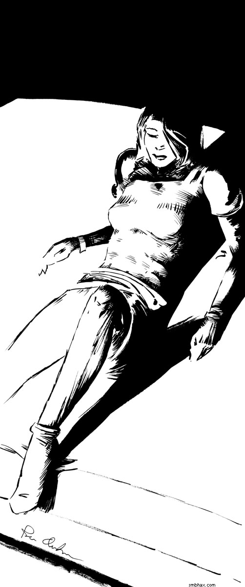
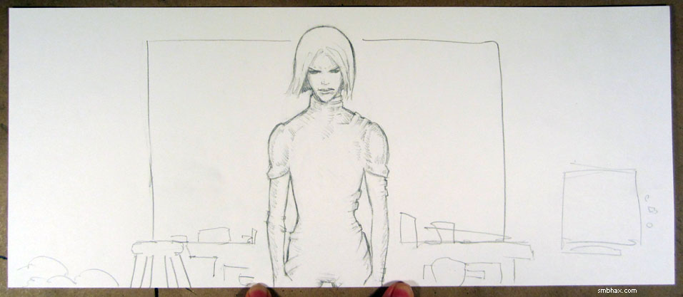
Added 1 new A* page:While doing the pencil drawing for today's page I was stuck as to whether I should have a dark or light background, so I took a photo of both versions (as sketched in pencil, anyway)
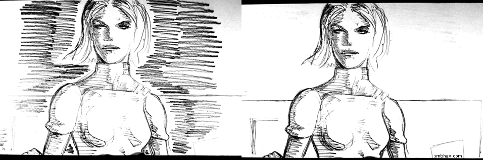
and posted it on my Twitter/Facebook/Google+, asking "dark background or light background"? The responses were all for the light version--although later at least one clarified that this was because the darker pencil background was less organized. I'd been leaning toward dark, but I tried light, in ink, and it didn't really seem to come off. So, following the rule of desperate amateur gamblers as seen in movies everywhere--"always bet on black"--I added a lot of ink, and voila.
More or less, anyway. I'm still trying to get a certain bold, high-contrast look in ink, and to do that I have to force myself to cover up most of the cross hatching I do with big solid brush strokes, and to obliterate complicating details like the edge lines on the dark sides of Selenis' arms and body here--counter-reflections of that sort in general are generally out. So you end up with a simple looking drawing that took a lot longer to draw than a more complicated-looking drawing that more directly copied the pencil lines would have taken.
That sort of rendering philosophy was largely inspired by Frank Miller's work in his "Sin City" comics, but it's taken me years to realize that it's pointless for me to try to draw like him--and actually until today to realize how he probably actually drew that stuff, because I thought to search for "Frank Miller drawing" on YouTube, which led me to this video of someone else imitating one of his Sin City drawings--again, it isn't Miller drawing that, but it's a convincing enough copy that that's probably how he does a lot of it: drawing the contours of the shadow areas ("spotting blacks") in pencil, then just being really precise in tracing and filling them in; the artist in the video is using what looks like a Pitt marker, and a Pentel Pocket Brush Pen, whereas I would guess Miller probably usually uses nib pens and regular brushes, although I could be wrong about that.
I think he probably also uses a lot of white ink to get some of his white on black lines down in certain places, and that's reminded me that one thing I want to try out (Miller does a lot of this in his more recent, post-freakout "Holy Terror" graphic novel, from what I could tell from online images of it today) is a big "white out" type correction pen for white line effects, like Bill Sienkiewicz can be seen using in this video, although I can't tell what brand that is. I've tried a few smaller white ink pens but they just haven't had good ink flow. So I'm going to try to hit the local office supply superstore tomorrow and see if they have anything like that, because the white ink I use with brushes can't really be applied in long narrow lines like that.
Anyway though as I was saying I've learned I can't really draw like Miller did in his Sin City method--I just don't have the patience for deliberately shaping loads of little fill-in areas; probably not the eye for it either, because I still haven't really learned the trick of being able to see what that will look like inked in when it's just at the stage of pencil lines--and in fact I don't think I really want to; that approach sort of forces a certain sharp, angular, inorganic line quality, whereas I find when I draw that a looser, brushier, curvier, more organic style comes much more easily and naturally to me.
Oh yeah and this bold contrast style is again handy for iconography, like so:

|
·····
|
| |
| Hey I got a page done finally | Oct 16, 2013 9:23 AM PDT | url |
| | | |
Added 1 new A* page:Took me forever to decide on a color palette for this one. : P And to draw Thierry's head, for some reason. Silly head.
|
·····
|
| |
| The cleansing power of ink | Oct 15, 2013 3:20 AM PDT | url |
| | |
Added 1 new A* page:I had a kinda nifty crew-cutted Selenis sketch but then I thought "oh I'll just ink it real quick" and well that didn't really work out. So I got nothin'! : P
Today's page took a while. I often seem to start out with a rather cartoony drawing, and it seems like only numerous applications and counter-applications of black and white ink will be able to drill down to the more realistic figure beneath the cartoon. I guess as long as I get there eventually I can't really complain though. The other recent one like that was the dark silhouette one of Selenis from that yellowish page last week; over the weekend I turned that into a banner I was kind of happy with

It's easy to make a designy-looking design with a high-contrast ink drawing like that. I think this all means that shooting for that look is the right track; hopefully I'll get a little more efficient at finding it.
|
·····
|
| |
| Of science and brushwork | Oct 12, 2013 10:02 AM PDT | url |
| | |
Added 1 new A* page:How about a BBC science news roundup of nifty articles I didn't mention during the week?
- Higgs boson scientists win Nobel prize in physics - Peter Higgs doesn't have a cell phone and it took an old neighbor running across him as he walked along the street to tell him he (and Francois Englert, who worked separately) had won the Nobel for his 1964 hypothesis of what would come to be known as the Higgs boson, the thing that gives mass to matter--it wasn't until last year that the Large Hadron Collider at CERN was able to generate particle collisions powerful enough to knock some Higgs particles free to be detected. The article also has an interesting discussion of how the Higgs field that permeates the universe works, comparing it to people in a room (representing bosons of the Higgs field) who glom on to a popular person (representing a massive particle) as it moves through the room, slowing its progress.
- Planck telescope set for switch-off - This orbiting ESA telescope sent up to measure the Cosmic Microwave Background radiation has run out of helium coolant for its main instrument and is due to boost away from Earth, expel the rest of its coolant, and shut down. One tantalizing result that could still emerge from its recent data is detection of a certain type of polarization in CMB light: "B-Mode" polarization would in theory be the result of distortion by massive gravitational waves generated during the theorized rapid inflation of the newly born universe almost directly after the Big Bang, and would be a long-awaited substantiation of the widely accepted but never proven inflationary model.
- Russia replaces space agency chief Popovkin - Rumor has it this shakeup is due to setbacks the Russian space program experienced during its several years under Popovkin, including that videotaped massive rocket crash I mentioned back in July. We can hope that the unfortunate Popovkin will not, at least, be sent to Siberia.
~~~~~
The pencils for today's page ^ were of the loose expressive type I used to struggle with trying to convert to ink, but it actually went pretty darn smoothly today; I tried a few new ways of handling the brush: instead of trying to follow the swooping pencil lines of the hair with a quick, long single stroke or two of the brush, in imitation of how I'd moved the pencil, I used more carefully considered, individual strokes to capture it in curved sections, which seemed to allow greater fidelity to the original sketch in terms of my aim, and prevented the brush from running dry mid-stroke and giving a broken line; and then I used the side of the brush to get a blockier stroke for sections like the lower left background and some of the black fill around the neck and shoulders, which gave a stronger look than making a lot of thin lines with the point of the brush would have. So some progress made there, I think.
While I'm at it, I might as well point out that the white ink spatters here were made with two different white inks: the yellow-colored spatters on her shoulder on the right are Dr. Ph. Martin's Bleed Proof White, a non-waterproof ink that tends to break apart into tiny droplets when flicked--good for stars and dust--and dries powdery; the purple-colored spatter to the left of her mouth is Deleter White 2, a thick, waterproof, latex-like ink that tends to whip out in strands--good for spittle and other stickier effects.
And no, Selenis will not be this foul-mouthed very frequently. : o
|
·····
|
| |
| US shutdown kills nasa.gov, threatens science | Oct 11, 2013 8:52 AM PDT | url |
| | |
Added 1 new A* page:Ugh it's late/early. This BBC article earlier today pointed out that the partial US government shutdown has shut down NASA's web site, nasa.gov; when I first checked it, it was failing to respond, but now it redirects to "notice.usa.gov" which has a brief message saying "Due to the lapse in federal government funding, this website is not available. We sincerely regret this inconvenience."
Man.
The article also points out lots of other scientific endeavors threatened by the shutdown.
~~~~~~
In happier news, all the new ink pages I've done have had bidders on their eBay auctions now. Gosh! Thanks to everyone who's been bidding, it gives me hope that this all might work out some day--and it means I'll be able to give this art to people! Oh well of course the auction of the original art for the page I just posted doesn't have any bids yet, but hopefully someone will come along and throw down $0.99 on it at least before the week is out. : )
|
·····
|
| |
| Pencil vs ink round x | Oct 10, 2013 7:02 AM PDT | url |
| | |
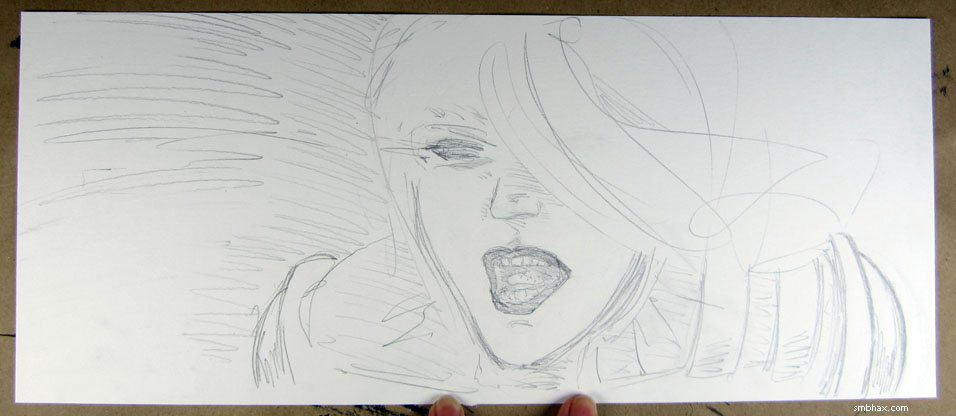
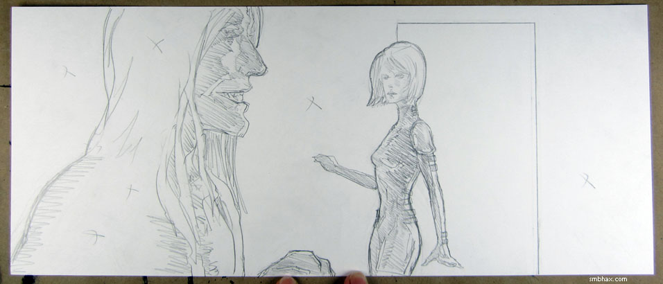
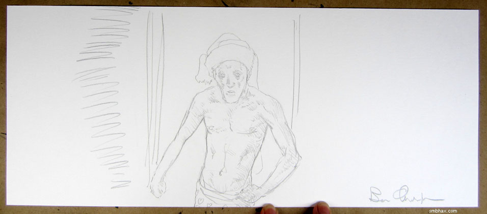
Added 1 new A* page:I had some odd thoughts about style when trying to make this page, particularly when thinking about how I'd ink it, and they almost backfired. The pencils looked like this
and I could tell that this was the kind of drawing whose subtle shadings would be pretty darn tough to ink. So I thought I'd forget trying to emulate all the hatched shading and go with solid black on the figures instead. I also kind of liked how Thierry's hair, not shaded in, looked, and thought maybe I'd leave it white like that in the inking--but it's funny how the balance of things changes from pencil to ink, and what looks right in pencil doesn't work in ink--anyway leaving that hair white was one thing that didn't seem to work. So the ink looked like this for a while
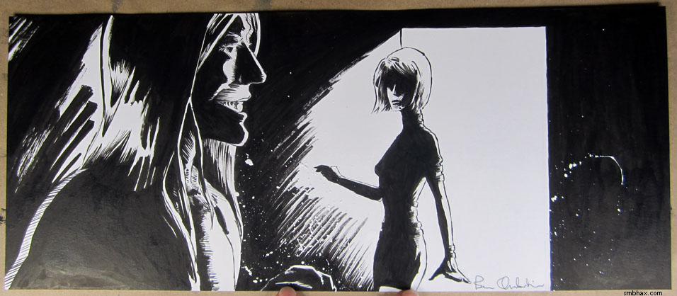
which I found distressing. It had gone awry--not only had I sacrificed the subtle shades of hatching for solid blacks without much apparent payoff, but I had managed to screw up the translation of the faces as well; even though Thierry's face looked more or less accurate, little things here and there were off and built up into a less than satisfying conversion. In my despair over this I went so far as to try just using the photo I'd taken of the pencils as the basis for the final page, but it was too murky. So I had to go in and try to correct the inks, including repainting Selenis' face directly in ink, from scratch. My hopes were low.
That actually worked out okay, though, and in the course of it other things I could tweak started popping up: pushing the shading of her body more into the abstract, for instance, and correcting my usual problem of drawing women's heads too large (they're generally smaller in proportion to body size than men's heads, but I seem to be stuck on drawing them man-sized); and the correction of the tiny little inaccuracies on Thierry, although all seemed nearly inconsequential on their own, collectively brought him up to snuff somehow.
I guess this shows that my sense of what things will work in ink, or how a pencil drawing will translate to ink, is still a bit off after not inking for so long; I'm still seeing the pencil drawing as pencils rather than a plan for ink. I'm not sure I was all that great at that even back before I went on my all-pencil jag. Seems like something I could definitely stand to improve and which would save me a lot of time in fiddling around with the inks. Then again, a skeptical part of me says that ink is ink and pencil is pencil, and I'll get better results if I do just go off with the inks in their own direction at the end, as I had to do here--I don't think I'll ever be able to pencil a face like Selenis' final inked face came out, for instance, but it's the kind of loose, high contrast rendering I've had a hard time achieving since I left my dear old digital Lasso Tool behind. Come to think of it, the final eyes on the discarded original inked version of yesterday's page were also painted al fresco, as it were (the one on the left was black ink over white ink, and the right was white ink over black ink--I had ended up obliterating the original eyes painted over the pencils separately), and those worked out pretty well too (only the rest of the thing was kinda bleh), so maybe the all-pencil period helped me out with that sort of thing somehow. Which strikes me as odd, because what I thought I'd learned from working in pencil was a tighter, more line-intensive rendering style, whereas what seems to work better for me in ink is being able to step back and take the balance of white and black in a reduced, more abstract direction. Hum I have more to say about that but there's that sleep thing I should do for a while here first.
|
·····
|
| |
| Drawing tips for whatever they're worth | Oct 09, 2013 3:55 AM PDT | url |
| | |
Added 1 new A* page:I'm not particularly qualified to give anyone drawing tips, but someone asked me for some today, and as I began to cudgel my brains for something useful to say, all this stuff started falling out. It sort of degenerates into an awful load of aphorisms at the end, but just because they're trite doesn't mean they aren't true, darn it! So here it is:
~~~~~
My favorite human anatomy drawing guide currently is George Bridgeman's classic "Constructive Anatomy," which you can find online pretty easily by Googling. Other guides I've found useful in the past have been another oldie, Andrew Loomis' "Figure Drawing for All It's Worth," and (in my younger days) the Stan Lee / John Buscema "How to Draw Comics the MARVEL Way" although I would now take Bridgeman over both of those.
If you're thinking of inking more or less traditionally, both Klaus Janson's "The DC Comics Guide to Inking" and Gary Martin's "The Art of Comic Book Inking" have useful information.
Other than reading those kinds of things, I would say just look at (and look for) a lot of photos, films, artwork, and comics you like, and study them but don't copy them. Illustrators I've been into lately include Alex Raymond, Bill Seinkiewicz, Frank Frazetta, David Downton, René Gruau, Alfons Mucha, Frank Miller, Fiona Staples, Takehiko Inoue, and Yoshihisa Tagami. I grew up on more traditional Marvel comics illustrators like John Byrne and Alan Davis. I've also found it useful to study fashion photography both for the models and the clothing. Tumblr is a good place to find these sorts of things; my tumblr is smbhax.tumblr.com if you want to see the kinds of things I'm looking at there. I should note that I look at art for inspiration, and photos / film and real life (I go to a gym most days of the week, and I'm sure that subconsciously (or otherwise >_>) observing others there has been absolutely invaluable for drawing) for actual reference material--and that for the most part I don't advise drawing directly from a photo or whatever, but rather just consulting them to get an idea of how things look in the real world, then setting that photo, etc aside and drawing your own image. I try not to look up photos while I'm in the middle of a drawing unless I'm really really stuck on something.
Oh! Also, mirrors are very useful. I have a hand mirror next to my drawing table for making faces in if I need help drawing a particular expression (although sometimes my own face won't cut it and I have to go looking through my trove of reference photos or Google images for clarification), and of course the larger closet or bathroom mirrors are available if I need to try a pose or check a calf muscle or something; in that regard, getting in better physical shape has helped, too. The mirrors are also very helpful for checking drawing accuracy by looking at the drawing reflected in the mirror: this makes it easy to pick out errors or distortions that your eye has been skipping over; if you're working digitally, just use your drawing program's function to flip the canvas horizontally.
I would probably still be working all digitally (I did up through the initial part of episode 13 of A*) if it hadn't started being ergonomically uncomfortable for me. I do miss the ease of use of certain digital tools, but I'm actually glad I switched to working traditionally, even though it takes longer and isn't quite as flexible, because once I did I realized that the very easiness of using those digital tools had been allowing me to get by without really having to know how to draw certain things, like oh say nostrils for instance--because I could just sort of muddle around and undo/redo until something came out looking sort of right, even if I didn't quite know how I'd done it. So I would definitely recommend trying to work on paper as well as digitally, if just to expand your knowledge of tools and techniques. You can find a list of the materials and tools I work with on the about page of my main site; lately most of my daily blog entries there have been about drawing and stuff, usually with more detail than I put in my comments here.
Specific pencils and paper and brushes and ink aside, though, I would say that I've found the most important drawing tools are time, an eraser, and sheer stubbornness; it isn't that you eventually start to make drawings without mistakes, but rather that you get better at recognizing a mistake, or just a weak drawing, and refuse to let it be seen by anyone; you have to be willing to obliterate a drawing that just isn't working well, and start over from scratch. Usually you will be able to come up with something better if you just keep at it. Constantly question your results, look back over your past work and note what went well and what didn't. If you're entirely satisfied with your work, something has probably gone wrong. Don't strive for perfection, but for what successfully conveys the idea; when I'm stuck on a drawing I generally find that it's because I was trying to force my way through by drawing highly polished details of some high-falutin' idea, whereas what I really need to do is to keep searching until my hand and eye have hit upon a valid basic inspiration; once the beginning is good, it can always be refined. Don't overthink it. Modern pop culture would have it that drawing skill is the result of some sort of magical talent you have to be born with, but it actually comes from observation and practice, and those who are the best at it are those who have worked the hardest and most effectively at it. There will always be someone better than you, but you can always get better than you currently are.
~~~~~~
Since then I thought of a couple more things:
- After working on something for a while you can become blind to problems in it--or to opportunities!--so I find it useful to take a break for a while once I think I'm done laying it out (generally this is when I go eat dinner), and then come back to it with fresh eyes.
- No matter how late I stayed up working the night before, I don't take caffeine when drawing anymore, because I found my drawings were coming out impatient and jittery.
~~~~~~~
As if to illustrate the earlier point about being stubborn, I ended up drawing two pages for today's one; the first came out like this, which is a nice creepy staredown face, and would have been fine, only after a lot of reworking in white and black ink, the proportions got away from me a little bit, and it also just wasn't a very feminine face; in fact, now that it's been staring at me a while longer, I've realized it illustrates the down side of using a mirror too much for facial reference, because it's actually at least as much a portrait of me as it is of Selenis. Super creepy! Gah!
And if that isn't far out enough for you for one A* day, here are the colors I almost went with for today's page (the final version is actually this combined with an earlier pink gradient scheme I had scrapped but tripped over later):
|
·····
|
| |
| Real ISS action | Oct 07, 2013 11:32 PM PDT | url |
| | |
Added 1 new A* page:That new "Gravity" movie in which the International Space Station and apparently pretty much everything else in Earth orbit is destroyed in a debris storm is popular right now, but in a rather more plausible story involving the ISS, Orbital's commercial test Cygnus cargo module successfully docked with the ISS last week, although that was a week later than planned as "software problems" "left the freighter unable to establish the correct communications and navigation links with the space station" until Orbital operators on Earth were able to create, upload and install new software to the robotic module--and it was a week delay because in the meantime a new crew had arrived at the station and needed to dock, so the fixed module had to wait for all that to finish up. It's nonstop action up there!
Pencils for today's page just for funzies:
and here are the pencils for the previous page, which I didn't post on Friday because I actually had something to talk about then : p:
|
·····
|
| |
| Fiona Staples, Takehiko Inoue, Mike Mignola | Oct 05, 2013 11:05 AM PDT | url |
| | |
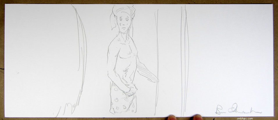
Added 1 new A* page:I said yesterday there were three direct artistic inspirations for this sudden switch back (sorta) to ink. Here are two of them:
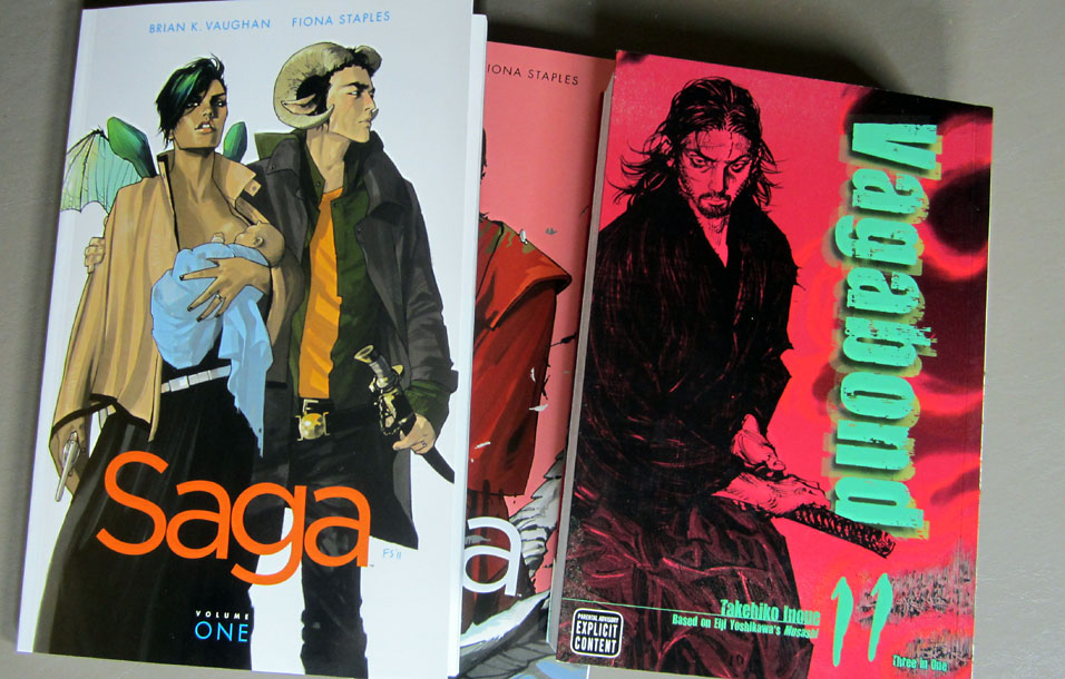
See I treated myself to a trip to the comic store...I figure maybe I can "afford" this once a year or something. >_> So I looked through their vast collection of collected comic editions and came up with these as the most artistically inspiring: Fiona Staples' gorgeous full color digital artwork in "Saga," and Takehiko Inoue's amazing black and white brush and pen work in "Vagabond." Like, you can't really see it in this tiny photo but that samurai dude's face is composed of like a billion tiny hatched lines--incidentally, I think that's meant to be Miyamoto Musashi. I can't say a whole lot about the story in either of these series because I haven't actually sat down and read them yet, but dang, that art.
Staples manages to get her main male character shirtless for a good deal of the first two "Saga" volumes, and I'm pretty sure that somewhat sinuous torso I had on the first rejected pencil drawing of Thierry yesterday (this one) was basically my subconscious attempt at a Staples torso. But more to the point, her fluid black linework is smoother than what I could do with a pencil, and that got me thinking about going back to ink.
I mean, while working in pencil I've been thinking constantly about other options, as I tend to do. And I have kind of missed some aspects of working in ink, like crisp, fluid lines. And Inoue's black linework in "Vagabond" got me thinking even more along those lines, especially in the spots where he supplements the gorgeous little arrays of pen lines with larger brush strokes. Really gorgeous stuff that you kind of need ink in order to do.
The third thing was something I heard while drawing the pencils for yesterday's page: listening to episode 18 of the Word Balloon comic book podcast, "Hellboy" artist and writer Mike Mignola in an October 24th, 2006 interview, when asked if he had concerns about other artists drawing his stories, mentioned that one worry is that the other artists might not be as good at he is as "spotting blacks," meaning identifying places around the page where an area of black ink can go; the mosaic of these black areas vs the unmarked white areas of the page more or less defines the primary light/dark balance of the composition; Mignola is very well known for his bold use of chunky black areas, ink applied with markers. So anyway as I was sketching away and filling in Thierry's torso with various hatched pencil lines for shading, I thought "heck, I could be doing that instead of trying to imply dark areas with all these gray pencil lines."
And this is actually something that's been nagging at me since the very first page in which I decided to go all pencil, that being episode 19, page 2
because there I had actually defined, with a pencil outline, the precise area of shadow cast by Selenis' nose. It had worked very well and was part of what helped persuade me to leave off trying to match that in ink, and just stick with pencil, but in all the pencil pages since then I hadn't really gone back to that process of outlining shadow areas--instead, I had just kind of poked them into shape by starting to hatch lines in here and there. Not that there's anything wrong with that, but the spotting process definitely has advantages in many situations; only, one thing that was keeping me from doing it more was that with pencil alone, even supplemented later by digital color, I didn't have a great way of filling such spotted areas in, at least not in a really consistent way that would work well with the rest of the pencil lines.
Basically you kind of need ink for that, or something sort of equivalent like the Lasso Tool in Photoshop that I used to use in the old days when I worked all digital. I don't want to spend all day working away on a computer screen, so that leaves ink, basically. I erased all my hatching lines inside Thierry's contours and replaced them with a single line delineating the shadowed and unshadowed areas, the black and the white. And it was surprisingly easy, since I'd already figured out the volumes when I was hatching lines here and there.
There was no call to use that approach on Selenis today because we're basically seeing her directly in the light, but still the ink came in handy for the sharp little hatched lines around her edges; if you check the large, 1080p version of the page, or the pure ink line work visible in the images accompanying the eBay auction of today's original art (hint, hint : D), you can see that those lines are way sharper than what I was able to do with pencil alone.
In fact, they're sharper than any lines I've been able to do up to this point. I'm still using the same brush I used before; the difference is the paper: when going to pencil I needed a smoother paper that would cause less breakup of the graphite lines, so I went from the heavy Canson Illustration paper I'd been using, which was great at absorbing heavy washes, and had a little bit of texture to it, to Canson's Foundation Bristol, smooth, which isn't as heavy, but is definitely smoother. And darned if that little bit of difference in tooth makes a huge difference in the kind of lines it feels like you can make on it; the rougher paper I was using before would tend to break up delicate lines--you can see that in all the little lines I tried to do in the last ink page I'd done before I gave up and switched to pencil, the final page of episode 18
where the roughness of the paper causes them to skip and break up, so they look a little scattered and uneven. It's a subtle difference to look at but what a vast difference it makes in feel when you're trying to draw; this smoother paper has me finally approaching ink work as drawing rather than as painting. I should be able to do both, but I'm definitely appreciating the precise detail that finally feels like it comes easily now. I'm going to have to learn how to color over or under all this black ink--whereas with pencil lines you could--and kind of had to--apply color everywhere since the lines took up no volume of their own--and hm how to get the penciling and inking and coloring done without needing to stay up all night to get it done, but this has definitely solved some problems for me so I'm kind of excited about it. : )
|
·····
|
| |
| Slipping back into the inkwell | Oct 04, 2013 11:32 AM PDT | url |
| | |
Added 1 new A* page:Today went like this:
And then I figured well heck I might as well just ink it. : P So I did. Definitely easier to do heavy shadows this way... And what I learned from working in pencil alone was spending the time to get the pencils right--whereas before when I was also inking I left the pencils very loose and figured I'd just resolve all the drawing problems while inking...which often caused more, un-erasable problems--so that allowed today's inks to be very tight and precise, and somewhat to my surprise that actually helped me avoid boo-boos. Doing all the little hairs on the towel kind of killed my arm, but eh we'll lose the towel as soon as possible. >_>
We'll see how long I can keep this up. I *am* still putting up the original art for each new page on eBay, starting at $0.99, just like the pencil-drawn pages--the link to the auction is in gold letters under the page graphic--the auction for today's original inked piece is here, by the way--so if you were looking to get an inked piece from me, this is probably your chance to pick one up for a song. Please, please do--I want to get these out to people.
~~~~~
There were actually three very specific artistic inspirations for this sudden return to ink today and I'll try to go into that tomorrow.
|
·····
|
| |
| Dark scenes the easy way | Oct 03, 2013 6:14 AM PDT | url |
| | | |
Added 1 new A* page:I feel like I should make a 20/20 joke of some kind... Uh... Anyway this is the easy way to do a dark scene--total silhouette, woohoo! I even got rid of the original pencil lines entirely and just kept the polygonal lasso fill shapes I'd traced beneath them, because there was nothing here that needed that organic look. The real test will be if I can keep things dark when I have to do organic detail. I have an idea or two to try but who knows if it'll pan out. Also I realized after yesterday's page that I'd taken the gradient fill thing too far, and I need to get back to a sharper method, like say oh episode 19, page 118--although maybe a little tidier looking. Or maybe going for tidiness is sort of holding me up. I dunno, but there's still a ton of dark scene pages left to do this episode, so I guess I'll have plenty of time to experiment. : o
|
·····
|
| |
| An A* Advertising Adventure | Oct 02, 2013 6:18 AM PDT | url |
| | |
Added 1 new A* page:I've been trying to make some color ads for A* lately. Here's what I've got so far:
I suppose I might try making an ad out of today's page, although it might be a little too low-contrast (and even just in general : o). Not sure how these others will do, the first ones might be too simple/sketchy, the last ones too rough. But I don't know! So usually I just make a bunch of ads, let them run for a while, then delete the underperforming ones. : P Often the ones that do best aren't even my favorites, but just happen to look kind of like something a lot of people online like, like anime or something. Advertising's a funny business!
|
·····
|
| |
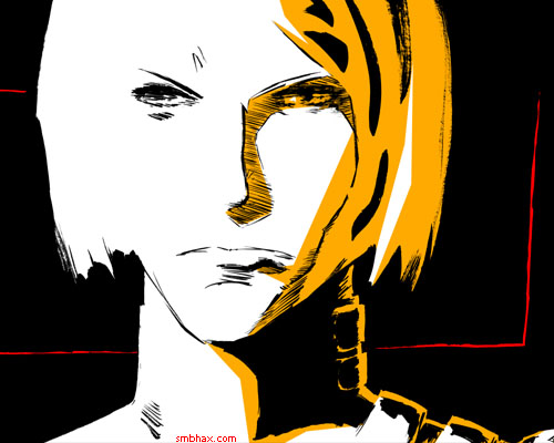
| 99¢ for this face, ladies and gents | Oct 01, 2013 4:04 AM PDT | url |
| | |
Added 1 new A* page:I had this page all colored up dark, with some digitally fingerpainted highlights and all kinds of stuff, and then I realized it was obscuring the original drawing too much; and how could I cover up this face?
D-aw! So I peeled the colors back until it was mostly visible again; I feel kinda bad about even covering it this much, but something had to take the harshness off of the black and white... Wait a sec, what if I don't force the lines to black in the first place... *edits and re-uploads page* Hm. I kinda like that. Softer, more subtle look, preserves more of the weighting and shading of the original pencils.
Anyway the point I was going to make was that hey, not too bad of a drawing, is it? And you know, the original drawings are all going straight up on eBay these days, which means you could bid, and potentially get that original drawing for just 99 cents. Worth a shot, right? I don't mind low bids; for now I just want to get some sales under my belt, you know? The auction for today's page is here; the link to the live auctions are always in gold text right under the page image.
|
·····
|
|
|